5 Ingenious Bathroom Tricks That Will Help Make the Most of Even an Awkwardly-Shaped Room
These clever bathroom hacks will help you get more from a challenging space

Sometimes a clever bathroom hack is exactly what's needed to solve your layout dilemmas. Bathroom design can be far from formulaic when it comes to choosing finishes and styles, but when it comes to where things go, it's the tried and trusted ideas that many designers fall back on.
The problem is that when you're working with small bathroom ideas, you might have an awkward floorplan or something in the wrong place that causes havoc when it comes to perfecting your layout. If you're working with the right interior designer, they should be able to problem-solve your space, but if you're going it alone, you might need a little help.
We asked five contemporary designers for their biggest and best bathroom hacks when it comes to getting the layout and look right for narrow, tiny and awkwardly shaped bathrooms to learn the lessons from their challenges.
Bathroom hacks to make the most of a small or awkward space
There are some re-occurring problems when it comes to getting your bathroom layout right. These include the position of windows, where to locate a bath and shower, and how to fit in all the design elements you want when space isn't on your side.
You might find yourself playing a game of Tetris with all the different fittings you want to include, but is there an idea you've not considered that might revolutionize your layout.
Possibly, and maybe one of these five ideas is the one you've been searching for.
1. Go bespoke with the bath to fit an narrow bathroom
Fitting a bath into a small bathroom might be high on your agenda, but isn't always practical. Even if you opt for a scaled-down, miniature bath, its success depends on the measurements of the space you're working with, and how much space will be, potentially, wasted.
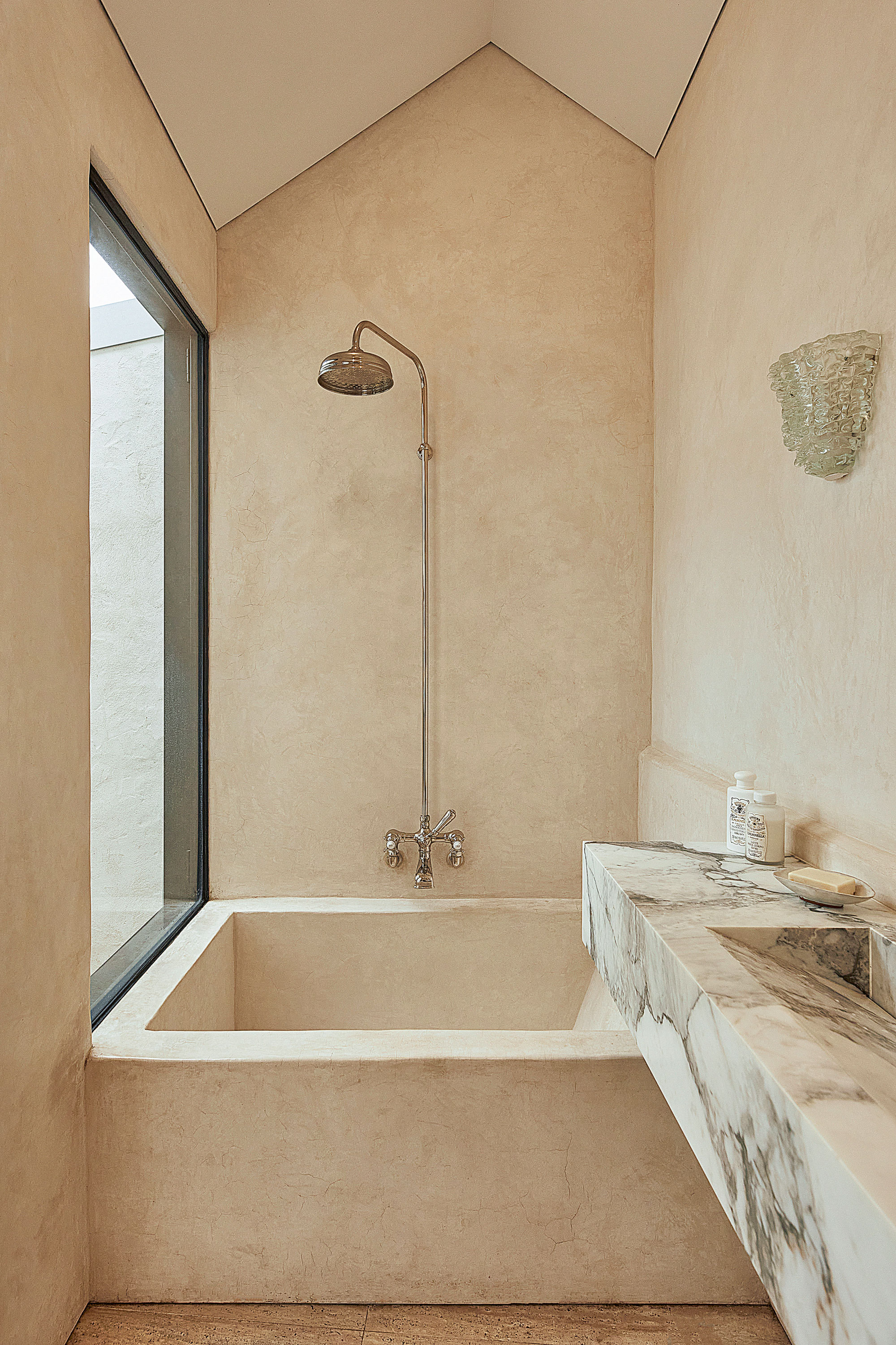
'The dimensions of the bathroom really prevented a standard bath from being used in the design,' explains Richard Huxley, founder of Sydney-based Huxley Architects and designer of this clever modern bathroom idea. 'By designing a bespoke bath, it could fit the space perfectly and we could also play with the geometry in the room; having the bath provide a counterpoint to the floating shelves opposite framed the marble vanity in the center.'
In order to get a finish that was cohesive, the architect used a tadelakt lime render across the walls and bespoke bath. 'It was important that the bath belonged to the room and did not overpower the composition,' Richard explains. 'By rendering the bath as an extension of the wall, it became robust enough to belong, while being respectful to the other elements in the room.'
'That's the beauty of designing a bespoke bath, it's flexibility and uniqueness,' he adds. 'You can specify any suitable finish you want. You can design a bath of almost any shape or size, or respond to site-specific constraints through design that a standard bath simply could not address.'
2. Make a window work in a shower enclosure
The placement of existing windows can present a real issue for getting your bathroom layout right - moving them as part of a renovation is costly and disruptive, after all.
Whether a window should be inside a shower room or enclosure is often a big layout concern, as there's a few issues that go alongside it. A modern uPVC or aluminum window will cope fine in a shower enclosure, but older timber windows will suffer in this space. Likewise, you're limited with your window treatment options, with privacy glass the only real choice for a shower window.
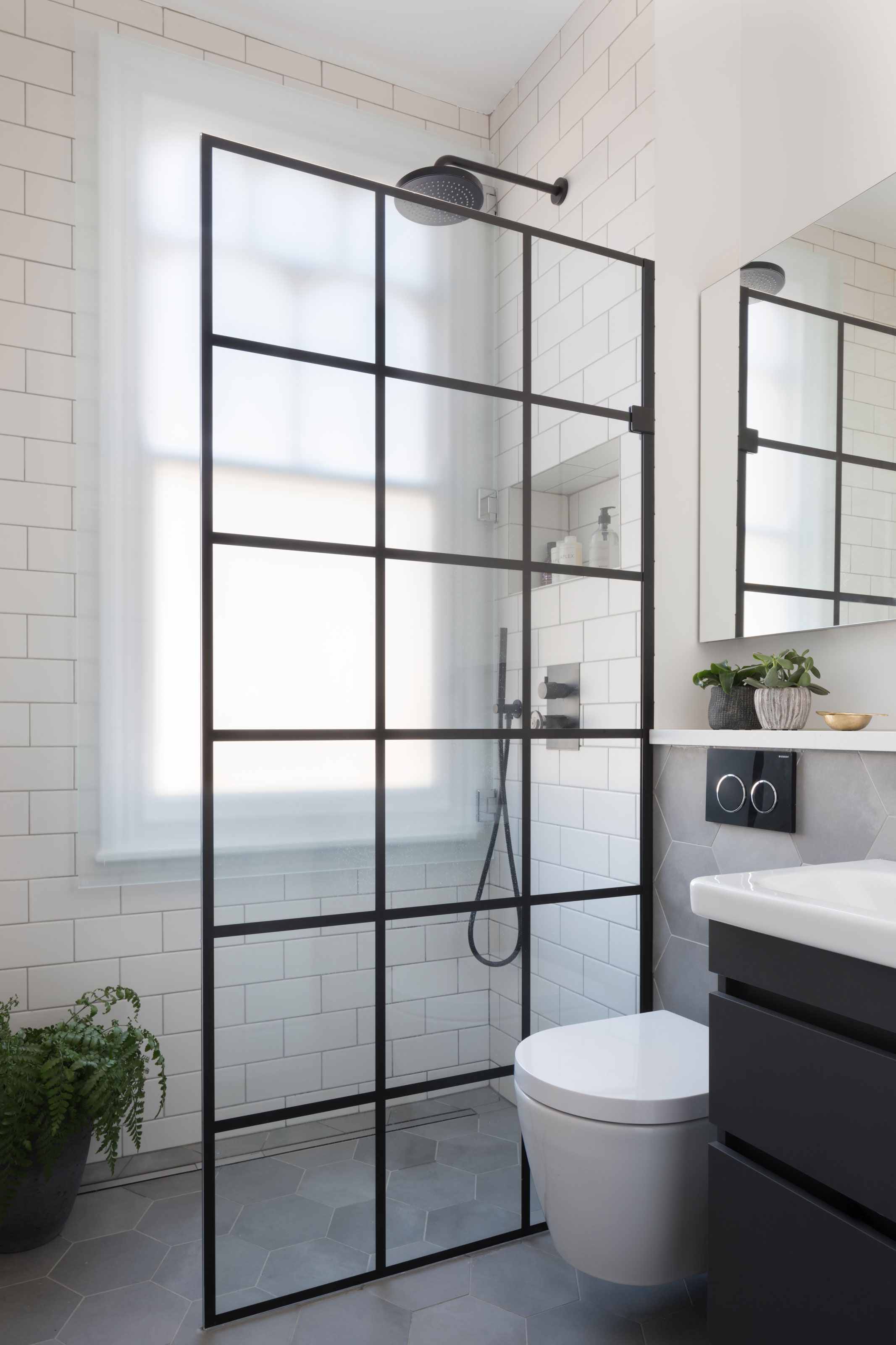
However, in this design by West One Bathrooms, a clever bathroom hack was created to solve the issues presented by a layout that saw the window in the shower enclosure - a reverse shower screen.
'The room was compact in space and the clients wanted a large shower, the only place this could be accommodated was under the window,' says Louise Ashdown, head of design at West One Bathrooms.
'To overcome the issue of a window directly in the shower, we suggested a frosted glass panel on hinges to cover the window, this protected the woodwork and also allows for ease of cleaning.'
3. Recess storage into the walls
A minimalist style bathroom is the perfect choice when you're dealing with a small space. Undoubtedly, it will help the room feel more restful and streamlined, but you'll still need to find space for storage to keep the bathroom clutter-free.
Vanity mirror storage is a brilliant way to add concealed space, but as a small bathroom storage idea, these can sometimes feel bulky and intrusive. Consider then recessing a storage mirror when designing your space, so that the mirror itself appears flush with the wall.
'In this project, we were catering for a family so we needed shaving cabinet storage - however we’ve recessed these into the wall and paned the front,' explains Shona McElroy, founder of Smac Studio. 'The mirrors have become modern design features as well as very functional.'
4. Position a mirror in front of a window
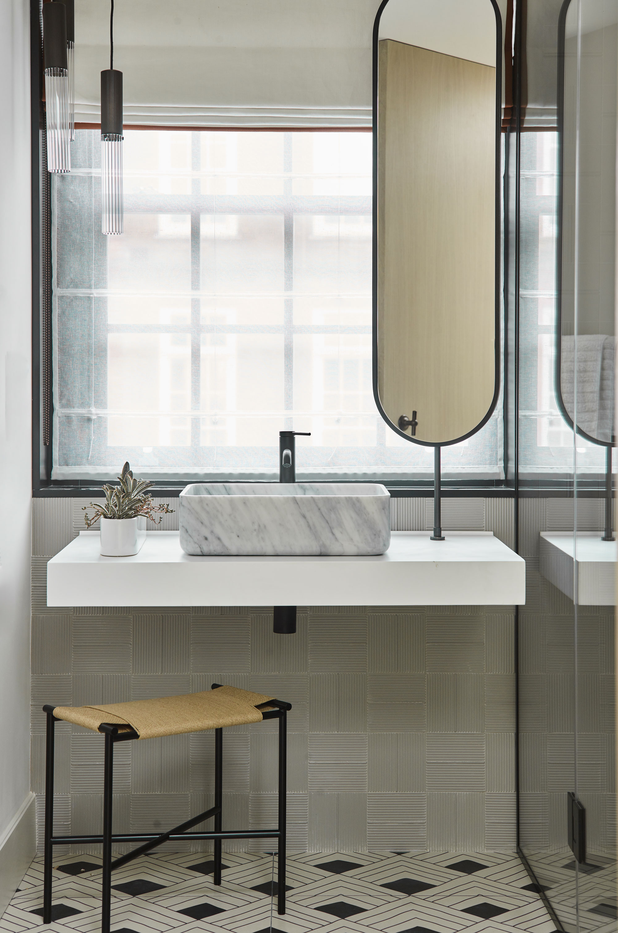
If you can't find a workaround for your basin to be located anywhere but in front of a mirror, it raises the question - where do you position the mirror?
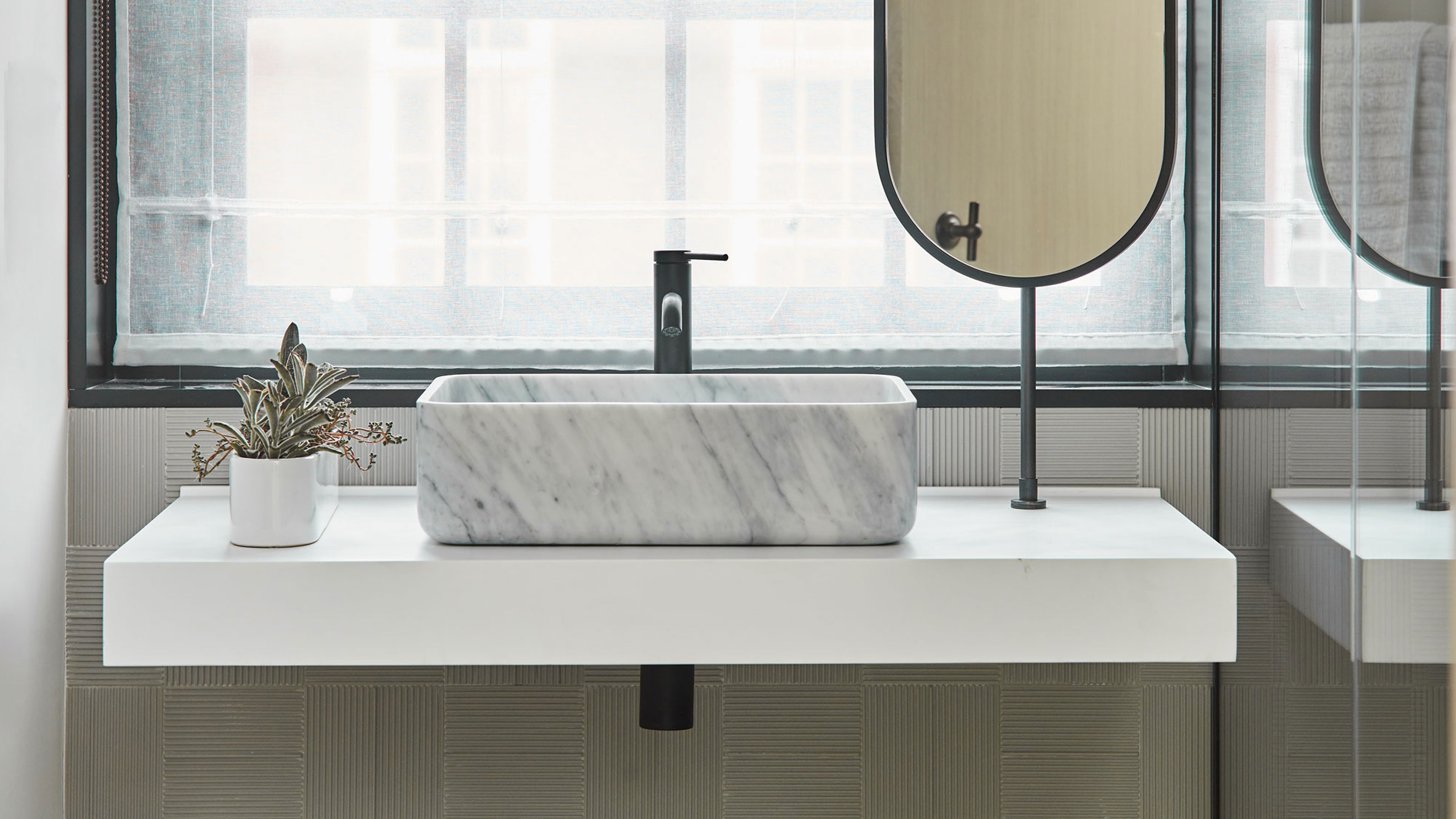
'The natural place for a bathroom mirror is above the basin, but when the basin is positioned in front of a window, it presents a design dilemma, explains interior designer Irene Gunter, founder of Gunter & Co. 'Solutions include mounting a mirror to one (or both) of the side walls. Another option is to attach a bespoke swivel mirror to the vanity countertop and ceiling, as shown in the shower room of this Chelsea townhouse.
'The beauty of this is that the mirror can be turned sideways when not in use, so it doesn’t block too much of the light or view,' Irene explains.
5. Add a partition wall for a broken plan design

Small bathroom layout ideas usually focus on fixtures and fittings around the edges of the room. It makes sense as a way to create the largest amount of floor space, but could you pack more features into your small space if you took a different approach?
In this bathroom by interior designer Katie McCrum of Katie McCrum Studio, a partition wall has been created in this narrow ensuite allowing for a more creative layout.
'The layout of this room was seriously challenging, it was a former kitchen full of odd-shaped angles and a redundant dumbwaiter,' explains Katie. 'Our aim was to create an elegant, contemporary, sleek haven of relaxation and the best way to manage all the different angles and accommodate necessary pipework was to create two separate zones using bespoke dramatic Crittall-style screens.'
Not only in the bath and shower in a wet room enclosure, but the layout has also allowed for dual vanity sinks without creating a 'corridor' of fixtures. Vanity mirrors have also been placed on the dividing Crittall-style screen.
'Finer details such as brass-trimmed mirrors and textured finishes provide subtle connections along with well-considered layers of lighting that define each area and offer an overall sense of depth, atmosphere and ultimate luxury,' Katie adds.
Be The First To Know
The Livingetc newsletters are your inside source for what’s shaping interiors now - and what’s next. Discover trend forecasts, smart style ideas, and curated shopping inspiration that brings design to life. Subscribe today and stay ahead of the curve.

Hugh is Livingetc.com’s editor. With 8 years in the interiors industry under his belt, he has the nose for what people want to know about re-decorating their homes. He prides himself as an expert trend forecaster, visiting design fairs, showrooms and keeping an eye out for emerging designers to hone his eye. He joined Livingetc back in 2022 as a content editor, as a long-time reader of the print magazine, before becoming its online editor. Hugh has previously spent time as an editor for a kitchen and bathroom magazine, and has written for “hands-on” home brands such as Homebuilding & Renovating and Grand Designs magazine, so his knowledge of what it takes to create a home goes beyond the surface, too. Though not a trained interior designer, Hugh has cut his design teeth by managing several major interior design projects to date, each for private clients. He's also a keen DIYer — he's done everything from laying his own patio and building an integrated cooker hood from scratch, to undertaking plenty of creative IKEA hacks to help achieve the luxurious look he loves in design, when his budget doesn't always stretch that far.
-
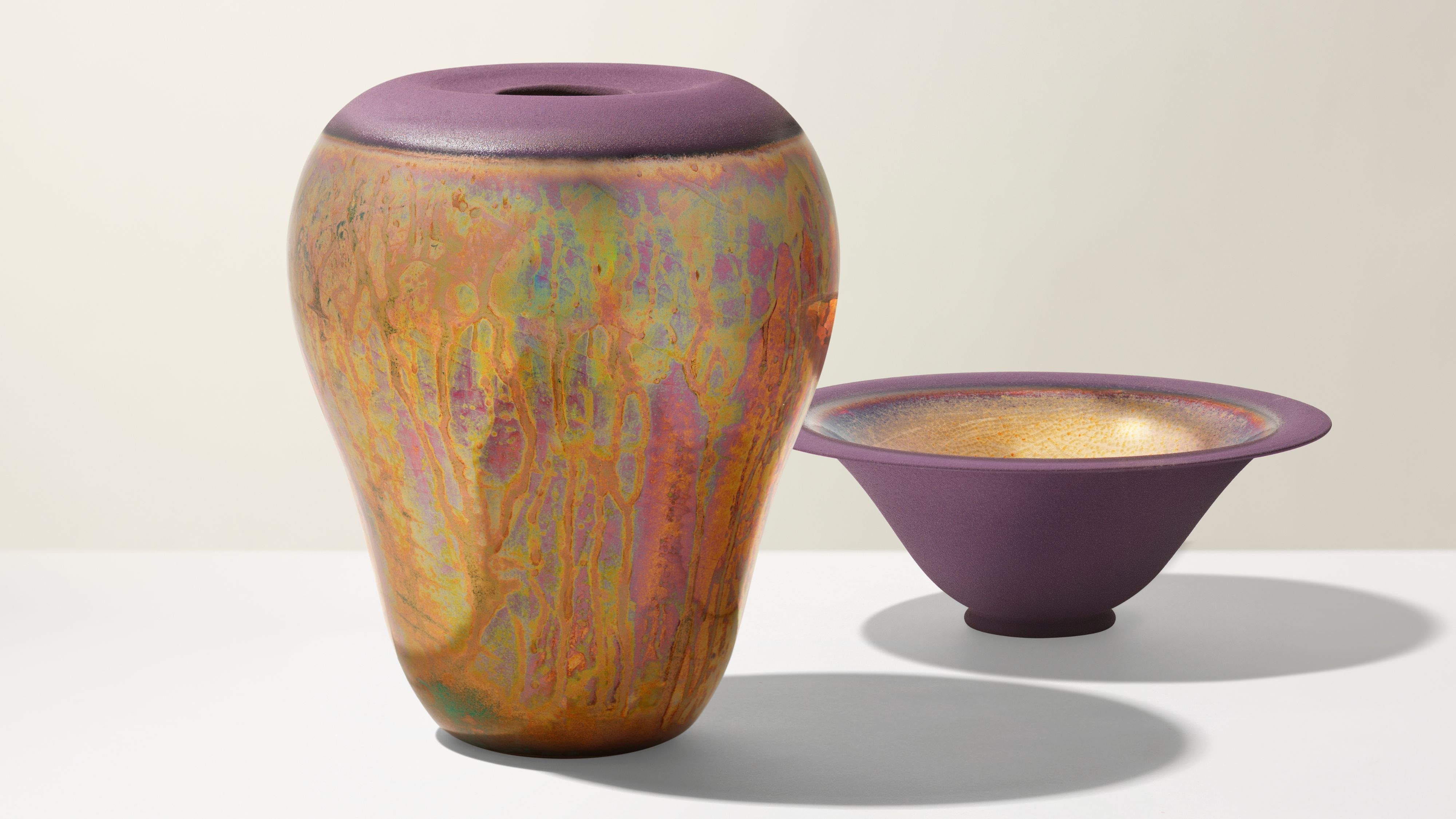 Iridescence Is Chrome’s More Playful, Hard-to-Define Cousin — And You're About to See It Everywhere
This kinetic finish signals a broader shift toward surfaces that move, shimmer, and surprise. Here's where to find it now
By Julia Demer
-
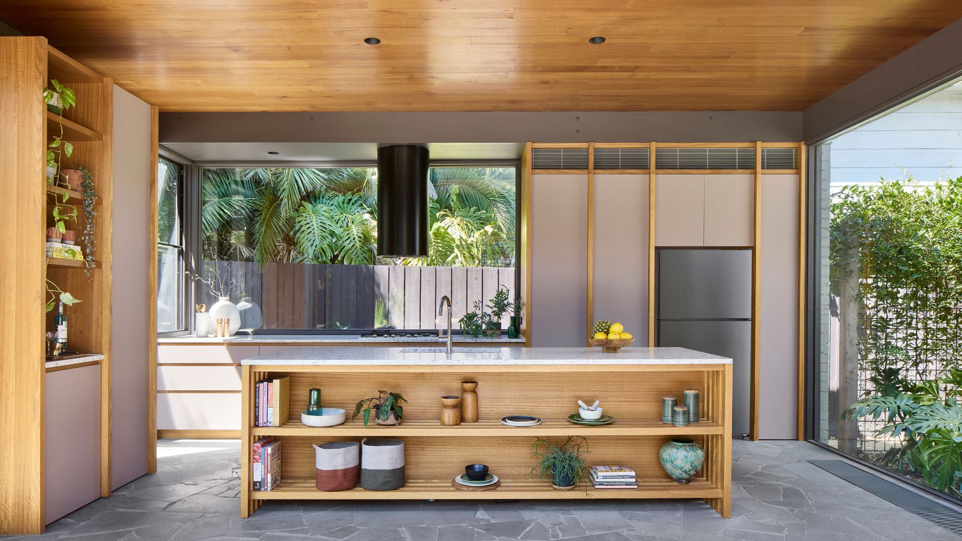 Biophilic Decluttering — What to Take Out of Your Home (and What to Put in) for a More Natural Home
Try your hand at biophilic decluttering to ground your interiors, connect to the environment, and cure chronic clutter in one go. Here's how.
By Amiya Baratan