5 Rooms with Beach Color Schemes That Each Take a Different Approach to This Laidback Look
Bring the outdoors in with colors drawn from the sea and the landscape to create restful spaces inspired by nature
The Livingetc newsletters are your inside source for what’s shaping interiors now - and what’s next. Discover trend forecasts, smart style ideas, and curated shopping inspiration that brings design to life. Subscribe today and stay ahead of the curve.
You are now subscribed
Your newsletter sign-up was successful
If you love the idea of incorporating some coastal design influences into your home, then color is a great place to start. The best way to weave in any beach-inspired references is to take a subtler approach, and that applies to your interior palette, too. While nautical schemes often lean on primary shades and brighter hits of color, a modern beach house palette takes a more understated route, harnessing tones from the surrounding environment, both land and sea. Blue in all manner of shades — from pale and hazy to deep and inky — is an obvious choice, but it’s also worth looking to earthier tones for a less conventional take, such as soft greens, foggy greys and warmer hues like clay and rust.
"My approach to devising color palettes for coastal homes is inspired by the natural beauty and tranquility of the seaside," says Salt Design Company’s Sarah Brady, whose design ethos is inspired by her New England upbringing. "I focus on incorporating soft, muted tones like sandy neutrals, crisp whites, and various shades of blue to reflect the ocean, sky, and shore. These colors are not only soothing but timeless too, creating a serene and inviting atmosphere."
Sarah also favors subtle touches of earthy and organic color to bring in warmth and texture, as well as organic materials like rattan, linen and reclaimed wood. "This approach allows the beauty of the coastal environment to shine through, creating a calm and inviting atmosphere that feels both luxurious and naturally harmonious."
Article continues belowWe’ve compiled a few of our favorite examples that adhere to this more relaxed take on a coastal color palette below.
1. SERENE GREENS
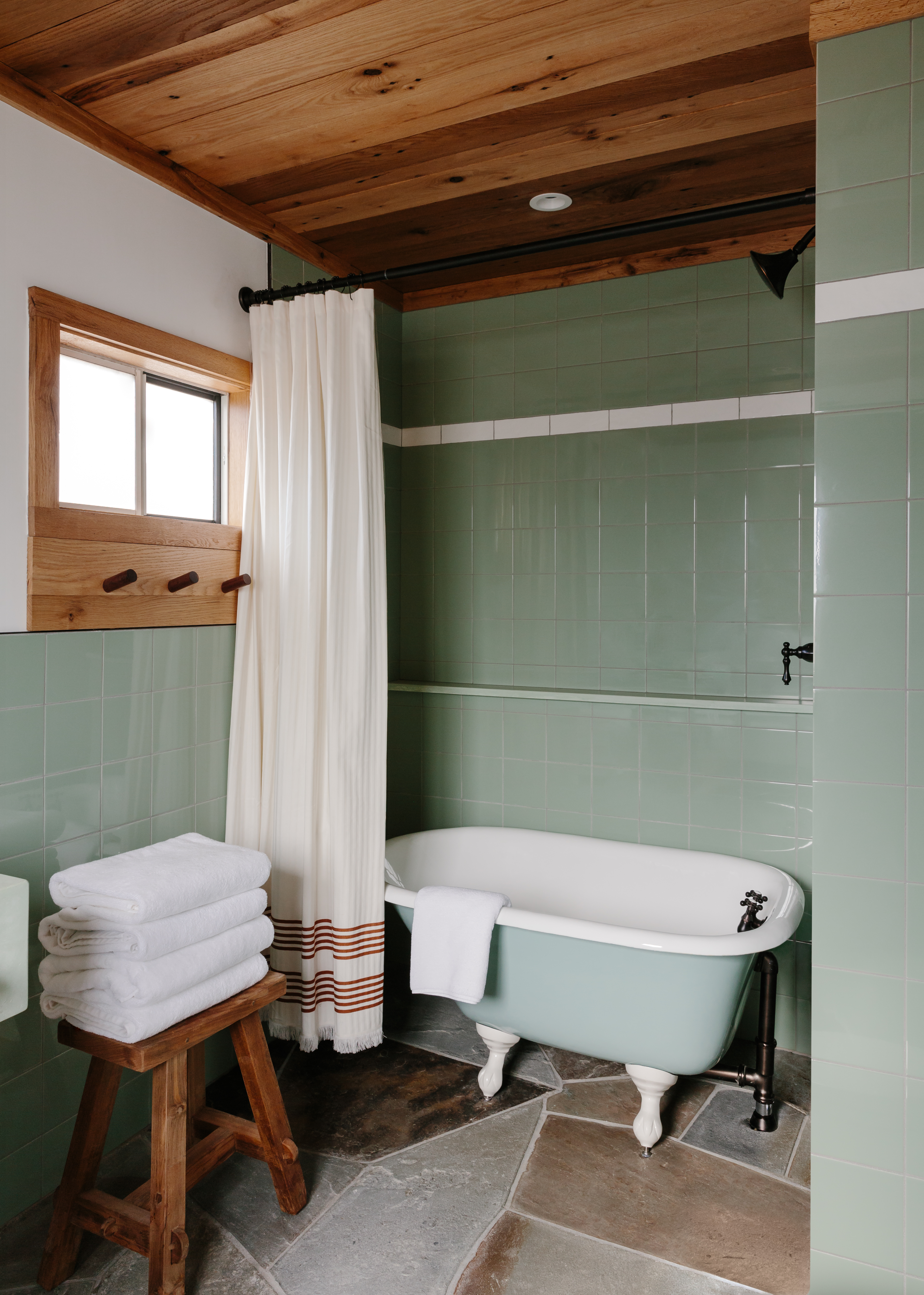
Green may not feel like your first thought for a beachy color palette, but as this coastal design-inspired bathroom goes to prove, it's perfect for nailing the laidback look. In combination with the pine (something that brings to mind beachside cabins), this palette of soft green with a tiny red accent in the shower curtain grounds this space in its locale.
"Our gut renovation of Daunt’s Albatross pays homage to a time when the village of Montauk felt like a hidden gem," says Oliver Haslegrave, founder of Home Studios, who redesigned this historic motel. The design team married the colors and textures of the beaches of nearby Shadmoor State Park — shades of white, warm greys, browns, faded yellows and ocean hues – and relied on raw and rugged materials, such as knotty pine and flagstone floors."
"We left the stone floors unadorned as the organic shapes provide texture and pattern, grounding the space and connecting us to the earth beneath our feet," explains Oliver. "The tiles possess a handmade quality and the color palette throughout is as subtle and varied as the Montauk cliffs."
The Livingetc newsletters are your inside source for what’s shaping interiors now - and what’s next. Discover trend forecasts, smart style ideas, and curated shopping inspiration that brings design to life. Subscribe today and stay ahead of the curve.
2. FOGGY GREYS
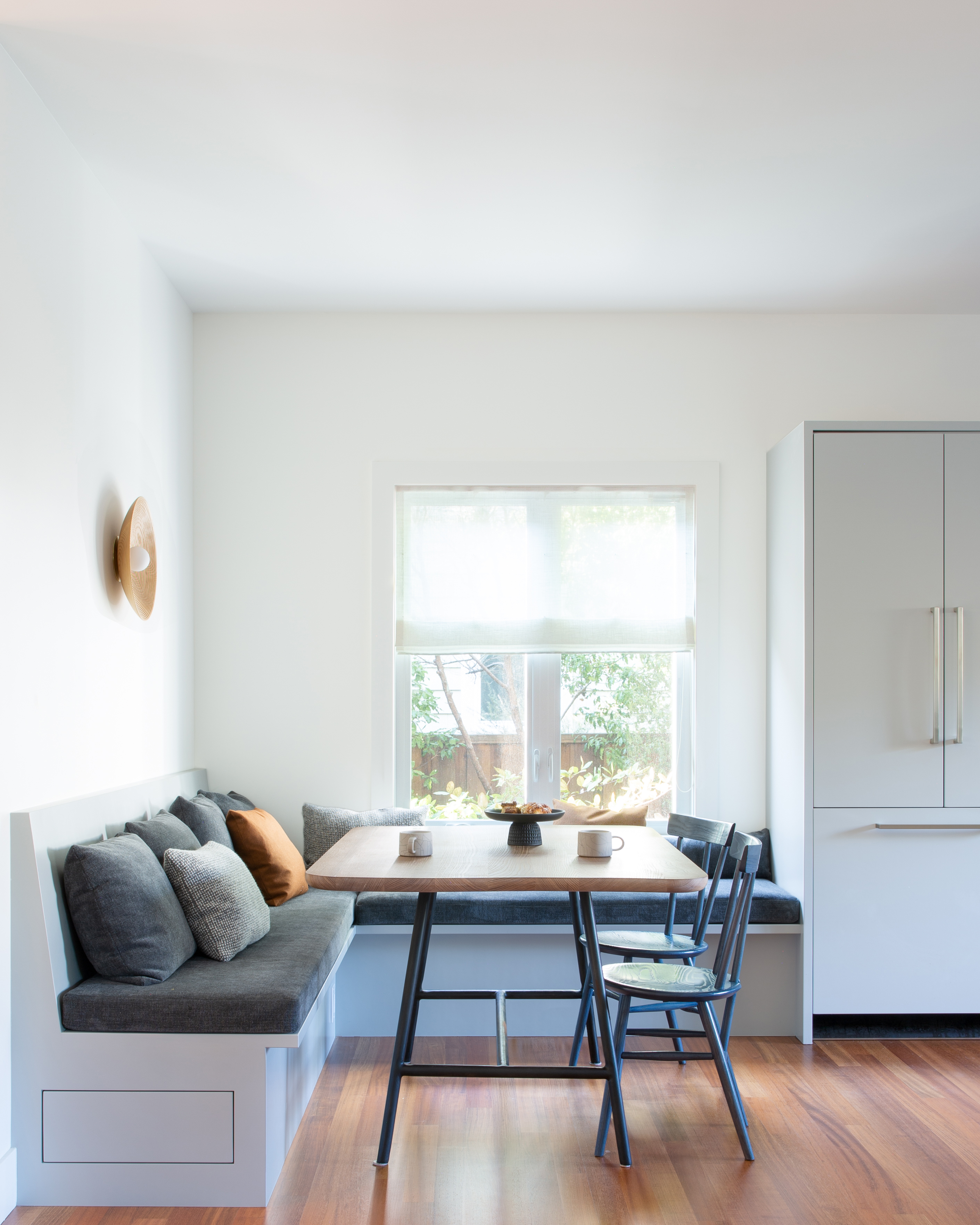
"The homeowner asked for a space that evokes the Northern California coastal surroundings," says Gretchen Krebs, co-founder of Medium Plenty, the studio behind the redesign that took this Californian beach home from an unremarkable two-story residence to a place of ‘calm and comfort’.
"We focused on warm whites and a variety of blues and grays, offset by touches of wood throughout. Because fog and cloudy days are frequent, we used a semi-sheer fabric for the Roman shades to keep the space bright and cozy," she continues. When designing a coastal home, Gretchen states that her go-tos are wood, natural materials and neutral or earthy coastal paint colors that evoke the surroundings.
3. SEASCAPE TONES
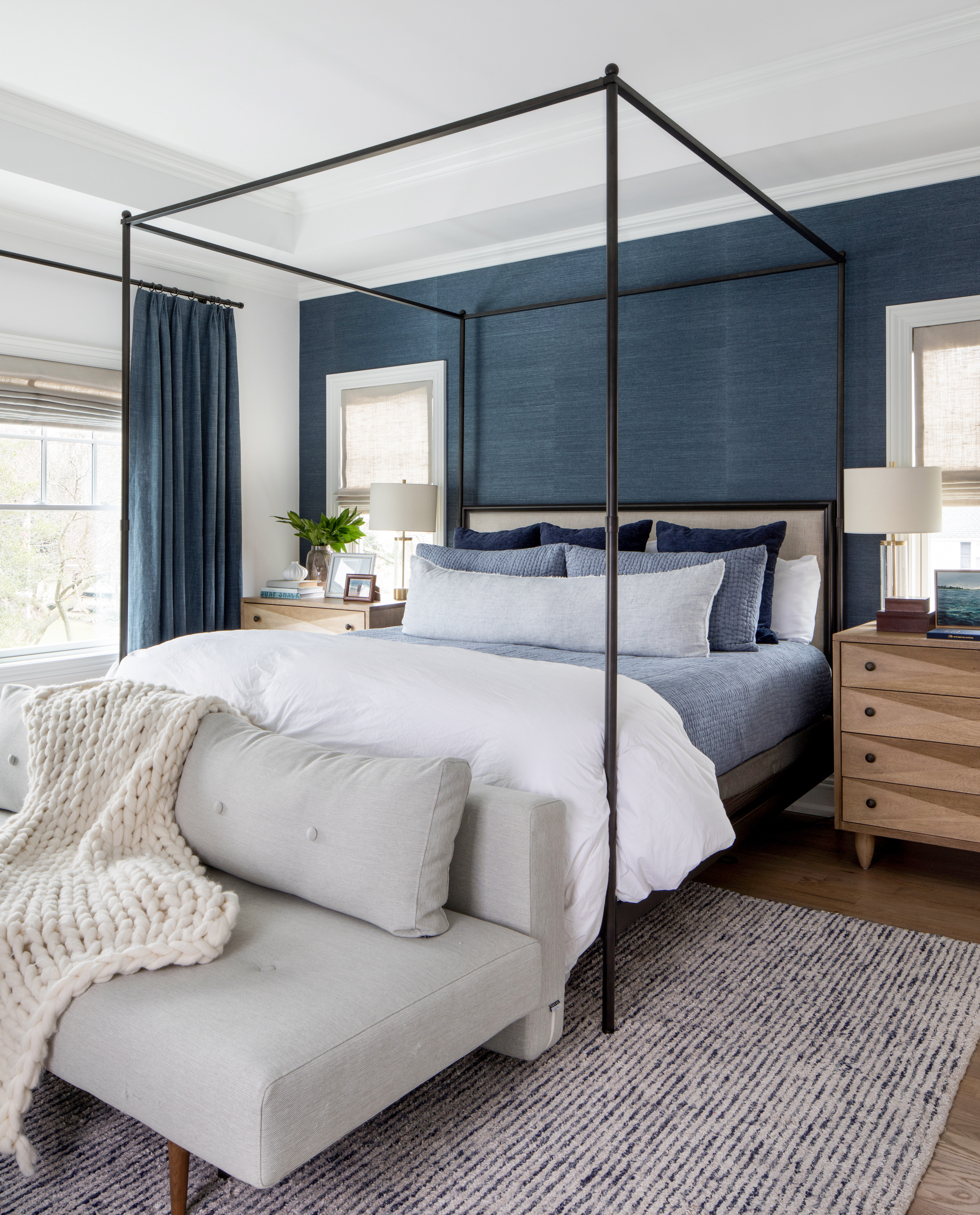
When Salt Design Company set to work on the interiors of this new-build project, they focused on creating a livable space with an abundance of texture, as well as some moodier moments. The coastal bedroom is a lesson in layering blues, combining inky colored wallpaper and curtains with soft furnishings in midnight blues through to paler tones, nodding to the ever-changing palette of a seascape.
"My aim is to create coastal interiors that feel effortlessly elegant and timeless. To achieve this, I focus on a palette that draws inspiration from the natural surroundings rather than relying heavily on overt themes," says Salt Design Company’s founder and principal Sarah Brady of her approach.
4. EARTHY COLORS
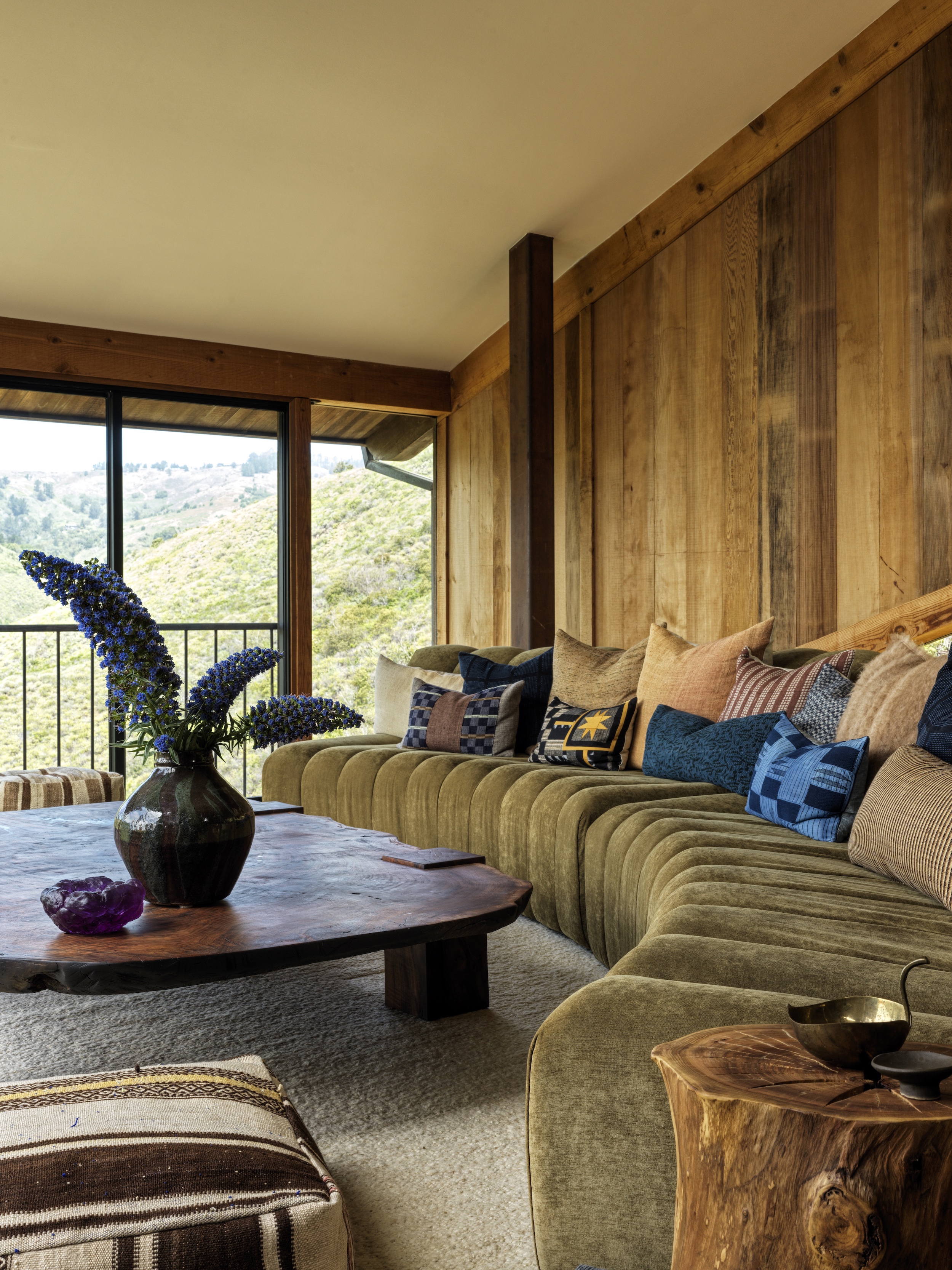
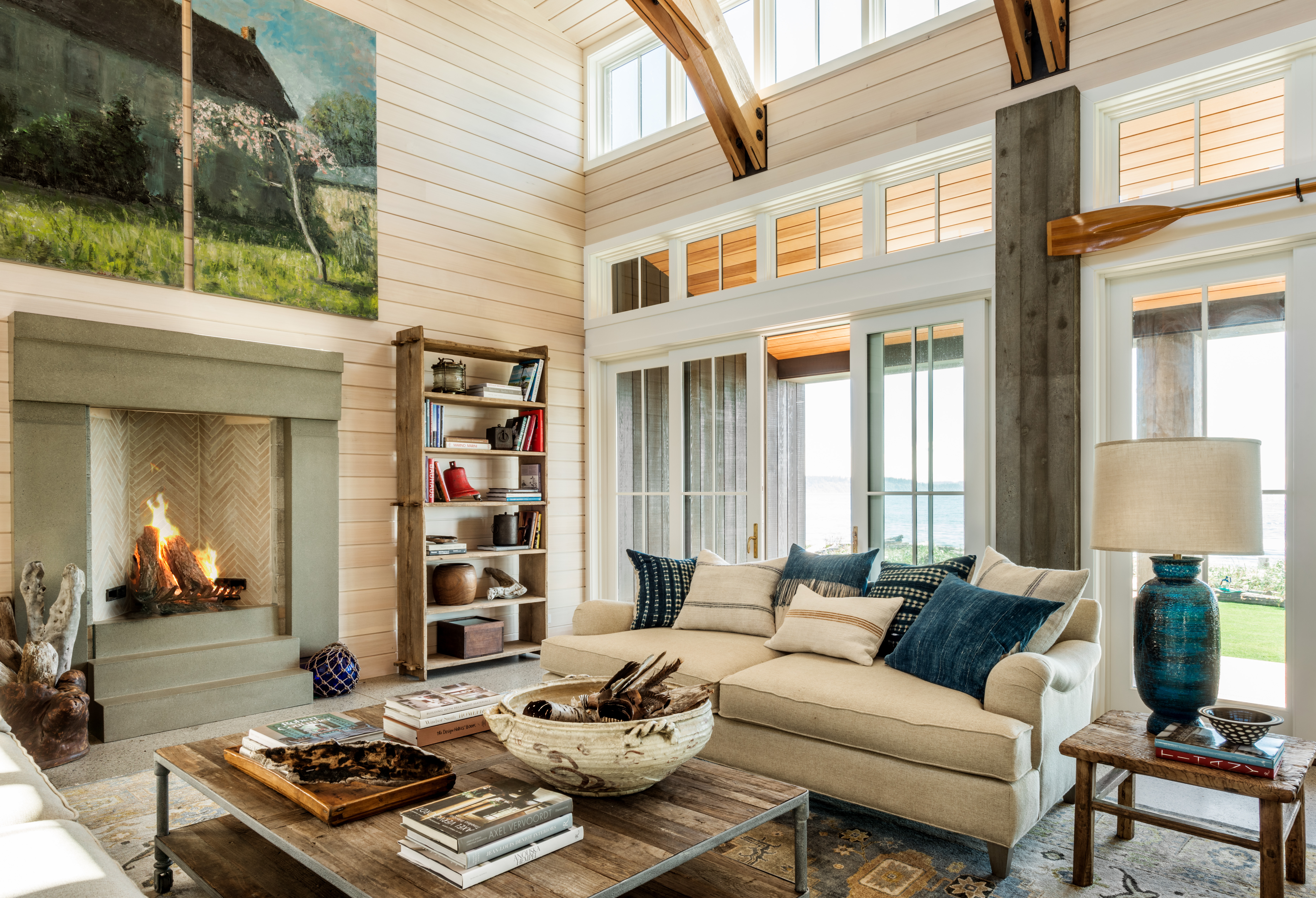
When Electric Bowery principal Cayley Lambur moved into this Mickey Muennig-designed house in Big Sur, she wanted to create a home that offered the quintessential laid-back coastal experience. The main house was restored and updated to celebrate its connection to the outdoors, using tones drawn from the landscape that range from olive greens to electric blues, as shown in this beachy coastal living room.
"Inspired by the rugged and mountainous coastline of Big Sur, our design incorporates a warm and earthy palette that is carried throughout the home, layering textures and natural materials reflective of the property’s surrounding locale," says Lucia Bartholomew, co-founder of Electric Bowery. "Each design choice was made with respect to the home's original architectural style, with the use of redwood paneling throughout, inviting the essence of Big Sur into every corner of the space."
5. CHALKY BLUES
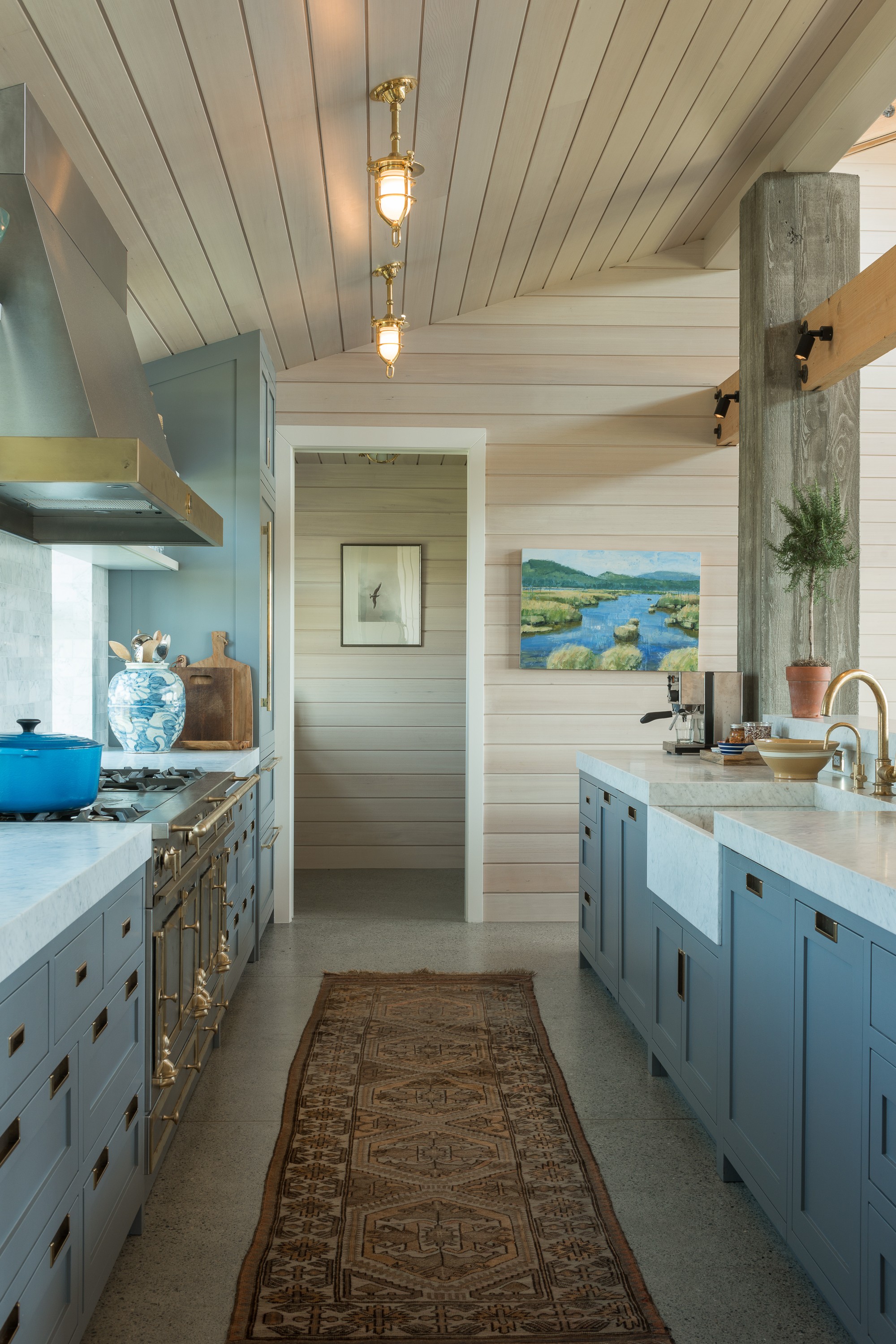
When Hoedemaker Pfeiffer designed this Pacific Northwest home on Whidbey Island, they created a large great room that separates the owners bedrooms from the guest wing. "Adjacent to the great room is a communal galley kitchen where family and friends gather to cook, while on the beach side of the house, the gathering space opens up to a two-tiered deck framing a private view of Puget Sound," says architect and studio partner Steve Hoedemaker.
The practice worked with Paula Alvarez of PB Design to devise a warm and welcoming interior that harnesses the colors of the ocean outside and incorporates subtle coastal references. The powdery blue hue used on the kitchen cabinetry pairs beautifully with the bleached timber cladding that covers the interior walls, resulting in a beachy palette that’s undeniably classic.
Tessa Pearson is an interiors and architecture journalist, formerly Homes Director at ELLE Decoration and Editor of ELLE Decoration Country. When she's not covering design and decorative trends for Livingetc, Tessa contributes to publications such as The Observer and Table Magazine, and has recently written a book on forest architecture. Based in Sussex, Tessa has a keen interest in rural and coastal life, and spends as much time as possible by the sea.


