5 Beige Bathroom Ideas That Will Make Neutral Spaces Feel Anything But Boring
Leading designers share their tips on how to transform beige bathrooms from boring to beautiful
The color beige can sometimes get a bad rap, and for good reason — in the wrong hands, a beige space can easily feel bland and conventional. But when treated right, beige can become a color of understated luxury.
This makes it a great choice for a bathroom color palette: it’s neutral enough to create calm but is easily elevated to create a look that feels expensive.
‘Designing a neutral bathroom doesn’t have to be boring,’ says DeeDee Gundberg, Chief Designer at Ann Sacks. ‘Incorporating similar colors in slightly different tones lends a soft, layered look while allowing the elements in the room to play well together.’
From using a range of tones, to layering up luxe textures, here leading designers explain how to make beige bathrooms glamorous and even exciting.
1. Use a variety of shades of beige
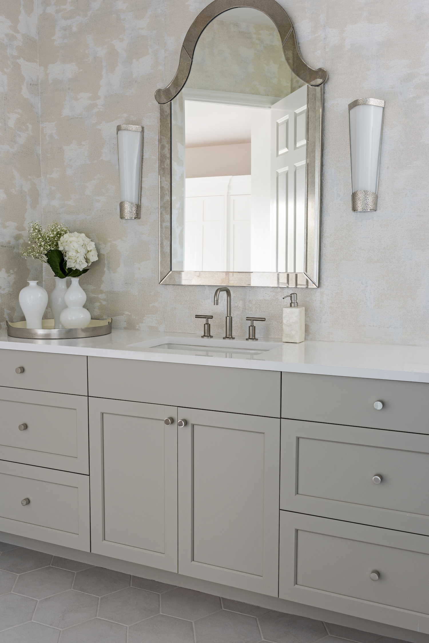
The first trick to elevating a bathroom when decorating with neutrals is to incorporate a range of different beige tones. This helps to create depth, preventing a beige bathroom from feeling flat and bland. Try combining different hues like oatmeal, alpaca and sand, as in the above example by Trade Mark Interiors.
‘To bring beauty and interest to this bathroom, I implemented varying tones of beige alongside other neutrals and whites, each with a metallic finish to achieve shine and the desired luxe factor,’ says Tracee Murphy, CEO and Principal Designer at Trade Mark Interiors. ‘I included a wallpaper to finish the space, adding visual interest and texture.’
2. Choose natural stone tiles
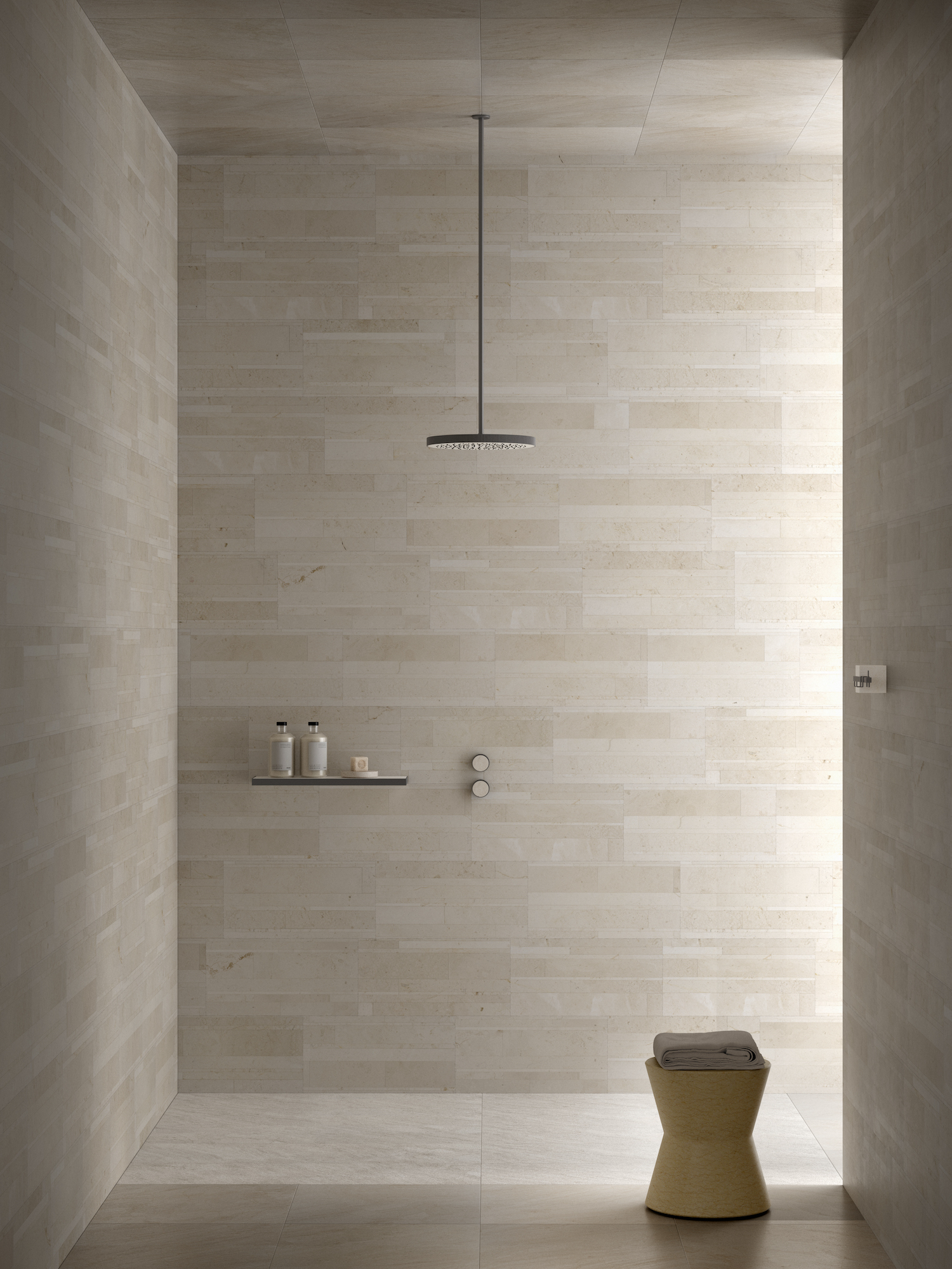
An easy way to incorporate beautiful variations of beige tones is by choosing natural stone tiles. With no two tiles completely identical, natural stone tiles add instant character, warmth and dimension to a bathroom.
You can emphasize the personality of the stone by keeping the rest of the space super minimal, as the space above by Salvatori demonstrates. But natural stone will also happily layer with other textures and accessories for a more decadent approach.
3. Add metallic accents
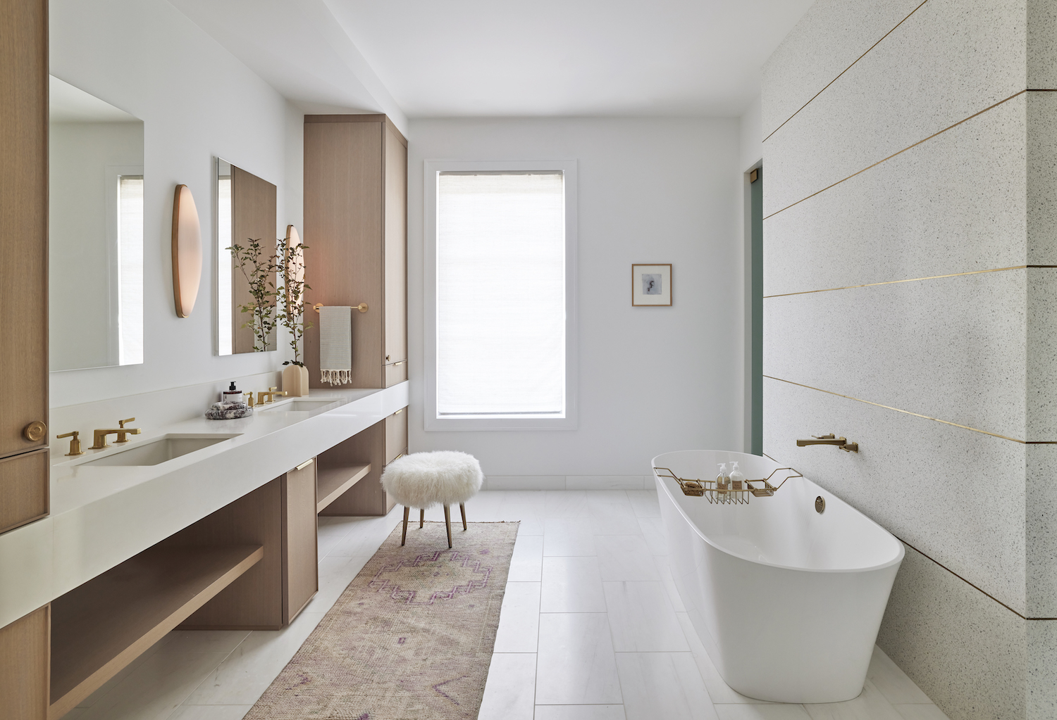
As a warm neutral color, beige pairs beautifully with metallics. And from tapware to bathroom mirrors and wall sconces, there’s plenty of opportunity in bathrooms to add hints of gold, silver and copper.
‘Rather than using bold accent colors to create visual interest and contrast against the neutral beige backdrop, we added metallic accents to the walls, fixtures and hardware to add a touch of glamor and sophistication to the space,’ says Melissa Benham, Co-founder of Studio Gild, who designed the beige bathroom pictured above.
4. Layer different textures
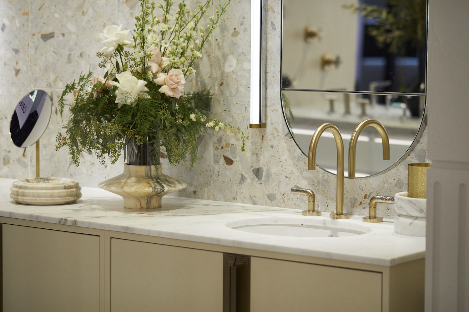
Another way to create depth in a beige bathroom is through the use of texture. ‘You can create visual interest by adding several different textures through bathroom tile, furniture, paint, or soft goods,’ says DeeDee Gundberg, Chief Designer at Ann Sacks. ‘Adding textures to an otherwise tonal space creates instant sophistication.’
Glenna Stone of Glenna Stone Interior Design agrees. ‘To keep beige from being boring, experiment with various textures and patterns to add depth and dimension to the bathroom,’ she says. ‘Incorporate textured wall tiles in a complementary shade to beige or introduce patterned wallpaper as a focal point. Mix and match different materials like marble, wood, or glass to create visual interest. For instance, a sleek marble countertop paired with wooden accents can add warmth and character to the space.’
5. Emphasize luxe materials

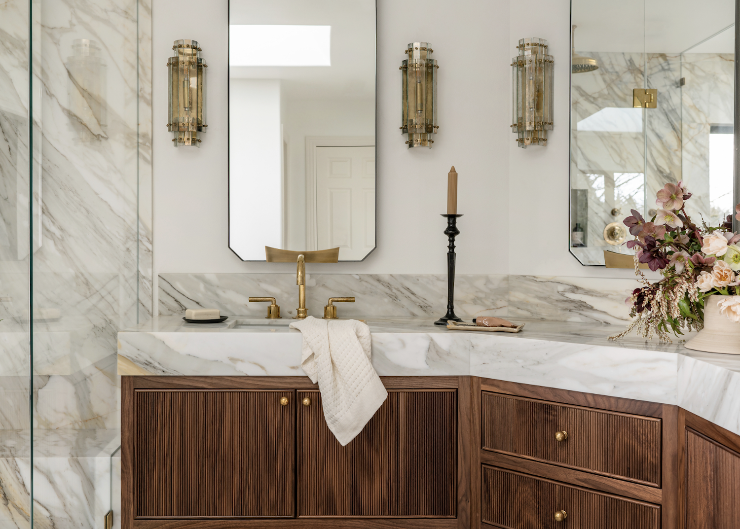
As an understated color, beige provides the ideal backdrop to showcase luxe materials. Rather than shout for attention, a beige color scheme will focus the eye on expensive details — such as the wood cabinetry with delicate ribbed doors, marble vanity, and decorative wall sconces in the bathroom above by Cohesively Curated.
'In crafting this master bathroom, I aimed for elegance, sophistication, and timelessness,' says Emily Ruff, Owner and Principal Designer at Cohesively Curated. 'I intertwined white hues with bronze touches, natural wood features, and deep browns to fashion a warm and inviting haven.'
Be The First To Know
The Livingetc newsletters are your inside source for what’s shaping interiors now - and what’s next. Discover trend forecasts, smart style ideas, and curated shopping inspiration that brings design to life. Subscribe today and stay ahead of the curve.
Kate Hollowood is a freelance journalist who writes about a range of topics for Marie Claire UK, from current affairs to features on health, careers and relationships. She is a regular contributor to Livingetc, specializing in reporting on American designers and global interiors trends. Based in London, Kate has also written for titles like the i paper, Refinery29, Cosmopolitan and It’s Nice That.
-
 The 'New British' Style? This Victorian London Home Embraces Its Owners' Global Background
Warm timber details, confident color pops, and an uninterrupted connection to the garden are the hallmarks of this relaxed yet design-forward family home
By Emma J Page
-
 Muji Living Room Ideas — 5 Ways to Harness The Calming Qualities of This Japanese Design Style
Inspired by Japanese "zen" principles, Muji living rooms are all about cultivating a calming, tranquil space that nourishes the soul
By Lilith Hudson