

One thing that has captured my attention (and heart) lately, is how more and more people are starting to embrace saturated neutrals in their home. Gone are the days of crisp whites and dull grays — now people want neutrals with character and pigment. They want Benjamin Moore's Hale Navy.
With moody, characterful interiors on the rise, so too is the amount of people using this shade to decorate with. While the shade found itself (perhaps unfairly) type-cast as too 'coastal' or 'preppy' not so long ago, those days are well and truly over. And I'd argue Benjamin Moore's Hale Navy paint shade has a lot to do with that.
Listed as one of Benjamin Moore's most popular paint colors, Ella Baker, interior designer at Element Design Studio, describes it as "navy blue in its truest form — deep, rich, and balanced." Where you might have reached for black or dark brown, Hale Navy may just be the elegant and more expensive-looking alternative.
Not convinced? Below, I've broken down how to best bring this paint shade into your home, as well as shared designers answers to the internet's biggest questions about Benjamin Moore's Hale Navy.
What Makes Benjamin Moore's Hale Navy So Popular?

This bedroom, painted in Benjamin Moore's Hale Navy, showcases the shade's ability to feel both serene and statement-making.
Many designers attribute Hale Navy's prosperity to its deep charcoal undertones that give it a comforting intensity. "Hale Navy has this rich, moody depth that feels both grounding and sophisticated," describes Marie Cloud, founder and principal designer at Indigo Pruitt Design Studio. "It has the ability to be bold yet calming, making it a go-to when designing spaces that need a strong yet inviting presence."
Its deep blue tone offers a perfect balance — it has enough saturation to add drama but enough neutrality to remain classic. "While navy blue is timeless, Hale Navy feels especially relevant today as it seamlessly aligns with the rising fisherman core trend, which celebrates the rugged beauty of coastal interior design through weathered textures, natural materials, and a deep connection to the sea," adds interior designer Ella Baker.
You can also find decorating with navy blue at the heart of more modern interior aesthetics like the 'Castlecore' design trend, where the grandeur of rich materials and sophisticated spaces are wholly celebrated.
And finally, Benjamin Moore's Hale Navy has a hint of gray that makes it particularly versatile and elegant, allowing it to adapt to different lighting and pair beautifully alongside all the colors that go with navy blue.

Price: £2.95/peel-and-stick sample

Marie Cloud is the owner of interior design studio, Indigo Pruitt. Her designs have been recognized by several renowned publications and companies in the interior design world for their timeless elegance and creativity. Benjamin Moore's Hale Navy has been a staple color in multiple of Marie's projects.
Where Should You Use Benjamin Moore's Hale Navy?


Depending on how it’s styled, Benjamin Moore's Hale Navy can feel crisp and coastal or deep and moody, making it adaptable across a range of design aesthetics — traditional, transitional, and modern spaces alike. "Whether used in a stately study, as a navy living room idea, or even a cozy bedroom, it lends itself to both refined and casual aesthetics," explains Marie.
She goes on to explain how the shade plays particularly well with natural light, "creating shifts in mood throughout the day, which makes a space feel dynamic and layered." This is what prevents it from making a space feel dark or constricting, provided there is a light source — natural or artificial — to bounce off the color's undertones; the perfect way to create dark color schemes that aren't overwhelming.
In particular, Benjamin Moore's Hale Navy works well in home offices (seen above), bedrooms, dining spaces, and even on cabinetry or millwork. "In smaller spaces, it can create a jewel-box effect, while in larger rooms, it adds a strong architectural presence," says Marie.
As for Ella's favorite application, she says she can't go past Hale Navy as a kitchen cabinet color, especially "paired with a warm walnut, antique brass, and an intricately veined marble." The contrast of materials is bold, striking, and yet still timeless.

Ella Baker has a BA in Interior Design from Michigan State University. With over 10 years of experience in high-end interior design, her design studio, Element Design, blends her love for historic architecture with modern functionality.
What Colors Go With Benjamin Moore's Hale Navy?

This kitchen showcases a crisp contrast of Benjamin Moore's Hale Navy paired with a sleek white, while the orange-toned wood brings warmth to the space.
Whether you are already planning a navy blue color scheme for your living room or envisioning this shade in a luxurious bedroom, understanding the shades that complement it will help you create a more harmonious space.
"I love pairing Hale Navy with warm neutrals like soft taupes, creamy whites, and camel tones to create contrast while keeping the look inviting," says Marie.
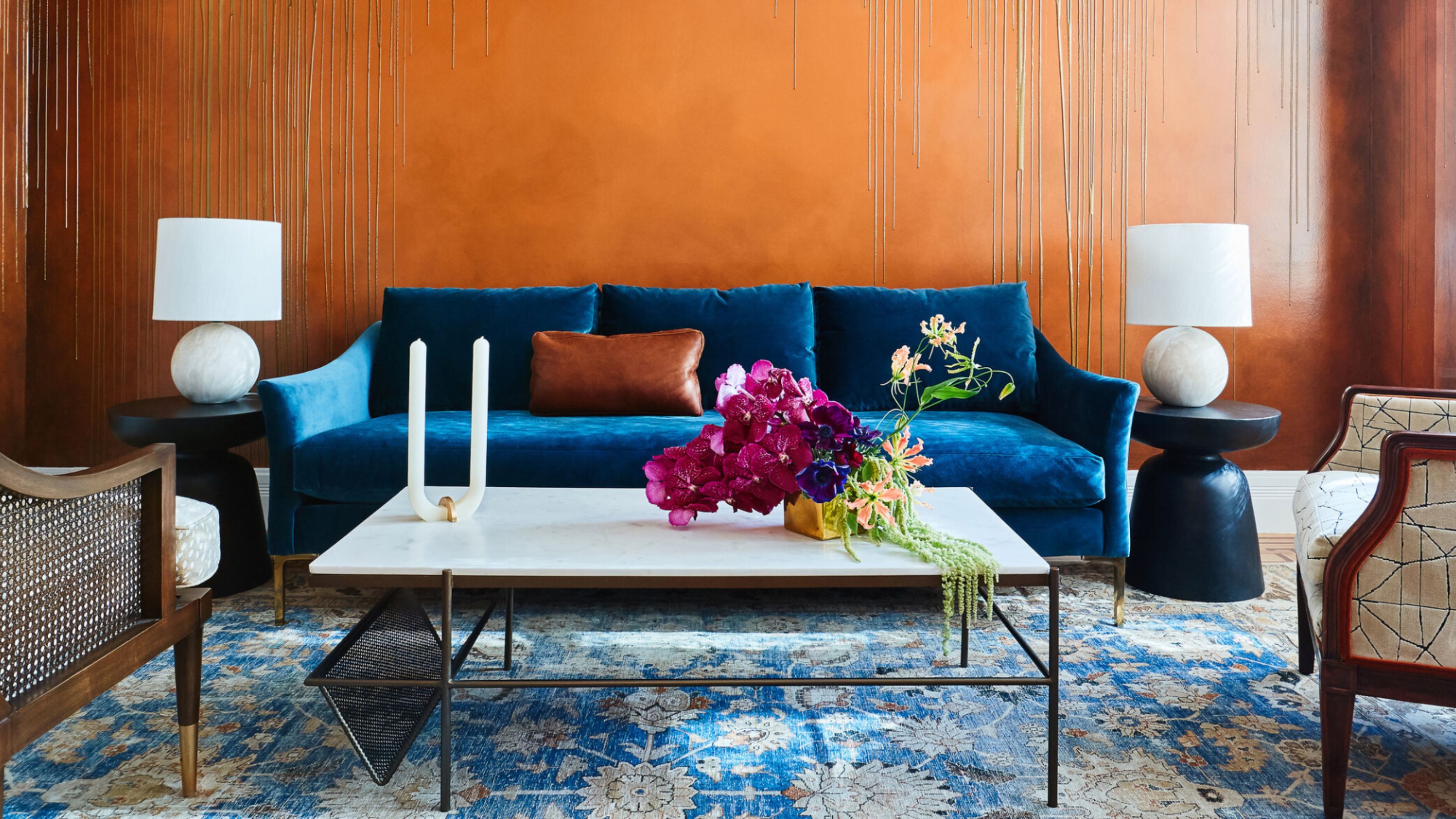
The subtle warmth of these shades plays off of the cool, charcoal tones of Hale Navy. Looking to color theory, blue's natural complement is yellow, and Hale Navy has a tinge of purple in it, which makes orange a lovely complement to that shade as well. Selecting neutrals with these undertones is also an easy way to create a cohesive palette.
"For a bolder approach, mustard yellow or deep olive green can introduce an unexpected pop," says Marie, while decorating with jewel tones such as emerald green, deep plum, and burgundy adds depth and luxury to a Hale Navy base.
And speaking of luxury, "Texture-wise, it pairs beautifully with natural woods, brass, and textured textiles like velvet or linen for added depth," adds Marie.

Price: £5.50/sample

Price: £5.95/sample

Price: £5.50/sample
Benjamin Moore's Hale Navy is a paint color you honestly can't go wrong with — so it's not surprising that it continuously tops the charts of the brand's best-selling shades.
However, if you aren't quite ready to make the plunge, you can always try experimenting with the shade by painting smaller accents or styling navy decor in your space.

-
 7 Sustainable Product Designs That Are Setting the Agenda for Environmentally-Conscious Homes in 2025
From pillows made from textile waste to sanitaryware made in the world's first electric kiln, these brands are revolutionizing sustainable design — for the better
-
 NYC's New Rules Forced Me to Find a Chic Compost Bin — Here's 7 Options Significantly Cheaper Than the $300 Fine
Composting is now mandatory in NYC. Here’s how to do it stylishly


-
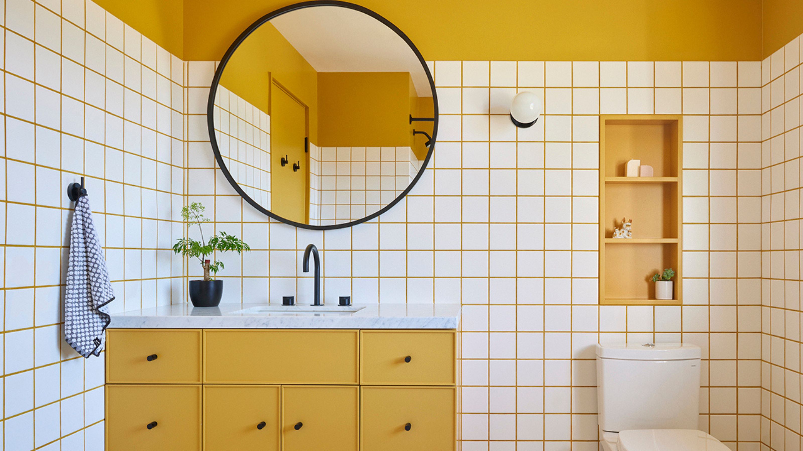 10 Yellow Bathroom Ideas That Vitalize Your Mornings and Look Unexpectedly Sophisticated While Doing So
Yellow is a color that by its very nature is energetic and full of life, and these designers have proved it's ideal for a bathroom
-
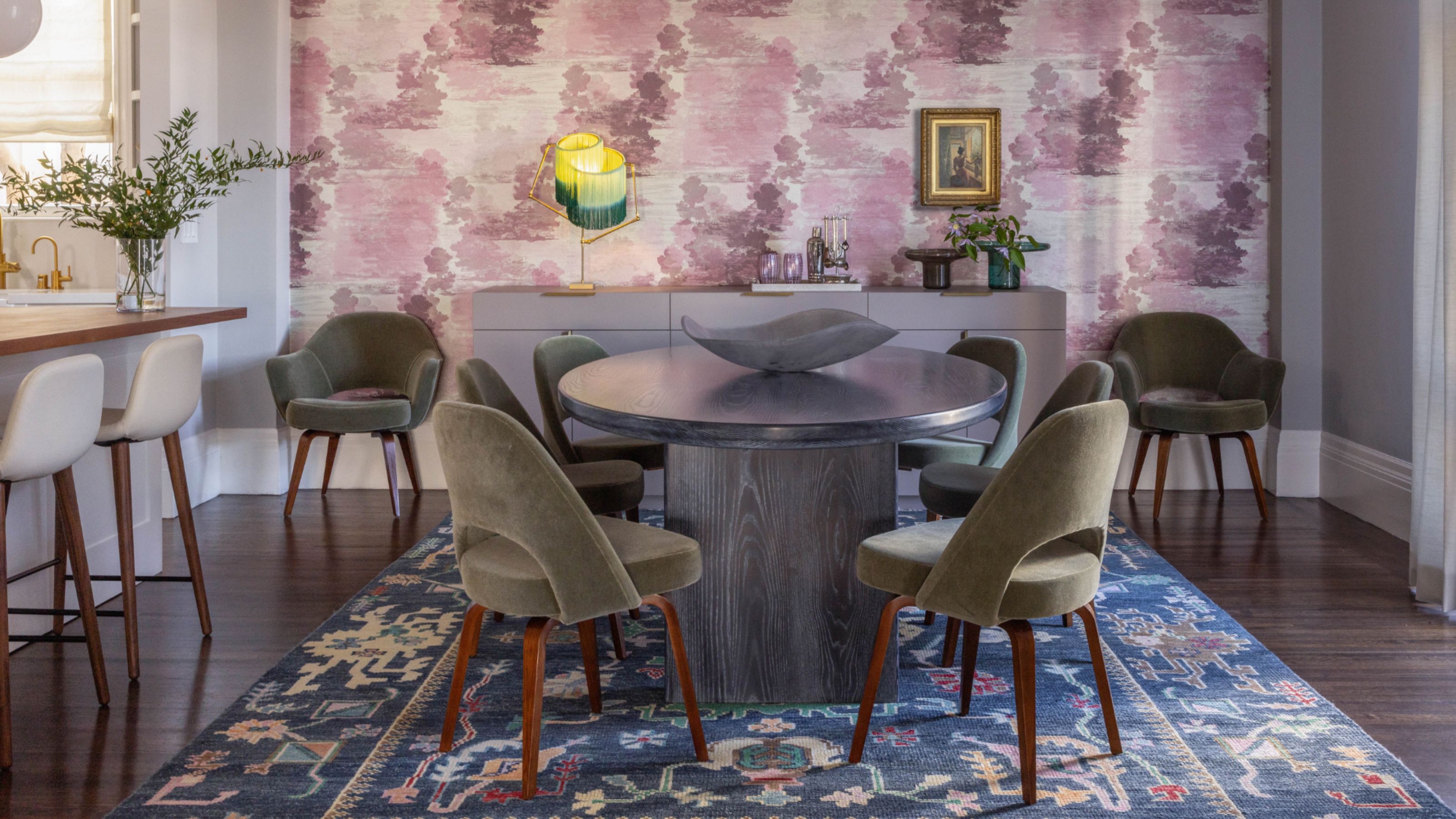
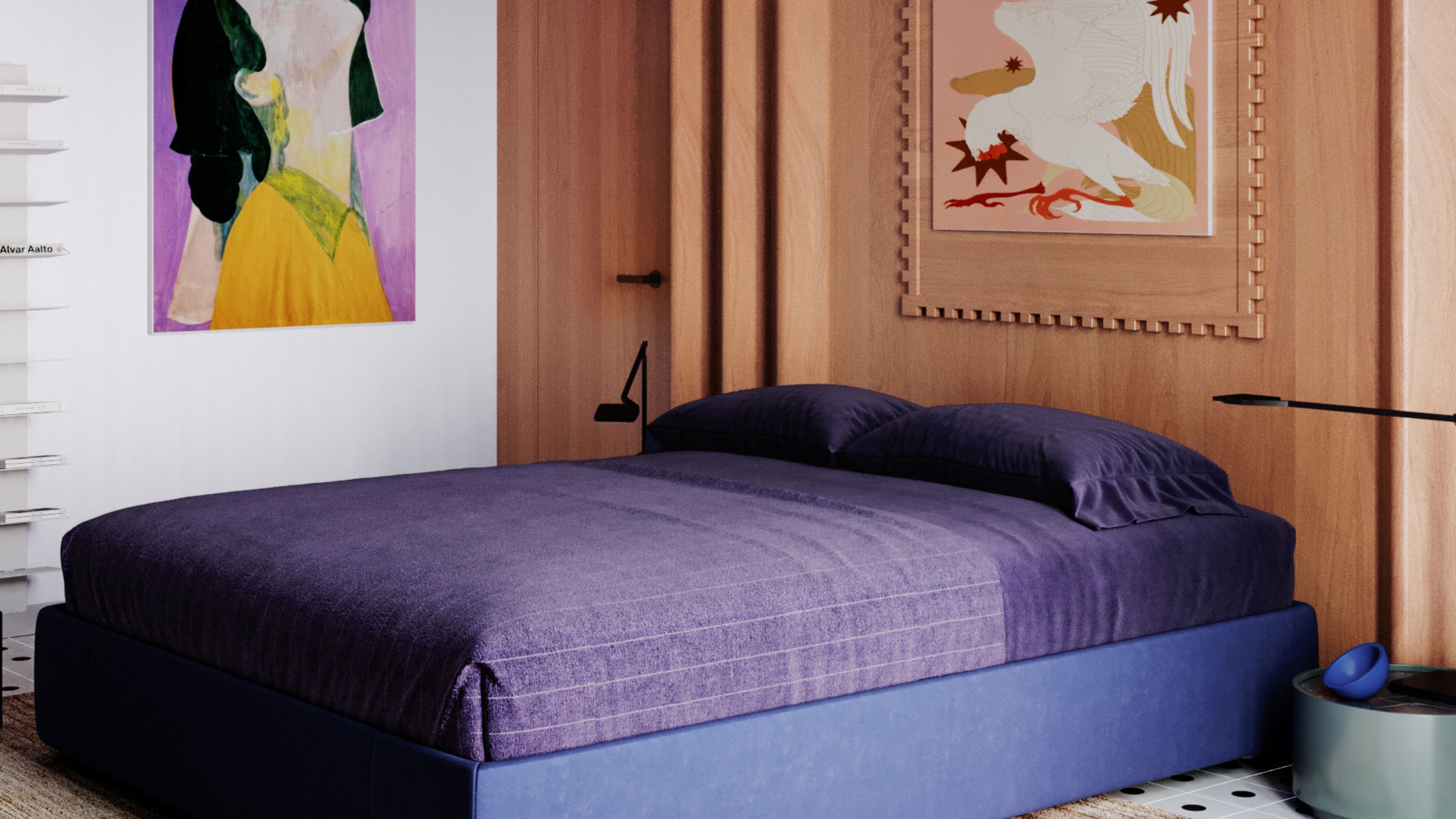 It's a Color Symbolic of Dreams, so These Purple Bedroom Ideas Almost Guarantee a Good Night's Sleep, Right?
Not always an obvious choice for the bedroom, these designs prove that purple has restful and calming qualities, making it perfect for the bedroom
-
 Amethyst, Heather, Pansy, Plum — Turns Out Decorating With Purple Opens You Up to a World of Possibilities
Purple certainly isn't a color for the faint hearted, it's a shade that can smell your fear. Here's how to conquer it through your interiors
-
 The Combination You Weren't Expecting to Love — 8 Blue And Orange Living Room Ideas That Feel Surprisingly Elevated
A blue and orange scheme for living rooms may sound jarring, but these spaces prove they're striking, vibrant, and certainly unforgettable
-
 Smeg Says Teal, and We’re Listening — The Kitchen Shade of the Year Is Here
Designers are already using the soft, sea-glass green everywhere from cabinetry to countertops
-
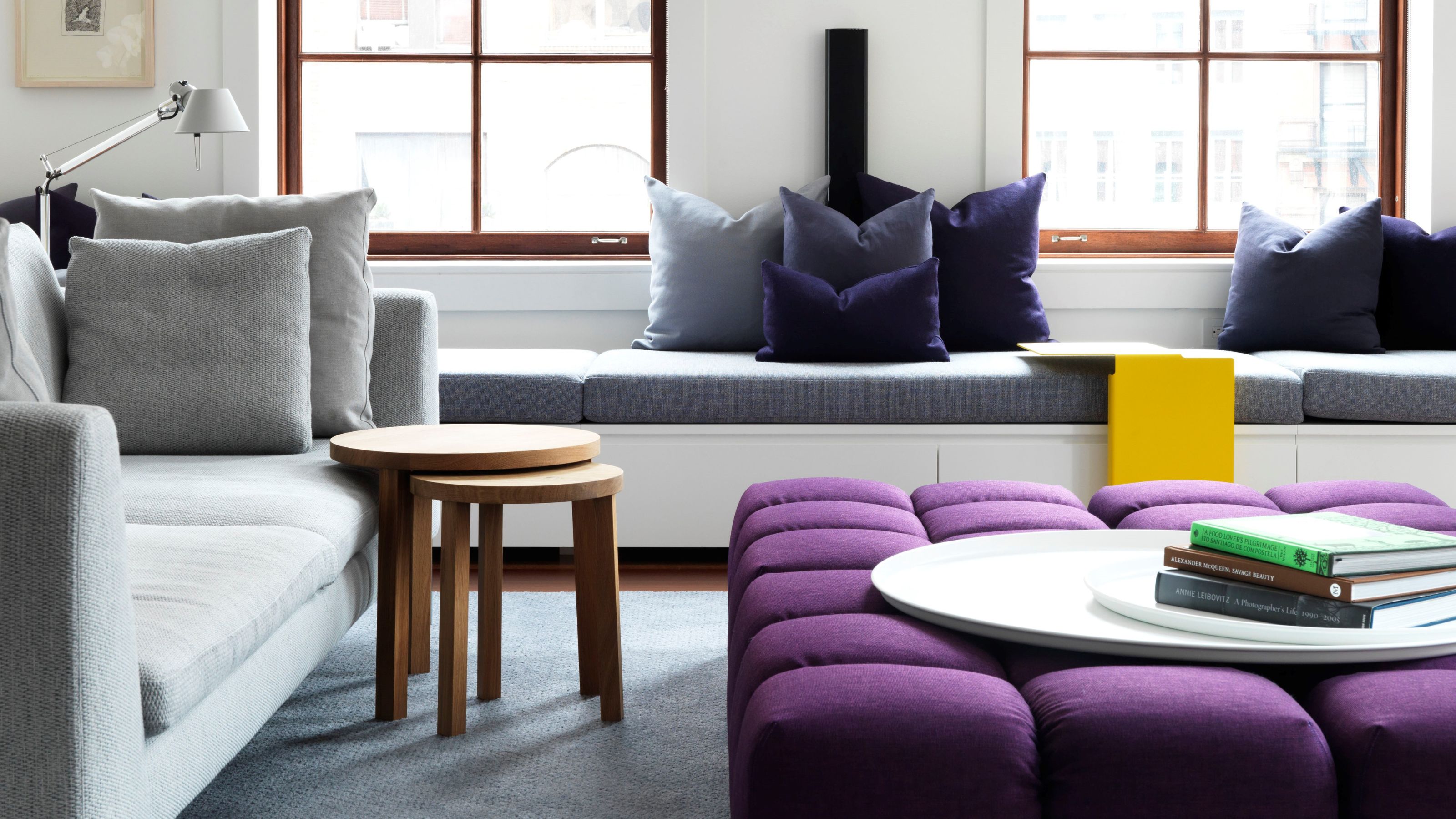
 Do Yellow and Purple Go Together? Designers Reveal How to Make This Unexpected Pairing Feel "Totally Intentional"
In an era where unexpected combinations have become cool, we've done a deep-dive to discover how to pair yellow and purple in a space
-
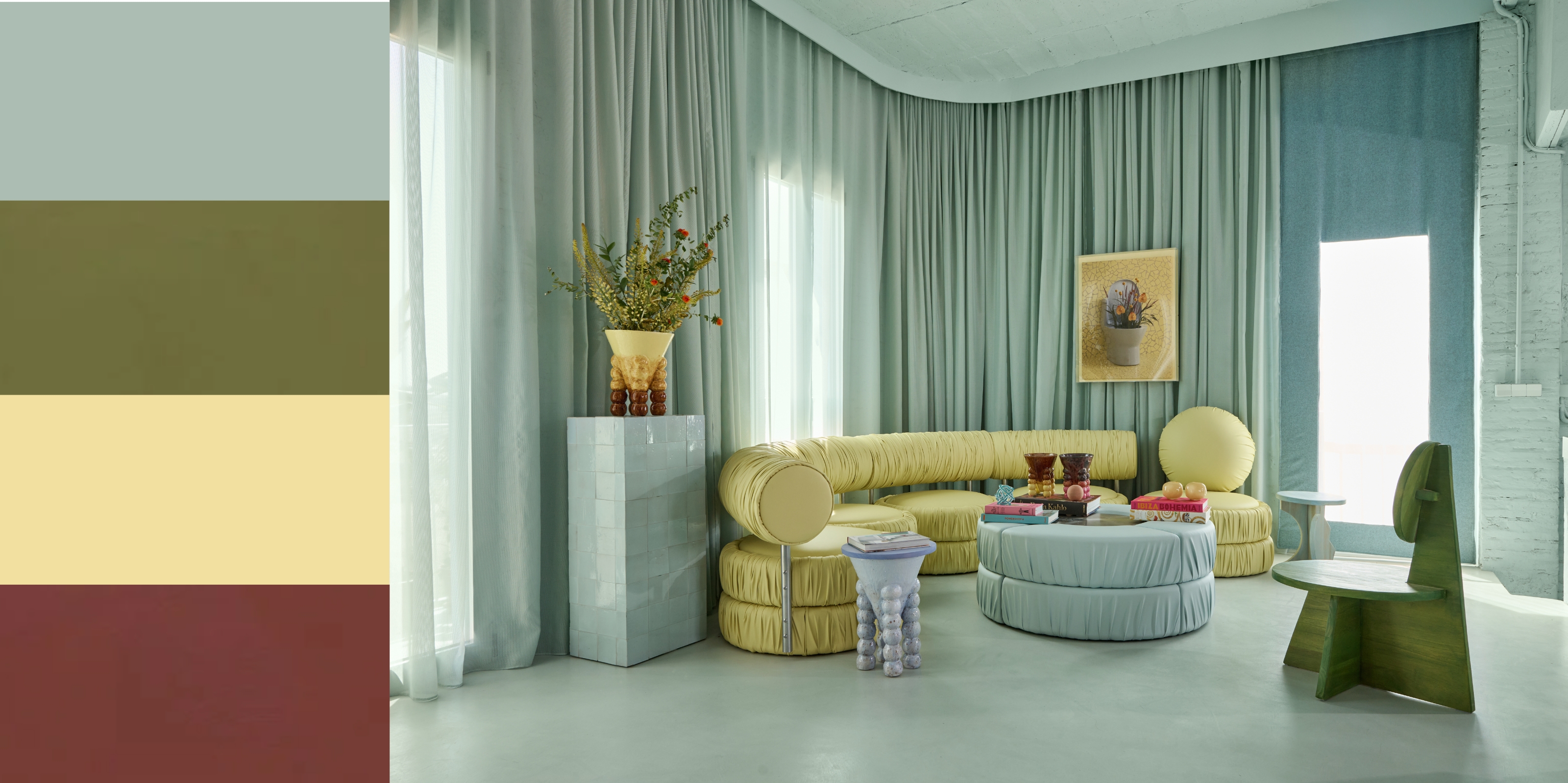 5 Unexpected but Seriously Stylish Spring Color Palettes to Shake Up the Season — "It's Pastel, but Punchy"
Spring color palettes are notorious for their use of pretty pastels, but that doesn't mean they have to lack variation
-
 The 'Red Table Trick' Is the Easiest and Most Expensive-Looking Trend to Hit 2025 So Far
A red dining table makes a seriously stylish statement; the beloved pop of red trend just got an bold and expensive-looking upgrade


