

As many interior buffs and design lovers already know well, Benjamin Moore is the paint company of choice for rich, sumptuous shades. With vast and exciting color offerings, they can instantly snap you out of even the most persistent design ruts and quality to match. It's no wonder they are consistently heralded as one of the most premium options on the market. We’ve lusted over their neutrals and their pastels alike, but now, our attention has been caught by a deeper, moodier, more sultry tone. Okay, we’ll admit it — a paint shade has seduced us. But once you discover the allure of Salamander, you won’t blame us.
There are many popular Benjamin Moore Paint colors, but this one takes the crown. Named after its 'chameleon' like nature, Salamander is a deep, inky green that seamlessly adapts to its surroundings, morphing into the ideal backdrop, no matter the setting. Black, blue, and green are shaken and stirred into a color cocktail with an enduring and wide-reaching appeal. Despite its intense depth of tone, it takes deliberate intention for Salamander to appear overly dark. When combined with lighter neutrals and plenty of natural light, this shade adds the perfect touch of moodiness to the home, giving it a more balanced, nuanced feel.
However, if pure gothic intensity is what you’re after, Salamander can easily lend itself to a lair-like appearance. With a light reflective value (LRV) of 5.72, Salamander is one of the deepest tones offered by Benjamin Moore. But, unlike other darker shades, Salamander is unmistakably modern and current in appearance, making it a great choice for homes that blend the contemporary with the antique. Its teal undertones prevent the shade from feeling harsh or uninviting. It's witchy but in a whimsical, playful way, as opposed to feeling spooky or creepy.

Price: £5.95/ sample
What Makes Salamander So Popular?

Pairing Salamander with copper fixtures and wooden features gives the kitchen an elevated, vintage feel.
Salamander is a known favorite of designers, regularly popping up in Studio McGee design projects. Salamander has its 'chameleon' nature to thank for its fan appeal, with interior designer Troy Spurlin saying, "This is such a chameleon color. In a room with less natural light, it may look black at first, but in certain lighting, it starts to show "its true color," bringing a surprise element." A testament to the colors appeal – after shooting the project, Troy's photographer was so enamored by the shade, that she went home and painted her own pantry to match.
A unique and complex combination of tones, Benjamin Moore’s Rebecca Garmuglia explains, "Salamander has notes of green, black and blue — each more prominent depending on the time of day or lighting." While the bright light of morning brings "its blue undertones to the forefront," exposing "a cooler shade of green that feels timeless and tailored," by the afternoon, "the green tone dominates, evoking a sense of calm and serenity." Whether you want to call it a green paint or blue paint is up to you?
"In spaces with limited natural light," Rebecca continues, "Salamander can be used as a chic alternative to black, offering the same anchoring depth but with the added allure of a subtle green undertone."
The green undertone is what gives Salamander this adaptable quality, offering an earthy neutrality that imbues space with a sense of light despite the darkness of the color. In our design opinion, the shade is perfect for decorating with earth tones. Interior designer Artem Kropovinsky says, "Salamander’s deep, rich green generates earthiness and brings elegance to any space to infuse dramatic intensity."
Which Colors Pair With Salamander?

Bright, orange dining chairs pop against the dark green background.
True to its 'chameleon' title, Salamander can pair effectively with a whole spectrum of shades, from airy neutral rooms to punchy neon spaces; it all relies on the feeling you are hoping to create within your space. Dana Arazi Levine, creative director of Arazi Levine Design, recommends pairing the paint with "other jewel tones such as amber, moody yellow, and maroons," as well as suggesting "light blues and greens." Complementing Salamander with other equally dramatic jewel tones creates an intensely rich and luxurious space while maintaining an air of comfort and relaxation.
For a softer, lighter look, Rebecca suggests pairing the color with warm neutrals, like "leather brown and creamy beige," saying, "These warm-infused tones complement the deep hue, creating a polished and sophisticated atmosphere. Lighter beige and creamy hues soften the look, providing a cozier and more inviting space." For those wishing to create a look with more depth, Rebecca recommends "layering in textures like brushed copper and walnut wood." Pairing Salamander with materials like walnut draws out the earthy tones in the color, making it feel increasingly welcoming.
"For a more dramatic approach," continues Rebecca, "pair Salamander with an inky hue like After Midnight CSP-630. Though similar in depth, Salamander pulls out the blue undertone of this rich hue, resulting in a captivating and alluring space. Reflective surfaces like glass, mirror, and gold accents introduce a touch of glamour."
Where Should I Use Salamander?

Depending on the mood you're hoping to create, Salamander could be used throughout the home, either as an accent color or as a dramatic statement-maker. As Dana says, "It's a stunning color that truly works in any space. However, I prefer to reserve dramatic hues for areas dedicated to guests and entertaining, such as bars, dining rooms, powder rooms, and formal living rooms."
Not just limited to walls, though, as Rebecca notes, "Salamander works beautifully across a variety of surfaces including walls, built-ins, furniture, and exteriors." Or, for a more dramatic look, "consider color drenching a small powder room for a jewel-box effect or accent the built-in around the fireplace. Whether used in small or large applications, this deep color grounds the space with intrigue and sophistication."
Similarly, Troy celebrates using the color in smaller, enclosed spaces, creating "a jewel box effect." The rich tone creates a treasure-trove-like feeling, perfect for dressing rooms or en-suites. Designers also recommend incorporating this shade in living rooms or dining rooms when you want to create a more intimate atmosphere. "Salamander performs excellently as an interior shade within private spaces like bedrooms, libraries plus dining rooms along with snug living rooms," shares Artem.
How Can I Style Salamander?

Pair Salamander cabinets with white walls and counters for a light and airy kitchen with plenty of depth.
When decorating with a shade as dramatic as Salamander, ensuring that you strike the right balance and don’t overwhelm the space is of central importance. Rebecca says, "Bring in light and airy elements through color and texture. In bedrooms, opt for soft white bedding and add framed artwork that features lighter hues." For those dining room ideas or living spaces, "Woven chairs or rattan lamp shades contrast beautifully with the deep tone. Placing mirrors across from windows or hallways reflect light, uplifting the room while adding visual interest and finish."
Alternatively, why not lean into the drama and embrace the intensity of the color? This shade lends itself well to the color-drenching trend; "let the color take center stage by keeping minimal décor or expressing your personality by layering in framed artwork and colorful textiles," suggests Rebecca. An equally intriguing suggestion, Dana recommends covering the walls in a complementary wallpaper and using Salamander as a dramatic ceiling color.
Another way of playing up the drama, Troy says, "We prefer to lean into the dramatic effect it creates and fill the room with complementing colors and shades. Rich brown wood floors or tables, aged bronze, or brass—all these would work beautifully."
Minimalist lovers worry not. Similarly, Rebecca suggests, "if you prefer to keep the space light and airy, use Salamander to accentuate key features in the room. In a semi-gloss finish, it beautifully highlights the intricate details of millwork and built-ins. Pair it with white marble, light gray tones and metal hardware for a clean, minimalistic modern aesthetic."
Now we've worked through all the possibilities for this chameleon color, the next obvious step is buying a sample and trying it for yourself. Only after acquainting yourself with proper how to use paint samples properly, of course.

-
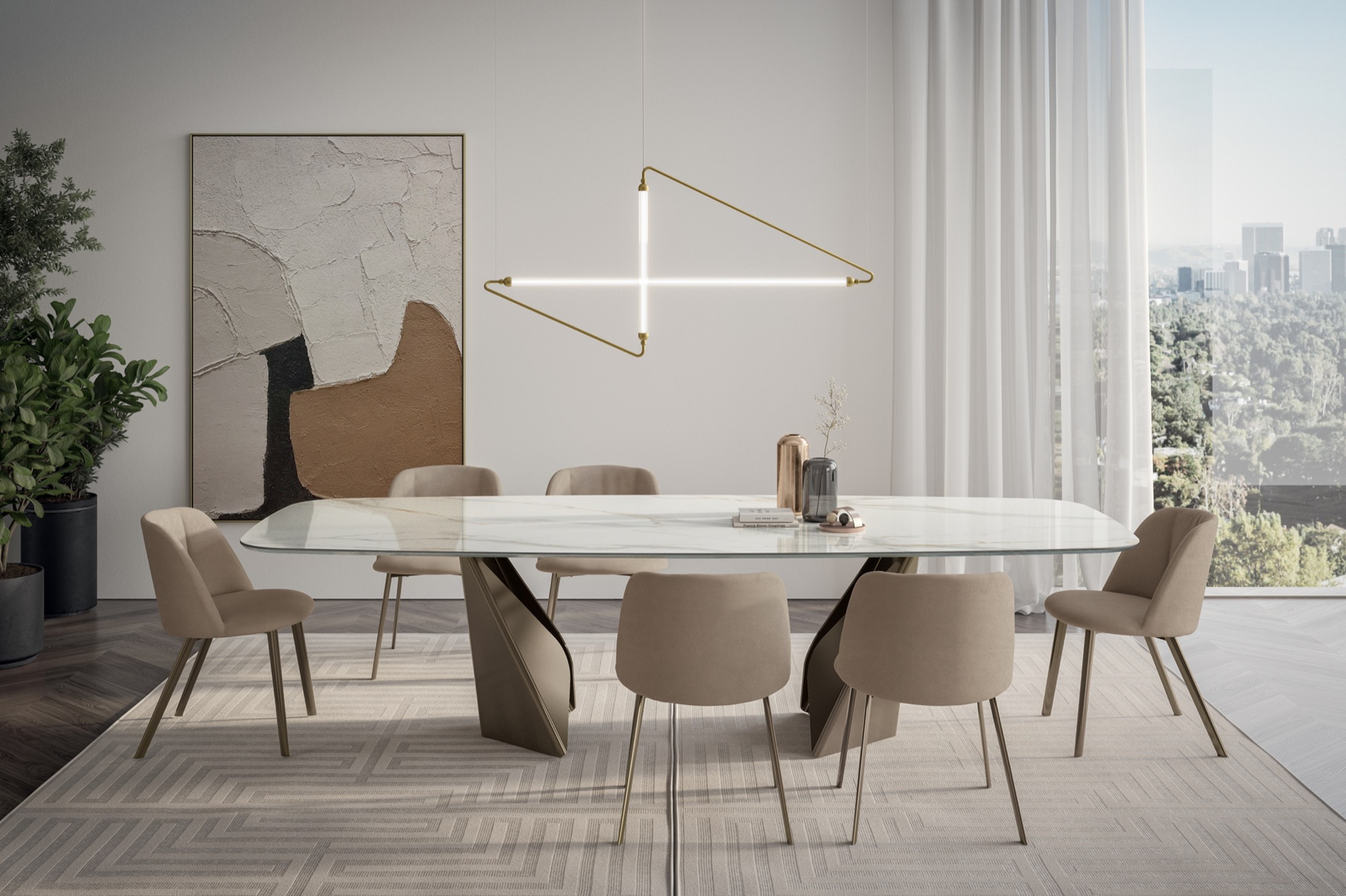 My 10 Favorite Designs at Milan Design Week 2025 — Out of the Hundreds of Pieces I Saw
There is a new elegance, color, and shape being shown in Milan this week, and these are the pieces that caught my eye
-
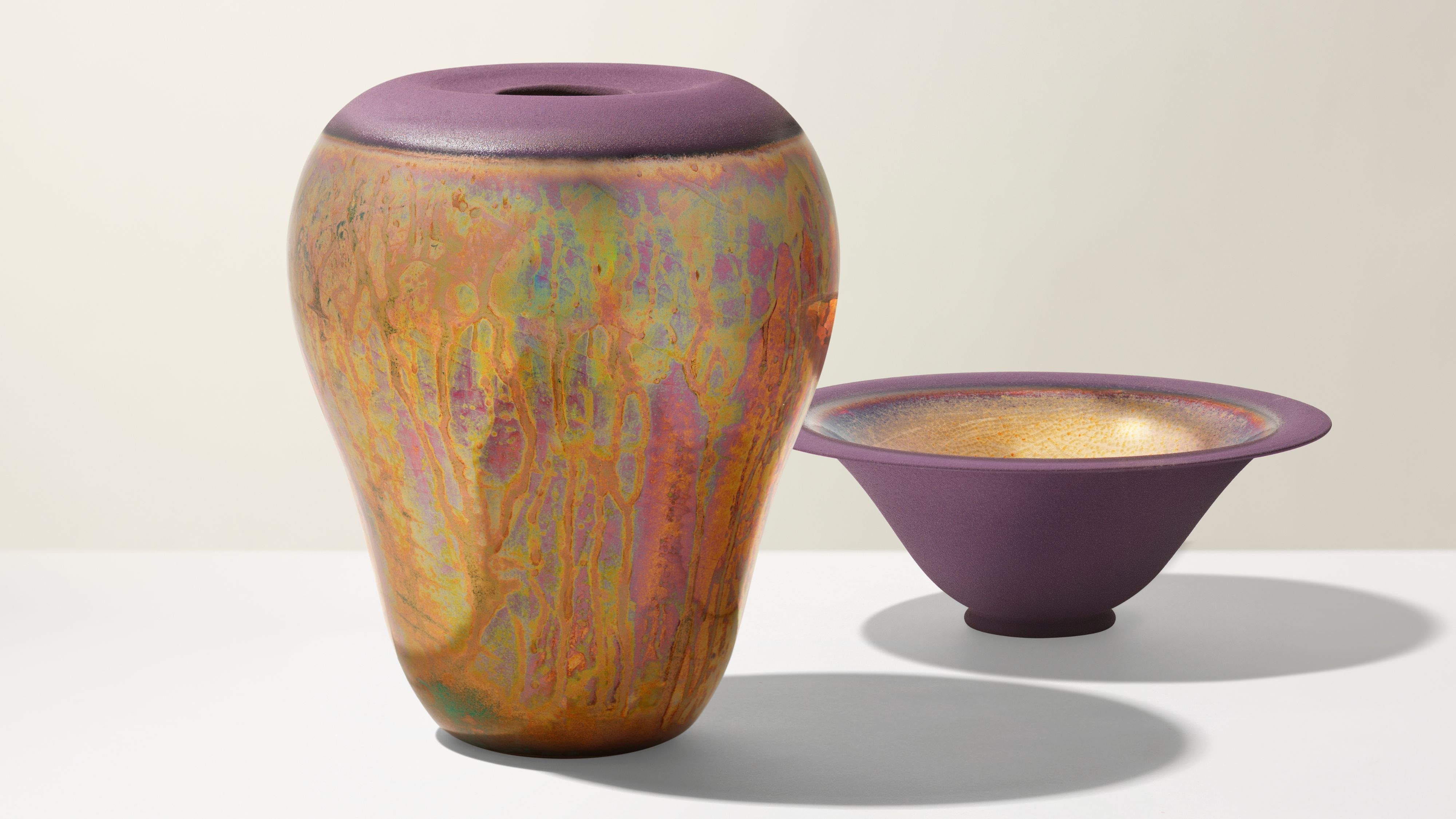 Iridescence Is Chrome’s More Playful, Hard-to-Define Cousin — And You're About to See It Everywhere
This kinetic finish signals a broader shift toward surfaces that move, shimmer, and surprise. Here's where to find it now

