Colors That Go With Pink — 14 Pairings, Both Classic and Unexpected, That Make for On-Trend Rooms
Pink can be elegant, sophisticated, or cheery; it all depends on what colors you pair it with. Here are some great examples to take inspiration from

I've always been a fan of pink — but I've been careful about the shade of pink I've chosen to fall in love with. The mid-tone pinks or ones with a gray undertone have appeared in almost all the homes I've lived in. And for good reason. The tone has an inherently cheerful vibe and can lift any scheme easily. It looks great on walls, furniture, textiles, and decor, plus it's a great accent color. And, it pairs wonderfully with several tones and can help you design the most unique interior.
But I've noticed that many of my friends find pink intimidating and hard to live with in the long run. But this doesn't have to be so. Pink can complement almost every color. It's easy to pair with neutrals, but also more unexpected combinations like green, yellow, even red. To give you some more inspiration for decorating with pink, I spoke to top designers, and put together wonderful examples of the colors that go with pink. Take a look at these and give your home a taste of the sweet and sophisticated pink like I have.
What colors go with pink?
Whether delicate, preppy, wild, or edgy, pink works in a variety of decorating styles. If you're looking for a more timeless scheme, experts strongly suggest the more grounded colors that complement pink — think gray, blue, or tan. You could go for colors that go with light pink or better, colors that go with salmon pink for a rooted palette.
Of course, for more upbeat schemes, the whole color wheel is at your disposal. Consider colors that go with blush pink such as red, green, and yellow for a punchy scheme.
Here are 14 of our favorite combinations.
1. Turquoise

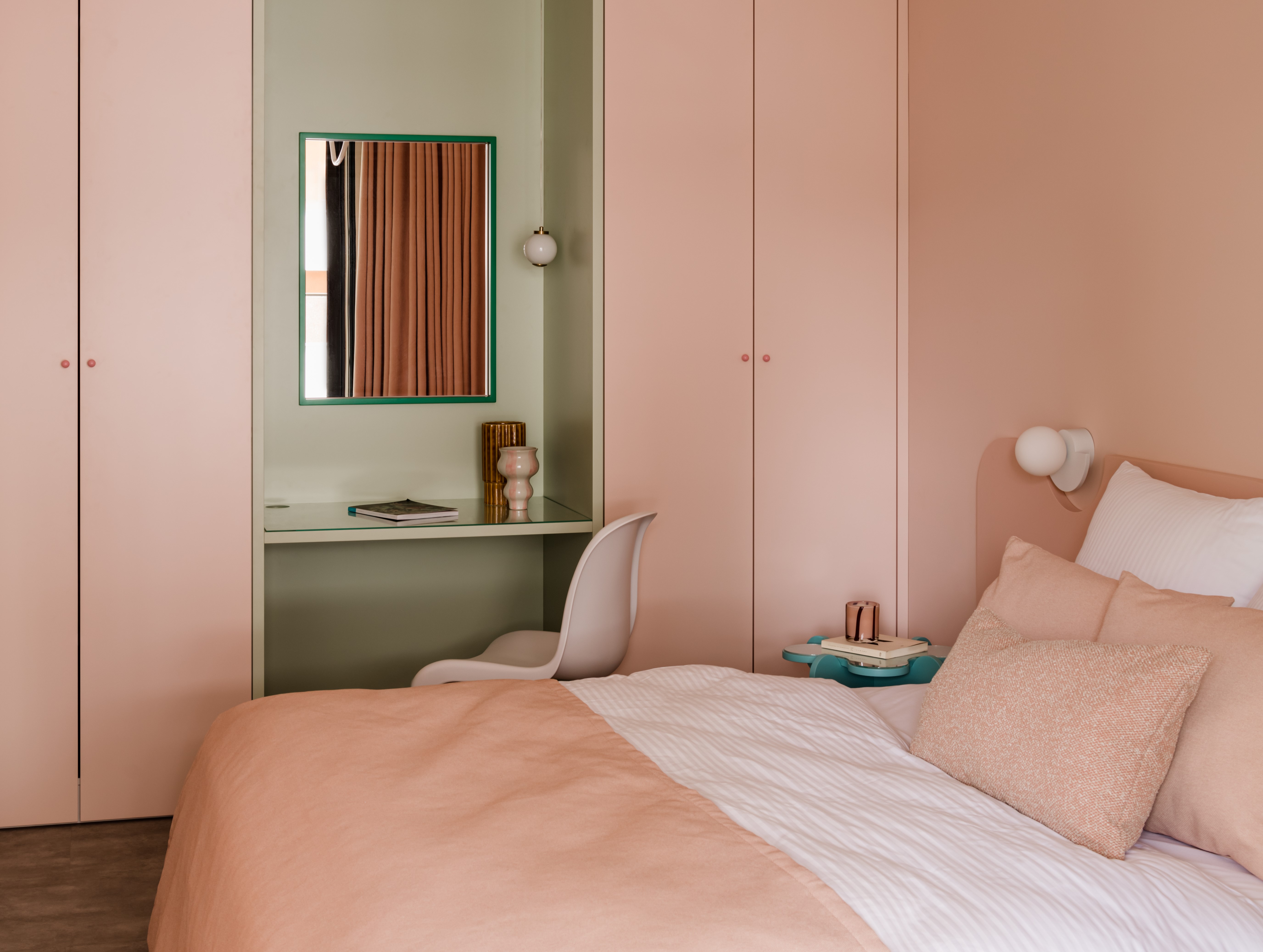
Turquoise is the shade of swimming pools and Mad Men office doors, and can mesmerize in the right combination in your home. It's more lively than teal, warmer than blue, and a tone that brings the sea and sky indoors. Plus, many colors go with turquoise including, as it turns out, pink. If the tone feels a bit too bright for your indoors, consider adding it in as an accent tone, perhaps on furniture, decor pieces, or furnishings.
"The place is incredibly soft thanks to the color combinations," share Diana Żurek and Gutek Girek, founders of Furora Studio. "Green interwoven with pink and blue, against a background of broken white, is complemented by stronger accents and above all textures. Plus, various shapes and forms create a harmonious whole. Most of the furniture has been designed specifically for this space, making it unique but also providing functional solutions."
2. Light gray
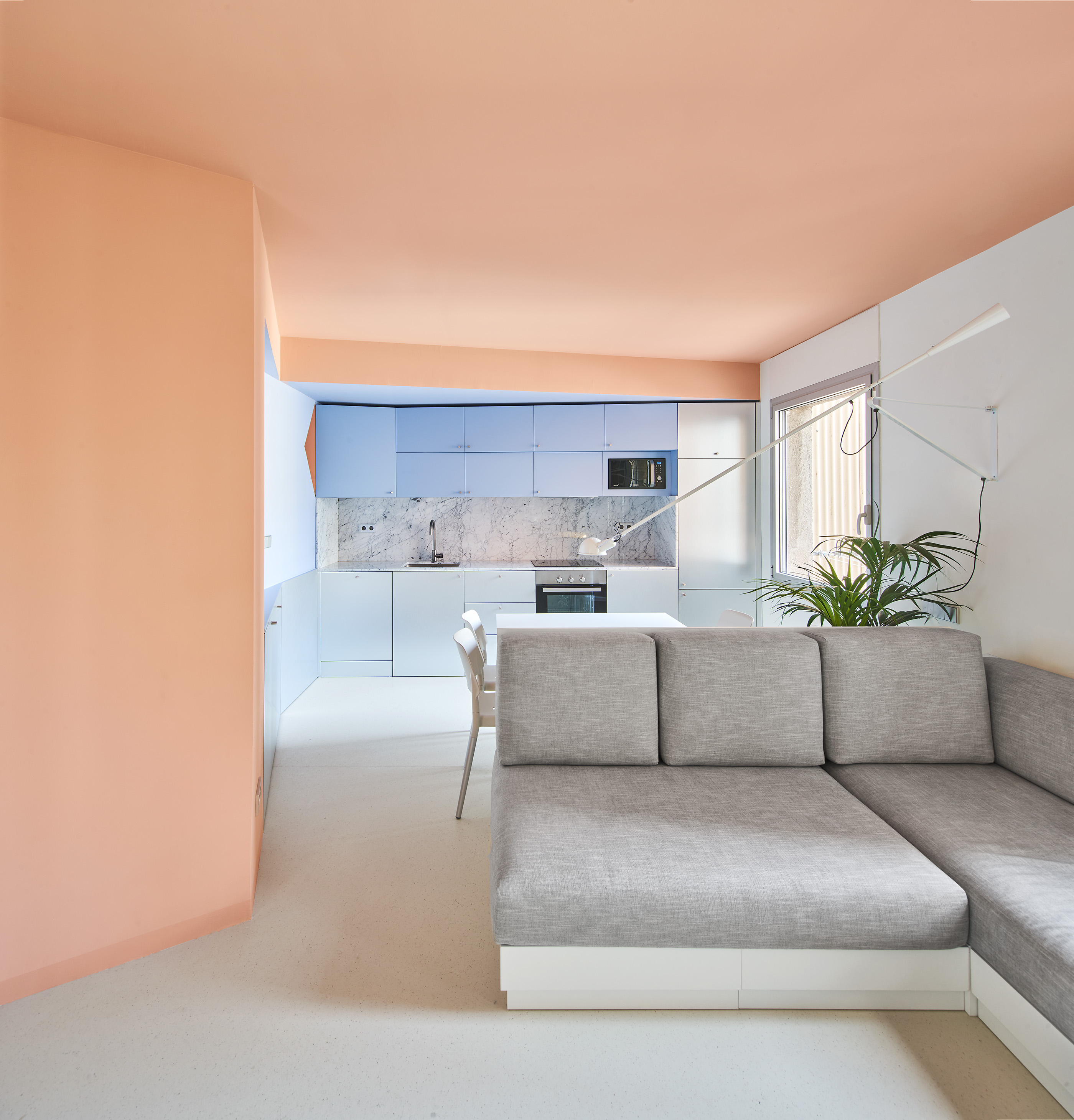
The softer tone of gray is perhaps the most timeless neutral. Cool or blue grays tend to have a very crisp look to them, and many colors go with light gray. This tone looks especially great with brighter pink tones pinks.
"Depending on whether the gray is cool, warm, or more neutral will guide you towards its perfect companion," says Amy Krane, architectural color consultant and founder of Amy Krane Color. "Ochre, gold or pink, work well with any kind of gray."
"The color of the ceiling — blush pink — adds an element of warmth and comfort to the room which receives a lot of sunlight," say Aureli Mora and Omar Ornaque, founder of AMOO. "This tone extends to the home, contrasting it with bluish tones and the gray furniture. The metallic elements contrast and nuance the almost milky and warm atmosphere of the house."
3. Yellow
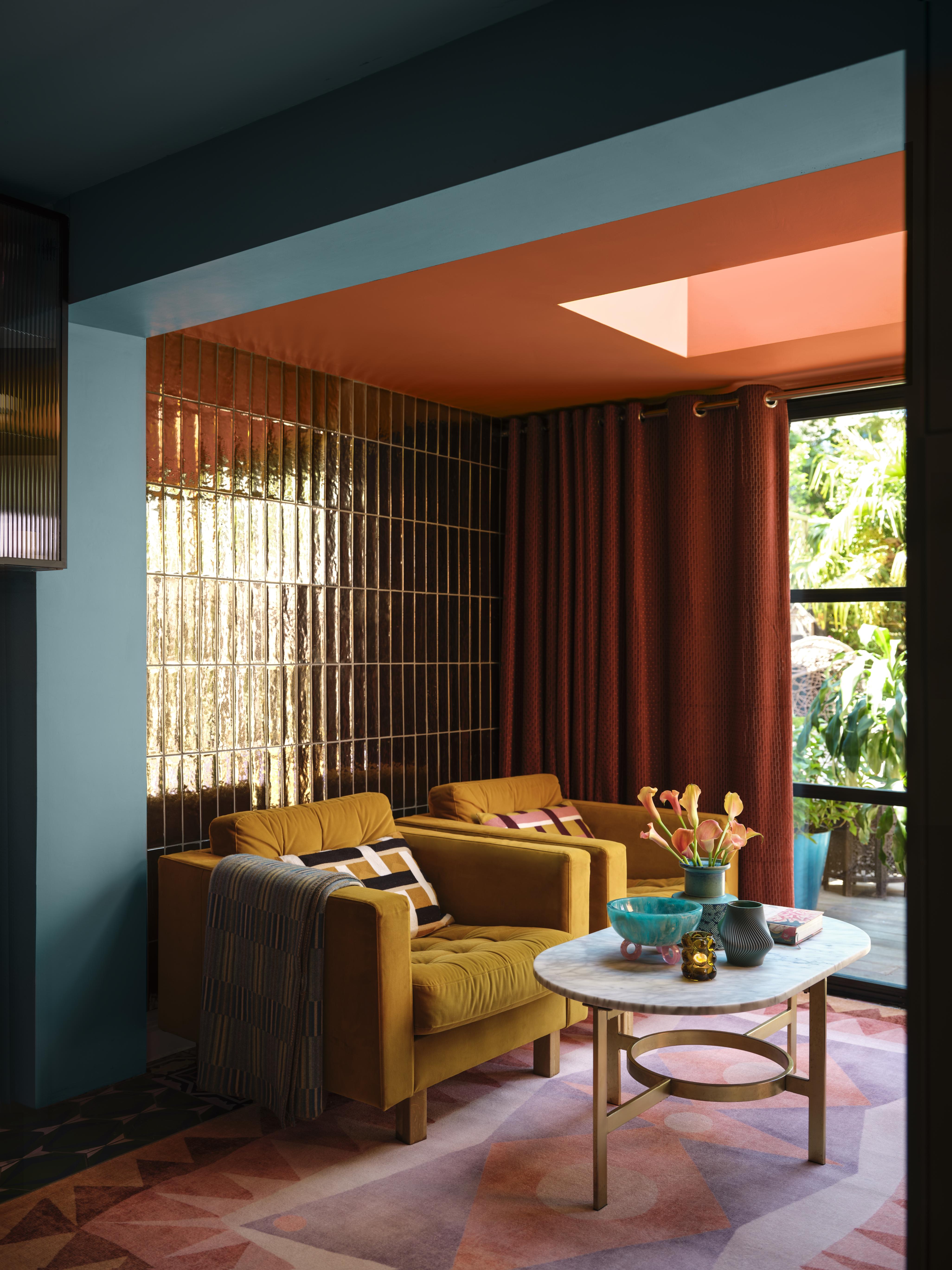
Whether you like it or hate it, yellow is an attention-grabbing color and one you won't forget. And, it is available in so many varying shades and tones that if you look hard enough, there's definitely a yellow you can find that appeals to you. But it is among the colors that go with pink? Yes, but it can be a bit tricky as if you don't choose the right tones of both, you could end up with a garish interior.
For those who like a more earthy, rooted interior can consider an ochre or dijon tones as colors that compliment pink. Even buttery, or medallion yellow is a great tone to bring home. But if it's a more energized interior you wish to create, consider a light shade of it like a sunshine or canary tone, and bring in a third color that goes with yellow like beige, cream, or gray to ground the scheme.
“Pink and yellow are two colors that don't have that much in common so it is important to choose the right shades of each," advises Helen Shaw, director of marketing (International), at Benjamin Moore. "A great way to approach this look is with a dose of retro glamor, opting for mustards and roses, whose warm undertones add instant coziness. Incorporate other rich hues such as terracotta, rust, and a warm-based blue to bring the scheme together. Finally add tactile elements such as velvet upholstery for a tailored, 1970s Halston-inspired effect.”
4. Maroon
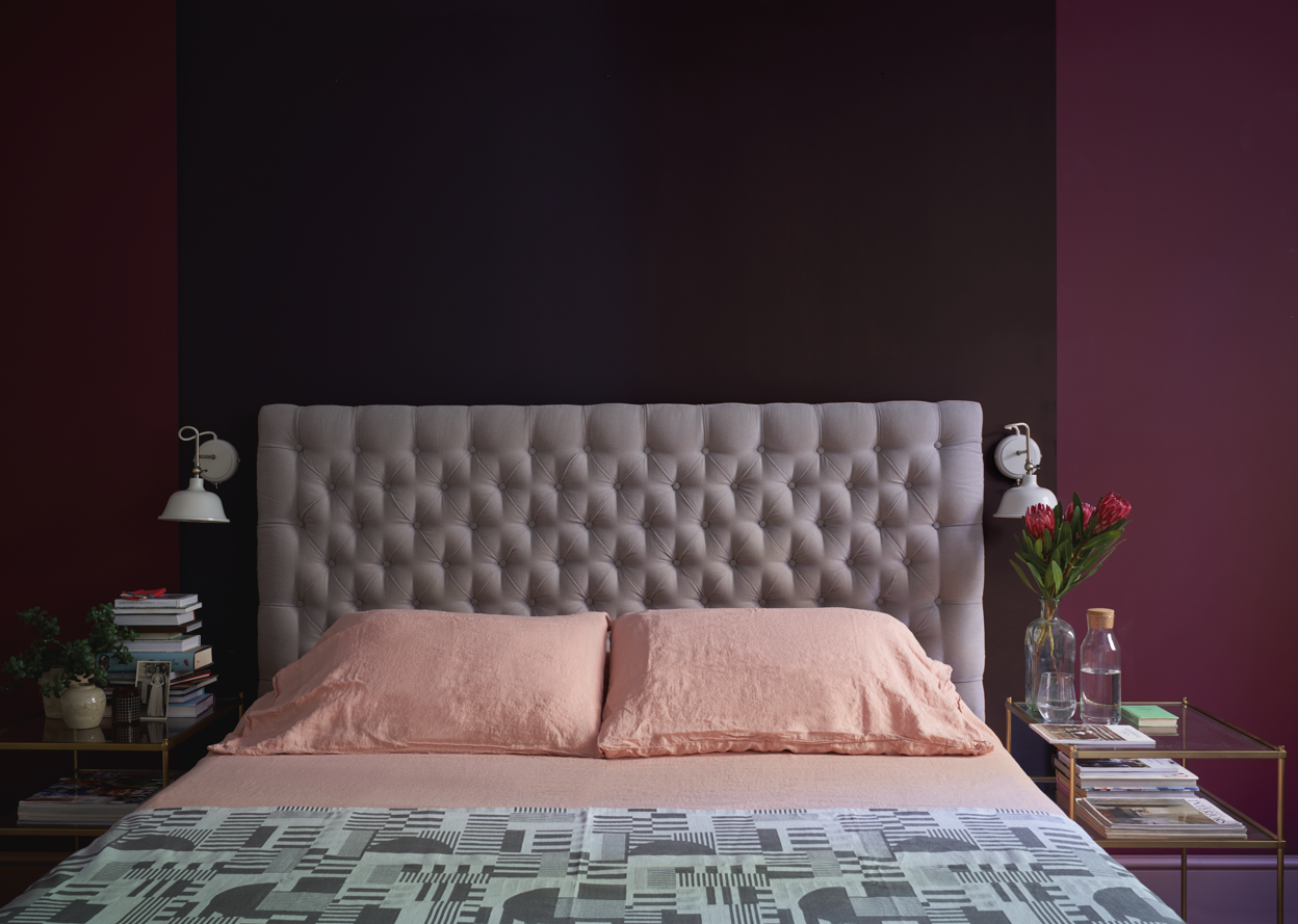
Amongst the colors that go with maroon, pink can feel a bit of a stretch. And that's only because both colors are strong, hold their own, and can feel bold. But it doesn't always have to be the case. A lighter pink can be a good balance against brighter, warmer purple, and in the right shade, can even play the role of a neutral.
"I am a huge fan of pairing dusty pinks, corals, maroon and cinnamon colors together," says Nicole Dohmen, founder of Atelier ND. "For the perfect combo, ensure they have the same warm undertones."
5. Light green

Green can feel a bit surprising as one of the colors that go with pink, but the combo works just as it does in nature. If you want a jewel-box effect in your bedroom color scheme, these two tones, especially in their lighter, pastel versions could be a good bet. A neutral like white or beige is a wonderful third color that goes with green, adding a balancing tone to the interior.
"What distinguishes this interior is primarily the interweaving light colors of pink and green combined with unique shapes," say Diana and Gutek. "We decided to have some fun with the place by adding both modern forms and subtle retro colors. This is a comfortable and colorful space with a difference, taking us to a slightly different world, not too saccharine but full of dreams and wonder."
6. Black
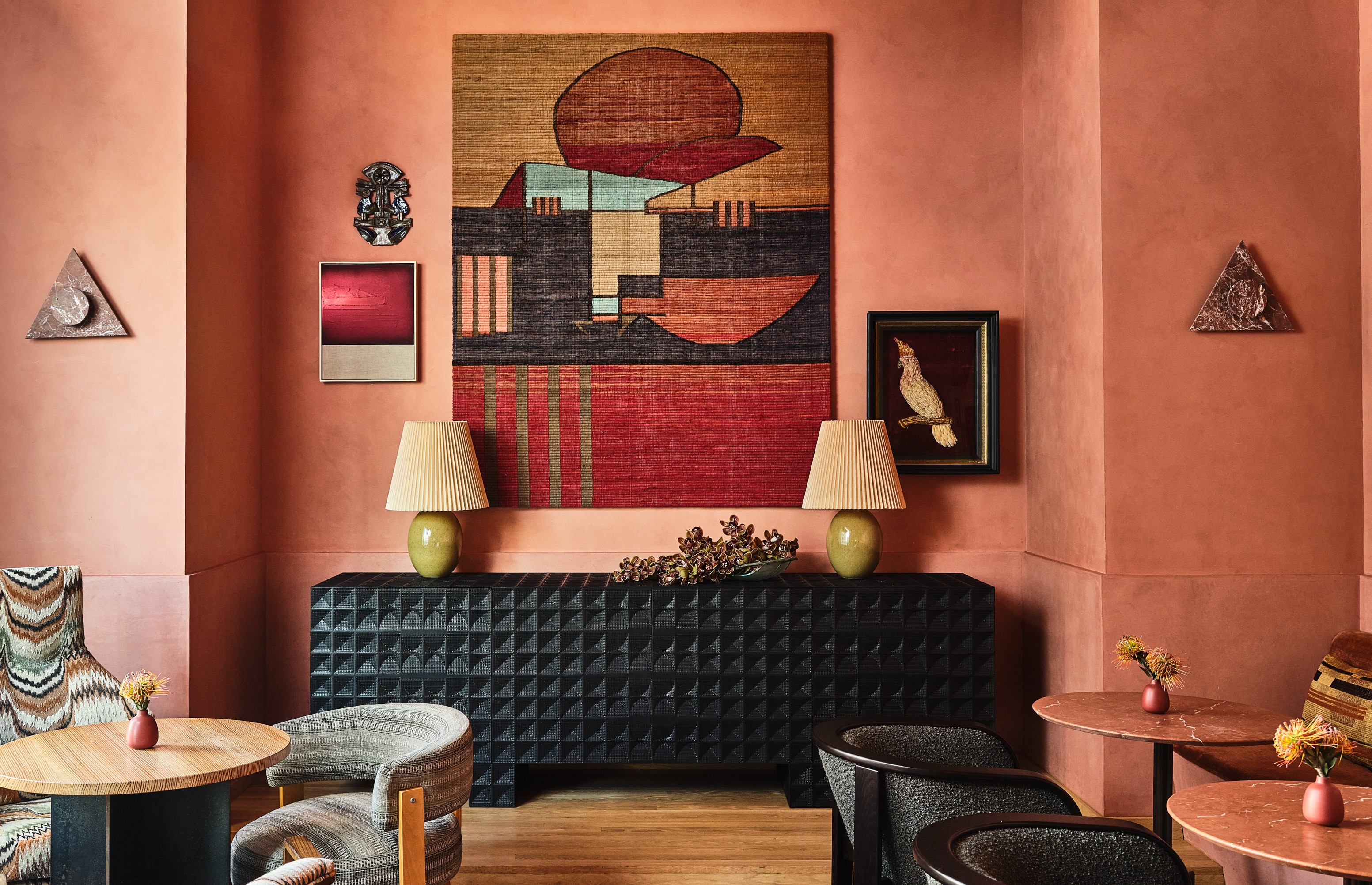
Black, though a dark neutral is one of the colors that compliment pink and is loved by designers. That's because the combination has both depth and drama. Plus several colors go with black, meaning you can add more layering to the room which has black and a pink palette.
"The best way to pair pink and black – simple, you don't use real black," says Lucie. "You do an almost charcoal or a deep, deep green. That plus any pink – whether pale or hot pink – will feel fresh and modern. Doing a true black with any pink will read too 90s in my opinion."
7. Pink
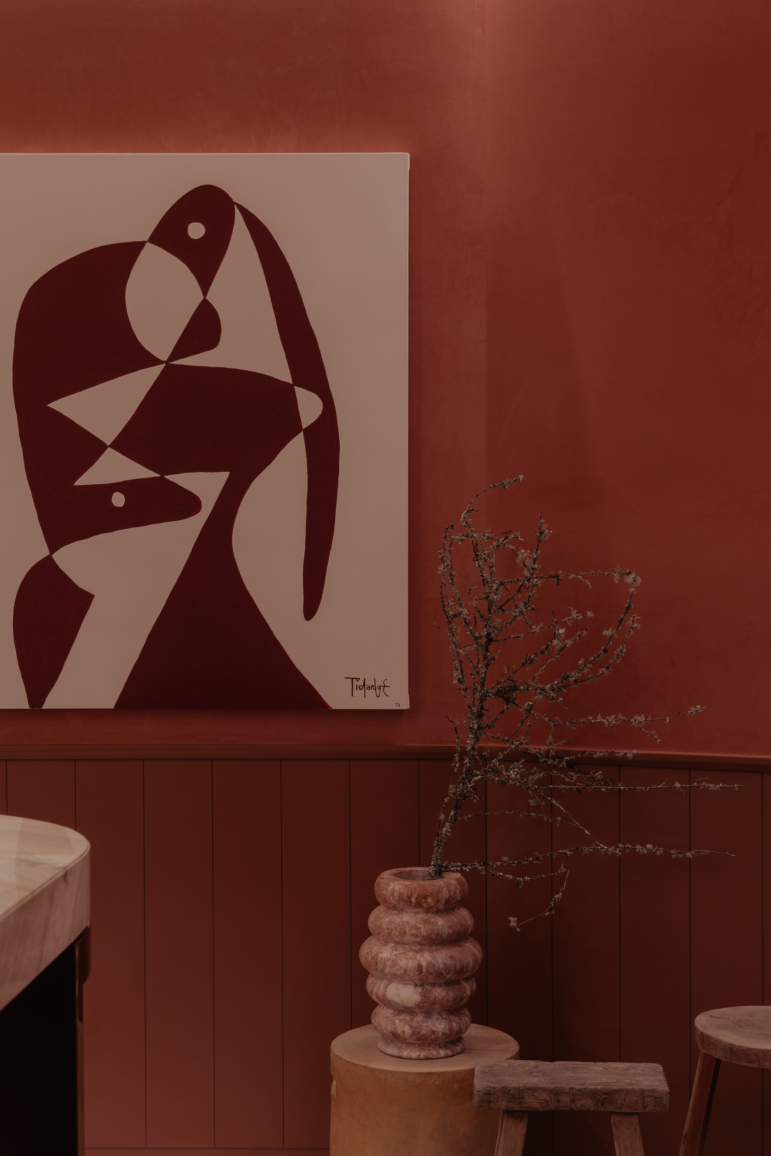
Yes, among the colors that go with pink is...pink! By color layering two shades of the same tone, you can create an interior that has depth and visual volume. Think of an earthy pink and a reddish-pink for a warm interior. Even two pinks of different color temperatures can do the trick.
"The color pink emerges as the central element, defying expectations and transforming the visual experience of the space, making us feel contained and warm," says Santiago Cuaik, founder and CEO of Cuaik. "To use two shades of pink in a room effectively, select a dominant pink for walls and large items, complement it with a contrasting shade for accents, incorporate neutral tones for balance, and add texture and accessories to create a harmonious and visually pleasing space."
"Pink layered with deeper or contrasting tones of pink can set a space apart," says Charlie Morrison, a designer at Topology. "As a standalone hue, it works well as both an accent color, and as a subtle backdrop."
8. Blue
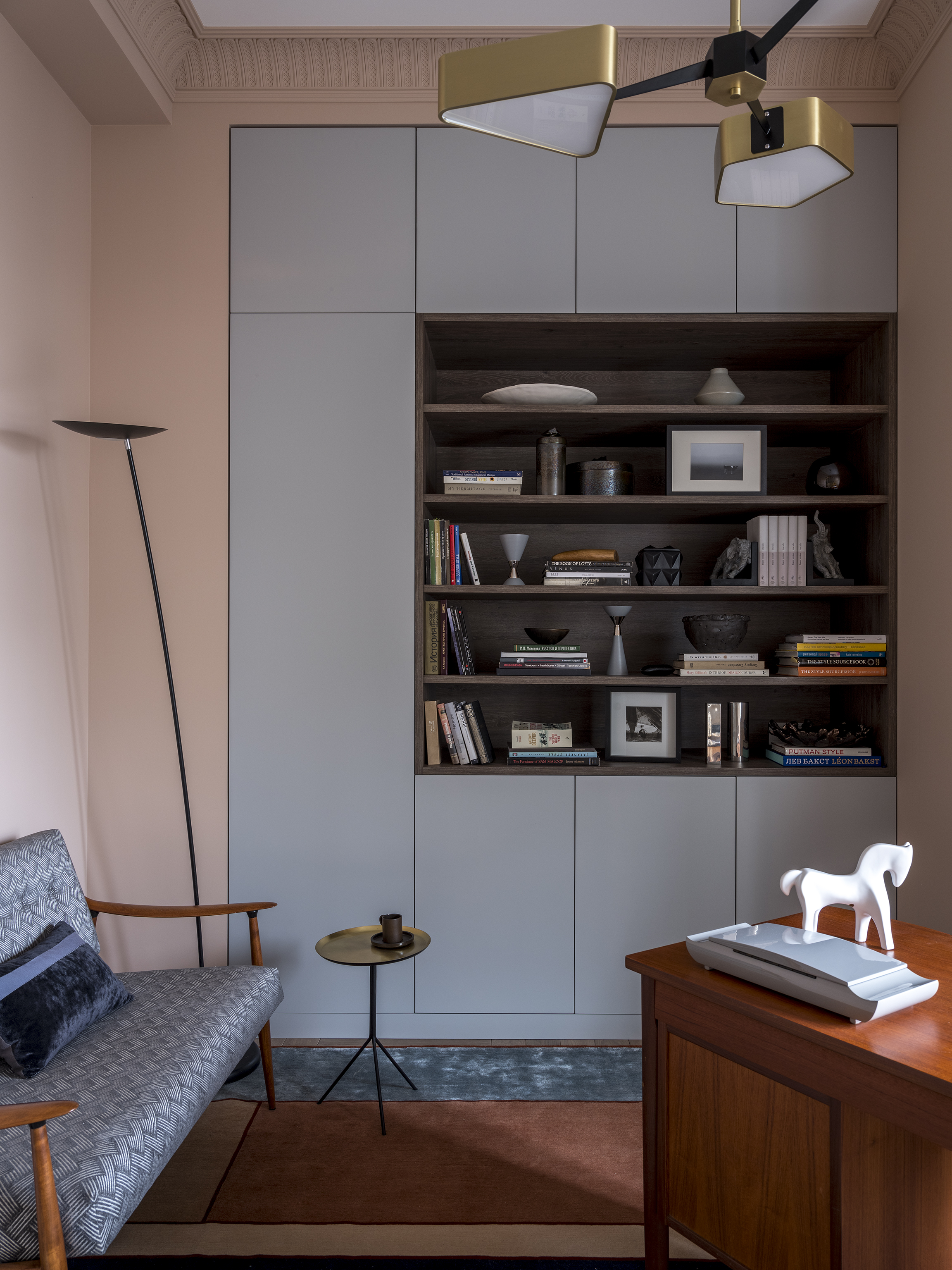
What colors go with pink to create an instantly charming interior? Blue of course! The lovely blush scores high in the colors that go with blue, and in fact, if you like a slightly sweeter pink you can tone down its effect with a deep navy blue or dark teal. Alternatively, the pastel renditions of both colors look lovely, especially in small spaces.
"This little study room faces the north direction and was not getting enough light," says Anna Clark, interior designer and founder of House of Clark. "So to make it a brighter and more attractive space, we decided to use pink plaster on the walls. The color embraces you and it's never too overwhelming; it's always pleasing to the eye. The cabinet with shelves occupies a lot of space, and so for a lovely contrast, we decided to paint it this grey-blue tone. The color is quite delicate and neutral, but not boring at the same time."
9. White
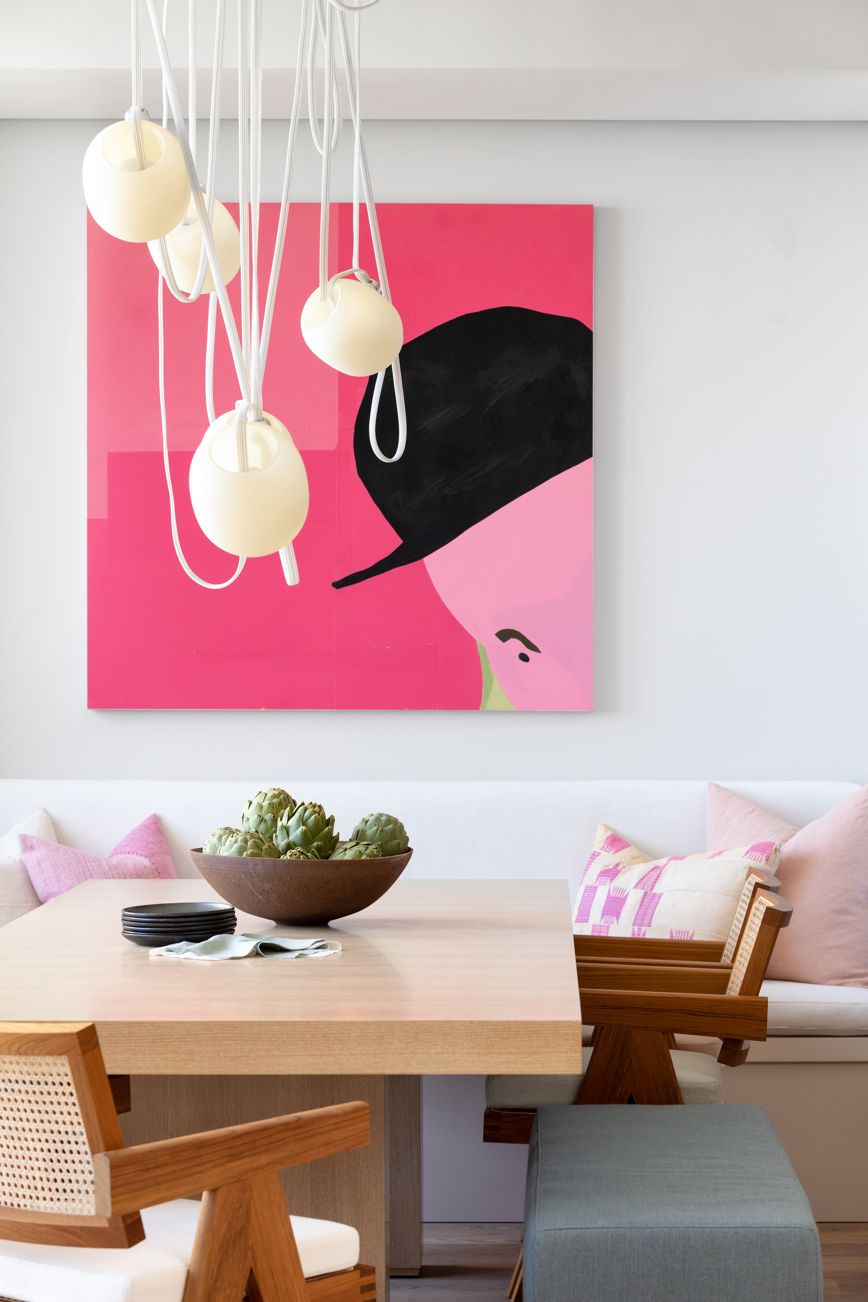
White creates a crisp and bold scheme when paired with rosy hues, and largely, decorating with neutrals is fairly easy. In this project by House of Hudson Interiors,white provides simplicity, and a good background and the boldness of the pink artwork really takes center stage. It's a versatile combination too, working with pale pinks and a bold fuchsia, all against a muted wall.
"Having pink as part of a pattern in a white fabric, or perhaps the drapery or rug is recommended," says Jennifer Morris, founder of JMorris Design. "Even a pop of pink on an all-white pillow could change the ambiance of a space. The color has soft, gentle connotations, and is also a flexible tone. I think it’s a great balance with light and dark tones."
10. Emerald green
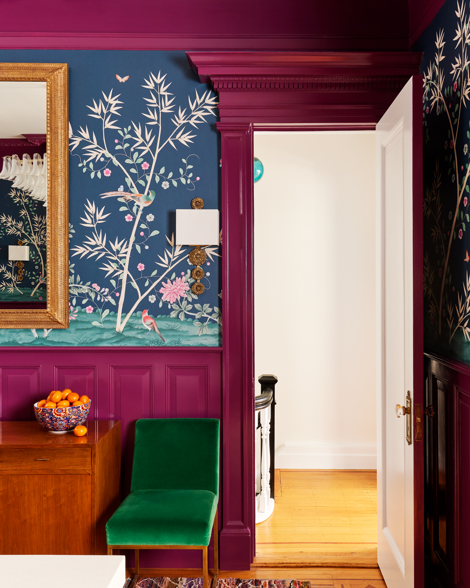
If you've always wanted a royal, high-end interior and were wondering how to decorate with jewel tones, then a combo of pink and green is highly effective. Pink, be it light, dark, or raspberry bright, works well especially with emerald green because pink creates a sense of balance to the royal and rich green.
"The atmosphere we wanted to create in this room was an enveloping one, with a feeling of warmth and comfort," says Erin Fearins, partner and lead interior designer at Studio SFW. "Our client loves color, so we wanted to make this dining space feel like a special jewel box destination, with a clash of raspberry pink and green."
11. Red
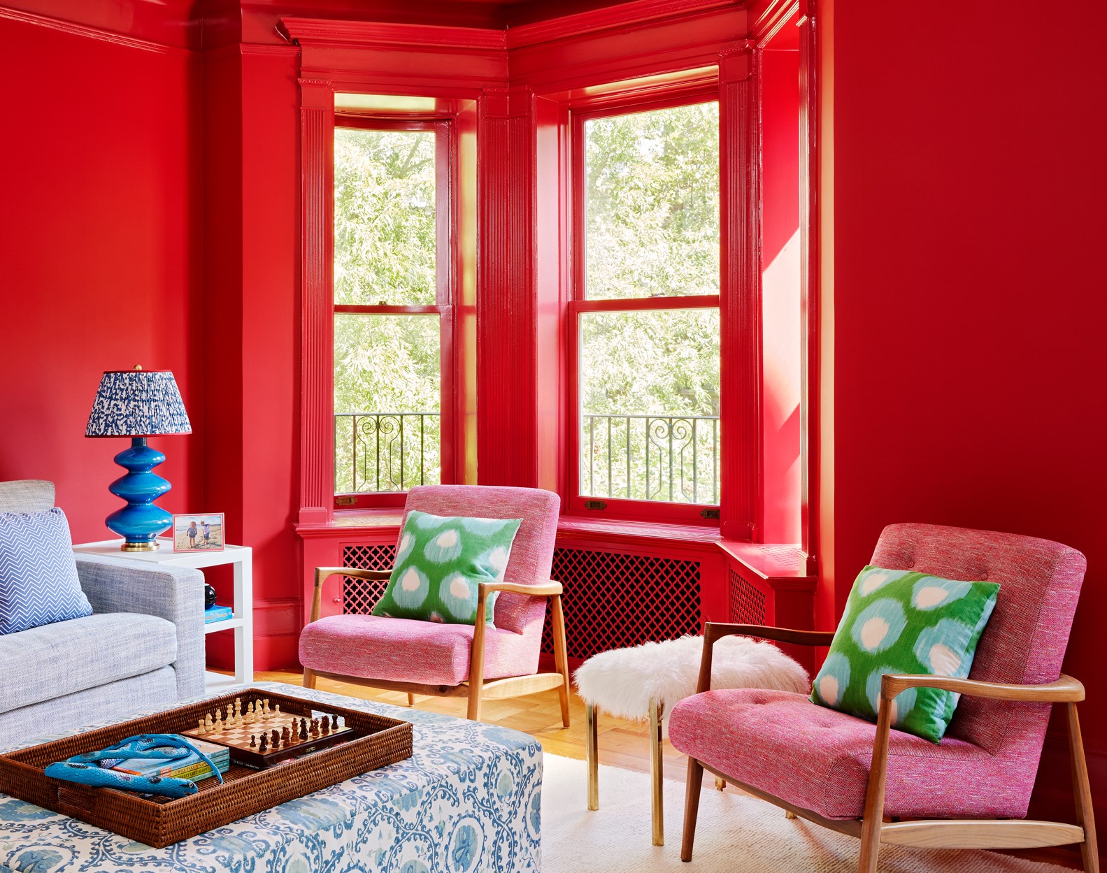
Pink is a lovely color that goes with red, as both tones have several variants, and can look great together. Take the pink and red combination a step darker for a contemporary twist or team neutral pink with earthy terracotta and shades of clay for an on-trend tonal look. Or, for a modern look, pair the muted tones of both for a calm feeling.
"In this family room, there is a large piece of art that our client cherished which inspired the color scheme," says Erin. "We lacquered the walls red making the space feel warm and enveloping as a family room for everyone to gather together and be cozy on the sofa. The chair features pink, and other warmer tones mixed with cooler colors like blues and greens take over the room. We tried to incorporate a mix of color in the space to provide a great backdrop for the beautiful piece of art."
12. Gold
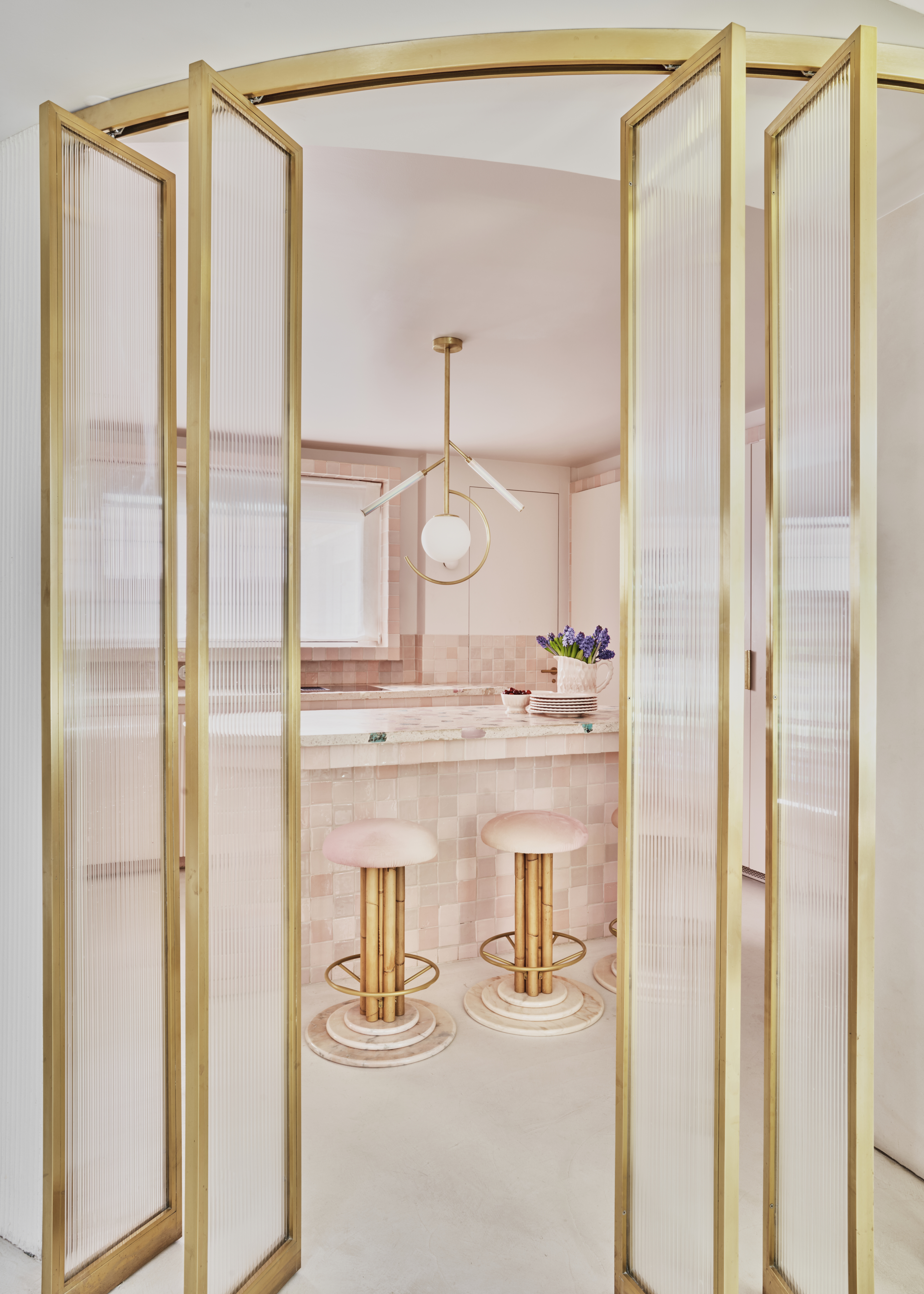
Thank goodness we all seem to be getting over the rose gold phenomenon of the past few years, but what it's left behind, the popular pink and gold combination is an iconic duo that has much more longevity.
As one of the colors that go with pink, gold can feel luxe and imbue a space with a high-end feel. Avoid going for anything too light with anything too bright when choosing colors that go with gold — if you are drawn to lighter pinks, bring in a darker, aged brass tone whether it be in a piece of furniture or a metallic wallpaper. And, likewise, if you do want to go bright and shiny with your gold, pair it with a more muted blush pink shade.
"Use unlacquered brass as an accent to a pink interior as it feels incredibly romantic, classically French, and just timeless," says Lucie.
13. Orange
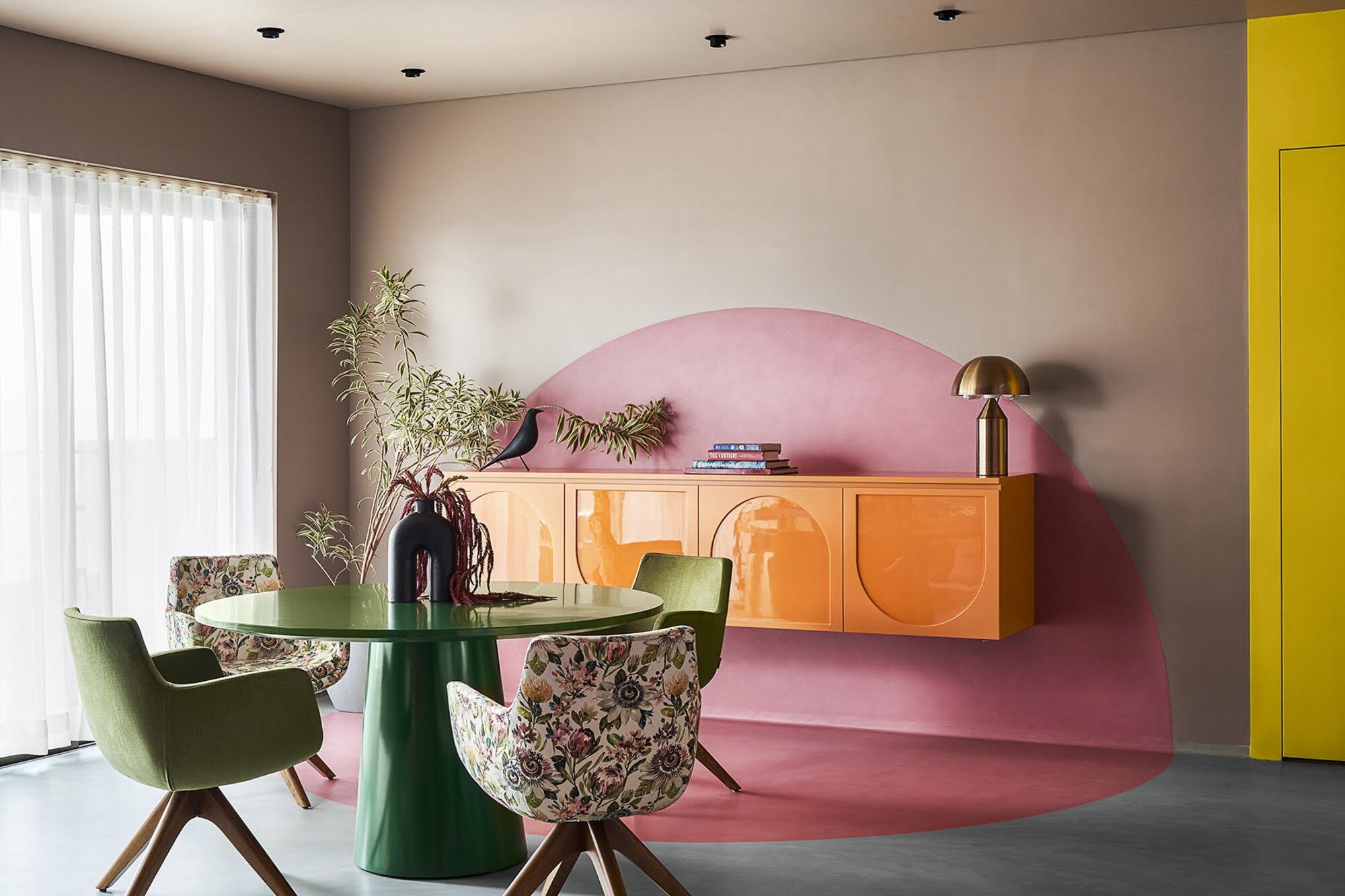
For a vibrant interior, choose colors that go with orange, such as pink, as the two tones work well together because they are located so close together on the color wheel. From hot pinks and vivid oranges to more muted tones of blush pink and terracotta, this is a fun pairing that adds warmth and playfulness.
In this scheme, the designer has gone bold. "We used salmon pink and juicy orange as the main story visible at the dining credenza," says designer Prashant Chauhan, founder of Zero 9. "Also the bright orange sofa recliner with the backdrop of pink and blue forms an interesting clash in colors."
Both colors are playful and beautiful, so they work fabulously in a social space such as a kitchen, living room, or dining room. The juxtaposition of hot orange and a cool-toned pale pink is simultaneously retro yet elegantly contemporary.
14. Mid-tone gray
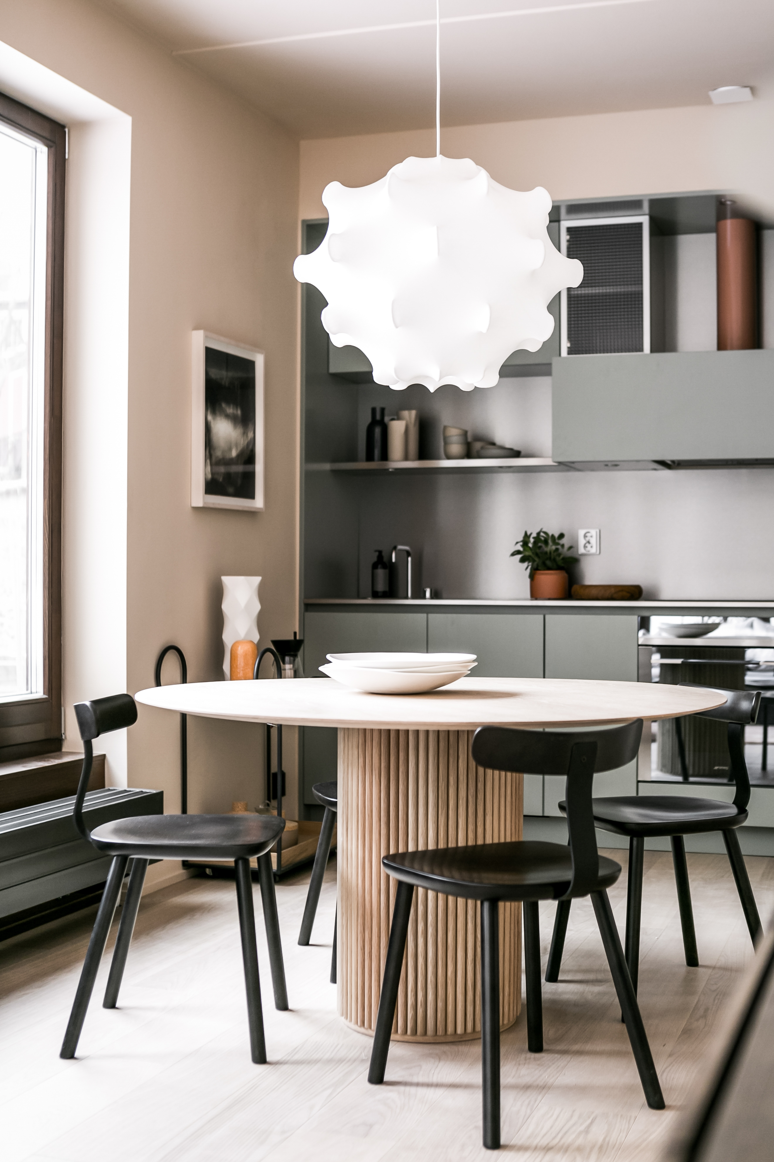
Gray is one of the go-to colors that go with pink. Gray typically has a lot of coolness to it, so needs the warmth of pink to help the scheme feel friendly and hospitable. When it comes to how to create a color palette, balance is key.
"When using pink with gray, consider a charming and eclectic approach," says Meera Pyarelal, founder and interior designer at Temple Town. "Opt for a warm-toned, medium gray as the base to infuse a cozy ambiance. Experiment with a bold and vibrant shade like coral or magenta for an unexpected twist. To add depth and visual interest, introduce patterns that blend gray and pink elements, such as geometric prints or watercolor designs. This creates a dynamic and lively atmosphere, ideal for those seeking a playful and trendy interior."
"Gray is not a color to create a monochromatic environment with," says Amy. "Adding other colors to a gray backdrop will always help enliven and elevate the space. Ochre or pink work well with any kind of gray."
Whether you are using pink in a pale blush color or a bright pop of bold fuchsia, it can work beautifully with a gray tone. In this scheme, the pink almost works as a neutral when balanced against the grey, and helps to highlight the natural wood used in this kitchen.
What colors go with pale pink?
Pale pink can be a tricky shade to work with — get it right and you have an uplifting space that feels fun and fresh. Get it wrong and you risk falling into Pepto-Bismol, kid's bedroom territory. The key to is to pair these paler pink shades with the right colors. "There’s no doubt about it; pink is a versatile color that enhances a feeling of warmth and calm, in turn making it an attractive color within interiors," says Charlie Morrison of Topology. "There is a vast range of hues to pick from — from pinks with deep earthy undertones to lighter brighter rosy pinks. It works well as both an accent color in a space, seen within soft furnishings, and as a subtle backdrop instead of a classic neutral. It has become much more than a tone associated with romance and femininity. In recent years paint companies and furniture brands have really broadened their horizons with their offering of pink paints and fabrics."
If you are after a less neutral, more colorful combination, navy blues look lovely with light pinks, and the deep jewel tone gives the pink a more grown-up, glamorous feel.
What color contrasts most with pink?
If you want to design an interior that's bold, eye-catching, and filled with personality, you could look at the color wheel to choose the absolute opposite of pink. In this case, it's green. These two tones paired together are a guaranteed way to amplify a design.
Be The First To Know
The Livingetc newsletters are your inside source for what’s shaping interiors now - and what’s next. Discover trend forecasts, smart style ideas, and curated shopping inspiration that brings design to life. Subscribe today and stay ahead of the curve.

Aditi Sharma Maheshwari started her career at The Address (The Times of India), a tabloid on interiors and art. She wrote profiles of Indian artists, designers, and architects, and covered inspiring houses and commercial properties. After four years, she moved to ELLE DECOR as a senior features writer, where she contributed to the magazine and website, and also worked alongside the events team on India Design ID — the brand’s 10-day, annual design show. She wrote across topics: from designer interviews, and house tours, to new product launches, shopping pages, and reviews. After three years, she was hired as the senior editor at Houzz. The website content focused on practical advice on decorating the home and making design feel more approachable. She created fresh series on budget buys, design hacks, and DIYs, all backed with expert advice. Equipped with sizable knowledge of the industry and with a good network, she moved to Architectural Digest (Conde Nast) as the digital editor. The publication's focus was on high-end design, and her content highlighted A-listers, starchitects, and high-concept products, all customized for an audience that loves and invests in luxury. After a two-year stint, she moved to the UK and was hired at Livingetc as a design editor. She now freelances for a variety of interiors publications.
-
 The Easiest Way to Turn Your Designer Scarf Into Wall Art — No Frame, No Fuss, No Regrets
Because silk this pretty should never stay in a drawer
By Julia Demer Published
-
 Italian Kitchen Trends — 5 Emerging Ideas From the Chicest Italian Designers That I Predict Will Go Global in 2025
Fresh from Milan Design Week, these are the exciting finishes, styles, and innovative materials I can't wait to see in more kitchens this year
By Faiza Saqib Published


