5 of the best Farrow & Ball blue paints that interior designers are obsessed with – all shown in real spaces
Thinking of painting your home blue? Consider these winning Farrow & Ball paint colors that have interior designers' seal of approval

Blue is an incredibly versatile color for decorating your home. It can be crisp and refreshing, or moody and cozy; reminiscent of nature, while also being modern and playful, too. It's no surprise that interior designers love to use it. 'Blue tones add gorgeous saturation to a space while still offering a bit of levity,' says Marie Flanigan, founder of Marie Flanigan Interiors.
Farrow & Ball has some of the most iconic blue paint colors you can think of, and it remains a go-to paint choice for people looking for elevated color schemes.
If you are considering painting your home blue but are unsure of which shade to pick, we've asked interior designers for help. They've selected their favorite blues from the best Farrow and Ball paint colors to inspire your choices.
1. De Nimes

Whether it's a blue living room, bedroom, or kitchen you're looking at, De Nimes is a great choice - it's a lovely tone that is the mid-point between blue and grey. The color isn't a typical deep blue that can sometimes overwhelm. This tone is the right balance between light and dark.
It's the color that was used by interior designer Julia Miller from Yond Interiors for this stylish living room. 'We used fresh paint to highlight the incredible existing architecture,' says Julia. The layered blues on the built-ins mirror the color of the nearby armchairs nicely.
For an easy way to introduce De Nimes to your home, consider pairing it with calm neutrals such as creams and beiges.

Price: $40 for 3 litres
Consider this clean and elegant blue, inspired by the tones of denim. This color is fashionable and yet always feels grounded.
2. Wine Dark
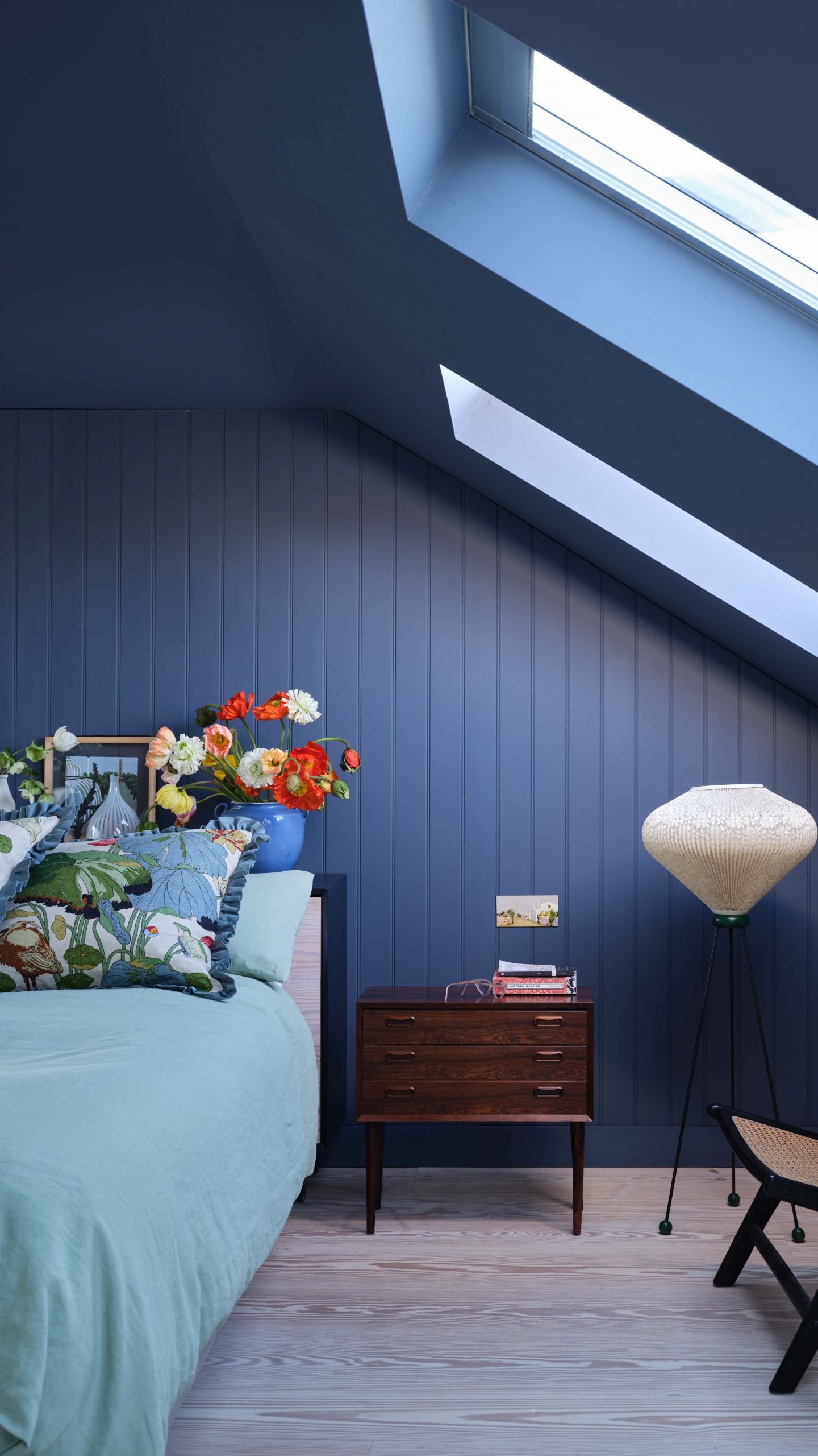
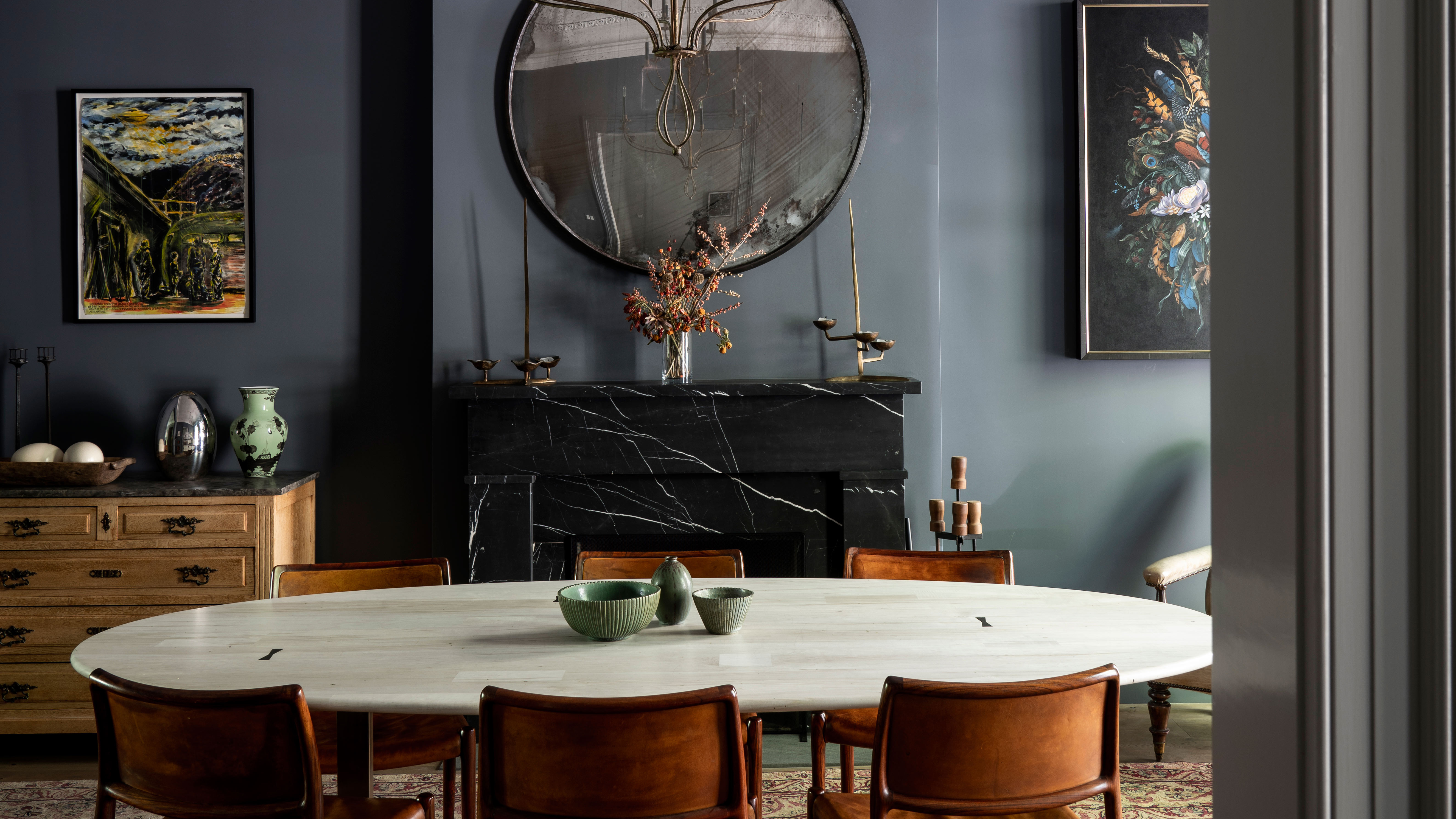
If a dark color scheme appeals to you, then go for Wine Dark – a tone inspired by the midnight sky. A rich, velvety blue, it has an inherent modern appeal, and a subtle grandeur to it. The color can look especially glam in a double-height living room or a large master suite. To add further layering, consider dropping a chandelier from the ceiling and adding floor lamps to the room. The soft, warm lighting paired with this tone will give the room the most cozy vibe.
'My go-to blue paint lately has been Wine Dark,' says Juliette Thomas, founder and director of Juliettes Interiors. 'The color offers a sophisticated yet upbeat hue. It's inspired by midnight skies and works well in most rooms of the home. It is an ideal choice if you’re looking to create a statement, whilst the depth and intensity of the color can make a room feel both intimate and glamorous. As a versatile shade with subtle undertones, it is equally effective on larger surfaces.'

Price: $40 for 3 litres
With a sophisticated yet upbeat tone, this color looks especially nice in low light and looks richer in warm chandelier lighting.
3. Hague Blue

Hague blue living rooms, kitchens, or bathrooms are smart and full of style. This earthy and natural tone looks especially great when paired with green tones. Sophisticated, rich, and elegant, this tone can create a wonderful mood.
'I love Farrow & Ball’s Hague Blue because it’s incredibly decadent and rich, creating a cozy, cocoon-like effect,' says Marie Flanigan, founder of Marie Flanigan Interiors. 'With this space, we decided to add a lacquered finish to beautifully reflect light and create the illusion of a larger space.'

Price: $40 for 3 litres
This strong blue tone works wonderfully to ground skirtings or can act as an accent color on the walls. The green undertones of this timeless, deep, and dramatic blue give it a slightly energetic tone while still ensuring it emanates a warm vibe.
4. Blue Ground
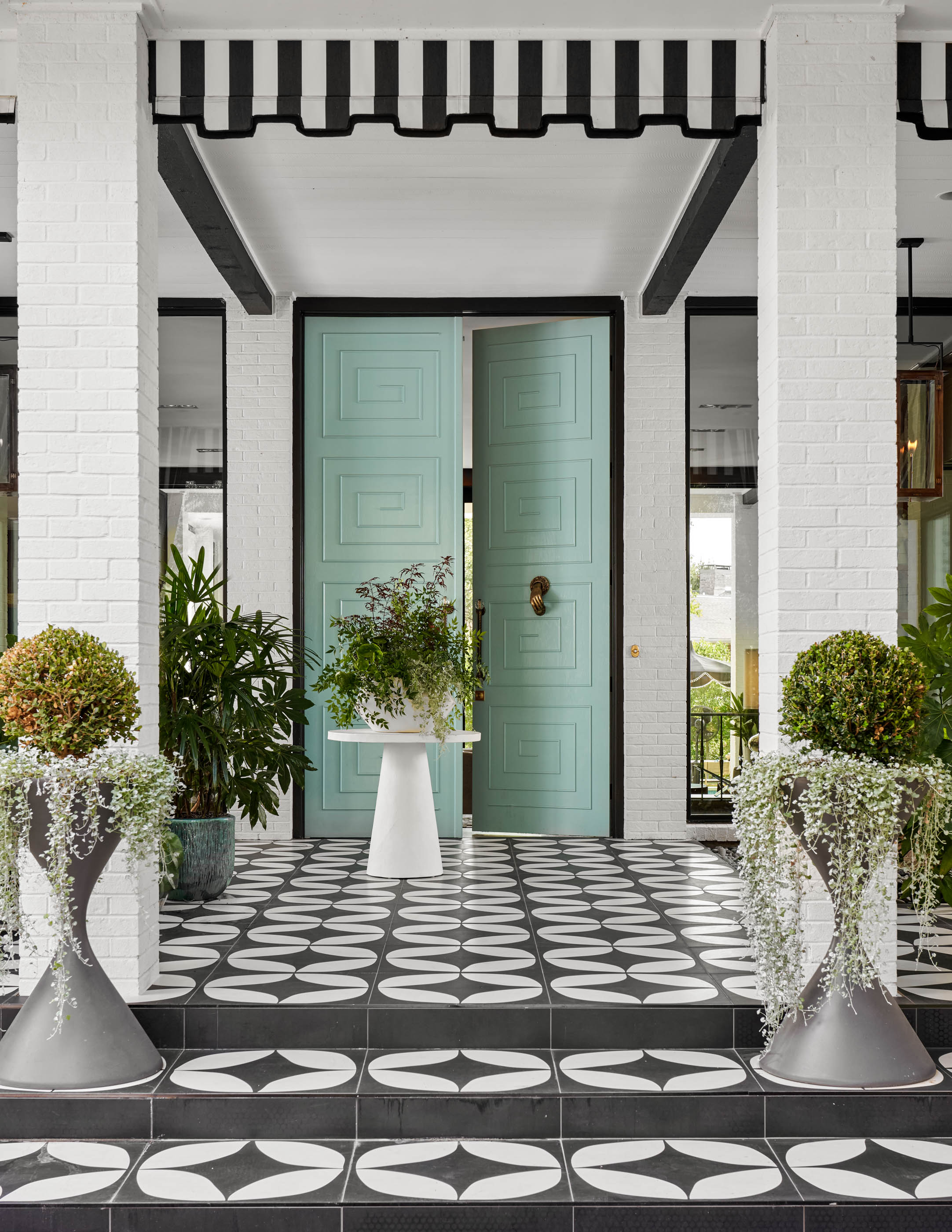
This clean, upbeat mid-tone blue can imbue a space with a happy atmosphere. The color, ideal for playrooms, hallways and even entryways can add an optimistic and friendly vibe. It's warm yet welcoming. Plus, due to its softer appeal, there are many colors that go with blue with this turquoise leaning.
'I love Farrow & Ball Blue Ground so much that I used it on my own front door,' says Eddie Maestri, principal architect and founder of Maestri Studio. 'I love its calming nature for a resort-like vibe that's also a tad retro. That apart, I also love Farrow and Ball Stiffkey Blue. This shade has a flair for the dramatics without being too dark.'

Price: $40 for 3 litres
This color creates a happy atmosphere and looks especially nice with metal and woodwork. The tone is cooler, clean, and instantly pleasing.
5. Light Blue

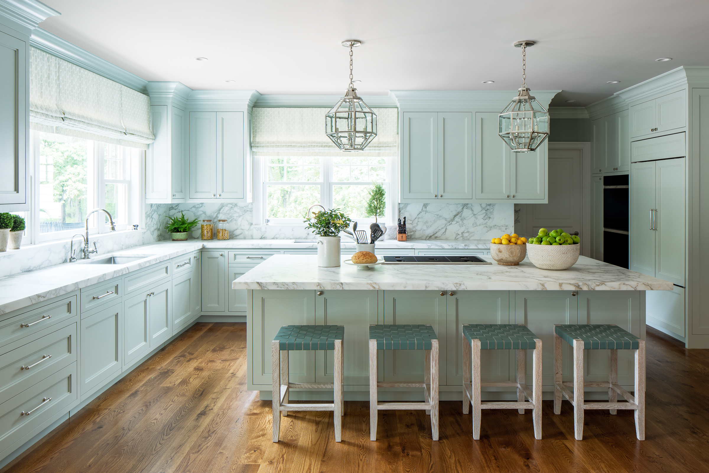
Whether it's on walls, floors, cabinetry, or backsplashes, blue kitchens have been turning heads and giving people a lot of inspiration. The color has a watery, outdoorsy effect, instantly calming a room that usually is busy, and can be a bit stressful to work in. Light Blue, which is a beautiful warm and subtle blue/green/grey paint color is a great choice.
'This space opens up to the family room, and was designed to function as part of the overall room,' says Emily Tucker, founder of Emily Tucker Design. 'We wanted to have some color in the kitchen, but not so much that it felt overpowering. In the end, we settled on this Farrow and Ball Light Blue which we mixed with a lighter green so that the kitchen reads as a pale green. The stools are custom-made and the lanterns are from Charles Edwards.'

Price: $40 for 3 litres
Consider this silvery blue for walls of hallways, living rooms, and even kitchens. The tone reads as a neutral grey and feels both peaceful and calming.
Be The First To Know
The Livingetc newsletters are your inside source for what’s shaping interiors now - and what’s next. Discover trend forecasts, smart style ideas, and curated shopping inspiration that brings design to life. Subscribe today and stay ahead of the curve.

Aditi Sharma Maheshwari started her career at The Address (The Times of India), a tabloid on interiors and art. She wrote profiles of Indian artists, designers, and architects, and covered inspiring houses and commercial properties. After four years, she moved to ELLE DECOR as a senior features writer, where she contributed to the magazine and website, and also worked alongside the events team on India Design ID — the brand’s 10-day, annual design show. She wrote across topics: from designer interviews, and house tours, to new product launches, shopping pages, and reviews. After three years, she was hired as the senior editor at Houzz. The website content focused on practical advice on decorating the home and making design feel more approachable. She created fresh series on budget buys, design hacks, and DIYs, all backed with expert advice. Equipped with sizable knowledge of the industry and with a good network, she moved to Architectural Digest (Conde Nast) as the digital editor. The publication's focus was on high-end design, and her content highlighted A-listers, starchitects, and high-concept products, all customized for an audience that loves and invests in luxury. After a two-year stint, she moved to the UK and was hired at Livingetc as a design editor. She now freelances for a variety of interiors publications.
-
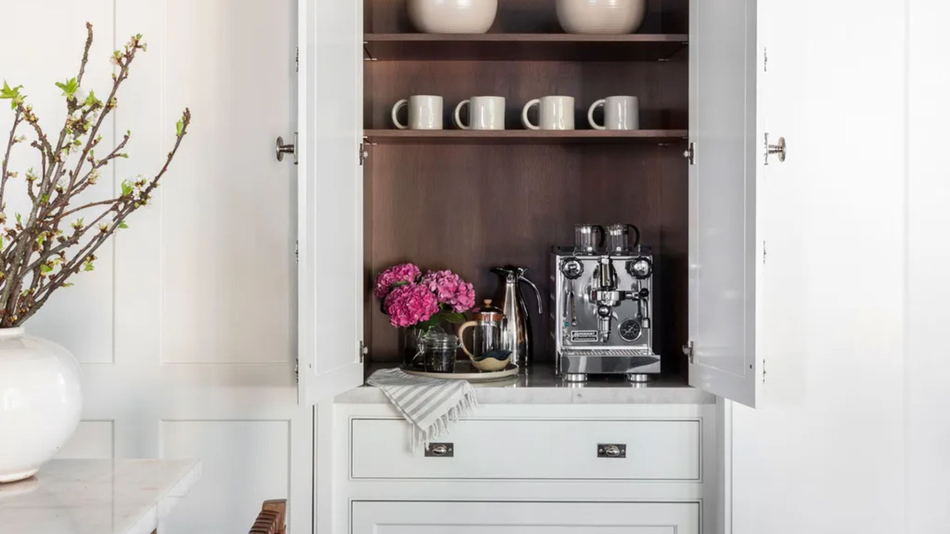 Turns Out the Coolest New Café is Actually In Your Kitchen — Here's How to Steal the Style of TikTok's Latest Trend
Goodbye, over-priced lattes. Hello, home-brewed coffee with friends. TikTok's 'Home Cafe' trend brings stylish cafe culture into the comfort of your own home
By Devin Toolen Published
-
 5 Bathroom Layouts That Look Dated in 2025 — Plus the Alternatives Designers Use Instead for a More Contemporary Space
For a bathroom that feels in line with the times, avoid these layouts and be more intentional with the placement and positioning of your features and fixtures
By Lilith Hudson Published
-
 Farrow & Ball Setting Plaster ideas – how to use this muted pink paint color
Take a look at these Farrow & Ball Setting Plaster ideas for inspiring ways to use this popular paint color in your home
By Aditi Sharma Published
-
 The Best Farrow & Ball Paint Colors — 12 Shades Chosen by Designers to Inspire Your Next Decorating Project
Get inspired and pick the best Farrow & Ball paint colors from this vibrant, designer-approved selection
By Aditi Sharma Published
-
 How to Use Farrow & Ball’s 'Pigeon' in Your Home — 10 Ideas and Expert Advice for This Best-Selling Neutral
Is it blue? Is it green? Is gray? However you interpret it, you'll love the way Farrow & Ball's Pigeon, a complex-yet-classic shade, will work in your interiors
By Emma Breislin Last updated
-
 Farrow & Ball Down Pipe – how to use this popular dark grey in every room
'Downpipe has achieved cult status - like Madonna and Kylie you need only say its name for everyone to know instantly that you are talking about a particular shade of dark grey paint'
By Hebe Hatton Published