5 light paint colors designers always recommend for living rooms – 'they make even dark spaces feel bright'
Light paint colors not only create a sophisticated feel for a living room but can also make them look bigger. Here are the 5 best shades designers recommend

The Livingetc newsletters are your inside source for what’s shaping interiors now - and what’s next. Discover trend forecasts, smart style ideas, and curated shopping inspiration that brings design to life. Subscribe today and stay ahead of the curve.
You are now subscribed
Your newsletter sign-up was successful
Light paints have an inherent calm and "clean" feel to them. Unlike darker tones, these seamlessly blend into any style of home and provide a sophisticated canvas to elevate your room's other elements. By itself, a soft, subtle paint can create a perfectly minimalistic, yet stylish vibe, and even boost how large your room looks.
If you are looking for living room color ideas to change the look and vibe of the space, then these paint shades suggested by experts will point you in the right direction.
1. Light salmon
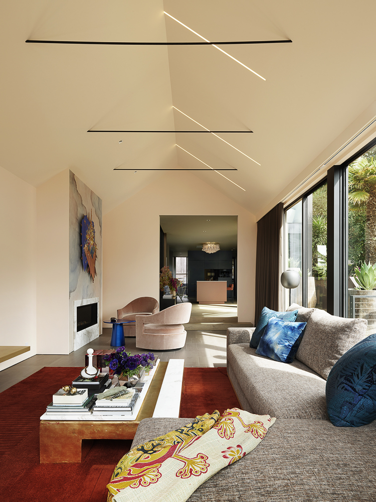
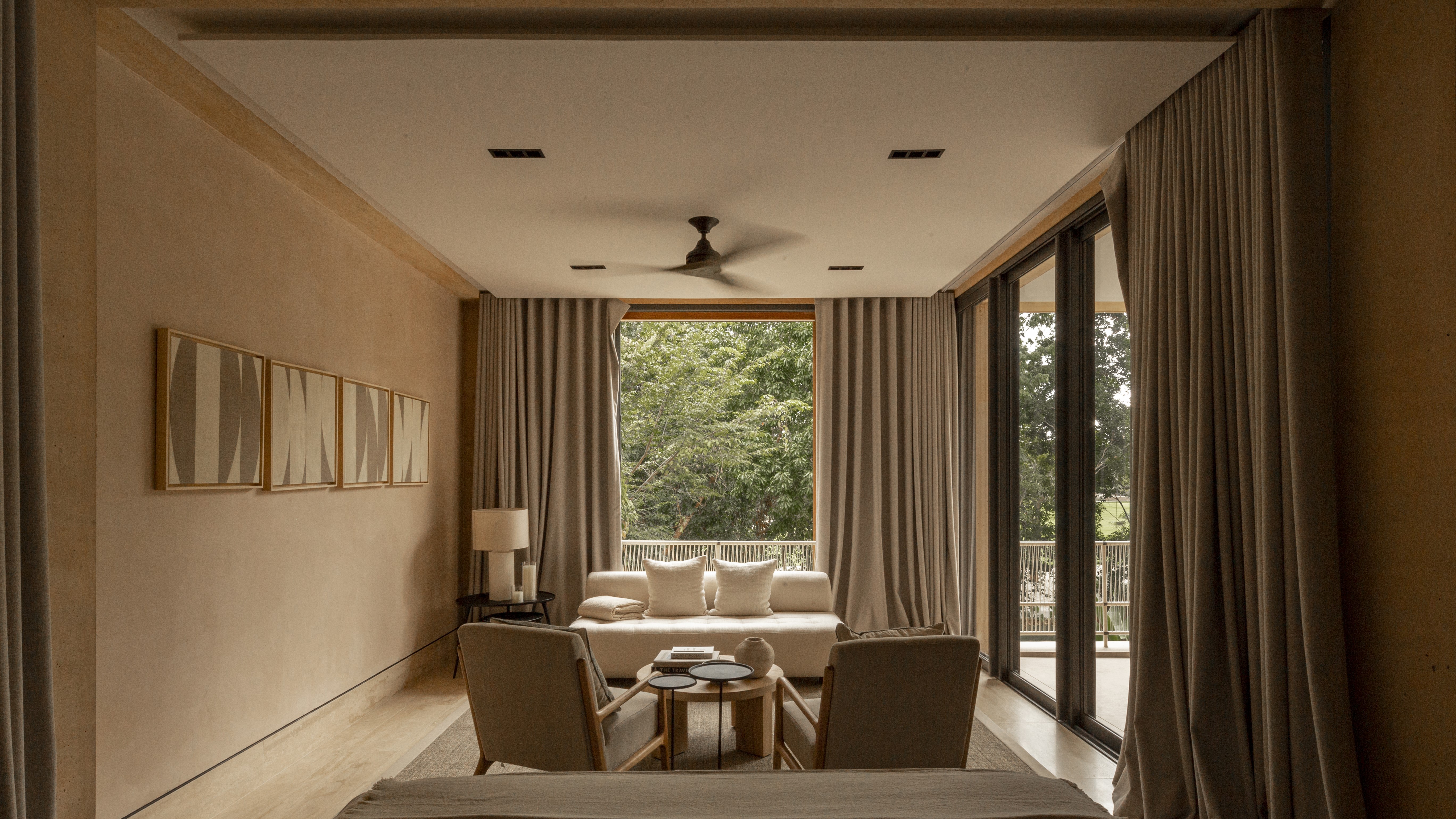
Pink is a timeless hue and the right shade can make any room look fresh, modern, and effortlessly stylish. If you're planning on color drenching your living room then consider a light shade of pink. A muted salmon, for instance, will fill the interior with warmth and modernity. Plus, several colors go with light pink.
Article continues below'I love colors that are playful with light and glow from within,' says Kevin Sawyers, founder of Sawyers Design. 'Consider Benjamin Moore's Sweet Salmon 2167-60, which is a delightful shade of peachy salmon that changes constantly as the day passes and the weather and light shifts.'
2. Greige
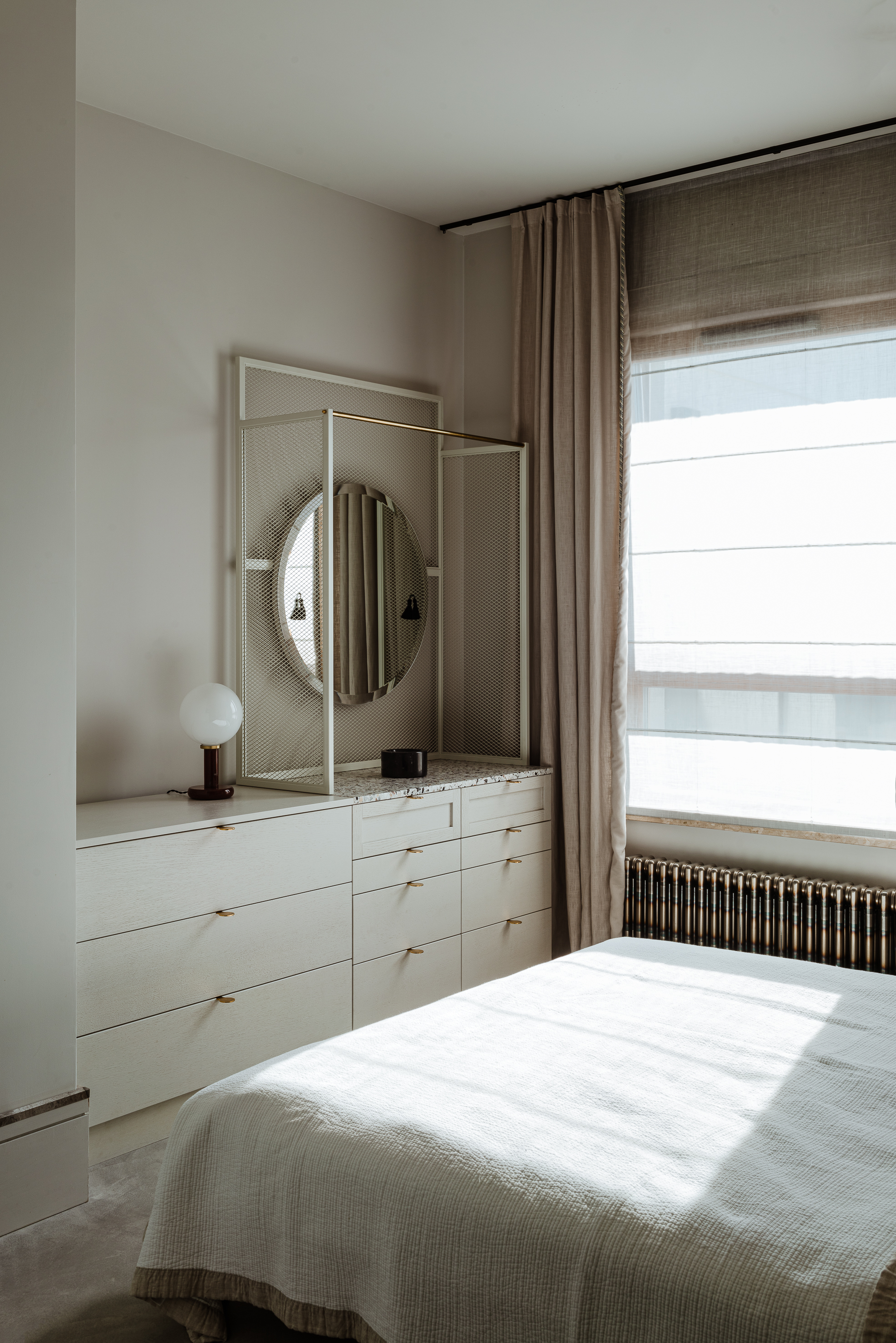
A seamless combination of grey and beige, this color has been around since Giorgio Armani made it popular in the 80s. The color combines the best of both worlds, where the cooler and more placid grey merges with the warming nature of beige. Such is the popularity of this tone that there are several best greige paints to choose from.
'A very pale 'greige' color can work with both cool and warm colored furnishings, and bring light to dark spaces,' says Bethany Adams, founder of Bethany Adams Interiors. 'It can be dressed up or down depending on your style. I love Benjamin Moore's Pale Oak OC-20 for a living room because it is a real chameleon of a color.'
3. Warm white
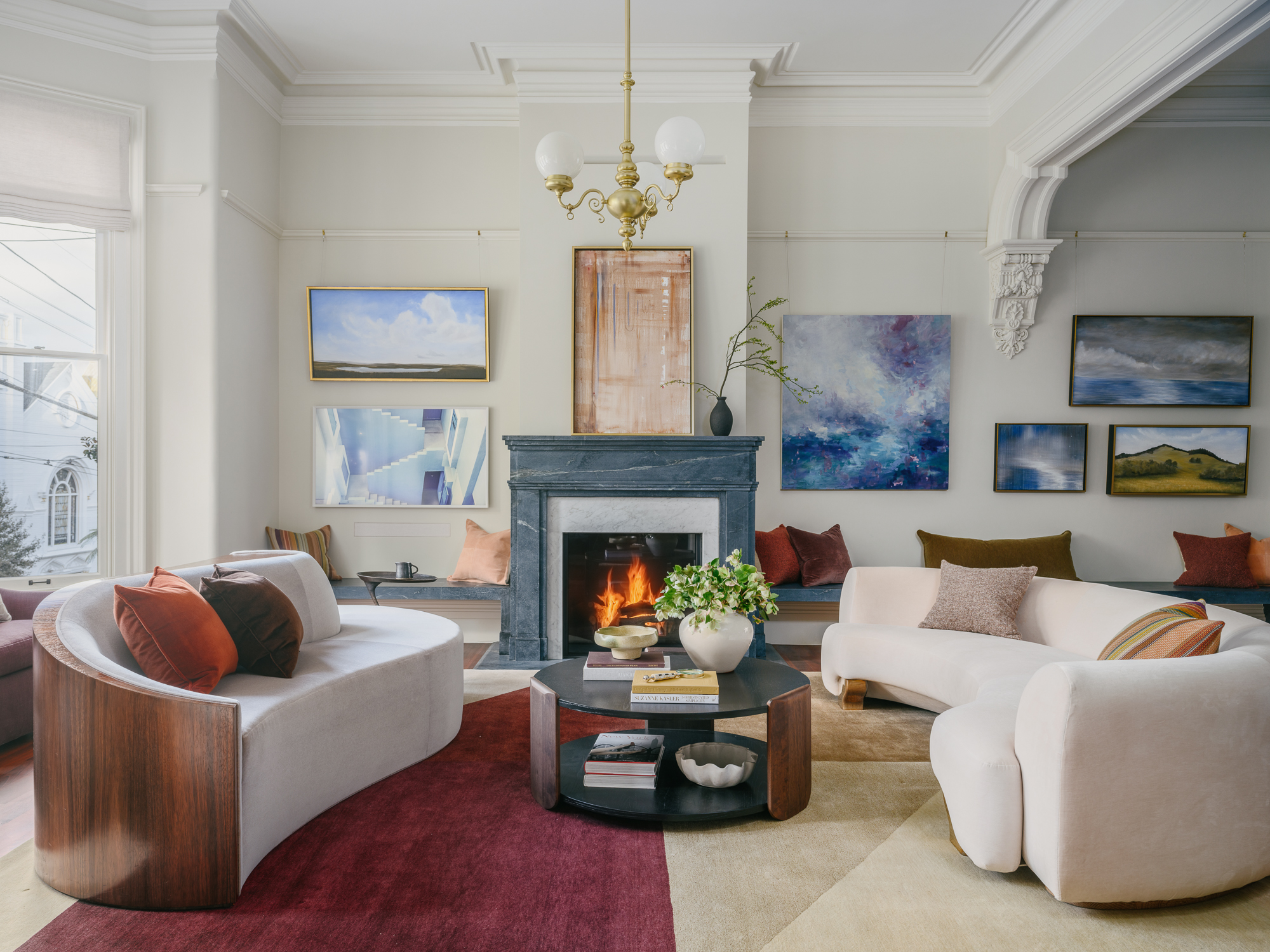
A true white could feel slightly clinical, but not a warm white. A more creamy tone, this is possibly the best white paint for interior walls. The color highlights different elements and tones, and makes a room feel warm and welcoming.
The Livingetc newsletters are your inside source for what’s shaping interiors now - and what’s next. Discover trend forecasts, smart style ideas, and curated shopping inspiration that brings design to life. Subscribe today and stay ahead of the curve.
'I absolutely love Farrow & Ball’s Shadow White Estate which is what we used here on the walls (architectural Trim: Farrow & Ball Slipper Satin),' says the Berkeley-based designer, Denise Hall Montgomery, founder of DHM Architecture. 'But it all depends on the context. My rule of thumb is access the light: If the daylight in the room is northern (cool) light, I might opt for a warmer shade of white than if the room has a southern exposure. Also, the wall, floor and ceiling colors in adjacent spaces inform which white as well. If the floor is a red oak, I would stay away from a pinkish white for risk of clashing with the rust-y undertones of the wood.'
'Choosing the right paint color for a living room is paramount to achieving the desired ambiance,' says Dara Huang of Dara Maison. 'I often find myself drawn to warm whites for this space. They offer a timeless elegance that can adapt to various design styles. Among the spectrum of warm whites, I'm currently enamored with Dulux 74073. This particular shade strikes the balance between a soothing, neutral backdrop and a touch of warmth, creating an inviting atmosphere that complements both contemporary and traditional interiors. Its versatility makes it an excellent choice for those seeking a light paint color that can stand the test of time, providing a serene backdrop for your living room's unique personality.'
4. Light Grey
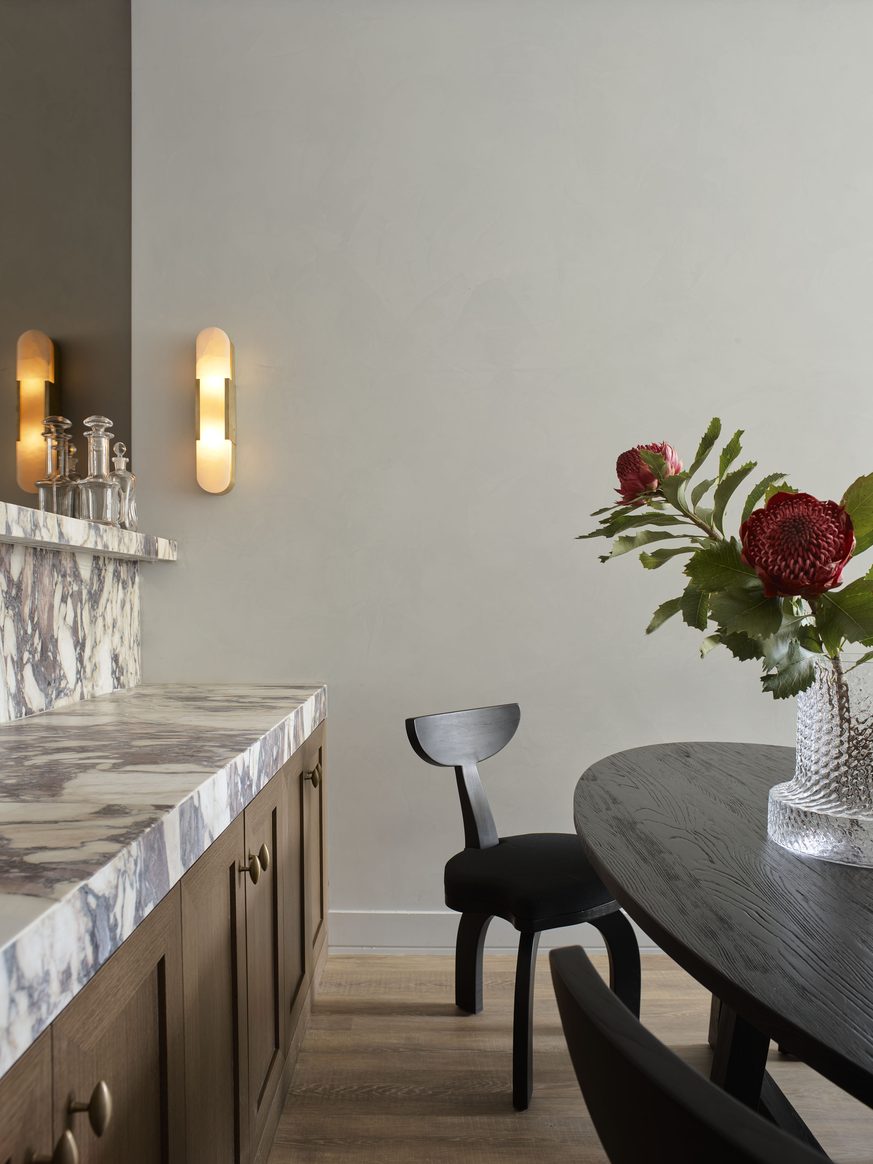
Grey is that quiet tone that has been the 'it' neutral for decades. In the right shade and undertone, the color can stand for style, sophistication and glamor. A grey with the yellow or brown undertone will give the room a more rooted appeal. Plus, many colors go with light grey, making it the perfect supporting tone for any type of color or texture layering.
'I love Sherwin Williams Drift of Mist in living rooms that receive a lot of golden natural light or evening sun,' says Lauren Sullivan of Well x Design. 'It’s a great cooler white with just a hint of grey that perfectly neutralizes these warmer tones.'
5. Light blue
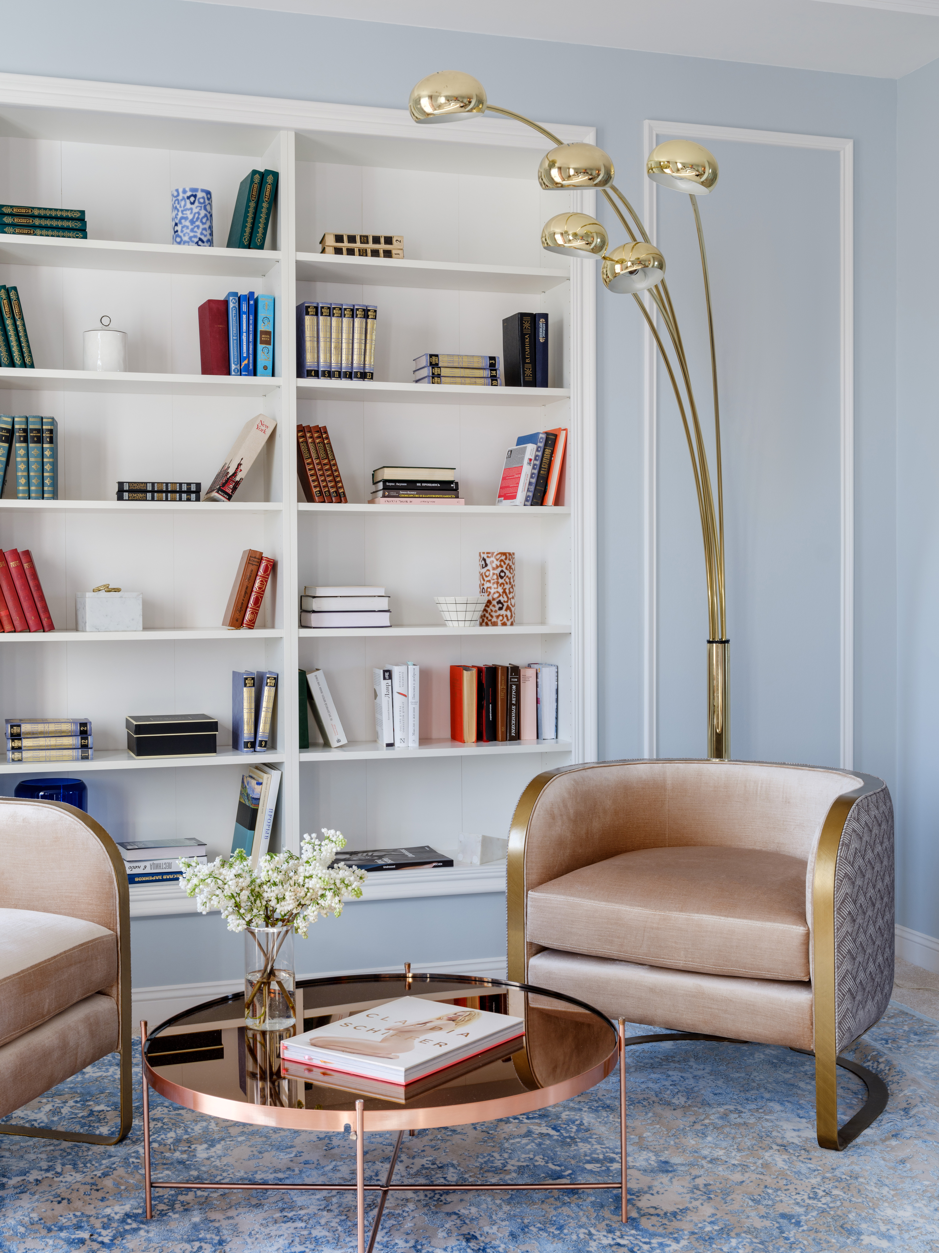
A classic decorating color that appeared in traditional motifs dating back thousands of years, the days of light, baby or pastel blue are here again. The color is calming and easy on the eye, and reminds one of the the outdoors and clear seas. And many colors go with light blue.
'Consider a soft, soft pastel shade of blue that can work very well for a beach-side holiday home or warm mountain colonial-style home,' says Nishita Kamdar, founder of Studio Nishita Kamdar. 'With interesting contrasting black styling elements with hints of gold and silver, you can make the combination work very well.'
3 light paint colors to buy

Aditi Sharma Maheshwari started her career at The Address (The Times of India), a tabloid on interiors and art. She wrote profiles of Indian artists, designers, and architects, and covered inspiring houses and commercial properties. After four years, she moved to ELLE DECOR as a senior features writer, where she contributed to the magazine and website, and also worked alongside the events team on India Design ID — the brand’s 10-day, annual design show. She wrote across topics: from designer interviews, and house tours, to new product launches, shopping pages, and reviews. After three years, she was hired as the senior editor at Houzz. The website content focused on practical advice on decorating the home and making design feel more approachable. She created fresh series on budget buys, design hacks, and DIYs, all backed with expert advice. Equipped with sizable knowledge of the industry and with a good network, she moved to Architectural Digest (Conde Nast) as the digital editor. The publication's focus was on high-end design, and her content highlighted A-listers, starchitects, and high-concept products, all customized for an audience that loves and invests in luxury. After a two-year stint, she moved to the UK and was hired at Livingetc as a design editor. She now freelances for a variety of interiors publications.


