'Try something different!' 5 ways interior designers are making their beds that instantly make a bedroom look elevated
Looking for a fresh way to style your bed? These five ways will create the ultimate pampering space
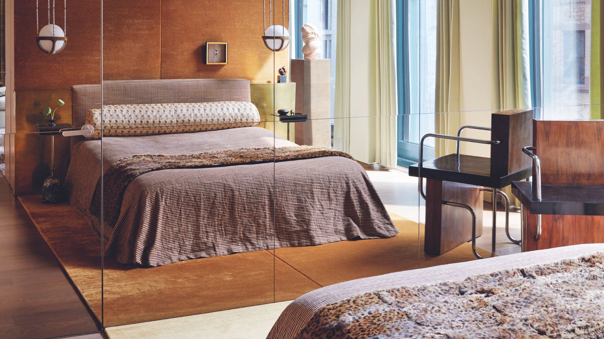

When it comes to dressing your bed, it's easy to get stuck in a standard routine. But thinking outside the box and going for a totally new look can help elevate your bedroom and give the whole room a total refresh.
Your bed is the focal point of the bedroom, so shake off your routine and unlock the bed's potential to be a stunning focal point. 'Every piece of fabric you use on your bedspread should be carefully considered,' says Jarvis Wong, principal of JARVISSTUDIO, who recently designed a range of family-friendly bedrooms at the tallest tower on Manhattan’s Upper West Side, 200 Amsterdam. 'Every fabric and pattern must convey that this is a comfortable and relaxing space.'
From clever ways to fold your sheets, to clever color-blocking tactics, to the way you arrange your pillows and cushions, these are our favorite ways to dress a bed in 2025, and surefire bedroom ideas to give your space a new lease of life.
1. Try the bolster look
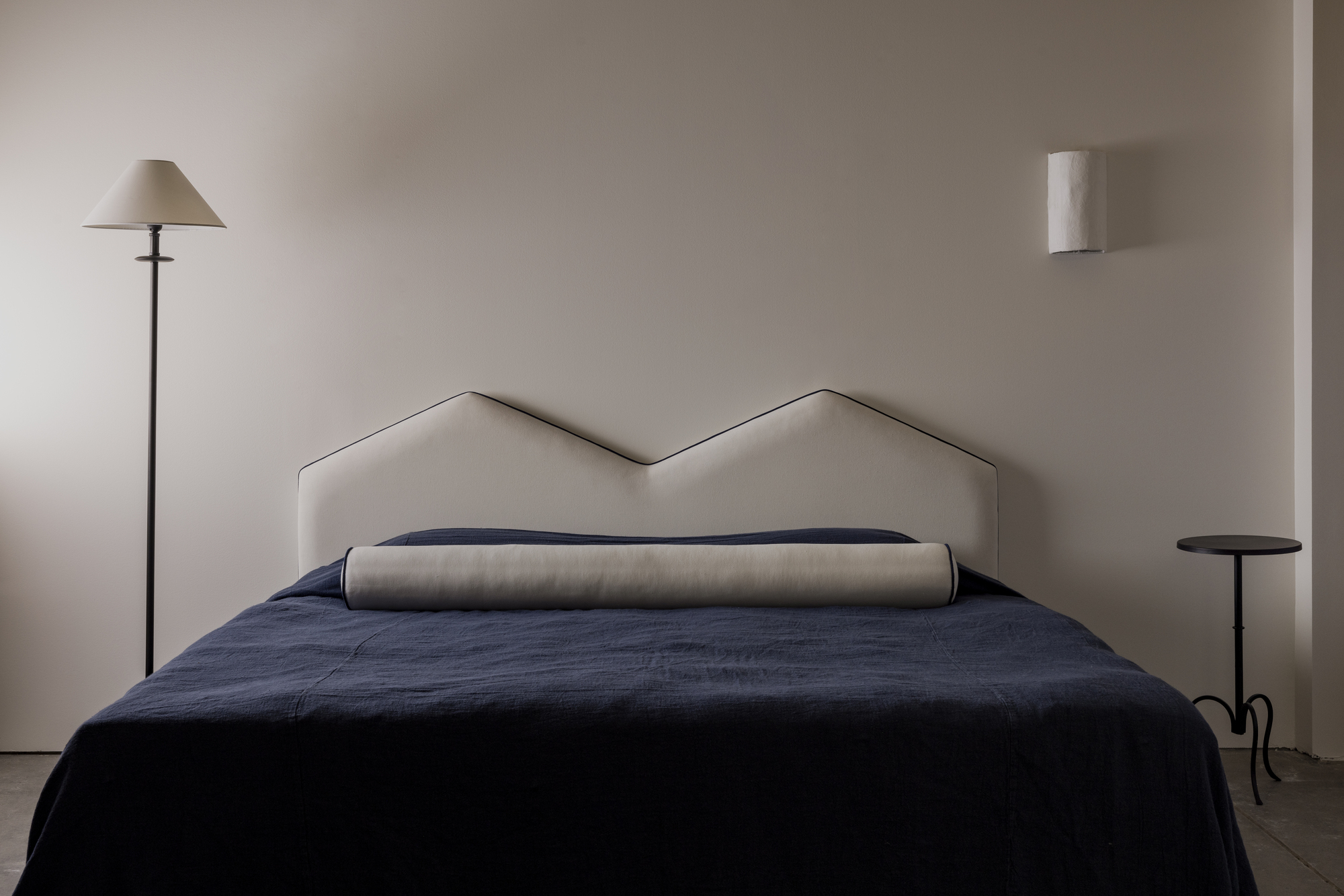
I've been shouting about this bed bolster trend for some time now, having seen more and more designers eschewing the standard square-shaped throw pillow look, replacing them with one single, elegant bolster.
It's super simple, can bring a calming, minimaluxe feel to a bedroom. Best of all, it turns the mundane task of making your bed into something that is super easy to achieve.
The bolster look works well when your bedding and the bolster pillow fabric blend together in terms of color and texture, but it's also a chance to play with contrast. Think thick stripes on your bedding paired with pinstripes on the pillow, or a subtle and gentle color clash like this from Australian furniture designer, Rachel Donath.
The bolster pillow can also work in place of a headboard too. In 2023, our furniture is becoming more and more low profile, so a bolster in place of headboard can fit with this trending aesthetic.
'The bolster pillow is very functional due to the extra long width, making it stable and neat,' says Danish textile designer, Helene Blanche. 'It is soft and comfortable and especially wonderful for a siesta or to function as a reading pillow.'
2. Or try one-piece bedding
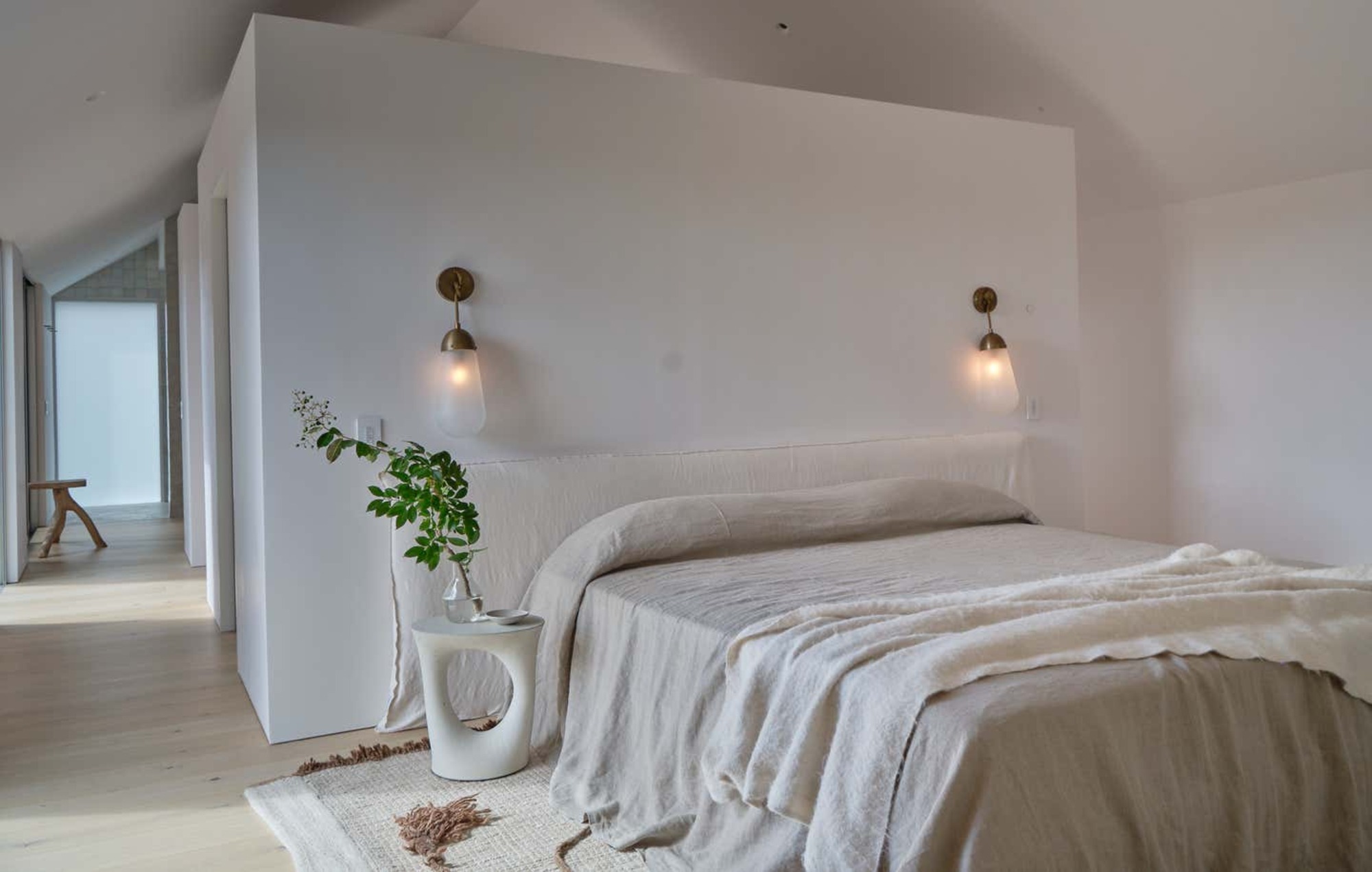
This example from Michael del Piero also uses the bolster look for an elegant bedhead, but it's the loose draping of the sheets that give this look its charm. This minimalist bed styling trend is also known as 'one-piece bedding', requiring little maintenance and delivering with a strong, minimalist aesthetic.
To create the look, use a large coverlet - a lightweight layer or blanket - as your top sheet, carefully placing it on the bed and allowing it to drape down the sides of the bed. It gives the feel of a cool Mediterranean bedroom, with lightweight sheets transporting you to sunnier climes.
Another great aspect of this style is that it's the perfect way to dress your bed between washes - especially with fabrics like linen, which loses its plumpness after one night's sleep. Instead of trying to plump up cushions that refuse to retain shape, this style embraces the creases and the imperfections, with a flat sheet creating a simple and calming bedroom.
3. Or go tucked in
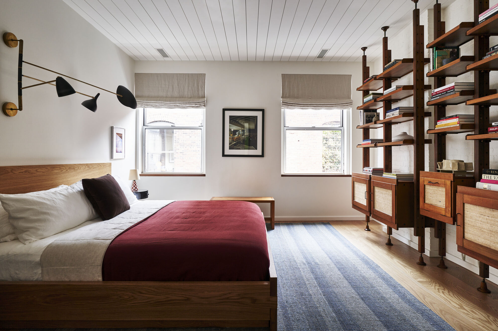
The antithesis to this long, draped look is this tucked-in style which I'm also seeing more and more of. If you're wondering how to style a bed like a hotel, and get that crisp hotel bedding look, this tucked-in style is for you.
It's also a great look if you have a stylish bed frame, perhaps with a distinctive texture that you want to show off. Tuck in your best bed sheets and throw blanket into the frame and keep things taut to perfectly emulate the look.
4. Try the 'sandwich' technique
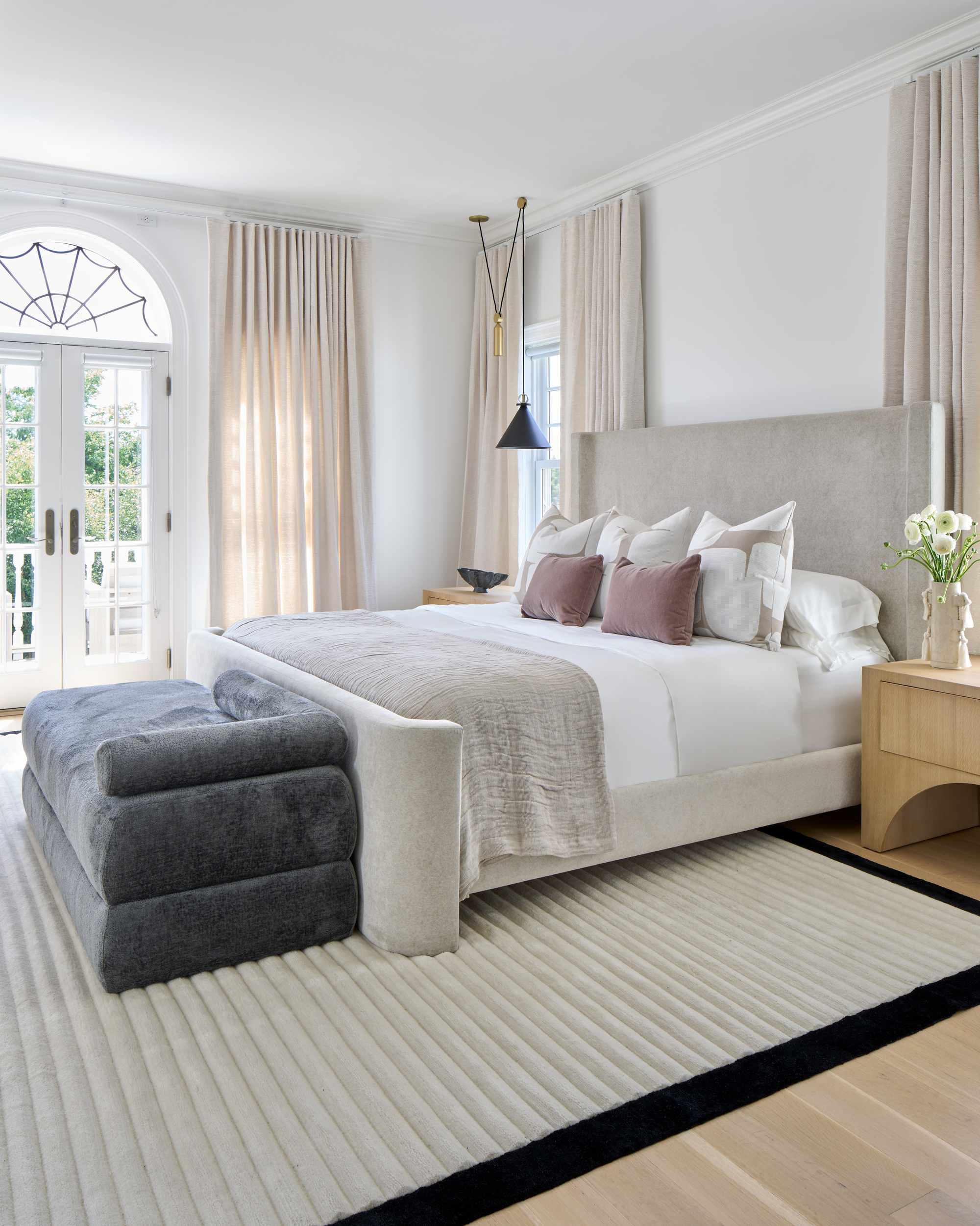
This bedroom design from Ali Budd Interiors exhibits the commonly used 'sandwich' technique, which is the look I've currently picked for my own bed. This look involves seeing your bed as a canvas and splitting it into thirds, cleverly color-blocking and using your duvet, a throw, and an underside of the duvet to split the bed into three distinctive textures and colors.
Using layers to create dimension is important to Jarvis Wong, principal of JARVISSTUDIO and designer of 200 Amsterdam. 'When you come home from work, you typically remove your layers. The same idea holds true for your bed – we tend to peel away the layers of our bed sheets before crawling in at the end of a long day. By adding layers, you ensure that a room doesn't feel flat or one-dimensional.'
Strategically arranging layers on a bed – think cozy bedroom mohair blankets that contrast against your linen or cotton sheets. It's all about creating a beautiful contrast and using your bed as a vehicle for a color palette.
5. Go symmetrical
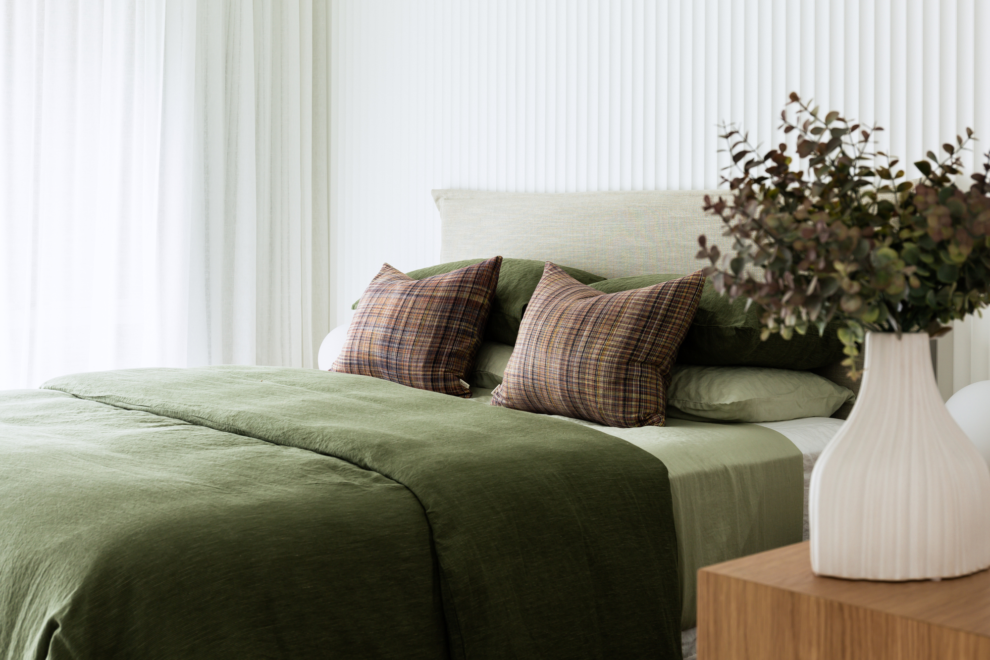
If in doubt, go for a symmetrical format and the design will inevitably follow. For the global brand, Soho House, every bedroom design follows the same symmetrical format. 'We dress each bed with three medium, square pillows along the back, against the headboard,' says lead designer at Soho House, Severine Lammoglia. 'Two large, firm pillows are layered in the middle, with two medium, long pillows at the front. Add a few decorative cushions, preferably with a patterned fabric, trim or some detail. Then, at the end of the bed, we always have a throw for an extra layer.'
When ordering your throw pillows, order them in height order on each side of the bed, with the smaller at the front so you can admire all styles of pillow on display. You can also lay two pillows flat with one of top of the other, instead of upright, with two pillows in front, as per this example by Twill Interiors.
As long as the look is symmetrical, it should come together pleasingly. But don't overdo it, warns Jarvis 'It's important to know when to stop and strike a balance,' says Julian, so be wary not to go for too many pillows and layers.'
‘Simplicity rules in 2023,' adds Nadia Watts of Nadia Watts Interior Design. 'Eliminate the extras, but just make sure what you keep has some scale to it. This will look modern, simple, and elegant all at the same time.'
Balance your use of color too. 'The master and another of the guest bedrooms both used a shade of green that was hand-picked from the artworks and paired with white,' says Jacqui Mitchell of Twill Interiors. 'The combo of green duvet, with a crisp white sheet set perfectly achieve that balance.'
Be The First To Know
The Livingetc newsletters are your inside source for what’s shaping interiors now - and what’s next. Discover trend forecasts, smart style ideas, and curated shopping inspiration that brings design to life. Subscribe today and stay ahead of the curve.

Former content editor at Livingetc.com, Oonagh is an expert at spotting the interior trends that are making waves in the design world. She has written a mix of everything from home tours to news, long-form features to design idea pieces, as well as having frequently been featured in the monthly print magazine. She is the go-to for design advice in the home. Previously, she worked on a London property title, producing long-read interiors features, style pages and conducting interviews with a range of famous faces from the UK interiors scene, from Kit Kemp to Robert Kime. In doing so, she has developed a keen interest in London's historical architecture and the city's distinct tastemakers paving the way in the world of interiors.
-
 These Are the Flower Crowns I’m Wearing This Spring (Spoiler: They’re Actually for My Door)
Coachella confirmed the comeback of flower crowns. At home, they just go by another name: the spring wreath
By Julia Demer
-
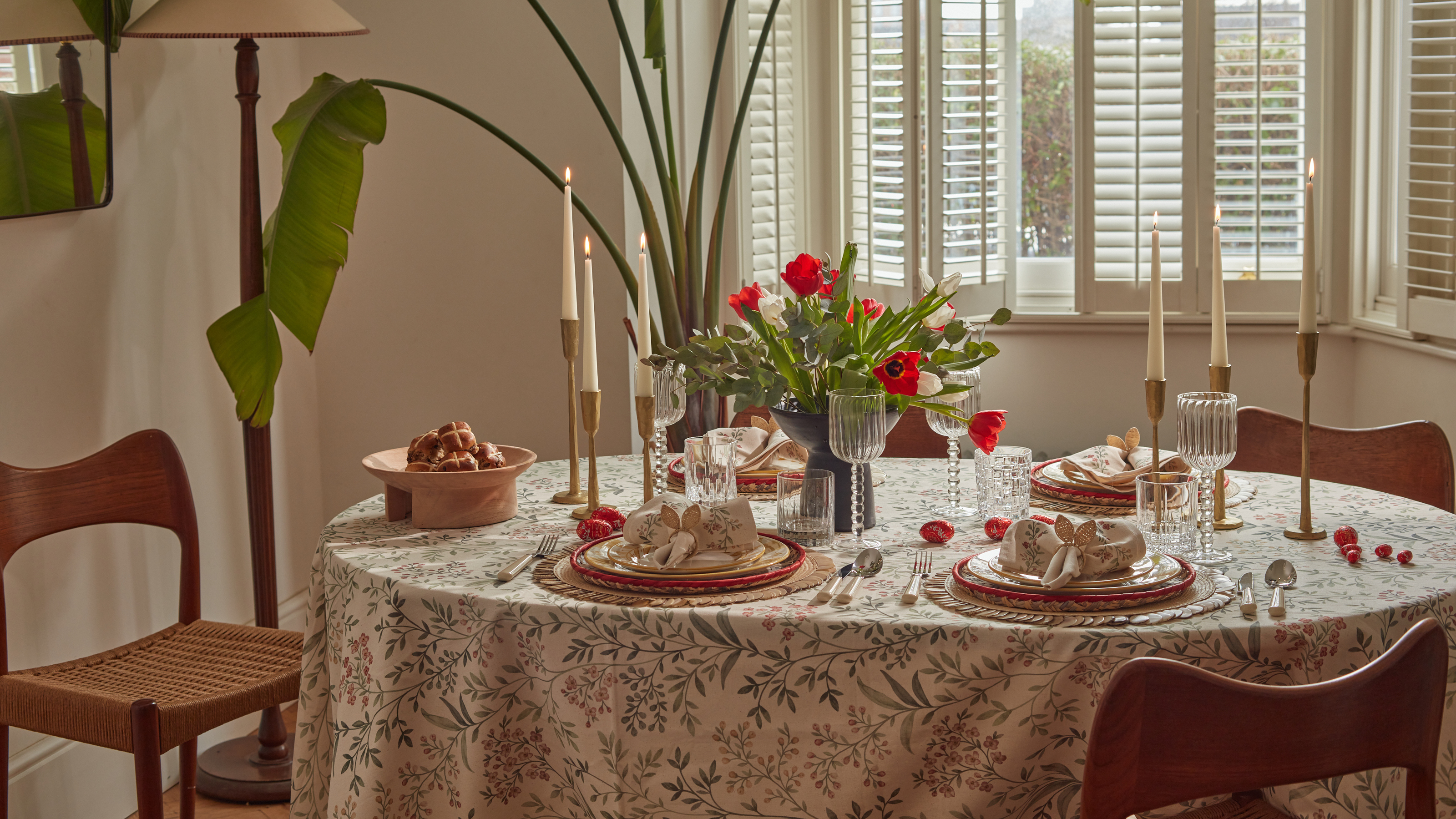 Bunny Ears, Be Gone — 7 Easter Table Styling Mistakes That Will Take Your Setting from Tawdry to Tasteful
From fussy floral displays that disrupt conversation to over-relying on tacky tropes, don't fall victim to these errors when decorating your Easter table
By Lilith Hudson
