How to Design a Black and White Kids Room That's Surprisingly Chic, While Never Feeling Boring
A monochromatic color scheme is pretty timeless, and sophisticated enough for parents to enjoy too — but that doesn't mean black and white rooms can't be fun for the kids as well


A black and white kid's bedroom can be a strong and steady scheme to go with right from the very beginning.
As a kids' room idea, it's easily adaptable as the child grows, and there are endless ways to tweak a design like this. However, a monochromatic palette doesn't necessarily mean every single item or finish in the room is black or white, but it’s a great place to start and can be good fun to apply to whatever space you have, playing with shapes, layers, shades, pattern and more.
In the right hands, it can be every bit as exciting as using lots of color. Read on to learn the different avenues of how to craft a cohesive monochrome space.
1. Begin with a particular focus
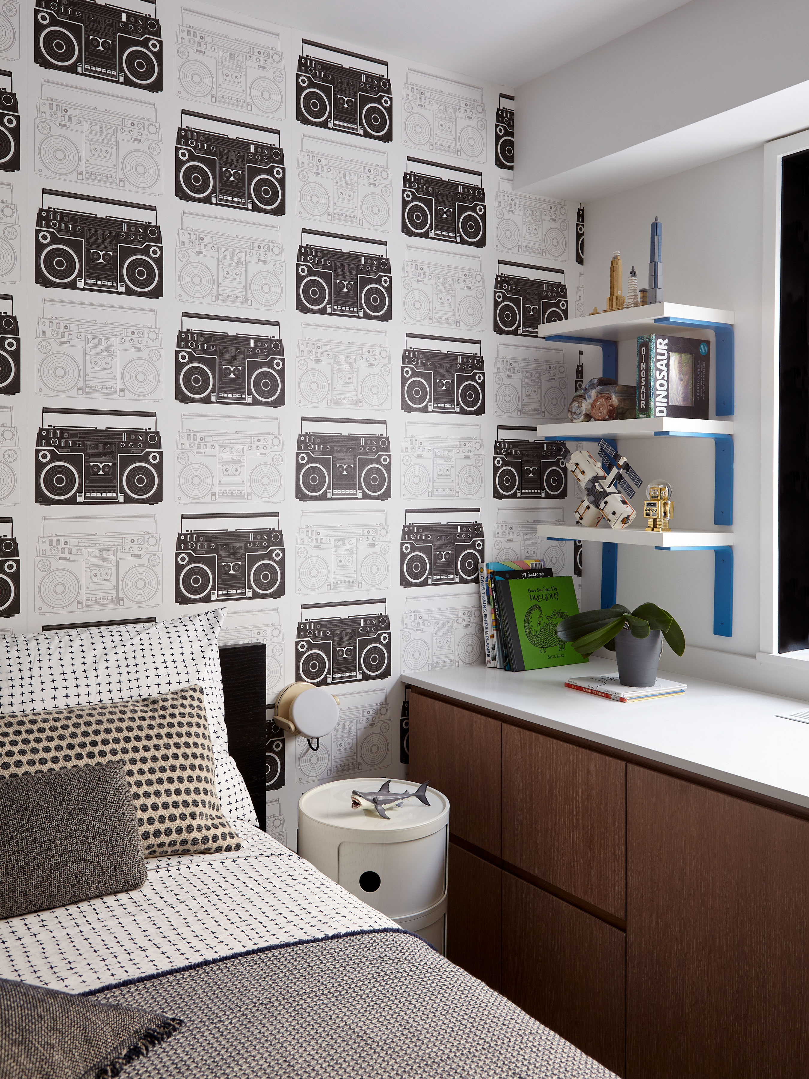
When beginning a design journey with black and white, you’ll need to find your main focus that leads the way. You may have already found a certain piece that’s led you here, but if not, look for something on a bigger scale such as wallpaper, mural or a large rug.
Interior designer Annie Leslau explains how she began this design based on some kid's room wall decor: "I knew one element needed to be the star of the show and everything else had to fall subtly into place alongside it, so we selected the graphic wallpaper first and then made all other selections around it."
Once the focal point is chosen, you can start to slowly purchase more, sticking to the goal and picturing how all the different pieces will complement each other.
2. Play with pattern, shades, scale and texture
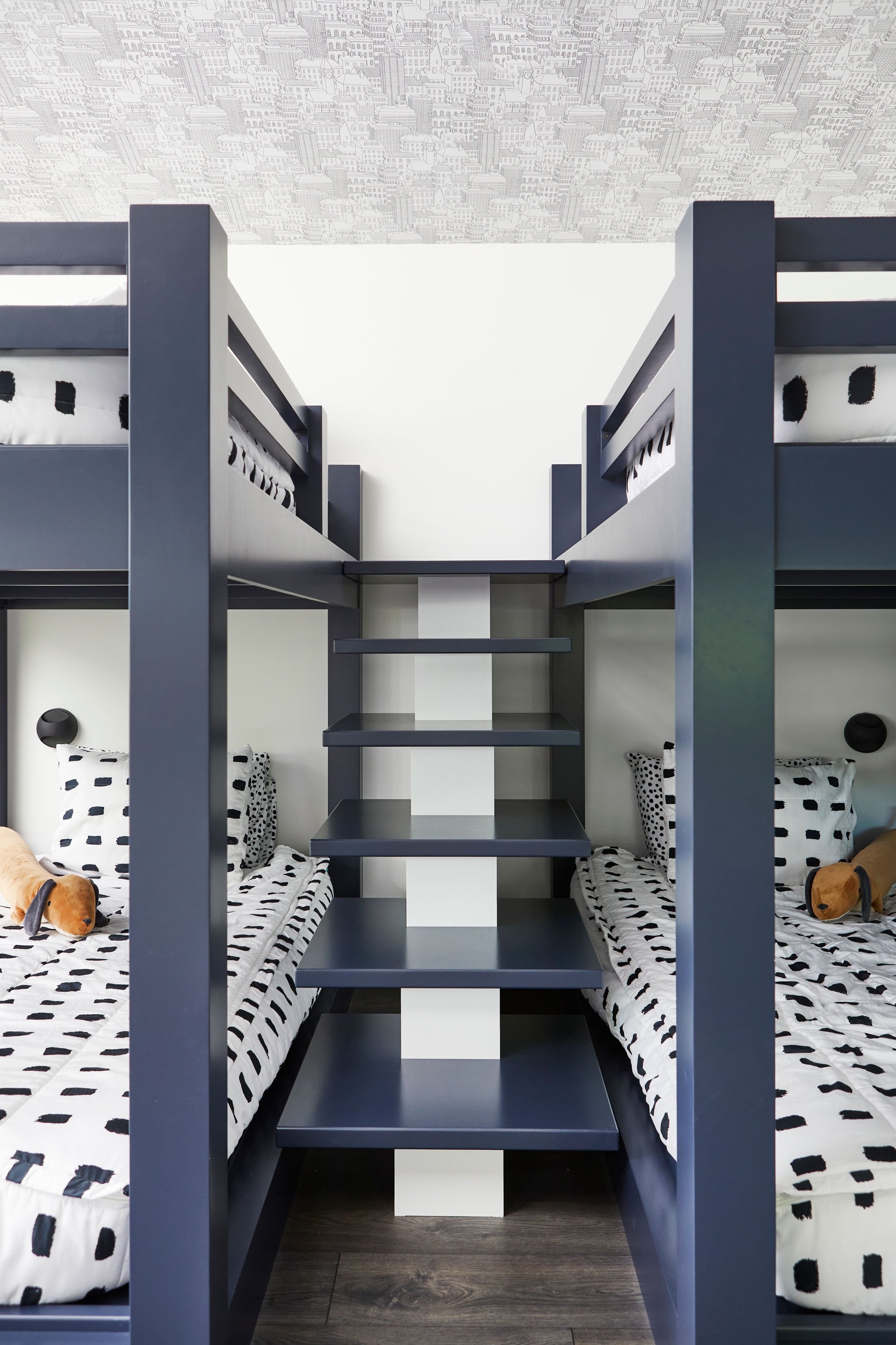
Working with the space you have is what brings the uniqueness and interest. Whether it’s an attic bedroom with cozy, dark corners, or a totally white room with windows framed in black: "The great thing about black and white is that you can incorporate any style, patterning or texture you desire without it becoming overwhelming," reassures interior designer Breegan Jane. Allow yourself to be drawn to unusually distinctive finishes to give your room some depth.
In this design by Toronto-based Studio P Interiors, a larger scale of pattern on the kid's bedding creates an interesting contrast with the smaller print of the ceiling wallpaper idea.
3. Experiment with light, depth, and contrast

When choosing colors, don't forget you can get warm and cool undertones. Every kid's bedroom needs a feeling of warmth, comfort and coziness and a warm off white will contrast, yet still pair nicely with black and go easily alongside other materials to hone in on that feeling of comfort.
You’ll also need to take into consideration the amount of natural light the room gets. "I picked a black and white layout, but I had white walls and a great deal of natural light available, which allowed the room to not feel closed in," says Breegan. "You could make similar choices in the opposite direction and lean into the darker tones to create a more cavernous space if you have less natural light."
The light can influence the perception of the colors you choose, "Don't hesitate to experiment with different shades. Monochrome is a fine-tuned balancing act often based on trial and error," says children’s interior designer and founder of Eklektik Studio, Joanna Landais.
4. Incorporate other materials to create a warm atmosphere

Using of an array of materials will immediately soften a space, even when they are black and white. "A successful monochrome look involves not only incorporating various shades but also playing with different textures and materials within the same color family, such as velvet, leather, or fabric," explains Joanna. The tactility helps to create the feeling of a safe and comfortable space, whilst also adding level of interest and layers. How to do this? Think layers of bedding such as duvet cover, comforter, throw cushions, as well as rugs, window dressings, and lampshades — with each of these being a different material version of black and white, some patterned and some more neutral, the layers will begin to overlap and work together. Be creative — you could even paint an area with chalkboard paint and let the kids decorate that section.
Don’t forget large areas such as flooring, or big pieces of furniture. You’ll most likely need to introduce some natural materials like wood, cane, rattan and metals. These will all assist in creating the feeling of comfort we crave when escaping to our bedrooms. However, too much on one surface area will take focus from a black and white scheme and begin to compete, so have a rug at the ready to break things up! On the other hand: WMetal accents are appropriate and hard to overuse in most monochromatic designs," says Breegan, but stick with the warmer finishes for a softer ambiance.
5. Accent colors
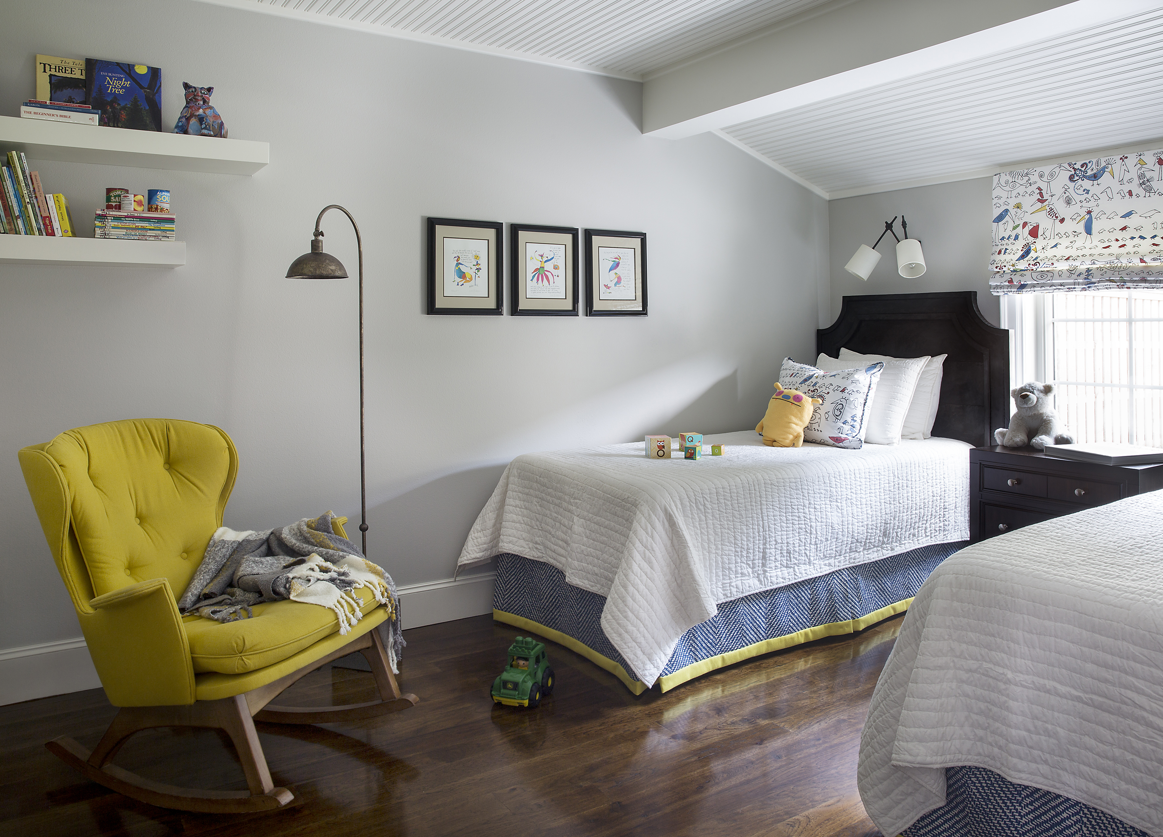
A black and white environment is a great base to inject accent color or two. It will elevate the accent color to another level, rather than allowing it to get lost amongst other things. Find an accent color by pulling it from elsewhere in the design to ensure a good connection with the rest of the room. You can apply this with a piece of furniture, artwork, or simply through paint.
There are endless ways to create a harmonious balance of black and white, and you can take it as far as you like — it’s still neutral enough that as the child grows up, any necessary changes won’t be too drastic. So, roll with it, be playful, and enjoy creating a space for childhood memories!
Be The First To Know
The Livingetc newsletters are your inside source for what’s shaping interiors now - and what’s next. Discover trend forecasts, smart style ideas, and curated shopping inspiration that brings design to life. Subscribe today and stay ahead of the curve.

Portia Carroll is an interior stylist, writer, and design consultant. With a background in interior architecture and design, she has a plethora of creative experience in the industry working with high end interior brands to capture beautiful spaces and products and enhance their qualities.
-
 The 'New British' Style? This Victorian London Home Embraces Its Owners' Global Background
Warm timber details, confident color pops, and an uninterrupted connection to the garden are the hallmarks of this relaxed yet design-forward family home
By Emma J Page
-
 Muji Living Room Ideas — 5 Ways to Harness The Calming Qualities of This Japanese Design Style
Inspired by Japanese "zen" principles, Muji living rooms are all about cultivating a calming, tranquil space that nourishes the soul
By Lilith Hudson