

It's not every day you come across a new color, or rather a velvety blend of familiar favorites that makes you rethink your perception of color completely, but that was the case when I first saw this not-quite-brown-but-not-really-orange shade.
The color black-orange sits somewhere between red, brown, and orange with a subtle black undertone. According to Livingetc's color expert, Amy Moorea Wong, it should never be called brown, though. "It is so much more," she says. "Think of it as brown’s warmer, more personality-filled cousin — it’s something you’d find somewhere on a tiger’s coat, in the embers of a hearth, or within deliciously rusty metal."
The more you understand the nuance of this color, the more you'll start to notice its prominence in the design world. Black-orange is terracotta but with a bit more soul. It's burnt orange with a more fashionable edge. It's mocha-brown with a bit more mystery. And it's the new color trend that should be on your radar right now.

Black-orange has texture and depth to its undertones.
My first encounter with the color was through an Instagram video by US paint brand, Tonester. It feels close to so many other cozy paint colors I've seen, but somehow has this mysteriously sophisticated and luxurious edge to it.
"Unlike traditional design approaches that lean on standard beiges, whites, and grays, we focus on deeply saturated colors that make an impact in a space," paint expert, designer, and founder of Tonester, Tony Piloseno tells me. "Our curated selection of deep hues also includes Black-Violet (High at the Gala), Black-Blue (Wilshire), and Black-Teal (Opium)."
But the one that's captured my attention, their Black-Orange shade, is a rich fusion of black, maroon, and red pigments, that Tony describes as "a gothic, orange-toned brown with remarkable depth." Unsurprisingly, it's one of the brand's best-selling colors, and complement changes the game when it comes to decorating with orange.

Tony Piloseno first gained traction online by sharing videos of the paint-mixing process. It resonated with viewers and many of his videos quickly went viral, after which, Tony decided to start his own business, Tonester Paints. Today, the company ships thousands of gallons of paint across the country and is opening its first retail location in Orlando, Florida.

Price: £42/one quart

Price: £5.50/sample

Price: £3.50/sample
Though some iterations may feel like they belong to a brown color palette, the inventiveness of this pigment lies in its uniqueness. You must let yourself be unconfined by typical color boundaries and labels to fully indulge in what this hue really has to offer.
"The biggest way black-orange differs from brown is hidden right there in its name — it’s the presence of pigmented, spicy, orange," explains Amy Moorea Wong. "Adding a touch of tangerine fills the brown-like-but-not-brown shade with heat and richness, imbuing it with an earthy and energetic ambiance."
The hue also reflects more light than a classic brown. When used in a room that has plenty of natural light, black-orange will seemingly glow from within — "the injection of orange adding a richer, more uplifting, and playful feel," says Amy.
Black-orange is a total shape-shifter and will adapt depending on where it is used in your interiors, too. "In low-light spaces, it leans towards a deep, warm brown, exuding richness and sophistication," says Tony. "Under natural light, its orange undertones come alive, revealing a dynamic and dramatic warmth."

Amy Moorea Wong is Livingetc's color expert. She is a color authority and interior design writer who has specialized in all things decorating for over a decade, and has a contemporary interior design book Kaleidoscope: Modern Homes in Every Colour. Amy has a fiery way of describing and understanding color bringing to light a new way of grasping the color wheel.

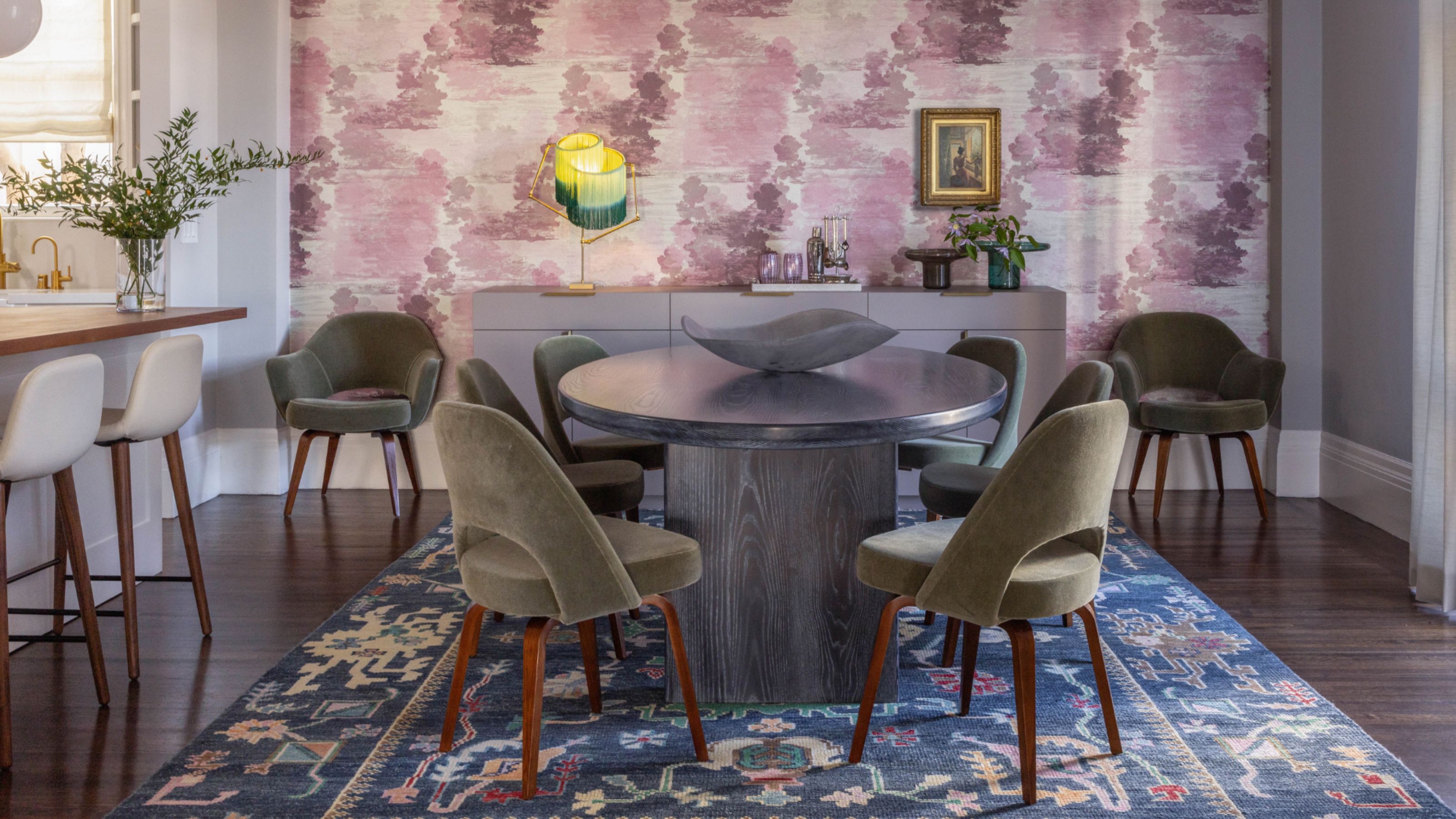
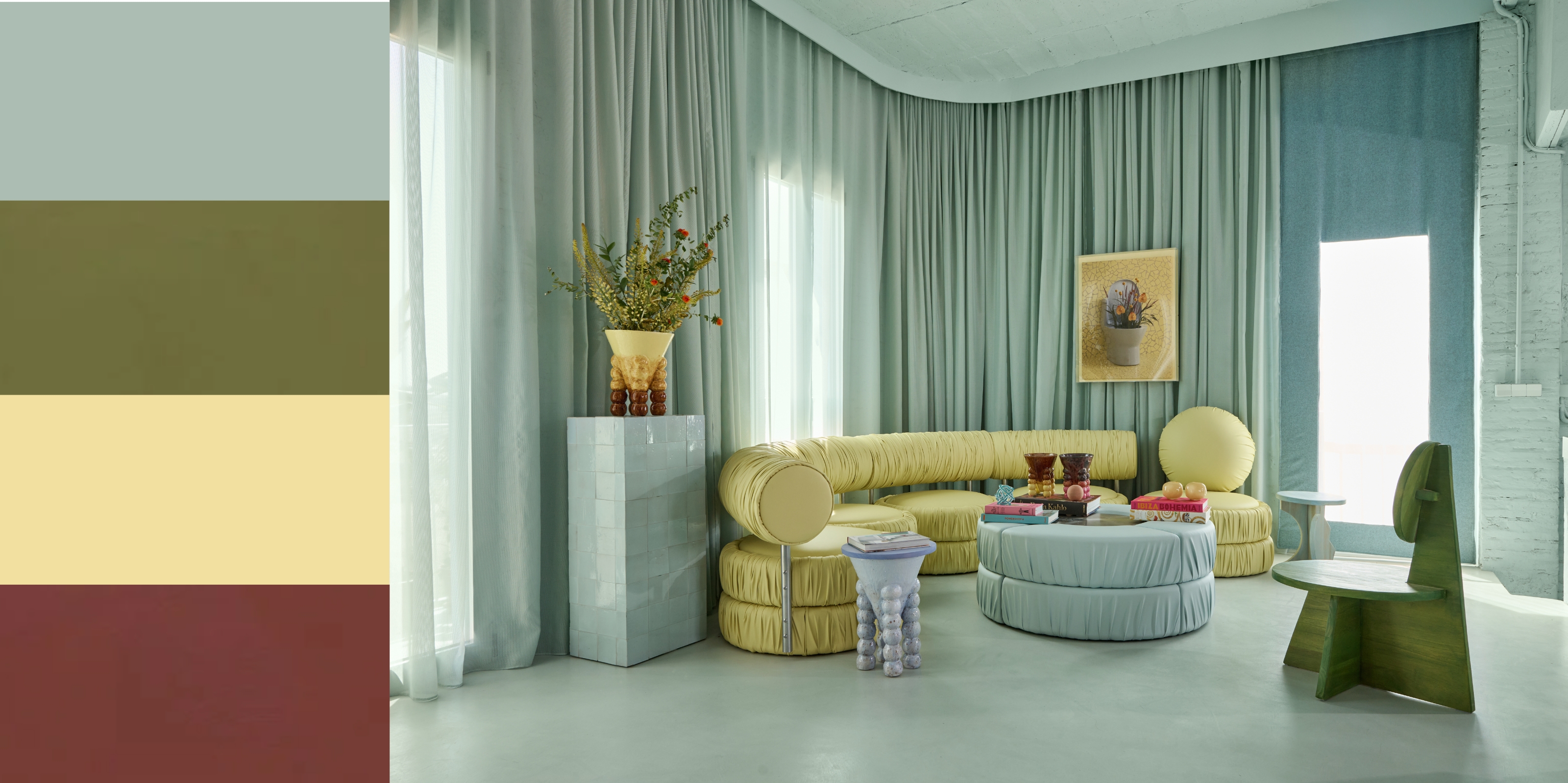
Here you can see how light affects this black-orange shade on the wall. The blue upholstery provides an elegant complement.
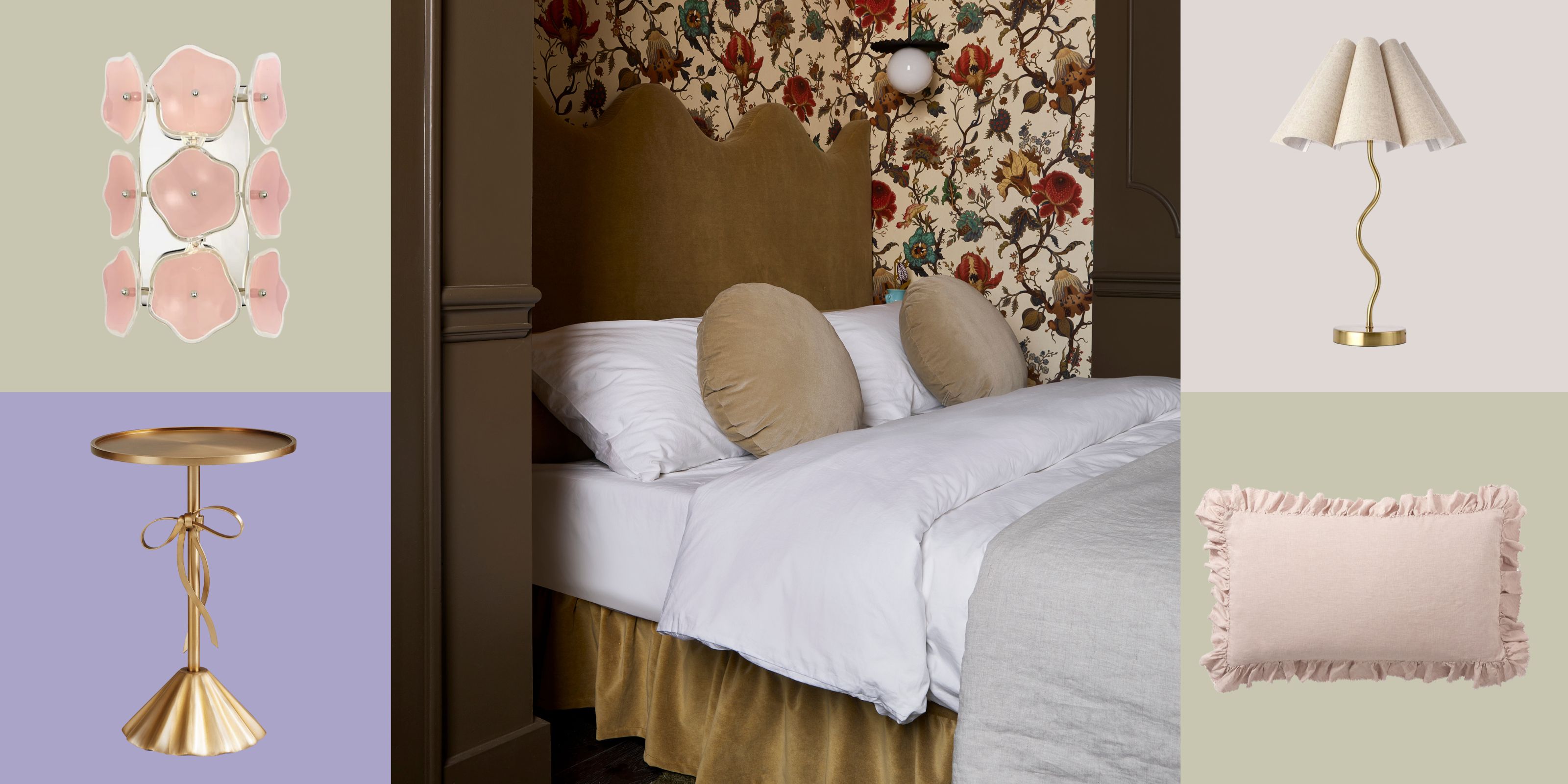
So how and where can you use this brown-y black-orange hybrid? In the home, black-orange is all about creating spaces that feel cozy and cocooned. "Try it as a bedroom color idea for instant wrap-around warmth, creating a space that’s snug and secure — the quietly vibrant color powerful yet gentle enough on the eyes for soothing a sleep," says Amy.
This color indeed thrives in intimate settings like bedrooms, offices, and bathrooms, where it creates a moody, enveloping atmosphere. However, you can't ignore the powerful undertones of black-orange, either. While it would act as a great contrast to more minimalist palettes — Benjamin Moore's Swiss Coffee paint color comes to mind — black-orange also "brings a bold, dramatic energy — perfect for high-impact, avant-garde design statements," says Tony.
He recommends pairing it "with deep jewel tones, rich textures, or chrome-metallic accents to enhance its gothic elegance." Cool blues or even a dark navy, (like Benjamin Moore's Hale Navy) would pair well because of their complementary positions on the color wheel.
Alternatively, black-orange can be used as accent pieces rather than to completely coat the walls. Try a sofa or throw pillow in the shade to add ultimate luxe to a living room or bedroom — not to mention a sophisticated 70s vibe.
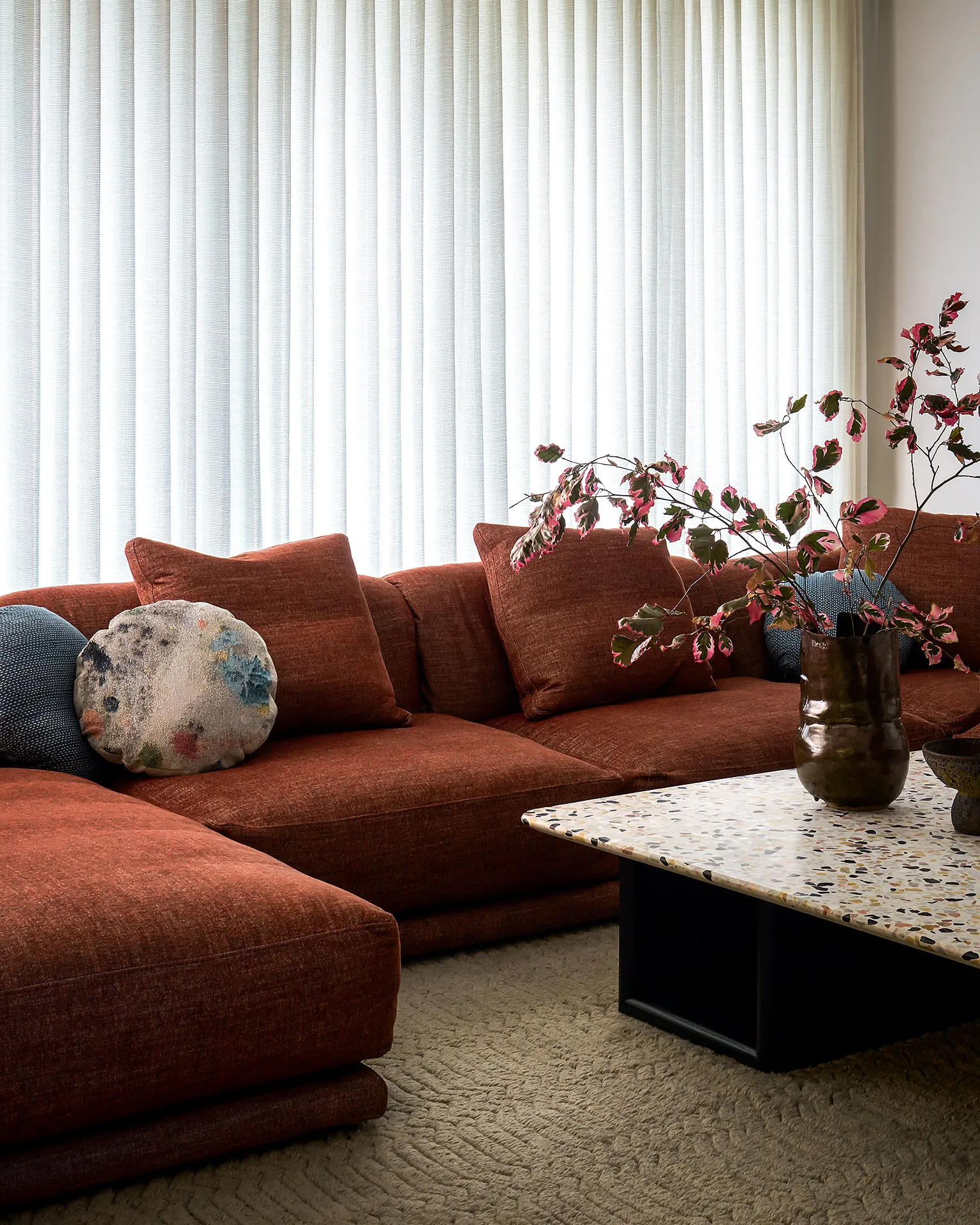
This rich velvety black-orange sofa transforms this otherwise neutral space, filling it with a sense of warmth.
This color proves that what we think we know when it comes to colors shouldn't feel limited to rules and theories. Black-orange is an example of how you can find ways to be experimental and creative in your home design, and when you do, it can pay off in spades.

-
 5 Bathroom Layouts That Look Dated in 2025 — Plus the Alternatives Designers Use Instead for a More Contemporary Space
For a bathroom that feels in line with the times, avoid these layouts and be more intentional with the placement and positioning of your features and fixtures
-
 Why Decorating With Mustard Yellow Helps Fill Your Interiors With a Sense of "Confident Calm"
There is so much more to decorating with this turmeric-tinted sauce-wiggled-on-a-hotdog not-quite-yellow shade than meets the eye


-
 The Combination You Weren't Expecting to Love — 8 Blue And Orange Living Room Ideas That Feel Surprisingly Elevated
A blue and orange scheme for living rooms may sound jarring, but these spaces prove they're striking, vibrant, and certainly unforgettable
-
 Smeg Says Teal, and We’re Listening — The Kitchen Shade of the Year Is Here
Designers are already using the soft, sea-glass green everywhere from cabinetry to countertops
-
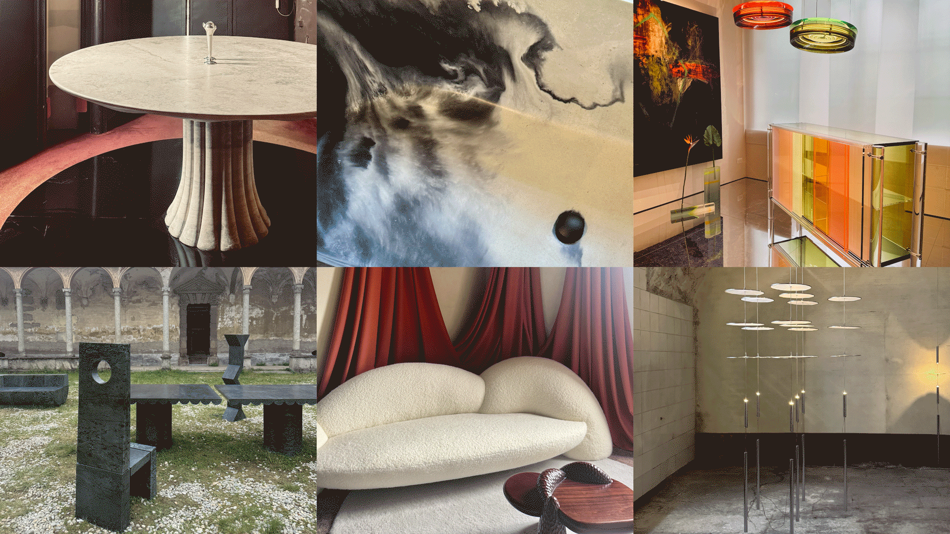 Straight from Salone: 5 Emerging Trends I Found in Milan That'll Shape Interiors for the Year Ahead
From reflective silver to fluidity, here's my perspective on the key themes and new moods coming through from Milan Design Week
-
 Do Yellow and Purple Go Together? Designers Reveal How to Make This Unexpected Pairing Feel "Totally Intentional"
In an era where unexpected combinations have become cool, we've done a deep-dive to discover how to pair yellow and purple in a space
-
 5 Unexpected but Seriously Stylish Spring Color Palettes to Shake Up the Season — "It's Pastel, but Punchy"
Spring color palettes are notorious for their use of pretty pastels, but that doesn't mean they have to lack variation
-
 The 'Red Table Trick' Is the Easiest and Most Expensive-Looking Trend to Hit 2025 So Far
A red dining table makes a seriously stylish statement; the beloved pop of red trend just got an bold and expensive-looking upgrade
-
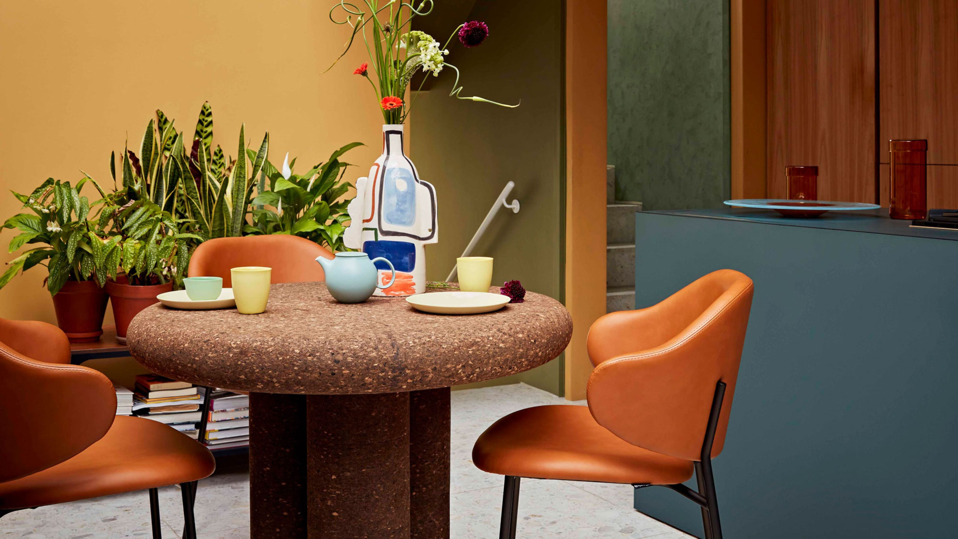 Cork Is the Cool, Sustainable, and Surprisingly Chic Material We Can't Stop Furnishing With Right Now
In honor of Earth Month, we’re toasting to cork... furniture, that is
-
 The Coquette Aesthetic Is Still Going Strong in Homes in 2025 — But Now It's Charming, Whimsical, and Has Modern Flair
A designer weighs in on how you can make the classic coquette trend feel modern while still retaining its whimsical elegance


