The Combination You Weren't Expecting to Love — 8 Blue And Orange Living Room Ideas That Feel Surprisingly Elevated
A blue and orange scheme for rooms may sound jarring, but these spaces prove they're striking, vibrant, and certainly unforgettable
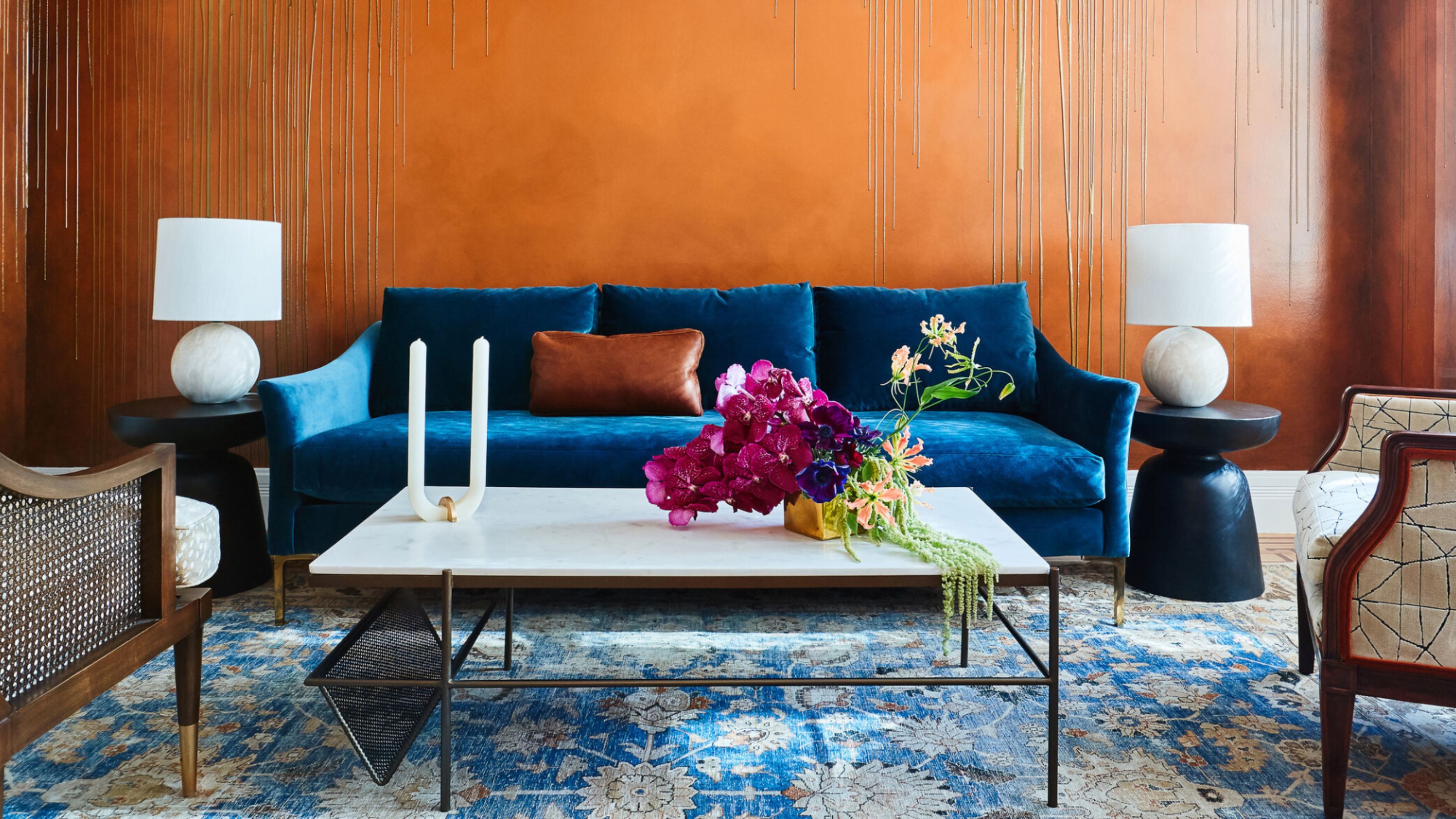

If you're searching for one of the most lively color combinations, a blue and orange scheme for your room makes for a highly desirable choice. Fun and inviting, but also rich and dramatic, there are many faces to this vibrant pairing, it's unsurprising that it's a go-to for designers.
"I have long loved blues and oranges together as they exist on opposite sides of the color wheel," explains designer Noz Nozawa. "These colors paired are once harmonious and contrasting." With a flurry of shades, tones, and tints to play with across both hues, layering this primary and secondary color can be transformative anywhere in the home, but especially in convivial space like the living room.
Classical, modern, and even minimal decorators needn't shy away from this punchy and colorful living room idea, and here are eight interior designer-styled spaces that show you why.
1. All Enveloping Orange And Peacock Blue
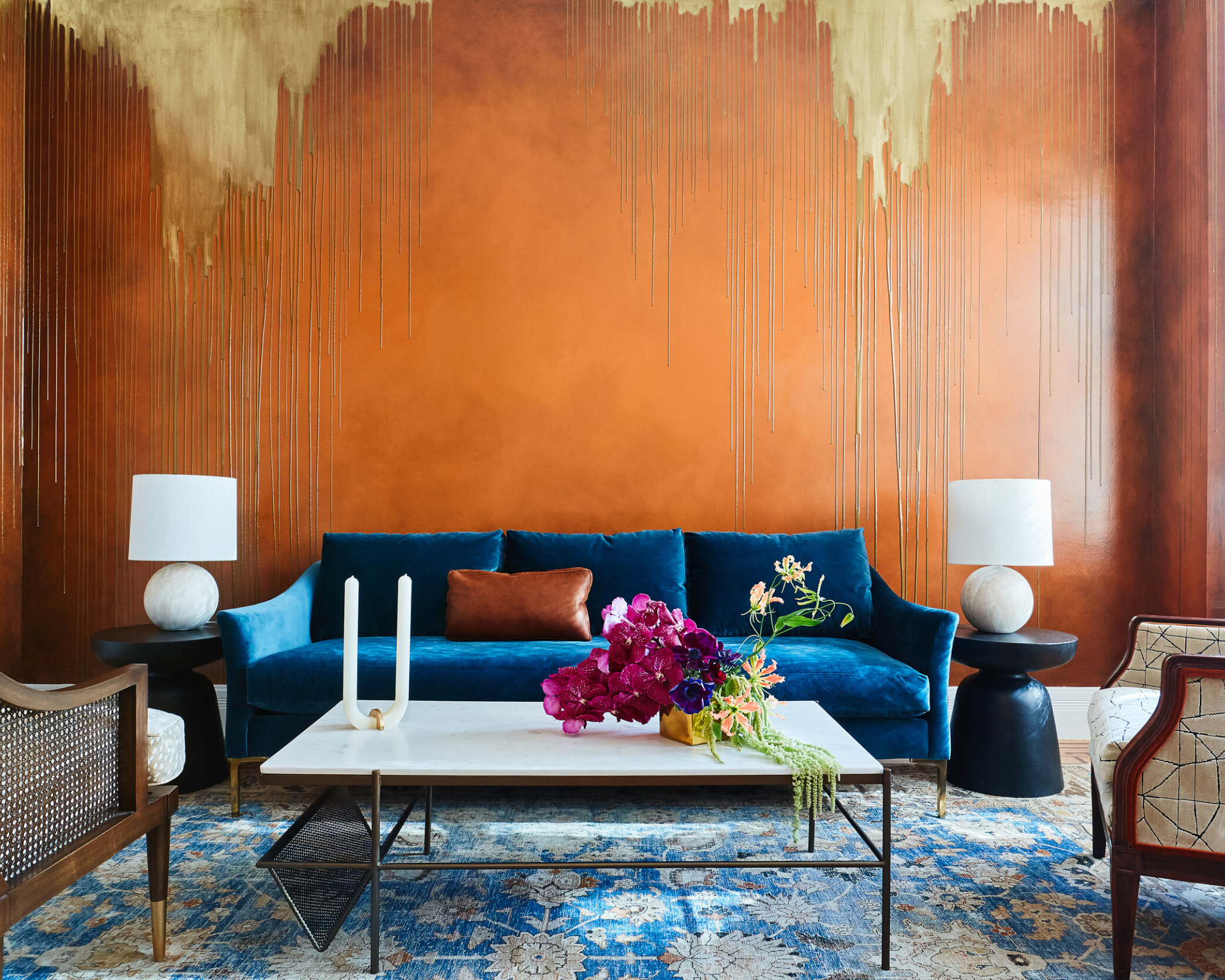
As opposite colors, blue and orange color schemes create a energizing, uplifting feel.
For a welcoming finish that still comes across as effortless, Noz Design shows us how to work this duo by color drenching.
"The peacock blue and orange are collaborators in creating the overall mood of the living room," explains Noz Nozawa, principal designer. "I wanted the colors together but as separate entities, so the orange remains on the walls, and the blue stays on the furniture — I didn't want to add orange pillows or blue wall art to make the colors feel overly coordinated."
The homeowners wanted an enveloping, inviting, and "moody" space, so for that, Noz explains that she, "chose seating in silhouettes that are familiar and inviting, while allowing the walls to be the primary visual interest."
Vibe achieved — all without being overbearing, containing each color to separate entities rather than completely covering the room in both at once. "I think the pairing brings a lot of energy to the space," says Noz. "In general, I think saturating all the walls of a room in a rich hue is so enveloping and transformative."

Noz Nozawa is the founder of Noz Design, a San Francisco-based studio with a fearless style and colorful approach to interiors. Noz's talent for creating artistic and highly personal spaces that spark joy in clients has earned her vibrant projects recognition across the country, as well as industry accolades.
2. Pair Dark Ochre and a Moodier Blue
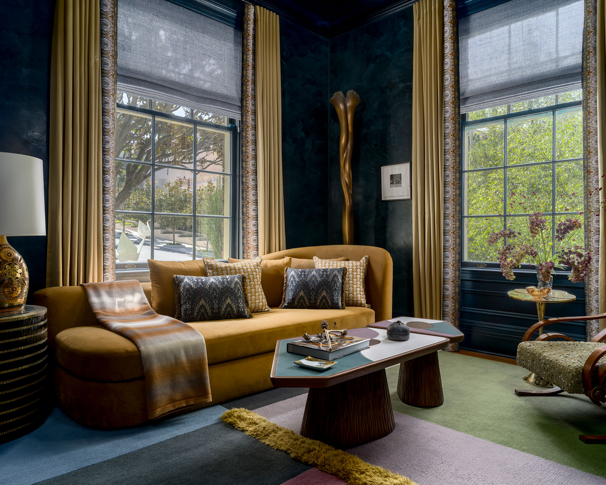
Blue and orange can also be paired to create moody interiors, when the selected shades are more muted.
For a more traditional blue and orange room idea, choose a tonal or deep shade of orange to elevate a moody blue complement. "Blue and orange are a dream duo in this living room because they strike the perfect balance between bold and inviting," says designer Tineke Triggs.
As energetic colors they complement one another. "Here, the deep, moody blues ground the space with sophistication, while the rich ochre and golden-orange tones bring warmth and vibrancy," says Tineke. "The contrast not only adds visual drama but also highlights the room’s luxurious textures, from the plush velvet sofa to the glossy, layered walls. It’s a palette that feels both daring and timeless, full of character and confidence."
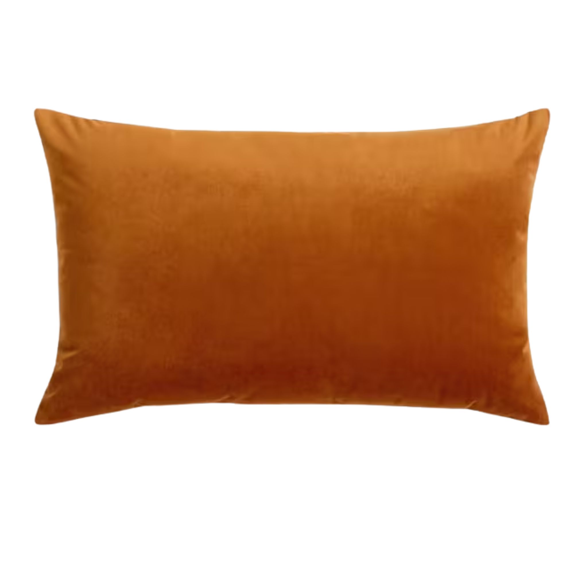
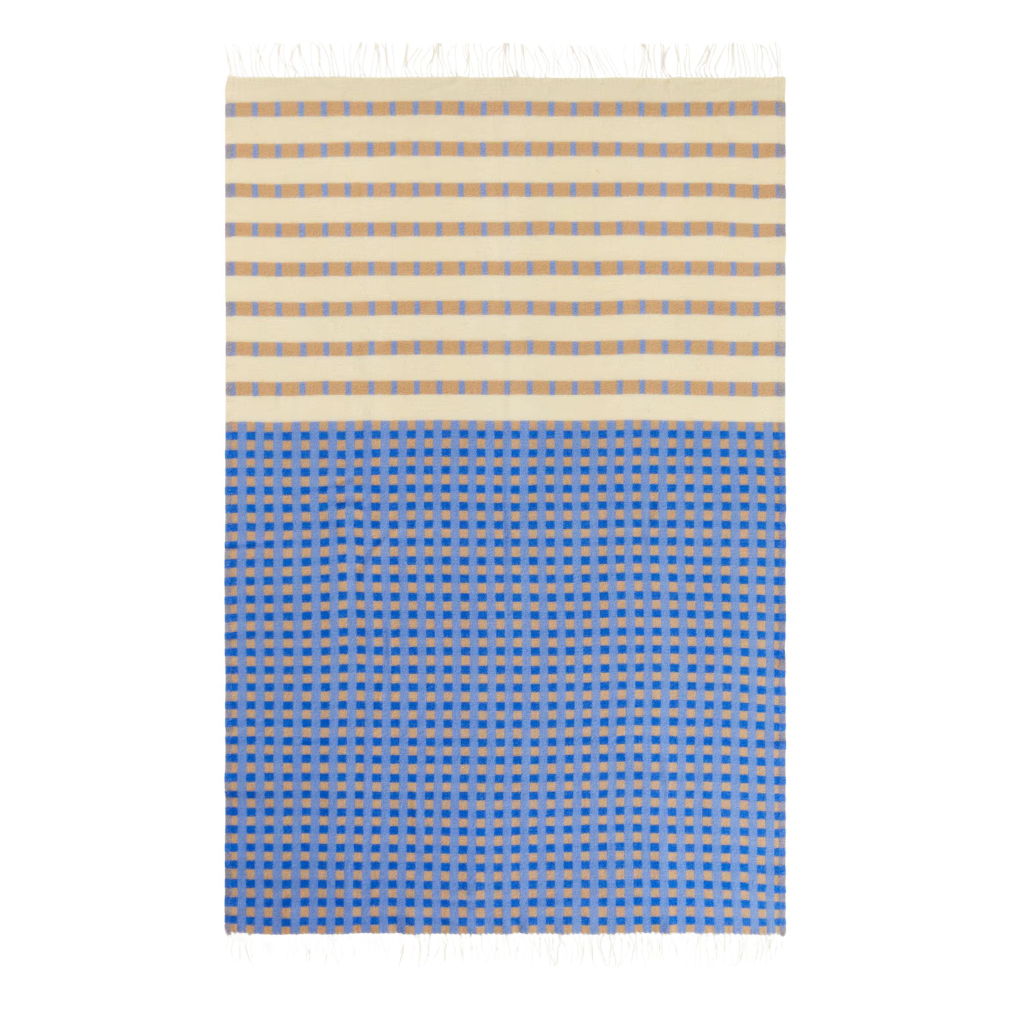
On a smaller scale, this velvet cushion in an ochre color would complement and lift a deep, navy blue living room.
3. Complement Cool Denim Blue and Burnt Orange
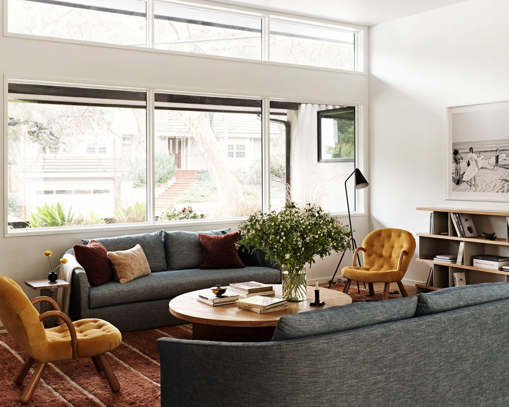
When paired together, blue and orange color schemes in living rooms can feel quite contemporary.
For a modern living room idea, let key pieces be a canvas for intricate color combinations. “When designing a living room, I like to use unexpected color pairings to create a more dynamic space," says interior designer Lauren Waters. "Balancing warm and cool tones creates visual contrast. I often select the art simultaneously with the furniture and then pull fabrics that complement the art."
Combining lighter tones with dustier shades brings layered design interest to the otherwise white living room, shown above. "We paired a soft blue sofa with a rusty orange shag rug and amber velvet armchairs," explains Lauren. "Since blue and orange are opposites on the color wheel, the contrast creates a pop and gives the space an energizing feel."
If you're not ready to go all out and commit to a colored sofa or area rug (which can help anchor the room), Lauren suggests that "accent chairs, lamps, pillows, and throws are a great way to bring in color without overwhelming the space."
4. Introduce Through Your Decor
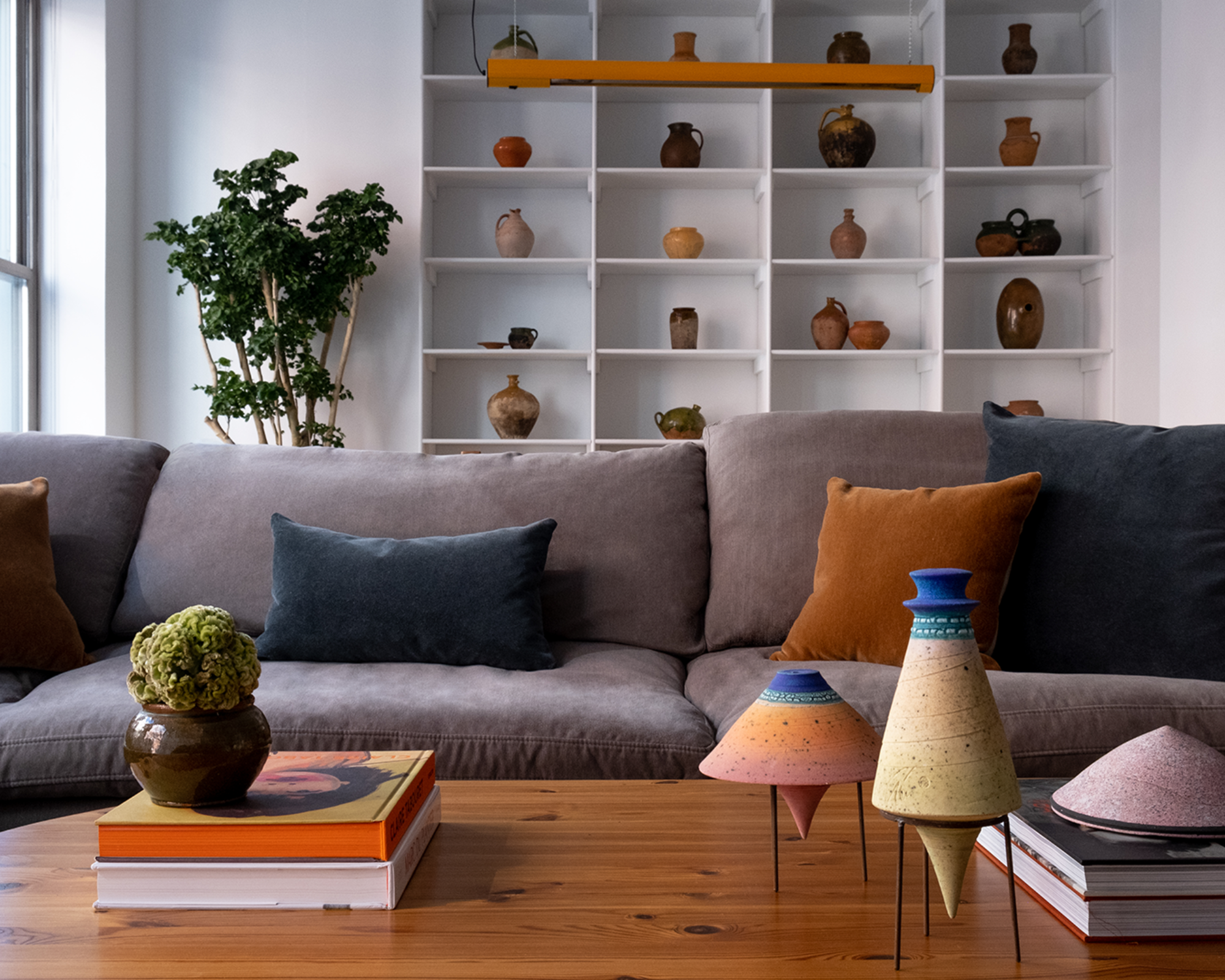
Ceramics nod to each other from the coffee table to the open shelving in this Tribeca Apartment.
A duo of blue and orange in a living room can come in smaller doses, too. Be selective with the placement of rich, pigmented hues to capture the gaze of guests discreetly, as for this dark gray couch living room.
"For the living room of our Tribeca project, we refreshed our clients' existing gray sectional with jewel tone velvet pillows," says Lauren Waters. "The deep navy blue and orange of the pillows are also repeated in the ceramic accessories and dining pendant light, which directs your eye from room to room.”
5. Make It Goldenrod Orange
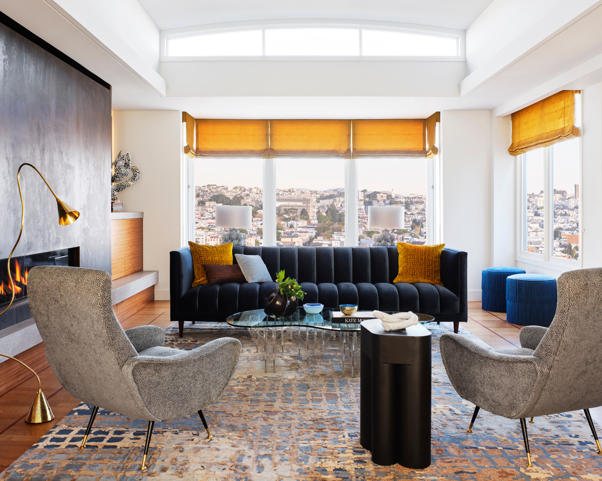
A blue and orange color scheme doesn't have to overpower a space, but can instead be used to accentuate it.
For warmth and a dash of drama when joined with a deep navy, weave in a little goldenrod orange, for a jewel color hit in your living room design scheme.
"We consider blue to be a highly versatile neutral in interior design," says interior designer Kristin Riccio. "Its balanced combination of calmness and energy makes it a foundational color that complements a variety of styles. Different shades of blue, at varying levels of saturation, pair beautifully with goldenrod, allowing the vibrant color to truly stand out. Goldenrod, with its rich, warm yellow hue and orange undertones, adds the perfect touch of warmth to complete this palette."

Kristin Riccio is the principal designer and founder of multi-disciplinary interior design studio, Kristin Riccio Interior Design. The studio, which is based in San Francisco and Lake Tahoe, creates meaningful spaces that are deeply rooted in the homeowner's lifestyle and in response to the site and architecture, be that through playful design choices with vibrant wall art or by layering colors and tactile materials for visual interest and sophistication.
6. Layer Cobalt For A Trio Of Dynamic Color And Pattern
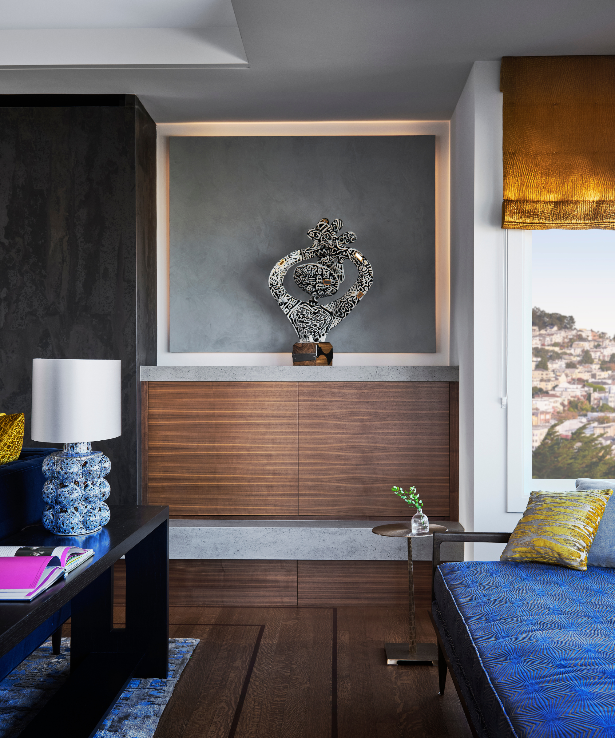
There is something innately jewel-like to a blue and orange color scheme.
In the same living space but from a different angle, goldenrod is caught with another expensive looking shade of blue, sporting pattern and a pop of lemon yellow, too, giving a dynamic finish.
Decorating with cobalt blue and goldenrod creates a rich, playful, and interesting interior, says Kristin. From opposite sides of the color wheel, these two colors offer balance and harmony when paired."
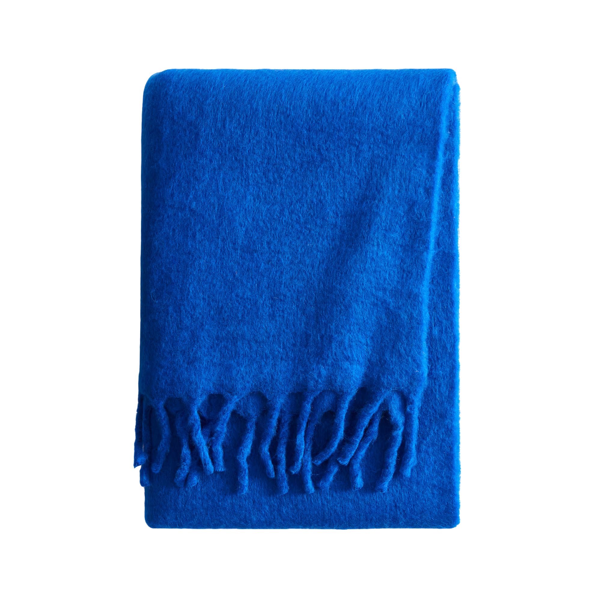
A striking shade of blue, cobalt blue decor is always sure to add a pop of energy to your living room scheme.
7. Go for a Two-tone Blue And Orange Scheme
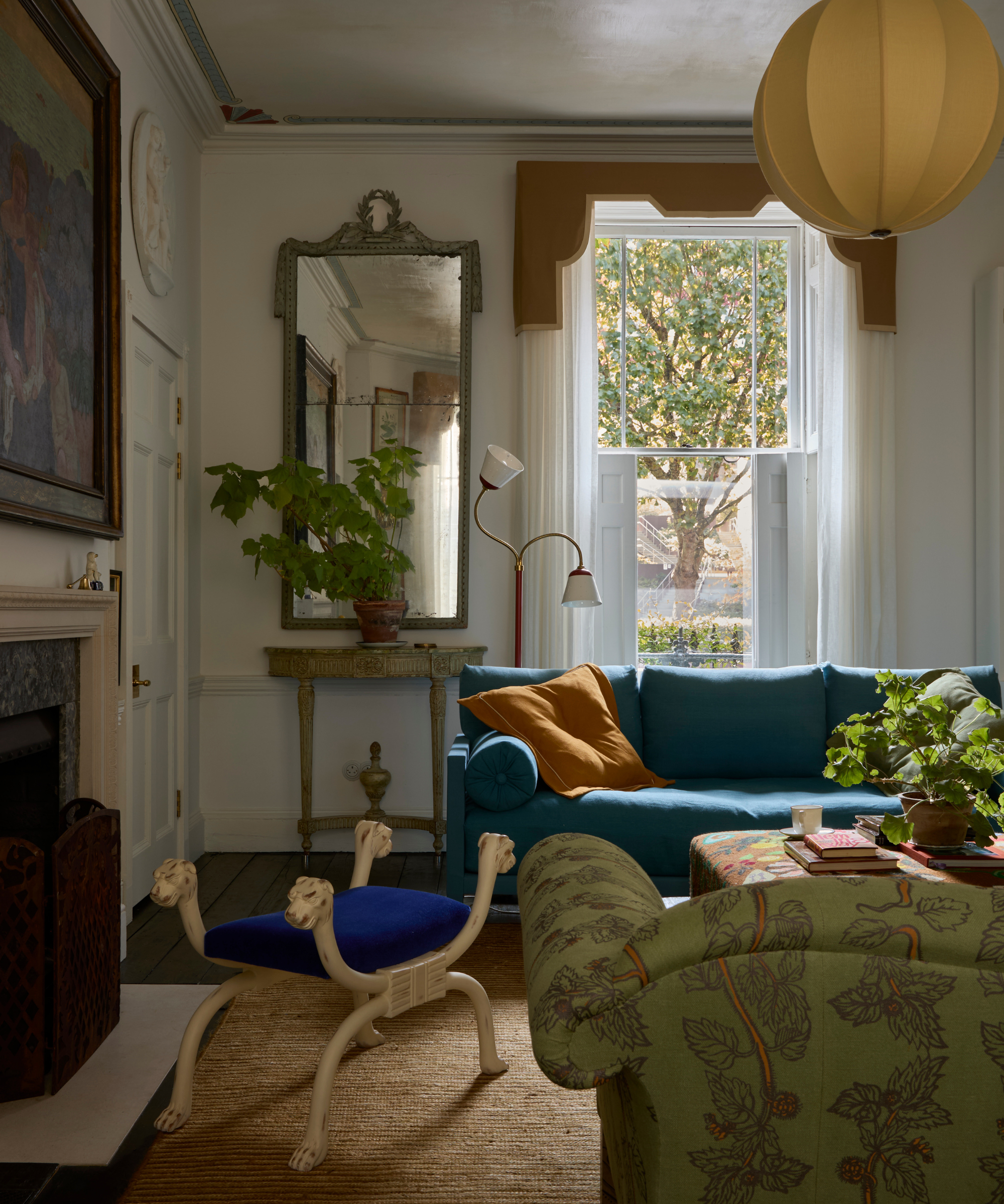
The Beata Heuman 188 Hammersmith Studio cradles two shades of blue and a dash of burnt orange, injecting zest and contemporary flair into a classic interior design scheme.
Introducing different shades of blue can add contemporary interest to more classic living room designs, too. Be selective with the ratio of your accent color, as Beata Heuman has mastered above in the studio lounge, boasting a pigmented navy and almost prussian couch.
"Blue has been a big color trend in the past few seasons when now teamed with the warmer tones of orange will create a bold yet balanced look," adds Paula Taylor, color expert at Graham & Brown. "The cool and the warm tones will create a dramatic impact with both colors balancing out the room. In a living room, the soothing tones of blue combined with the warmth and vibrancy of the orange will strike a perfect balance creating a cozy rich environment."
8. Balance Sky Blue And Toast Accents
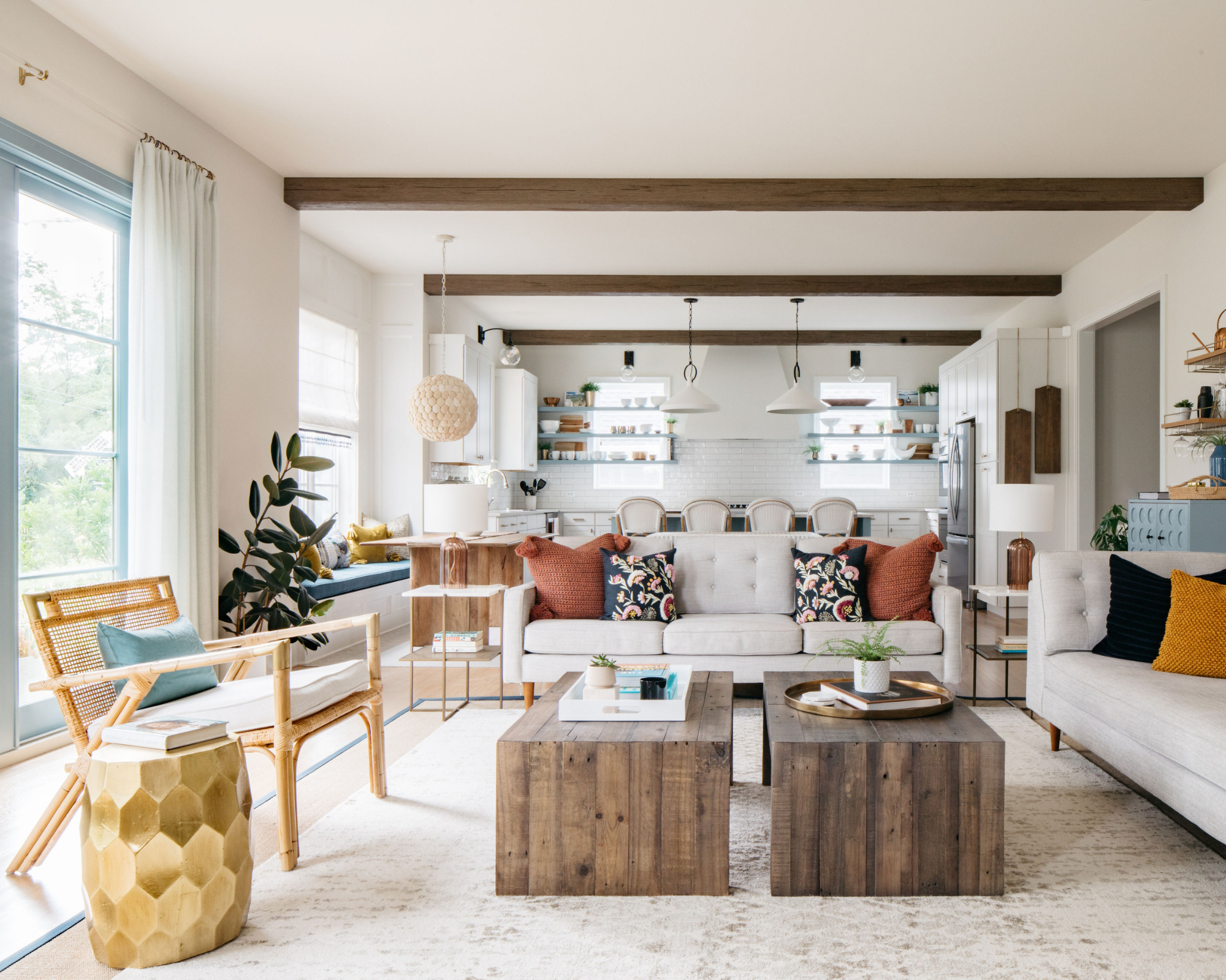
You can make a blue and orange color scheme feel light and fresh too, it's all about the specific shades you pick.
While deeper tones certainly work with this striking color combination, it also works in a lighter palette. To carry cooler blue colors — especially on a fresher, more neutral living room canvas — combine them with toasty and tonal shades of orange.
It's also important to consider the size of the space you're working with, and dare to add more color if you have the square footage. "If the room is small consider using 60% neutral base with one accent color of 30%, and pops of the other color to avoid being too overwhelmed,” recommends Paula Taylor.
The joy of blue and orange color room ideas is that each look can be truly unique. Whether you love a traditional home aesthetic, or like to follow all of the most modern trends, it's an energizing combination that can transform a space.
After another exciting combo? Discover how well pink and green go together in a space. (Hint: it's a lot.)
The Livingetc newsletters are your inside source for what’s shaping interiors now - and what’s next. Discover trend forecasts, smart style ideas, and curated shopping inspiration that brings design to life. Subscribe today and stay ahead of the curve.

Camille is a freelance interiors writer and the former deputy editor of Real Homes where she covered a broad range of topics, including DIY, small space design, and gardens. She studied English language and Italian at the University of Manchester and it was during her year abroad studying in Bologna that she started documenting her adventures and observations in a blog. Camille has a passion for art and beautiful spaces. When not writing or refreshing her home, you will find her gallery hopping, taking photos, painting, and traveling to seek out interiors inspiration.
