5 reasons I'll always paint my shelving the same color as the wall – it's the secret to more cohesive decorating schemes
Consider me hooked! Here's what designers had to say about this tried and thoroughly tested trend for painting shelves and bookcases to match your walls
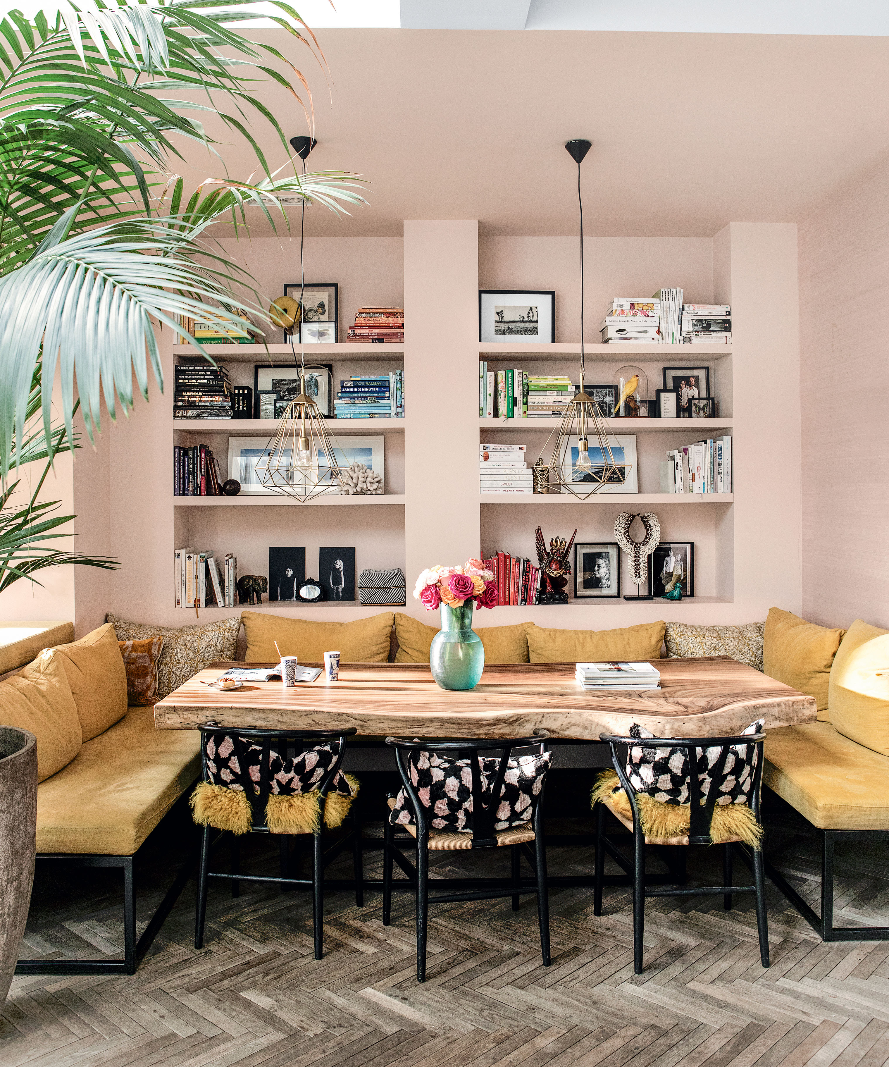
Color drenching just about any part of your home is having a bit of a moment. From ceilings and skirting boards to radiators and doors — saturating elements of your wall in an all-over color scheme has been trending for some time now.
But to really take this trend to the next level, it's time to consider painting your bookcase and/or shelving the same shade as your walls. ‘A consistent palette with walls and bookcases in the same color family absolutely balances and anchors a room,’ interior designer and home expert, Marie Cloud of Indigo Pruitt, says.
And we couldn’t agree more. So if you're sold on this paint idea but are a little unsure about the effect it will have on your room — be it a little or large space you're working with — we asked interior designers for their insight.
From making your room feel bigger to creating a fuss-free, uncluttered space. Here’s what experts had to say.
1. It creates an immersive experience
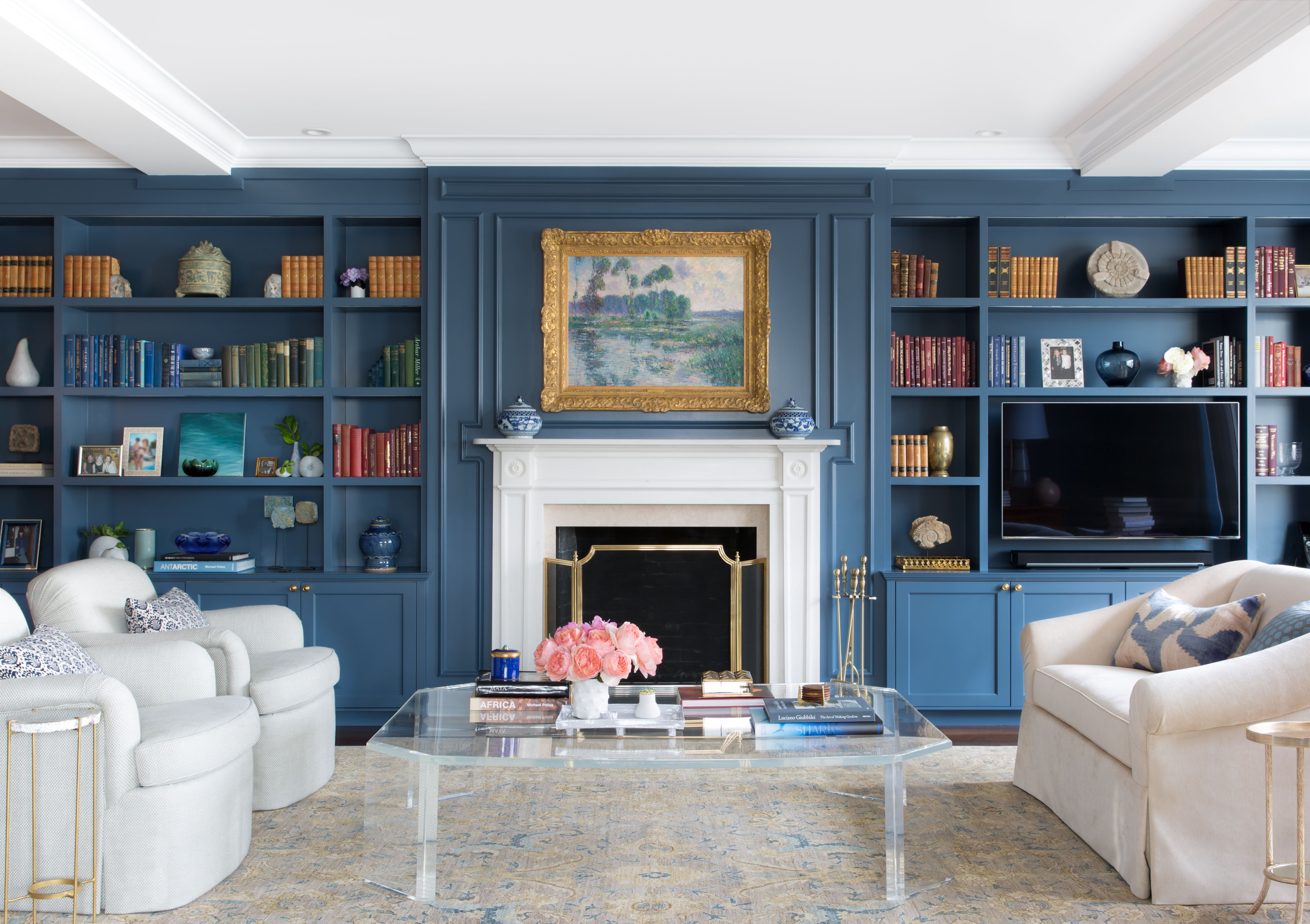
‘If you are looking for the cave-library look, painting the walls, the frames and the shelves in the same color works well,' Siri Zanelli, partner at architecture and design studio, Collective Works, tells us.
'This will be more dramatic if your shelves cover all the walls so the bookcases are not a standalone piece of furniture — but part of the walls,' Siri adds.
Just take this design idea from ABH Interiors as your inspo. Featuring an all-over wall with shelving covered in blue, you'll be lost in the world of literature in no time.
2. It will help your space seem bigger
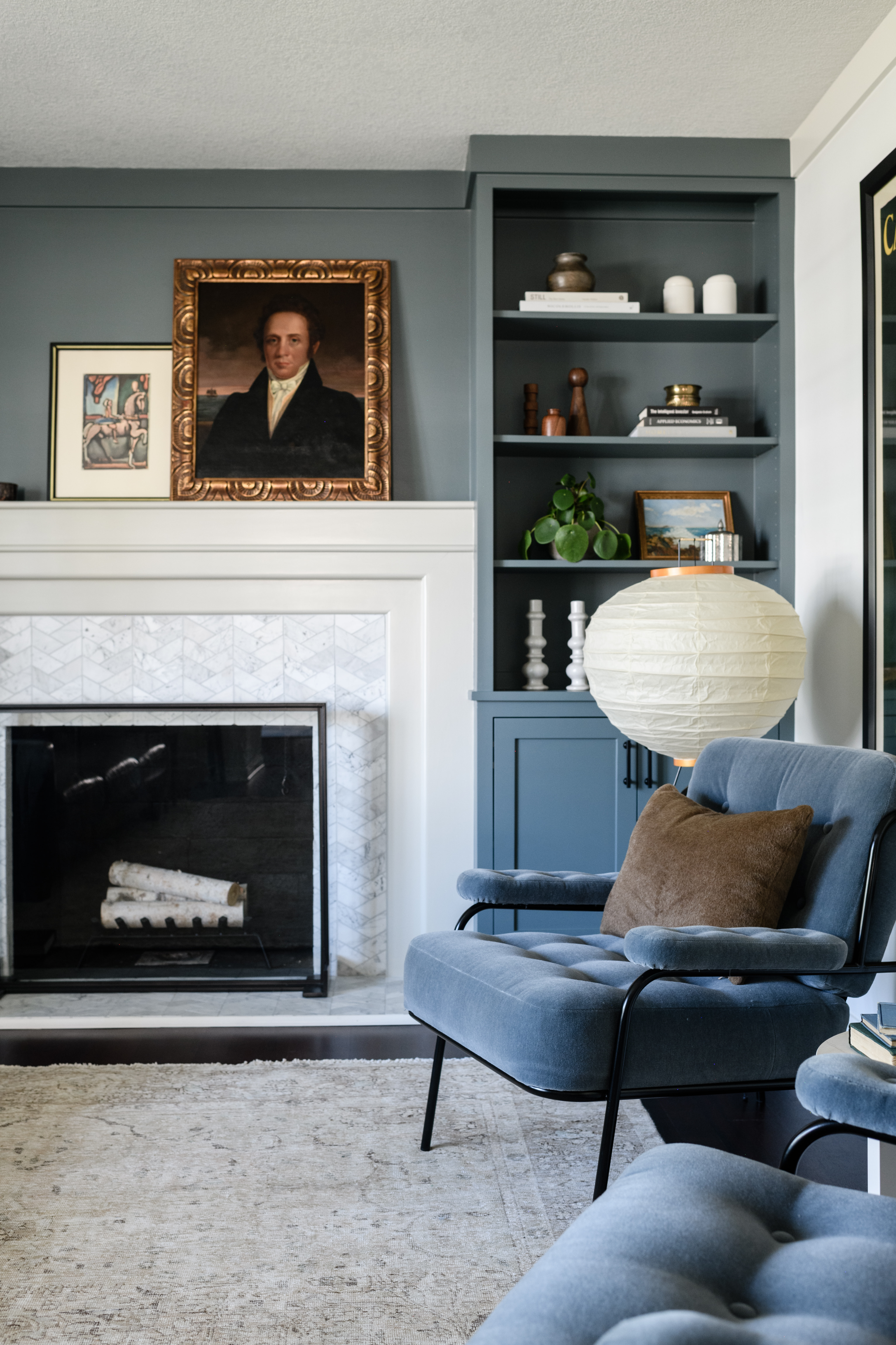
Have you got a small living room? If so, saturating your shelves in the same hues as your wall can help your space feel bigger as it lets your wall and shelves become one.
‘Painting a bookshelf the same color as your wall allows the bookshelf to recede into the space,’ Julia Miller, founder and creative director of Yond Interiors tells us.
3. It allows for other design elements to shine

'Painting bookcases the same color as the walls is a tried-and-true design technique that has long been popular in traditional settings and, more recently, in contemporary settings as well,’ Irene Gunter, founder of Gunter & Co explains. ‘Using the same color for both seamlessly blends the bookshelf into the walls, making it less of a focal point and allowing other elements in the room to shine. When the bookcase has a different finish, it draws more attention and becomes a design detail in its own right.’
Meaning? From your paintings and your living room furniture to your accessories and your soft furnishings, you can let design elements like these do the talking.
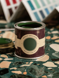
This rich, jewel green is a great choice for a statement-making living room with matching shelves.
4. It creates a seamless space

It's not just your living room where you can tick off the color-drenching trend. You could try it in your hallway, dining room or, as seen in this example, your home office space.
'I love 'drenching' a bookcase in a color,' interior designer Lizzie Green says. 'It provides a full and seamless backdrop for books and objects, it feels less broken up, and particularly for bookcases where your eye will be drawn to lots of different items, it helps to make that feel less jointed.’
5. It oozes a fuss-free feel

In the world of interior design, sometimes less is so much more. And when it comes to painting your bookcase the same color as your wall, it's no different.
This office space, which was the brainchild of Urbanology Designs, was intended to be a place to work but to also be inspired. ‘Colors, textures, lighting, and accessories were all added to marry these two worlds’, Ginger Curtis, who is president of the Texas-based interior design company, explains. ‘The walls and gallery wall/ bookcase are painted in an all-over shade of greyish-greenish black that creates a grounding and calming feel that invites deep work and concentration. We chose this color for this study because it is best for productivity.’
What color is best for bookshelves?
The short answer to this question is: there is no one size that fits all. Of course, it all depends on what colors you like, what hues pair well with the rest of your space and the aesthetic you're after.
However, as Charu Gandhi and founder and director of Elicyon explains, ‘You can never go wrong with a neutral tone — it’s the ultimate classic look. School House White by Farrow & Ball is a great warm off-white and Slakes Lime Deep is a lovely pale taupe color. However, if you would like to make the space feel intimate and cozy, go for a bolder color. Little Greene Nether Red would work beautifully in a library.’
Be The First To Know
The Livingetc newsletters are your inside source for what’s shaping interiors now - and what’s next. Discover trend forecasts, smart style ideas, and curated shopping inspiration that brings design to life. Subscribe today and stay ahead of the curve.
Becks is a freelance lifestyle writer who works across a number of Future's titles. This includes Real Homes, Top Ten Reviews, Tom's Guide, TechRadar and more. She started her career in print journalism at a local newspaper more than 8 years ago and has since then worked across digital and social media for food, fashion and fitness titles, along with home interior magazines. Her own interior style? She's big on creating mindful spaces in every corner of her home. If it doesn't spark joy or happiness, it has no place here. When she’s not writing, she’s reading and when she’s not reading, she’s writing.
-
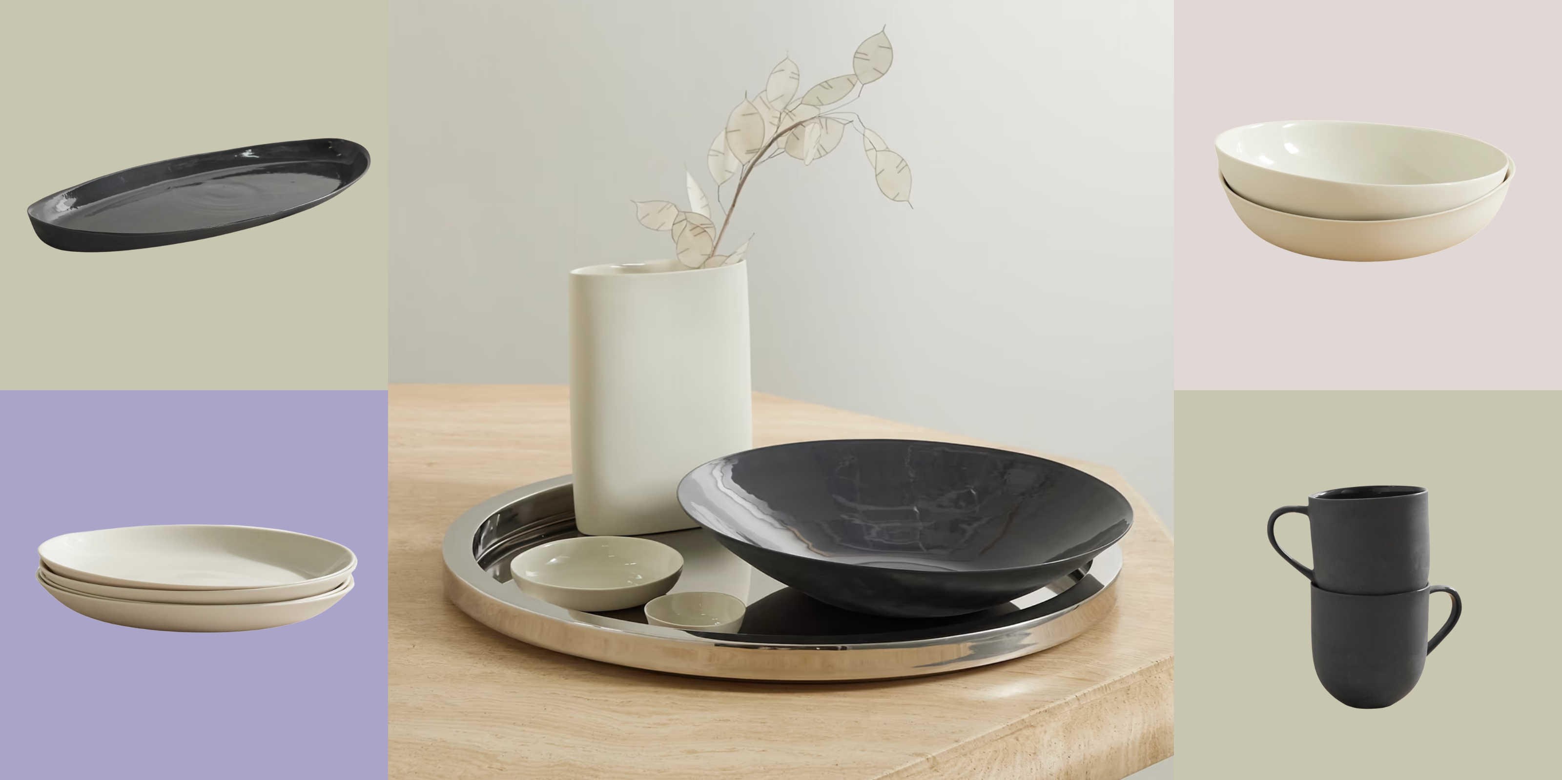 Turns Out, Sustainable Design Can Be Chic, and Net-a-Porter's 'Net Sustain' Curation Is Proof — Here's What I'm Shopping
From the Net Sustain collection, Mud Australia's homeware is not only design-oriented, but eco-focused, too
By Devin Toolen
-
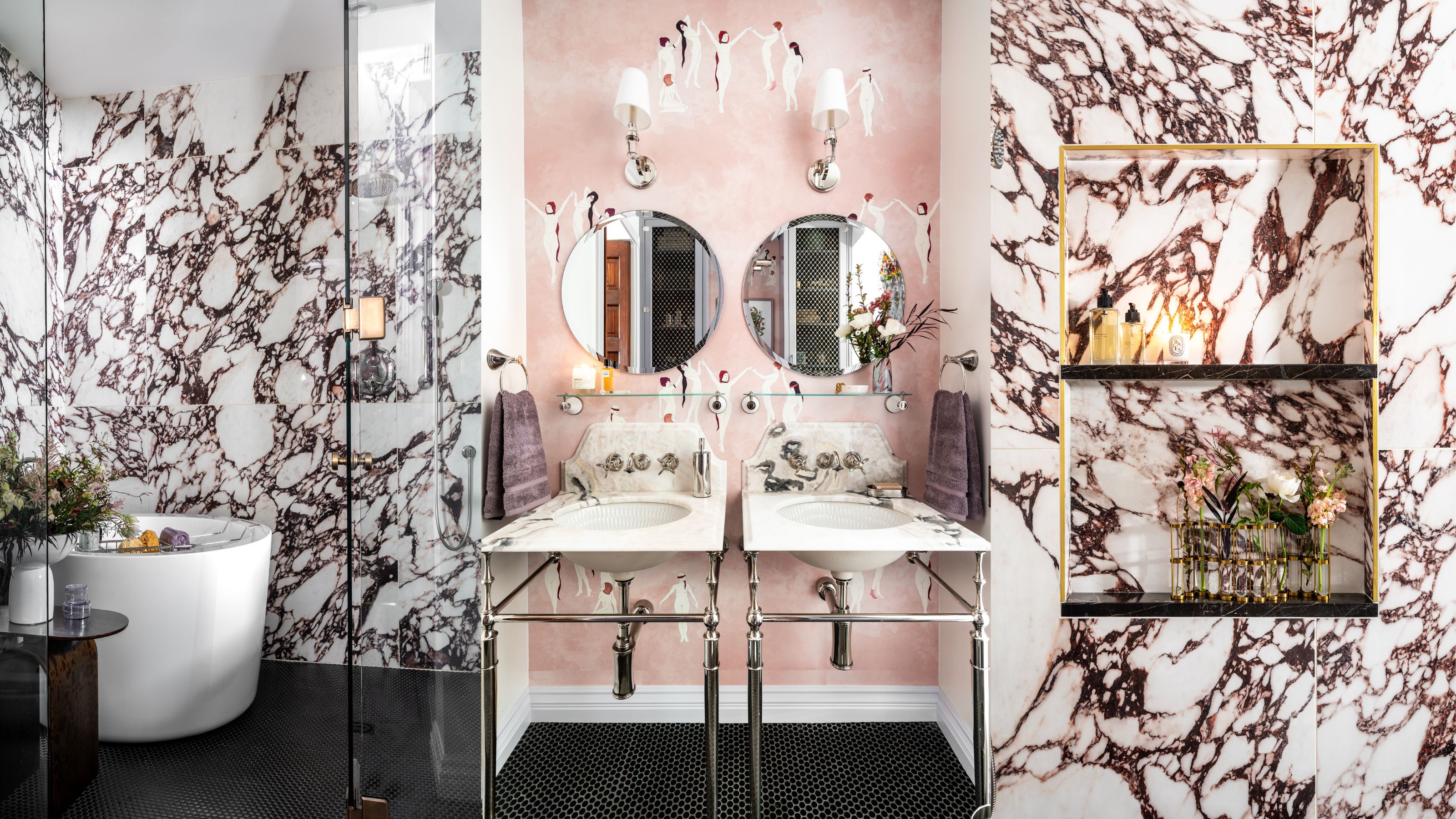 Before and After — How This Jewel-Box Bathroom Made the Most of Its Proportions With Maximalist Design and a 'Soaking Tub'
This design offers a masterclass on creating a luxurious bathroom that is equally playful and elegant.
By Maya Glantz
