10 brilliant breakfast nook ideas that will make you want to get out of bed in the morning
These breakfast nooks are the ideal places for casual dining in a kitchen for the perfect start to your day
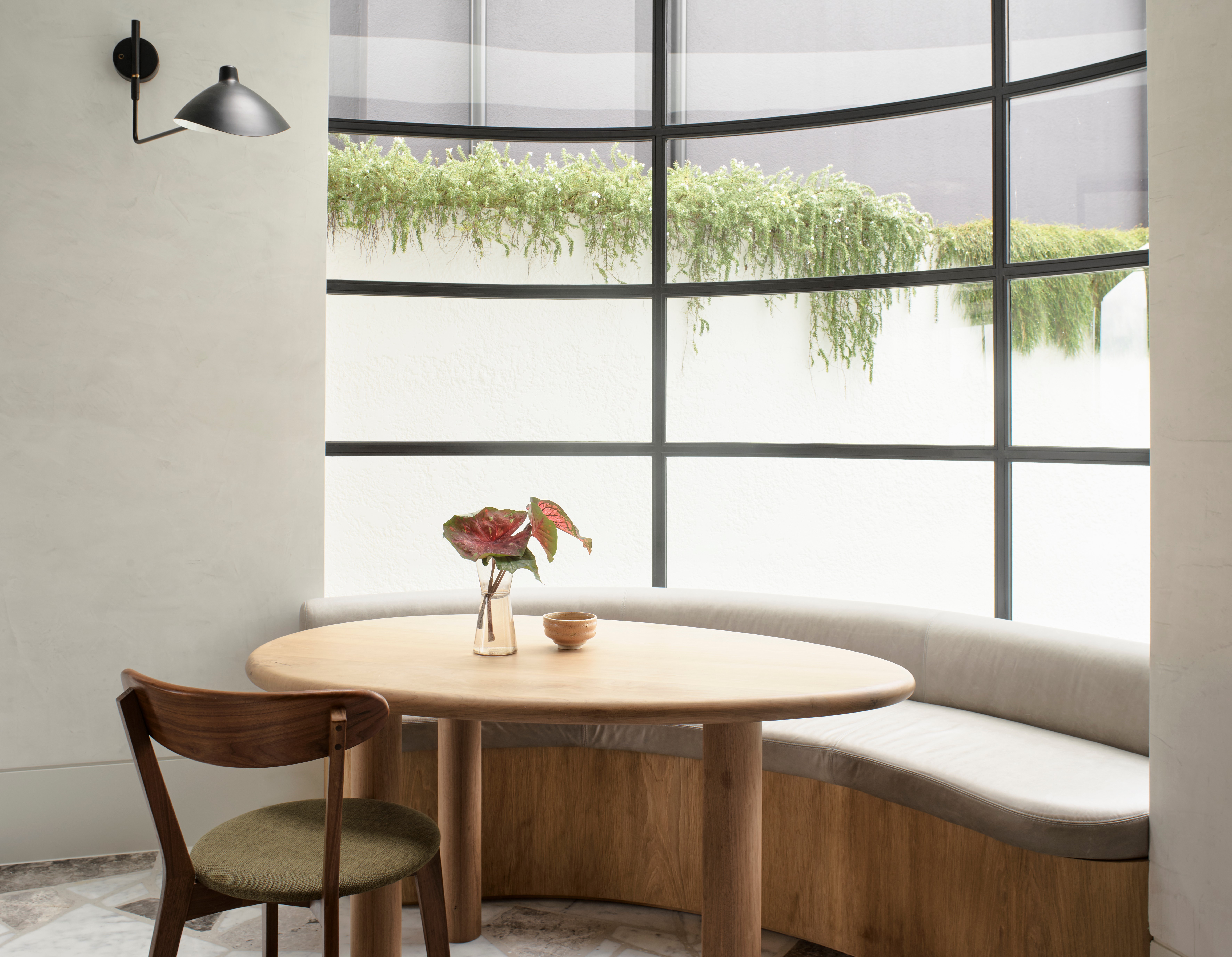

Breakfast nooks are ideal for quick snacks, informal meals, a morning coffee, or even just perching for a conversation. Usually set up inside or next to the kitchen or dining, these seating areas are those comfortable, laid-back spots that are designed to be casual and comfortable, compared to the more formal nature of a traditional dining room table.
'A breakfast nook is a special place in the home; a place to gather for casual meals, kitchen conversations, and a homework space for children while a parent cooks dinner,' says Ariel Bleich, founder of Ariel Bleich Design. 'It also serves as extra counter and work space if needed.'
We've rounded some of the most well-designed and equipped breakfast nooks that will make you start rethinking your modern kitchen layout.
1. This nook with a curving, pink sofa
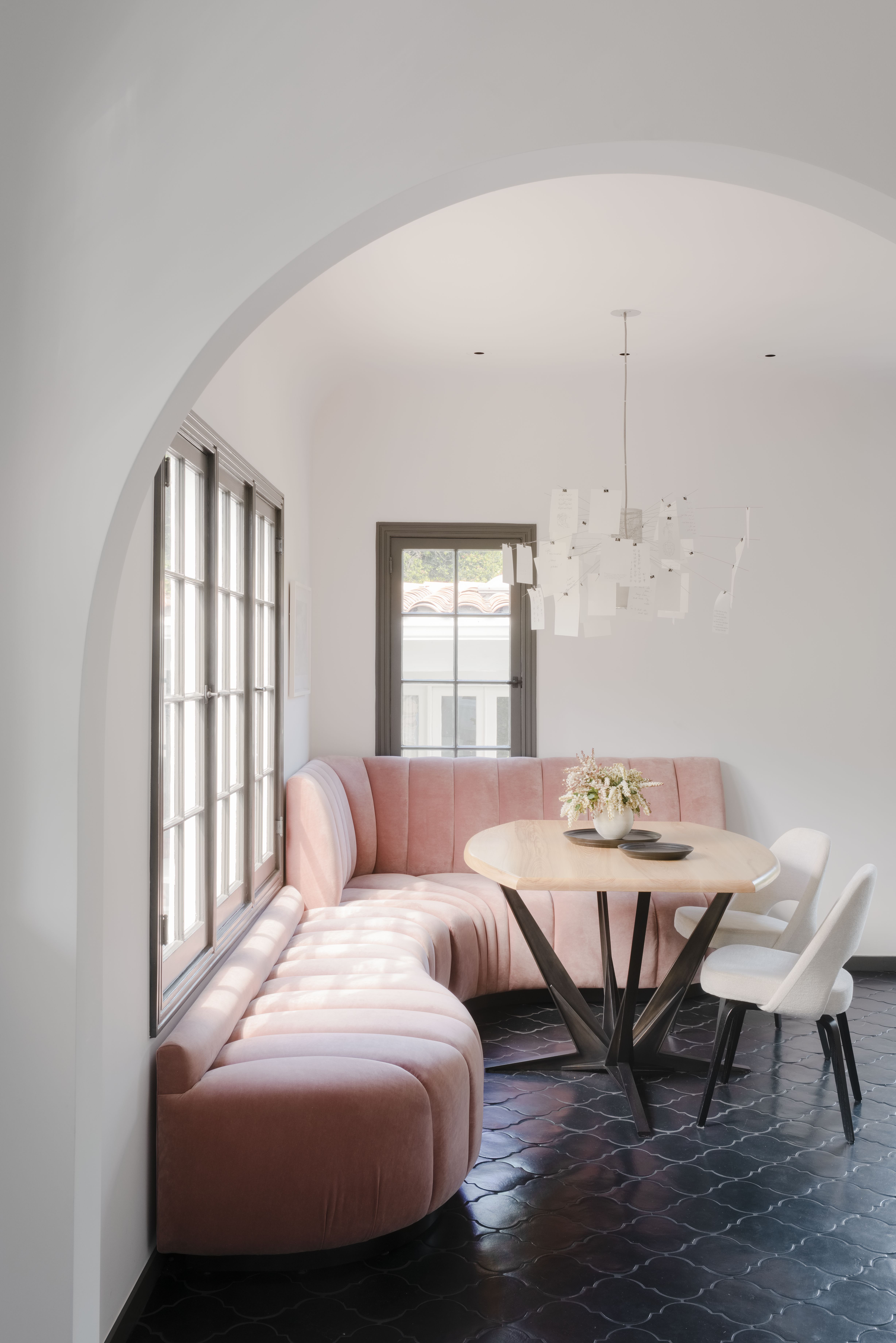
This breakfast bar or nook has been given special treatment by dedicating a corner of the kitchen to it. The space creates a laidback comfort using banquette seating, compared to a more formal dining that tends to have tall chairs and a long rectangular table. This is a great way to create an interesting mix in the home.
'Here we wanted to make a dining space that worked well with the existing architecture,' says Jessica Weigley, principal at Siol Studios. 'You can see how the seating adapts to the windows. That blush velvet is actually designed for outdoors –we picked it because we knew it could handle a lot of kid traffic and wouldn’t fade from all of the light from the south- and west-facing windows. We ended up with a casual and homey space that's also really inviting.'
2. This breakfast space with views of the outdoors
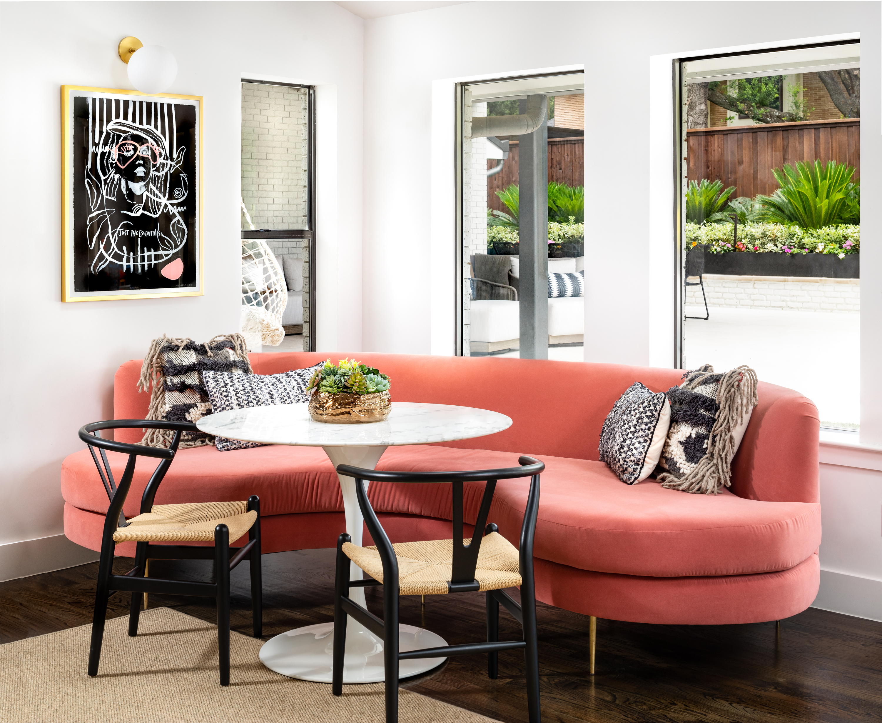
Consider adding a breakfast nook or banquette by the window when planning a modern kitchen redesign. This will add a whimsical touch to the room's look and feel and increase functionality. In this space, to protect the dwellers from the harsh afternoon sun, the windows feature blinds that can be pulled up and down as per their needs.
'I enjoy using banquettes in breakfast nooks, especially for tight spaces when we do not have the clearances for a full set of chairs,' says the Dallas-based Eddie Maestri, principal architect and owner of Maestri Studio. 'I like how a banquette can make the space feel more comfortable and intimate. It invites guests to sit and stay a while.'
3. This snug spot in a small kitchen
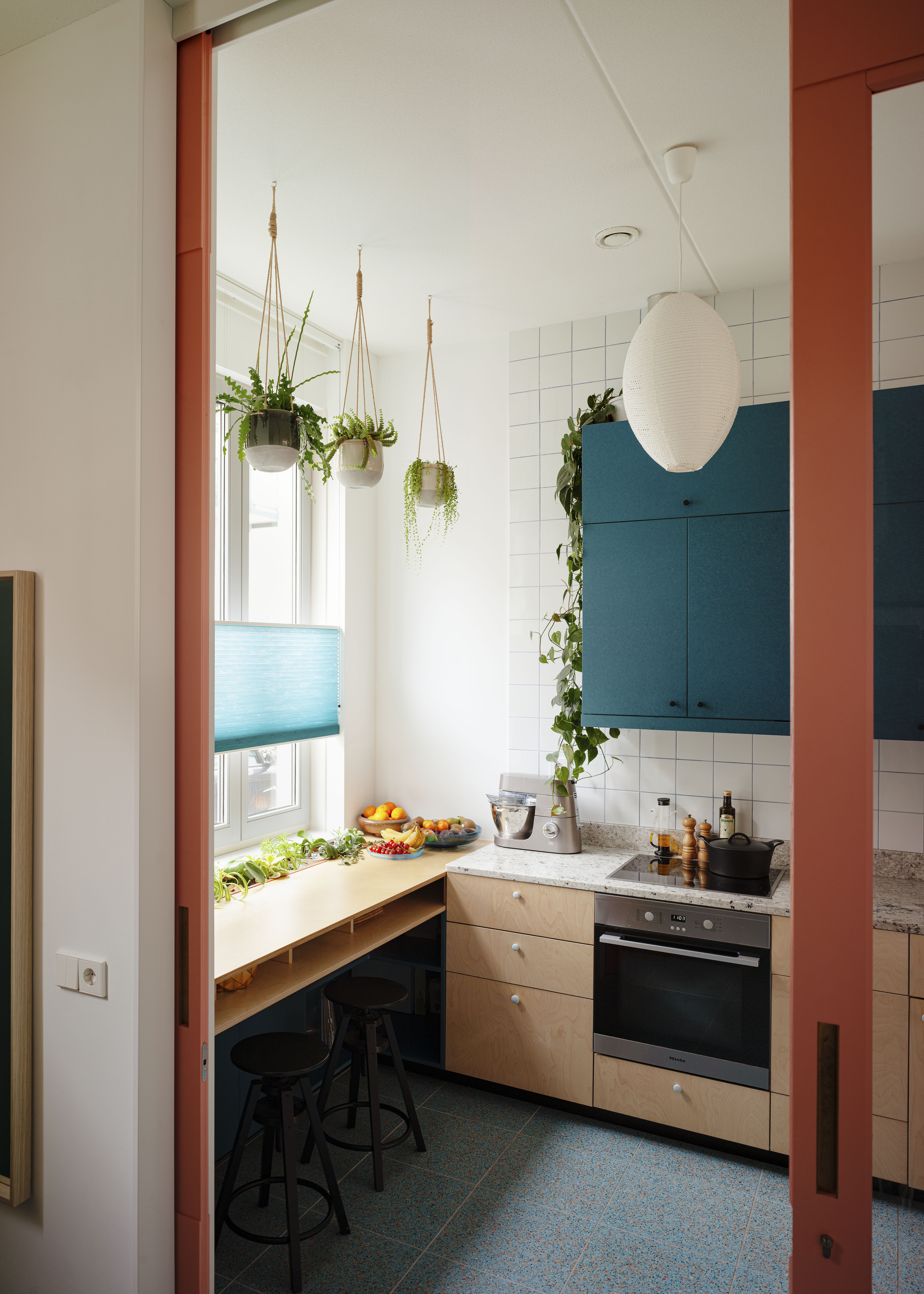
It's possible to create a breakfast nook in a small kitchen, too.
'The bar as we call it is designed with the idea of activating the front of the house, facing the street, in mind,' say Maria Vasiloglou and Victor Verhagen, founders of LAGADO Architects. 'Typically this spot is reserved for the kitchen sink, but we wanted to design a way to be more connected to the street and the light coming in through the kitchen window.'
'A row of sunken plants in pots just behind the window makes for a nice green buffer between the street and the interior,' said Maria and Victor. 'Also, by moving the position of the sink, you’re more connected to the dining and living space when cooking while this breakfast bar gives you a bit of a secluded feeling with its focus on the green and street.'
4. This banquette-style breakfast area
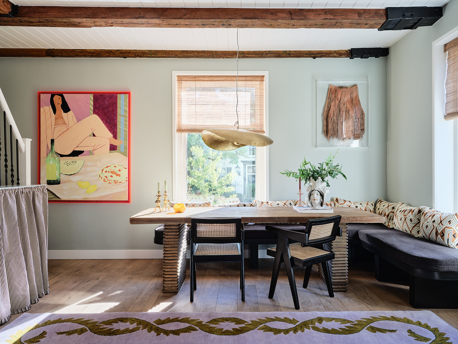
If you're building a home from the ground up or adding on to your kitchen, in large-sizes homes, consider dedicating an entire wall to the breakfast space, like in this project A long bench has been placed around a curve while a table is fit in the center.
'I love nooks because it feels so comforting to sit in the corner of a room and oversee everything, and have more lazy dinner than a more formal one,' say Nicole Dohmen, and Andrea van Well, owner and co-founder of Atelier ND Interior. 'My houses are never very formal. I like to feel immediately at home and I think dining nooks give you that feeling.'
To increase comfort, the banquette seating also features pillows that allow for long, leisurely breakfasts or post-work drinks.
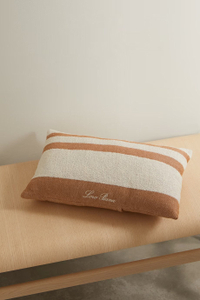
Cotton Blend pillow, Net-A-Porter
Consider this light-toned pillow with stripes in bouclé stitching, to decorate your breakfast nook area.
5. A breakfast platform behind a column
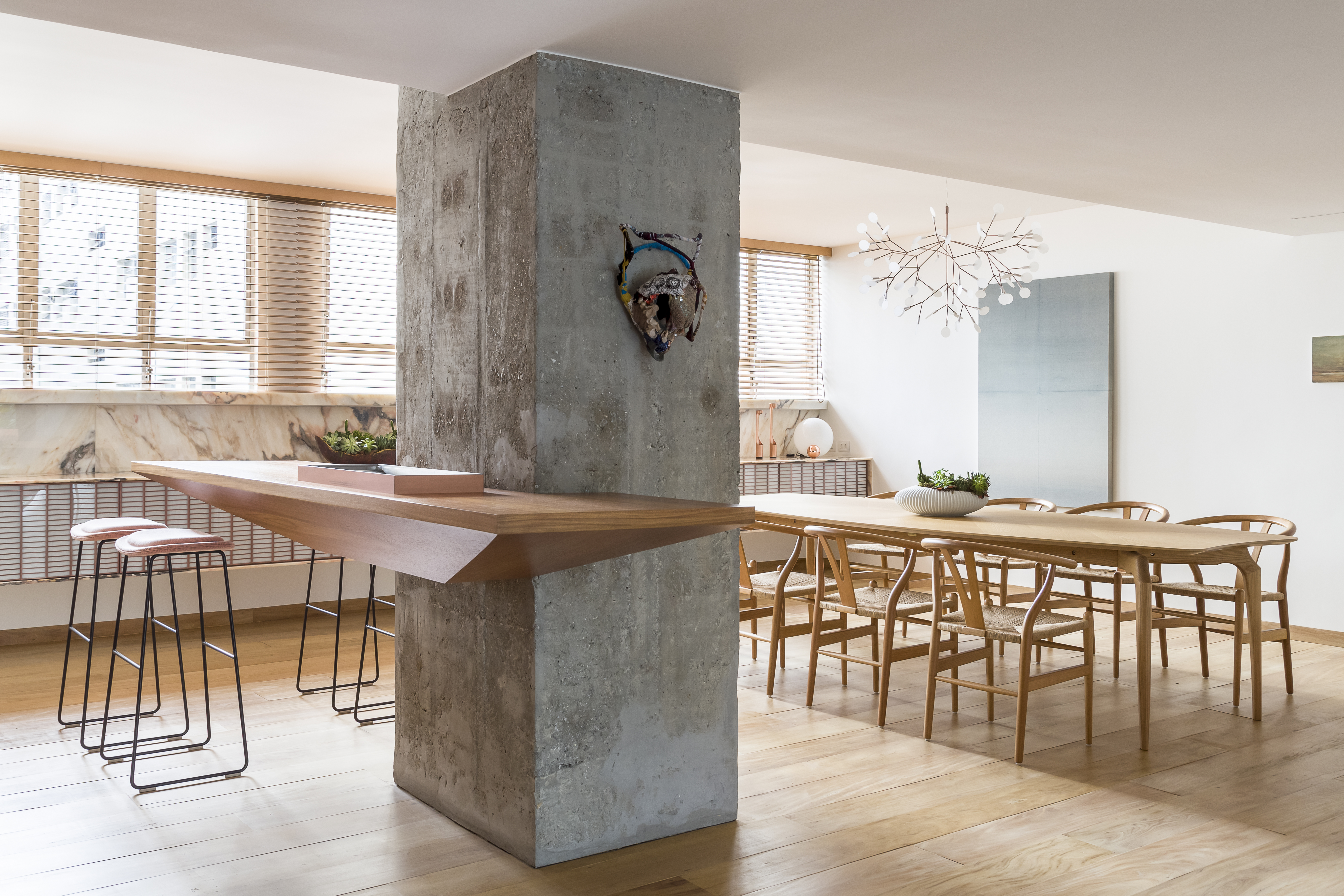
Need more kitchen countertop space? How about a breakfast bar that is ideal for eating, storing kitchen cutlery, and even chopping and prepping food? This project is all about making the breakfast area a multipurpose spot.
'The counter was designed aiming to be attached to the concrete column,' says Sarkis Semerdijian, co-founder of Pascali Semerdjian Arquitetos. 'Our client wanted a counter to serve multiple purposes: a bar counter, a dining serving board, or a breakfast counter. It also has an ice cooler inside it that can be removed for ice reloading. The piece has this diamond shape to make it lighter and slimmer.'
6. This nook illuminated with recessed, soft lighting

Drench your beloved breakfast space in soft lighting, when the sun goes down. Here, a large, ceiling light does that job, as it gently throws illumination down, converting this casual eating space into one that feels more formal and moody. This is also a great way to zone an open-plan kitchen. Plus, the tall windows offer great views of the pool outside.
'What can’t be seen in this vignette, is the swimming pool which touches against the base of the window,' says Jeremy Bull, principal at Alexander & CO. 'It is a long lap pool built within the structural void of an old vehicle driveway. We imagined a P&O moment where this dining folly, really just a breakfast nook, became the helm of the external experience. The family could drink coffee and look out over their conceptual ‘ocean’ on the garden side of the house. We sketched a small curving niche which joined the kitchen and formal dining room, a circular skylight and a little banquette and oddly shaped egg table.'
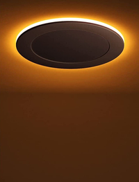
Recessed ceiling light, Amazon
Choose this LED recessed light, always on a downlight mode, perfect for illuminating a small seating area, in the day and with its night light synchronization reset function, even when the sun goes down.
7. This extended breakfast spot by the stairs
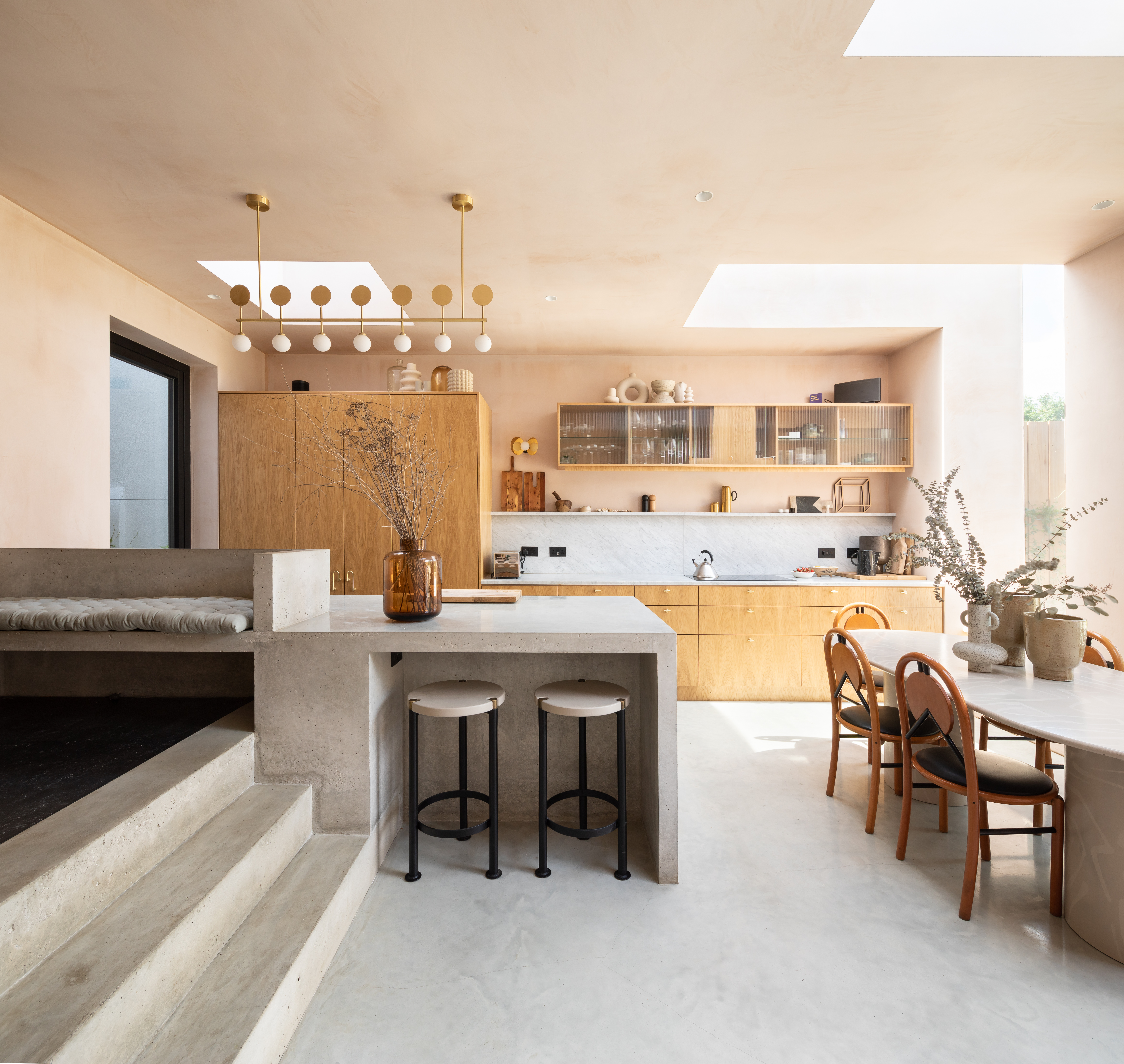
Packed with clever kitchen ideas, this space features different functional zones yet is a wonderfully integrated and unified space. The different seating areas – be it the breakfast nook or dining table, along with the bench above the stairs makes this room almost like a second living room.
'The island was designed as a piece of fixed furniture to separate the cooking space from the raised play space,' say Joe Fraher and Lizzie Fraher, founders of Fraher & Findlay. 'It was important that these spaces could interact but also remain separate functional spaces.
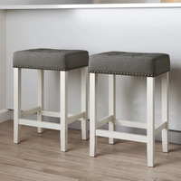
Make your kitchen island or counter more functional with these modern barstools.
8. This cozy space with a statement light
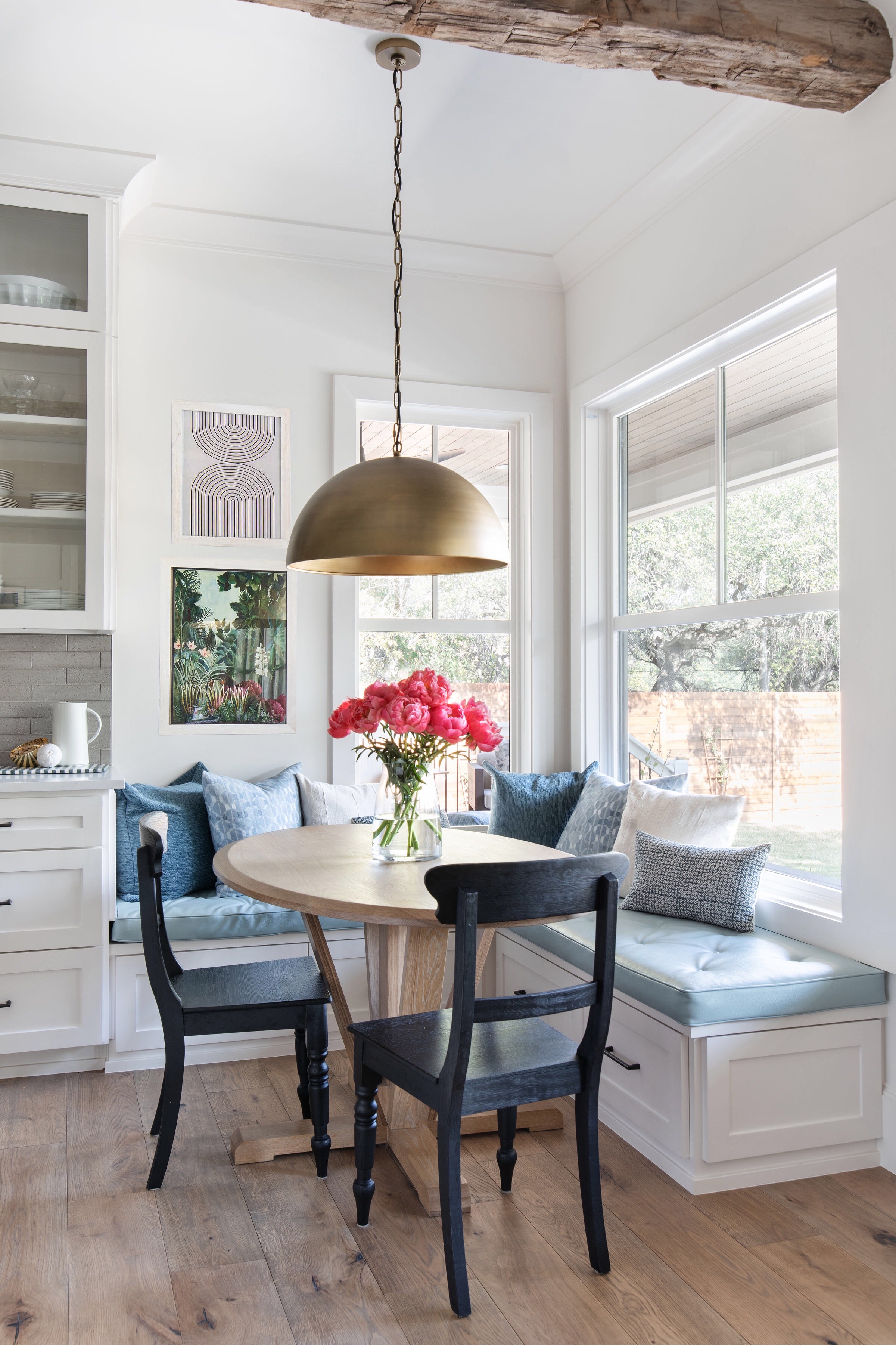
'This bright, cheerful, breakfast nook is designed to be a multi-functional space in the modern small kitchen,' says Ariel. 'We wanted to take advantage of the lovely backyard views at the corner of windows while having proximity to the kitchen without interruption of traffic flow. The table was custom designed to be oval to fit the space. With an oval shape, you can optimize circulation.'
'At the banquette, the owner needed storage for their kids’ arts and crafts supplies. The idea was to make the breakfast space multi-purpose. The banquet addresses their storage needs and it saves space in this small corner.'
9. This one decorated with color and wallpaper
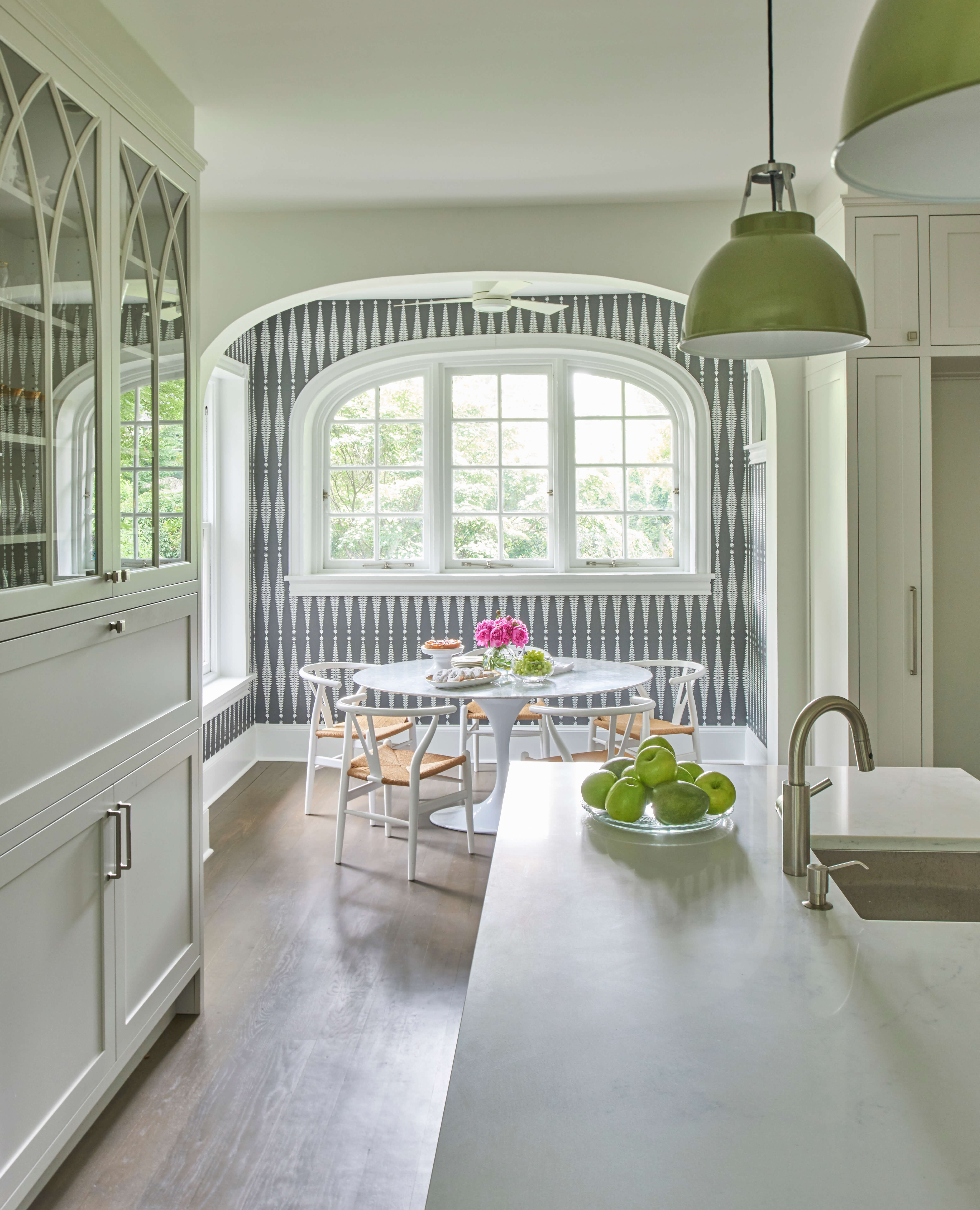
Whether it’s just on an accent wall or the entire corner, the paint will give a sense of separateness from an adjoining kitchen, helping the breakfast space feel more individual. In this space, the kitchen wallpaper too adds to the layering of the room, giving the breakfast nook an elevated aesthetic.
'Whenever possible, choose a corner with at least one window, and optimally windows on two sides,' says Mindy O'Connor, principal and founder of Melinda Kelson O'Connor Architecture & Interiors. 'A banquette table is generally desired to save space and create coziness, but opting for a corner near a window can make the space feel very open while using the overall kitchen space efficiently. Views and natural light are always welcome for starting a busy day. When a window location is not possible, take advantage of the walls to create extra tall and comfortable bench back. You can also use the walls above the seating as an opportunity to create a design moment in the room with decorative elements like artwork or wallpaper.'
10. This tiny booth with custom design pieces
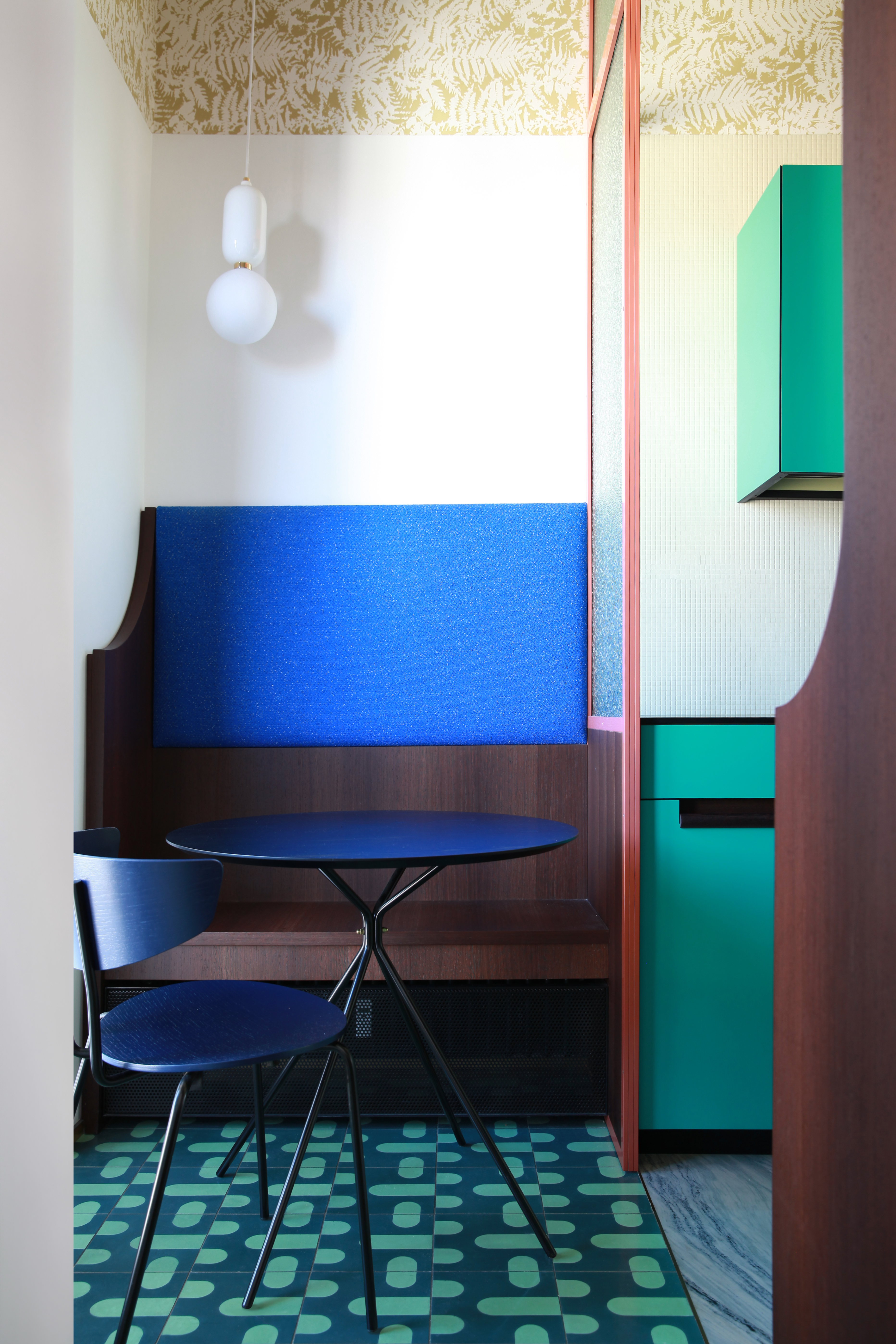
Who says small spaces cannot be packed with personality? This tiny breakfast booth is a great example, enriched with color and the choicest design pieces, along with interesting kitchen floor tiles.
'The custom made Kitchen furniture, metal and glass screen, and bench in wengè wood and Pilot Fabric by Raf Simmons for Kvadrat, were all designed by Marcante-Testa and realized by MATERIADESIGN,' say Andrea Marcante and Adelaide Testa, founders of MARCANTE – TESTA. 'We chose floor and wall covering by Bisazza (cement tiles + mosaic), and a lamp by Parachilna to give this tiny booth a personality.'
Be The First To Know
The Livingetc newsletters are your inside source for what’s shaping interiors now - and what’s next. Discover trend forecasts, smart style ideas, and curated shopping inspiration that brings design to life. Subscribe today and stay ahead of the curve.

Aditi Sharma Maheshwari started her career at The Address (The Times of India), a tabloid on interiors and art. She wrote profiles of Indian artists, designers, and architects, and covered inspiring houses and commercial properties. After four years, she moved to ELLE DECOR as a senior features writer, where she contributed to the magazine and website, and also worked alongside the events team on India Design ID — the brand’s 10-day, annual design show. She wrote across topics: from designer interviews, and house tours, to new product launches, shopping pages, and reviews. After three years, she was hired as the senior editor at Houzz. The website content focused on practical advice on decorating the home and making design feel more approachable. She created fresh series on budget buys, design hacks, and DIYs, all backed with expert advice. Equipped with sizable knowledge of the industry and with a good network, she moved to Architectural Digest (Conde Nast) as the digital editor. The publication's focus was on high-end design, and her content highlighted A-listers, starchitects, and high-concept products, all customized for an audience that loves and invests in luxury. After a two-year stint, she moved to the UK and was hired at Livingetc as a design editor. She now freelances for a variety of interiors publications.
-
 I Just Found a Stylish Wireless Pendant Light That Makes Your Garden Look (and Feel) Like a Living Room
This rattan-like pendant light is wireless and rechargeable — making it a functional and stylish choice for your outdoor space
-
 Icy Blue, Stripes, and the Design Equivalent of Shoulder Pads — 2025's Best Met Gala Looks as Interior Trends
The Met Gala carpet was alive with fashion trends that translate into the schemes designers are creating for the most exciting homes right now, too
