Color ideas for small kitchens that can make tiny spaces feel bigger, bolder and less apologetic
From statement neutrals to bold shades, these small kitchen color ideas prove that you can be creative, even in a compact room

When it comes to choosing kitchen color ideas for smaller kitchens, keeping things paired back and neutral is often the go-to choice – an accepted way to make a room feel light, bright and airy. But going for more color in your small kitchen can be a better solution to help the space feel bigger and bolder, helping give a smaller room more presence. 'Infusing color into a kitchen, especially if it’s a more compact space, livens up the room and adds a sense of depth that can be played with in so many ways,' says Sue Wadden, director of color marketing at Sherwin-Williams.
From the kitchen backsplash to the island, from the window treatment to the floor, there are ample ways to introduce color into the kitchen and various elements of the kitchen that can be a key part in the palette and really help lift the space. Read on for our favorite color ideas for small kitchens, where color can really transform the heart of the home.

Oonagh is a homes and interiors writer and expert. For this story, she dug out eight of her favorite small colorful kitchens and spoke to the designers to find out exactly why they went for these specific colors, and how color in the kitchen can really help bring freshness to the interiors.
1. Go bold with pops of red
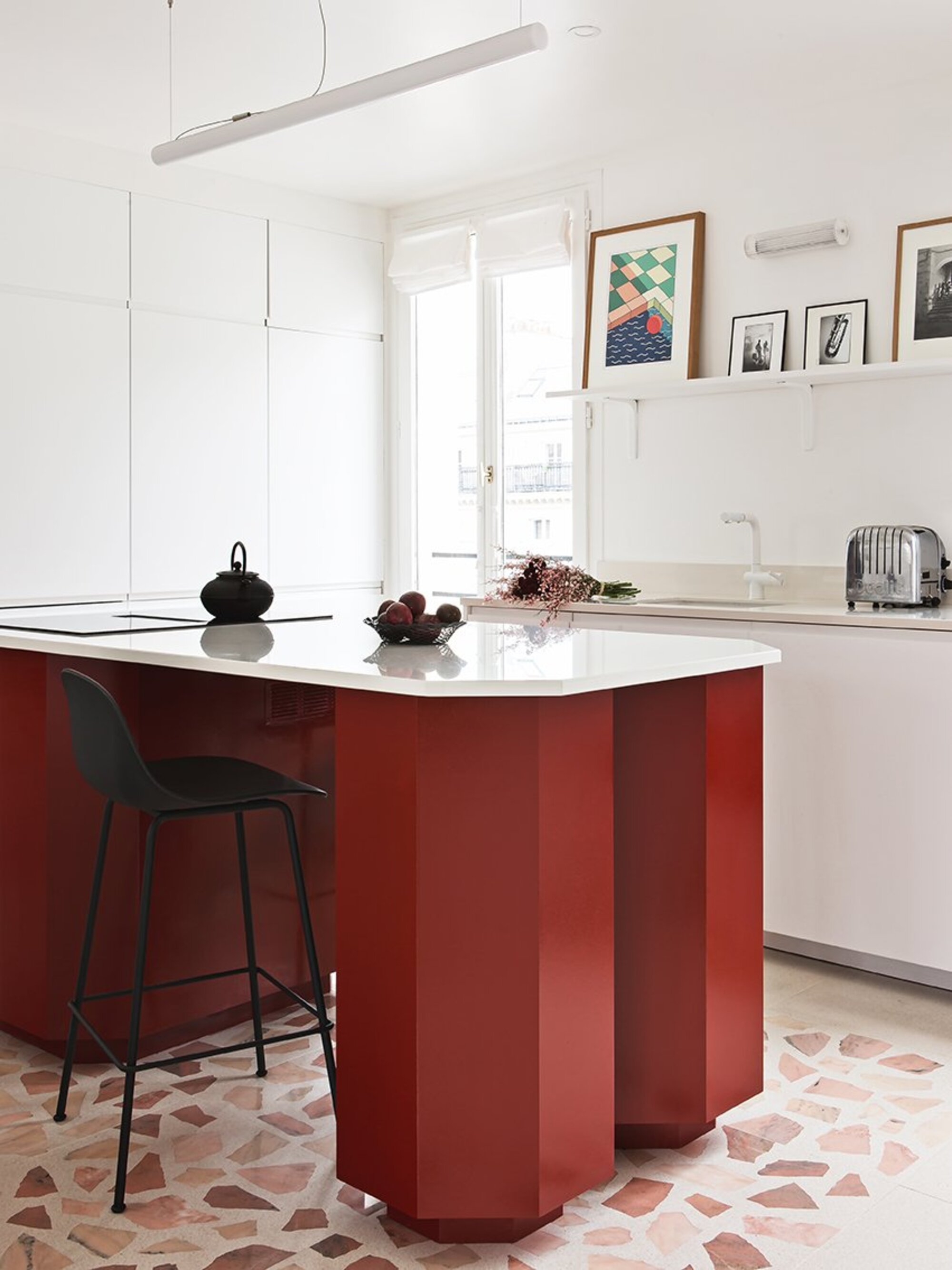
Consider keeping walls paired back for your big ticket items of kitchen furniture to do the talking. 'When you're working with a small kitchen, our advice would be to keep the bones of the room neutral but the kitchen itself slightly more vibrant,' says Athina Bluff, Founder of interior design studio Topology Interiors. 'This way you get a small punch of color, without making it feel too overbearing the space it's within.'
This is one such modern kitchen example from Space Factory, where the walls, kitchen countertops and other kitchen accessories like the faucet are a pristine white, but the island is a deep burgundy red, bringing an element of surprise to the space and bringing a cheery pop of color that doesn't overwhelm the kitchen.
'We choose this color for the kitchen island exactly because it's not a color we are used to seeing in a kitchen. The idea was to attract the eye on the island design rather than on the functionality of it,' say Ophélie and Edouard from Space Factory.
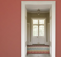
From Farrow & Ball's recent collection, this cheery tone of red has a fiery feel that brings warmth to any room.
2. Try paired back with muted shades of green
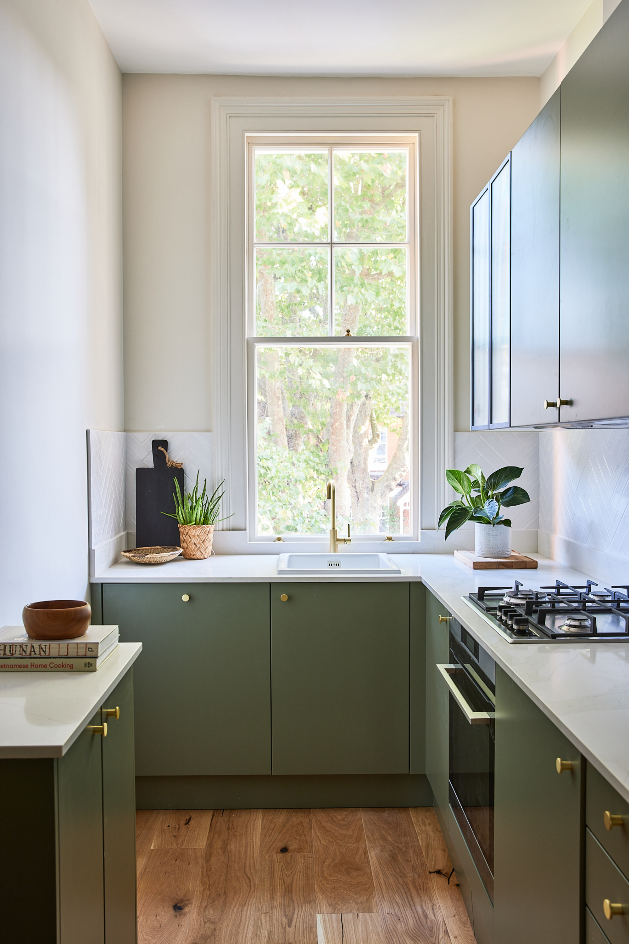
Green kitchens are always a winner. Whichever tone you're going for, from forest green to something lighter like pistachio or sage, the color's roots in nature always help the space to breathe, often needed in a small, cramped space.
'We think a muted sage green is a timeless color to try on your cabinets in a white kitchen,' says the founder of Topology. 'It's soft, inviting and goes with so many different other design elements from stone to rattan, to concrete or quartz.' In this small space, the green frames the view outside and encourages you to take in the scenery beyond the room and out the window.
A beautiful shade of sage with just a hint of blue, this paint is perfect for your kitchen, and has a crisp matt finish to boot.
3. Increase warmth with golden metallic tones
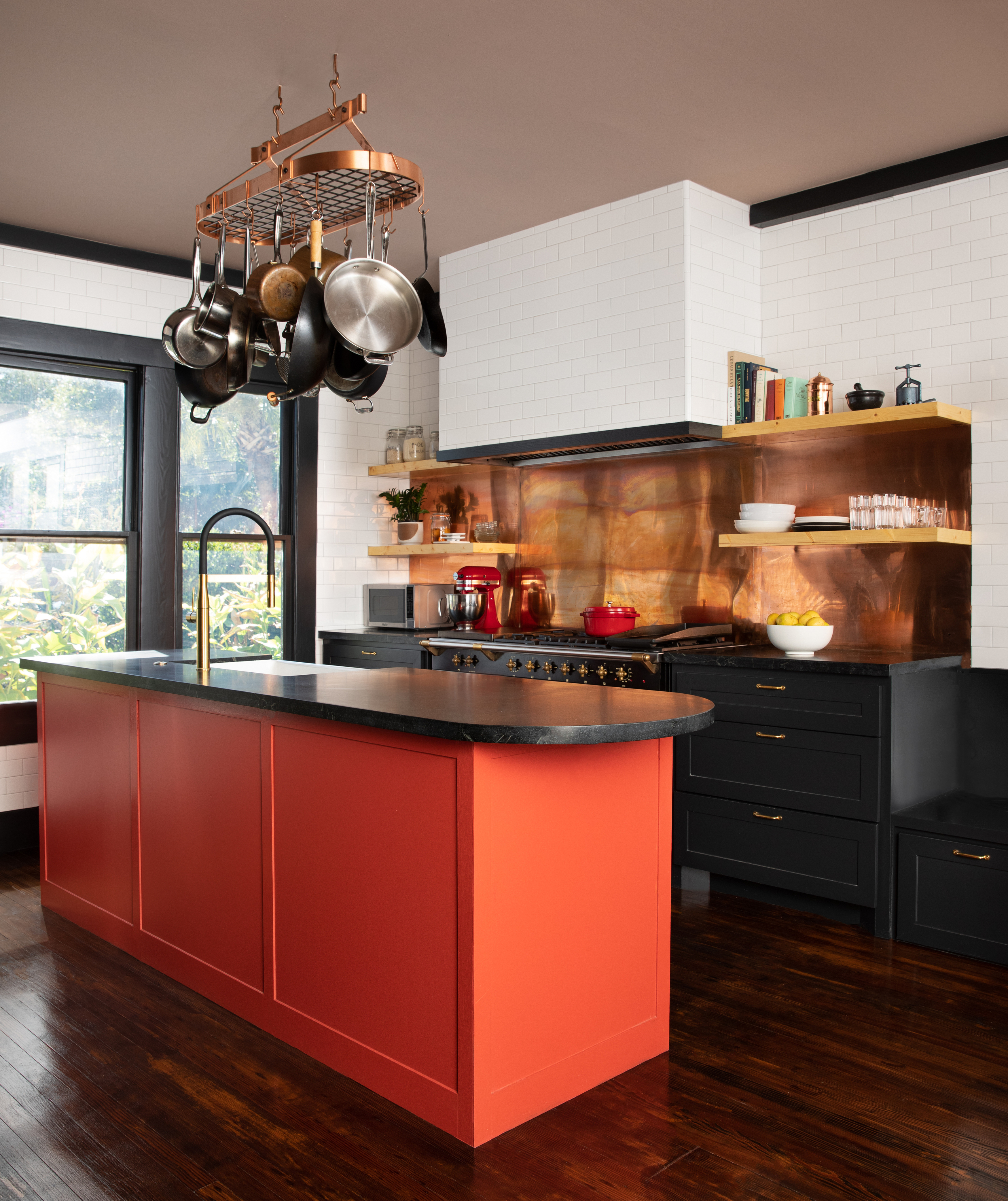
Why not embrace the size of your kitchen and go for a cozy kitchen feel, instead of trying to make a small space feel larger. Sometimes, if you're lacking natural light, this might be your best way to play a small kitchen, bringing glimmers of light bouncing off the walls. We're noticing a shift towards metallics and earthy shades across the home, including the kitchen. ‘In terms of trending styles, we’re seeing a lot of warm metallics like coppers, bronzes and brass colorways,’ adds Liane Burrett, senior design consultant at kitchen company, Roundhouse.
If you are installing on-trend warm metallic splashbacks, you might need to apply a coating of sealant. ‘Brass and copper splashbacks are beautiful but it’s important to understand how reactive they are,’ says kitchen designer, Ben Hawkswell, also of Roundhouse. Direct exposure to moisture will alter the appearance. Some like the aged look but if it’s not for you, either buy ready-sealed metal splashbacks or apply a thin layer of metal lacquer.
4. Try a warm neutral shade
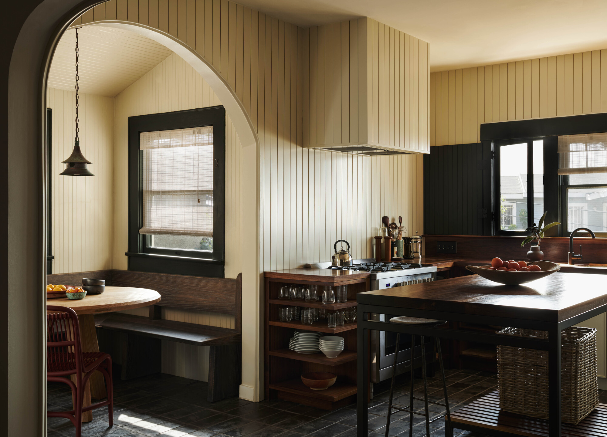
If you don't want to go for stark white on the walls, and are looking for something a little warmer and more rustic, cream can be a great neutral base from which to build with dark and earthy tones. In this farmhouse kitchen by Los Angeles-based designer Patrick Bernatz Ward, the wooden kitchen countertop works with the cream to feel cozy and comforting in this small space.
'Our proposal was to find a way to make the kitchen feel larger, while still including darker, warmer elements used in Arts and Crafts architecture,' says Patrick.
'The kitchen faces due south and we proposed a color that would reflect the high-toned sun at that time of day to enhance the scale of the walls. The darker contrasting walnut millwork countertop helps anchor the design against the warmer walls and terracotta base.
'We used Farrow & Ball’s Studio Green to accent the trim around the windows and also be in contrast to the walls. The end product feels warm, much larger, and is well balanced between the older historical elements and the newer palette.'
5. Opt for dark inky blues
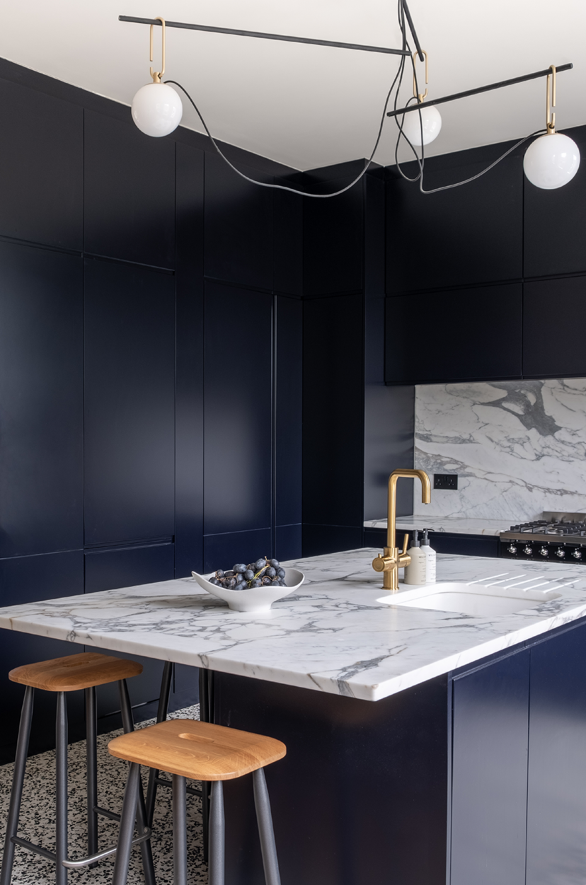
Go dark with a comforting inky blue, used in this kitchen from floor to ceiling to create a luxurious look. Going for a dark statement tone works well if you are designing an open plan kitchen where you want to create some differentiation. 'In this open plan loft we chose dark blue cabinetry to clearly "zone" the kitchen from the rest of the more neutral living space,' says Stephen Nash, creative director of All&Nxthing Interiors.
'With a small kitchen footprint, we made sure to utilize every inch of the generous ceiling heights and by choosing this dark color, the kitchen cabinets instantly become a focal point instead of blending in with the rest of the space.'
'To punctuate these blocks of deep blue, we’ve also incorporated terrazzo tiles for the floor and marble counters which have been made from the same source of marble – this means that the coloring is the same and, although busy visually, means that the coloring is co-ordinated with each making a statement in their own right, but not fighting between each other.
'Brass fixtures and fittings then bring in warmth and stand in contrast to the dark blue background again creating another focal point.'
6. Go all in with orange
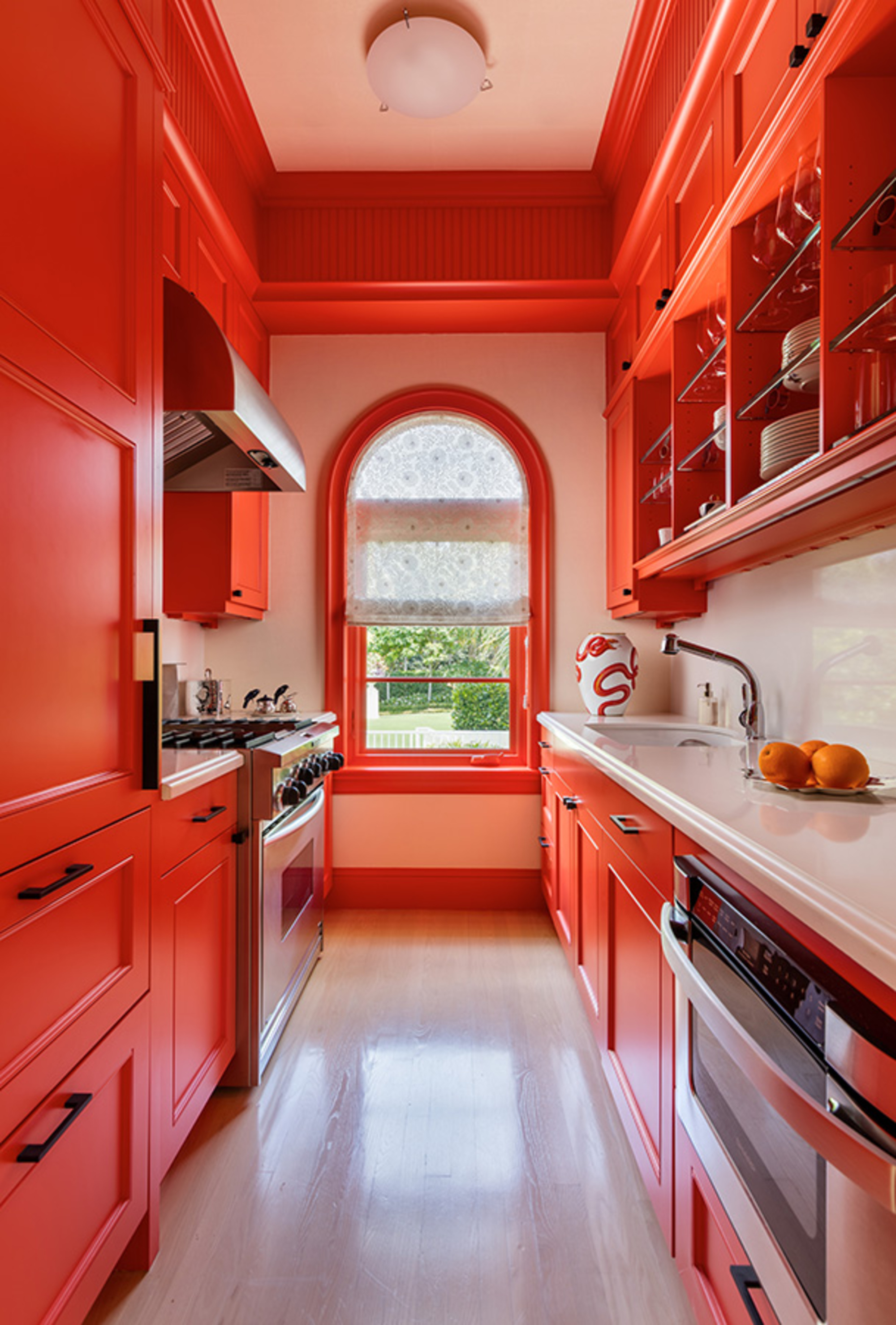
Sometimes, the small spaces are rooms where you can have fun. Forget trying to make the space feel bigger, instead, be brave and go bold, painting the trim and kitchen all the same color. 'Bold kitchen color is one way to grow a space that physically has a small footprint,' says Matthew Boland, interior designer at MMB Studio, who designed this kitchen.
'In this guest house's colorful kitchen, the bijou kitchen is narrow, so I wanted to make it a star. The color – Sherwin-Williams’ aptly named Energetic Orange – grabs your attention and allows your eye to travel the entire length and height. The smallest spaces can be the most memorable if you keep the focus strong. Here, the focus was the paint color and we used it with vigor.'
7. Introduce bright sunshine yellow
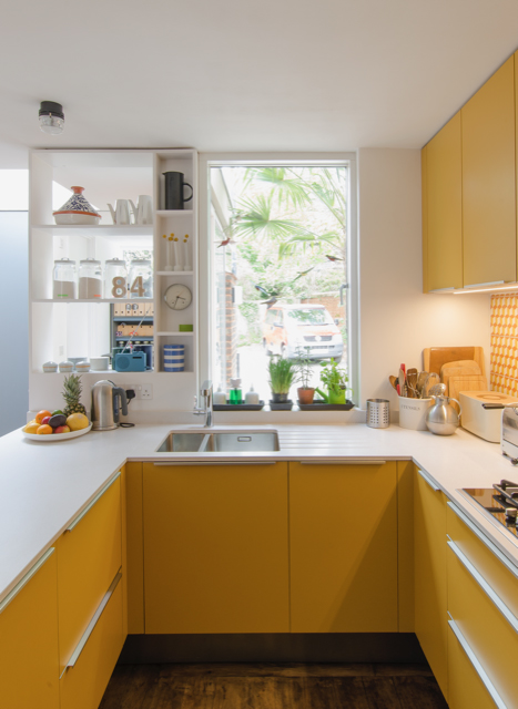
Design by R2 Studio Architects
Yellow is always a reliable color to really lift a room out of feeling awkward, cramped and small, and a yellow kitchen can really work well to bring a bit of joy to the space.
Try painting your kitchen cabinets in a sunshine pop of yellow, or consider bright yellow kitchen tile splashback for an energetic accent in the room. This U-shaped yellow kitchen was completed by R2 Studio Architects. 'The kitchen is now boldly colored, natural daylight floods in and allows the vibrant colors to sing,’ says architect Frederik Rissom.
Be The First To Know
The Livingetc newsletters are your inside source for what’s shaping interiors now - and what’s next. Discover trend forecasts, smart style ideas, and curated shopping inspiration that brings design to life. Subscribe today and stay ahead of the curve.

Former content editor at Livingetc.com, Oonagh is an expert at spotting the interior trends that are making waves in the design world. She has written a mix of everything from home tours to news, long-form features to design idea pieces, as well as having frequently been featured in the monthly print magazine. She is the go-to for design advice in the home. Previously, she worked on a London property title, producing long-read interiors features, style pages and conducting interviews with a range of famous faces from the UK interiors scene, from Kit Kemp to Robert Kime. In doing so, she has developed a keen interest in London's historical architecture and the city's distinct tastemakers paving the way in the world of interiors.
-
 Turns Out the Coolest New Café is Actually In Your Kitchen — Here's How to Steal the Style of TikTok's Latest Trend
Goodbye, over-priced lattes. Hello, home-brewed coffee with friends. TikTok's 'Home Cafe' trend brings stylish cafe culture into the comfort of your own home
By Devin Toolen Published
-
 5 Bathroom Layouts That Look Dated in 2025 — Plus the Alternatives Designers Use Instead for a More Contemporary Space
For a bathroom that feels in line with the times, avoid these layouts and be more intentional with the placement and positioning of your features and fixtures
By Lilith Hudson Published
