9 color palettes for minimalist bathrooms - instantly relaxing looks that feel elegant and expensive
Pared back designs can still have depth to them too, and color palettes for a minimalist bathrooms can still make a big design splash. Experts explain how
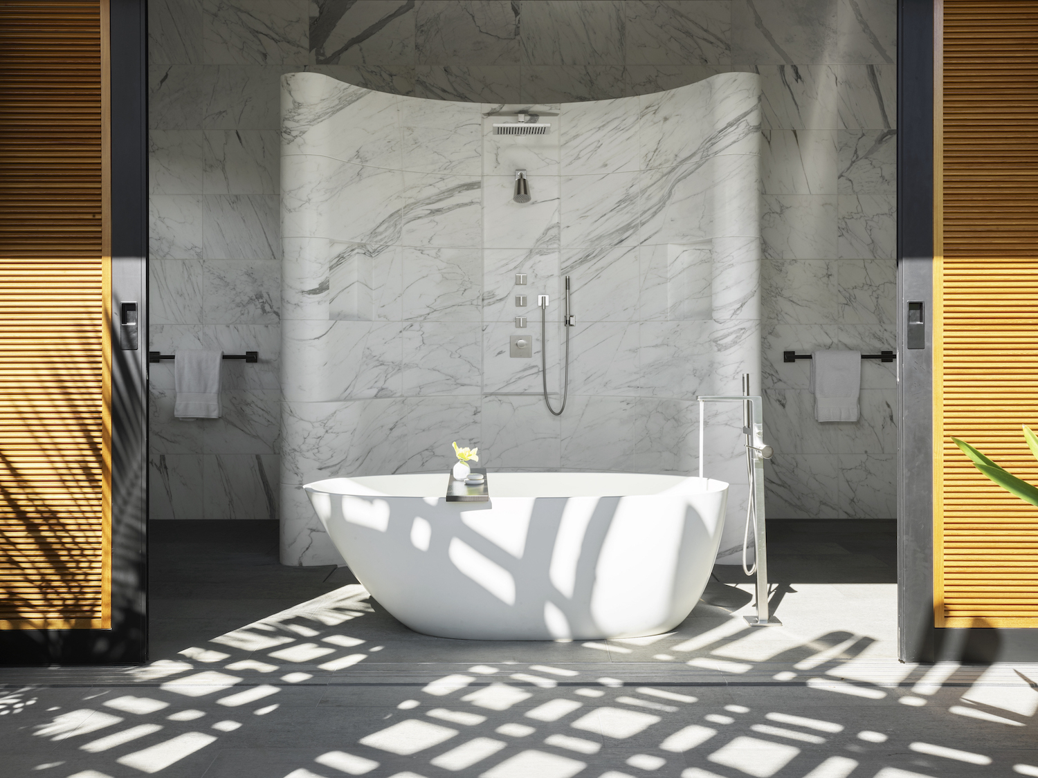
If you want to design a bathroom that’s super tranquil, contemporary and luxe, look no further than minimalism. The “less is more” design trend is about creating clutter-free spaces that enhance our wellbeing—ideal if you want your bathroom to have a spa-like vibe.
As minimalist interior design applies ornamentation very sparingly, the trick is to use color conservatively. You want your scheme to feel calming and cohesive, so avoid attention-grabbing hues or feature walls at all costs.
That doesn’t mean color palettes for minimalist bathrooms need to be boring. As a handful of leading designers explain below, you can add interest and depth to your scheme by pairing a variety of neutral palettes with organic materials.
9 color palettes for minimalist bathrooms
Keep reading to discover 10 of their favorite color palettes for you to try at home.
1. Crisp, classic white and muted, cool grey tones
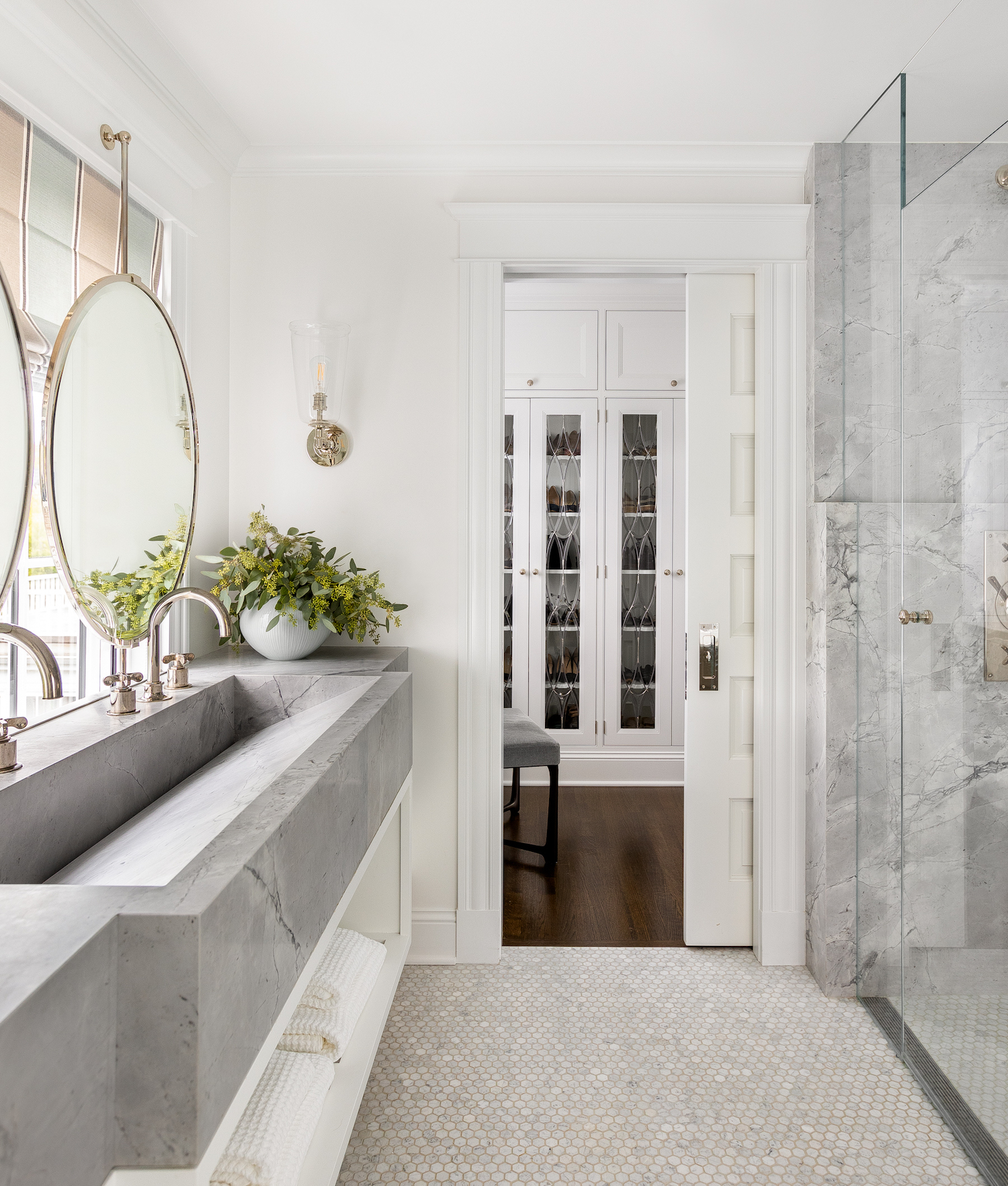
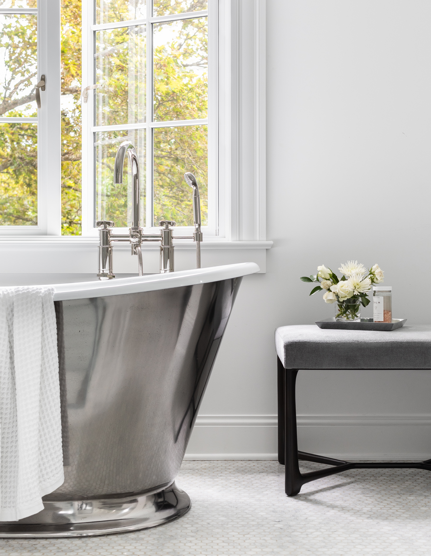
In the minimalist bathroom pictured above and below by Studio AM in Seattle, the white-based color palette is elevated with metal finishes and organic patterns in the tiles.
“Classic white bounces light in every small bathroom and gives it a larger sense of space,” says Danielle Krieg, an interior designers at Studio AM. “Natural light, simple lines and the classic white paint ensures this bathroom is elegant without being flashy. The polished nickel plumbing fixtures, sconces, mirror, and the leaded glass in the background add layers and depth without introducing complexity. The sweeping style of the statement tub was a staple for this minimal design to offset the large, custom integrated stone sink.”
2. Warm beige, sand and white
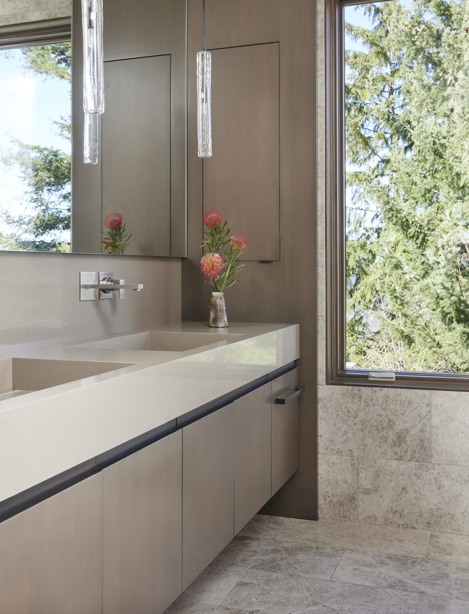
Minimalism is a great way to make the most of a bathroom with a nice view, as demonstrated in the design above by Studio AM. The warm, neutral palette and clean lines of this spa bathroom draw your eyes outside to the natural world.
“This neutral color projects a sense of coziness with layers of finishes,” says Krieg. “The tree branches outside the large window were very spirally and active so we knew we wanted to create a less busy feel in the bathroom. We added texture and layers with a pop of soft, red flowers and light pendants made of cracked, cast glass above a polished stone slab countertop.”
3. Brown, charcoal, beige and gray
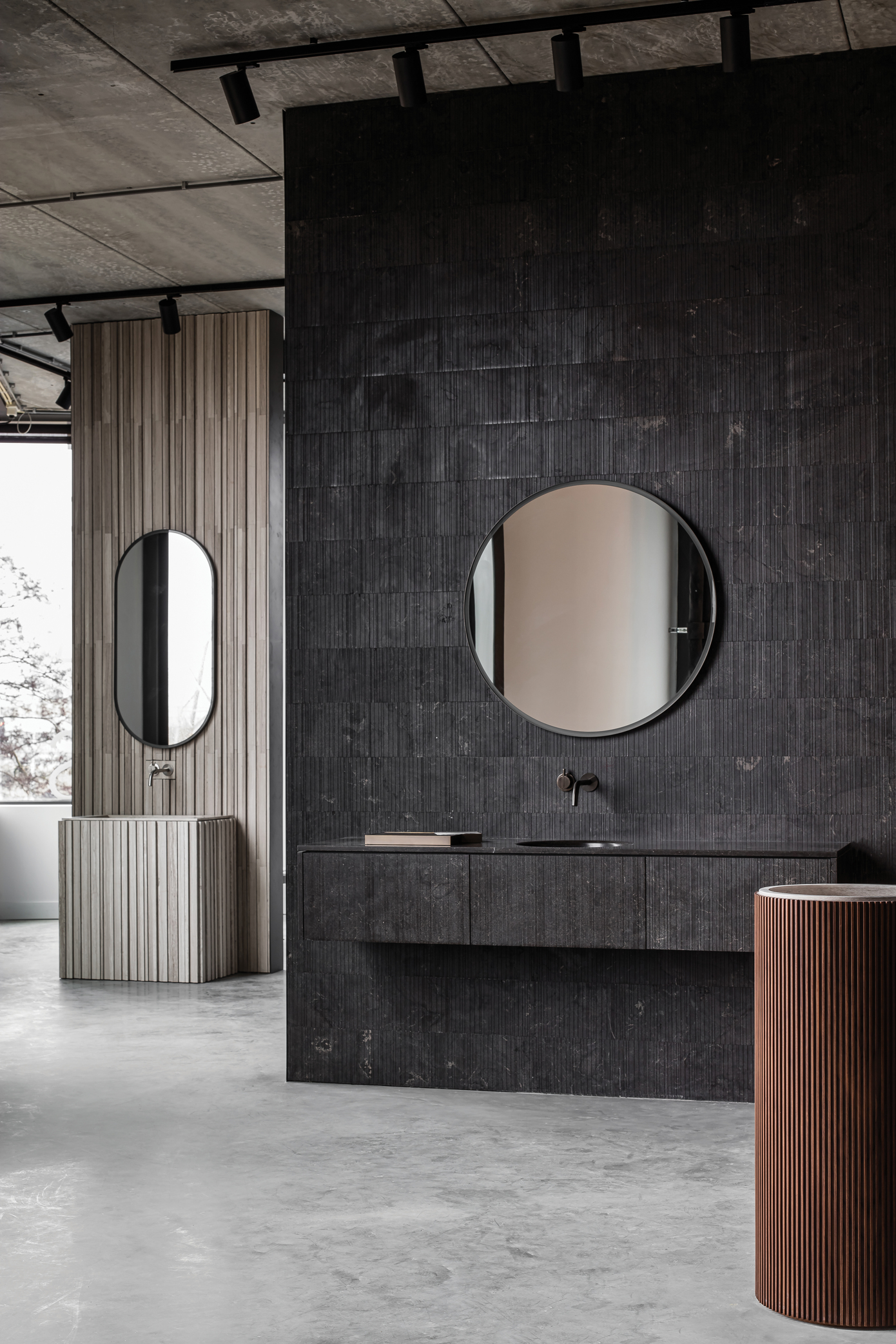
In the most recent wave of minimalism, often called soft minimalism, incorporating natural materials is essential. The idea is that organic objects help to calm us by reconnecting us with the natural world. This makes earthy neutrals – like in the image above by Salvatori – a great choice for minimalist bathrooms.
The Salvatori brand comments: “As more designs play off the importance of forging a link with nature, the natural minimalist look is a bathroom trend that is destined to stay. Salvatori recommends using neutral tones such as beige and gray, or natural materials like wood and plants to create a link to the outdoors. It’s all about creating a warm, soothing effect, whether it’s the use of an earthen color palette or earth-inspired textures in natural stone, to create a welcoming atmosphere no matter the climate.”
4. All white and dark wood
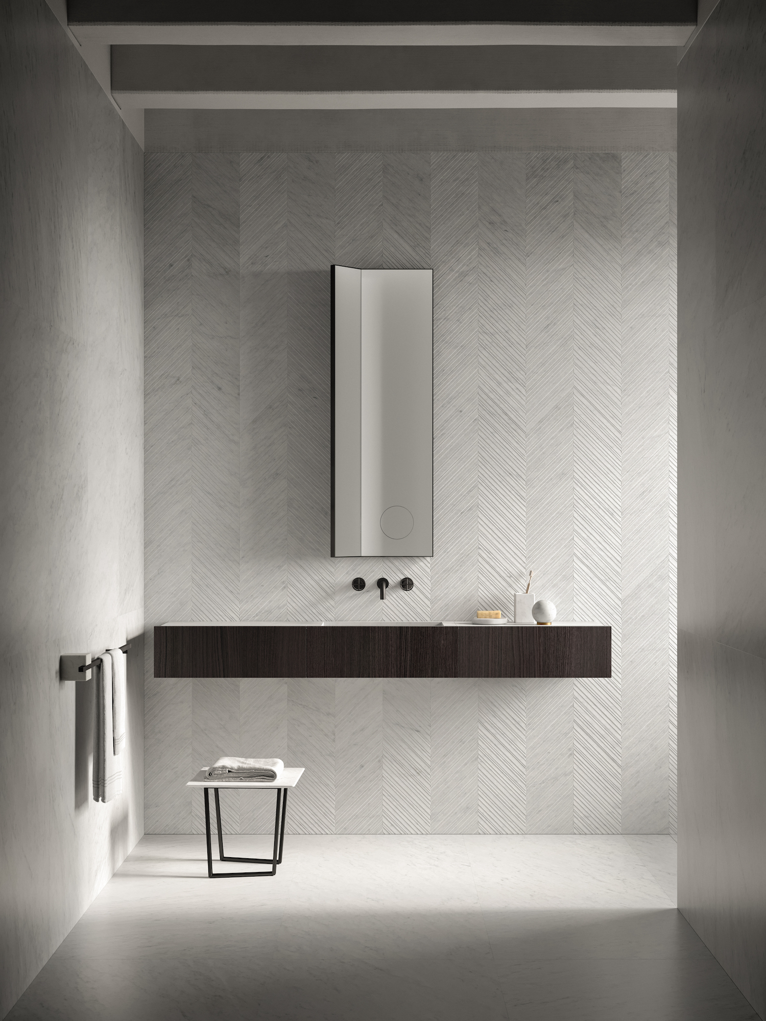
There’s a reason why an all-white space has become a cliche when it comes to minimalist design. “We believe an all white palette amplifies the perception of space," says the team at Salvatori. "This makes it a perfect solution for small or dimly-lit bathrooms, lightening the space with clean lines and creating an uncluttered effect."
If you go for white on white, make sure you use a variety of textures, as demonstrated in the bathroom above. Salvatori explain: “To avoid a stark, sterile result, we recommend playing with the shape and texture of the tiles you choose like Salvatori’s Chevron in Bianco Carrara, or adding a few white marble accessories to an existing design with the Fontane Bianche Collection by Elisa Ossino.”
5. Grey marble, wood and brass
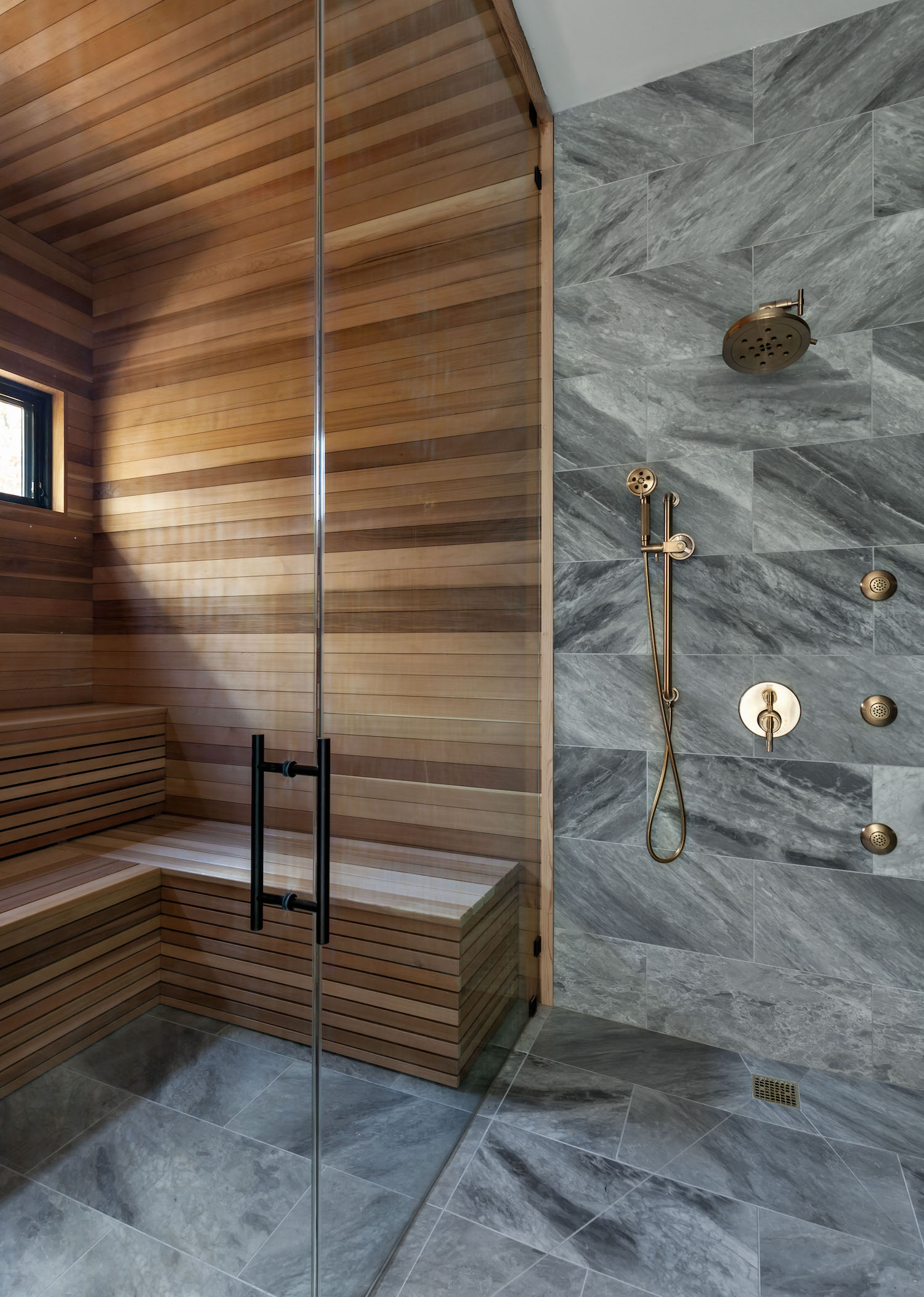
In the modern bathroom above my Studio Zung, the natural wood cladding and marble demonstrate how organic materials can create a luxurious, spa-like effect. The range of tones and natural patterns in the materials are enough to keep the palette interesting.
“In the bath space, I typically lean toward a Japanese style of bath experience, mixed with the modern layout of European hotels,” says Tommy Zung, Principle Designer at Studio Zung. “The bath space is a place for solace and solitude, mindfulness and cleansing. Creating a ritual is what drives the design.”
6. White, wood and a pop of orange
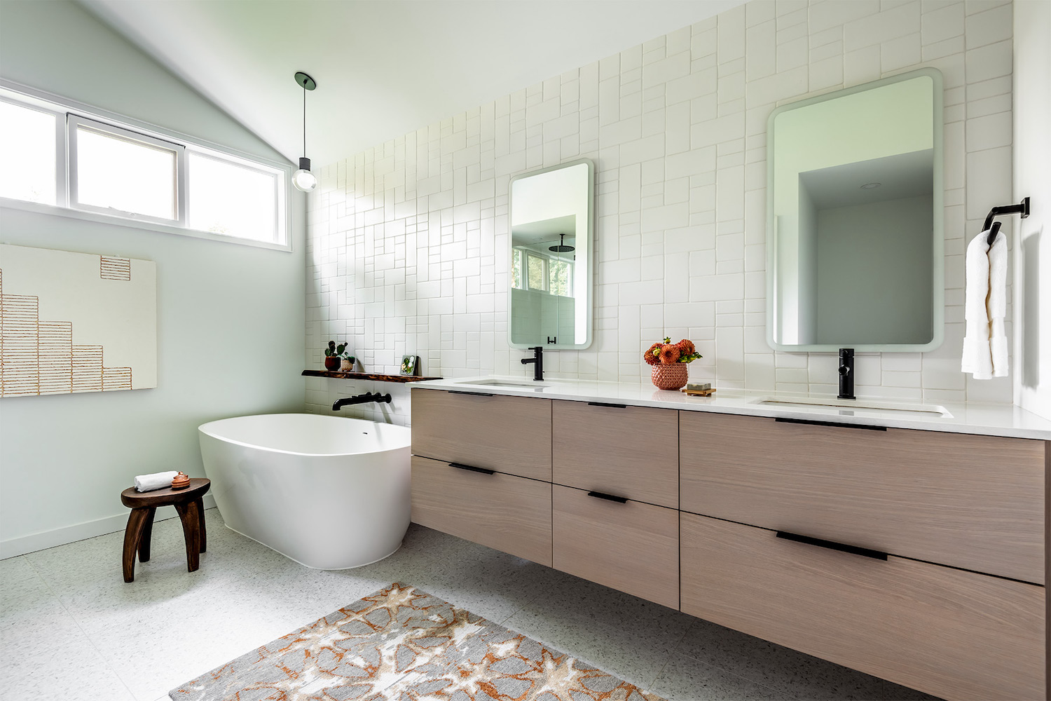
Orange bathrooms are trending, but aren't particularly minimalist. However, there is something to be taken from the joy they evoke. The bathroom above by Swivel Interiors shows how to use a splash of color in a minimalist way. The neutral base and layers of texture keep the space feeling calm. And by repeating the orange in the rug, painting and vase, the color blends with the rest of the room and maintains that cohesive feel.
“Whites, creams and soft grays all are ideal for minimalist bathrooms,” says Kathleen Glossa, Founder of Swivel Interiors. “To avoid a sterile or cold vibe, consider texture, patterning and organic materials. Without these details the space can end up feeling too flat or cold. A white tile is a "go to", but we often use a dimensional tile or modular tile (a mix of sizes) so these surfaces add a cadence to the interior space. Layering textural art, a bespoke piece of furniture and an artisan rug adds little moments of dimensionality to a minimalist bathroom.”
7. White and grey
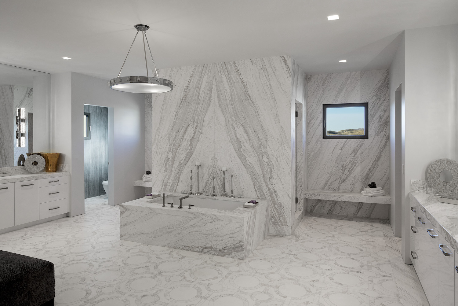
White and gray is another easy win for a minimalist bathroom, especially if you include the colors within a natural material like marble.
“You really can't go wrong with a palette centered around classic white in bathrooms,” says Jessica Earp, interior designer at Cushing Terrell, the firm behind the bathroom pictured above. “White always feels crisp, clean, and minimal. My key to selecting a white paint that feels bright without coming across as clinical is to choose a hue that offers a hint of gray, such as Backdrop Home's Moonstone. Alternatively, designing a bathroom around an unexpected monochromatic color scheme, such as Pantone's 13-1511 Pink Salt feels so unique and uplifting.”
8. White, grey and wood

When it comes to choosing a color palette for your minimalist bathroom, it can be best to let the materials you’re using guide the way. In the above indoor/outdoor bathroom by De Reus Architects, the composition and materials of the bathroom were the focus during the design process.
“Determining a color palette depends on the space and the finish materials,” says Mark de Reus, Founder of De Reus Architects. “For instance, in the prime bathroom for the Bias House [pictured above], the finish materials are Calacatta marble, light gray basalt stone floors, light gray stained white oak ceilings and cabinetry. These three finish materials form the entire palette of coloration and texture of the room. Yet because of the geometric shape of the ceiling and room, the counterpoint of a curved free standing marble stone shower, and the freestanding tub, there are compositional layers in this room – decoration is not needed.”
9. Charcoal
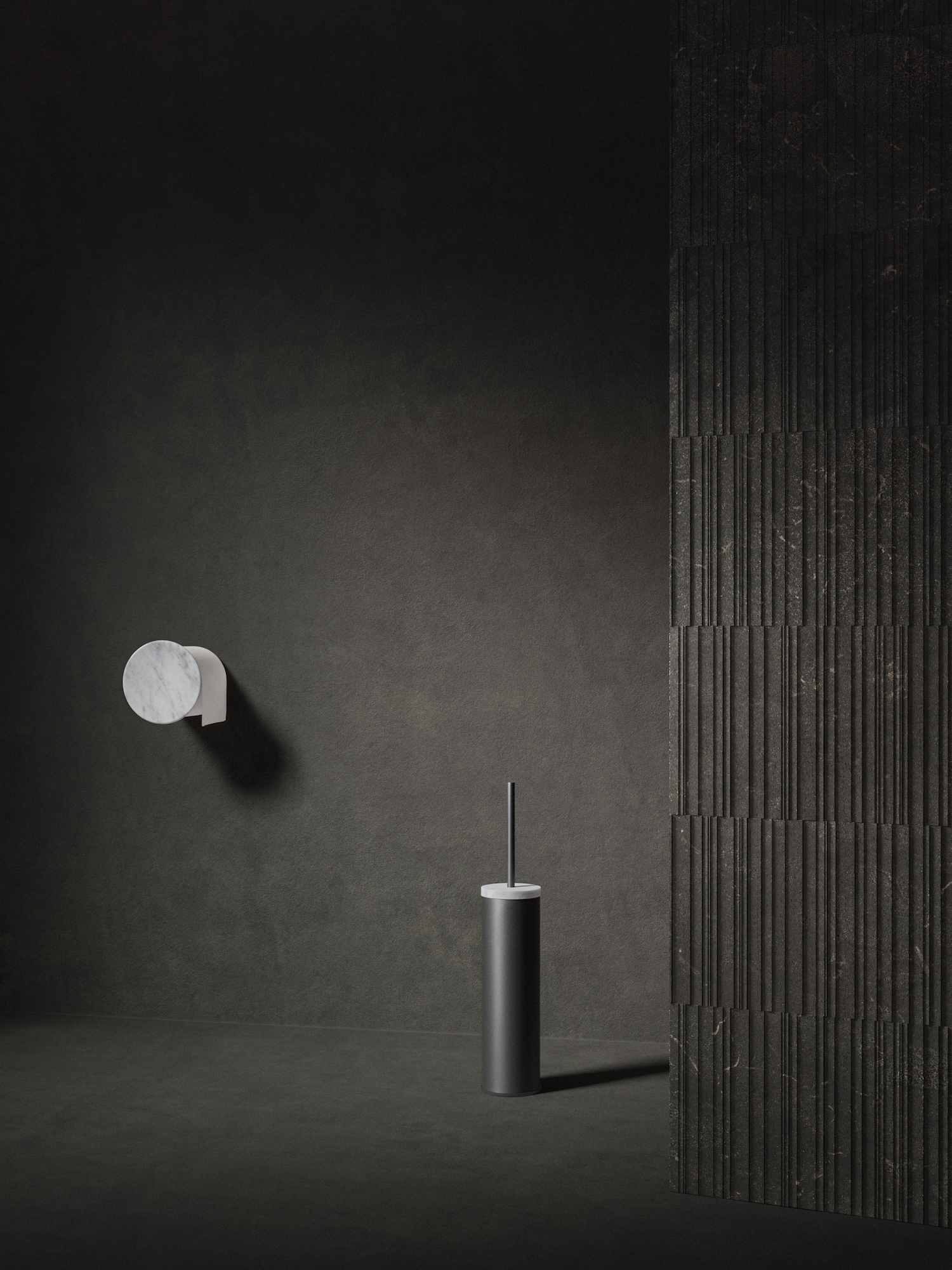
To create a minimalist bathroom that feels really enveloping, try decorating the whole room in one strong hue, like in the dark bathroom by Salvatori above. This look feels super modern and is a great option if you’re a minimalist with some maximist tendencies.
Once again, you can soften the look through layers of texture. If a charcoal bathroom feels too daring, other earthy shades could work just as well, such as olive green or terracotta.
Be The First To Know
The Livingetc newsletters are your inside source for what’s shaping interiors now - and what’s next. Discover trend forecasts, smart style ideas, and curated shopping inspiration that brings design to life. Subscribe today and stay ahead of the curve.
Kate Hollowood is a freelance journalist who writes about a range of topics for Marie Claire UK, from current affairs to features on health, careers and relationships. She is a regular contributor to Livingetc, specializing in reporting on American designers and global interiors trends. Based in London, Kate has also written for titles like the i paper, Refinery29, Cosmopolitan and It’s Nice That.
-
 Turns Out the Coolest New Café is Actually In Your Kitchen — Here's How to Steal the Style of TikTok's Latest Trend
Goodbye, over-priced lattes. Hello, home-brewed coffee with friends. TikTok's 'Home Cafe' trend brings stylish cafe culture into the comfort of your own home
By Devin Toolen Published
-
 5 Bathroom Layouts That Look Dated in 2025 — Plus the Alternatives Designers Use Instead for a More Contemporary Space
For a bathroom that feels in line with the times, avoid these layouts and be more intentional with the placement and positioning of your features and fixtures
By Lilith Hudson Published