9 perfect color palettes for transitional- style living rooms - the design trend of the moment
Design experts share the best color palettes for transitional-style living rooms and how to layer them to perfectly balance old and new
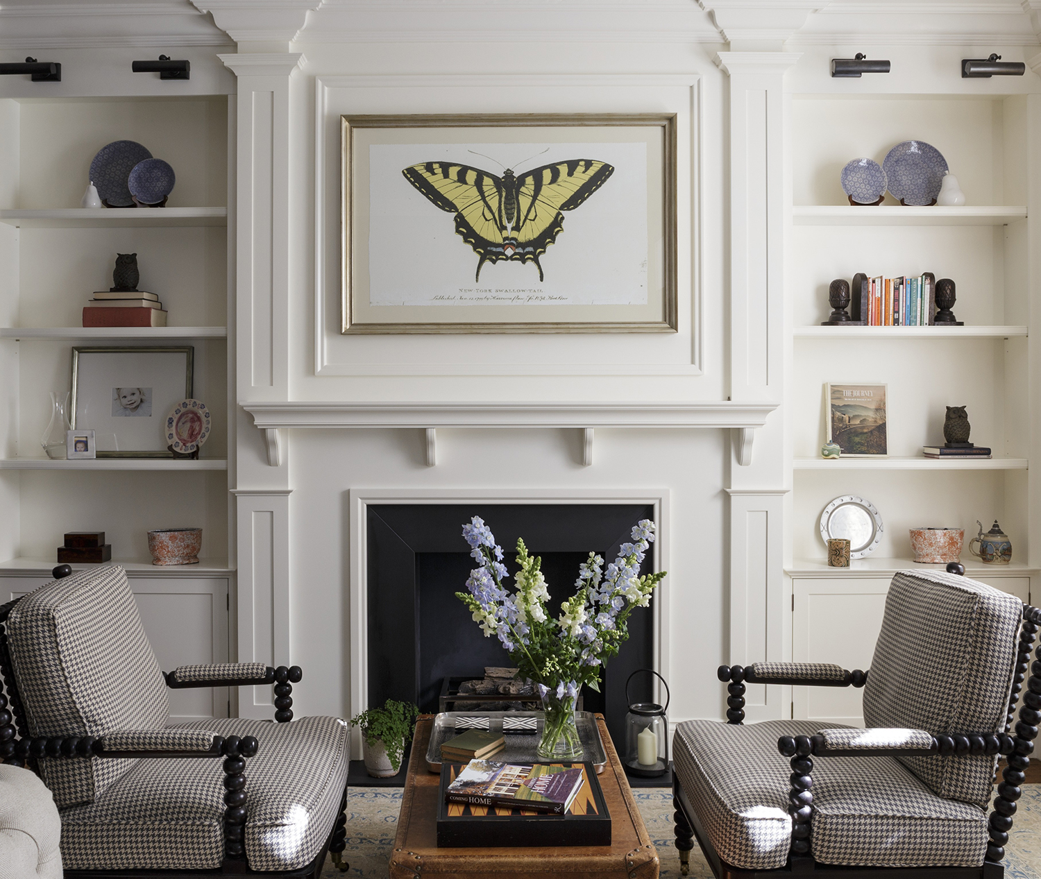
Blending traditional and modern elements, transitional style can help you design a living room that’s both relaxed and full of character.
“This style feels personalized, comfortable and has the innate flexibility to evolve with residing families,” says Hannah Yeo, Manager of Color Marketing & Development at paint brand Benjamin Moore. “In some ways, transitional style allows homeowners to create their own style and accommodate individual needs, making this style ideal for a room where families gather. And because it has the power to stay current, this style will not go out of style for the foreseeable future.”
Key to achieving this look is creating a sense of balance and marrying the eclectic design elements together. Color is one tool that can help you do just that – whether you opt for a backdrop of neutral tones or apply layers of harmonizing blues.
9 color palettes for transitional living rooms
Fancy trying out this adaptable, timeless style in your own transitional-style living room? Here are our design experts’ favorite color palettes to help get you started.
1. Pale blue and beige with gold accents
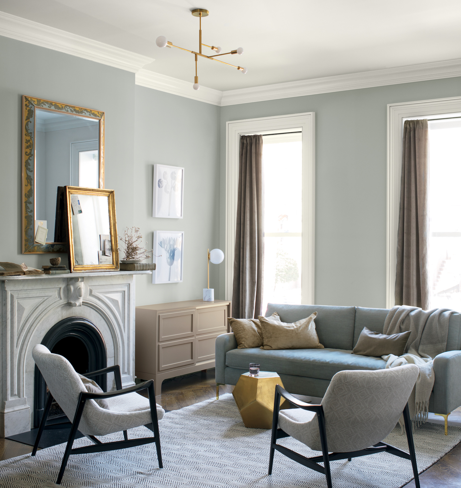
Pale blue and beige are a calming combination, reminding us of nature and days spent on the beach. In the above design by Benjamin Moore, the addition of gold accents makes the room feel luxe and contemporary. Benjamin Moore’s Hannah Yeo explains: “Soothing blues such as Wedgewood Gray HC-146 or Quiet Moments 1563 make a great backdrop for a relaxing yet classical living room. Both hues have a healthy dose of gray undertone that makes them easy to decorate and easy to live with.”
Yeo adds that when in doubt, go for a neutral hue, “Staying neutral is a safe choice for transitional style,” she says. “With a neutral backdrop such as Edgecomb Gray HC-173 or Metropolitan AF-690, any new piece you add – whether it’s a new piece of furniture or accessory, will fit right in. These soft neutral hues have a stately traditional look, however, can quickly take on a modern look by pairing with other bold colorful accents.”
2. Grey, white and yellow

Want to include a bolder color in your transitional living room palette? Perhaps surprisingly, yellow is a safe bet – demonstrated in in the subtle nod to the sunshine shade in the artwork, above. Yellow has always been one of the best colors that goes with grey, and it particularly works for this look.
“Yellow is a great color to use with neutrals because it is so close in tone that it blends effortlessly,” says J Renee Designs’ Principle Designer Jessica Schuler. “This was a pass-through space that my client wanted to be soft on the eyes but still fun. Yellow is a color that can pull that off. It can be soft while still being an accent in the room.”
3. Grey, white, black and brown leather
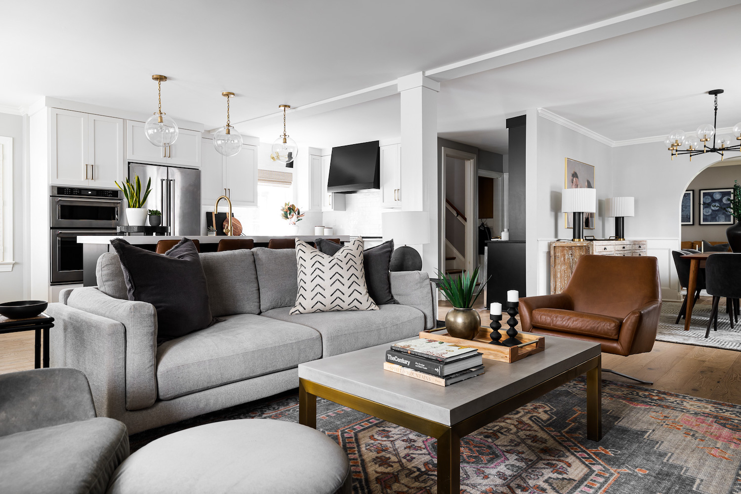
Another trick is to keep your palette entirely neutral. In the living room above by J Renee Designs, the neutral palette helps the more traditional elements – the cabinetry, the sofa, and the rug – sit happily alongside the more modern armchair, coffee table and light fittings.
Schuler explains: “This creates a very strong color scheme that can be used as a base palette for any color or pattern to be added in.”
4. Green, purple, cream and charcoal
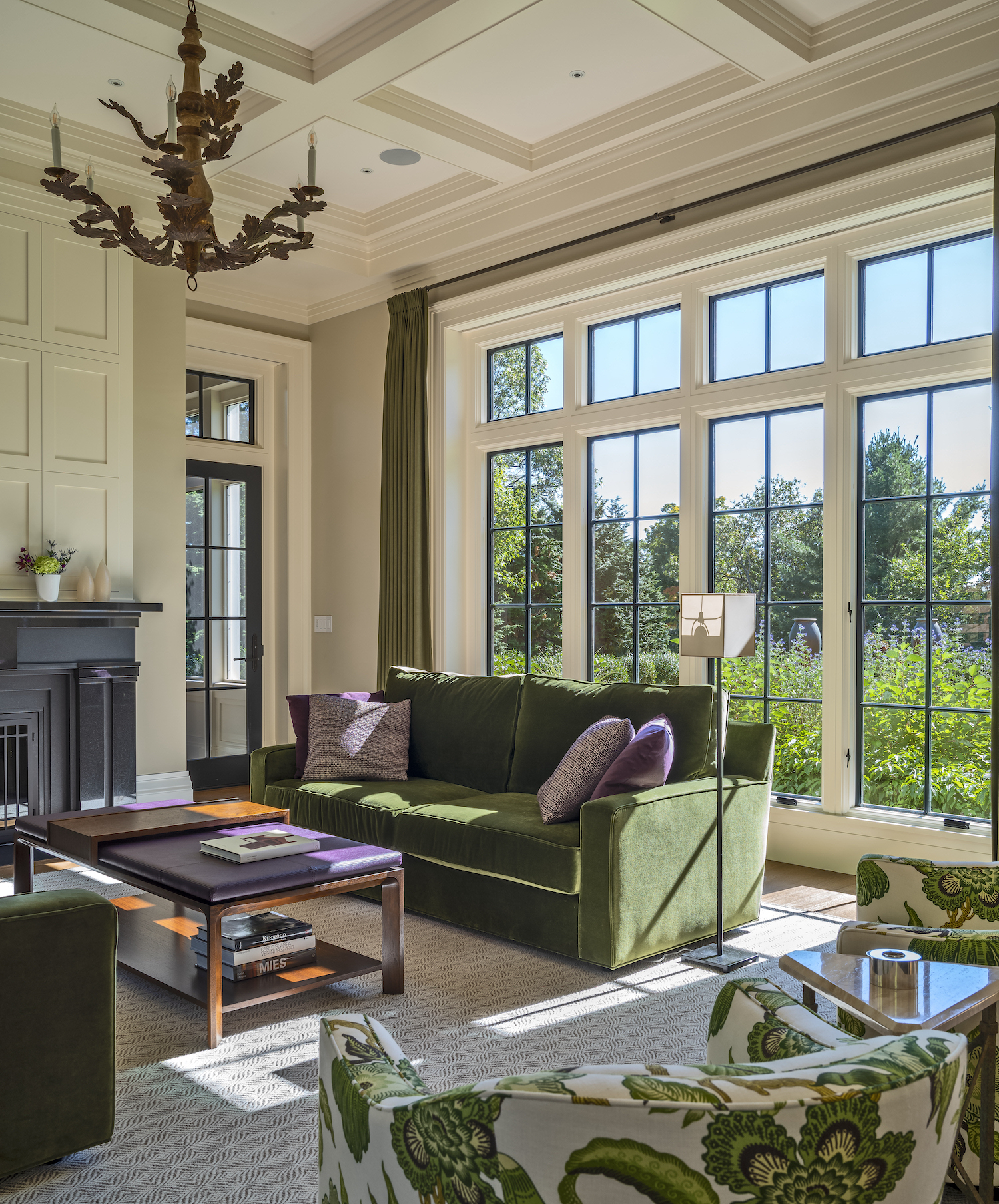
You can also create a sense of balance through contrast, as demonstrated in the design above by Winchester, MA-based Kristen Rivoli Interior Design. As contrasting colors, purple and green serve to harmonize each other. Contrast is applied elsewhere in the living room pictured with the dark charcoal window panes and doorway against the cream walls.
“Deep charcoal to almost black hues endures traditional weight,” adds Benjamin Moore’s Yeo. “These dark colors are great to highlight architectural details in places like window mullions, French door frames or staircase spindles. It also takes on a fresh modern look when paired with crisp whites to create high contrast. Kendall Charcoal HC-166 and Racoon Fur 2126-20 are two of my favorites.”
5. Blue, white, cream and beige
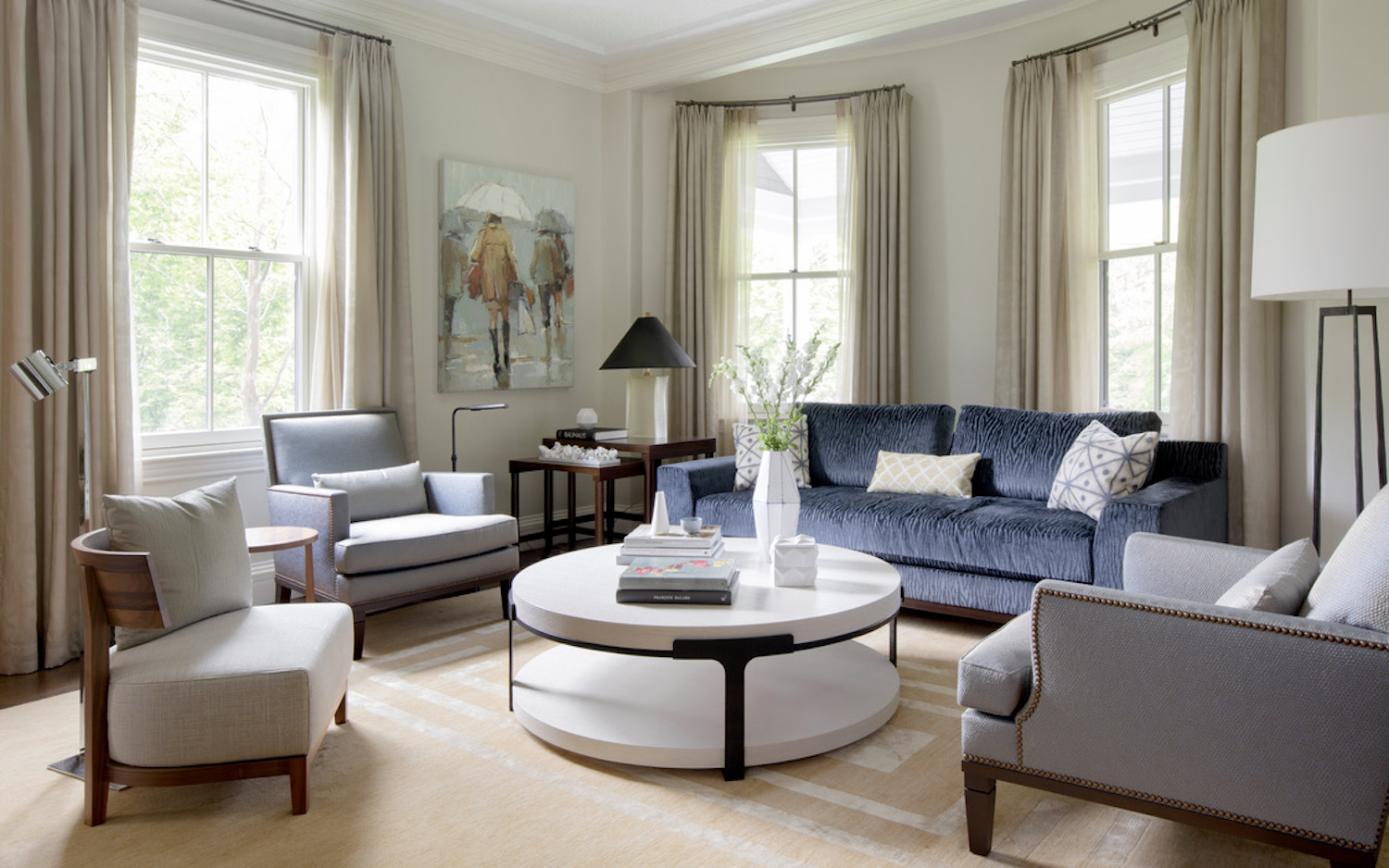
For a transitional living room that feels super calming, try a palette of blue, white cream and beige. In the living room pictured, the furniture feels like a set despite featuring pieces from a range of eras.
“I always tend to use a shade of blue, which feels like equal parts color and equal parts neutral,” says Kristen Rivoli, Principal Designer at Kristen Rivoli Interior Design. “Blue is such a huge favorite with my clients, it has such a welcoming presence. There are many tones of white, cream and beige that can be collected in a room palette that work beautifully together.”
6. Lavender, brown, beige and wood
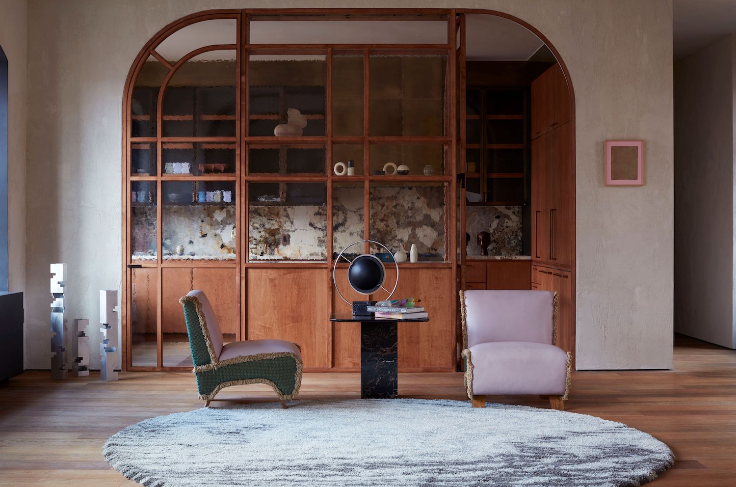
Natural wood and plaster finishes can behave as neutral tones and help to balance a transitional living room. They are perfect colors that go with lavender (a tone that is trending in itself).
“To bring a sense of intimacy, warmth and history to a space, we like to use fundamental materials like wood, plaster, metal or stone to set the color palette,” says Crina Arghirescu Rogard, Principle Designer at NYC-based Crina Architecture. “Transitional style is a natural option for living rooms. It is very open for interpretation and personal taste, and allows you to reconcile different types of furniture, materials, and eras into one space. We can combine new and old to create a completely fresh environment.”
7. Light blue, dark blue, white and grey
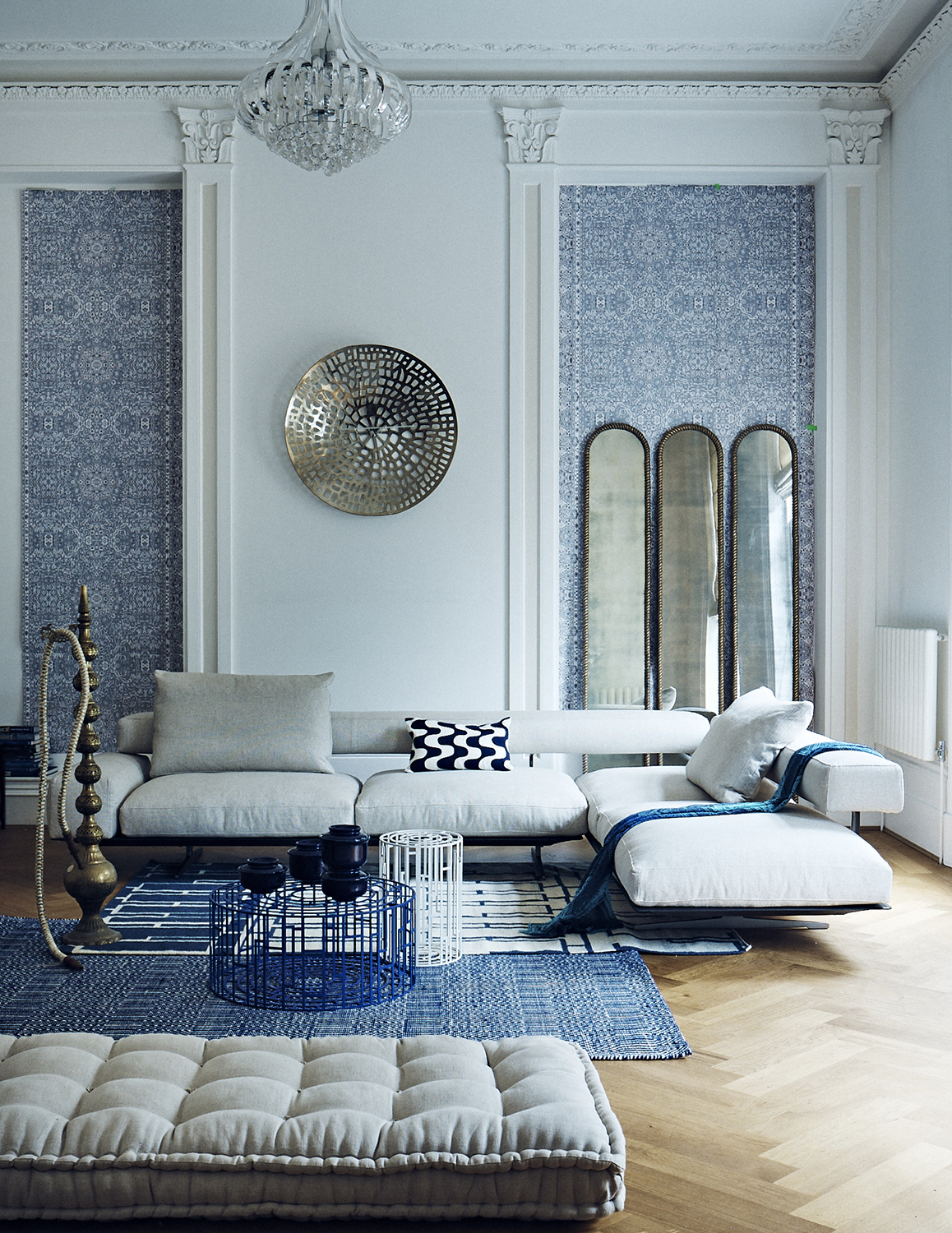
Layering multiple tones of the same hue can help to soften a color palette, creating exactly the kind of calming vibe you want in a transitional style living room.
Jessica Schuler explains: “One of my favorite color palettes involves using varying tones of the same color in the same space. In this space I paired a light blue with a darker blue which was set off against a very light creamy colored sofa. By using white with the blues it allows the room to have a softer airy feeling.”
8. Tones of grey and brown with a pop of mustard yellow
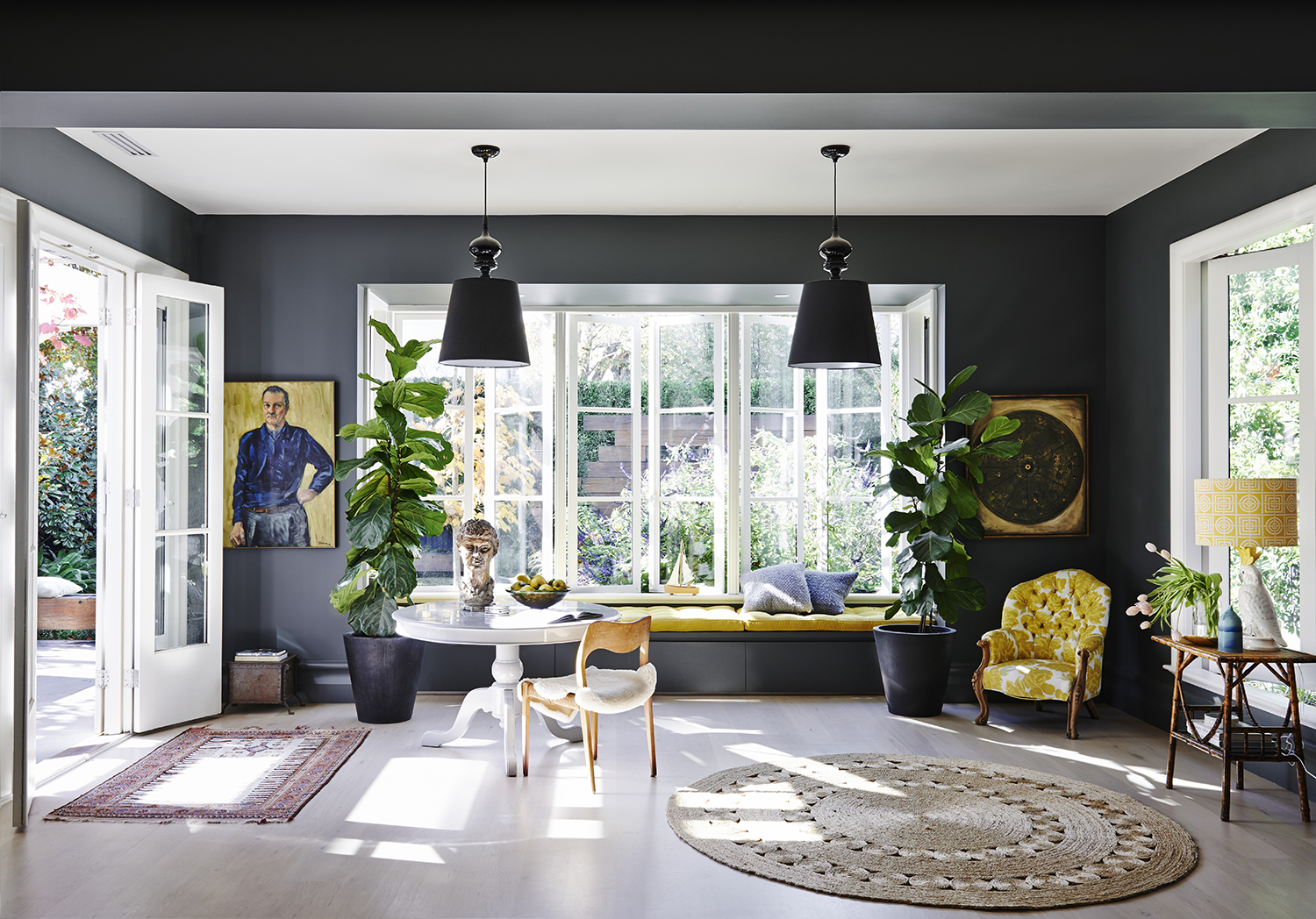
Another way to use contrast in a transitional living room is through balancing a neutral base palette with a loud pop of color.
“Sometimes we only want color in very small doses, as in this space [pictured] where the client was a single male who preferred a simplistic approach to design,” says Schuler. “This color palette allowed us to pair traditional fabrics with more modern furniture pieces effortlessly. When all of the colors are neutral tones the patterns don't compete as much.”
9. Beige, gray, orange, yellow and green
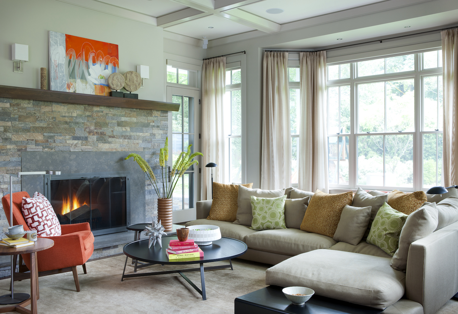
You don’t have to pick just one hue for a color pop. In the living room above by Kristen Rivoli, pops of orange, yellow and green are blended with beiges and grays.
“Transitional pieces make it easy to marry different styles together in a way that feels collected and relaxing,” says Kristen Rivoli. “Transitional styled furniture has softened details from traditional furniture and nods to the modern aesthetic that feels welcoming and elegant, while not being too stuffy or too stark.”
Be The First To Know
The Livingetc newsletters are your inside source for what’s shaping interiors now - and what’s next. Discover trend forecasts, smart style ideas, and curated shopping inspiration that brings design to life. Subscribe today and stay ahead of the curve.
Kate Hollowood is a freelance journalist who writes about a range of topics for Marie Claire UK, from current affairs to features on health, careers and relationships. She is a regular contributor to Livingetc, specializing in reporting on American designers and global interiors trends. Based in London, Kate has also written for titles like the i paper, Refinery29, Cosmopolitan and It’s Nice That.
-
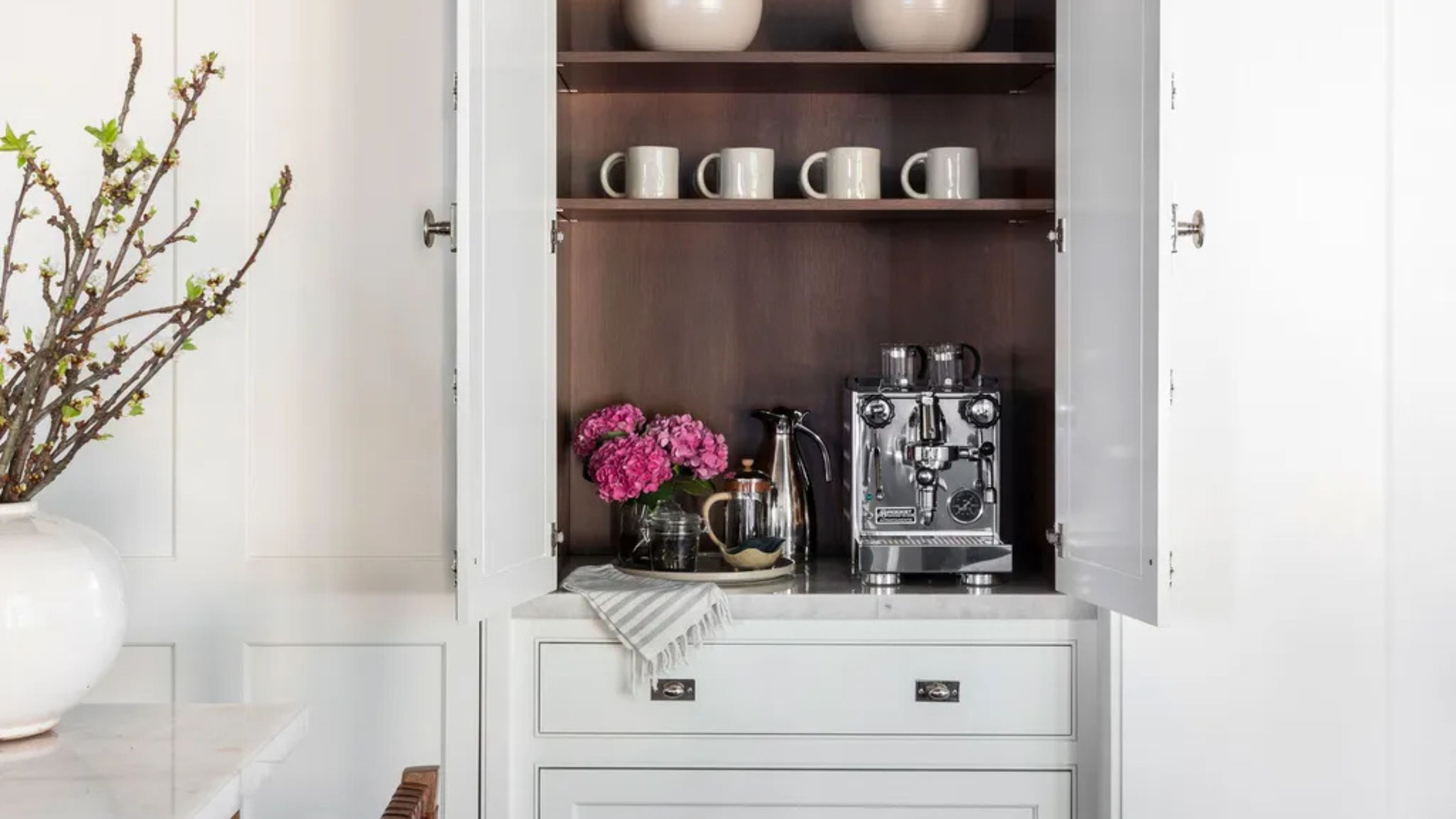 Turns Out the Coolest New Café is Actually In Your Kitchen — Here's How to Steal the Style of TikTok's Latest Trend
Goodbye, over-priced lattes. Hello, home-brewed coffee with friends. TikTok's 'Home Cafe' trend brings stylish cafe culture into the comfort of your own home
By Devin Toolen Published
-
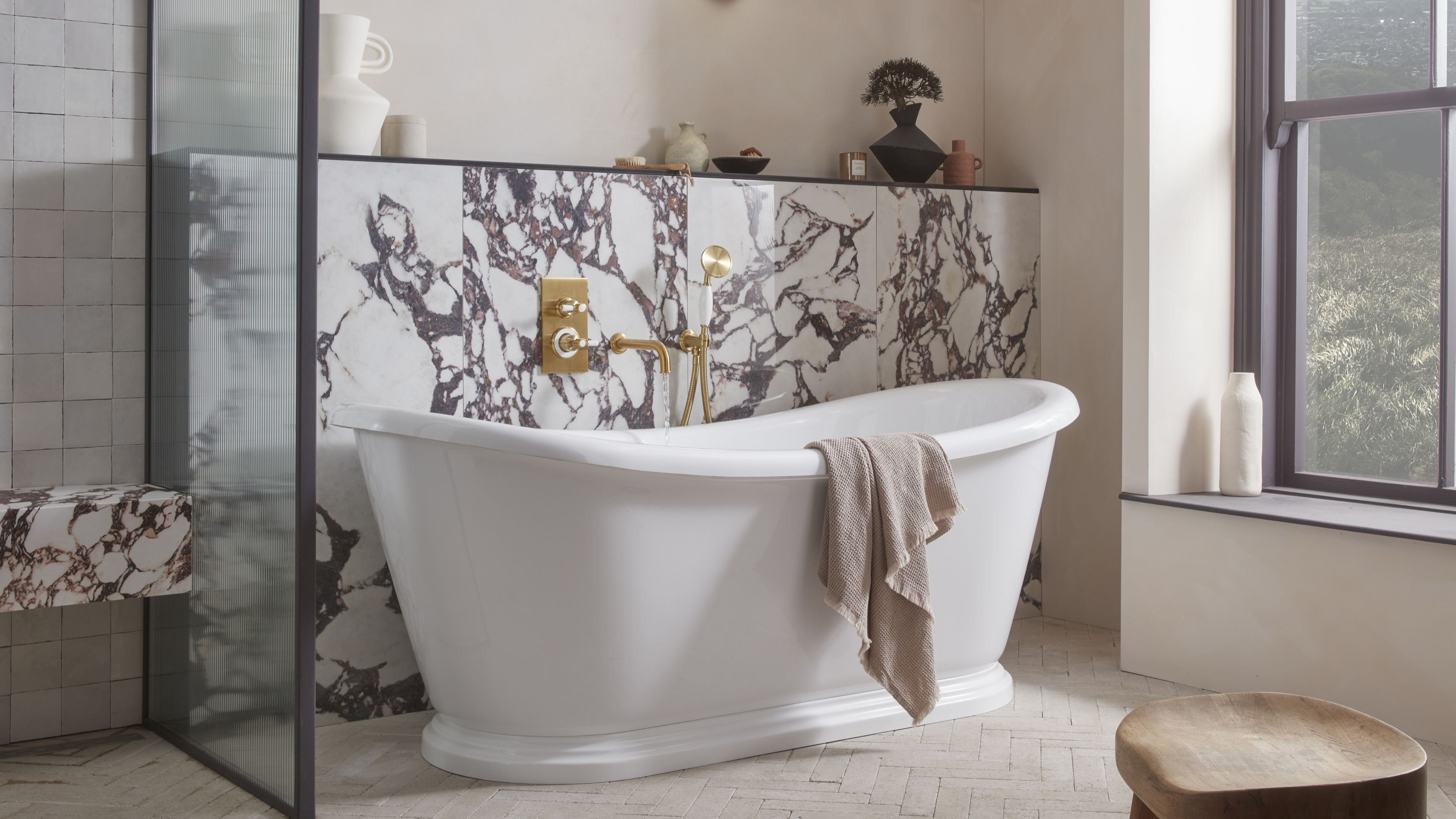 5 Bathroom Layouts That Look Dated in 2025 — Plus the Alternatives Designers Use Instead for a More Contemporary Space
For a bathroom that feels in line with the times, avoid these layouts and be more intentional with the placement and positioning of your features and fixtures
By Lilith Hudson Published