Color theory ideas - 10 perfect palettes interior designers have taken from the color wheel
Taking inspiration from these color theory ideas means being able to follow interior designers and paint experts to create perfect eye-popping palettes
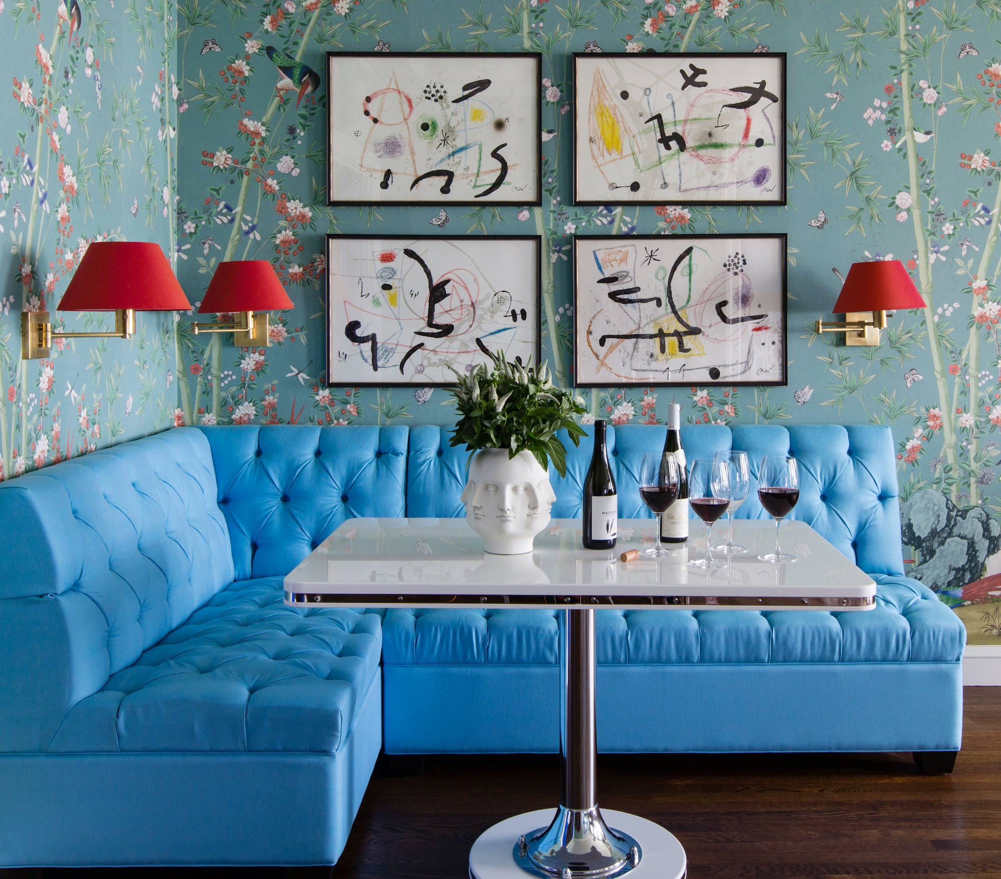
The best color theory ideas are here to solve all your decor dilemmas. Without it, the world of design can feel a little overhwhelming. As design trends keep changing, picking a color to actually use is often impossible.
But here comes the science bit, the analytical approach to picking the perfect palette. What is color theory in interior design? It’s an area of academia, certainly, but it's also an art.
“In interior terms, color theory is the general guidelines and industry-standard approaches (the dos and don’ts of mixing colors) when it comes to design direction,” says interior designer Martin Kesselman, a color expert at NYC’s INCOLOUR.
Color theory offers logic to explain why certain color schemes work – there’s usually a good reason that different shades, tints, and tones mix well together.
So, if choosing colors makes your head spin, look to the color wheel for inspiration. You likely remember the terms from elementary school that are guiding forces in color theory (primary, secondary, and tertiary colors), but many of color theory's most useful lessons are far less technical.
“For many people, the process of choosing colors is highly emotional and people choose the colors they’re drawn to, or they avoid the colors they dislike – it’s as simple as that,” says interior designer Nicole Gibbons, founder of Clare paint company. “But for the person who needs a framework to help guide their choices, I think color theory can be a really effective tool to help with color selection."
Ready to see it in action? Below, we spoke with interior designers and experts about their favorite tried-and-true color theory principles.

Keith is an experienced homes writer and editor. He has written hundreds of articles for various international titles helping readers make the best home design choices, and spends his days interviewing interiors industry experts to bring the latest ideas to his readers. For this piece he spoke to the world's best designers and thought leaders on use of color to compile this indepth article on what color theory really means.
What are the rules of the color wheel?
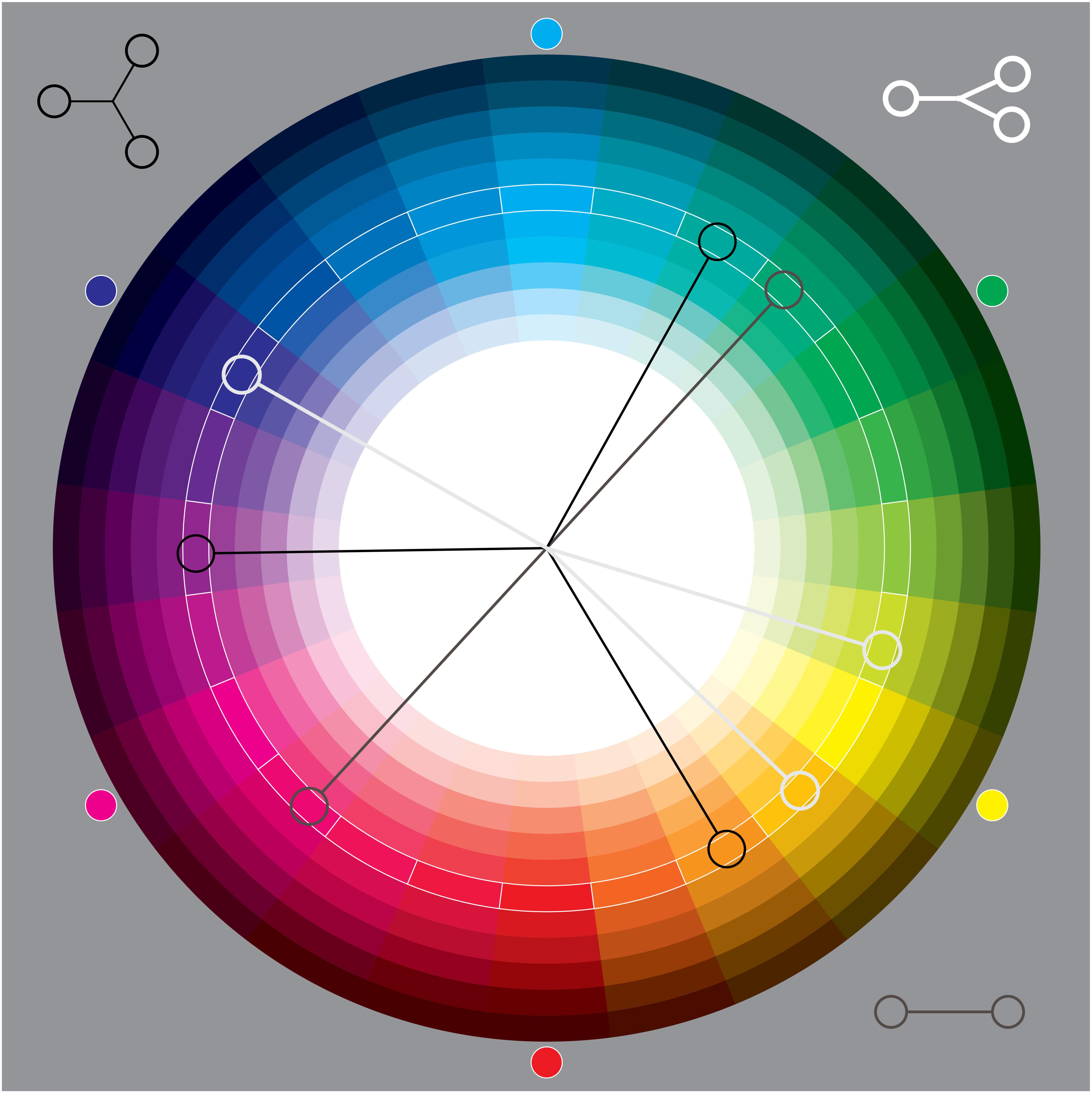
If the sheer volume of paint color ideas for every room seems daunting, start by reviewing the color wheel, the bedrock of color theory. The wheel itself is made of primary colors (red, yellow, and blue), secondary colors (like purple, a mix of two primary colors), and tertiary colors (like red-orange, a mix of primary and secondary colors).
Does this mean you need to furnish your space in basic colors? Not necessarily. “In interiors, you won’t see many primary colors or even secondary colors from the color wheel used in their truest form, but you will perceive them in the undertones of interior architectural colors,” says Martin Kesselman.
You can build a strong color scheme – a sensible mix of hues driven by color wheel principles – by picking two colors on opposite sides of the wheel, otherwise known as complementary colors.
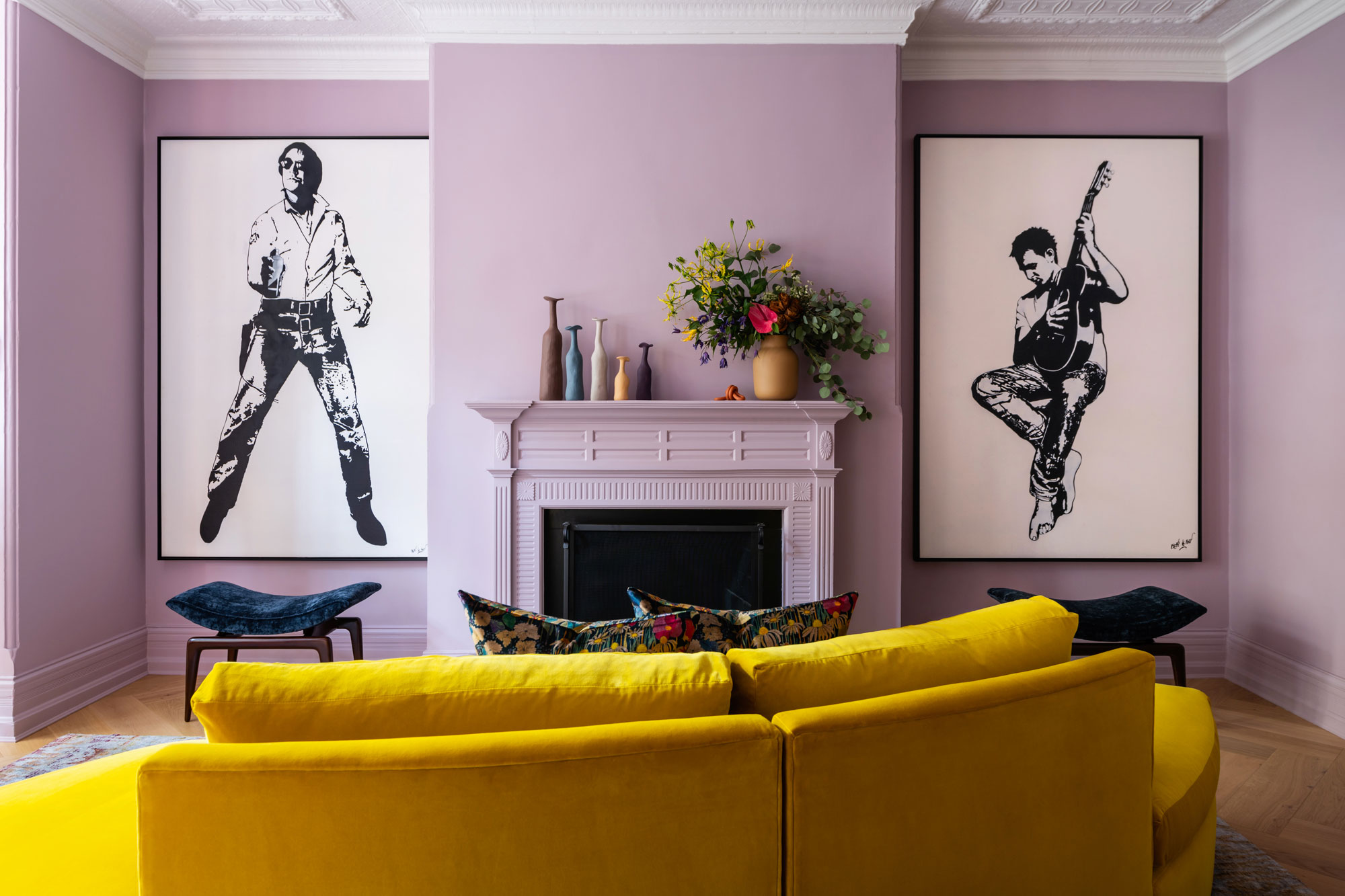
“Just like in fine art practices, pairing harmonious colors from the wheel can achieve continuity, or a desired mood, through complementary colors,” says Martin Kesselman. In the purple living room below, a bright yellow couch brings a soft, complementary contrast that sings.
Color theory ideas - our favourite pairings taken from the color wheel
1. Dark blue and bright yellow
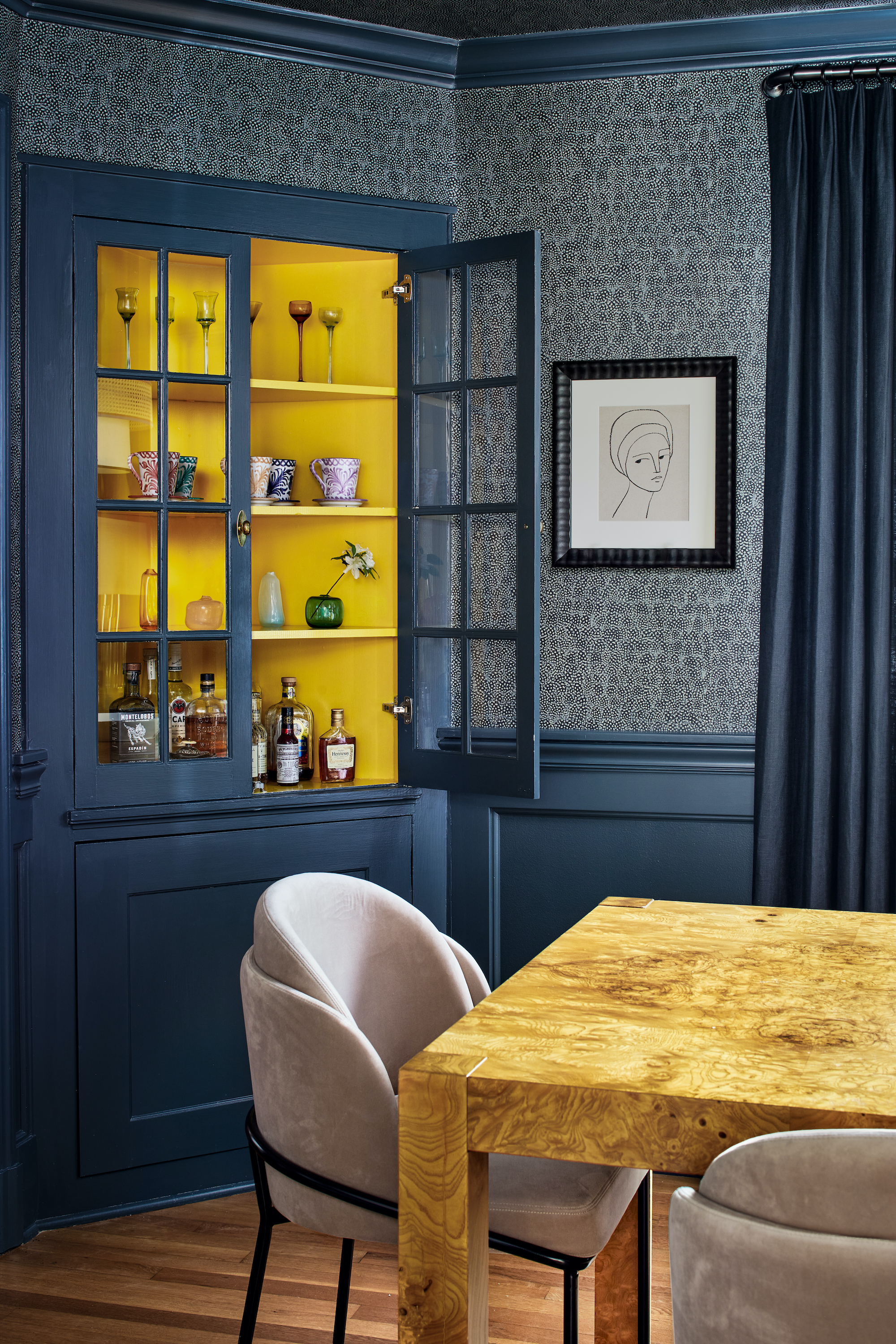
While pure primary colors are less common in modern interiors (they can be rather loud, to say the least), they're excellent at creating contrast, especially if you’re highlighting two primaries (together, they make each other pop), or plucking out a single primary as an accent wall idea.
In the blue dining room above, a bold splash of yellow brings a dose of sunshine to an otherwise cool color scheme. “In this space we were looking to create a pop that felt cohesive with the rest of the selections in the room,” says Washington, DC’s Zoe Feldman. “While the blue and green in the wallcovering and paint lean cool, the burl wood table and blush dining chairs offer a juxtaposition with warmer hues. Adding a warm pop of yellow to the inside of the built-in serves as a direct contrast to the moodier walls while still relating to the rest of the room.”
2. Red and orange
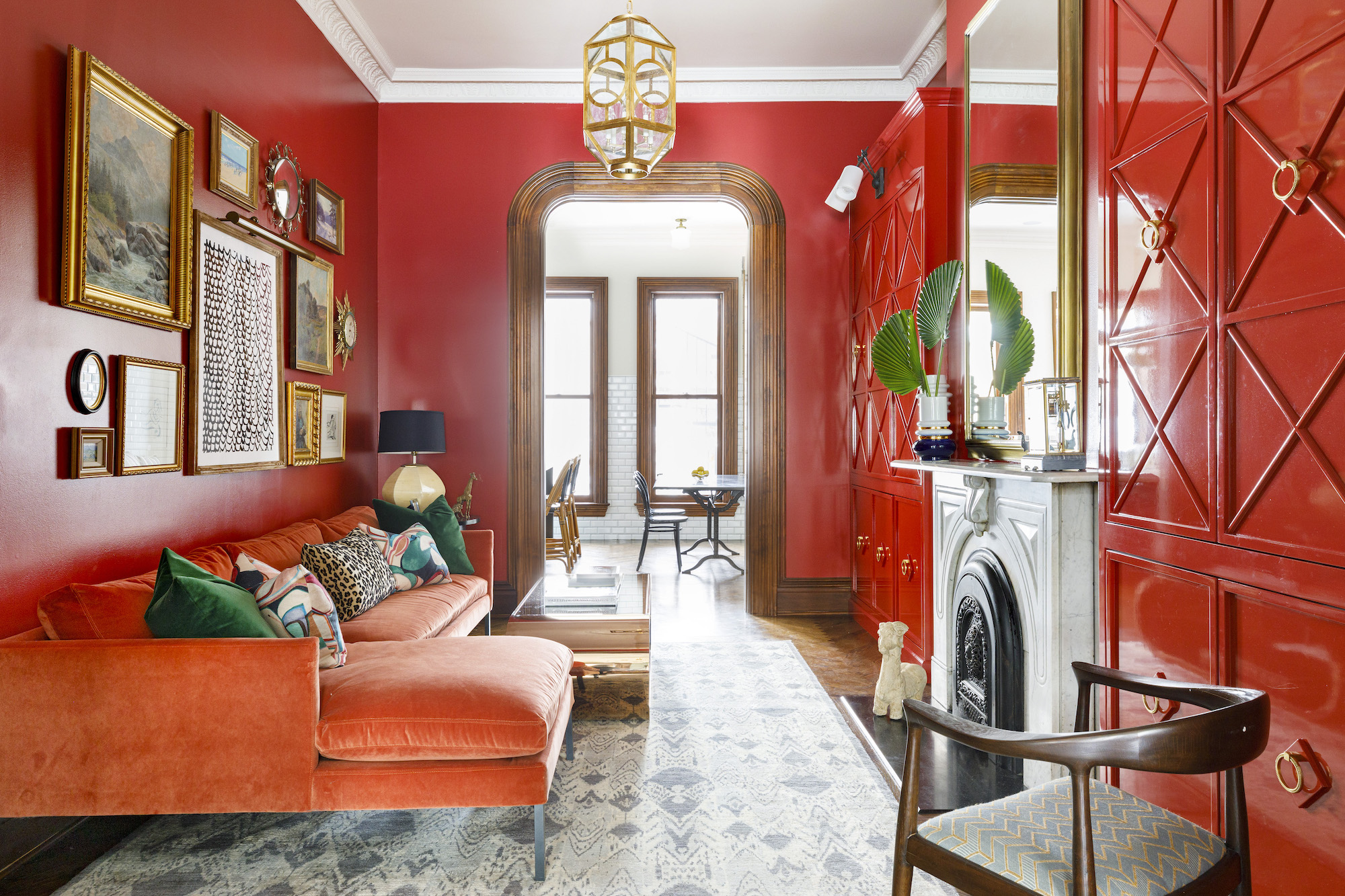
While complementary colors are on opposite ends of the color wheel, analogous colors are found alongside one another. A true analogous color scheme creates harmony by mixing three adjacent hues – for example, the combination of red, orange, and red-orange.
In the living room above, Chicago’s Sarah Vaile Design made this color scheme work thanks to a smart choice in upholstery and high gloss paint, furnishing the space with orange and red hues that sit comfortably alongside one another on the color wheel.
“You’ll notice here that the wall pulls in the deep reds found in certain areas of the velvet sofa,” adds Vaile. “With any other fabric, reusing the same color might fall flat and monochromatic but with a rich velvet like this one there are so many shades to play off of. It also worked to our benefit that lacquer typically dials up the vibrancy of any paint color so in this case the built-ins echo the oranger tones from the sofa, rounding out the balance of color.”
3. Green and red
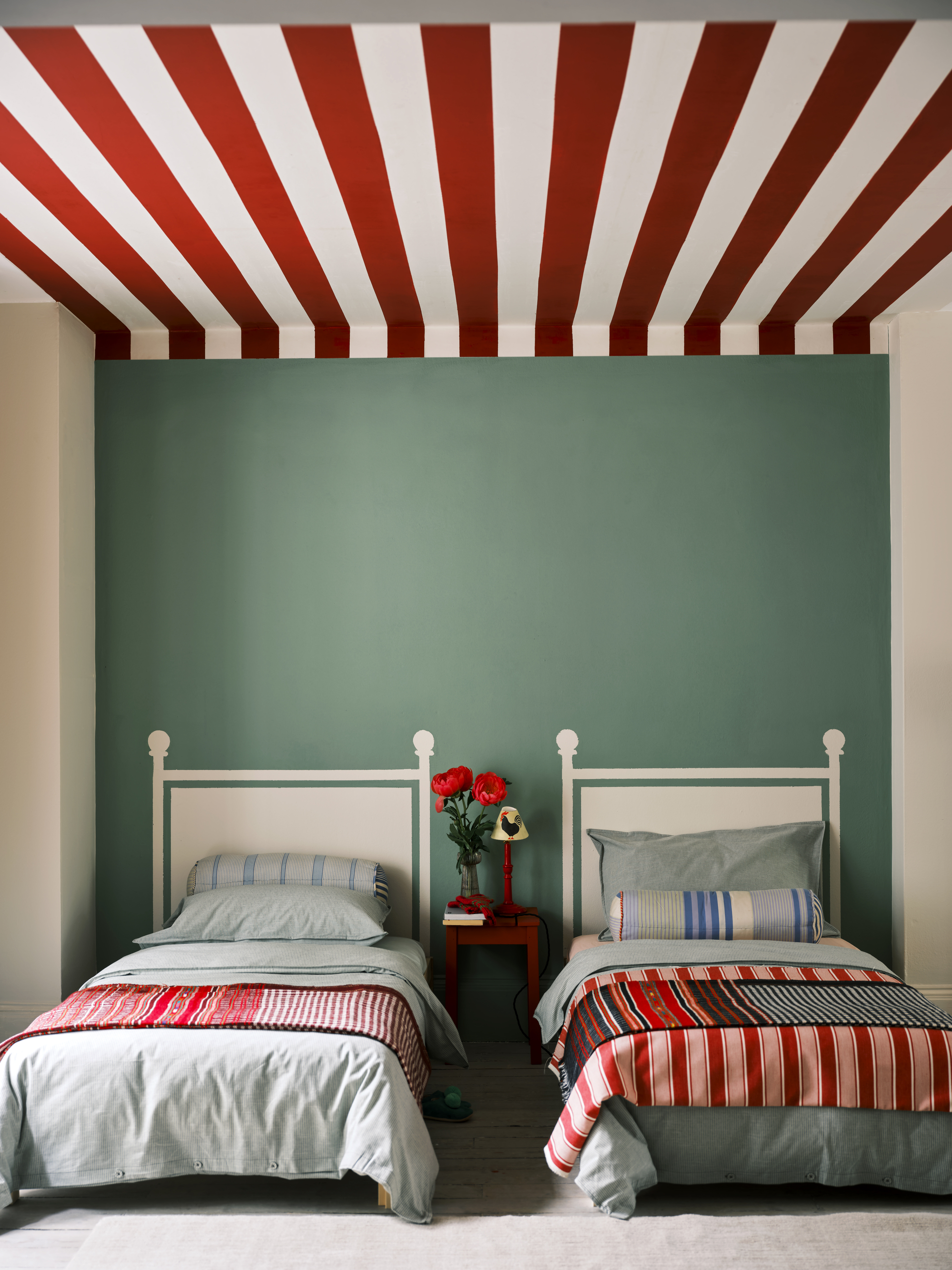
It sounds obvious: something warm balances out something cool. It’s the same idea behind the combination of warm colors (like red and yellow) and cool colors (like blue and green) in one interior space – they can soothe one another. In fact, it can be surprising which colors go with green, but these pairings all boil down to color theory.
In the above bedroom, a palette of red and Farrow & Ball's Breakfast Room Green creates a balanced, symmetrical design that feels just right. “It’s not always a fight when pairing the two types,” says interior designer Martin Kesselman, a Farrow & Ball ambassador himself who enjoys mixing warm and cool colors throughout his interiors, pulling from both ends of the spectrum. “It could add a design dimension and/or call attention to a material or architectural element with an opposite color.”
4. Blue and indigo
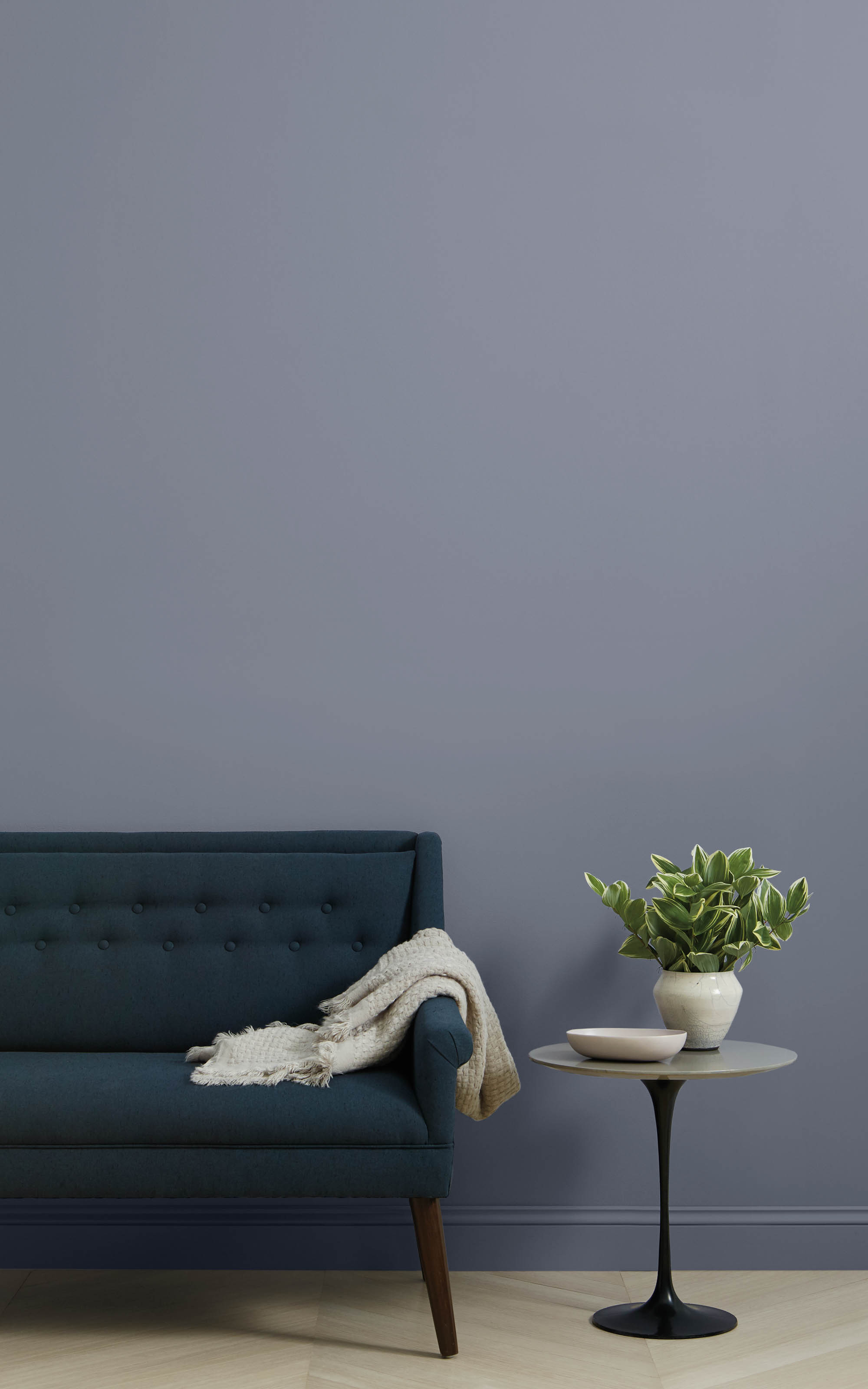
No doubt, color is psychological; we associate colors with certain moods or feelings. “Color can really impact your moods, so that’s another area where color theory can be helpful in guiding choices if you’re not sure,” says Nicole Gibbons. “A lot of it is fairly intuitive – the idea that blues can invoke a sense of calm and serenity, and more vibrant colors can be energizing – so depending on how you want to feel in your space, that can guide your choices as well.”
So, if you’re hoping to anchor your space in a certain mood (like opting for warm and happy paint colors, or moody and cool color schemes), stick with one dominant color temperature to keep your intended emotions in check. In this case, the indigo wall is only made more alluring by addition of the dark blue sofa - two shades next to each other on the color wheel. “If the emotion or mood you want is more of a calm energy, choosing colors that are derived from nature, like blues and greens, are perfect for that,” says Nicole Gibbons.
5. Pink and red
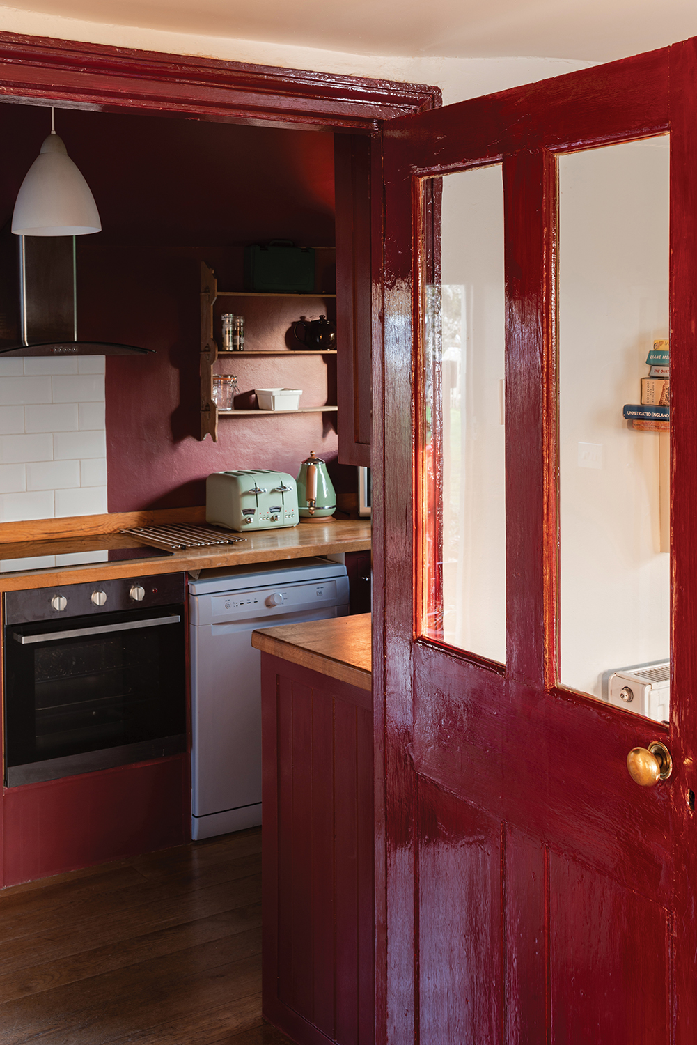
As a child, were you taught that red definitely wasn't one of the colors that goes with pink? Well, back then, clearly the color wheel wasn't being taken into account - sat next to each other on it red and pink are actually the perfect pairing. Almost alike, but just different enough so the room doesn't come across as one note.
In fact, in modern homes, one increasingly popular color palette is the monochromatic color scheme. While the entire scheme is based on one color, designers use a variety of tones, sheens, and textures in order to create variation and visual interest. Here, the dark red of the door and frames is offset by the dark pink of the tiles, bringing the best out of both.
“My go-to is my monochromatic approach,” says interior designer Martin Kesselman. “I use subtle tint and shade variations of my wall color on the other surfaces to truly connect a space. I also experiment with sheen and textured variations of a color to play with how it’s viewed – this introduces a color that is a different version of itself. ”In the interior above, a high gloss paint by Farrow & Ball paint on the doors and cabinetry are mellowed out with a flat paint in the same color across the walls – the result is a cohesive yet varied look.
6. Soft green and bold pink
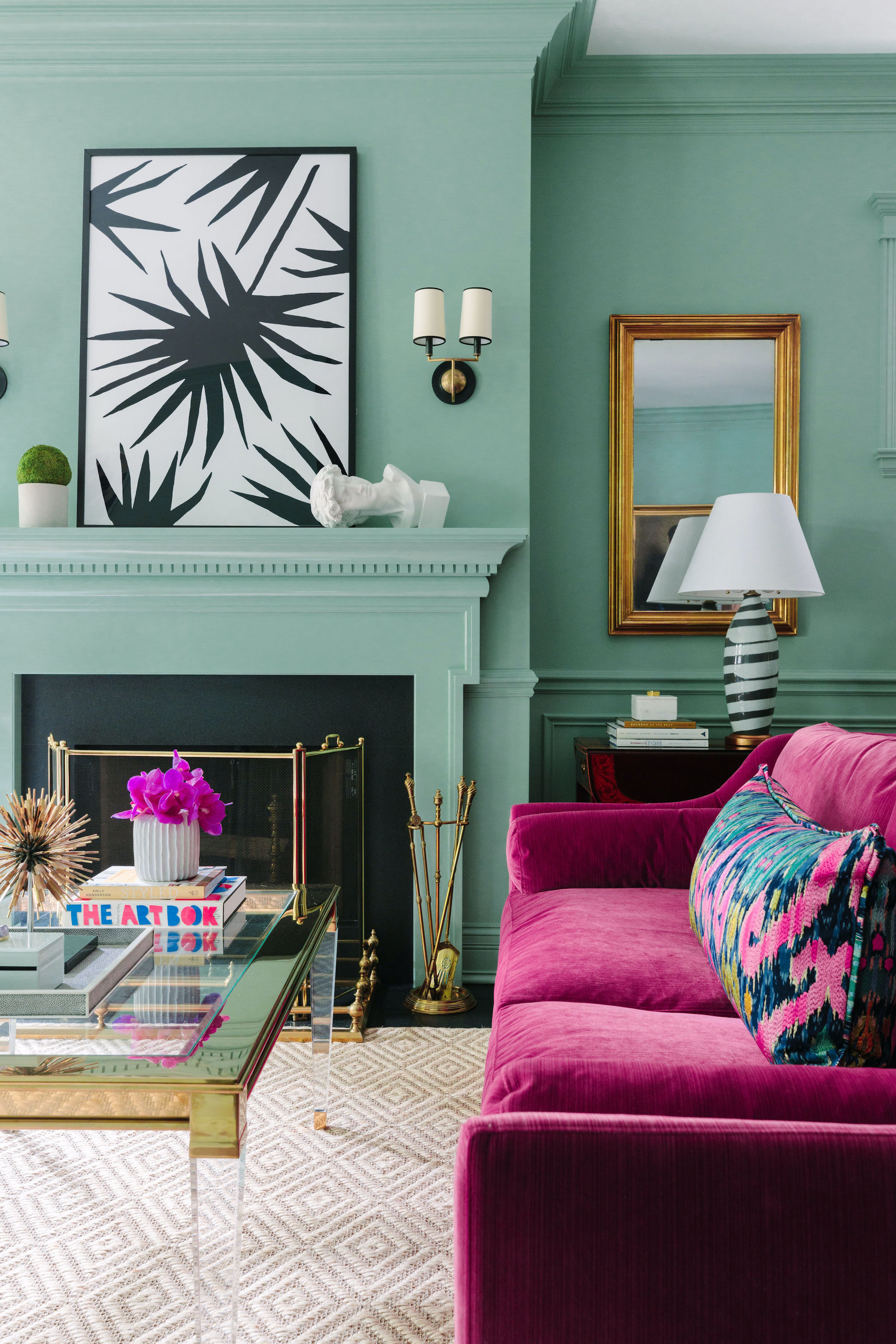
Sure, our minds quickly look to paint ideas when the phrase “color palette” comes into play. But color theory applies to more than just our walls – our furniture will also influence the overall palette, and a bold sofa or table (which take up plenty of surface area) can make just as much of an impact on color schemes as a coat of paint.
In the above interior, Sarah Vaile Design created a beautifully contrasting color palette on and off the wall. Here, a bold fuschia sofa takes center stage against a mint backdrop, while a soft couch pillow using both hues ties the warm and cool palette together. “One basic rule of color theory that we most often live by is to combine warm and cool colors,” says Sarah Vaile. “Stick to this equation and you will typically always find bold contrasting colors that work together, even some you might not expect – in this case mint and fuchsia.”
7. Light blue and deep red

Another spot in your interior where color theory comes into play is wall decor, perfect for adding small-but-mighty pops of color. In color theory, picking an accent like this is part of the 60-30-10 rule – if you're following the formula, a balanced color scheme should be 60 percent from a base color, 30 percent from a secondary color, and 10 percent from an accent color. In order to round out that final 10 percent, things like wall decor tend to have the perfect proportions.
In the above breakfast nook, Chicago’s Summer Thornton brought a maximalist aesthetic to the interior but kept her color scheme in check with the right dining room wall decor. The space, anchored by a bright blue banquette and a teal wallpaper, gets an uplifting dose of contrast thanks to bold red sconces - there really are so many colors that go with burgundy. “White shades are so boring. Live a little,” says Thornton. “Whether it's a bold color or a wild pattern, sconces are a great opportunity to make a statement and add some life to your room.”
8. Strong pink and soft purple
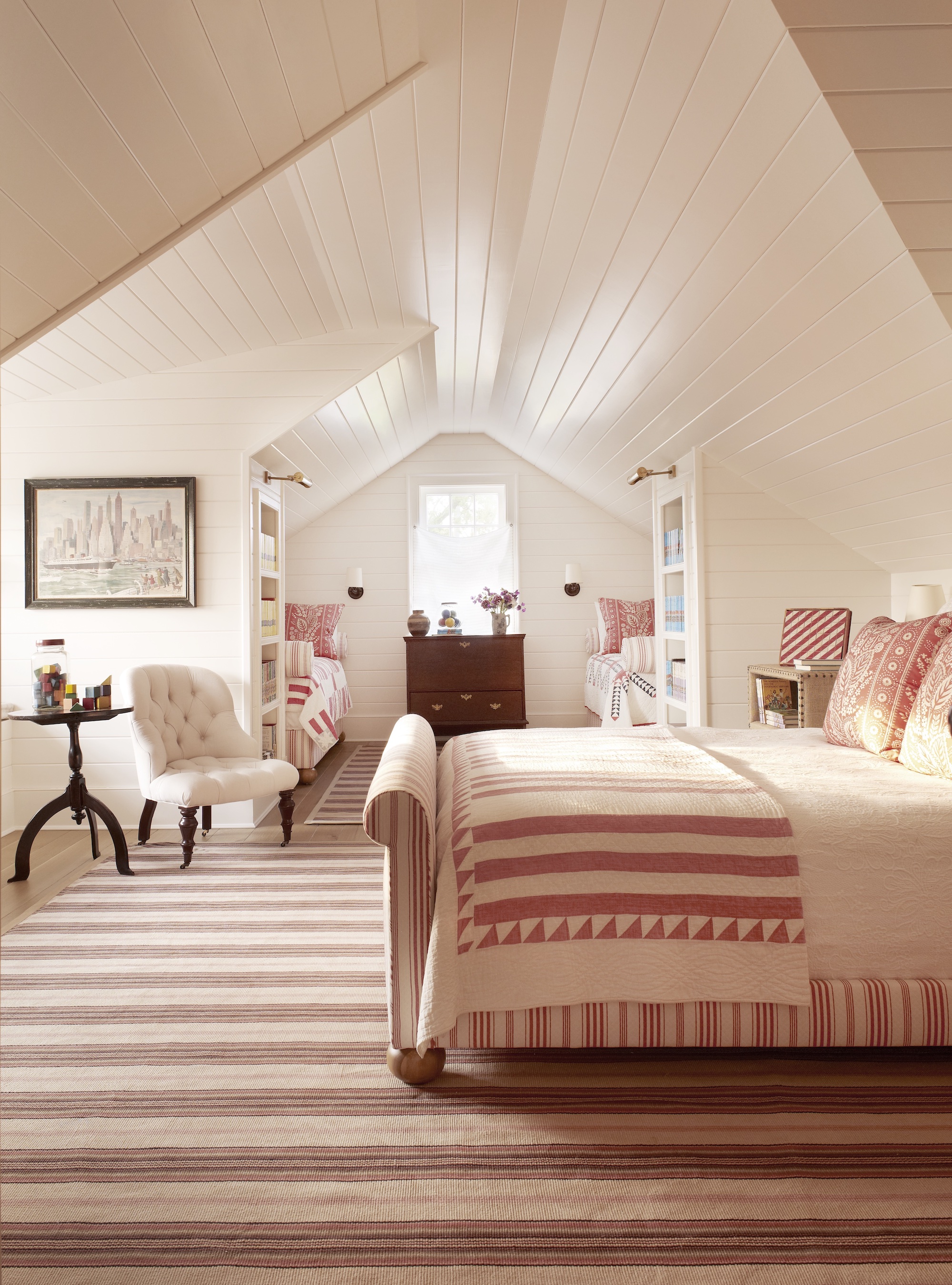
The truth is, many of color theory’s principles are as old as time, which means your potential palette has plenty of sources for inspiration throughout modern interior design – you can build your color scheme by referencing anything from antique textiles to contemporary artworks, or pretty much any colorful object that resonates with you.
In the above guest room, the blush color scheme was inspired by an antique quilt, and blend a deep pink with the faded purple stripes in the rug - two shades next to each other on the color wheel. “As one might look to an antique rug, or some other anchor of a room’s décor to develop a color scheme, our cues came from our client’s collection of antique textiles that they wanted incorporated into the decor,” says Carrier and Company. “Ultimately, the color added a softness and warmth to an otherwise crisp, white attic bedroom.”
9. Royal blue and orange
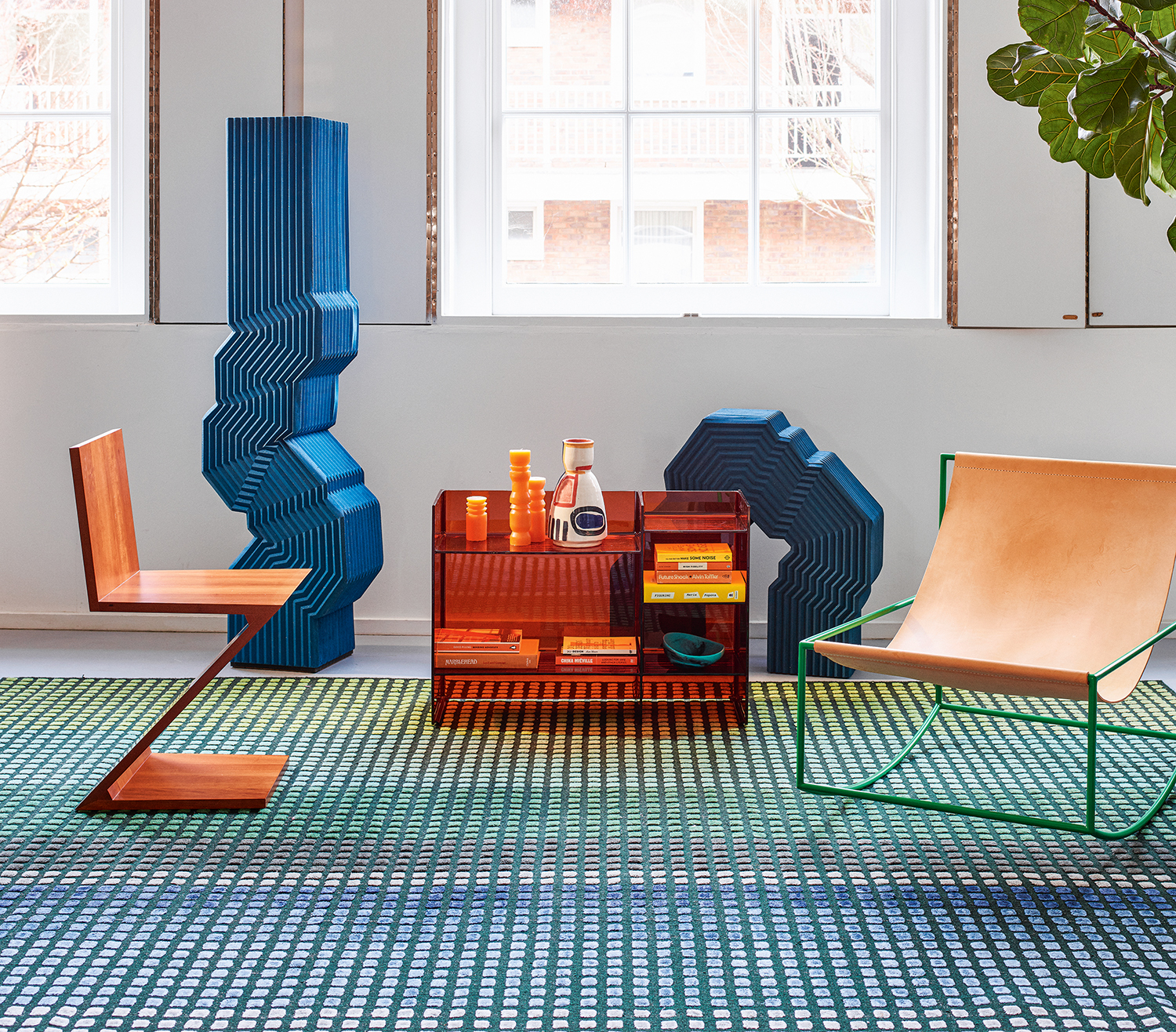
Directly opposite each other on the color wheel, royal blue and orange make for a bold pairing that is not for the faint hearted. It's a zesty take on design though - and the reason blue is one of the colors that goes with orange is because it cools down the sunshine heat of the the brighter shade.
For a look that doesn't completely overpower, keep the blue and orange for the furniture and use a calming white for the walls.
10. Purple and pale green
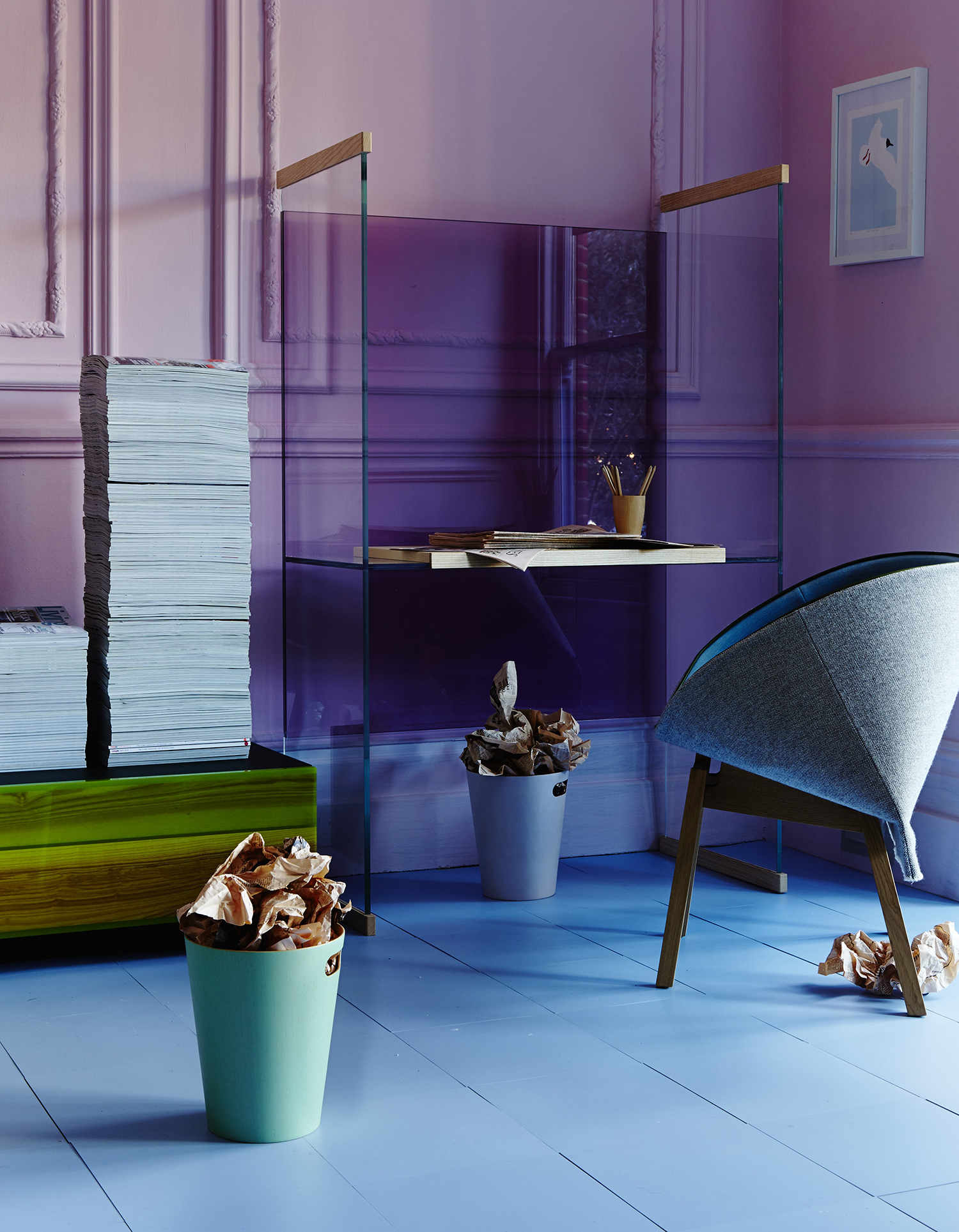
Incredibly, purple and green are an ideal pairing - though they're not shades that are currently featured in interior design trends right now. The trick is to go to the softer end of the green spectrum, where chartreuse nudges into yellow, and play with contrasting stronger purples that start to get close to blue. It makes for a richly uplifting palette.
Can you go against the rules of the color wheel?
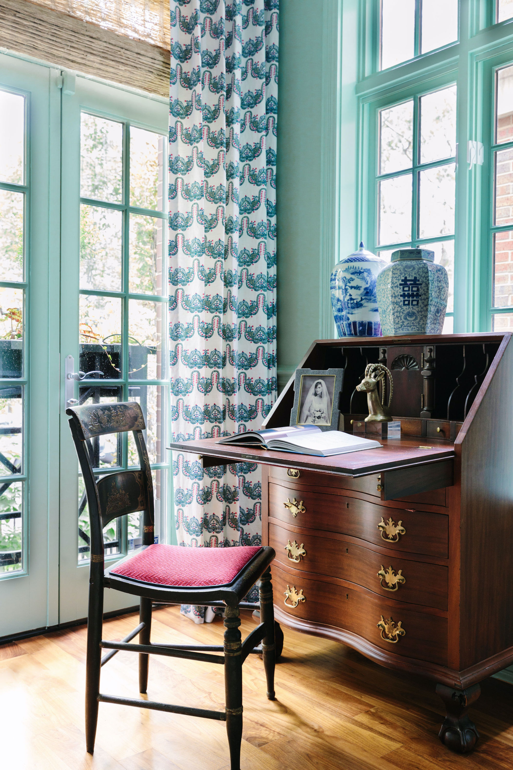
Sure, the color wheel is the foundation of color theory, but that doesn’t mean there isn’t logic beyond the wheel. “Another color theory rule that I only recently heard put to words was to bring in ‘off colors’ to balance the vibrant ones,” says Sarah Vaile. “It immediately resonated as a tactic we had been subconsciously doing for years: balancing bright pinks, purples and yellows with colors ‘off’ the wheel like browns and grays.”
In the interior above, a bright teal wall gets a dose of “off color” wooden tones, balancing out the vibrant paint. “This painting and sideboard of our clients’ family heirlooms do just that,” adds Vaile. “We found these lamps to offer a nice bridge between new and old as well. They could honestly go either way!”
And of course, rules are made to be broken. And design is meant to be fun and from the heart - not slavishly following a chart. That's why some designers suggest thinking of color theory like a guidebook, not a textbook. “I think they’re helpful guides, especially color theory – understanding the opposites versus the colors that sit next to each other and how they pair – but your eye is going to be your gut check, right?” adds Gibbons, noting that tools like color theory are great in theory.
“And so I’d say, to all of this, the parting words I would give to the reader is use these frameworks as a helpful guide but trust your gut in the end, because that’s generally where you’ll be happy in the end."
Be The First To Know
The Livingetc newsletters are your inside source for what’s shaping interiors now - and what’s next. Discover trend forecasts, smart style ideas, and curated shopping inspiration that brings design to life. Subscribe today and stay ahead of the curve.
Keith Flanagan is a New York based journalist specialising in design, food and travel. He has been an editor at Time Out New York, and has written for such publications as Architectural Digest, Conde Nast Traveller, Food 52 and USA Today. He regularly contributes to Livingetc, reporting on design trends and offering insight from the biggest names in the US. His intelligent approach to interiors also sees him as an expert in explaining the different disciplines in design.
-
 Burl Wood Decor Is 2025’s Most Coveted Comeback — Here’s How to Get the Storied Swirls for Less
Irregularity is the ultimate luxury, but you don’t need an antiques dealer to find it
By Julia Demer Published
-
 5 Garden Features That Instantly Add Value to Your Home — While Making Your Outdoor Space More Practical, too
Get to know all the expert tips and tricks for making your backyard a standout selling point for your home.
By Maya Glantz Published