
The world around us shapes color trends, and I am always searching for new influences in my practice. There are no fixed rules — trends emerge from fashion and interiors but also from wellbeing, beauty, automotive design, and beyond. Innovation and science drive change, with material advancements, especially those rooted in sustainability, playing a crucial role.
But beyond physical developments, it’s essential to consider the emotional landscape when looking at the colors emerging in 2025. In a world of disruption, where topics like loneliness are increasingly part of the conversation, emotion is a key factor.
The color trends for 2025 have evolved beyond aesthetics into a powerful emotional connection and well-being tool. This shift reflects our collective need for calm, resilience, and joy. Softer, soothing hues encourage mindfulness and balance, while playful, vibrant tones spark light-hearted connections. Deep, grounding shades provide stability and symbolize inner strength.
Emotionally driven color palettes respond to a world seeking comfort, unity, and empowerment. More than ever, color nurtures us on a deeper level, transforming spaces and products into experiences that uplift and connect us. But what colors, exactly, are setting the tone for 2025? This is my edit of how color is influencing interior design trends this year .

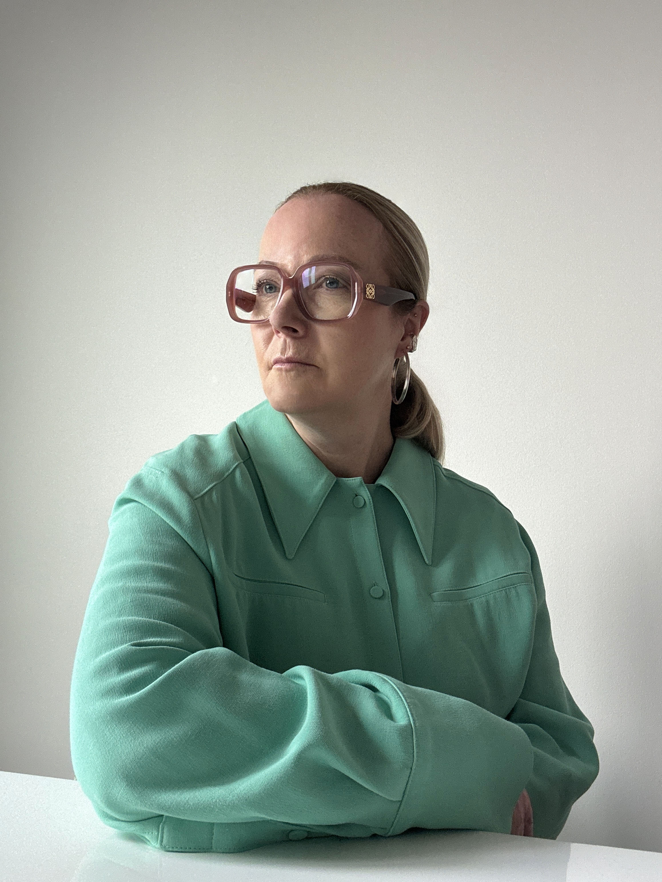
A pivotal figure at the Pantone Colour Institute, Jane contributes to trend publications and serves as the European Creative Director for Pantone’s Interiors annual trends publication, Pantone View Home and Interiors. Her approach to forecasting color focuses on observing current events and cultural trends to understand how perceptions of color are evolving.
1. Orange — The Color for Connection

In hotel Bybloss in St Tropez, designed by Laura Gonzalez, orange is a recurring color theme.
In times of uncertainty, the need for warmth, joy, and connection has never been greater. People seek brands, spaces, and experiences that offer care and authenticity. In this landscape, color plays a vital role, with orange emerging as a key hue for fostering optimism and togetherness.
Decorating with orange is friendly, inviting, and uplifting, radiating a playful energy that sparks interaction and moments of shared happiness. It creates an atmosphere that welcomes, encourages conversation, and ignites simple pleasures. Whether through vivid citrus tones, warm golden ambers, or soft apricot hues, orange bridges nostalgia and modernity, offering comfort while feeling fresh and exciting.
This shift reflects a desire for small joyful moments, ranging from indulgent treats to vibrant pops of color in everyday life. This is evident in kitchen design, retro lighting, and accessories. Whether used boldly or as a subtle accent, the orange color trend creates environments that feel engaging.
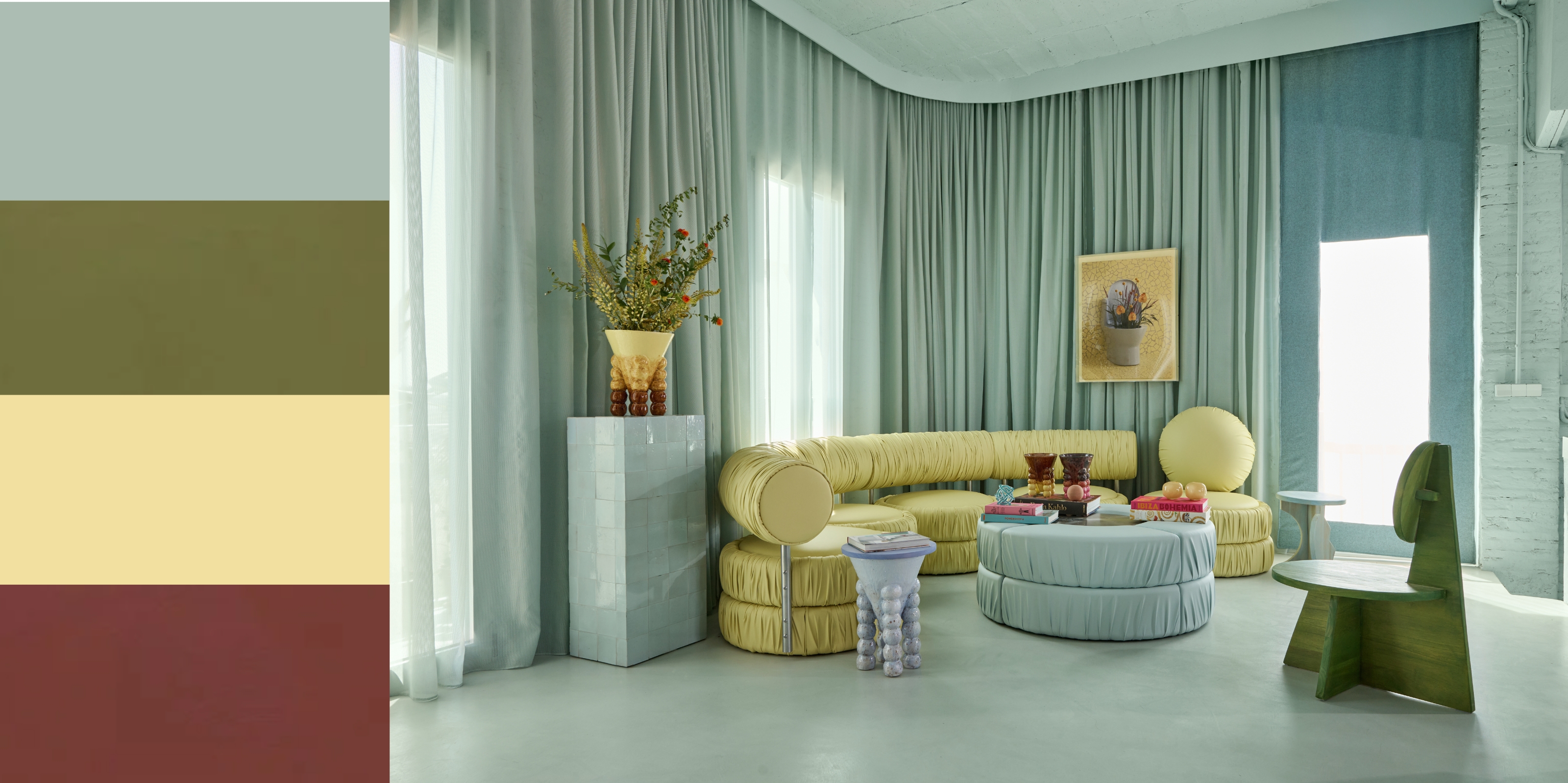
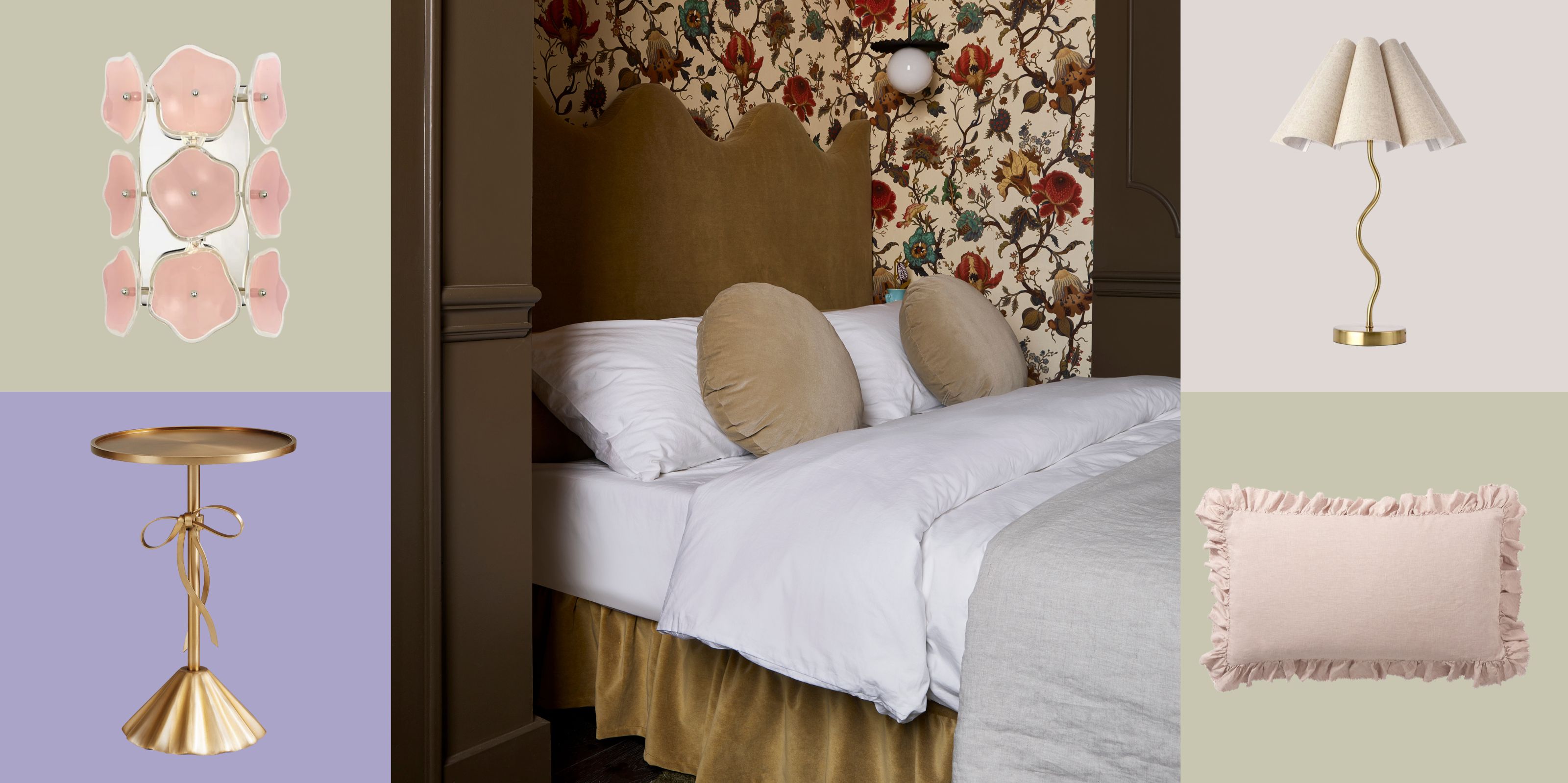
2. Butter Yellow

Butter yellow has taken on a more sophisticated character in 2025.
Quiet luxury has redefined our perception of neutrals, proving that refinement is rooted in subtlety rather than excess. This evolution now moves beyond classic muted tones towards deeply saturated neutrals like butter yellow, a shade that brings depth, richness, and a quiet yet confident warmth to interiors.
Once a staple of early 2000s interiors, buttery yellows were often dismissed as uninspired and middle-of-the-road. Now, they are experiencing a modern resurgence, reimagined with a soft, cocooning quality that aligns with the shift towards gentle, rounded forms and tactile materials. These updated tones move away from their past associations with outdated decor, embracing a refined elegance that complements plush textures, organic curves, and light-filled spaces.
This revival reflects a broader movement in design, one that values comfort, warmth, and timelessness. Butter yellow is no longer just a safe neutral but a sophisticated, versatile foundation that pairs effortlessly with other muted shades, soft pastels, and rich earthy hues. This color trend serves as a gentle bridge between warmth and minimalist interior design, bringing an understated glow that enhances the softness of contemporary interiors.
3. Raw Clay

This kitchen, showcasing Henry Holland's collection for Bert & may, is painted in a rich, earthy, brown color.
Inspired by the earliest sparks of human creativity, raw, chunky, and primitive furniture and accessories are already making a strong statement already, working their way through as a big design trend.
This bold and highly expressive interior style merges raw minimalism with earthy warmth, drawing from ancient heritage and early dwellings to create a deep, primal connection to nature. As a result, this aesthetic is driving trends toward decorating with earth tones, inspired by the natural materials of the earth, particularly clay, bringing a sense of grounding and authenticity into contemporary spaces.
4. Cosmic Purple

Purple has taken on a futuristic feel in how this color trend is being applied in 2025.
With pinks already paving the way, purple is set to emerge in 2025, bridging past and future to evoke a sense of nostalgic futurism, a fusion of retro-futuristic aesthetics and modern digital culture.
The rise of purple is complex and multifaceted. It aligns with the jewel-tone resurgence while tapping into the ethereal, cosmic, and alternative aesthetics shaping visual culture. Long associated with gothic subcultures and mystical themes, purple in 2025 moves beyond costume and gimmick, embracing a refined, almost futuristic elegance.
Already appearing at international tradeshows, purple is shifting away from ultra-sweet pastels and candied tones toward more profound, more substantial hues that carry a sense of futuristic nostalgia. It's an electric and energetic color when darkly saturated, amplifying surrounding shades and enhancing vibrancy. The blueness and ultraviolet undertones will continue to evolve, surfacing in traditional purples enriched with red-infused warmth or blackened depths.
Set to develop within interiors, tech applications, and digital spaces, purple offers a bold yet sophisticated bridge between past visions of the future and the aesthetics of tomorrow.
5. Deep Green

Luxurious, deep, dark greens are the way forward with this versatile color.
Luxury is evolving, its expression is shifting toward understated elegance, embracing subtle glamour and refined sophistication. Deep, opulent greens take center stage, evoking heritage, and timeless grandeur. These rich jewel tones, reminiscent of historical luxury, seamlessly blend with contemporary sensibilities, offering both indulgence and longevity. Acting as a dynamic foundation, they contrast beautifully with other hues, creating depth and a sumptuous, glamorous environment.
Decorating with this green isn't about historical styling but capturing the essence of the grand past through color and material, reimagined in a minimal, modern way.
6. Mineral — Vaporized Off Whites and 'Almost' Colors

Soft and chameleon-esque, colors like those of the dining chairs in this room bring an inviting quality to a room.
A renewed focus on glass, biomaterials' evolution, and resins' growing popularity are shaping a new design direction. This color trend reflects an increasing aesthetic interest in transparent and translucent materials, glass, resins, opaque biomaterials, and recycled elements, where color is deeply distilled and subtly expressed.
At the same time, a desire for colors that seamlessly integrate into existing interiors is driving a shift toward delicate, almost-invisible hues. Soft, vaporized tones create a refined presence, enhancing spaces without intrusion. These whisper-like shades gently illuminate and elevate, offering a cooling, comforting sensory experience, both soothing and quietly stimulating.
Adding to this refined palette, tinted off-whites with a natural greenish hue emerge as a refreshing alternative to traditional whites. These soft, nature-infused shades bring a sense of freshness without the starkness of pure white, offering a harmonious, contemporary balance that feels organic and effortlessly calming.
7. Sugary Brown — Complex and Sweet

This color trend elevates earthy brown tones for a more sophisticated design scheme.
Honest, reliable, and rich, brown transcends boundaries, acting as both a trend-driven fashion color and a timeless neutral. Decorating with brown remains a practical choice, effortlessly complementing any palette.
This shade has been evolving over multiple seasons and is already strong in interiors, it’s evolving to become increasingly complex with the infusion of pinkish undertones. These subtle pink elements emerge in varied lighting, adding softness and refinement.
While brown retains its grounding, earthy qualities, the pink infusion introduces a gentle sophistication. Smoothness is key, this shade balances warmth with elegance, offering depth and versatility.
8. Sour Lime — Tangy Hues Are the New Neons

In this colorful apartment, a zesty green makes for a dramatic backdrop for the palette.
Neon brights have dominated in past years, saturating social media, street fashion, and extending into product design and packaging. However, this narrative is evolving as sour hues take center stage, offering a more refined yet energetic alternative.
Instead of overpowering fluorescence, this green color trend retains vibrancy with a tangy, electrifying edge. Sour Lime leads the charge, zesty, sharp, and invigorating. With an effervescent bite, it delivers the same high-energy appeal as neon but with a more nuanced and sophisticated intensity. This punchy citrus hue, underpinned by a tart yellow base, cuts through sweetness and adds a refreshing dynamism to modern environments.
Bridging the gap between bold brights and pastels, Sour Lime injects life into schemes without overwhelming. Its citric vibrancy makes it particularly effective in accessories, offering a juicy, fresh pop of energy effortlessly and dynamically.
9. Ultimate Darks — A New Intensity of Black

At Faye Toogood's installation at this year's Maison et Objet, ultra dark room sets set the tone.
Black takes on new complexity, moving beyond a simple absence of color to reveal layered depth, texture, and nuanced undertones. This season, black in interiors is not just about stark contrast — it’s about intention, materiality, and interplay with light, creating spaces that feel grounded yet dynamic.
Hyper-enriched, ultra-deep shades, with richly pigmented tones that lean into shadowy sophistication, will be essential. These blacks are never flat; they carry subtle influences from earthy, organic elements, graphite-infused charcoals, bitter peat browns, and coal-like depths, each offering a refined, sophisticated edge.
Deep, algae-tinged greens also emerge within the dark spectrum, softening the intensity while adding richness and fluidity. Material choice is key in defining the impact of these complex blacks. Matte finishes absorb light for a deep, moody effect, while gloss and polished surfaces introduce subtle reflection, adding movement and dimension. The balance between finishes enhances the immersive power of black, ensuring it feels rich and sophisticated rather than flat or overwhelming.
Embrace the return of true darks as the foundation of interior schemes. These nuanced black shades offer an evolved alternative to solid black, acting as a dynamic base for layering color.
Light and texture should guide application, matte surfaces add quiet intensity, while sheen creates depth and luminosity.
10. Fresh Blue

Pale blues have become a new foundation shade for forward-looking schemes.
Soft blue is becoming a key hue in interior design, offering a fresh yet calming presence. It acts as a versatile foundation, layering seamlessly with softened neutrals while enhancing natural light. This creates open, breathable spaces that foster relaxation and quiet focus.
Its newness lies in application within futurist-led design. Paired with off-whites and metallics, decorating with light blue takes on a sleek, sophisticated edge. It thrives in high-tech environments, where glossy surfaces, structured forms, and mirrored finishes enhance depth and luminosity.
Beyond aesthetics, soft blue reflects a growing alignment between mindfulness and technology. It introduces a sense of balance, offering a tranquil retreat and a dynamic connection to innovation. Whether through tone-on-tone layering or contrasting textures, soft blue transforms interiors into immersive, forward-thinking spaces. As the demand for intelligent, adaptable design grows, soft blue emerges as a key element in shaping modern and restorative interiors.
FAQs
What's the Biggest Color Trend of 2025?
Once overlooked as a relic of early 2000s interiors, butter yellow is making a sophisticated return. No longer dismissed as bland or uninspired, this delicate hue now exudes warmth, depth, and understated elegance. Its revival speaks to a growing desire for soft minimalism, a movement that favors soothing, cocooning spaces where gentle curves, plush textures, and a carefully curated palette create an atmosphere of comfort and quiet luxury.
Butter yellow strikes a delicate balance; as a shade of yellow, it carries a quiet joyfulness without overwhelming the senses. Its presence feels nurturing rather than overstimulating, making it an ideal choice for interiors that embrace restraint and simplicity without sterility. This renewed appreciation for butter yellow signals a shift toward colors that feel both uplifting and effortlessly refined, rooted in warmth, tactility, and a sense of serene sophistication.
-
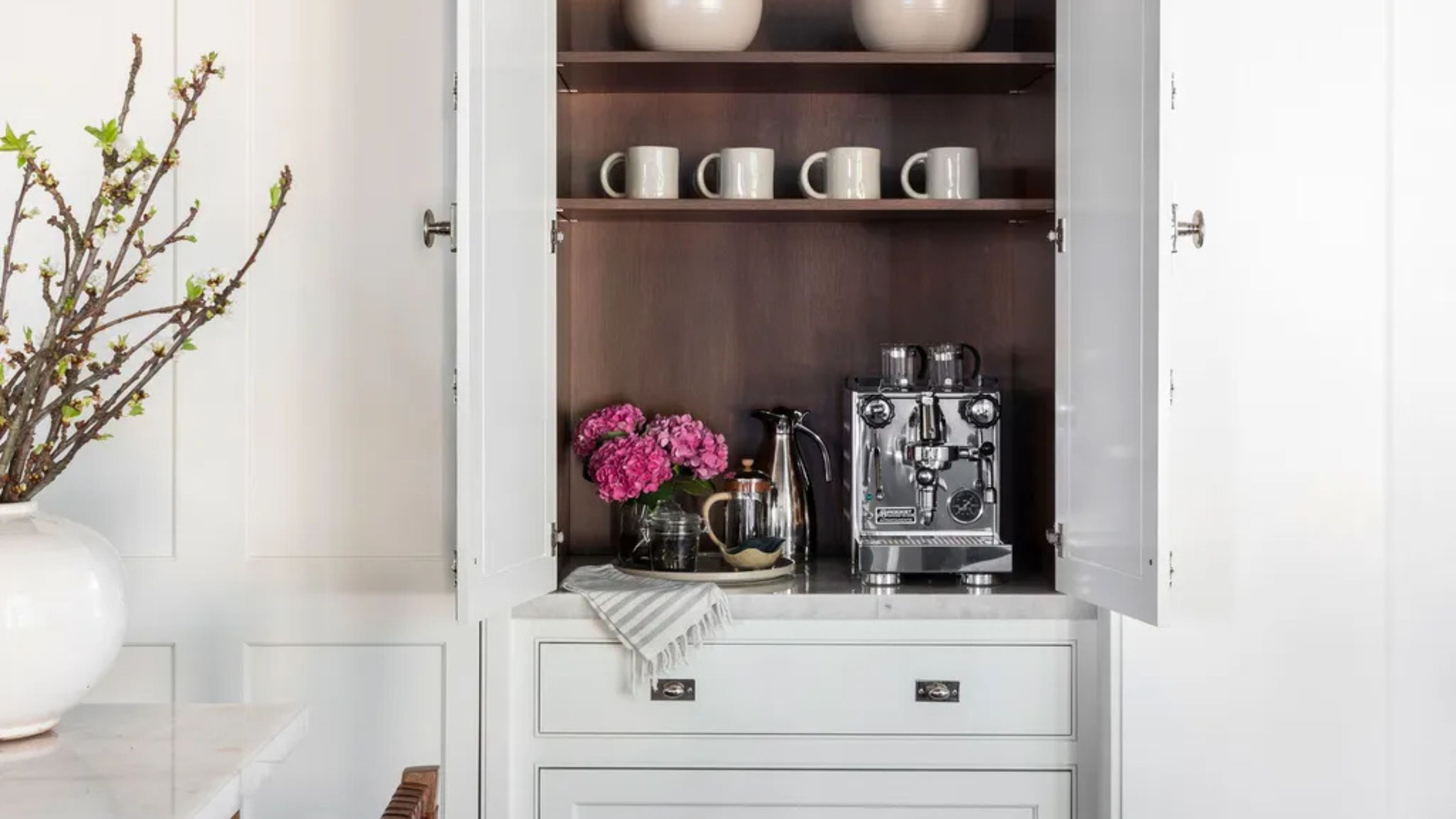 Turns Out the Coolest New Café is Actually In Your Kitchen — Here's How to Steal the Style of TikTok's Latest Trend
Goodbye, over-priced lattes. Hello, home-brewed coffee with friends. TikTok's 'Home Cafe' trend brings stylish cafe culture into the comfort of your own home
-
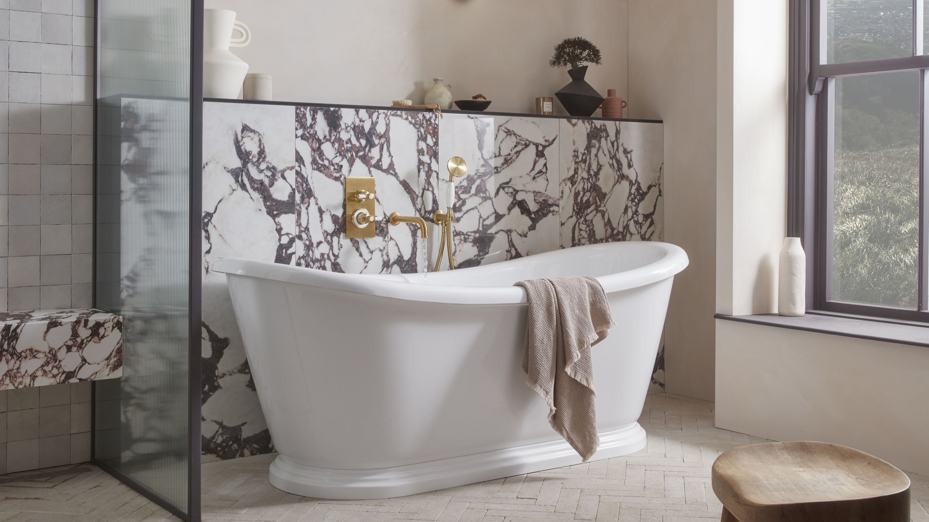 5 Bathroom Layouts That Look Dated in 2025 — Plus the Alternatives Designers Use Instead for a More Contemporary Space
For a bathroom that feels in line with the times, avoid these layouts and be more intentional with the placement and positioning of your features and fixtures


-
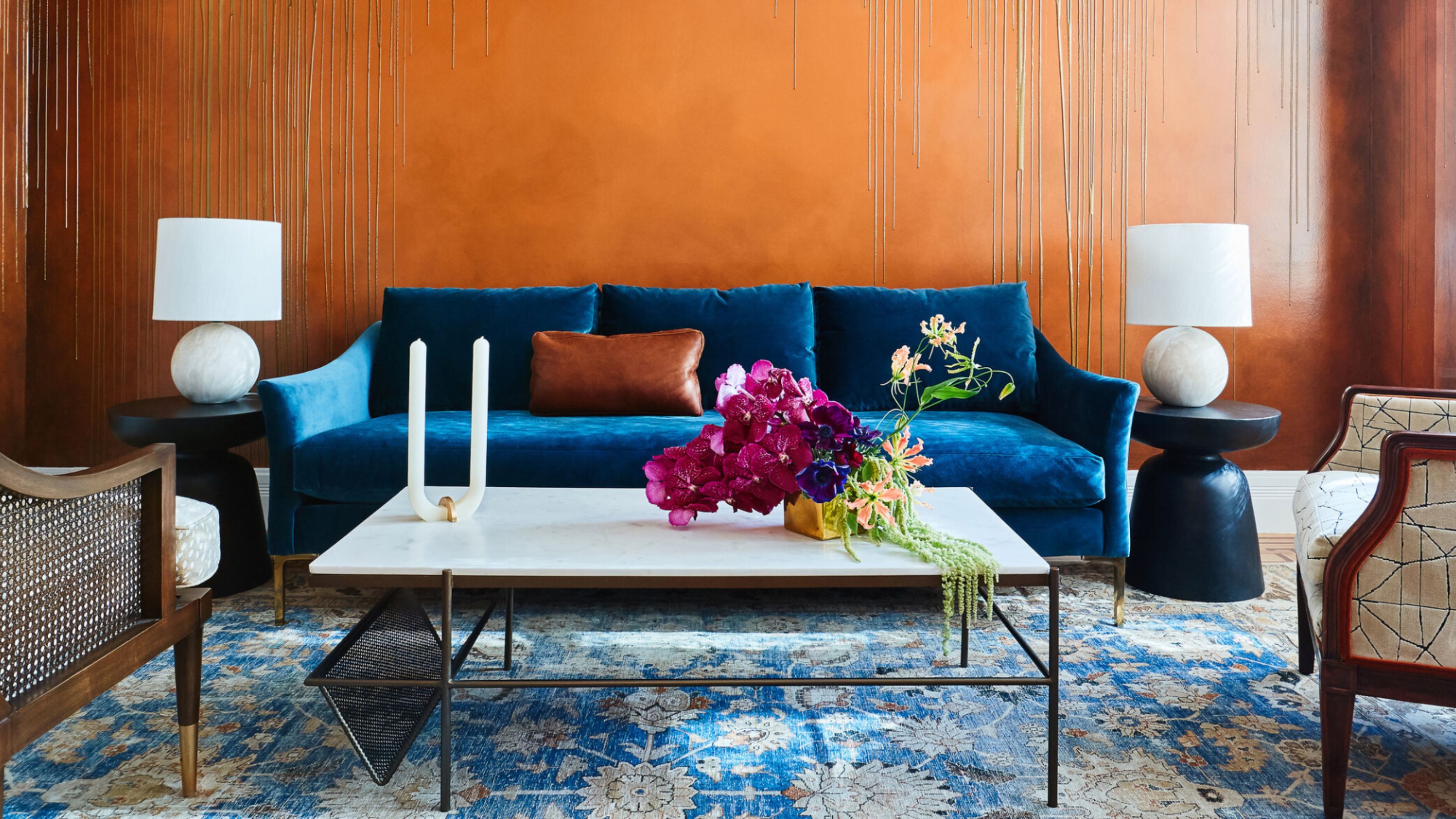 The Combination You Weren't Expecting to Love — 8 Blue And Orange Living Room Ideas That Feel Surprisingly Elevated
A blue and orange scheme for living rooms may sound jarring, but these spaces prove they're striking, vibrant, and certainly unforgettable
-
 Smeg Says Teal, and We’re Listening — The Kitchen Shade of the Year Is Here
Designers are already using the soft, sea-glass green everywhere from cabinetry to countertops
-
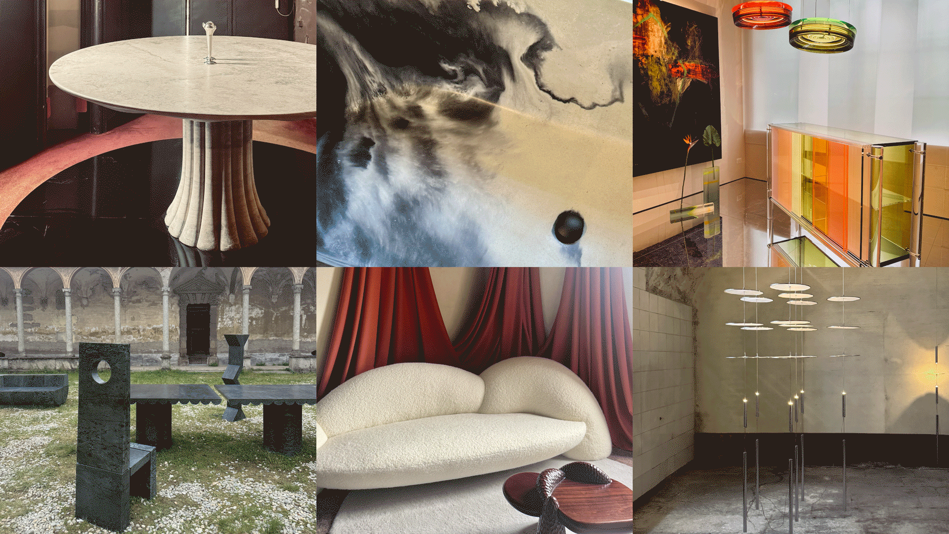 Straight from Salone: 5 Emerging Trends I Found in Milan That'll Shape Interiors for the Year Ahead
From reflective silver to fluidity, here's my perspective on the key themes and new moods coming through from Milan Design Week
-
 Do Yellow and Purple Go Together? Designers Reveal How to Make This Unexpected Pairing Feel "Totally Intentional"
In an era where unexpected combinations have become cool, we've done a deep-dive to discover how to pair yellow and purple in a space
-
 5 Unexpected but Seriously Stylish Spring Color Palettes to Shake Up the Season — "It's Pastel, but Punchy"
Spring color palettes are notorious for their use of pretty pastels, but that doesn't mean they have to lack variation
-
 The 'Red Table Trick' Is the Easiest and Most Expensive-Looking Trend to Hit 2025 So Far
A red dining table makes a seriously stylish statement; the beloved pop of red trend just got an bold and expensive-looking upgrade
-
 Cork Is the Cool, Sustainable, and Surprisingly Chic Material We Can't Stop Furnishing With Right Now
In honor of Earth Month, we’re toasting to cork... furniture, that is
-
 The Coquette Aesthetic Is Still Going Strong in Homes in 2025 — But Now It's Charming, Whimsical, and Has Modern Flair
A designer weighs in on how you can make the classic coquette trend feel modern while still retaining its whimsical elegance


