Colorful living room ideas – 10 spaces that prove going all-out with color can create stylish and sophisticated spaces
Going colorful with your living room ideas is all the rage – these 10 rooms show how you can wield colors without overwhelming your home

A colorful living room is a shortcut to joy, and it's fair to say they're a growing trend. In a world where it pays to stand out, more and more people are choosing to be unapologetic in how they use color in their homes, leading to living spaces that combine bold, vibrant shades in new and interesting ways.
Creating a colorful living room is a skill, however. From how to actually curate the palette itself, to working out the right proportions, there's some magic that's required to pull off a colorful scheme that can sometimes feel a little out of reach.
We've curated some of our favorite colorful living spaces not only to inspire, but to offer guidance on how exactly to pull your living room color ideas together for an exciting scheme.
Take palette inspiration from these colorful living room ideas
If you’re considering going colorful for your living room design, then experimenting with colors is a great place to start. Planning with a physical moodboard of samples is important when a design hinges so much on creating a cohesive palette, and don’t forget to test colors in the room they’re going in, as the light will change how you perceive them.
In the case of paint, that means trying it on every wall too to see how it looks at different orientations and at different times of day. Painting a room can be a significant expense if you’re investing in good quality paint, but it’s not such a permanent choice that you can’t change your mind later if a color doesn’t work quite as planned. Making a bold, colorful decision might be a tactical risk, but one that can pay dividends.
1. Draw a color palette from an existing piece
You might not always have the opportunity to get an interior designer or color expert in to design your home, but fortunately, masters of color are hard at work designing home furnishings that you can draw a well-formed color palette. From artwork to textiles, rugs to wallpaper, there are all kinds of objects in a living room design that can be a source of color inspiration.
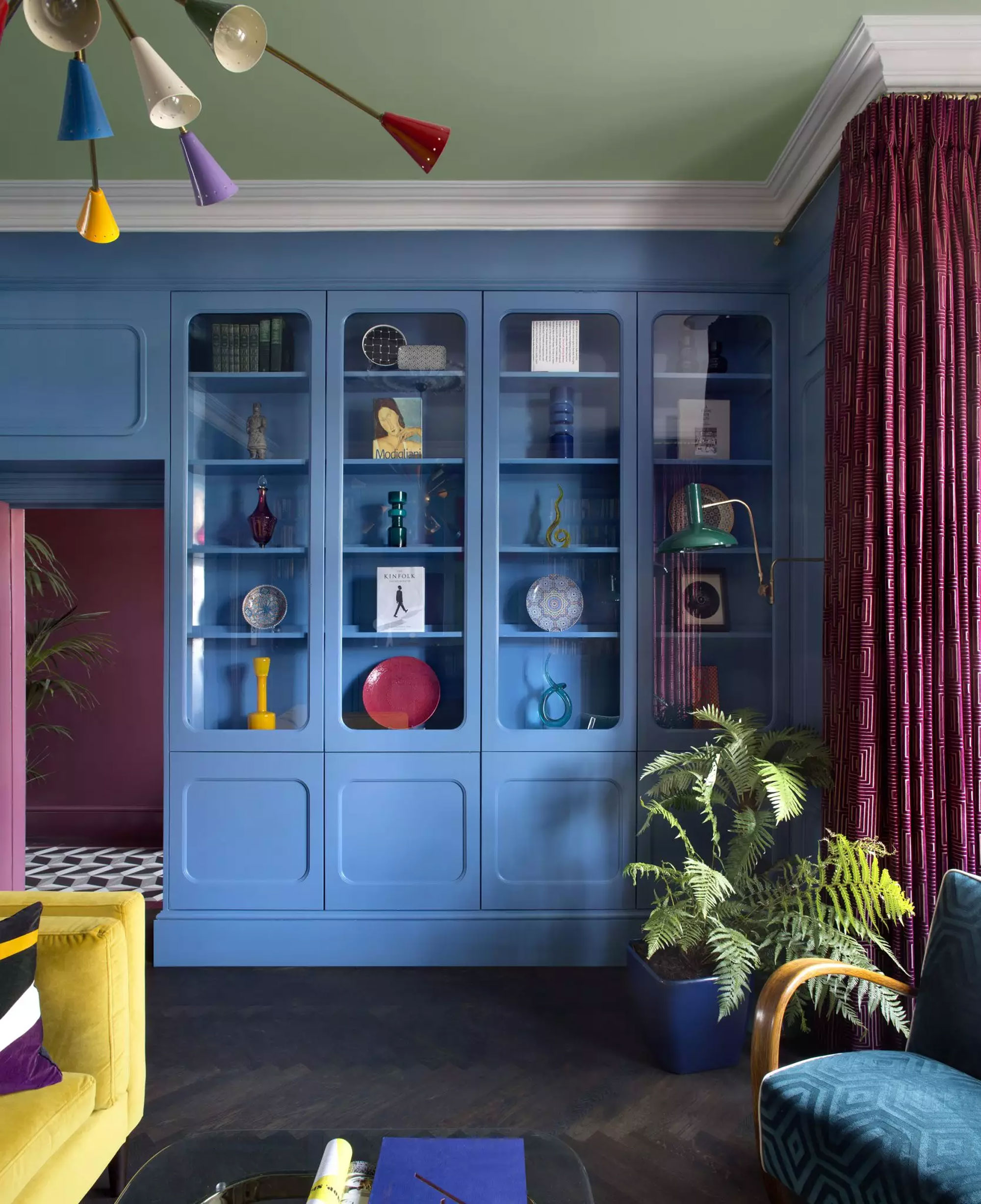
In this living room created by Roisin Lafferty, creative director of interior design studio Kingston Lafferty, the bold color palette of seemingly incongruous shades hangs together perfectly. It also aligns with the palette of this colorful Sputnik-style living room lighting, which holds the color scheme together.
'It was really about taking an artistic approach and looking at how paintings and bold artwork can manage to merge and combine so many different colors and tones,' explains Roisin. 'We wanted to bring that playfulness to a space and apply an almost painterly approach. There is a deliberate graphicness to the design with influence from artist Joseph Albers as well as the contrasting primary colors in the vintage Italian sputnik light fitting we sourced as the centerpiece.'
2. Let your art do the talking
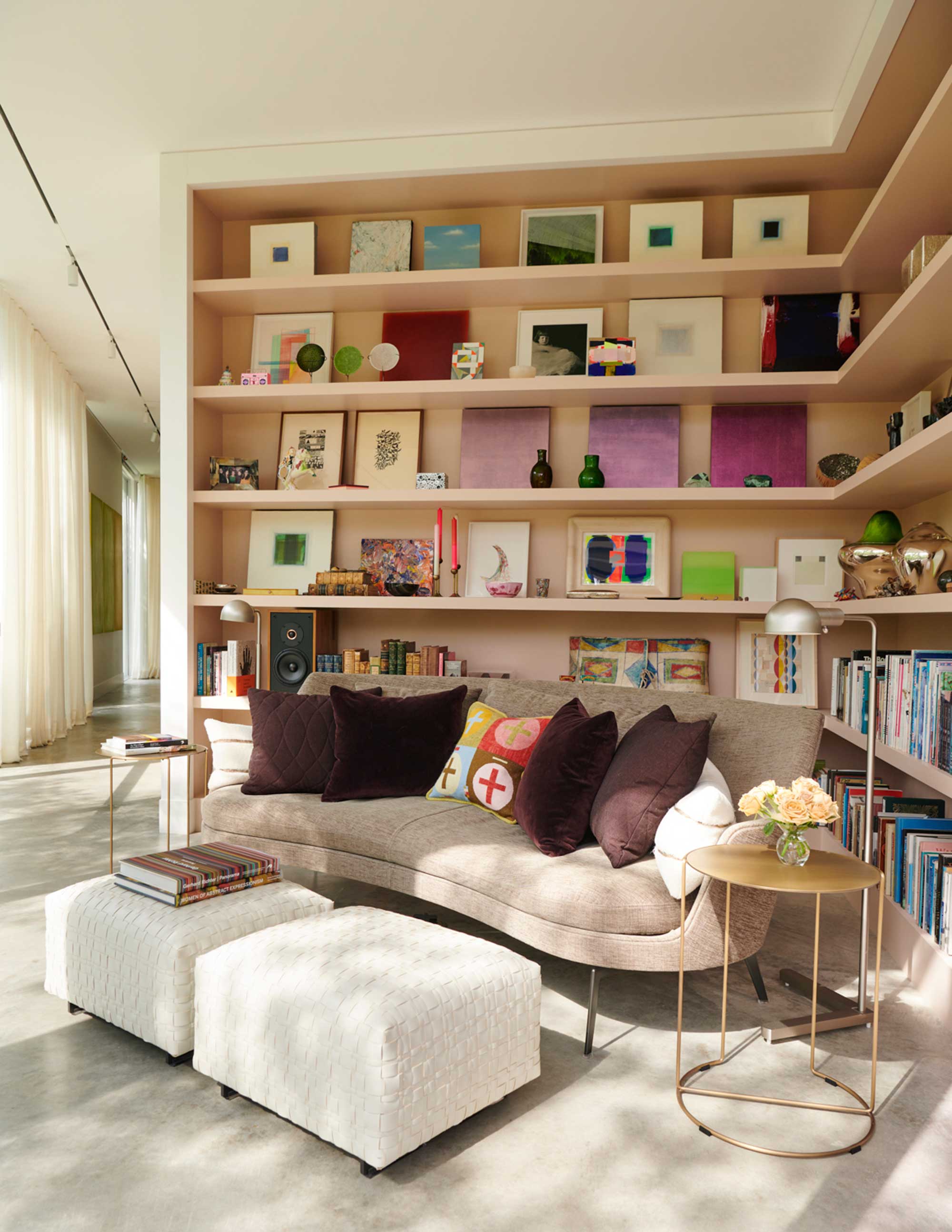
Art is a natural way to bring color into a room, and with the right collection, you can make a room that's otherwise neutral feel colorful. That was the outcome of this small living room corner created in a modern home to showcase an art collector's contemporary collection.
'This corner is called the Cozy Room,' explain Jennifer Mobley and Bill Bloomfield, founders of architecture and design studio Mobley Bloomfield, who interior designed this home in collaboration with with Dillon Kyle Architects. 'It's a beautiful space that you can retreat to, that is not the grand space, nor formalized space, just an intimate space where one can have a private conversation, read a book, or drink a cup of coffee?'
To bring character to the corner, seamless shelves display the owner's art collection - like an alternative gallery wall. 'The shelves were designed for a growing collection of art and objects - a personal collection of family treasures,' Jennifer and Bill say. 'They were designed and engineered so that the shelves would be uninterrupted with no vertical separations for maximum flexibility. The shelves are wood, and painted in a rich, saturated warm pink hue by Farrow & Ball called Setting Plaster.'
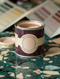
Setting Plaster, Farrow & Ball
This near-neutral pink is the perfect backdrop for the colorful art collection in this cozy corner.
3. Use classic color combinations as a base
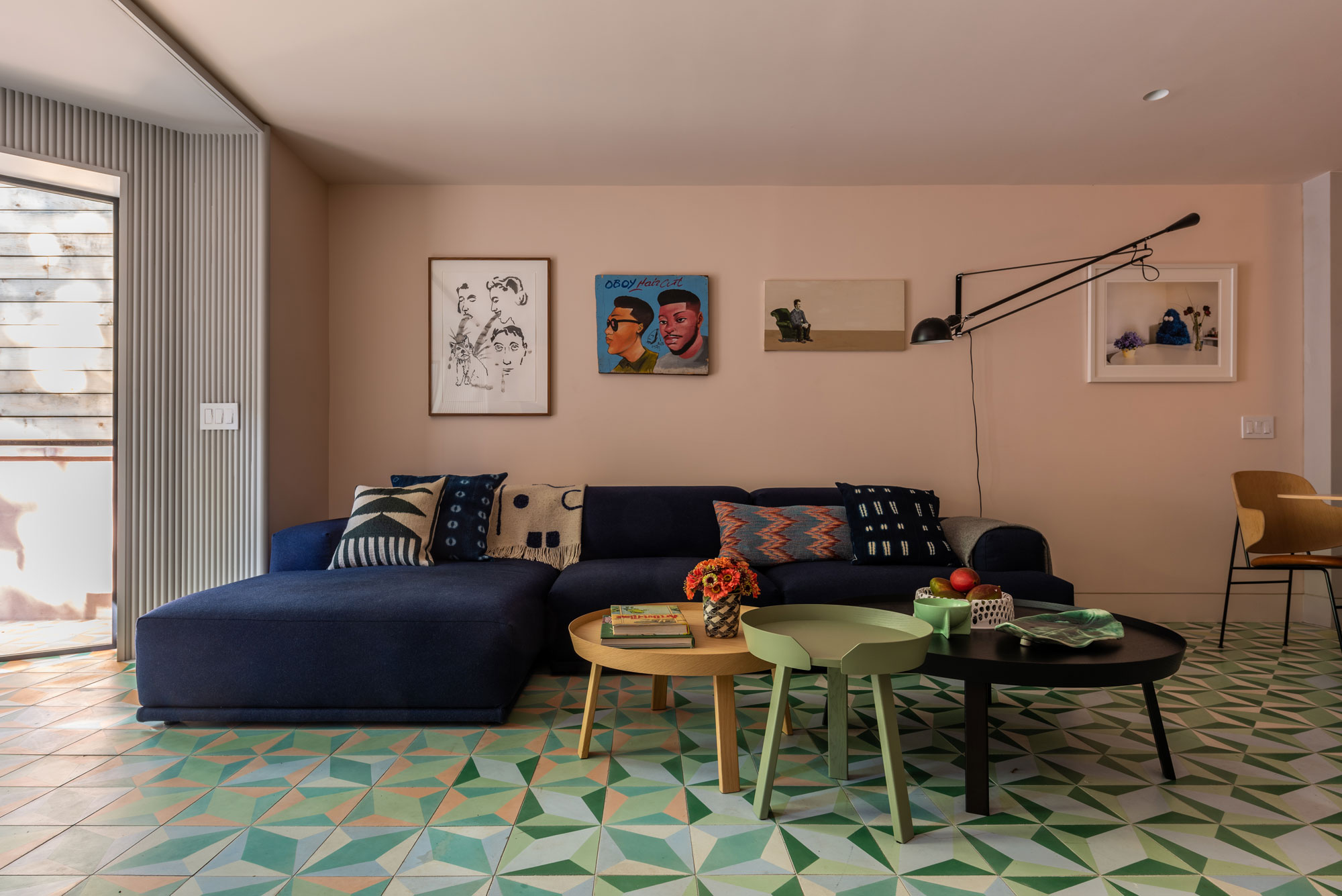
Getting creative with a color palette for your living room doesn't mean going beyond what you already know works. Start your color scheme by choosing your favorite duo, and building on it with other hues that work with both individually.
In this basement snug of a Brooklyn Brownstone designed by MKCA, for example, the base of the color palette is based on the fact that pink is a great color that goes with green. Pink walls and a tonally shifting green tiled floor create a base for other colors to interact with, including a blocky dark blue sofa. 'We purposefully selected simple, hefty forms and pieces that were a single color that would hold their own against some of the strong colors of the architecture,' Michael K Chen, founder of MKCA says.
Each pairing works individually, but together they form a well-rounded triadic color scheme that has more dimension (and color) than a simple two-tone scheme.
4. Don't be afraid to clash colors
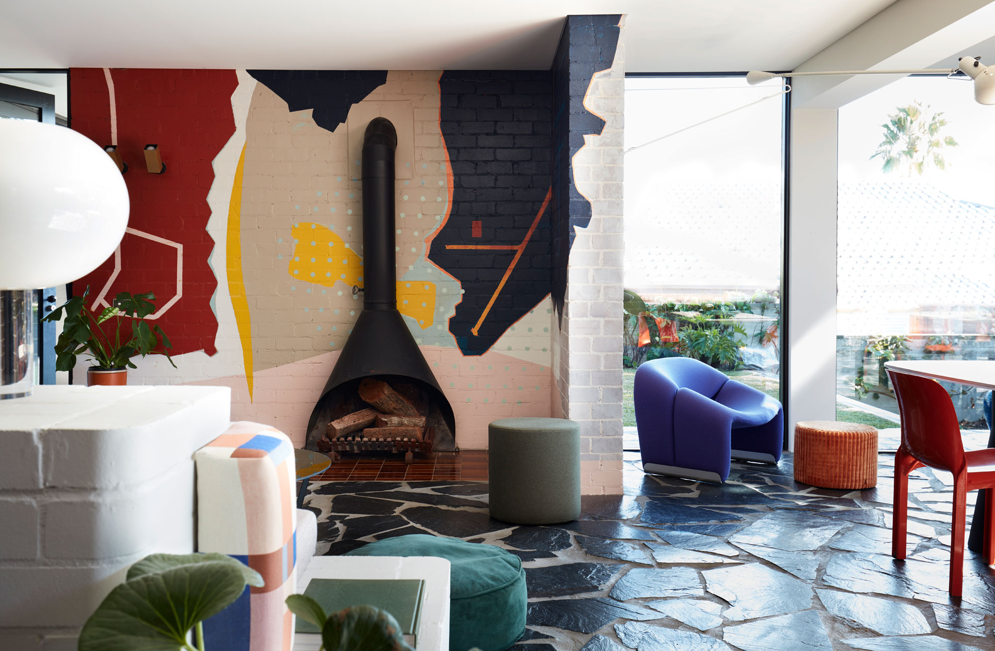
Sometimes, for a bold and unapologetic colorful living room, creating cohesion with color isn't the objective at all. This was the case for this 1960s home in Australia designed by YSG Studio, where colors used for a wall mural and furnishings clash, but in a complimentary way.
'This project is an ‘all in’ commitment to self-expression as the owners wholeheartedly wanted to embrace their fearless love of color which plays a pivotal role with contrasting quiet and bold schemes,' explains interior designer Yasmine Ghoniem, founder of YSG Studio.
'A local Sydney company, Lymesmith, created the mural on the brick wall behind the fireplace. The abstract artwork was inspired by aerial photographs of the property’s coastal location, animating the area with a welcomed alternative to a digital TV screen whilst complementing the new paving with its angular forms,' she explains.
'Whilst it influenced color selections for furniture, it didn’t dictate them as I never fall for ‘matchy-matchy’ conclusions,' Yasmine adds. 'I’m an avid believer in complimentary clashes. The quiet tones - warm shades of white and mushroom pinks - are the base neutral shades holding everything together to create harmony, whilst the brighter and deeper shades draw attention to the living areas and modular hero decor items.'
5. Pick an unexpected contrast
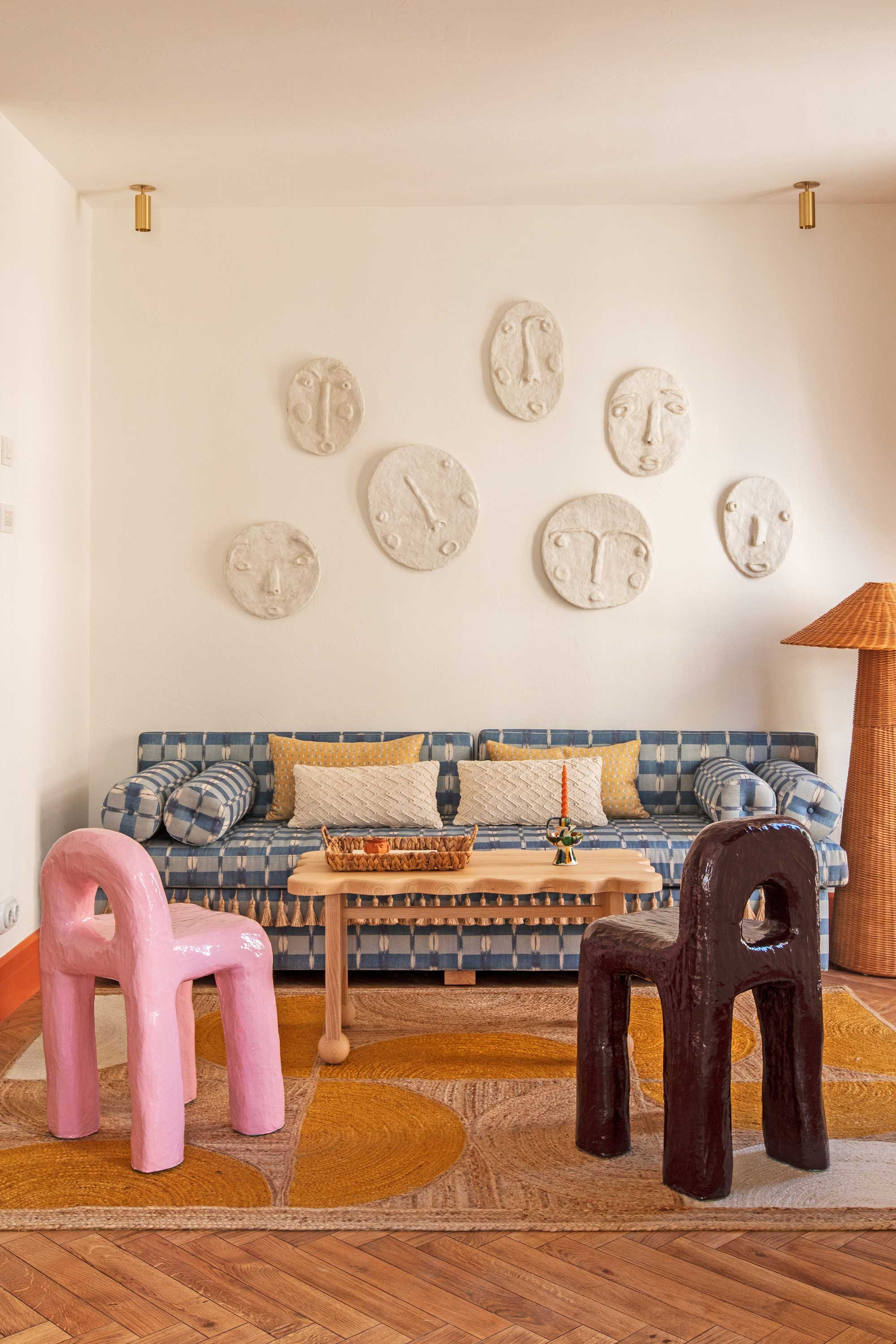
A surprising addition to your living room palette might be all that's needed to turn it from a color scheme to a colorful scheme. 'While the base and accent colors usually follow traditional theoretical rules, and can be categorized as split complimentary, triangular, analogue etc, the contrast color can be the rule breaker,' explains Dagny Thurmann-Moe, creative director of KOI Colour Studio.
In the design of Montesol Experimental Hotel in Ibiza, designer Dorothee Meilichzon created spaces that have bohemian beach vibes at their core. However, by injecting a playful pastel pink into the rooms, too, she's created a space that feels new, fresh and exciting.
6. Combine colorful elements with white walls
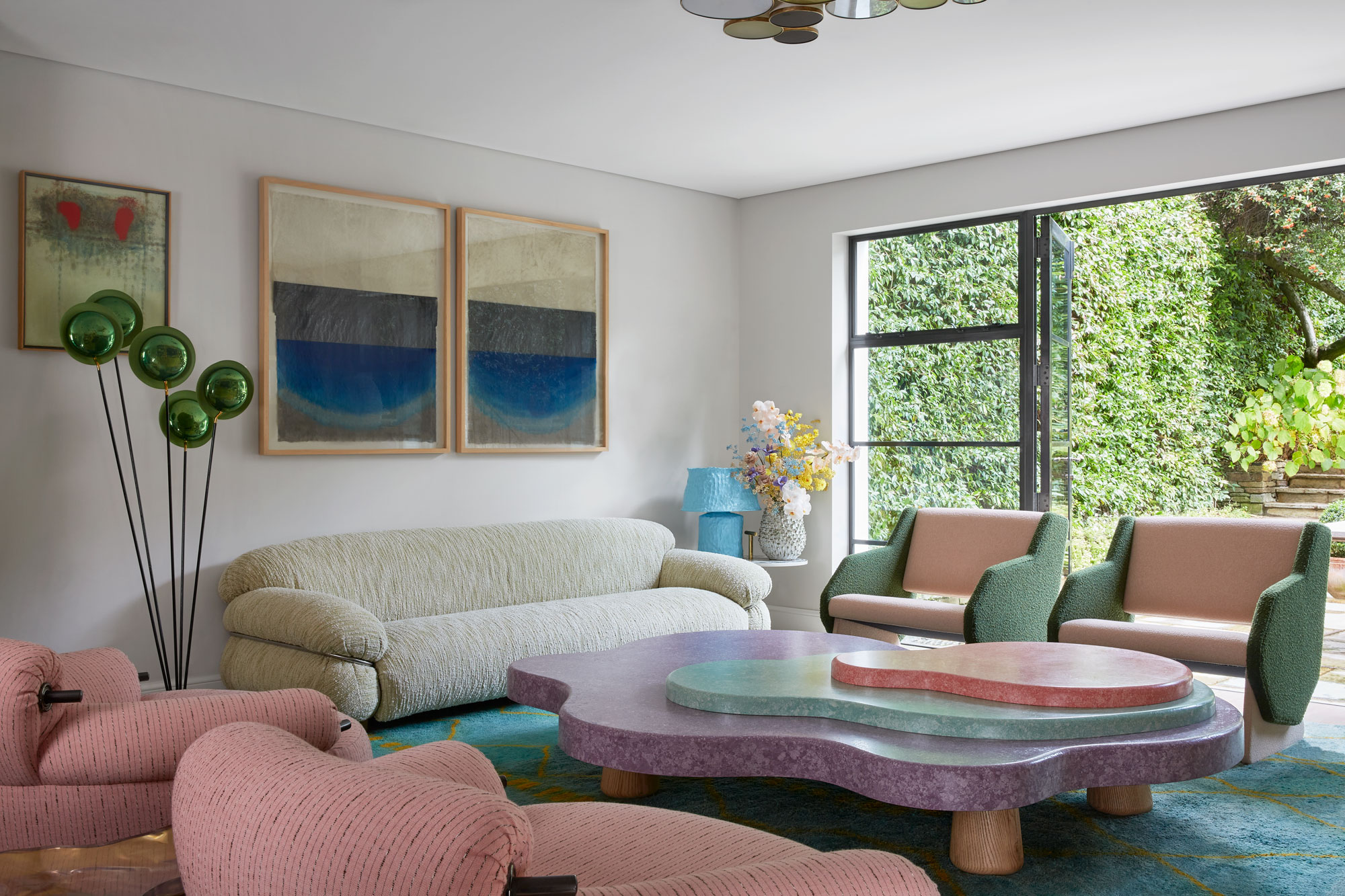
Colorful walls aren't for everyone, but paint and wallpaper aren't the only way to create a space infused with color. Building up color with furnishings on a neutral base is a great way to create an experimental palette, but one that doesn't overwhelm the space.
You should, however, be wary of how much color contrast occurs when using white walls as a backdrop. 'If you have white walls and you buy yourself a red sofa, all you’re going to see in that room is the red sofa because the contrast between the two is so high,' says Dagny Thurmann-Moe.
Working for lighter tones that create less contrast makes for a scheme that's easier to hang together, and that can be design forward too. In this living room idea, created by Korner Interiors using its collaboration furniture with the Invisible Collection, showcases a grown-up approach to decorating with pastels, against a white-walled room.
'Bold color combinations are one of the most effective ways to get your attention but too much of a bold color can overwhelm the details of the space,' says Katie Paulsen, interior designer at Maestri Studio. 'Playing with that balance and incorporating textures and pattern can create a color combination that is truly effective.'
7. Take a minimalist approach to colorful spaces
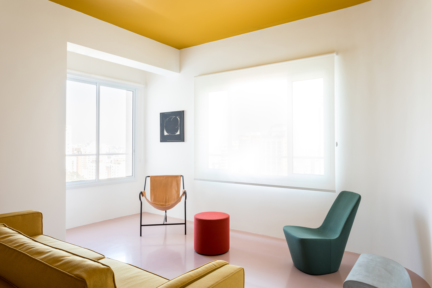
If you think about a colorful living room, you'll undoubtedly go straight to maximalism. After all, spaces that embrace a riot of color have got to be maximalist right?
Well, there's an idea called colorful minimalism that challenges this perception. It has all the hallmarks of minimalist interior design - clean lines, no clutter, and a sense of curation - but with color applied.
'There’s the cliché of minimalism where it’s cold, spare and severe; devoid of art, color, buoyancy and texture - the elements you actually want to live with,' says interior designer Greg Natale. 'But minimalist architecture can be an amazing canvas for expression.'
8. Use a wallpaper to introduce color
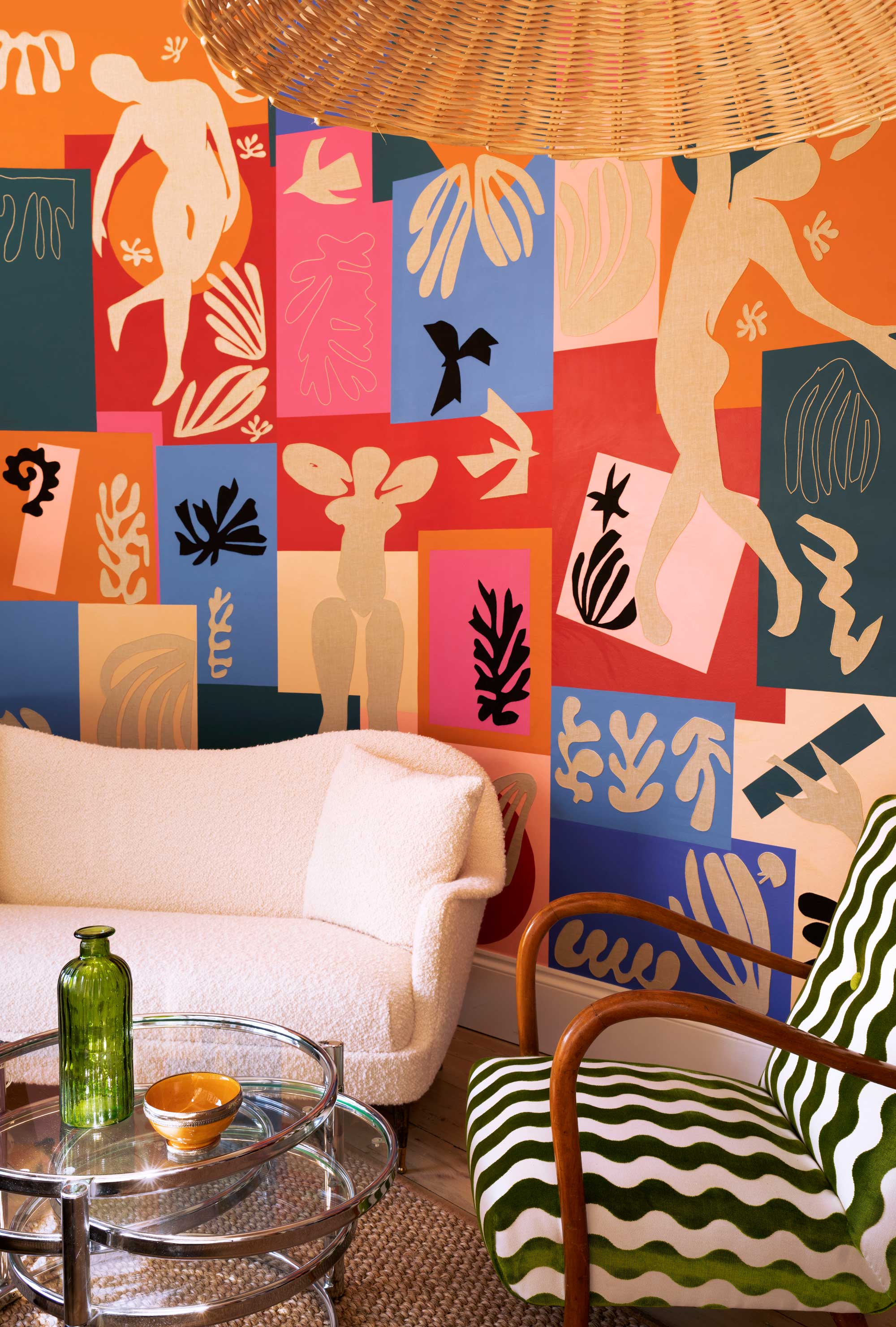
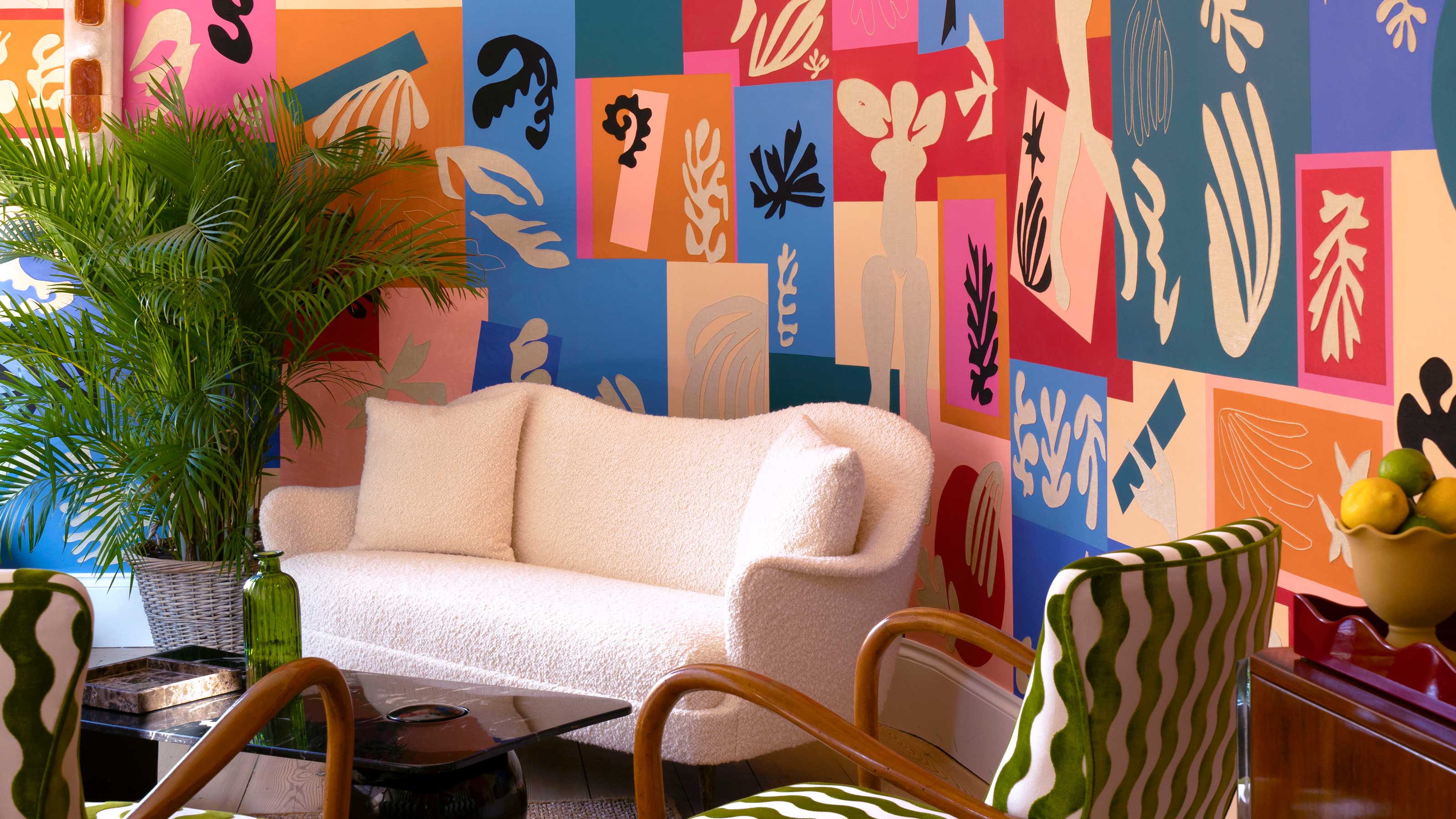
For a readymade designer color scheme, look to colorful wallpaper ideas and mural designs to form the crux of your living room palette. A design such as this, a hand-painted ‘Jazz’ design wallpaper with hand-embroidered Linen appliqué created by luxury wallpaper brand De Gournay as a bespoke installation for its London showroom, introduces all the color you need for a colorful living room look, meaning you can keep the rest of the scheme relatively simple.
Choosing to go all out on the walls and keeping your furniture and decor neutral means that your scheme will be easily adaptable should you wish to change it up in a similar way in the future, too.
9. Try a twist on a tonal scheme
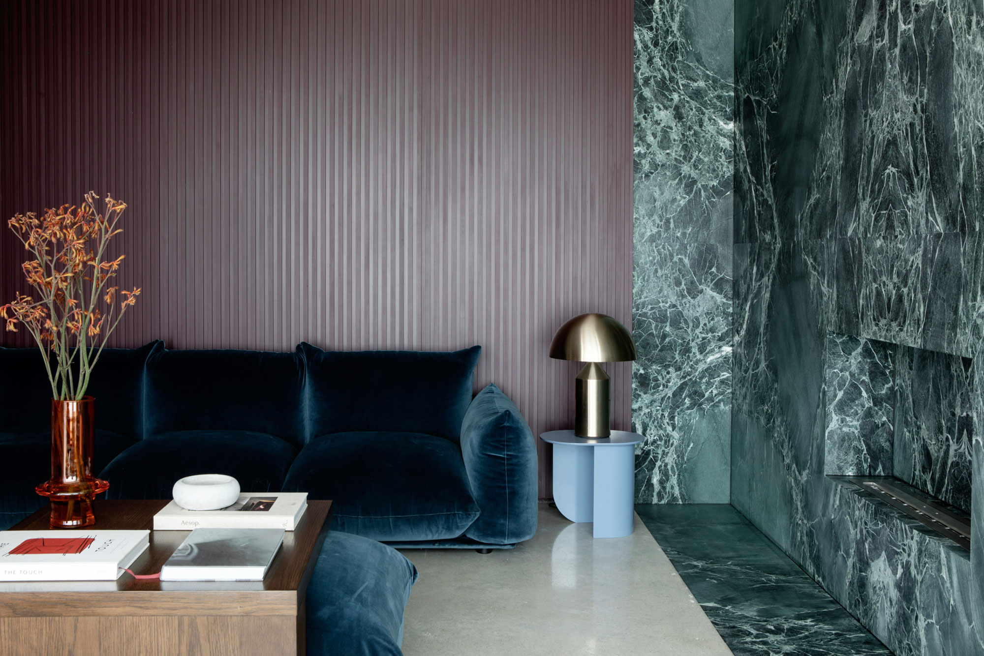
Tonal color schemes are made up of neighboring hues on a color wheel that have a natural affinity when used together. Depending on how granular you want to go, a tonal color scheme could be made of different tones of the same color, or similar shades.
In this purple and green living room design by Kingston Lafferty, tonal greens, blues and purples create a space that's big on color but still feels restful to the eye. 'We wanted to exude a sense of opulence and rich sophistication and wanted the richness of color to be created with natural stone,' explains Roisin Lafferty, creative director of Kingston Lafferty. 'The stone in this room is full of beautiful green tones and almost becomes a natural art piece and focal point in the room.'
'By using natural materials as the key color insertion, we have created a home that hinges on color but manages to be timeless and full of character.,' she explains.
The trick to rounding out this space? A pop of contrasting orange - a color from the complete opposite side of the color wheel - and wood create an accent that sets off these rich, jewel tones. 'As well as the stone being the color center point, rich timber tones deliberately contrast and intensify depth,' Roisin says.
10. Mix up lightness levels to make your scheme work
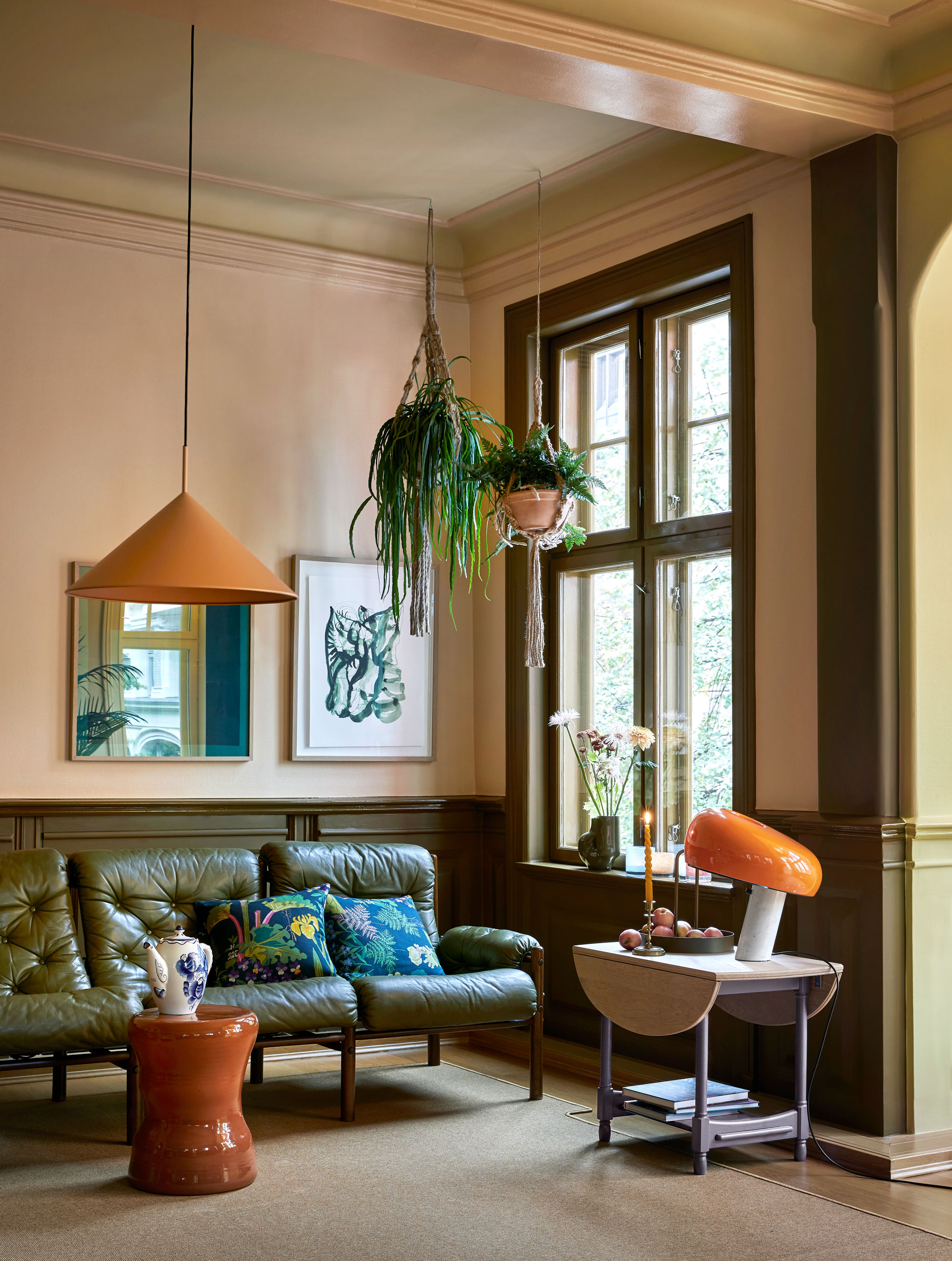
So you've decided on the colors for your scheme, but how do you mix them together successfully? To achieve balance, playing with color 'values' is the key. Values are how light or dark a color is, and combining three different values can help create a sophisticated yet colorful look for your living room.
'I prefer to combine hues with different lightness levels,' says Dagny Thurmann-Moe of Koi Colour Studio, who created the color story for this orange, green and pink living room, 'it results in an all-over more interesting look,'
With moldings painted in Pure & Original's Traditional Paint Eggshell in dark, rich Daybreak and Wetlands and walls in Pale Terracotta Licetto, a vibrant orange accent is introduced as an in-between to complete this refined pink living room scheme.
Living rooms are one of the spaces in the home where people can feel most confident in exploring color trends. In bathrooms and kitchens, bold color choices can feel too permanent, while there's a tendency to lean towards calming colors for bedrooms.
But what is trending in living room colors right now? Green is an always popular color, but bolder, more vibrant olive green is the direction color trends for the living room are heading right now.
On the flip side, for a soft, delicate color palette, but one that still feels colorful and exciting, designers are recommending lavender as a way to bring energy through less in-your-face tones.
Be The First To Know
The Livingetc newsletters are your inside source for what’s shaping interiors now - and what’s next. Discover trend forecasts, smart style ideas, and curated shopping inspiration that brings design to life. Subscribe today and stay ahead of the curve.

Hugh is Livingetc.com’s editor. With 8 years in the interiors industry under his belt, he has the nose for what people want to know about re-decorating their homes. He prides himself as an expert trend forecaster, visiting design fairs, showrooms and keeping an eye out for emerging designers to hone his eye. He joined Livingetc back in 2022 as a content editor, as a long-time reader of the print magazine, before becoming its online editor. Hugh has previously spent time as an editor for a kitchen and bathroom magazine, and has written for “hands-on” home brands such as Homebuilding & Renovating and Grand Designs magazine, so his knowledge of what it takes to create a home goes beyond the surface, too. Though not a trained interior designer, Hugh has cut his design teeth by managing several major interior design projects to date, each for private clients. He's also a keen DIYer — he's done everything from laying his own patio and building an integrated cooker hood from scratch, to undertaking plenty of creative IKEA hacks to help achieve the luxurious look he loves in design, when his budget doesn't always stretch that far.
-
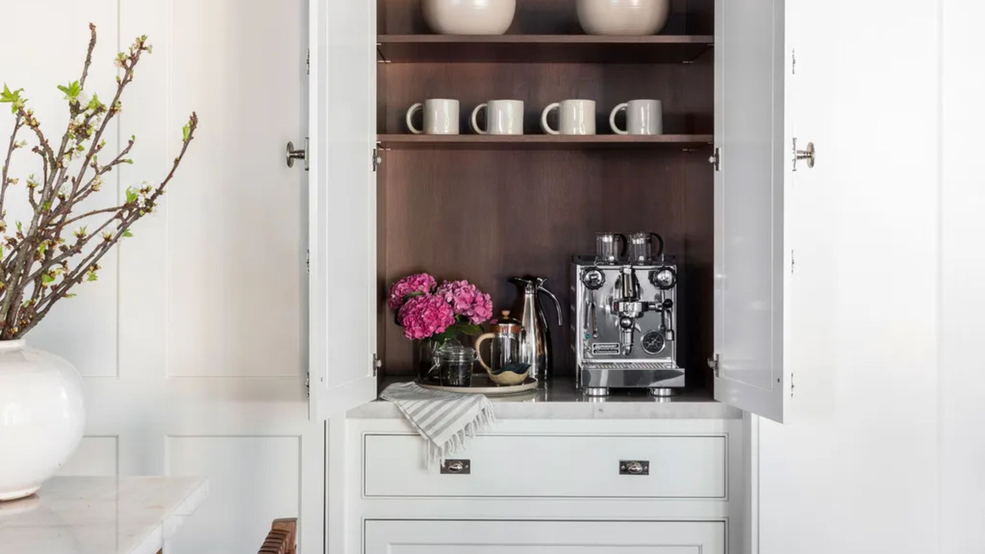 Turns Out the Coolest New Café is Actually In Your Kitchen — Here's How to Steal the Style of TikTok's Latest Trend
Goodbye, over-priced lattes. Hello, home-brewed coffee with friends. TikTok's 'Home Cafe' trend brings stylish cafe culture into the comfort of your own home
By Devin Toolen Published
-
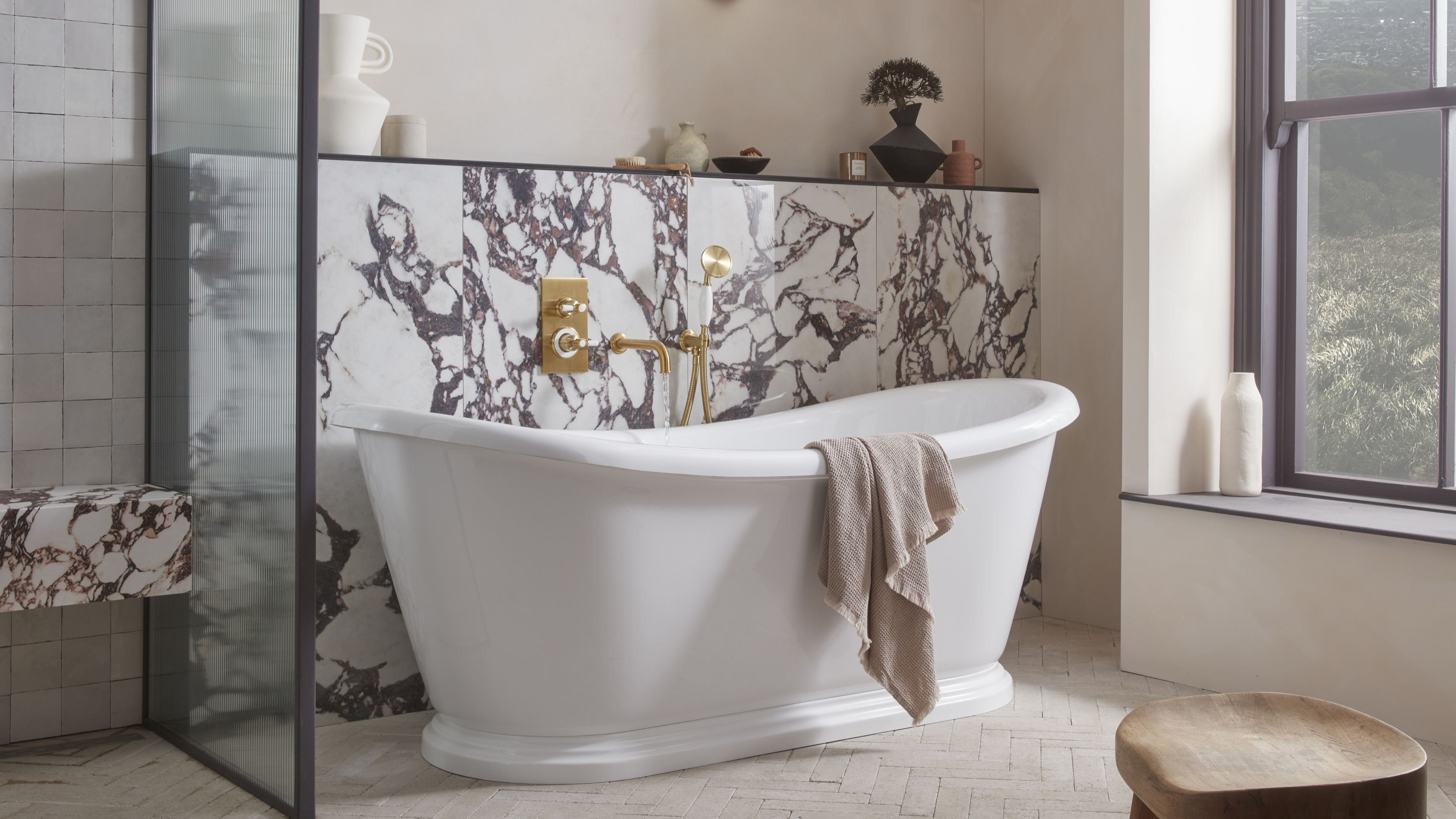 5 Bathroom Layouts That Look Dated in 2025 — Plus the Alternatives Designers Use Instead for a More Contemporary Space
For a bathroom that feels in line with the times, avoid these layouts and be more intentional with the placement and positioning of your features and fixtures
By Lilith Hudson Published
