5 Times Interior Designers Used Colorful Tile Grout That Make Me Never Want to Choose White Again
Colorful tile grout can give your space a retro vibe or modern twist, depending on how you treat it. These experts explain the beautiful benefits of thinking beyond white
Long gone are the days when tile grout was purely functional. Increasingly, designers are using color to transform the gap-filling plaster into a feature in its own right.
'Using grout as a design element has grown in popularity over the past several years, and with good reason,' says DeeDee Gundberg, chief designer at tile brand Ann Sacks. 'Grout has the ability to fully integrate into your design when picking tonal colors, or it can help make a statement when using contrasting colors.'
From retro patterns color combinations, to clean, contrasting hues that give walls a playful lift, here are five examples of colorful tile grout in modern bathrooms and kitchens that make us never want to pick white again.
1. Unify subtle zones of color
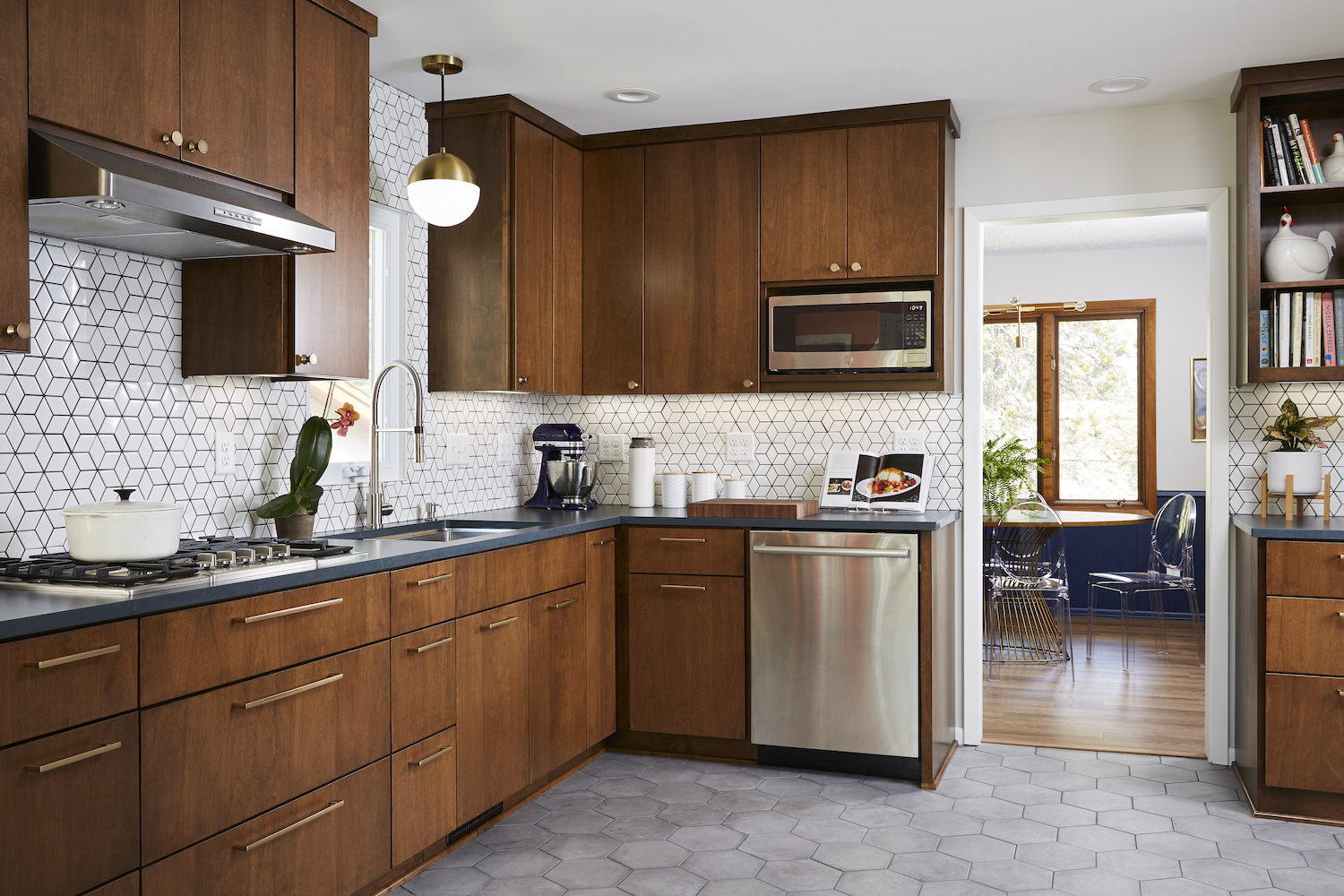
This kitchen by interior designer Colleen Slack at Fox Interiors uses navy tile grout to pick out and unify the blues used throughout the space.
'For this mid-century-modern kitchen, we chose zones of color that would elevate the design without overpowering it,' says Collenn. 'In order to highlight the pattern created by the diamond tiles in the backsplash we selected a navy grout that was a pop of color but subtle enough to not draw attention from the rest of the kitchen. The grout also unites the room by repeating the shade of navy used on the pantry cabinets on the opposite wall and the paneling in the adjacent dining room.'
2. Go tonal for a playful and retro feel
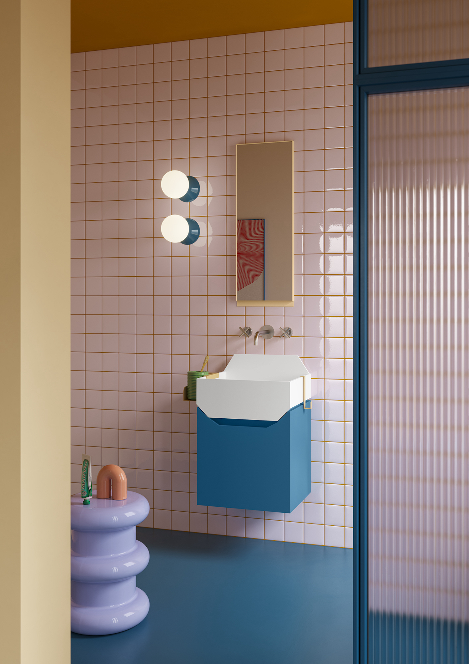
We’re obsessed with this bathroom by notooSTUDIO, which combines bold Tile and grout color combinations in tonal shades of pink and orange to create a funky, retro feel. 'It had to be a very colorful environment, reminiscent of the 70’s style, rather playful,' says Chiara Luzzatto, Art Director and Architect at notooSTUDIO. #I liked the effect of the tiles with the colorful contrast joint and that the same color then continued on the ceiling. The white plaster would have removed character.'
3. Have fun with a pop of color
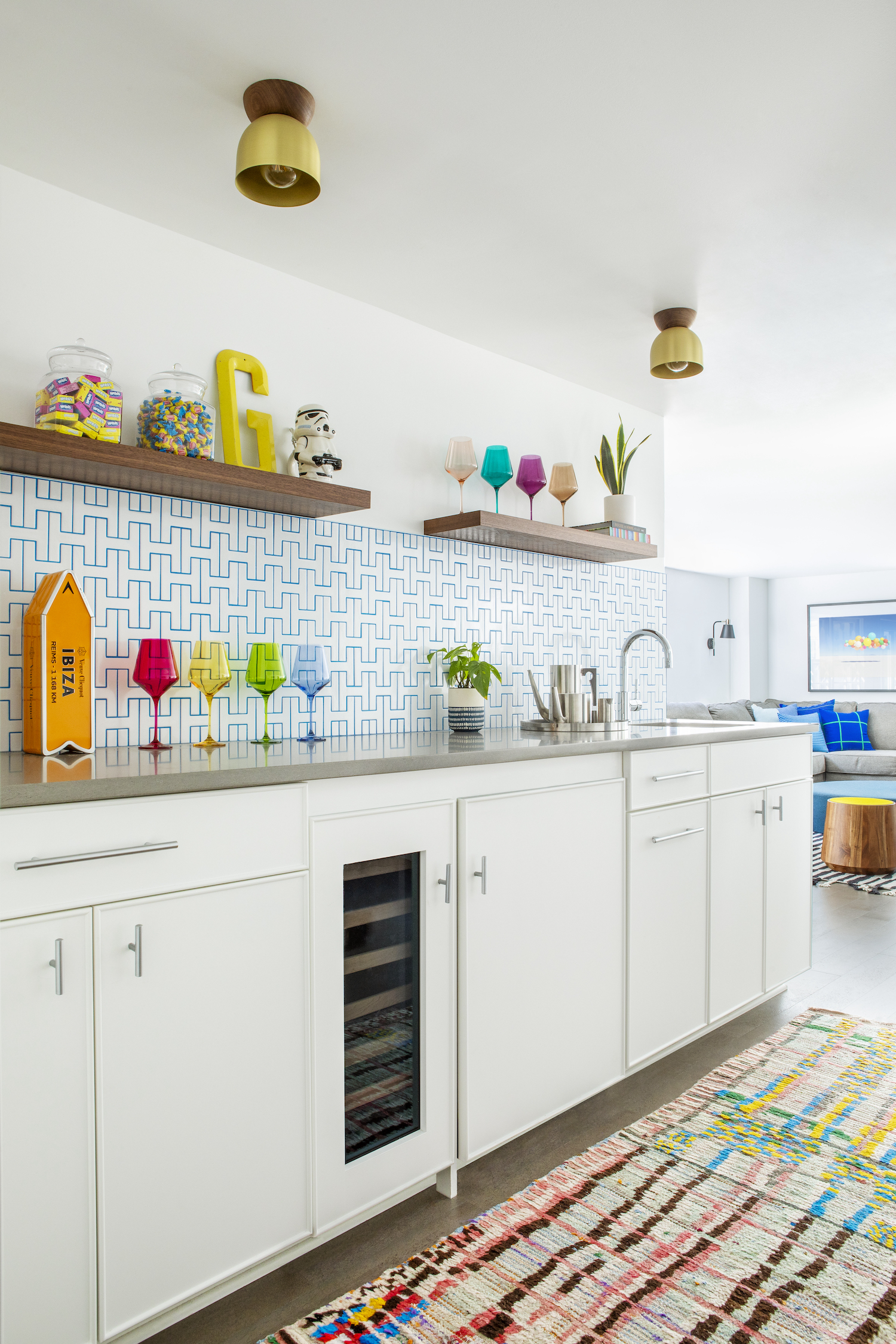
Brightly-colored tile grout—like the blue in this kitchen by interior designer Mandy Riggar—can create a modern, playful look that doesn't overpower the space.
'For this family room, we wanted to have fun, but without over-stimulating patterned tile or wallpaper,' says Riggar. 'Working with the existing white cabinets, we added simple white tile in an unexpected pattern and accentuated the pattern with a pop of bright blue grout. Adding colored grout works seamlessly with the neutral design, creating a "just enough pop of fun" moment. The bright blue is inspired by the bright blue in the vintage rug.'
4. Try a continuous color flow

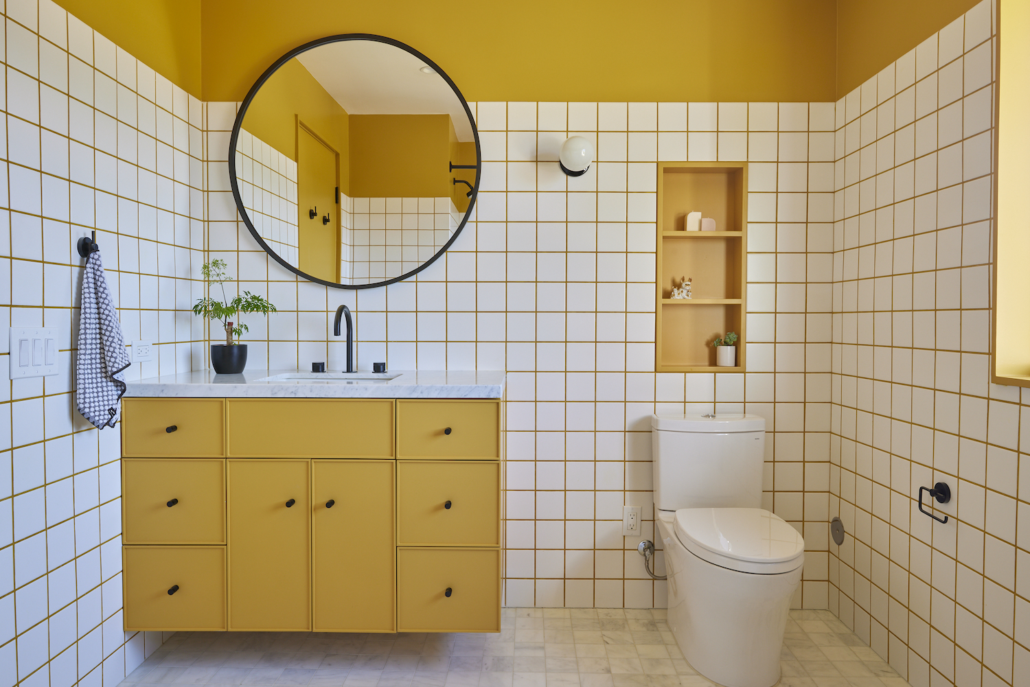
Colorful tile grout gives this bathroom by And And And Studio a more cohesive and calming feel, helping the room to feel drenched in marigold with a matching tile grout and painted ceiling.
'We wanted to create the effect of a continuous colored wall behind the tile, but of course grout prevents that,' says Annie Ritz, Principal Designer at And And And Studio. 'To achieve our desired effect, we painted the upper portion of the wall and ceiling a rich marigold and created a custom grout color to match it and create an illusion of continuity.'
5. Be bold with black
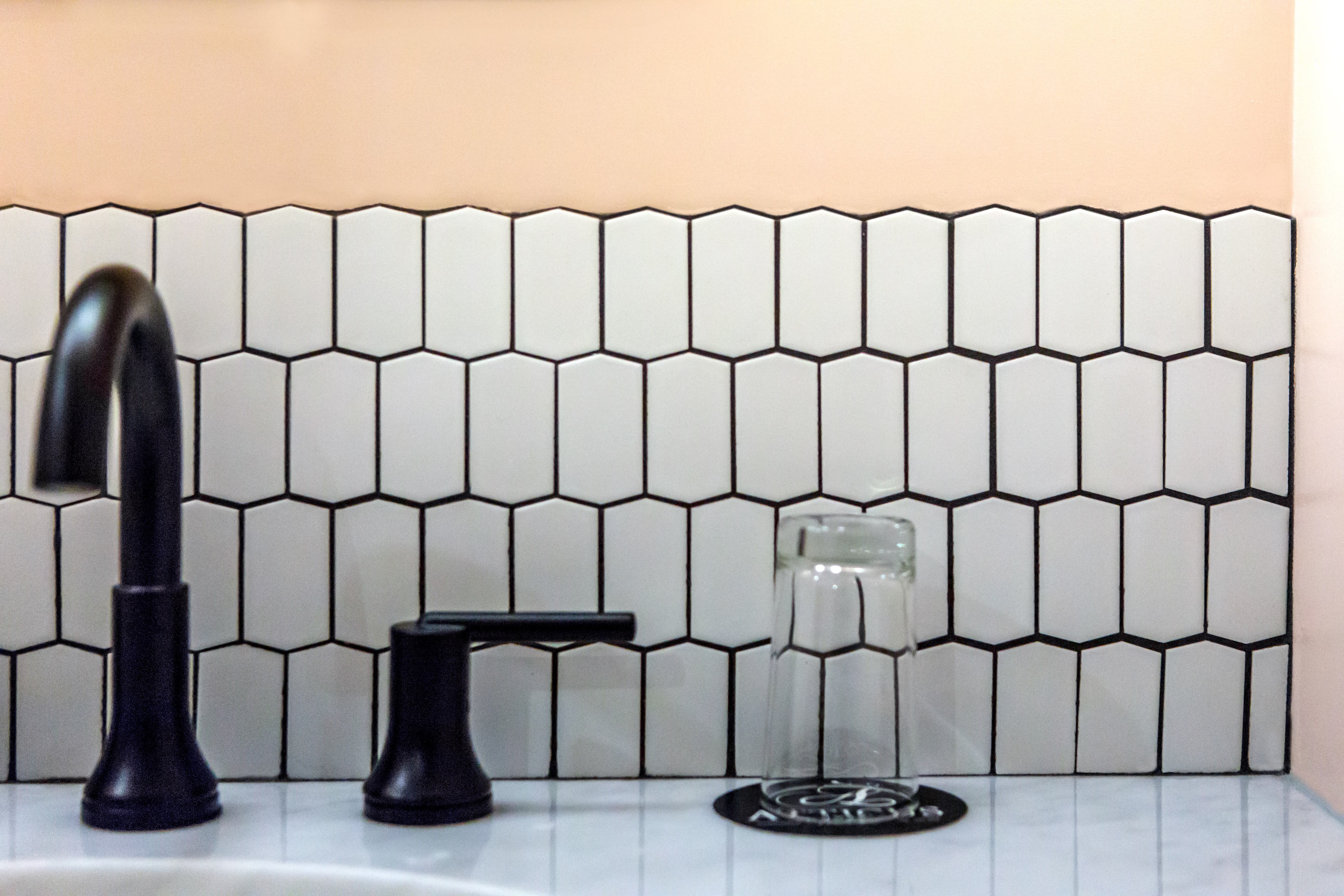
If you’re color-shy, but would love to play with contrast, black grouting could be the answer. In this design by Ann Sacks, the peach walls soften the black and white contrast. This helps keep the look clean, but relaxing. #Black grout with white tile, or white grout with black tile are by far the most common contrasting grout combinations,# says Ann Sacks’ DeeDee Gundberg. 'Black and white is a classic combination that will never go out of style.'
'Whatever contrasting color you choose, note that the grout will highlight your pattern so have fun and play with ideas like herringbone, offset or basketweaves to further accentuate your choice,' says DeeDee. 'If you are considering using contrasting grout, I would encourage you to test samples prior to making a decision. The grout truly will change the look of your installation, especially in smaller tiles such as mosaics where grout plays a larger role.'
Be The First To Know
The Livingetc newsletters are your inside source for what’s shaping interiors now - and what’s next. Discover trend forecasts, smart style ideas, and curated shopping inspiration that brings design to life. Subscribe today and stay ahead of the curve.
Kate Hollowood is a freelance journalist who writes about a range of topics for Marie Claire UK, from current affairs to features on health, careers and relationships. She is a regular contributor to Livingetc, specializing in reporting on American designers and global interiors trends. Based in London, Kate has also written for titles like the i paper, Refinery29, Cosmopolitan and It’s Nice That.
-
 The 'New British' Style? This Victorian London Home Embraces Its Owners' Global Background
Warm timber details, confident color pops, and an uninterrupted connection to the garden are the hallmarks of this relaxed yet design-forward family home
By Emma J Page
-
 Muji Living Room Ideas — 5 Ways to Harness The Calming Qualities of This Japanese Design Style
Inspired by Japanese "zen" principles, Muji living rooms are all about cultivating a calming, tranquil space that nourishes the soul
By Lilith Hudson