What Colors Go With Gray? 19 Arresting Combinations With This Time-Tested Neutral
These instantly eye-catching pairings with gray are a foolproof way to make any room feel chic, modern, and inspiring
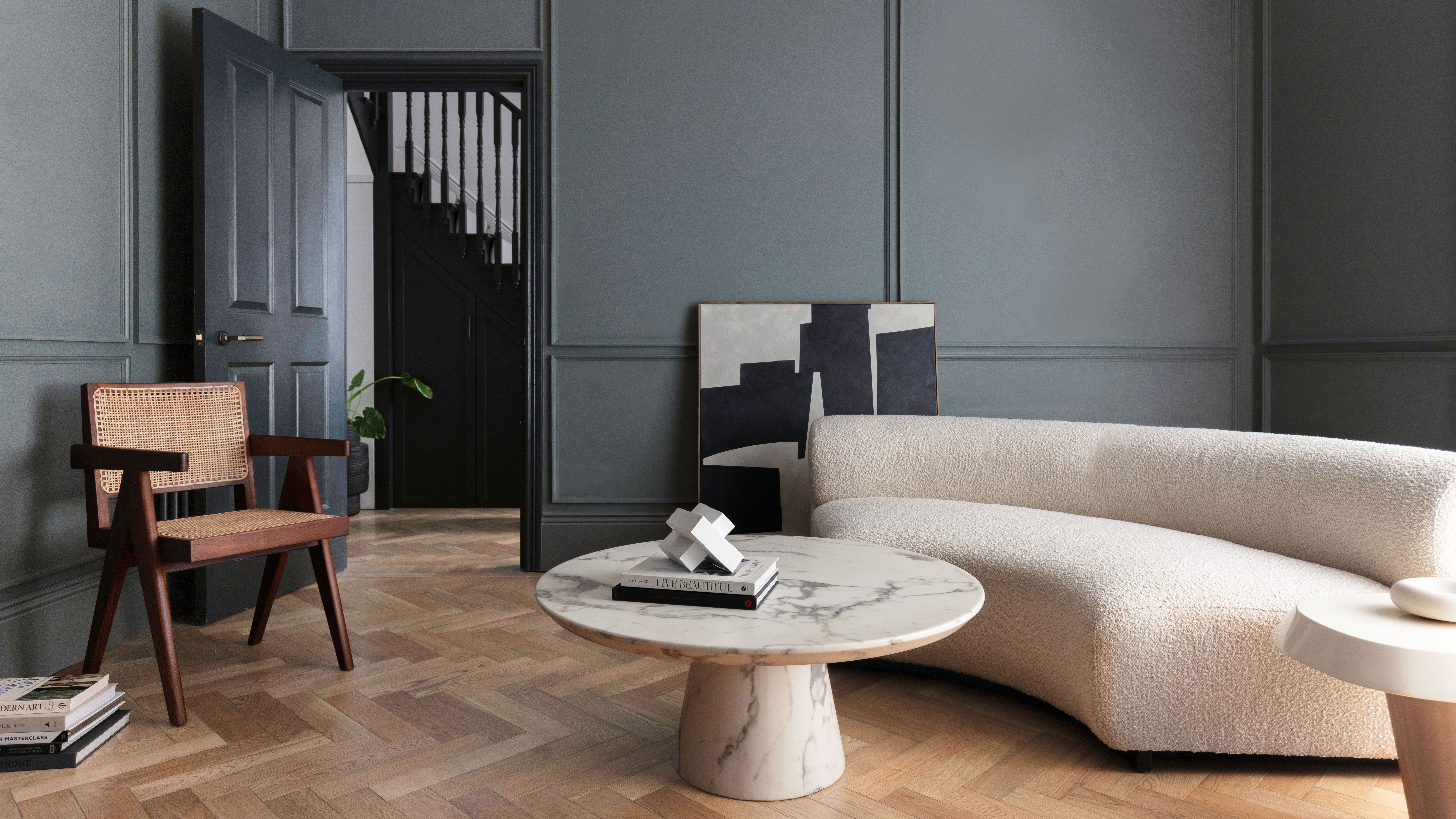

Gray has long been a universally loved neutral, synonymous with style, sophistication, and glamor. With a wide range of undertones — spanning blue, green, and brown — gray pairs effortlessly with nearly every shade on the spectrum without feeling overwhelming. This versatile tone, available in everything from the palest silver to deep charcoal, is celebrated for its chameleon-like adaptability.
"Gray is the ultimate neutral — it’s versatile, sophisticated, and effortlessly adaptable to various design styles,” says Burcu Garnier of Color Atelier. “Its timeless appeal lies in its ability to create a sense of balance and calm, acting as a perfect backdrop for other colors or standing out on its own. Whether it’s a soft, warm gray for a cozy atmosphere or a cool, sleek gray for a modern aesthetic, it never feels dated.”
When decorating with gray, identify the mood you want to evoke — combine gray with red for a bold, eye-catching interior, with cream for a soft, relaxing vibe, or with pastels for a modern, lively aesthetic. So what colors go with gray? Explore these expert-approved ideas to find all the colors that go with gray.
19 Colors That Go With Gray
1. Gray and Ochre
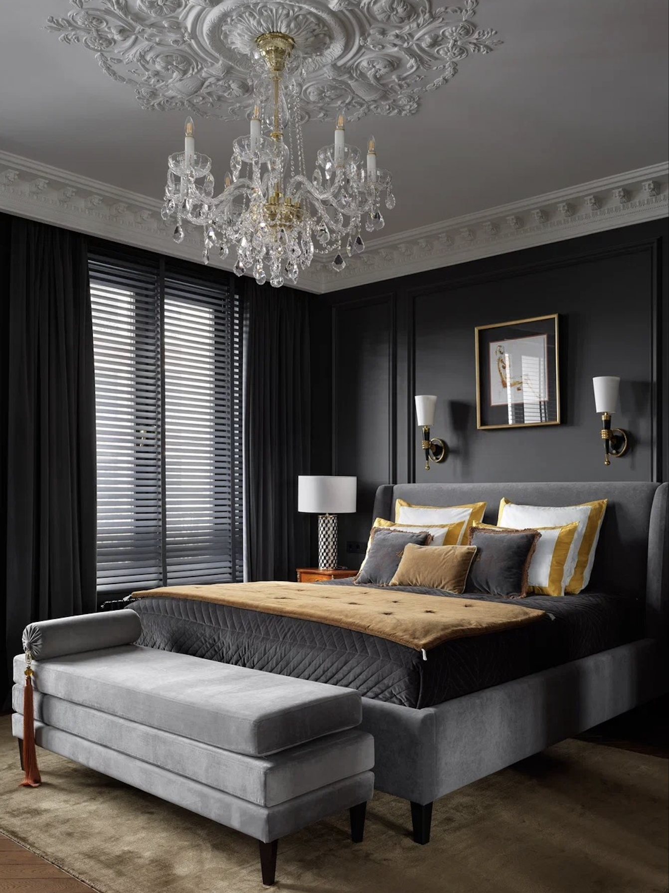
Ochre or mustard are great colors that go with dark gray, as they balance the deep tone, and inject a lively vibe. Also, ochre or other deeper yellows keep the more saturated grays from appearing too drab.
“The clients had lived in Paris for a long time and were keen to have an interior with stucco, fireplaces, and mirrors,” shares interior designer Mila Morgunyan. “We tried to evoke a feeling of “seriousness” in the home but dialed down effect with bright paintings, modern art, and various accessories. The owners also told us to go dark with the walls so we chose this gray and balanced it with ochre yellow bedding.”
2. Gray and Dark Blue
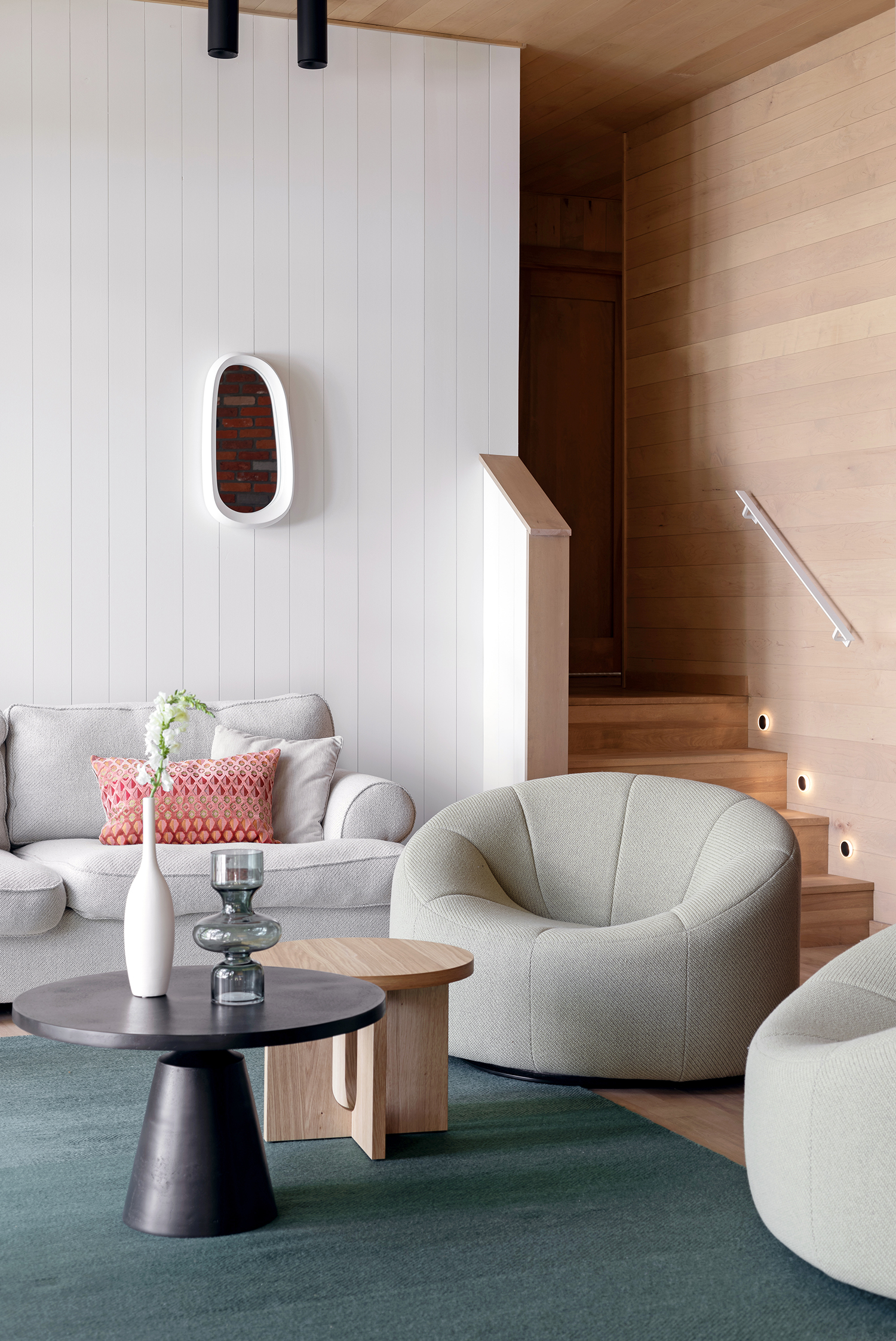
Another great color that goes with gray is blue — in any shade or variation — to create a mesmerizing contrast that feels both crisp and contemporary. It’s an especially great color that goes with light gray or mid-tone gray.
“For a dramatic look, pair gray with deep navy or charcoal — it adds depth and a sense of luxury,” says Burcu Garnier of Color Atelier. “Also, gray harmonizes beautifully with natural textures like wood, stone, and linen, making it a go-to choice for designers aiming to create a grounded, serene environment."
3. Gray and Emerald Green
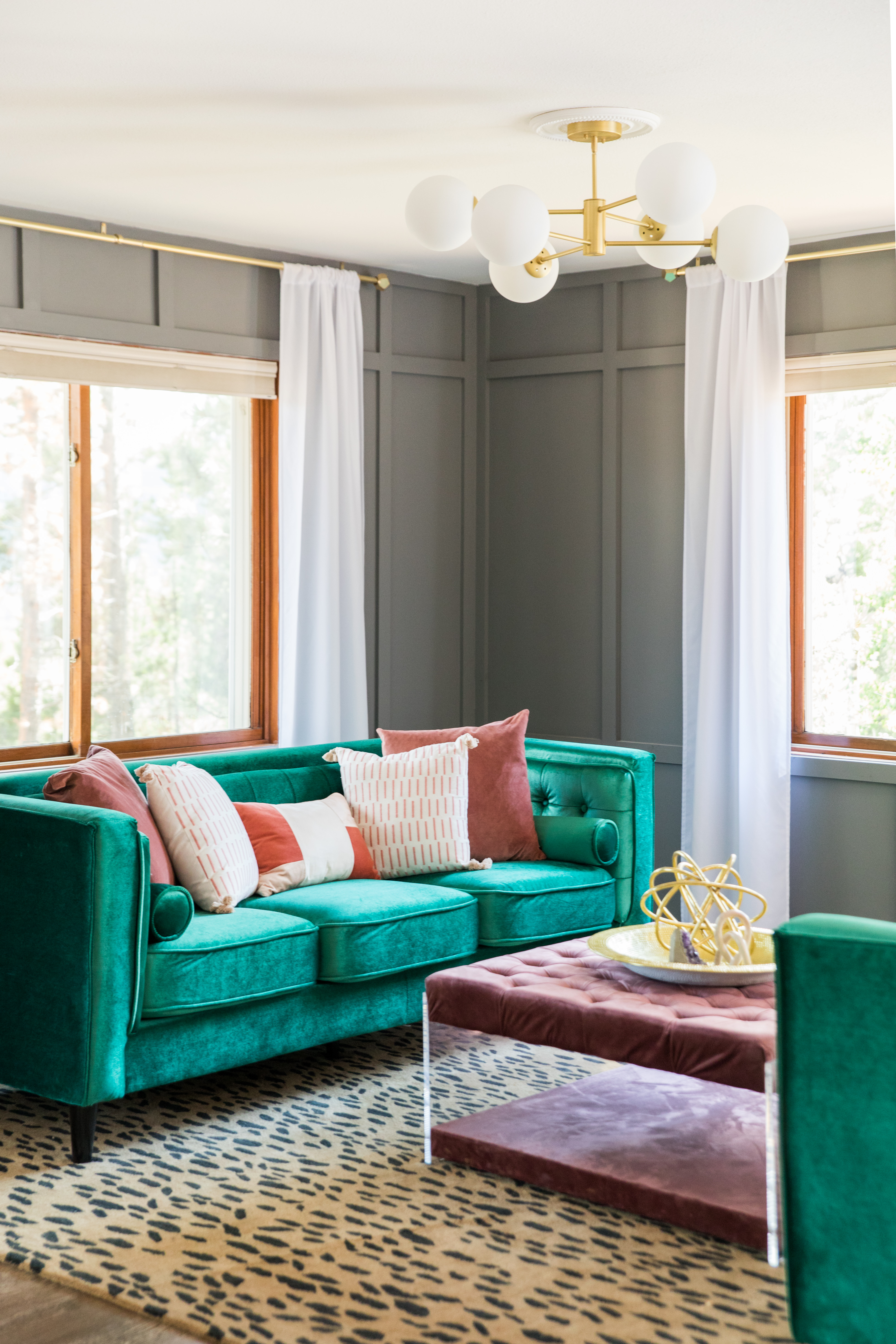
Gray is a wonderful color that goes with emerald green and can play the perfect diluting agent to emerald green, which can be a tad overwhelming if used in large quantities. Consider designing a largely gray canvas and pepper the room with emerald green accessories.
“A warm, saturated gray can serve as such a lovely neutral backdrop, with a bit more intrigue than basic white,” says Jasmine Listou Bible of Jasmine Bible Design. “Shades of pink and green are one of my favorite color combinations and never cease to bring vibrancy and intrigue to any space. In this room, the leopard rug by Safavieh warms up the space, and adds subtle pattern, while elements like lucite and brass keep it feeling fresh and modern.”
4. Gray and Gray
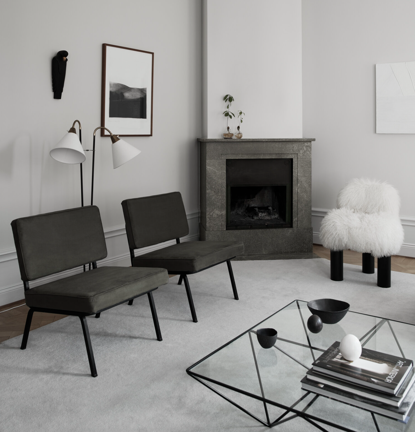
Another great color that goes with gray — is gray! A gray-on-gray scheme is easily the most calming, relaxing, and timeless one; the two colors add depth and dimension and also create an interior that won't feel dated for decades.
To create the perfect combo, ensure that the two gray shades aren't too close in color and you'll want to have some varying tones going on too. It's best to pair a charcoal gray with a light one, or perhaps bring light and mid-tones together. An all-gray living room or bedroom will inherently feel sumptuous.
“The apartment is composed of a palette of white, shades of gray and beige, and green, all pulled together with splashes of black,” avers Louise Liljencrantz of Liljencrantz Design. “The palette is crisp and clean, allowing the details of the furniture and artworks to come to life.”
5. Gray and Red
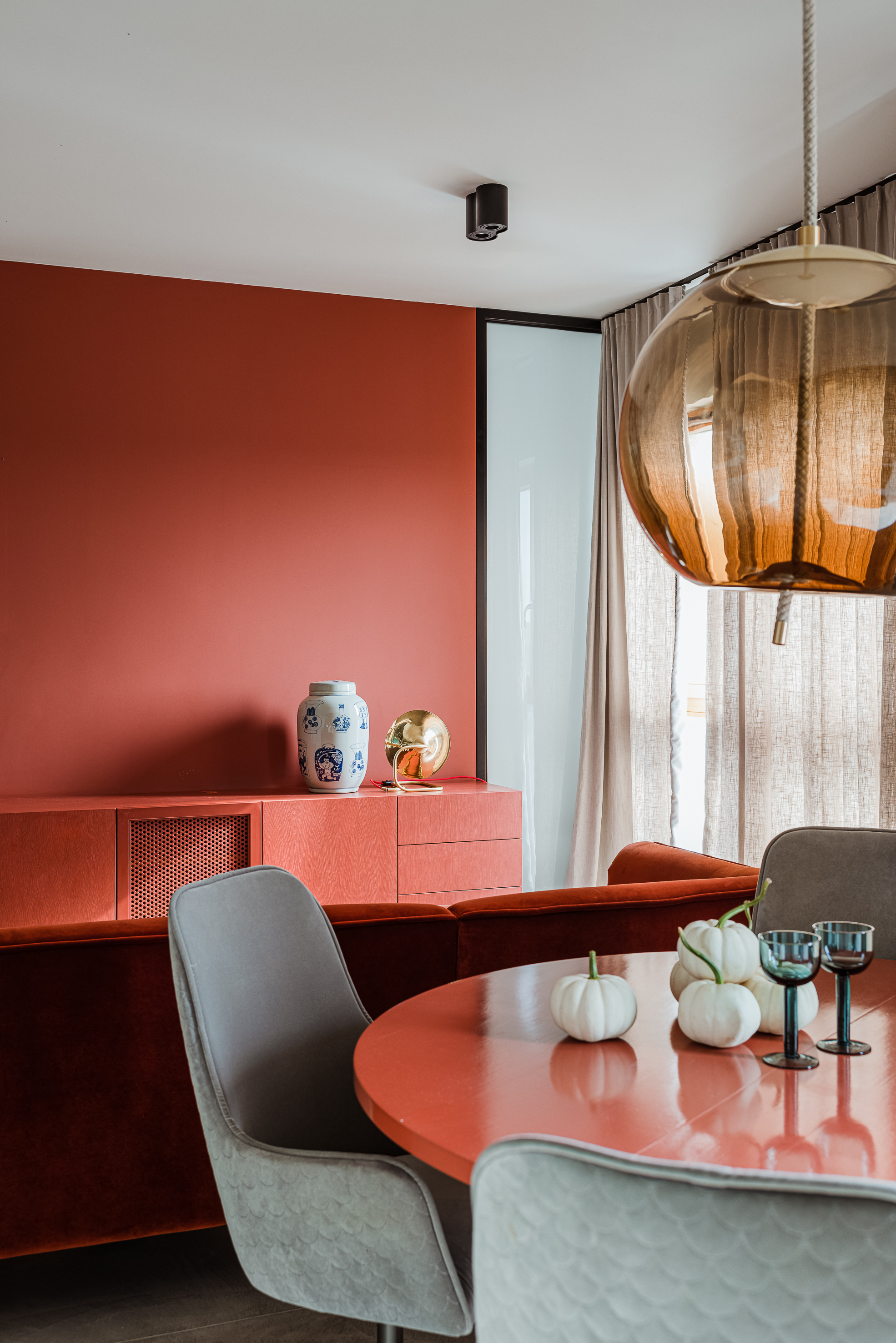
Gray works as a color that goes with red for its ability to tone down the intensity. If you have a bold red sofa, consider a lighter gray wall to ensure the interior is light and breezy. But if it's drama you're looking to create, go all in with a charcoal gray and a fiery red.
"Gray and red create a striking contrast when paired together," says Saba Kapoor, co-founder of Nivasa. "The key to an effective combination is selecting shades that complement each other. For example, pairing a light gray with a bright red can create a visually balanced and harmonious contrast. Light gray serves as a neutral and sophisticated backdrop, allowing the vibrant red to stand out."
"To create an effective pairing of gray with red, embrace the power of contrasts," says Meera Pyarelal, founder and interior designer, of Temple Town. "Opt for a cool-toned gray that exudes modernity and sophistication. Complement it with a bold, warm-toned red for an eye-catching and dynamic effect. Strive for a balanced composition by allowing gray to dominate larger surfaces like walls and furniture, while red takes center stage in accent pieces and decorative elements."
6. Gray and Black
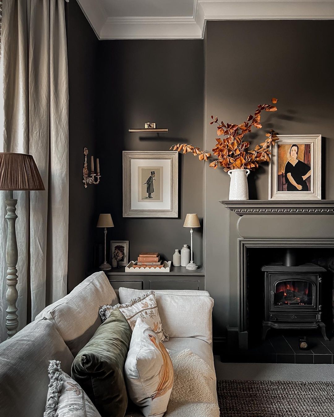
For colors that go with black, gray ranks high on the list. The two extreme neutrals can offset each other and create a deep, moody interior that's hard to ignore. Plus, the colors allow a third tone to slip in, without throwing off the room's balance.
"Just because gray and black are very similar does not mean they can't be used together," says interior designer Lindye Galloway, founder of Lindye Galloway Studio. "Utilizing dark or light gray with black can create a gorgeous and bold monochrome space. If the space feels too cold, you could consider accenting it with pops of color via paintings, pillows, and curtains to create more dimension against the dark background without detracting from the bold impact."
7. Gray and Cream
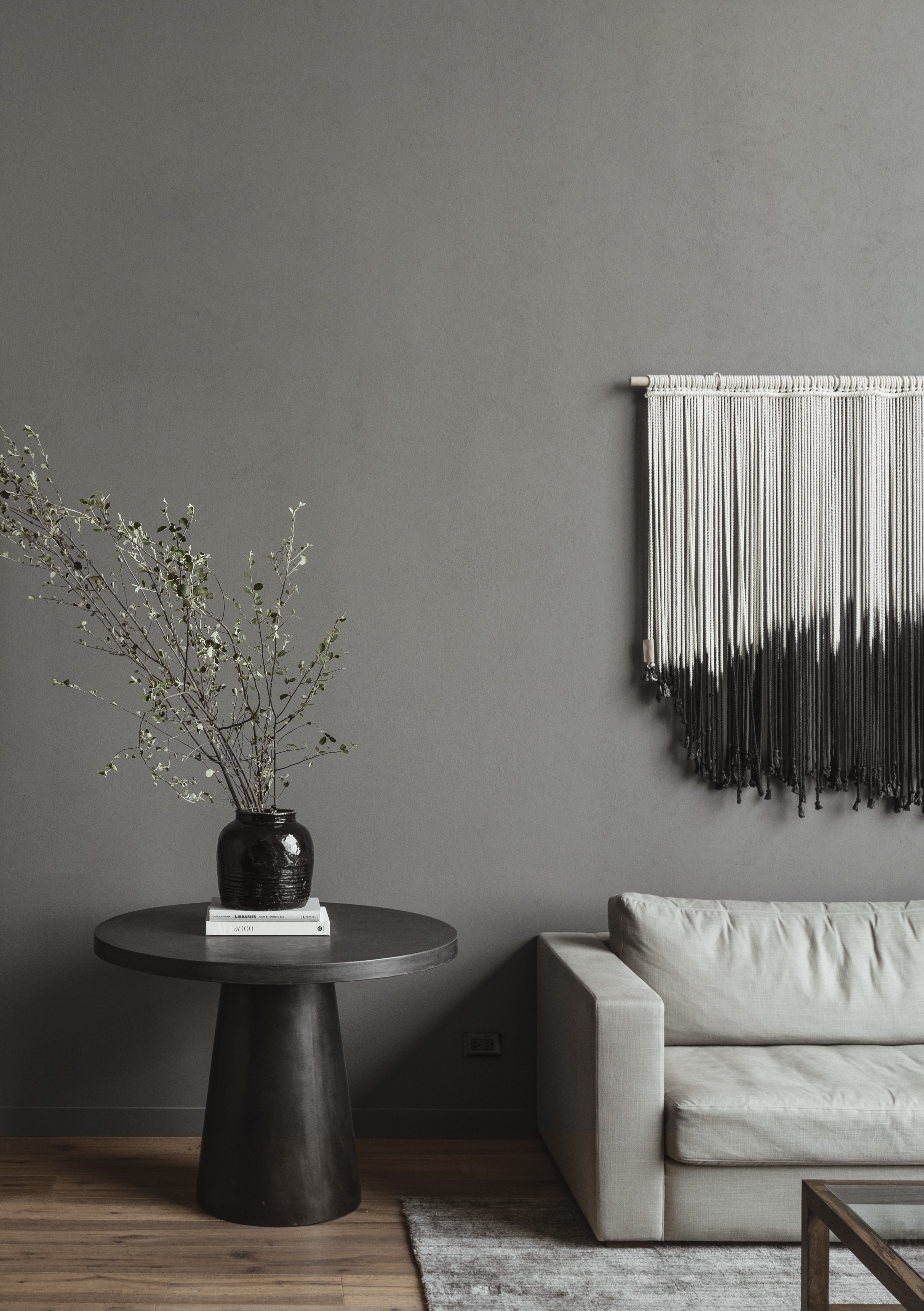
"Achieving a serene and calming interior with gray and cream involves embracing subtlety and softness," says Meera Pyarelal, founder & interior designer at Temple Town.
"Choose light and muted shades of gray and cream that emanate tranquility. Layer different shades of gray and cream in textiles, such as curtains, throws, and cushions, to create a cozy and inviting atmosphere. Consider incorporating natural materials like wood and stone to add warmth. Avoid using highly contrasting colors and patterns, focusing instead on creating a seamless and harmonious environment that promotes relaxation and comfort."
If you're worried that decorating with neutrals will make your home feel too one-dimensional, then consider layering in more textures for a cozy, tactile mood.
8. Gray and Clay
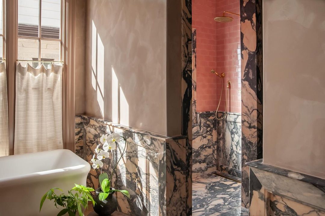
If you've been searching for gray bathroom ideas, you'll probably know by now that it's one of those colors that can make a space feel smart but cold. This is where the most muted of natural tones can be introduced to bring warmth to even the coolest of gray schemes. And it's a gray color combination that needn't be limited to a bathroom.
"Soft earthy shades, such as the palest terracotta, the most washed-out plaster, and even just-pink grays can be a wonderful match for gray in almost any room," says Livingetc's deputy print editor Ellen Finch. "It's a color combination you'll often find in the most beautiful marble, such as in the bathroom above. It fits my design motto: 'If it works in nature, it works in design'. The beauty of these colors is that they will sit well with both warm- and cool-toned grays, so you really can pick both the gray you love and the accent color you love."
9. Gray and Blue
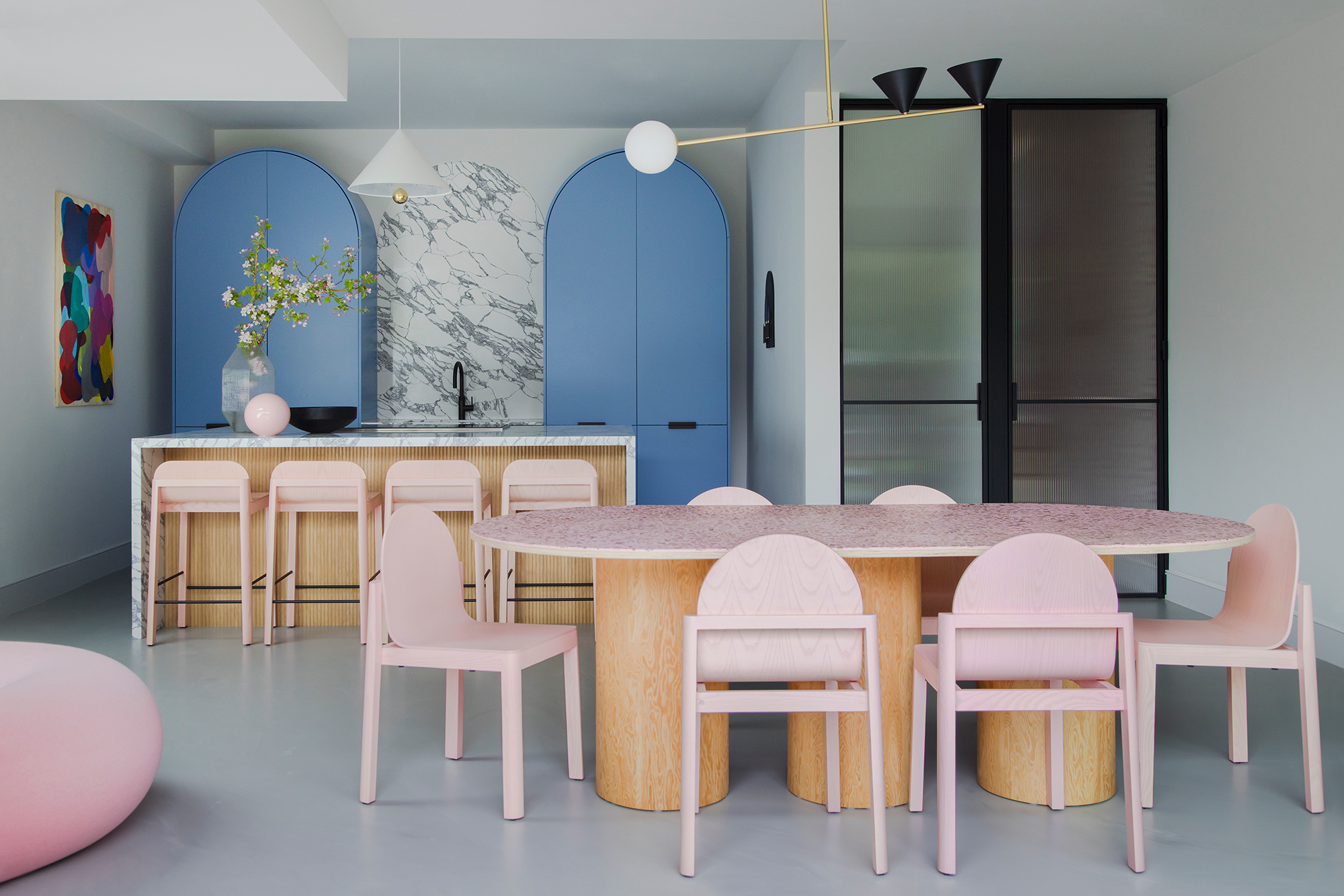
If you're looking for colors that go with blue, look no further than gray, especially if it's a more calming interior you want to create. From light gray to even charcoal gray, these velvety tones go brilliantly with blue. Other organic tones and materials work well with this earthy interior. Perhaps add a wooden vase, or a jute hanging light to the scene.
"I like to pair gray together with other cool tones such as teals and blues," says Grace King, design director at Studio Rey. "This creates a feeling of warmth and also lays the grounds for more texture and layering, plus the inclusion of subtle contrasts."
10. Gray and Brown

Gray is a lovely natural tone and pairs beautifully with other nature-inspired colors. Whether you're designing a gray living room or a warm and welcoming gray bedroom, it might be best to use tones of gray and contrast them with wood because it can make even the coolest of rooms feel inviting.
“Gray with earthy greens or muted terracottas brings a natural, organic quality to any space, evoking a sense of wellness and connection to the environment," says Burcu.
11. Gray and Yellow
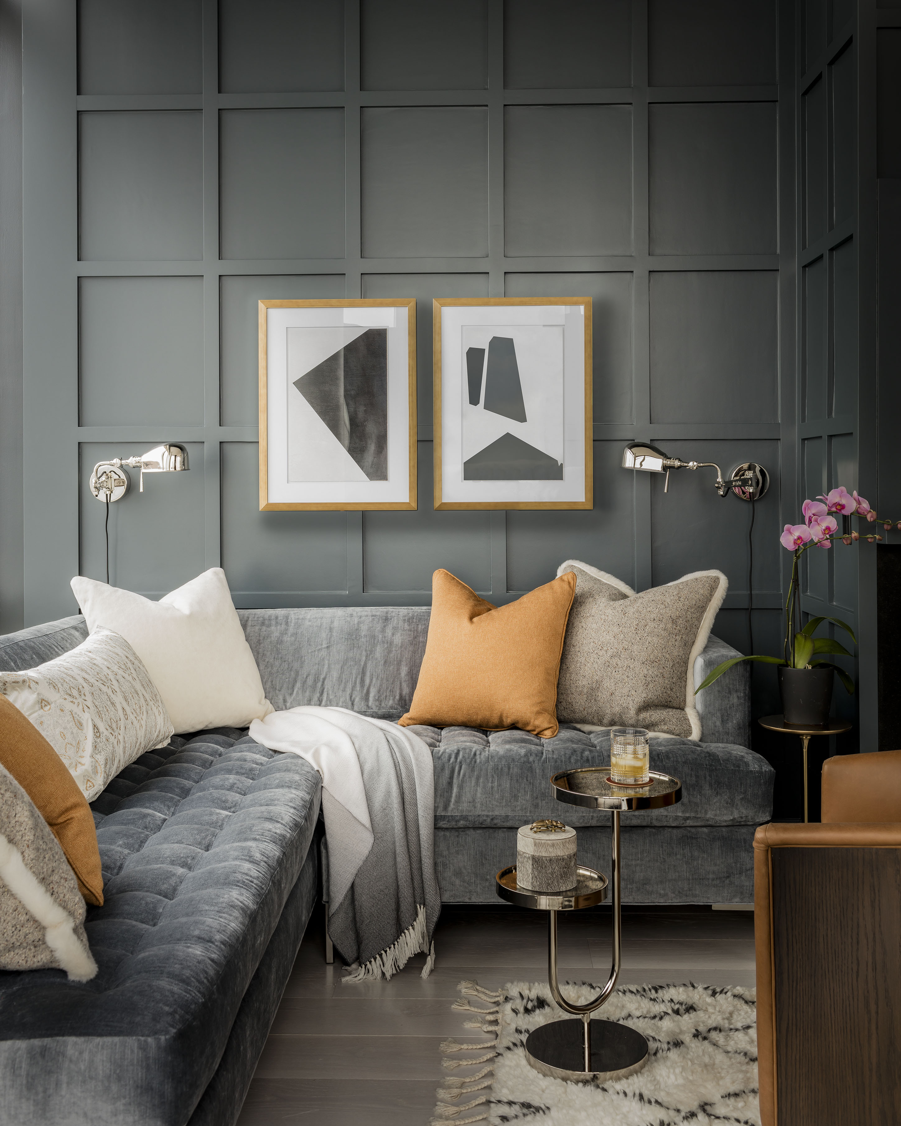
When it comes to colors that go with yellow, gray will help level out the energy. A gray and yellow combination can create different yet equally interesting looks. If you choose a bright yellow and pair it with a dark gray, you'll get an interior that is lively, upbeat, and refreshingly modern. Choose the lighter tones of both, and you'll get a subtle, soothing space. Yellows that have a brown or gray undertone usually do better with neutrals and are also easier to live with.
"There's a famous quote describing gray as the queen of colors, and I concur – it's an ideal neutral," says Robin Gannon, founder of Robin Gannon Interiors. "As for pairing partners, it goes with just about everything. And when you have a box of crayons, why pick just one or two? Don't be afraid to go a bit bold."
12. Gray and Sage Green
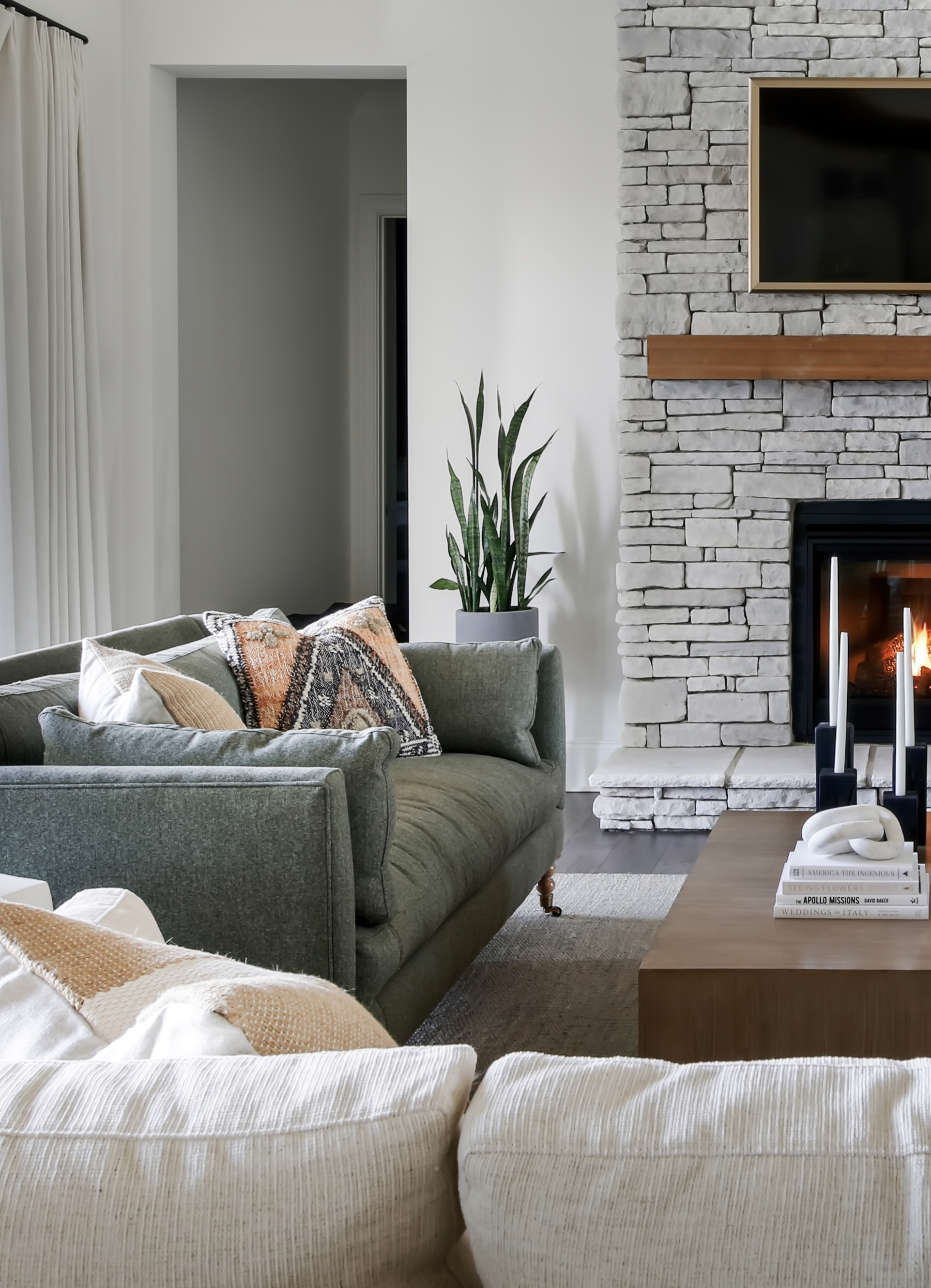
Gray is amongst the safe colors that go with sage green, as both tones are dipped in nature's palette, and therefore come together to create the most soothing setting. The two tones can be used liberally together as neither overwhelms. What you get is a layered, soft interior.
"Sage green with gray remains very popular amongst homeowners and one we suggest as a versatile and timeless color combo that won't go out of style quickly; not to mention it complements a variety of design styles," says designer Cat Dal, founder of Cat Dal Interiors.
13. Gray and White

When it comes to colors that go with gray — you can't go too far wrong with white. You can pair a barely-there gray with a crisp white for a bright and airy space or contrast white with deep, moody charcoal. This white bedroom idea uses a touch of gray in the side table and headboard to add depth to the almost all-white space.
As simple as this paring is though, not all white shades work with any gray shade. The undertones need to work together, so warmer whites are likely to work best with warmer grays, and, cool-toned grays with purer whites.
"Opt for light and subtle shades," says Saba. "Light grays with cool undertones and warm creams and whites work well together to create a serene atmosphere. Layering different shades of gray with neutrals will add depth and visual interest to the space. Consider incorporating various textures, such as soft fabrics, natural materials, and tactile elements like cushions or rugs, to enhance the overall cozy and comforting feel."
"Lighting plays a crucial role in creating a calming ambiance," says Saba. "Soft, warm lighting can enhance the relaxing effect of the gray and white color scheme. Additionally, adding accents of other soft colors, such as pastel blues or greens, can introduce subtle pops of color and prevent the design from feeling monotonous."

Price: $5.98/sample
14. Gray and Pink
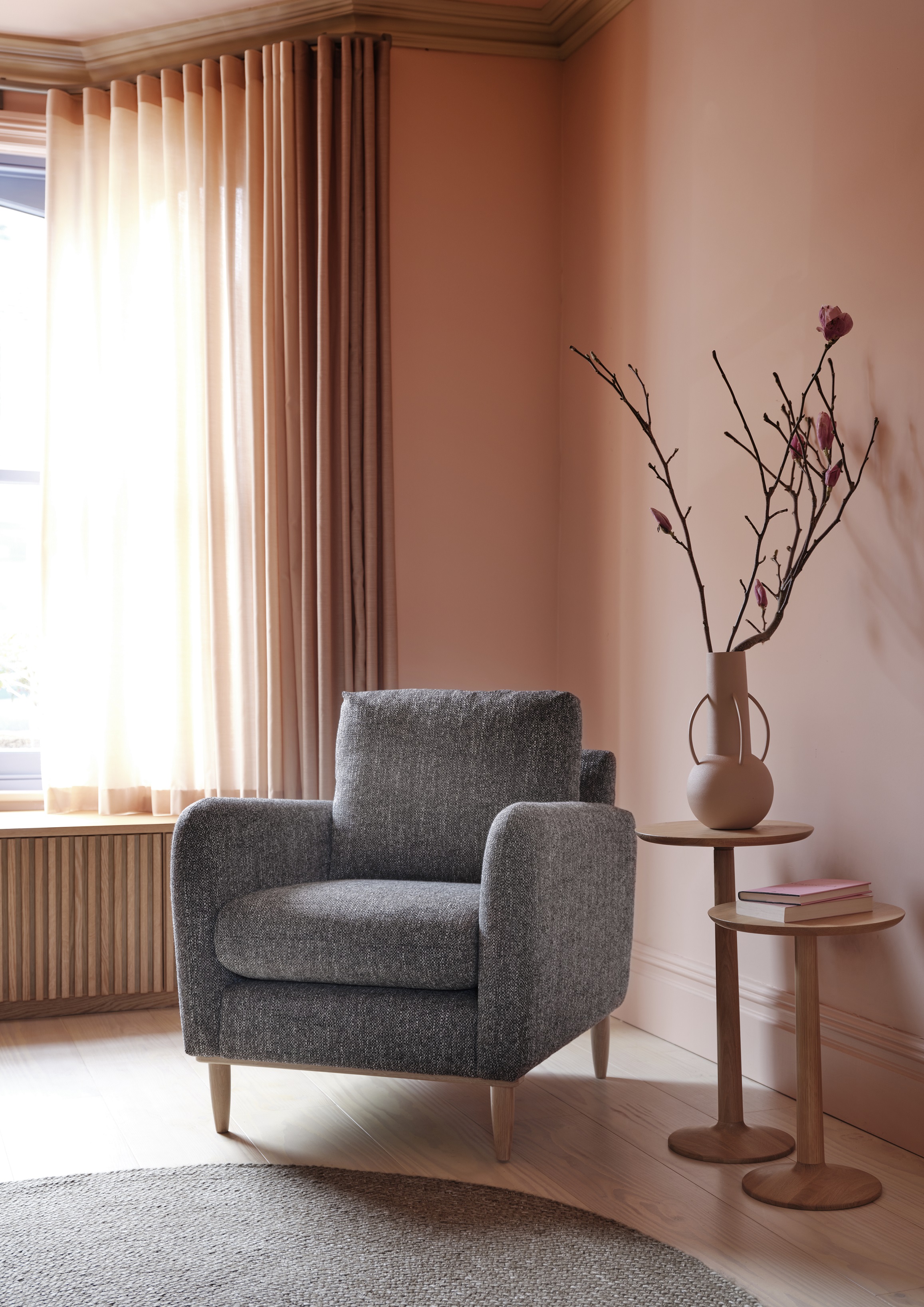
Pink and gray living rooms are soothing — the tones feel welcoming, restful, and on-trend. "Gray and pink is a classic color combination," says Grace King, design director at Studio Rey. "Why not try combining a soft pink paint with a combination of light and dark gray fabrics and soft furnishings in various textures to create a calming scheme? Don’t be afraid to add in some pops of bright color such as a bold teal blue as an accent."
"Opt for a light, cool-toned gray as the neutral backdrop and pair it with dusty rose or blush pink," adds Saba. "This combination evokes a sense of tranquility and sophistication. To achieve a balanced look, use gray as the dominant color in larger areas like walls or furniture. Introduce pink as accents through textiles, such as throw pillows, curtains, or rugs. Consider incorporating patterns that combine both gray and pink elements, such as floral or geometric designs, to create visual interest. These patterns can be applied to wallpapers, upholstery, or decorative accessories."
15. Gray and Purple
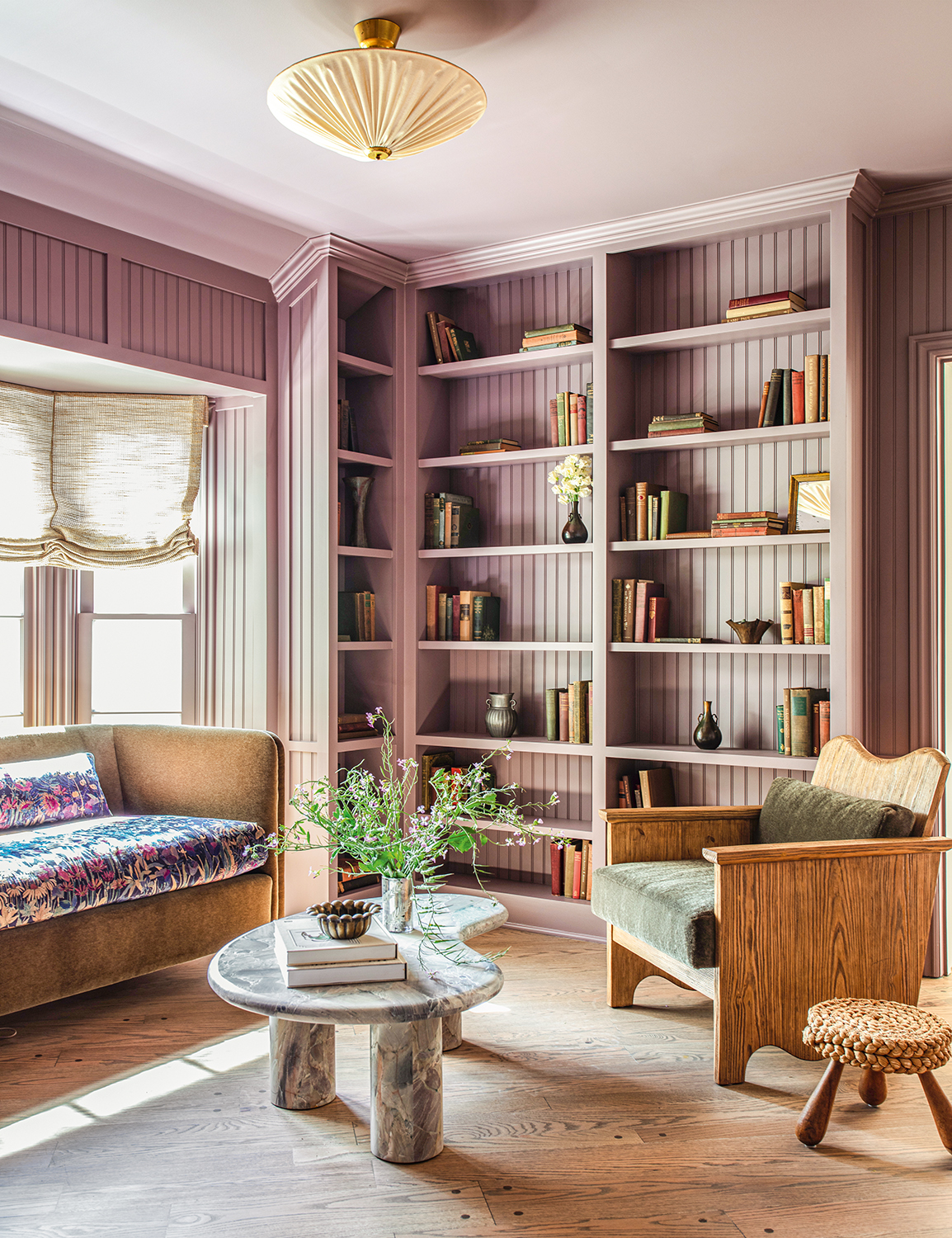
Several colors go with purple but one that balances it and makes it a more livable hue is gray. Purple, with a spectrum stretching from the deepest aubergine shades and striking royal purples, through to lavender, mauves, and soft lilac, can sometimes feel like an overwhelming shade, and can do better with a little help from warm neutrals.
"I’ve used purple on upholstery and decor pieces," says Kim Armstrong, interior designer and founder of Kim Armstrong Interior Design. "I think this shade effortlessly blends with so many colors, but my favorite colors to blend with purple are gray and blue. These colors together are soft and watery, and very easy on the eyes."
Thanks to their similar cool undertones, gray is a color that goes with lavender particularly well.
16. Gray and Orange
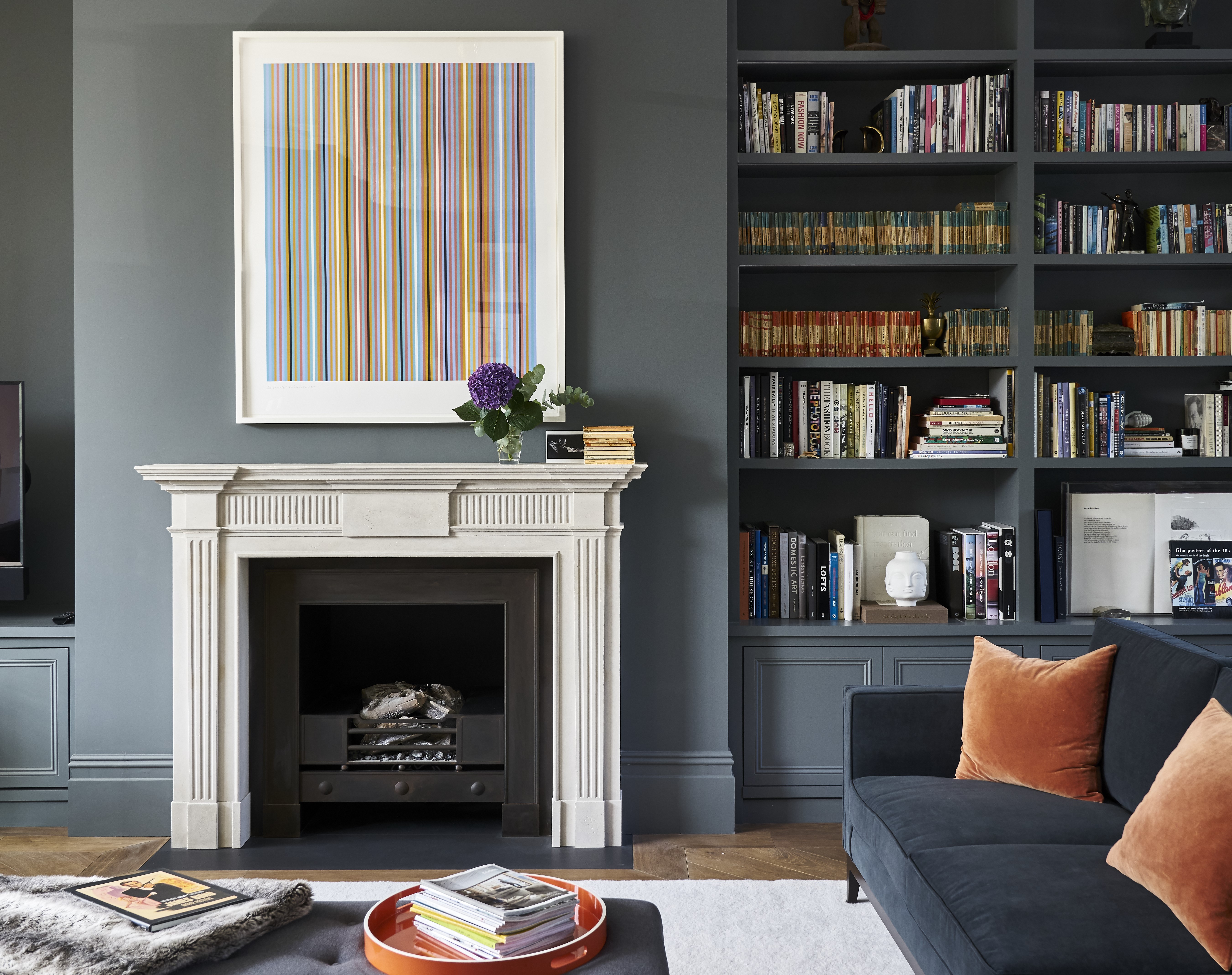
Many colors go with orange, but a combination with gray, in particular, is sure to bring freshness into any scheme. Plenty of orange tones pair perfectly with gray — be it light, mid-tone to reddish-orange — so you can go as bold or as subtle as you like.
Burnt oranges paired with a mid-gray for example could be the perfect rustic scheme, whereas a charcoal gray and bright tangerine hue will be more modern and striking. Whatever look you go for, introduce a clean white into an orange and gray color palette to up that contrast and make the orange stand out.
"Select a mid-tone gray that complements the richness of the orange hue," says Meera. "For a contemporary approach, opt for a light gray with pops of orange."
17. Gray and Peach
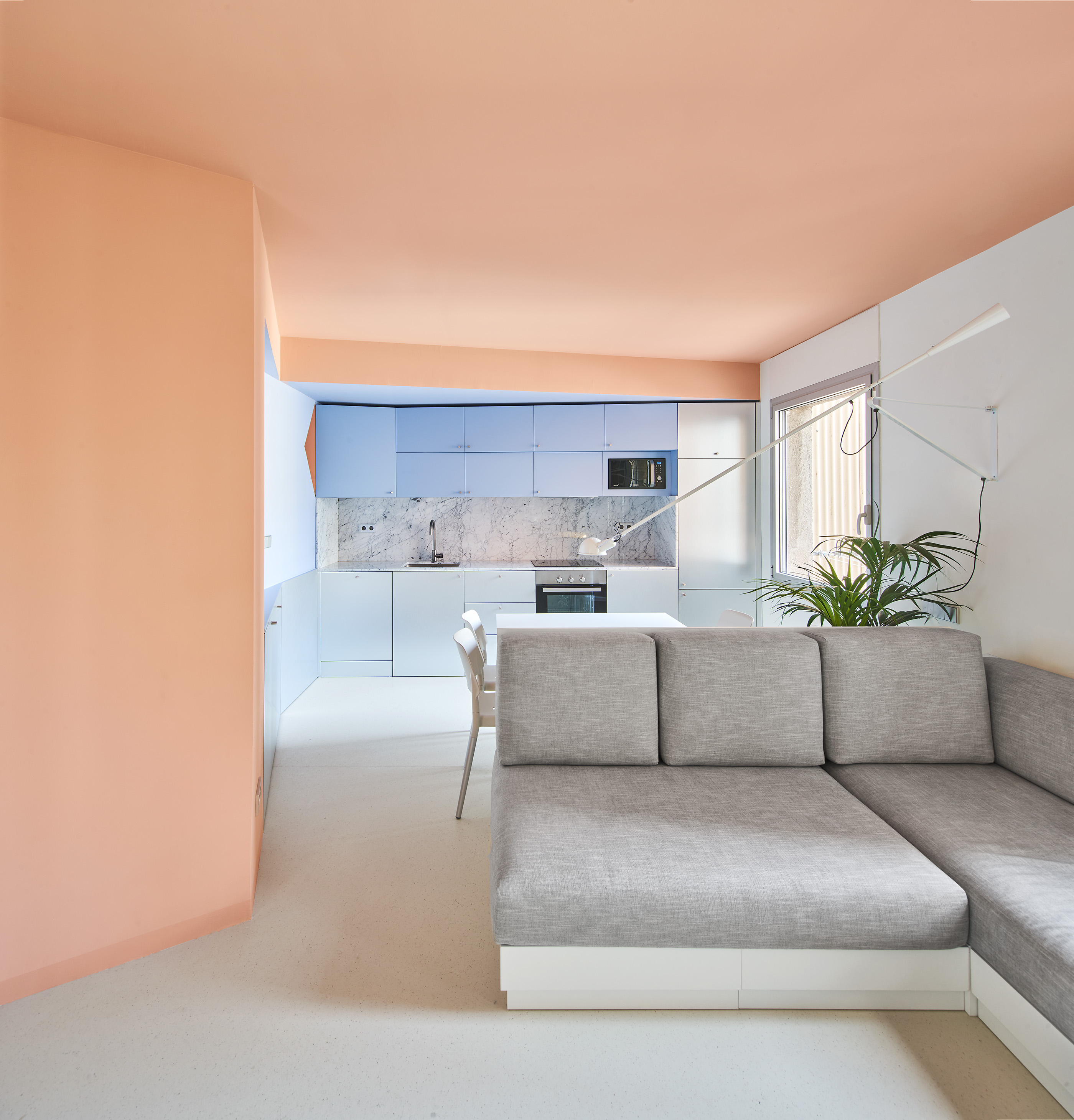
In a similar vein to orange, gray is also a color that goes with peach. The pairing helps make the modern pastel feel more sophisticated and chic, helping to steer it away from anything too sugary or juvenile.
"We are utilizing gray in combination with warmer neutrals, earthy shades, and even pops of vibrant colors to create spaces that feel both inviting and dynamic and not too big a jump from the former all-white trend," says Christiane Lemieux, author and founder of homewares brand Lemieux et Cie. "This approach helps maintain the calmness and neutrality of gray while enhancing it with textures and tones that add depth and warmth. It also helps clients explore and get to their next decorating place."
18. Gray and Teal
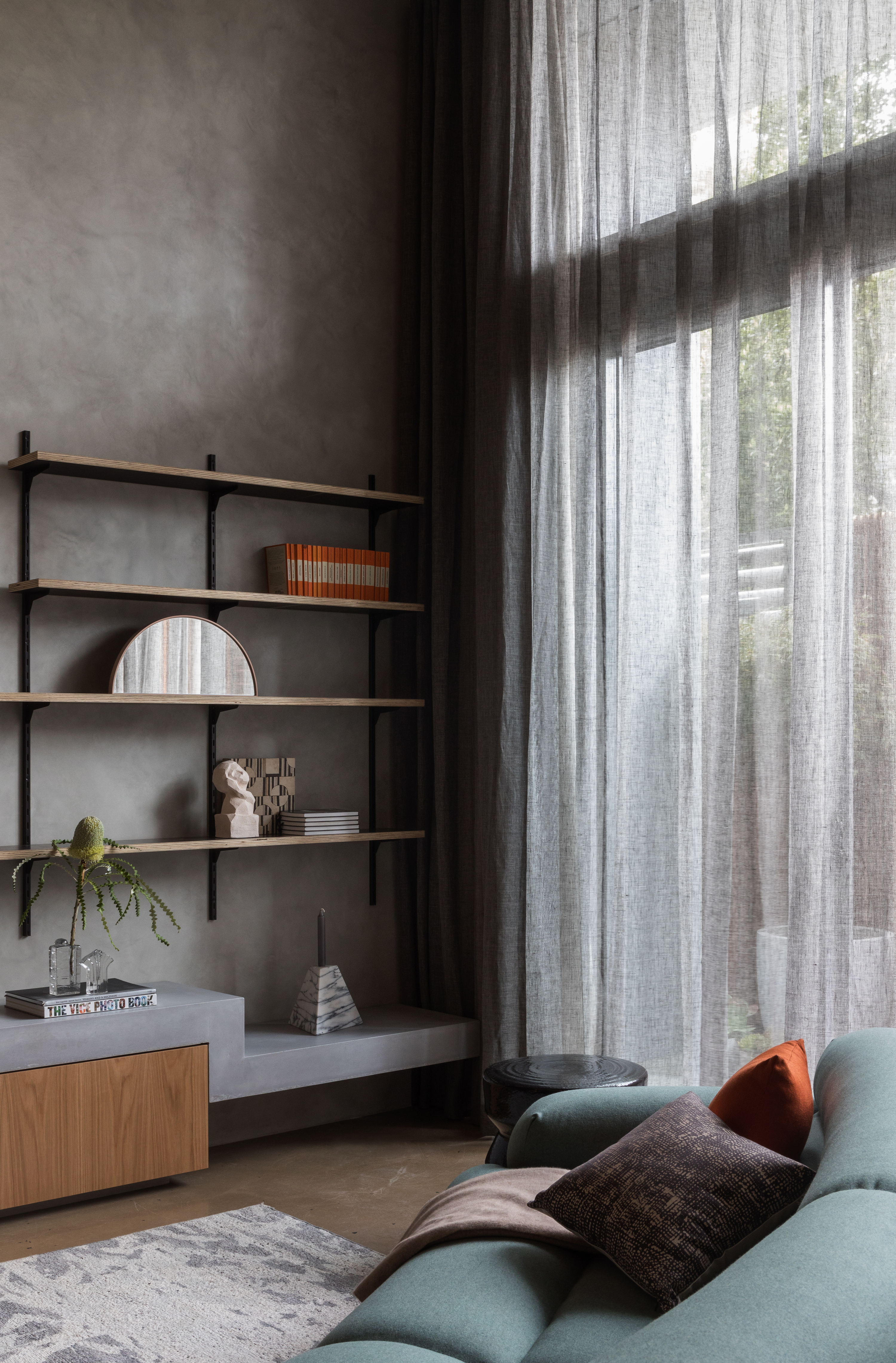
When considering what colors go with gray, we know blue and gray work together, but it's worth noting that gray is a color that goes with teal particularly well, thanks to their cool and complementary undertones.
"Teal can pair perfectly with gray because it has a blue undertone, but you’ll need to be shade-conscious to keep it grounded," warns Livingetc's global brand director, Sarah Spiteri. "A bright teal and pale gray will feel overly clean and modern, so look for darker pairings with more warmth (think greige over grey)."
19. Gray and Chrome
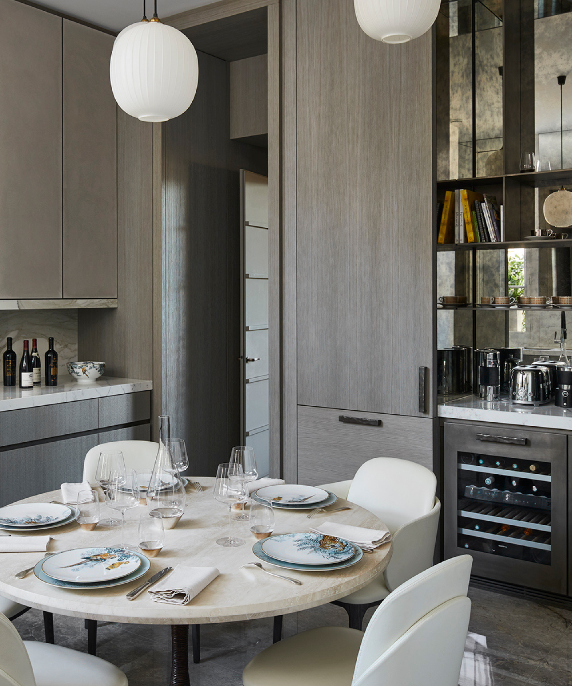
Stainless steel kitchens have been trending for a while now, and when considering colors that go with gray, pairing chrome or silver-toned finishes with gray feels both contemporary and sophisticated.
"I have a gray kitchen with plenty of silver accessorizing — including cabinet handles and accessories," says Livingetc's content director Lucy Searle. "The room is a sunny, busy space, so this toned-down color palette allows the space to feel smart and streamlined too. I have mitigated this gray-silver color pairing with warm wood flooring and touches of deep rust on accent walls and soft furnishings."
FAQs
What colors go with gray walls?
There is a wide range of colors that go with gray walls — being extremely versatile, they can pair beautifully with tones such as white, beige, cream, and black if you’re looking for ideal neutrals. Cooler shades such as blue, green, sage green, lavender, or lilac can add a subtle touch of elegance to a gray room.
In addition to these, warm colors like yellow, blush pink, rust, or terracotta bring depth to a scheme and can also serve as accent tones in an all-gray space. Finally, for a luxurious, regal feel, incorporate metallics like gold, brass, silver, or copper to achieve an industrial-chic look.
How does natural light impact gray color pairings?
As mentioned earlier, gray can look completely different depending on the light, so it's important to keep that in mind when selecting the colors that go with gray.
"If the room has a lot of natural light, or has southern exposure with all daylight, any size room should be successful using a wall color like dark gray," says Amy Krane, architectural color consultant and founder of Amy Krane Color. "Keep in mind the color of the floor, the trim, and the ceiling greatly affect how it will look as well as the color and value (lightness/darkness) of the furnishings.''
For dark gray — shades like taupe, blush pink, butter yellow, royal blue, and burnt orange work. Metallic tones like bronze or silver also look particularly interesting inside these warm-toned rooms.
Alternatively, choosing colors that go with light gray is an excellent way to temper the light reflected around sunny rooms; in cool, north-facing rooms, it can feel a little cold on walls, unless you choose a gray with a yellowish undertone. The best colors to match with light gray are those that tend to be bolder: yellow, orange, terracotta, deep royal blue, and even red.
Though in recent years, many have been seeking out colors to replace gray, it's undeniable that its popularity endures and will continue to do so, simply because it is so versatile as a neutral.
"Gray is gaining popularity again as the bridge out of the ubiquitous “all white bouclé interiors" of the last five years," says Christiane Lemieux. "We are using warm grays mixed with stronger palettes to help our new clients add dimension to their spaces. It’s a color but not too much."
Subtle gray is the latest gray to be on trend, so if you are looking for a gray to match with another color, this barely-there shade is a great place to start.
Be The First To Know
The Livingetc newsletters are your inside source for what’s shaping interiors now - and what’s next. Discover trend forecasts, smart style ideas, and curated shopping inspiration that brings design to life. Subscribe today and stay ahead of the curve.

Emma is the Interiors Editor at Livingetc. She formerly worked on Homes To Love, one of Australia's leading interiors websites, where she wrote for some of the country's top publications including Australian House & Garden and Belle magazine. Before that she was the Content Producer for luxury linen brand, CULTIVER, where she nurtured a true appreciation for filling your home with high-quality and beautiful things. At Livingetc, she spends her days digging into the big design questions — from styling ideas to color palettes, interior trends and home tours. Outside of work hours, Emma can often be found elbow-deep at an antique store, moving her sofa for the 70th time or mentally renovating every room she walks into. Having just moved to London, she's currently starting from scratch when it comes to styling her home, which, while to many may sound daunting, to her, is just an excuse to switch up her style.
- Aditi SharmaFormer Design Editor
- Hebe HattonFormer Digital Editor
-
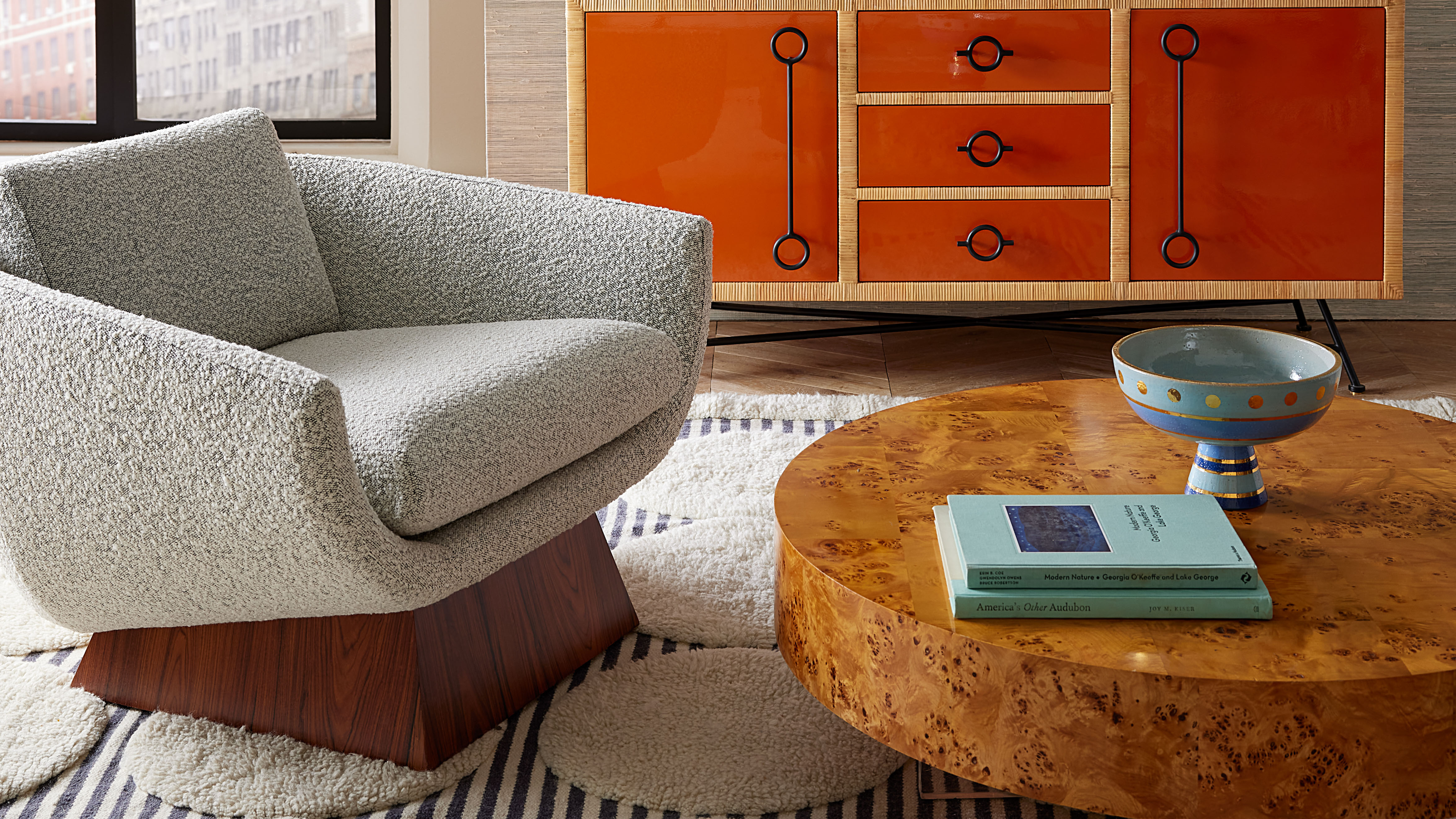 Burl Wood Decor Is 2025’s Most Coveted Comeback — Here’s How to Get the Storied Swirls for Less
Irregularity is the ultimate luxury, but you don’t need an antiques dealer to find it
By Julia Demer Published
-
 5 Garden Features That Instantly Add Value to Your Home — While Making Your Outdoor Space More Practical, too
Get to know all the expert tips and tricks for making your backyard a standout selling point for your home.
By Maya Glantz Published
-
 The Combination You Weren't Expecting to Love — 8 Blue And Orange Living Room Ideas That Feel Surprisingly Elevated
A blue and orange scheme for living rooms may sound jarring, but these spaces prove they're striking, vibrant, and certainly unforgettable
By Camille Dubuis-Welch Published
-
 Smeg Says Teal, and We’re Listening — The Kitchen Shade of the Year Is Here
Designers are already using the soft, sea-glass green everywhere from cabinetry to countertops
By Julia Demer Published
-
 Do Yellow and Purple Go Together? Designers Reveal How to Make This Unexpected Pairing Feel "Totally Intentional"
In an era where unexpected combinations have become cool, we've done a deep-dive to discover how to pair yellow and purple in a space
By Camille Dubuis-Welch Published
-
 5 Unexpected but Seriously Stylish Spring Color Palettes to Shake Up the Season — "It's Pastel, but Punchy"
Spring color palettes are notorious for their use of pretty pastels, but that doesn't mean they have to lack variation
By Olivia Wolfe Published
-
 The 'Red Table Trick' Is the Easiest and Most Expensive-Looking Trend to Hit 2025 So Far
A red dining table makes a seriously stylish statement; the beloved pop of red trend just got an bold and expensive-looking upgrade
By Olivia Wolfe Published
-
 Everyone's Going Crazy for This One New Shade From Farrow & Ball Online — So What's the Big Deal With 'Scallop'?
It's a classic beige, but with a hint of blush — and it's the shade we're expecting to see in every minimalist's home this year
By Olivia Wolfe Published
-
 4 Bathroom Colors That Are Going Out of Style in 2025 — Don't Say We Didn't Warn You
If you're redecorating your bathroom this year, our design experts suggest you avoid these outdated colors
By Maya Glantz Published
-
 70s Color Palettes That Work for 2025 — 4 Designer-Approved Color 'Recipes' That Feel Modern Enough for Homes Today
It's time to bring out your paisley print and disco shoes — the golden yellows, olive greens, and deep purples of 70s color palettes are making a comeback
By Olivia Wolfe Published


