10 colors that go with light pink, elevating your home with a sophisticated luxury
Interior designers on the best colors that go with light pink, and how to pair them to achieve elegantly uplifting and elevated schemes

The Livingetc newsletters are your inside source for what’s shaping interiors now - and what’s next. Discover trend forecasts, smart style ideas, and curated shopping inspiration that brings design to life. Subscribe today and stay ahead of the curve.
You are now subscribed
Your newsletter sign-up was successful
You'll be surprised by the number of colors that go with light pink. This sometimes elegant, sometimes playful but largely soothing tone is quite versatile and can bring warmth and coziness to any room. Whether paired with fresh neutrals or deep tones, the presence of light pink makes the whole space feel more elegant, more refined.
While it may be easy to think of pairings for more neutral tones, like colors that go with grey, white, or beige, it can be a little confusing with light pink. But much like other softer, muted tones, light pink is versatile, and many colors go with pink in this softer hue. Here's 10 that interior designers recommend.
10 colors that go with light pink
'Pink brings a warm glow to a room, mimicking the light of the sunset,' says Emilie Munroe, founder of Studio Munroe. 'It is bright, yet cozy, and very flattering to skin tone. This color is associated with health, vitality, and warmth. It is great for rooms where you want to feel energized but also cozy and relaxed.'
'Depending on the hue used, it goes with any style,' says Linda Hayslett, founder of LH.Designs. 'It can be modern, traditional, coastal, contemporary, or even wabi-sabi depending on the design. It's lasted through centuries and has always had a happy mood about it because its been used for romantic, rock n' roll, and even infant settings.'
'Before bringing pink into your home, make sure other members embrace it as well,' says Linda. 'It's been associated with being too feminine, but it isn't. It's a strong color choice depending on how it's used. Also, keep in mind the other complimentary colors you are looking to pair with it. That will help either subdue or enhance the pink color in the room.'
1. Navy blue
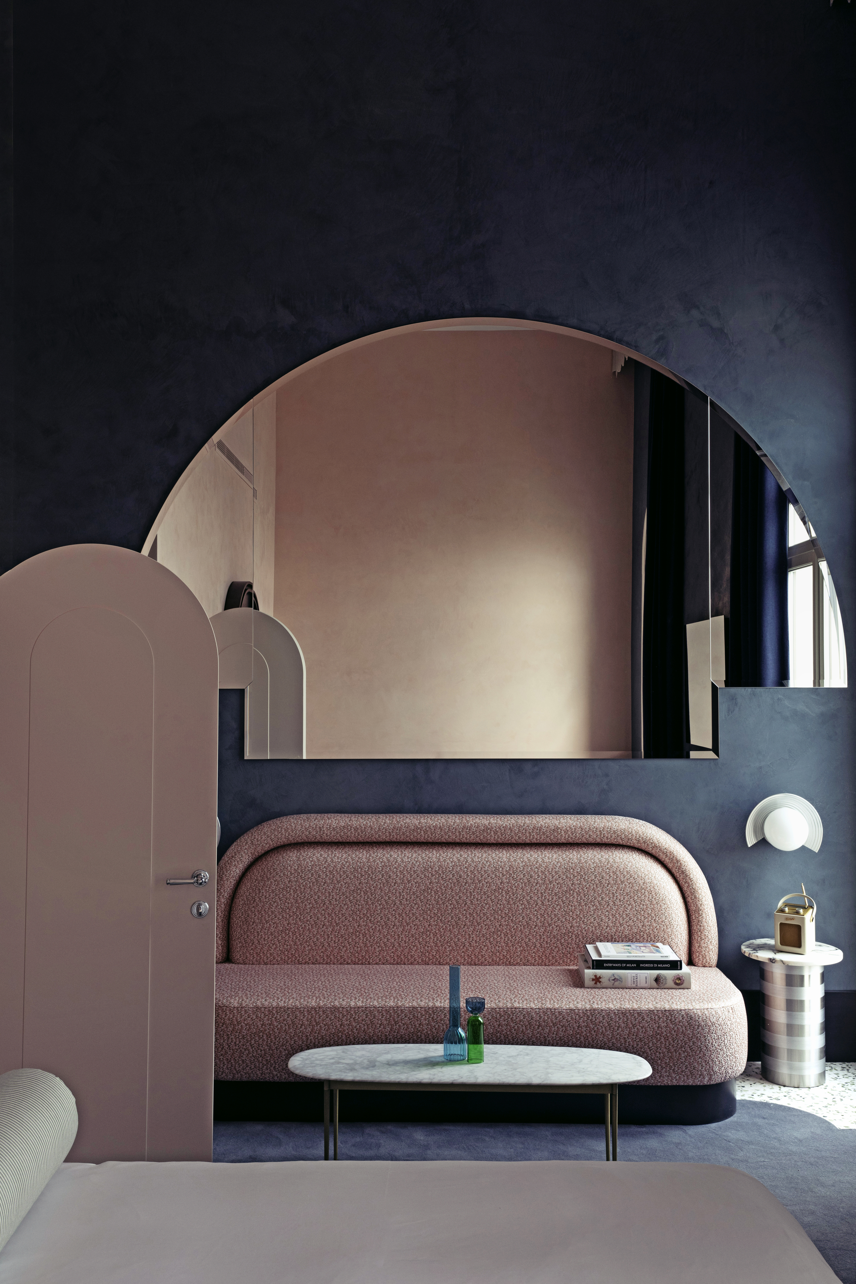
Agreed that while thinking of color combinations, people may not naturally gravitate toward pink and navy blue. But if you want to create a lasting impact, especially in a small space, consider pairing these hues for a dramatic and striking interior.
The softness of pink when juxtaposed with blue will give a room depth and personality. Interestingly, you can consider bringing in a third hue, like a grey or a cream, to perhaps lighten the scheme. Plus, several colors go with blue.
The Livingetc newsletters are your inside source for what’s shaping interiors now - and what’s next. Discover trend forecasts, smart style ideas, and curated shopping inspiration that brings design to life. Subscribe today and stay ahead of the curve.
'All walls of this project are in Marmorino, a traditional way of covering walls in Venezia with a marble powder,' says Dorothee Meilichzon, founder of CHZON. 'The color balance is always to mix dark, cold colors, in this case, navy blue, with brighter warmer tones like light pink.'
'A soft pink coordinates with almost any color,' says Emilie. 'Pink and navy is a classic combination, and it can enhance a room's energy through the tension of the contrasted tones.'
2. Black
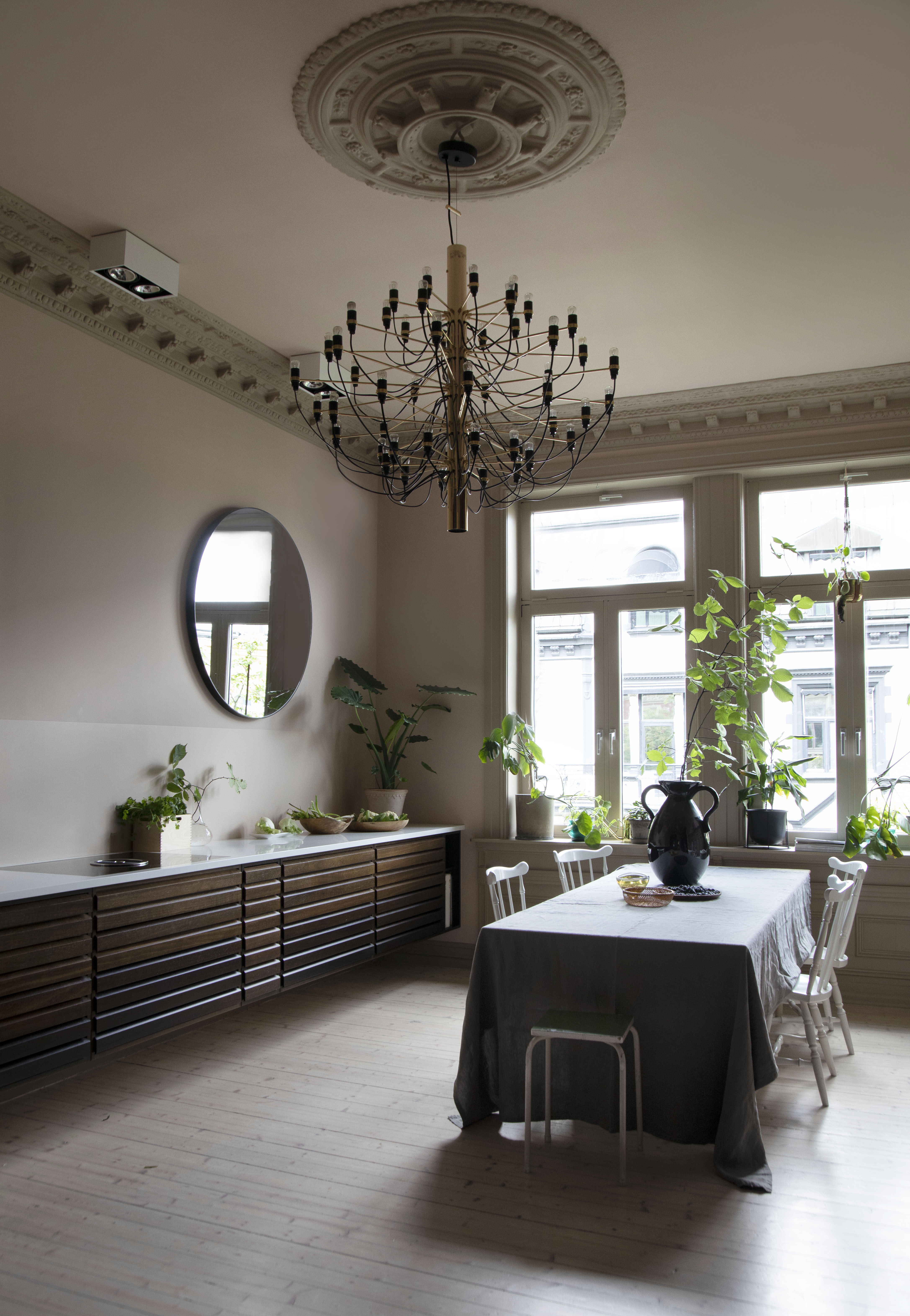
Much like how white, being the ultimate neutral can pair with any shade, black, also neutral is versatile and there are many colors that go with black.
Pink and black, though a slightly more eclectic combination can create a unique interior. Use the grounding and soothing aesthetic of pink to add a little softness to black, which can, at times seem too cold. Also, it would be great to use this combination in a room that receives plenty of sunlight, so the entire palette feels airy and welcoming.
'Pink goes well with black because it complements the hue and can become a prominent team player with it,' says Linda.
Tailor tack from Farrow & Ball
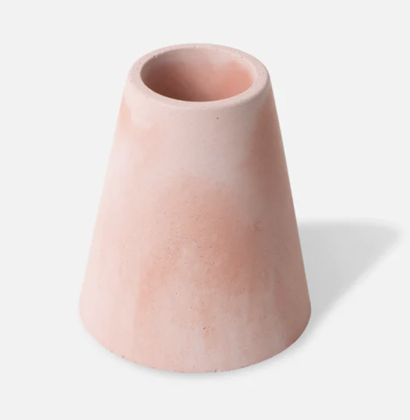
Choose this lightest and most delicate pink that can be easily paired with industrial accents, natural tones, and within modern schemes.
3. Emerald green
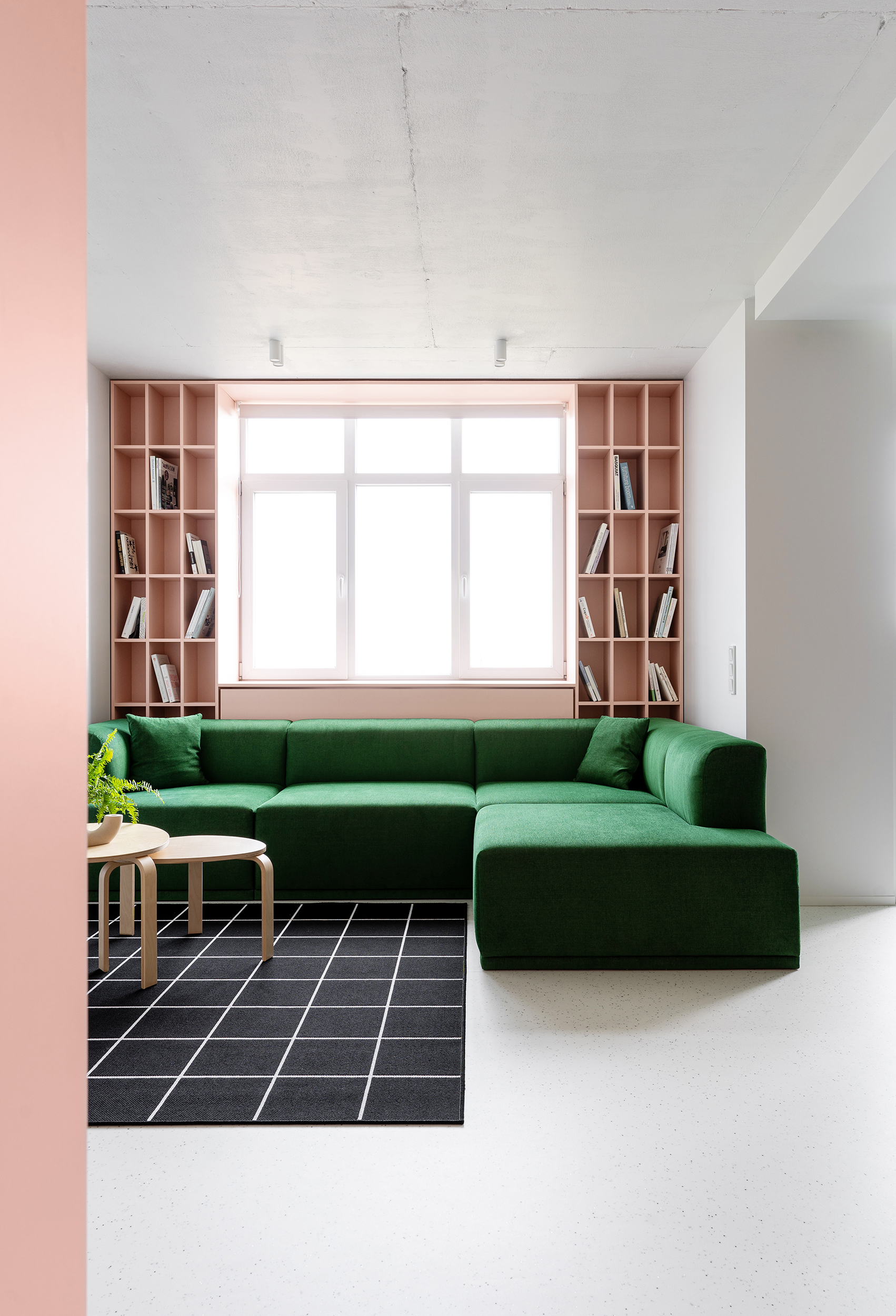
One unusual yet interesting color combination is pink and green. The two tones can easily come together where the softer, more subdued effect of pink combined with the stronger, more rooted appeal of green can create an appealing interior.
Sometimes the combination of the two can create a tropical vibe in the space, and if the pink shade is on a sweeter side you are bound to recall the charm of vintage sweet shops. A great way to bring in deep, dark green without paints or furnishings is with plants. If you end up feeling overwhelmed by the place, you can easily take the plants out. If you want to create a more playful scheme, paint the walls soft pink and add emerald green on tiles, cushions, or accessories
Since many colors go with green, experiment with other tones as well, and create an interior full of character.
4. Wood tones
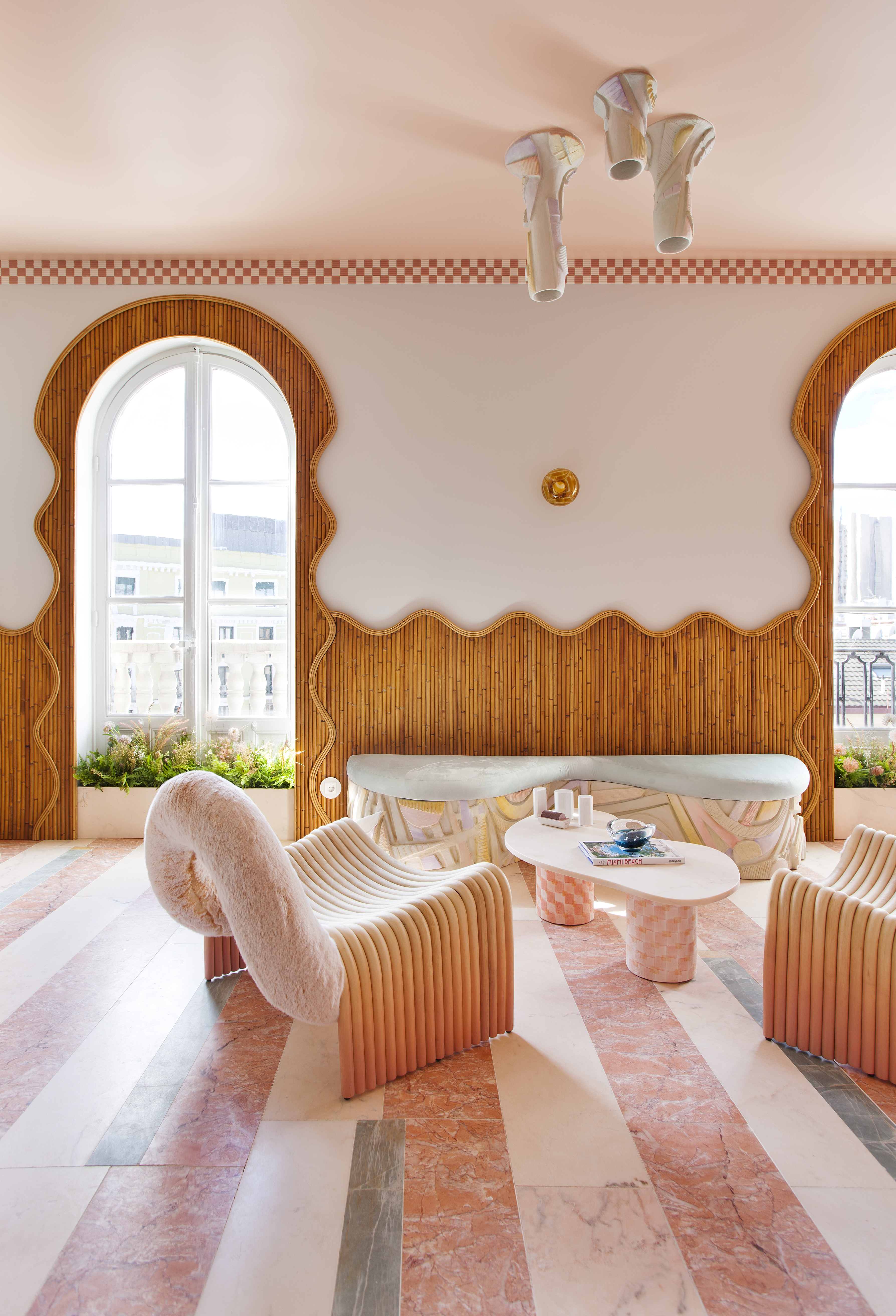
If you want to color drench your walls in soft pink, and are worried the space may look too OTT or non-serious, then there's no better way to ground a scheme than with natural materials, or more specifically, wood tones.
The natural brown makes for a great companion to more glam tones like pink or gold, and many other colors go with brown. It can dial down the fruity or overly decorated aesthetics to a more rooted and soothing environment.
'Pink is already the color of a whole generation,' says Patricia Bustos de la Torre, founder of Patricia Bustos Studio. 'It claims the fall of stereotypes. This color has no rules. It has the power to transform an interior and elevate it to a new dimension. It can turn a classic piece of furniture into a modern one or can refresh a sober environment into one that is young and cheerful. I also think that pink is immune to fashion, and can be easily layered with earth tones.'
5. Aqua
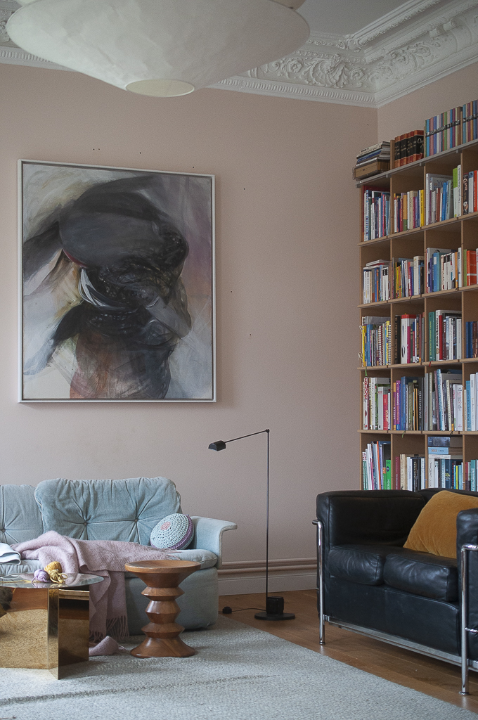
A great way to create a layered color scheme with a lot of depth is by pairing two tones of similar intensity. In this case, light pink pairs well with a soft blue or aqua, where neither fight for attention, yet create a wonderful, cohesive warm color scheme.
'The colors in the house are ever-growing but the first idea of the palette came from old frescos already present in the house,' says Eva Kaiser, founder of Lumikello. 'It was proof that this old manor was colorful back in the day. This space was painted first. We chose similar, tone-on-tone hues there but tried to make them look more grown-up. We added materials like steel, leather, and wood to ground the scheme. A very yellowish pink was the perfect match to create a cozy, embracing atmosphere, along with a light blue sofa. This room turned out to be the family chilling zone.'
Choose this light, soothing hue for a lovely base color, upon which you can layer tones such as aqua, grey, red, etc.
6. Powder blue

Decorating with pastels can, at first feel a little overwhelming and intimidating, especially since you're always worried about the space feeling too childish or one inside the set of the movie Barbie.
But a good combination, to begin with, is soft pink and powder blue, within a small space, making the entire room feel thematic. Think of lighter tones of pastels that can work well when used thoughtfully.
'While choosing a color for this bedroom, I wanted to take the classic 'palace' blue shade as the foundation,' says Tim Veresnovsky, founder of Veresnovsky Design Interior. 'To refrain the interior from seeing too serious and heavy, I remembered that the client had a portrait on a pink background. The combination of pink and blue is always a winning combination. I also added a banquette in a nice pink velvet fabric to layer the scheme.'
Stromboli chess club from Backdrop
Choose this vibrant, cornflower blue to add an energetic vibe to the house.
7. Grey
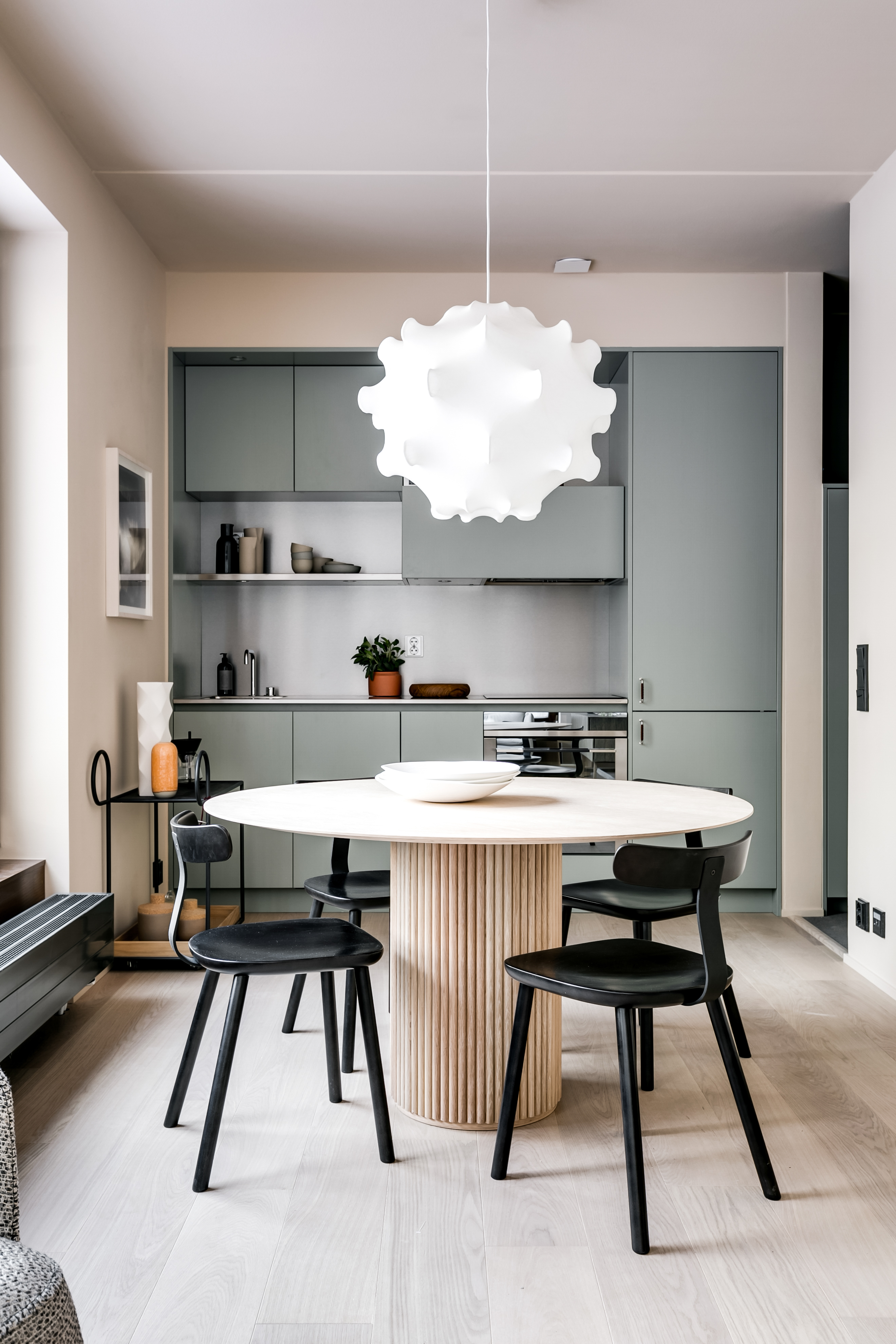
Light pink and grey is a classic combination, seen in several spaces, cafes, offices, and boutique stores. This combination can work in just about any space in the home, from a kid’s room to the kitchen and even in the bathroom or a grey living room. Both play well together no matter what undertones or shades you choose.
Choosing grey as the base color can be a good place to start, with light pink details layered in. What's also great is that light pink and grey go well with most colors.
Bear in mind when mixing colors in a scheme, they shouldn't be used in equal amounts. In a largely grey scheme, lift the somber nature of the tone with the slightest hint of pink, whether it’s a detail in your wallpaper or on an artwork or pillow print.
8. Gold
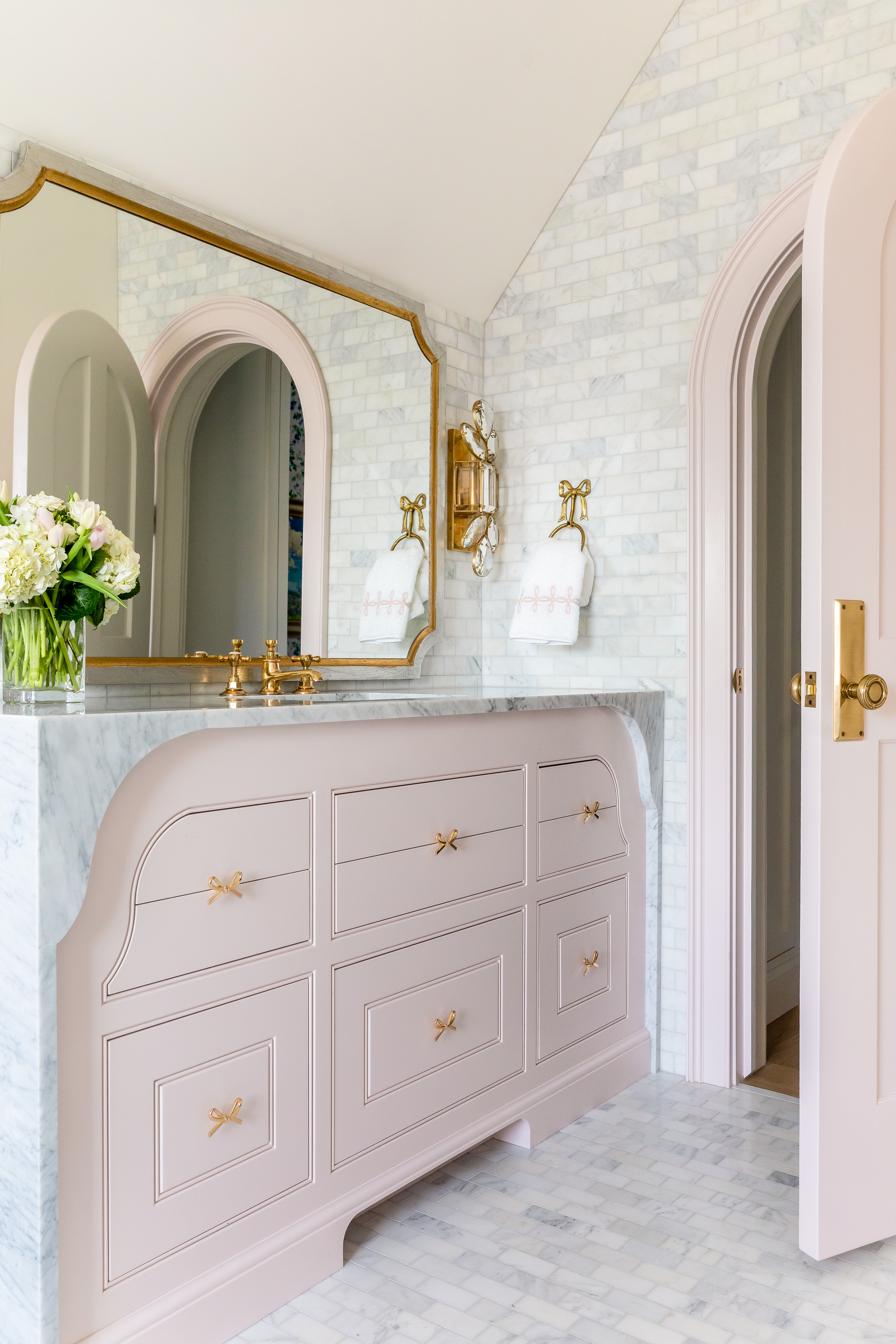
Among the many colors that go with gold is light pink, creating a glam, yet soft combination. If the two seem a little too bold for your home interior, consider sprinkling just a few pieces of each into your rooms to soften your space.
'We wanted the space to feel very custom, sweet, and girly with soft curves so we designed the marble to feel very incorporated into the vanity and part of the color scheme and design,' says Cara Fox, co-founder of Fox Group. 'We chose the color Benjamin Moore Proposal for the pink because it’s very soft and soothing for a bathroom. We added brass hardware and lighting to warm up the entire space.'
To add a warm glow to your home, consider bringing in gold accents through gilded furniture, mirrors, etc. Layer in soft pink in the background for a modern interior.
9. Red
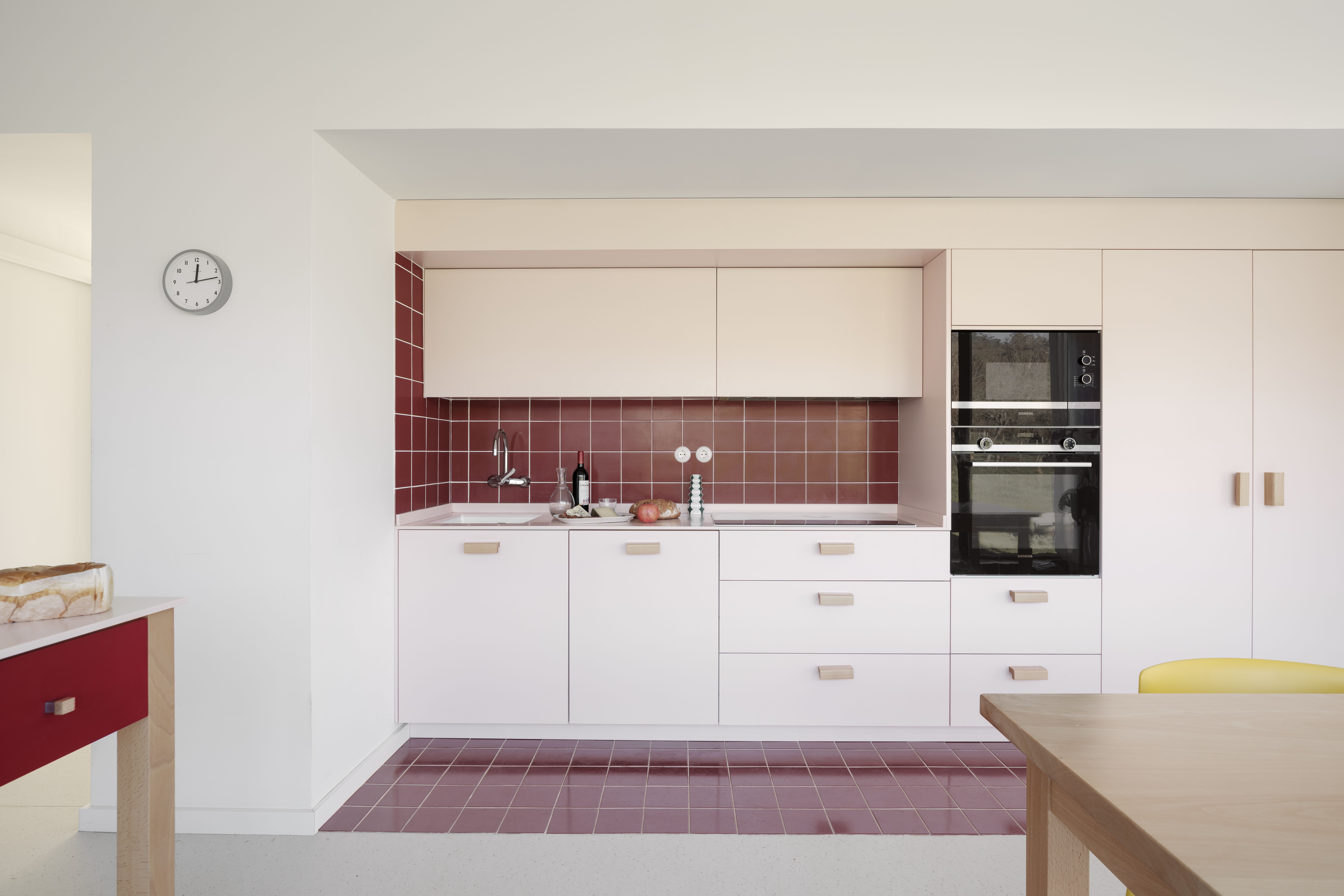
One of the modern ways to decorate with pink. While pink and red are a clashing combination when used carefully and conceptually can not only create a smart scheme but one with gravitas and personality.
Color-blocking walls with soft pink and red can work, especially as feature walls or more. Another way is with tiles. Red tiles with soft pink grout lines will work perfectly; as will, as seen in this project, a wonderful enclosure of red tiles within soft pink cabinets.
'We introduced this color combination to adapt to the existing, classical space, and to complement the modernity present in the original building,' says Miguel Zaballa LLano, principal architect at ACHA ZABALLA arquitectos. 'The use of color serves to generate a serene and optimistic atmosphere.'
10. Olive
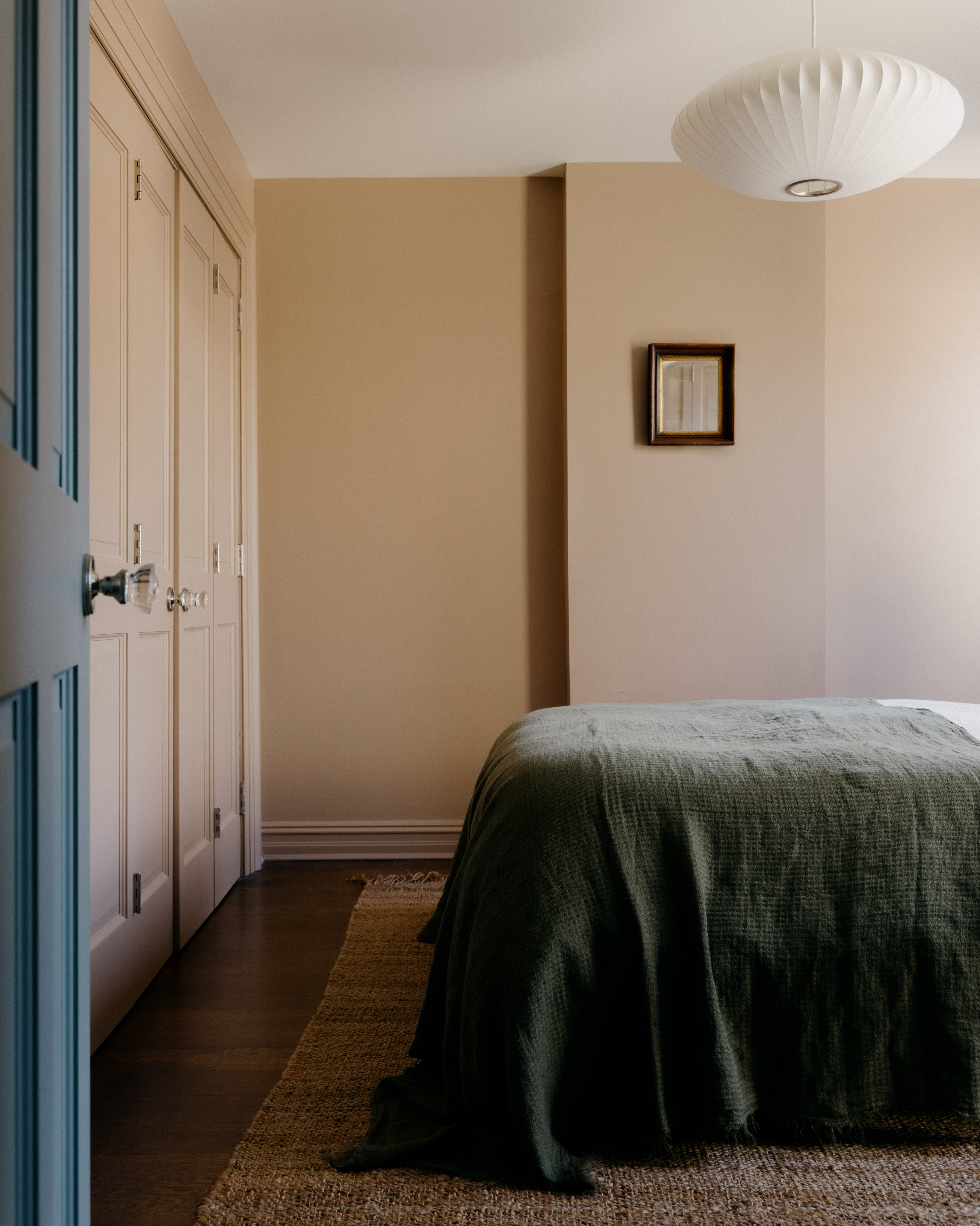
When it comes to this color combination, the name of the game is soothing. Pink with a deep green has a natural charm; it elicits thoughts of flowers, fields, and rainbows.
A great way to create a more visually warm combination with the two tones is by choosing a pink that has a brown or grey undertone, to reduce the sweetness of the hue. Soft pink too can go along with other colors that go with olive green to create an embracing scheme.
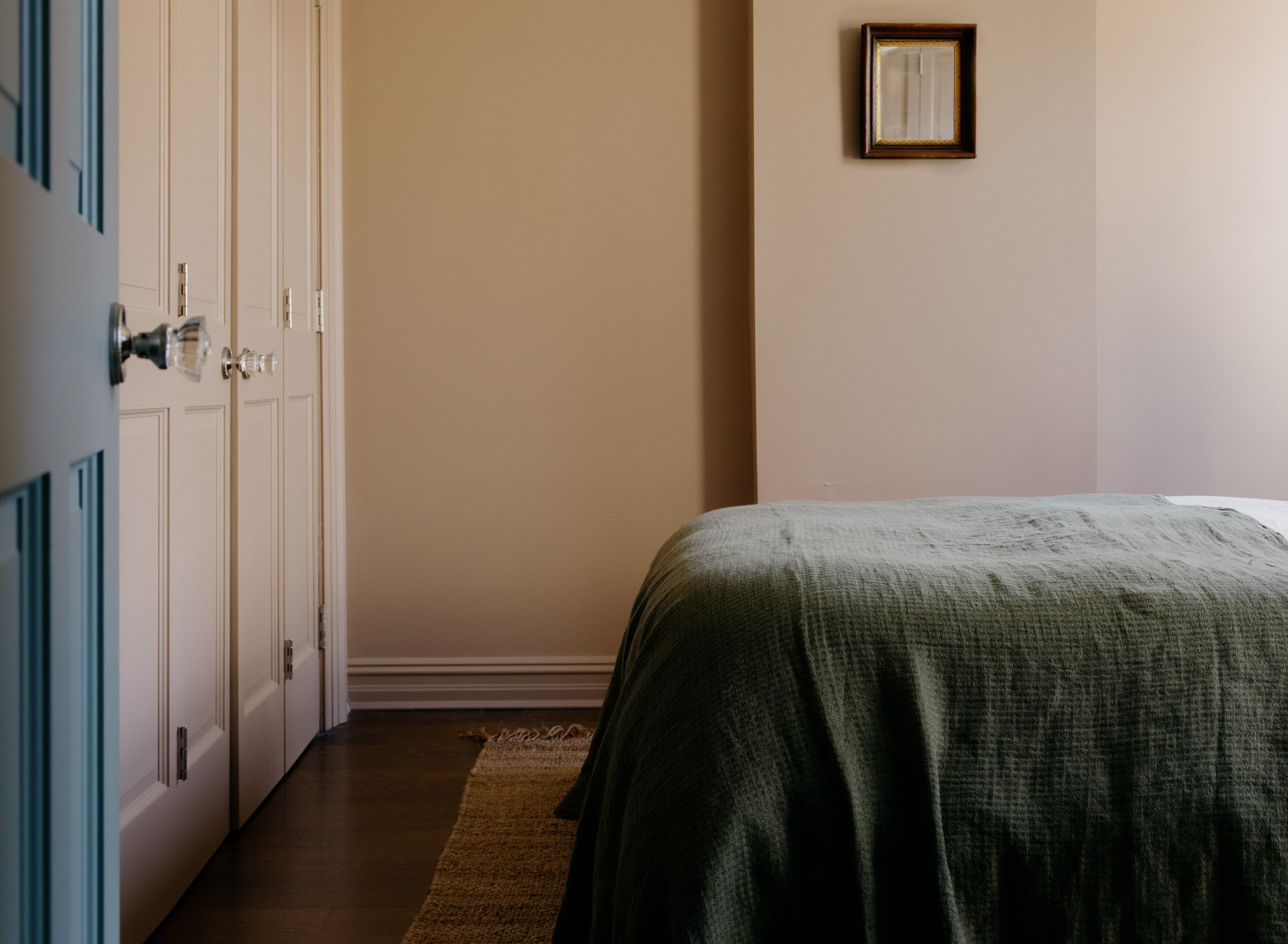
'In this bedroom, we employed colors and textures to shift the focus to the warmth within rather than the size,' says Melissa Lee, co-founder of Bespoke Only. 'We washed the walls in Dead Salmon, a demure rosy hue that's particularly romantic when graced by the teal blue door and olive bed linens.'
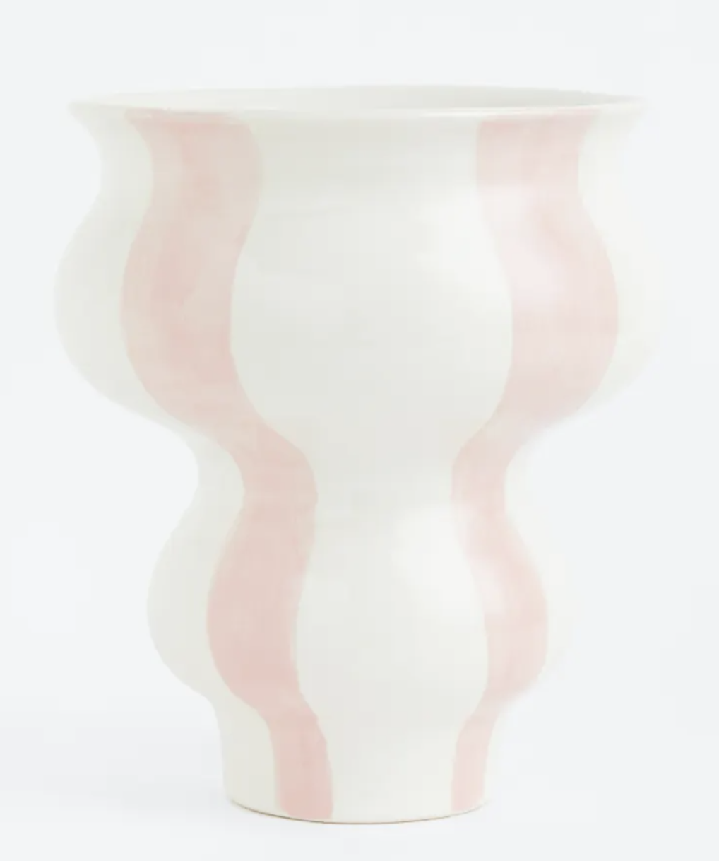
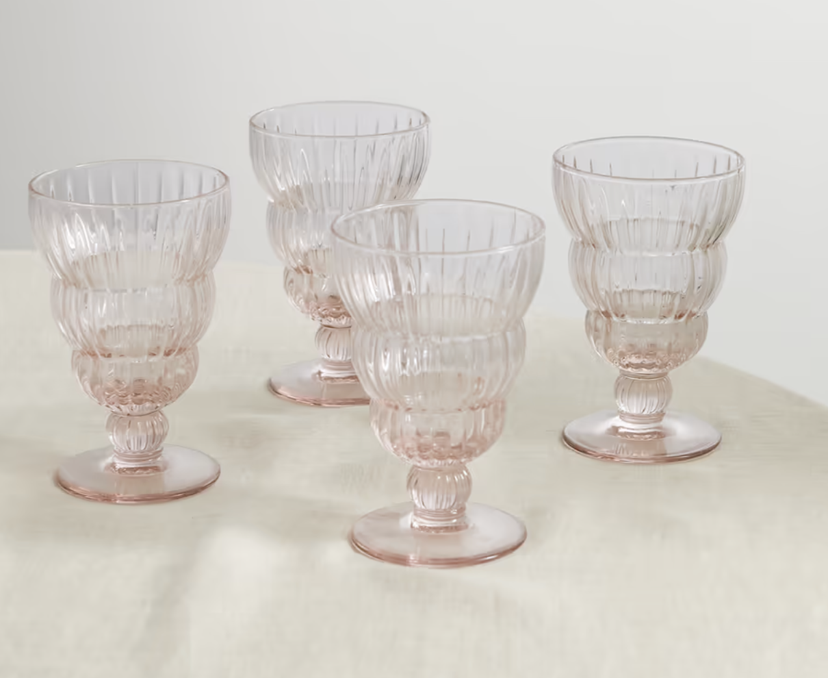
Our shopping editor picks her 3 favourite light pink accessories

Aditi Sharma Maheshwari started her career at The Address (The Times of India), a tabloid on interiors and art. She wrote profiles of Indian artists, designers, and architects, and covered inspiring houses and commercial properties. After four years, she moved to ELLE DECOR as a senior features writer, where she contributed to the magazine and website, and also worked alongside the events team on India Design ID — the brand’s 10-day, annual design show. She wrote across topics: from designer interviews, and house tours, to new product launches, shopping pages, and reviews. After three years, she was hired as the senior editor at Houzz. The website content focused on practical advice on decorating the home and making design feel more approachable. She created fresh series on budget buys, design hacks, and DIYs, all backed with expert advice. Equipped with sizable knowledge of the industry and with a good network, she moved to Architectural Digest (Conde Nast) as the digital editor. The publication's focus was on high-end design, and her content highlighted A-listers, starchitects, and high-concept products, all customized for an audience that loves and invests in luxury. After a two-year stint, she moved to the UK and was hired at Livingetc as a design editor. She now freelances for a variety of interiors publications.
