What Colors Go With Orange? 10 Harmonious Hues to Pair With This Zesty Shade
Orange can be a tricky color to navigate, but these expert-approved combinations allow you to decorate with confidence
Lilith Hudson
Orange is a color that grabs your attention, but if you want it to be for the right reasons you’ll need to know the best colors to pair it with. As such a bold shade, working out which colors go with orange is no easy feat, but the vivacious choice makes a great statement when used with the right care and attention.
When decorating with orange, its arresting character is undeniable, but it's also a fundamentally warming tone. This makes it a versatile color that's just as suitable for a sun-soaked orangery as it is for highlighting a cozy living room fireplace. It also means it goes well with a variety of other colors, from pastels to earthy neutrals and nearly everything in between.
Whether you use it in a palette of sunset tones or as a zingy accent color, orange can really bring new light to your interiors. To help you pick the perfect pairing for a balanced scheme that's guaranteed to draw the eye, we asked experts for their advice on what colors go with orange. Here are the ten shades they recommend.
10 orange color combinations
1. Orange and Navy Blue
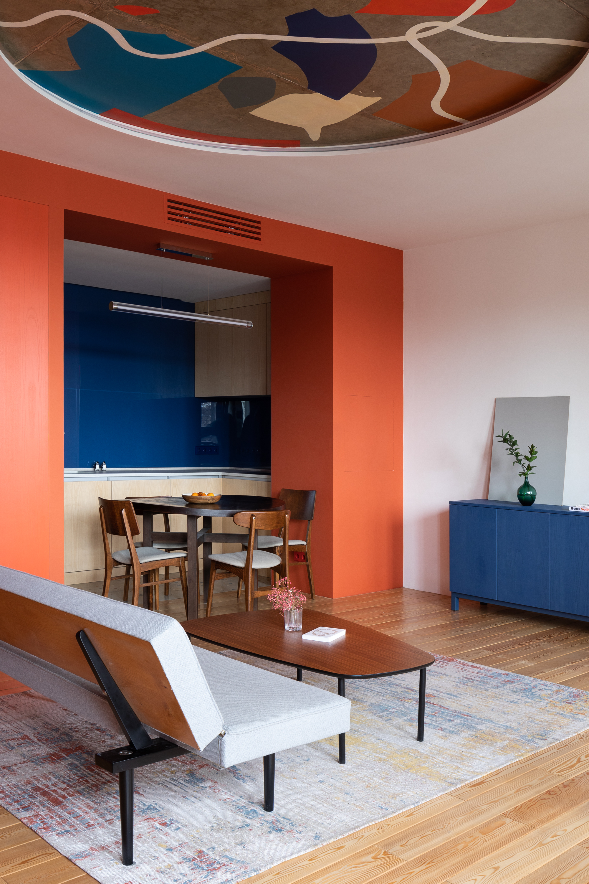
Navy blue and true saffron orange are a match made in color heaven. Where the harshness of black and the boldness of orange can compete for the eye to make a garish combination, the regal qualities of navy blue soften orange's punchiness.
As interior designer Isy Jackson, founder of Cheltenham Interiors, explains, "This paint color combination balances warmth with sophistication. Use navy as a main tone for walls or larger furniture pieces and accent with orange in accessories like cushions, throws, or artwork," she advises. "You could even consider a two-tone wall treatment where the bottom half is navy and the top half is a light neutral. This creates a stylish, grounded look in living rooms or dining areas."
2. Orange and gray

In a similar vein, a slate gray can make a great dark shade to pair with orange to make a dramatic impact. This pairing works especially well in a kitchen or orange bathroom where gray cabinetry or granite worktops can be combined with terracotta walls to inject warmth to the space.
To prevent over saturating your space with orange, however, you may want to keep color to a minimum by opting for an accent wall only. "A pop of bright, rich contrasting color is a great way to add impact, but keep the rest of the scheme muted," suggests Ruth Mottershead, Creative Director at paint brand, Little Greene. "Bright and warm oranges such as ‘Marigold’ work beautifully alongside both mid-tone greys and cooler greys, while a warm white is ideal if you want to create a little more contrast."
3. Orange and teal
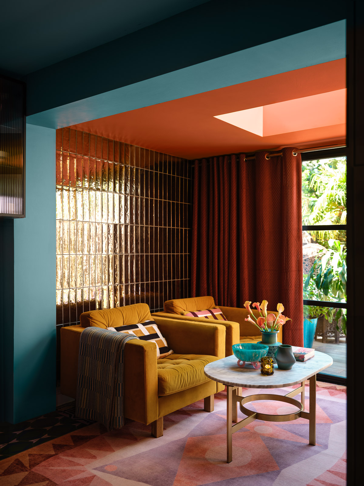
Teal, that elusive shade that falls between blue and green, has been one of the key color trends of recent years. It's also one of the best colors that go with orange, offering a great point of contrast that really draws the eye. This brave combination isn't for the faint of heart, however, and lends itself well to a more maximalist style.
"Teal's cool tones counterbalance the warmth of orange, creating a vibrant yet harmonious atmosphere," explains Isy. "Use teal in larger pieces, like sofas or accent walls, and incorporate orange through artwork and accessories. You could also try geometric patterns in teal and orange for wallpaper or textiles to bring modern flair to living rooms or bedrooms."
Some metallic accents elsewhere in the room can bring even more to the game, too. A hint of gold or a shimmer of silver will warm or cool the scheme respectively, to choose your proximal hardware wisely.
4. Orange and green
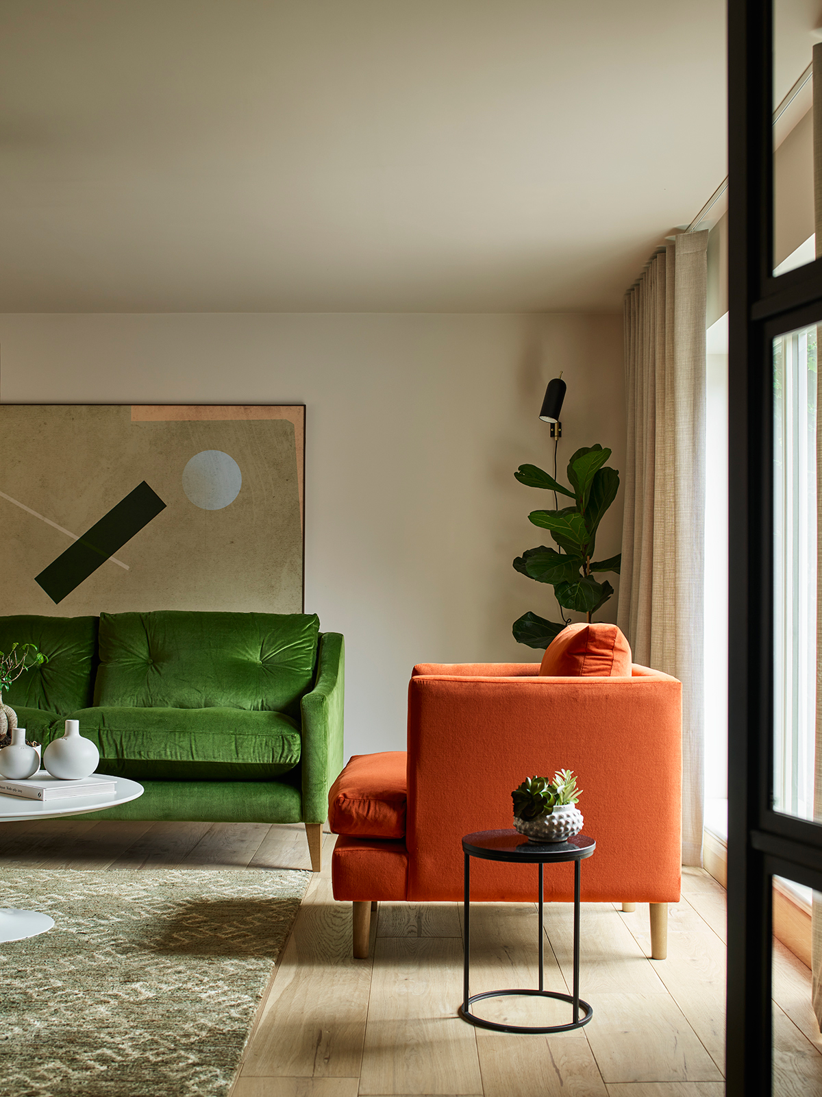
If you want to give your living room a taste of the dolce vita, take inspiration from the sun-drenched homes of the Amalfi coast and pair terracotta with earthy basil and forest green hues. You might embrace this pairing through paint ideas or with artisanal tiles and houseplants aplenty. Whatever you choose, you can rest assured this bold combination works wonders.
"The captivating interplay of green and terracotta orange sets the stage for a dynamic and inviting atmosphere," explain the team at London-based design studio, The Stylesmiths. "Green serves as a cool, calming element, counterbalancing the vibrancy and energy that the terracotta orange brings to the table. The soothing qualities of green also temper the boldness of orange, resulting in a palette that feels both cohesive and thoughtfully curated."
You can alter the specific orange and green shades to suit your liking, too. "In the living room, deep olive green can beautifully complement rich rust tones of the sofa and cushions, creating a unified look," say The Stylesmith team. Meanwhile, a lighter terracotta and a sage green can create a more airy and fresh bathroom or bedroom for a more soft orange aesthetic.
5. Orange and white
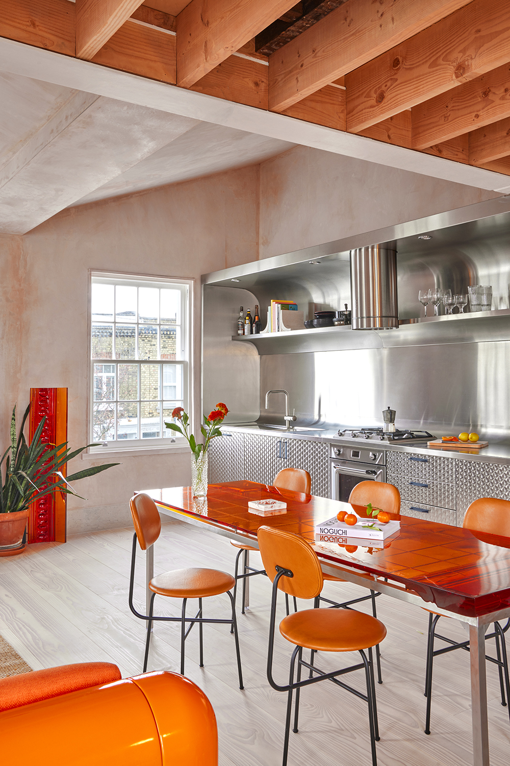
If you want your chosen orange hue to really pop, choose a white background. When creating a color palette, nothing offers a more stable foundation than pure white. This true neutral really allows zesty colors to sing, offering a clean slate that lets the bolder tone do the talking, but remember to choose a warmer or cooler white depending on whether you want to heat up the orange even more.
Take inspiration from the playful space above and use white as the main wall color and introduce orange through furniture, kitchenware, or accents, such as trim. "Striped walls with alternating orange and white can also add a playful touch, especially in kids' rooms or playful spaces like home offices," suggests Isy.
6. Orange and brown
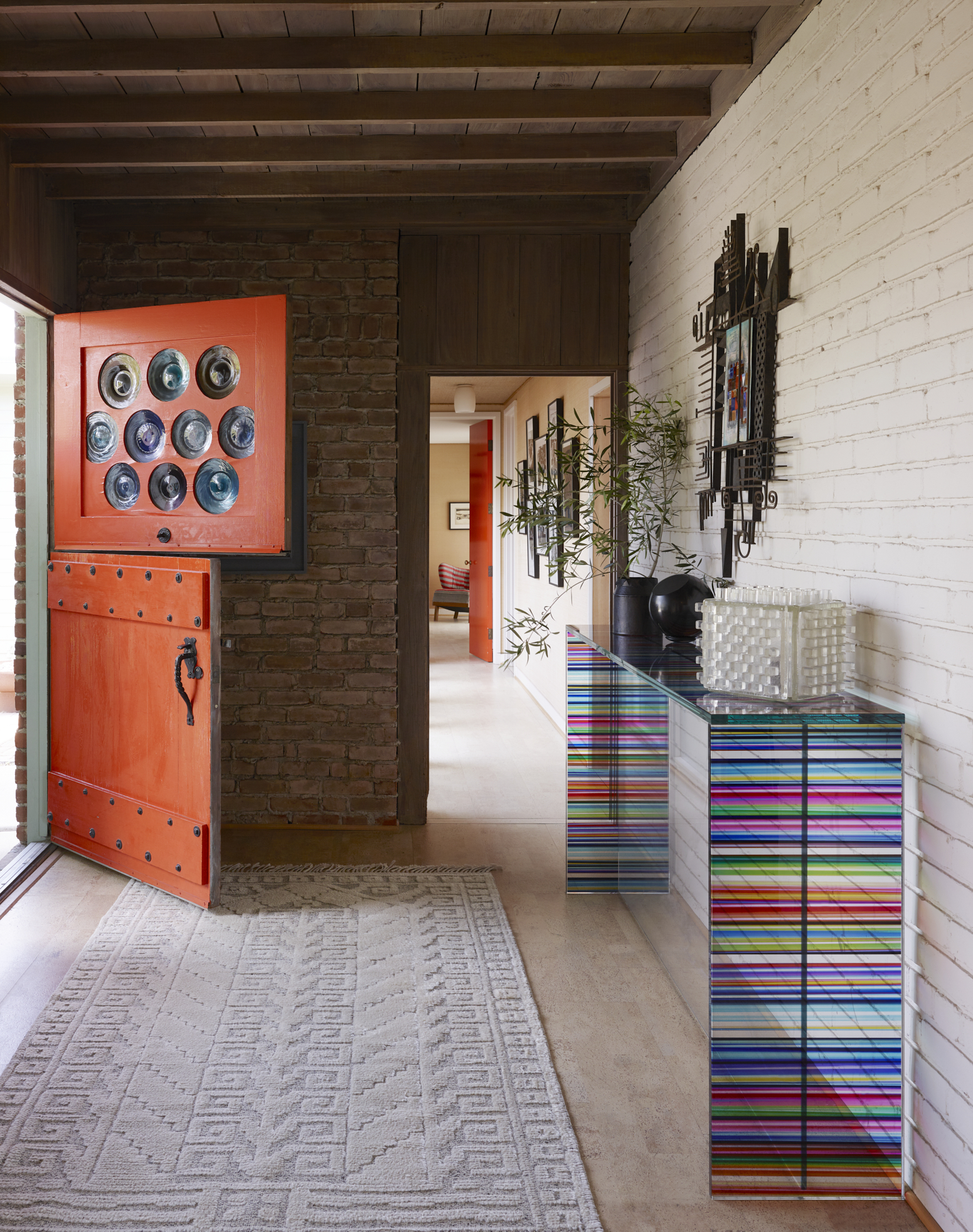
When considering what colors go with orange for a more earthy feel that's less harsh, brown is a great choice. Think muddy browns, dark olives, and umber alongside burnt orange decor or walls. "These provide a grounded, organic feel," Isy says. "Use olive or terracotta as wall colors, with orange accents in textiles or decorative items for a warm, inviting space."
Don't just limit yourself to paint, either. Often, the best way to embrace brown tones is through wooden accents. Reclaimed wood furniture, hardwood floorboards, or exposed beams can bring the perfect hint of brown to your orange scheme while still feeling natural and adding depth. "Or, consider a feature wall in a rich brown with orange artwork to draw the eye," suggests Isy.
7. Orange and steely blue
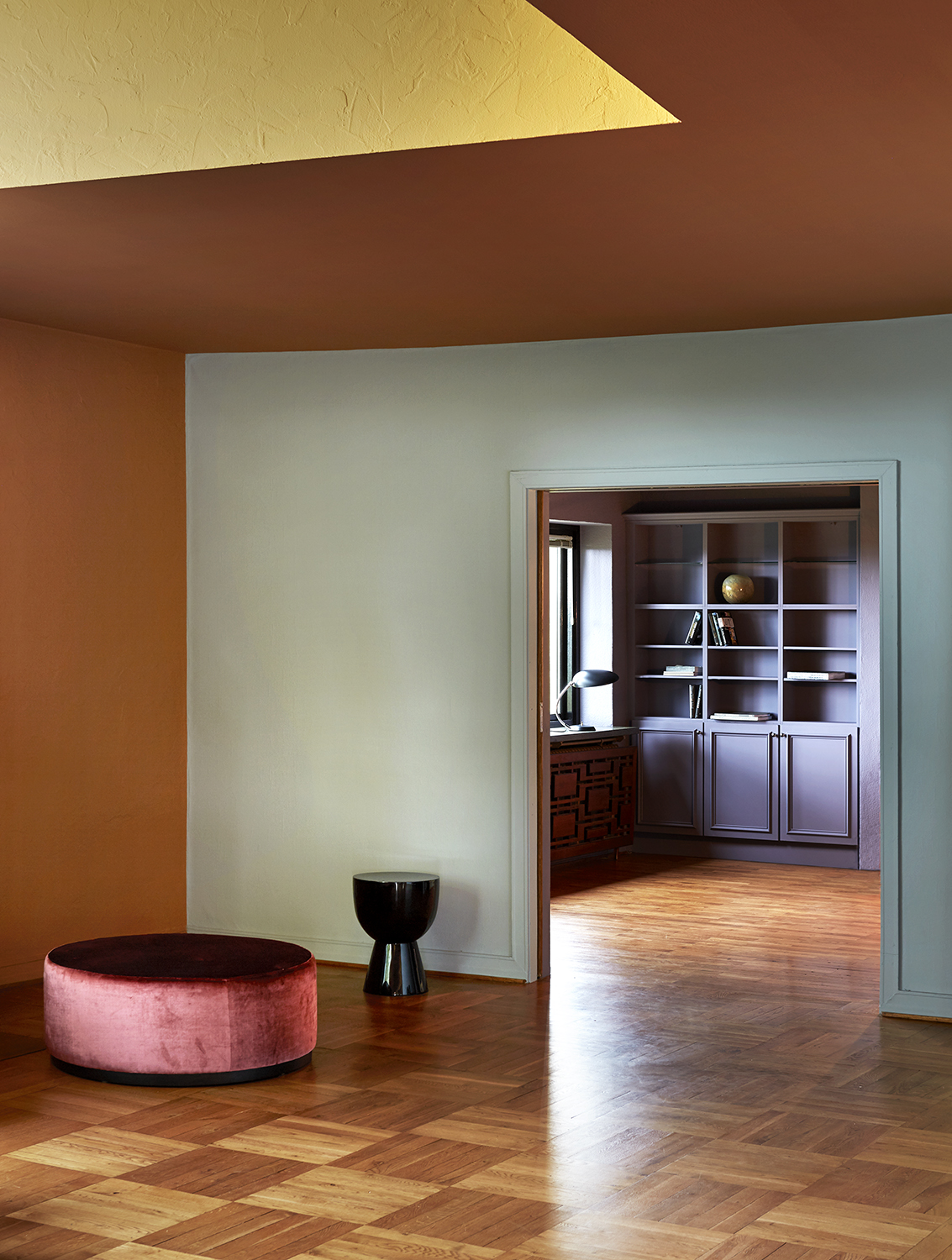
Cool, pale blues have been the talk of the town in recent years, and blue is a color that complements orange particularly well. It might be hard to imagine at first, but a glimpse at chic spaces like the one above quickly demonstrates how harmonious these opposing shades really are.
That's all owing to color theory. To make a statement with orange, just look to the opposite side of the color wheel. "Orange and blue go well together as they are complementary colors, sitting directly opposite each other on the color wheel," explains Dominic Myland, CEO of paint brand Mylands. "A deep blue can make a bright orange feel heavier and more grounded, while a paler hue will bring a feeling of light and openness."
8. Orange and Red
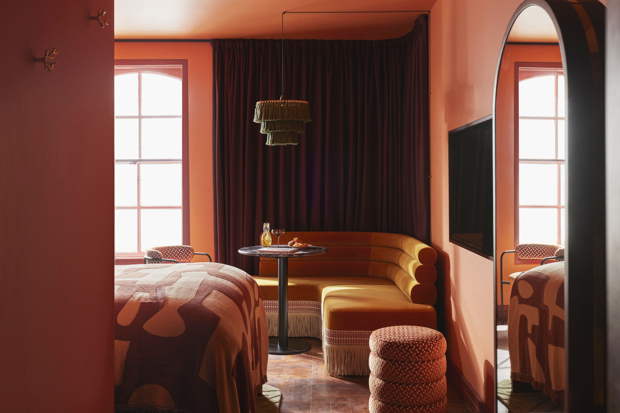
Orange's root colors are a good place to start when it comes to creating a cohesive decorating scheme, so consider layering with reds and burgundy. This can have a powerful, earthy effect thanks to the many connotations with nature.
"Orange has associations of spice and taste for many people, due to so many fruits and vegetables being this mix of red and yellow," explains Rob Whitaker, Creative Director at Claybrook Studio. "These links to the cycle of life and the natural world make it a popular choice for interiors; reflecting a yearning for renewal and regrowth, future possibilities and adventure."
9. Orange and pink
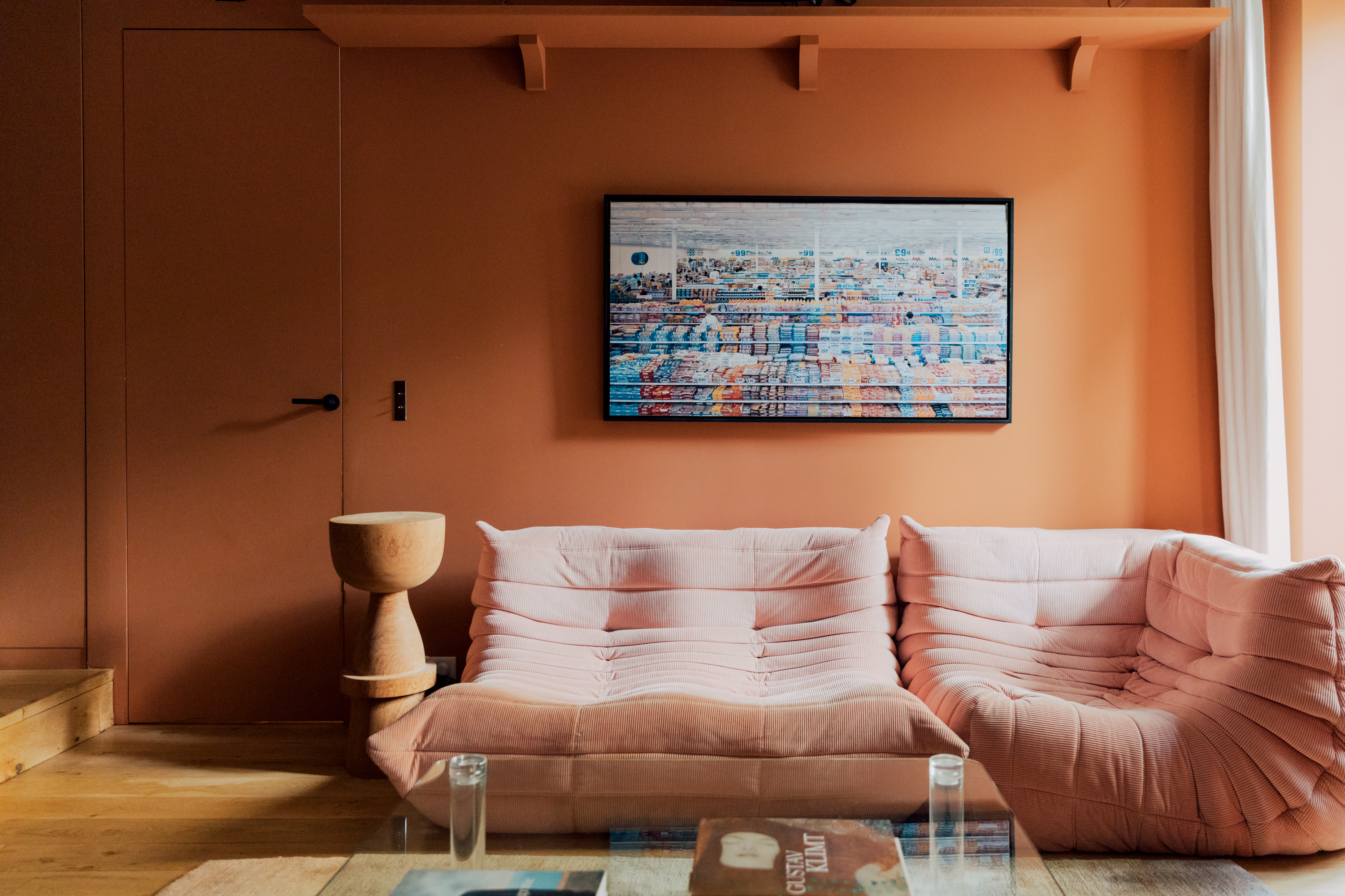
If a more muted approach appeals, you may want to look toward pink. Nuanced oranges like sienna pair wonderfully with all pinks, from pale pastels to deep fuchsias, and are easy to layer into many schemes comfortably. Or, if you already have a pink room, punctuate it by decorating with terracotta accents.
While these pink tones work just as well with a true zesty orange, most experts suggest an umber-based shade. Atelier Ellis’ paint color "Hari" is a particularly pleasing option. "By using umber as a pigment to ground it, it’s super easy to live with and loves to host art and objet," says the brand's founder, Cassandra Ellis. "Paired with warm browns, soft greens, or umber-based pinks, it makes a room feel very human and comfortable to be in."
10. Orange and yellow
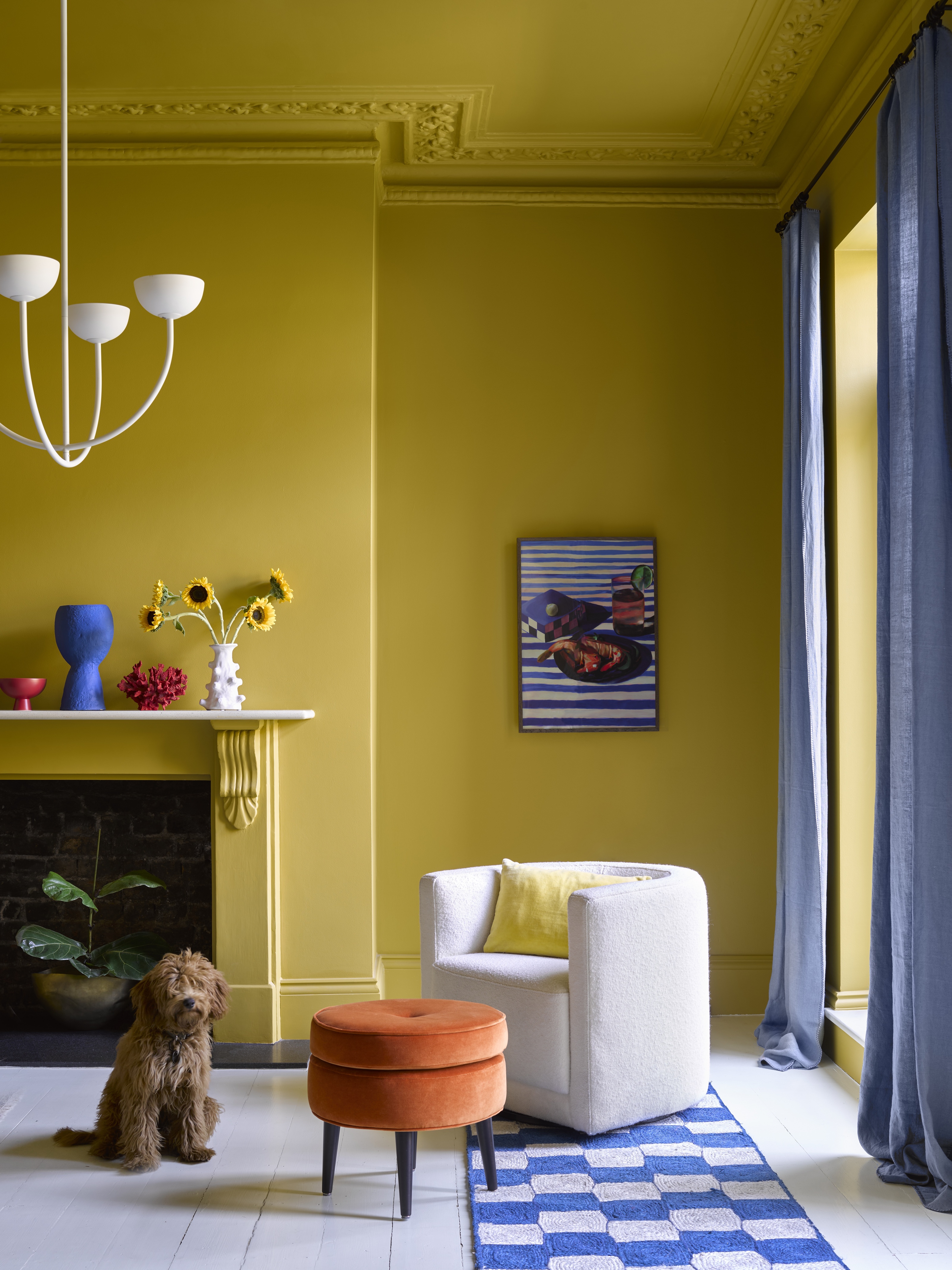
Similar to pink, yellow sits near to orange on the color wheel, making it a safe choice for colors that go with orange. "Pinks, corals, and yellows are all complementary shades within a similar spectrum," says Rob at Claybrook Studio. "You can lean into its warm and natural feel by using this muted, dusky palette and layering it within a room across lots of different textures."
Bright yellow might be best avoided, however, especially if you're using a true, saturated orange. "In this pairing, yellows will create a bit of chaos with an equal 'energy' color," explains Patrick O'Donnell from Farrow & Ball. Instead, opt for a pale yellow like Lick's Yellow 06 or a mustard shade and pair with a russet orange for a more earthy combination.
FAQs
Is orange a good color for upholstery?

If orange on the walls or floor isn’t for you, then a sofa or armchair in this statement shade may be the answer. "We’ve definitely noticed an increase in popularity for orange shades," says Chelsea Appleford, Buying Manager at Arlo & Jacob. "The fashion world has seen a return to the 1970s, which has directly influenced the world of interiors too — and orange shades fit right at the center of this trend."
Despite its boldness, orange is a surprisingly versatile choice for upholstery. "In its brightest form it’s playful and lively so it brings energy to the room, while more muted and rusty shades work as a neutral base," explains Chlesea.
Again, we can look to the natural world for inspiration on how to help oranges sit comfortably in our homes. "For a calm and grounding look, orange can be easily dialed back," says Chelsea. "Pared with olive greens, browns, and russet reds, it creates a beautiful organic flow through a room."
What colors don't go with orange?
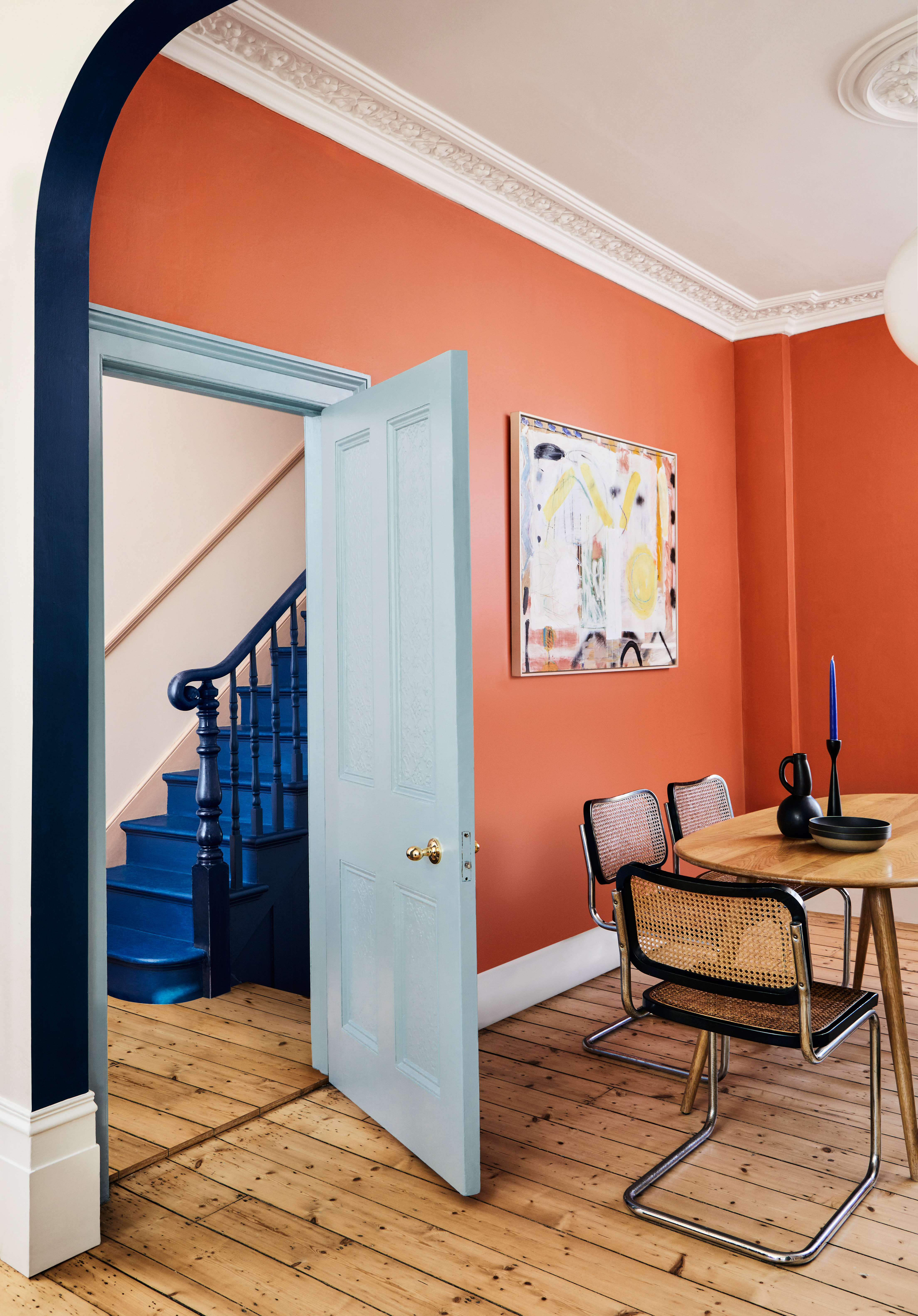
Orange is a divisive tone; you either love it or you hate it. Whether you use a russet color or a more subdued pastel variation, the vibrant hue is domineering and, when paired with certain other shades, it can easily oversaturate a color palette.
With that in mind, there are some shades you should avoid pairing orange with despite its versatility. These tend to be equally bright or garish shades that compete with orange when used together.
According to Patrick at Farrow & Ball, orange and equal parts black are colors that don't go together, since you're in danger of creating a Halloween vibe. "Pairing with purple or lilac may also make look fabulous on the catwalk at Valentino, but would be hard to translate into a successful interior," he adds.
That's not to say that these colors are completely off bounds, however. Depending on the effect you want, they can be incorporated more subtly into our homes if used in smaller doses like paint accents or upholstery. The trick, says Patrick, is to choose the right shade to start with. "True orange can be quite a challenge to decorate with, full stop," he says. Instead consider a base palette of burnt orange, apricot, or terracotta for safe color experimentation.
Be The First To Know
The Livingetc newsletters are your inside source for what’s shaping interiors now - and what’s next. Discover trend forecasts, smart style ideas, and curated shopping inspiration that brings design to life. Subscribe today and stay ahead of the curve.
Interiors stylist and journalist Amy Neason was the Deputy Style and Interiors editor at House Beautiful for years. She is now a freelance props and set stylist, creating work for a range of national publications and brands such as Imogen Heath. She has previously worked at Established & Sons, and her skills include styling still life and interiors shots for editorial features and sourcing unique products to create inspirational imagery. She is particularly respected for interpreting seasonal trends into feature ideas and style stories.
- Lilith HudsonFormer News & Trends Editor
-
 5 Types of Loft Conversion Every Homeowner Should Know About
We explain everything you need to know about the most common types of loft conversions to help you make an informed decision
-
 "New Prints on the Block" — Caroline Z Hurley Just Made Your Bed the Coolest Canvas in the House
The Brooklyn-based artist trades paint for pillowcases in a breezy Brooklinen drop made for mixing, matching, and musings


