What Colors Go With Red? 10 Colors That Hold Their Own Alongside This Fiery Hue
Red is a great way to make a design statement, and these expert-approved combinations complement the shade perfectly
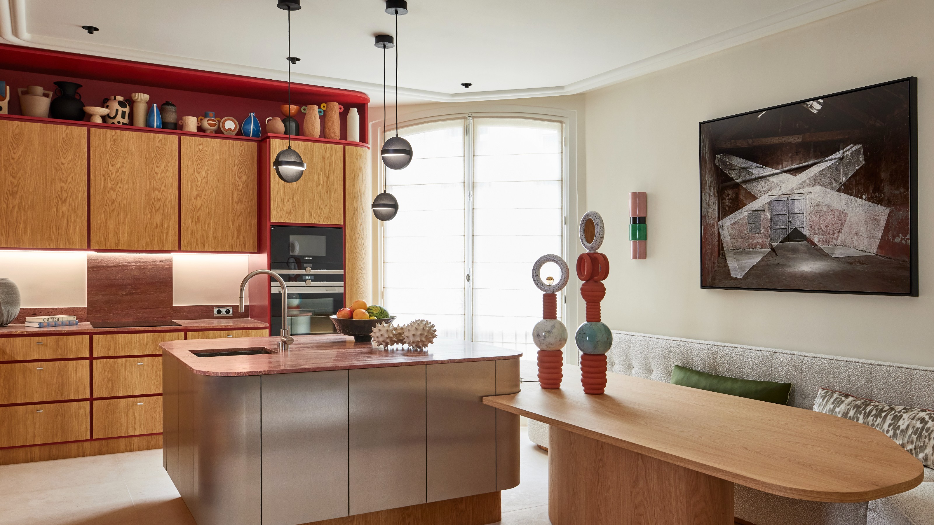

Ask any designer and they'll tell you that red is the mood of the moment right now. From bold crimson to deep burgundy, this invigorating hue has found its way into many stylish color schemes of late, and its power as a statement shade certainly shouldn't be underestimated.
Decorating with red doesn't always come naturally, however. This dominant, fiery hue can be tricky to get right if you haven't done your research. The good news is, this versatile shade works well with a wide range of other hues, forging powerful connections for an interior color scheme that feels perfectly balanced.
In general, primary red tones are usually reserved for accents, while darker, browner reds can wrap the room on walls, floors, and doors. First, you have to find the right shade for your space. "The range of red is wide; from vivid scarlet hues to rich maroons and earthy terracottas," explains Helen Shaw, Director of Color Marketing at Benjamin Moore. "This varied spectrum means you can dial the feel of your look up or down, creating statements or beautiful harmonies depending on the shade and how you pair them."
Next, it's simply a case of finding the perfect shade to accompany your chosen red, and there are options aplenty. To help you find the perfect complementary color, we asked designers what colors go with red so you can go ahead and embrace this on-trend hue with confidence.
10 red color combinations
1. Red and Pink
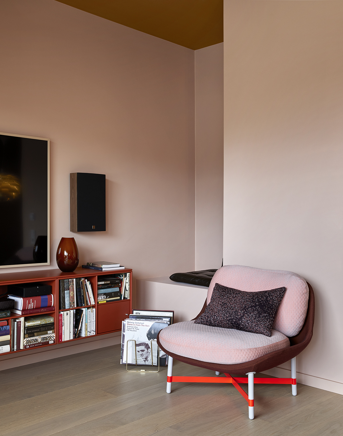
For far too long, people avoided pink and red in their homes for fear they would clash, but they actually complement each other beautifully. Pink is red's closest color friend and, as a result, the combination makes for a well-matched decorating scheme that looks peppy and playful.
For best results opt for a softer Etruscan or earthy red tone when approaching this paint color combination, as it tends to pair together more tonally than brights. "For a romantic and sophisticated pairing, deep burgundy red works beautifully with blush pink," suggests interior designer, Nina Lichtenstein. "This combination is perfect for a bedroom or living room, adding warmth and femininity."
2. Red and brown
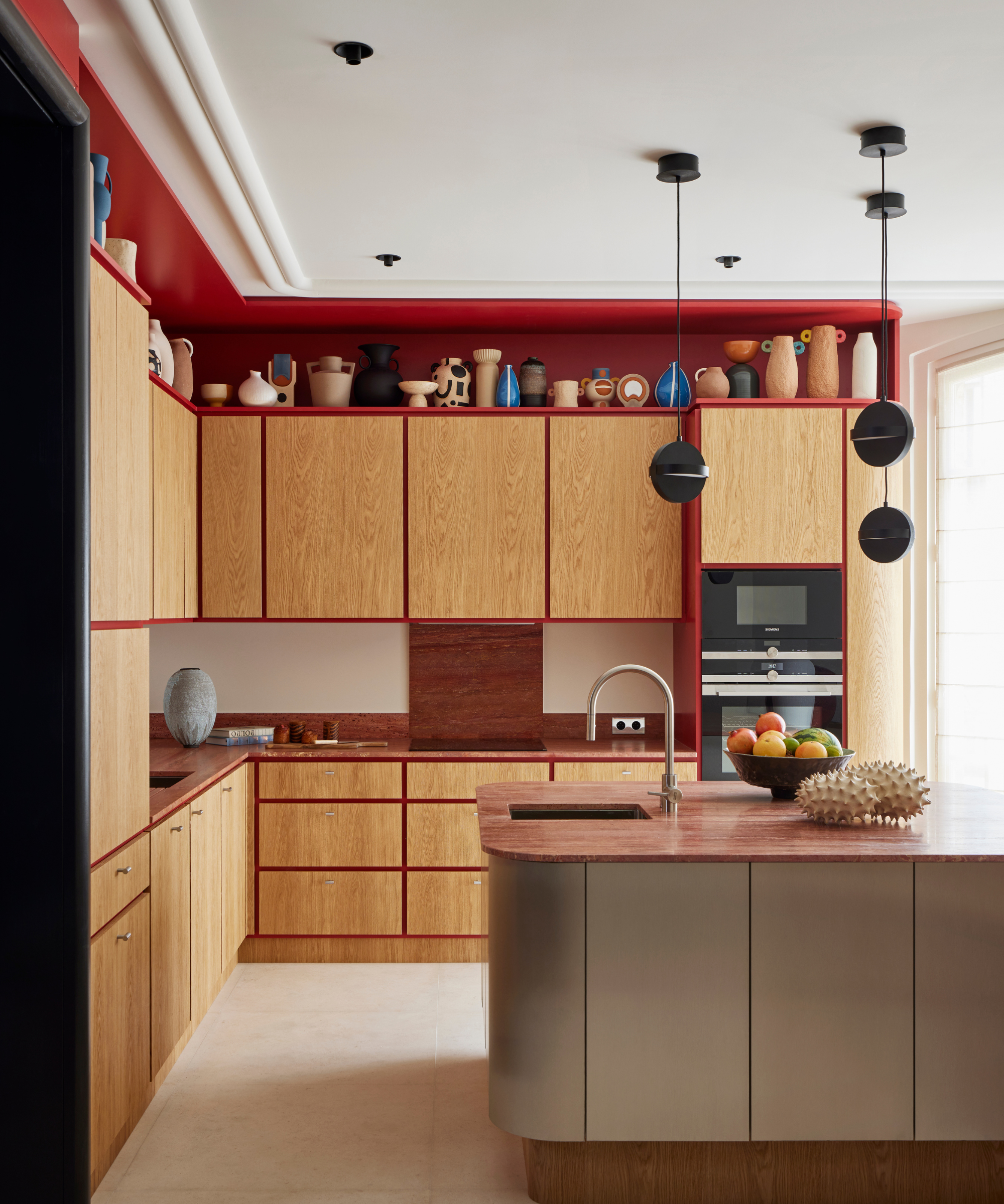
Red's invigorating qualities really shine when paired with more understated neutral tones, and brown is a great accompaniment. Whether that's dark chocolatey-brown walls punctuated with bright accessories for a red living room idea or red accents used alongside wooden furniture, this pairing looks timelessly chic.
The Livingetc newsletters are your inside source for what’s shaping interiors now - and what’s next. Discover trend forecasts, smart style ideas, and curated shopping inspiration that brings design to life. Subscribe today and stay ahead of the curve.
When it comes to particular shades, Helen Shaw of Benjamin Moore recommends choosing browns with a warm undertone to match with red. "A warm sun-baked brick will deliver depth and blend beautifully with brown, taupe, and wood accents offering added depth and a feeling of tranquillity.," she says. "Pairing reds with beige tones delivers a rustic charm that makes it easy to live with."
3. Red and light blue
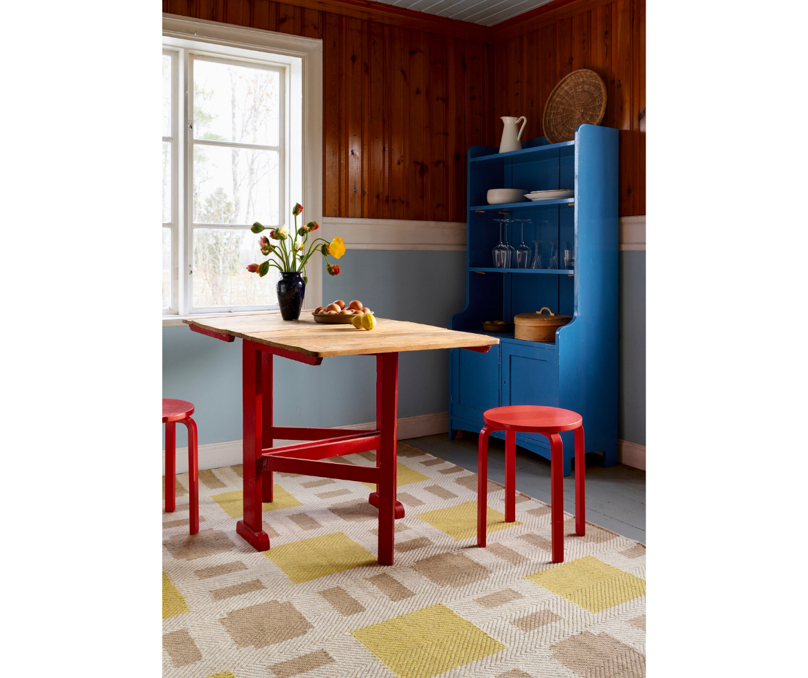
Light blue and red are like yin and yang, which is why they work so brilliantly when used together. There’s a definite and somewhat surprising harmony in seeing the two hues side by side. These contrasting primary shades work especially well for color-blocking, creating a playful, Bauhaus style that's zesty and energetic.
To get the colors right, consider the finish of the paint you use. The trick is to select a matt and chalky powder blue finish. "Powder blue is the perfect partner for a bright and bold pillar box red shade," says paint expert Annie Sloan. "It instantly cools the fiery tendencies of the red and has connotations of fun and playful mid-century decor. Think American Diner or those beautifully playful blue and red Italian kitchens and cafe schemes of the 1950s."
Nina also lauds this fresh and invigorating color pairing. "This combination works especially well in kitchens and dining rooms, where scarlet cabinets can pair with light blue walls or tiles," she says. "An accent wall in scarlet behind light blue open shelving, or a scarlet table runner over a light blue tablecloth, brings balance to these contrasting colors while maintaining harmony."
4. Red and purple
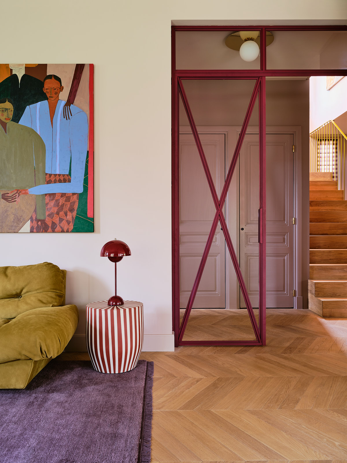
Red and purple might not be the first pairing that comes to mind when creating a color palette, but these two shades work surprisingly well together. When choosing which colors go with red for a more maximalist style, purple is a great forerunner since it draws on red's warmth for a sumptuous yet peppy scheme.
When decorating with these two colors, we recommend using them both as accents in an otherwise neutral space. "If you are working with a bold red, be sure to choose the pairings carefully so they sit together without creating a tension between them, otherwise the space will feel uneasy rather than vibrant," warns Helen. We think soft lavender or rich violet works best with a true red with a glossy finish.
5. Red and greige
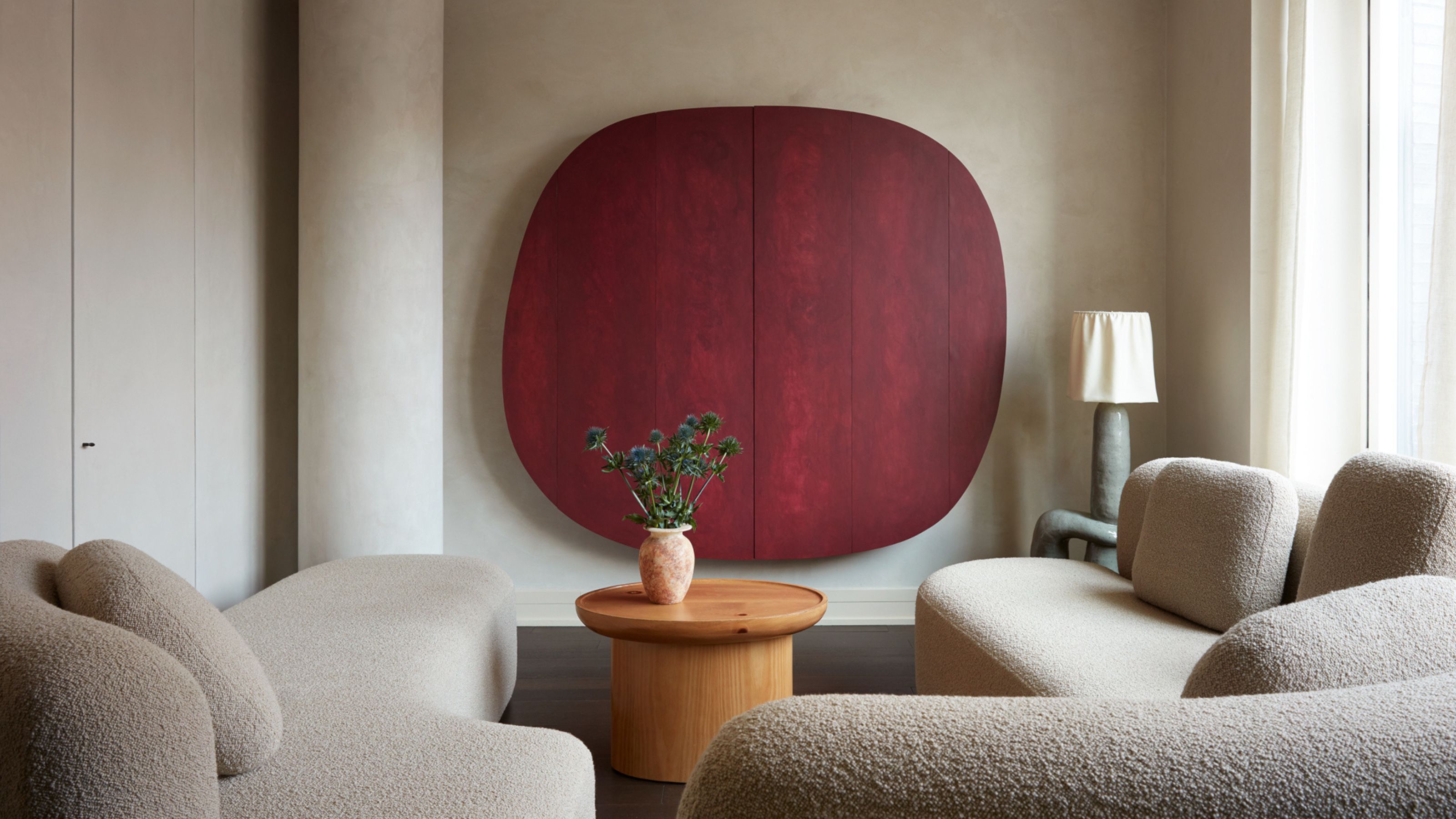
For a calming red room idea, tone down this fiery shade with a gentle greige. This makes a sophisticated alternative to white, adding a slight coolness while still contributing to a cozy and warm feel that's perfect for a living room or bedroom.
"When using a warm, rich red color to create a room that feels welcoming and confident, use a softer neutral beside it," recommends Joa Studholme, color curator at paint brand, Farrow & Ball. "The strong color feels luxurious and nurturing and cannot fail to introduce a little passion to your home, especially if you are brave enough to use a Full Gloss finish on the walls which will bounce any available light around the room."
For the perfect pairing, she recommends Dove Tale by Farrow & Ball, which has a gentle lilac undertone, to create a soft contrast with the intensity of red.
6. Red and green
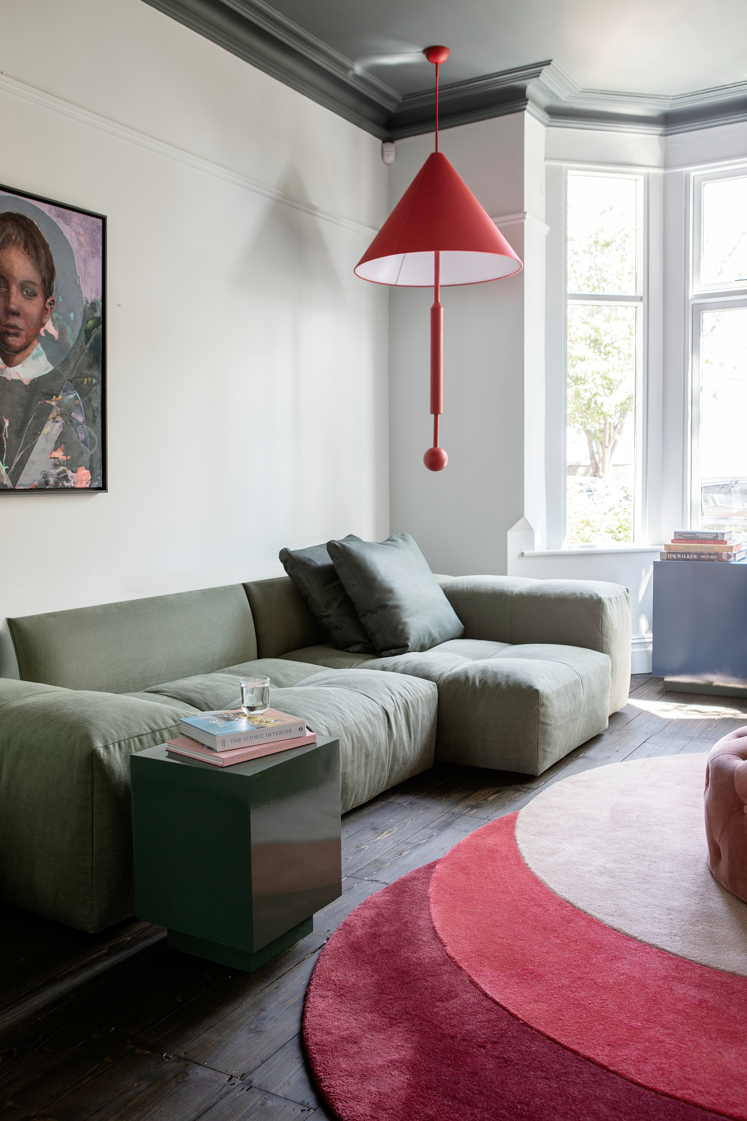
When it comes to selecting the perfect palette for your home, you can't go wrong with complementary color pairings like red and green. And before you start thinking that the combination sounds a little too much like Santa's workshop, let us assure you that red and green go together like a dream if you choose the right tones.
The trick is to choose subtler shades of green, like sage or olive, rather than deep pine or forest hues which are more Christmassy. For a harmonious pairing, consider integrating both colors via texture to keep your space from looking too seasonal.
"For this family living room, we wanted to create a sophisticated yet playful palette," says interior designer Roisin Lafferty who designed the space above. "The vibrant red color pops are the strong, bold feature in the statement pendant and rug. This was then balanced in the rich stained original flooring and the softer green tones on the sofa."
7. Red and off-white
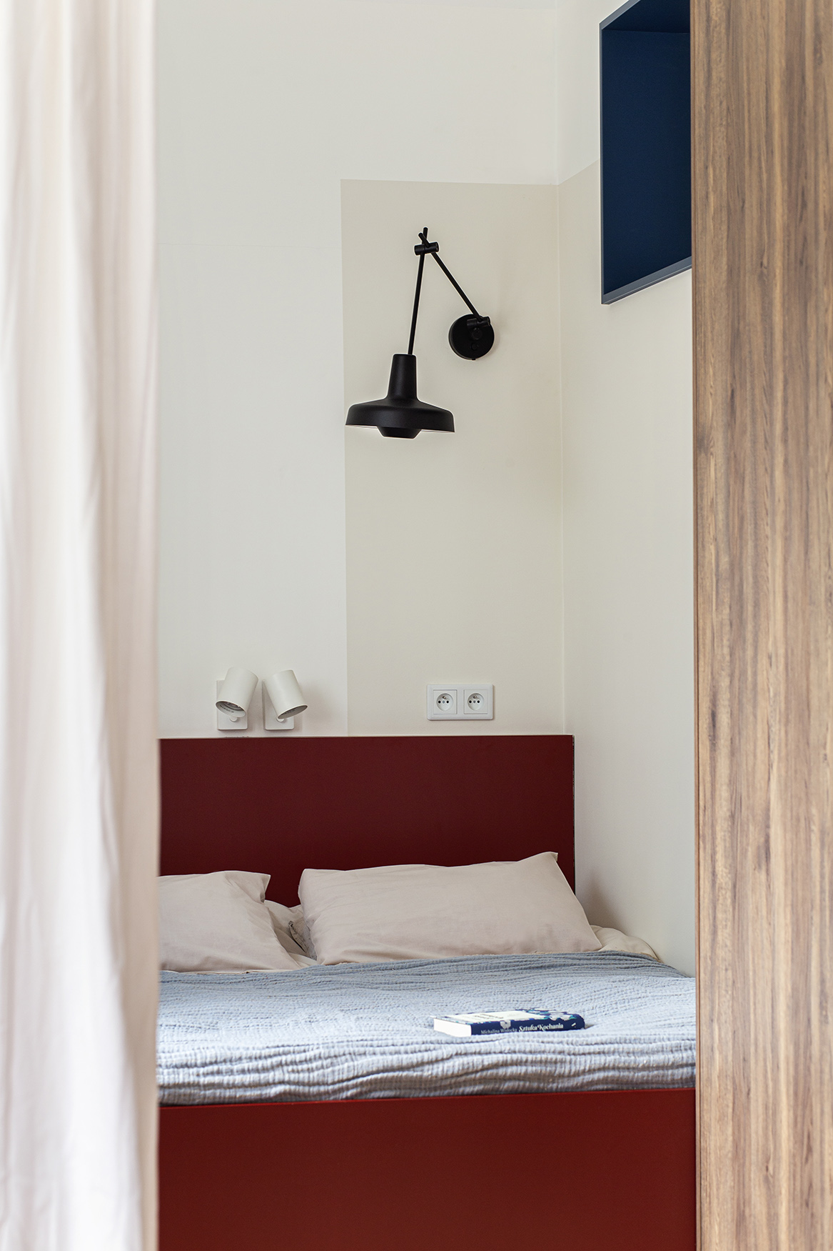
Decorating with neutrals is possibly the easiest task, as almost all hues go with creams, beiges, off-whites, and light gray. "When it comes to matching, the trick is to pair the shade of red with a color that has the same undertone, for example, a warm undertone shouldn’t be paired with a cool undertone," says Chelsea Clark, head of brand at Lust Home.
That means warm off-whites like magnolia and cream are the perfect accompaniment to red. "This high-contrast combination creates a clean, modern look," says Nina. "Try this combination in spaces like bathrooms or kitchens, where bright white walls can provide a backdrop to tomato red accents, such as towels, cabinets, or a bright red statement door. For a modern twist, use white zellige tiles alongside matte red cabinetry for visual texture."
"Darker red tones can give living rooms a magical quality, especially in the evening light," adds Patrick O’Donnell, color expert at Farrow & Ball. "Use empathetic whites to balance the tones and stop the room from looking too cloying."
8. Red and mustard yellow
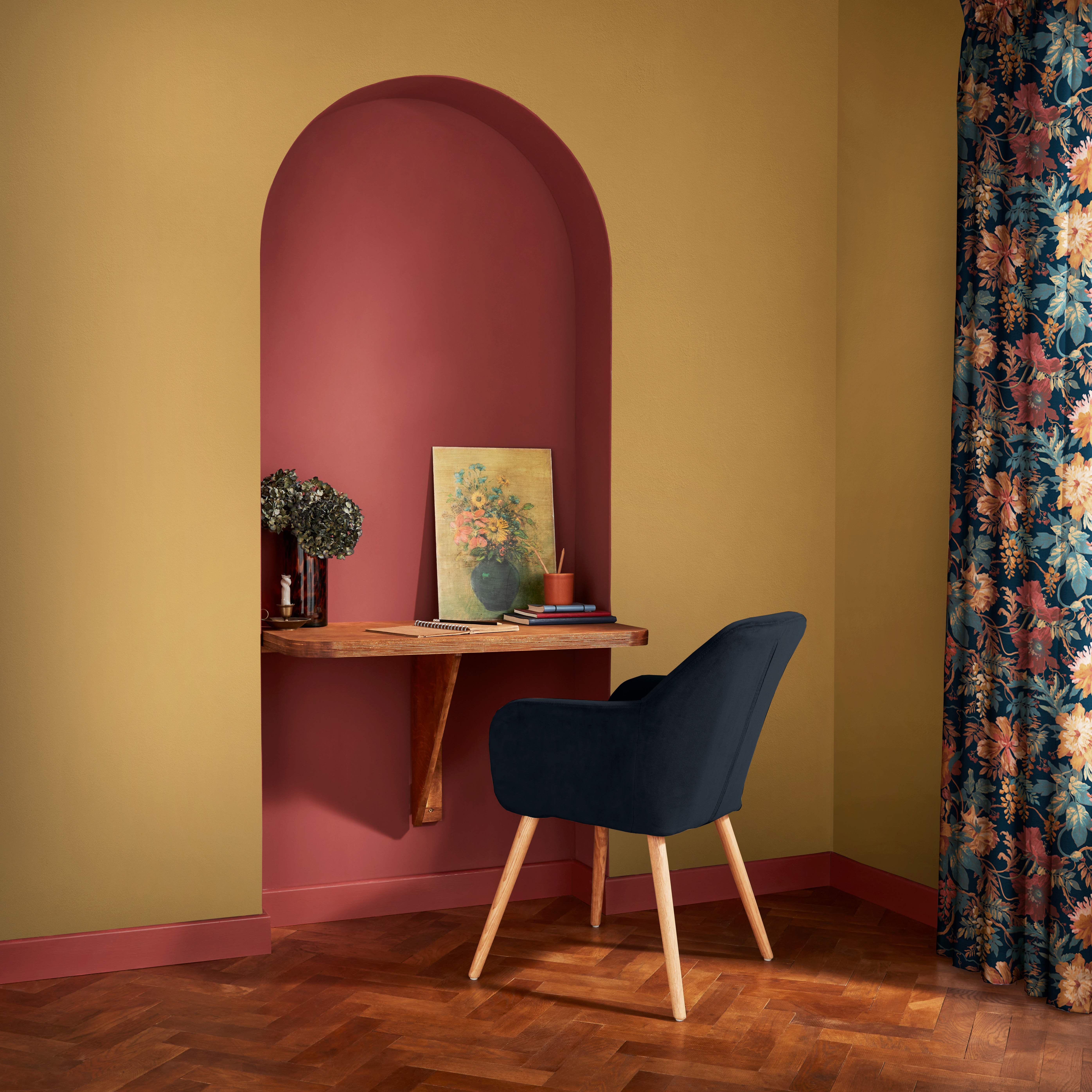
For colors that go with yellow, red is a great choice if you're looking to make a bold, dramatic statement. The colors offset each other, making the interior feel more lively and excitable. Since both red and yellow are bright hues, consider warm, yellow lighting to subdue their stark effect.
"Brick red and mustard yellow evoke a rustic, earthy charm, making this combination ideal for kitchens or entryways," notes Nina. "Use brick red as a textured accent wall or in floor tiles, pairing it with mustard yellow decor pieces like curtains, rugs, or cabinetry."
9. Red and gray
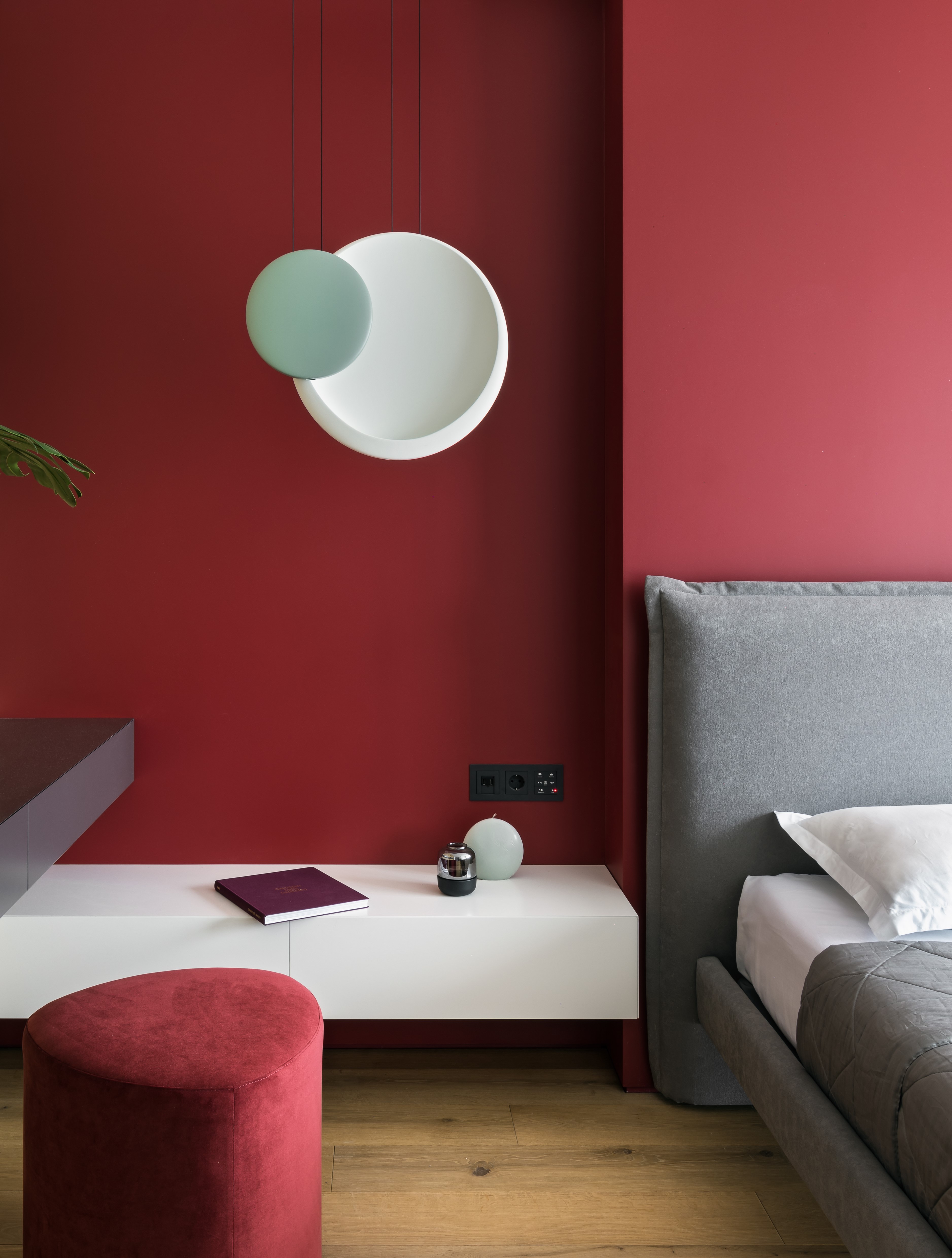
While red is a fierce, passionate, statement-making hue, gray is a color of solace and comfort. When used together, the two create a unique balance of eclecticism and can transform any room.
"Cranberry red adds depth, while charcoal gray introduces a sleek, modern feel," Nina explains. "This duo is great for home offices or dining rooms, where the darker tones promote focus and relaxation. Use cranberry as a bold accent, such as in artwork or a feature wall, against charcoal-painted walls or furniture."
If you're keen to have a statement wall in red as part of your bedroom color ideas, a good way to reduce its overbearing effect is to use gray in the upholstery. Red is a lovely color to show off your home's architectural features too, so if you have nice cornice work or wainscoting, consider painting it red.
10. Red and navy blue
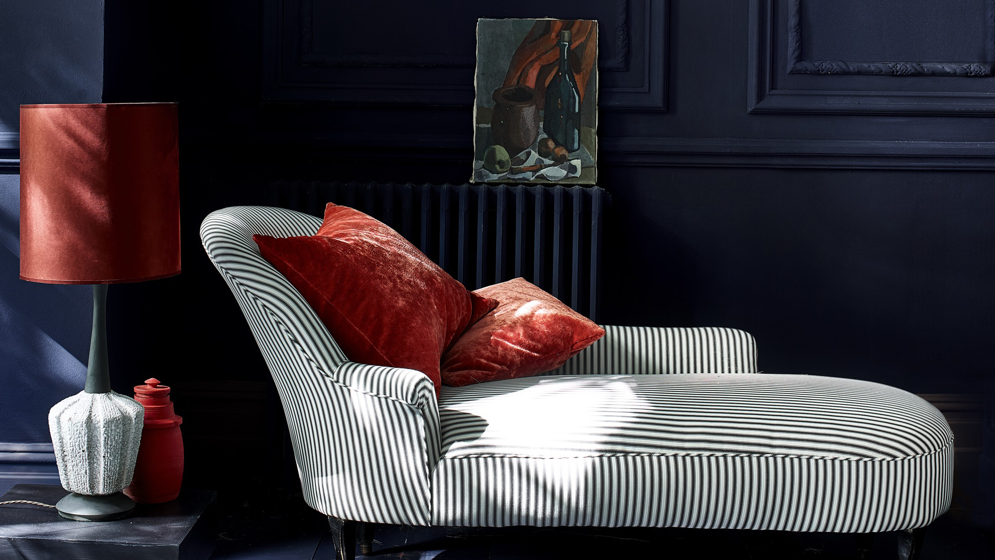
For a rich, warm paint idea, red and navy blue are a timeless and classic choice. Opt for smokey red tones or deep burgundy to match navy's moody energy. Red works best as an accent here, offering just the right dose of warmth to heat up a dark blue space.
"This classic, patriotic pairing brings both vibrancy and sophistication," Nina says. "Cherry red works best as a pop of color against the grounding navy blue. Consider a navy-blue wall or furniture with cherry-red accents like throw pillows, artwork, or smaller pieces of furniture."
FAQs
What colors don't go with red?
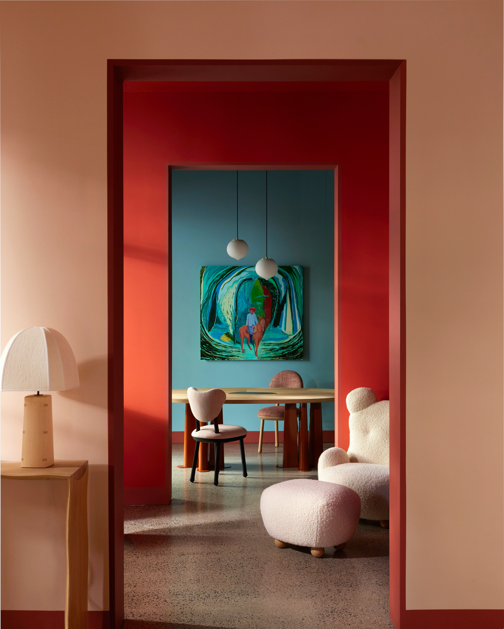
While red is a brilliant statement hue that offers great versatility, this dramatic shade doesn't pair with every color. It also demands more intention than softer shades or neutrals since it's so powerful and domineering.
Although you can make nearly any shade work with red if you choose paler, more nuanced tones, Nina urges us to steer especially clear of bright greens. "While muted or earthy greens like olive can work with red, bright green often creates a jarring contrast that can feel too festive," she says. "It’s difficult to create a sophisticated look with such a stark contrast."
Why is red trending?
Red has enjoyed a resurgence this past year with bright, tomato-like tones cropping up in many high-end designs. Peppering spaces with this bright accent can instantly elevate a space, adding depth, dimension, and an element of the unexpected. It's a trick that's since been aptly coined the unexpected red theory. "It shows that, used confidently, red is a color that will add charisma and a touch of charm to just about any decorating scheme," says Helen.
The widespread welcome of this trend signifies a daring approach to design that's happening right now. "After years of minimalism and cool-toned interiors, homeowners are embracing color again, and red, with its associations with passion and energy, is leading the charge," says Nina. "From accents to bold feature walls, red is setting the tone for spaces that are lively, dynamic, and full of personality, as people seek out environments that reflect their individuality and emotional warmth."

Lilith Hudson is a freelance writer and regular contributor to Livingetc. She holds an MA in Magazine Journalism from City, University of London, and has written for various titles including Homes & Gardens, House Beautiful, Advnture, the Saturday Times Magazine, Evening Standard, DJ Mag, Metro, and The Simple Things Magazine.
Prior to going freelance, Lilith was the News and Trends Editor at Livingetc. It was a role that helped her develop a keen eye for spotting all the latest micro-trends, interior hacks, and viral decor must-haves you need in your home. With a constant ear to the ground on the design scene, she's ahead of the curve when it comes to the latest color that's sweeping interiors or the hot new style to decorate our homes.
- Aditi SharmaFormer Design Editor
- Rory RobertsonDesign Expert

