These 5 colors to avoid on a ceiling will stop you making rooms feel smaller than they are
Knowing the colors to avoid on a ceiling can help you create expansive decor schemes where rooms feel bigger than they are
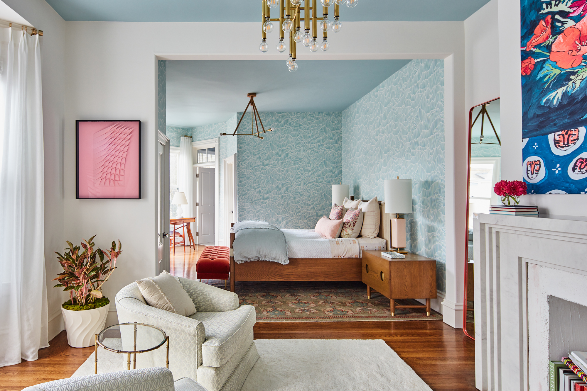

Colors to avoid on a ceiling don't tend to get too much attention - many of us default to white and don't worry about all the other hues. Plus we are all far more enthralled in choosing the right wall colors, the perfect furniture the exact fixtures and fittings that are going to complete the space right? The ceiling is a bit of an after thought, usually painted in some version of magnolia blah and left to go unnoticed.
However, the fifth wall is finally gaining some traction in the world of interior design trends. We are now seeing more experimental paint ideas; more colorful ceilings and wallpapered ceilings. And there's no denying it's a tricky look to get right, there's a reason white ceilings have reigned for so long. Get your shade wrong and you will instantly shrink a room, so we asked the experts, what colors to avoid on a ceiling (and what colors will always work).
Now we say never, but as with any paint color for any room and any surface, there are so many things to consider when choosing a shade. And while we can offer up advice on what should be avoided, you should always take your space and style into consideration too. Different colors and paint finishes are going to work for different sizes, shapes and the amount of light your room gets, and of course the vibe you want to create is important too.
'The ceiling should be considered carefully within your color scheme, it is often the largest expanse of color you will have in a space, so it will have a big impact on how the space will feel.' explains Ruth Mottershead Creative Director of Little Greene. 'Whether you opt to continue the flow of color up to the ceiling for a cohesive look or a contrasting color for a dramatic focal point, painting your ceilings is a great way to finish off the look of the room.'
5 colors to avoid on a ceiling - and what to use instead
1. Red
'When you paint the color of your ceiling it can either make your room feel a lot taller, or it can make the room feel a lot smaller. So have a think about the feeling you want that room to have, are you wanting to make it cozier or are you wanting to make it feel more grand, light, and airy?' says Tash Bradley, color expert at Lick.
If you are working with a smaller space and obviously want to add that height and loftiness, you want to avoid anything with a warm undertone (that's perfect for the cocooning effect). As Tash explains, 'oranges, yellows, and reds have the shortest wavelengths, so your eye is always drawn to those colors first, so you pick up these shades before blues and greens. So if you were to paint for the ceiling in a red, you are always going to bring the ceiling height down.'
'Harsh colors like red, with their powerful energy and elegance, can make a statement if used on your ceiling but it’s better to avoid them in places where you are seeking serenity, like in the bedroom or living room.' adds Tobie Lewis of Valspar.
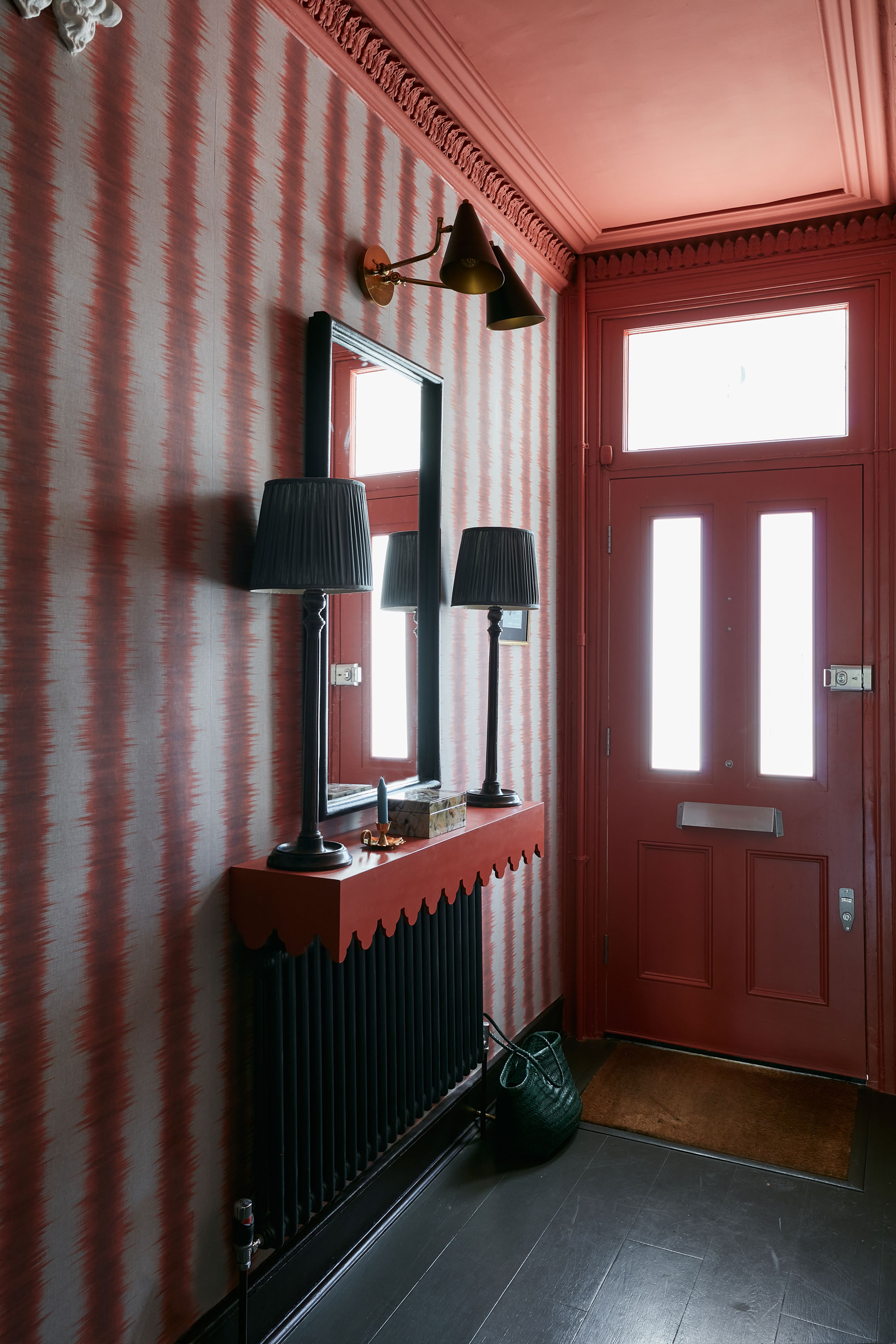
Red ceilings can work, as this entryway proves. But stick with less high-saturated colors, look for soft terracotta shades with a chalky quality that's going to town down the drama of using such a bold hue. And note the striped wallpaper that's helping add heigh, despite the darker color on the ceiling.
2. White - yes, really!

Surprise surprise, white was the most common response when we asked designer what colors to avoid on a ceiling. Finally, it seems that color trends are shifting away from sticking to just plain old neutrals on a ceiling and white should no longer be the go-to.
'The ceiling should always be considered in the color scheme. Known as the fifth wall, make sure this gets as much attention as the other walls - if left white you’ll run the risk of it feeling forgotten.' explains Emma Bestley, Co-founder and Creative Director for YesColours.
'Unless your ceilings and walls are the same white, I would certainly recommend keeping away from stark white simply because it won’t add anything to your room.' adds Clare Tilbrook of Fenwick & Tillbrook.
'Your ceiling wants to compliment the colors of your walls. A stark white will have a small amount of black tint and therefore a rather grey feel to it; rather than a reflective light, it will sap the room. Stark white will offer very little to the overall feel of your room.'
Of course, there are exceptions to when white works as a ceiling color, case in point with this modern bedroom. If you want a clean, crisp, minimalist look, you just can't go wrong with a true white.
3. Black
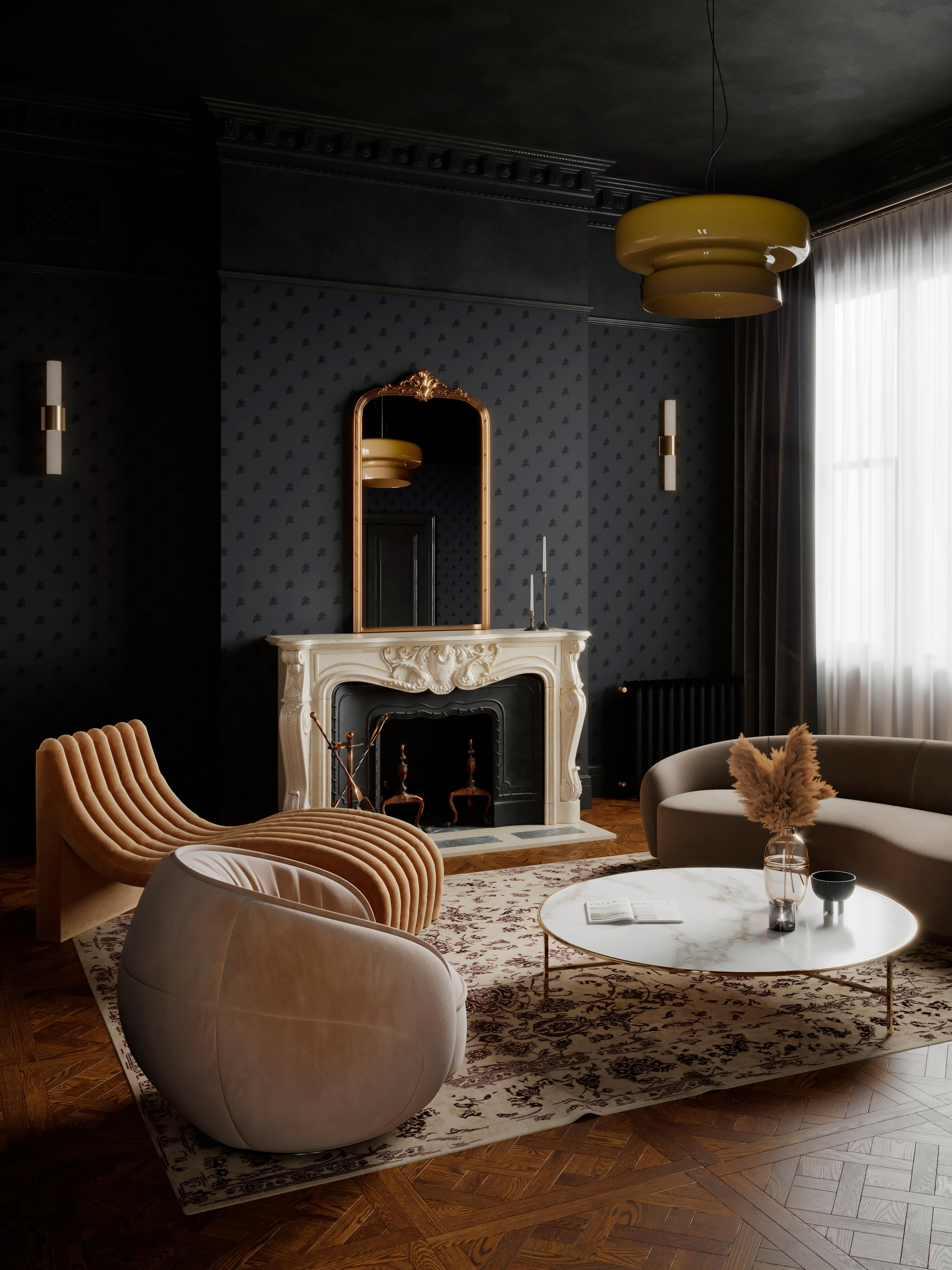
Now let us preface this with we have seen plenty of black ceilings that look incredibly cool and chic. But it's a tricky look to get right, and we would only really recommend it in a house with lofty proportions that can handle the ceiling-lowering effects of this color.
'Dark colors on the ceiling, such as black, navy or charcoal grey can make a space feel smaller, closed in and oppressive, so we wouldn’t recommend them in smaller spaces.' says Saskia Howard, Creative Director at Howark Design.
Jen and Marr of Interior Fox agree; 'the ceiling provides the perfect canvas to let your personality shine through and another opportunity to elevate the room. Darker tones can add interesting contrast, but these work best of period homes with taller ceilings so they can create a cozy feeling without feeling too cramped.'
If you are going to experiment with a dark ceiling, be inspired by this deliciously dark living room and go for a soft, velvety paint that has plenty of depth. And if you are feeling brave, take it down the walls too for all the drama.
4. Cream
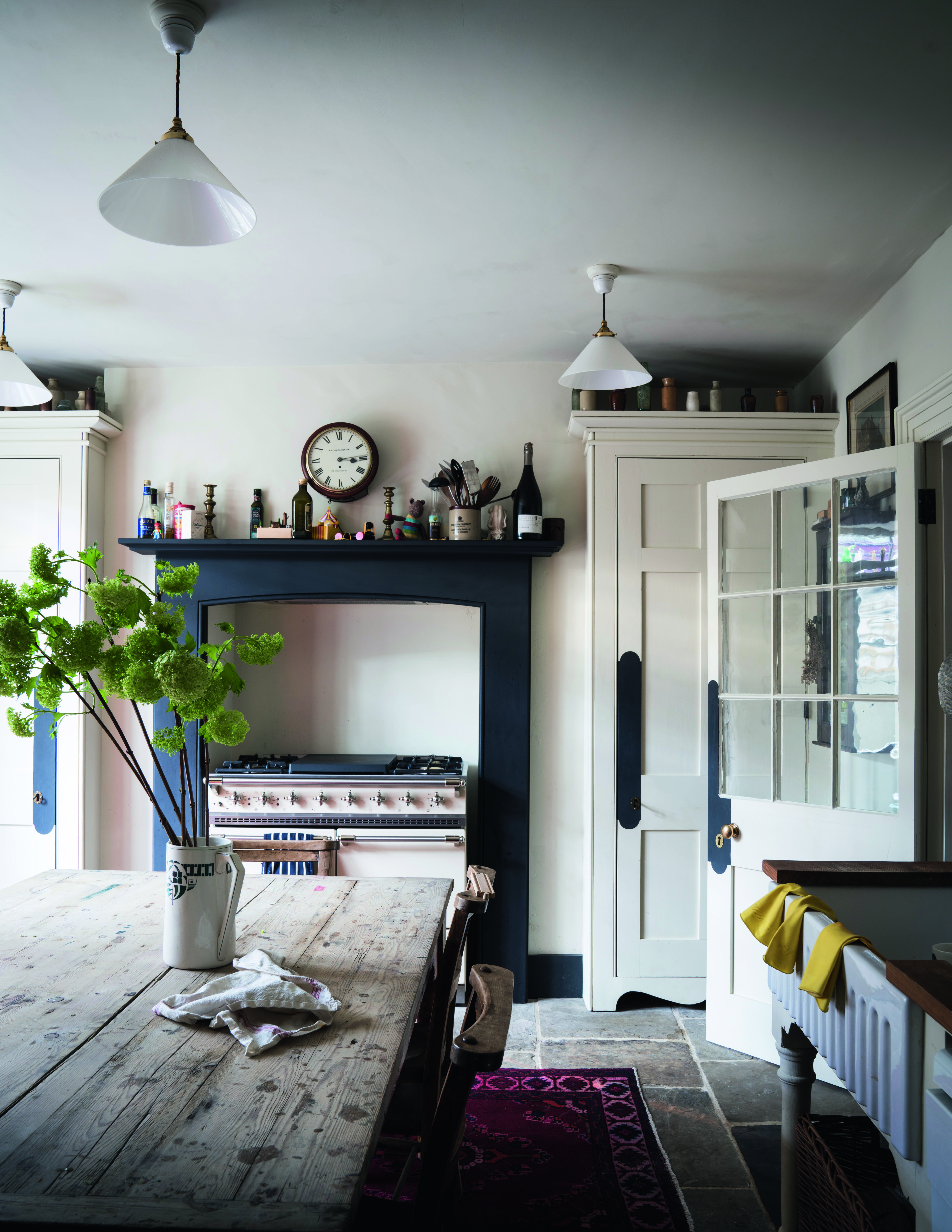
Another go to ceiling color that is on the out. While we love cream when it's layered with lots of textures in a neutral living room, and it's in the form of rugs or cushions or zellige tiles, we just can't warm to it in its paint form. It's can be so reminiscent of magnolia walls favored by landlords and bland hotels the world over that we think it should be avoided in our homes.
'I do think anything goes but it is about the ceiling height if it feels appropriate to have a colored ceiling and also the balance of colors within a room.' explains designer Elizabeth Hay. 'One color I would avoid would be cream or off whites, it needs to be more purposeful than this, it should either be standard white or a stronger color or design.' Agreed.
5. Overly contrasting colors
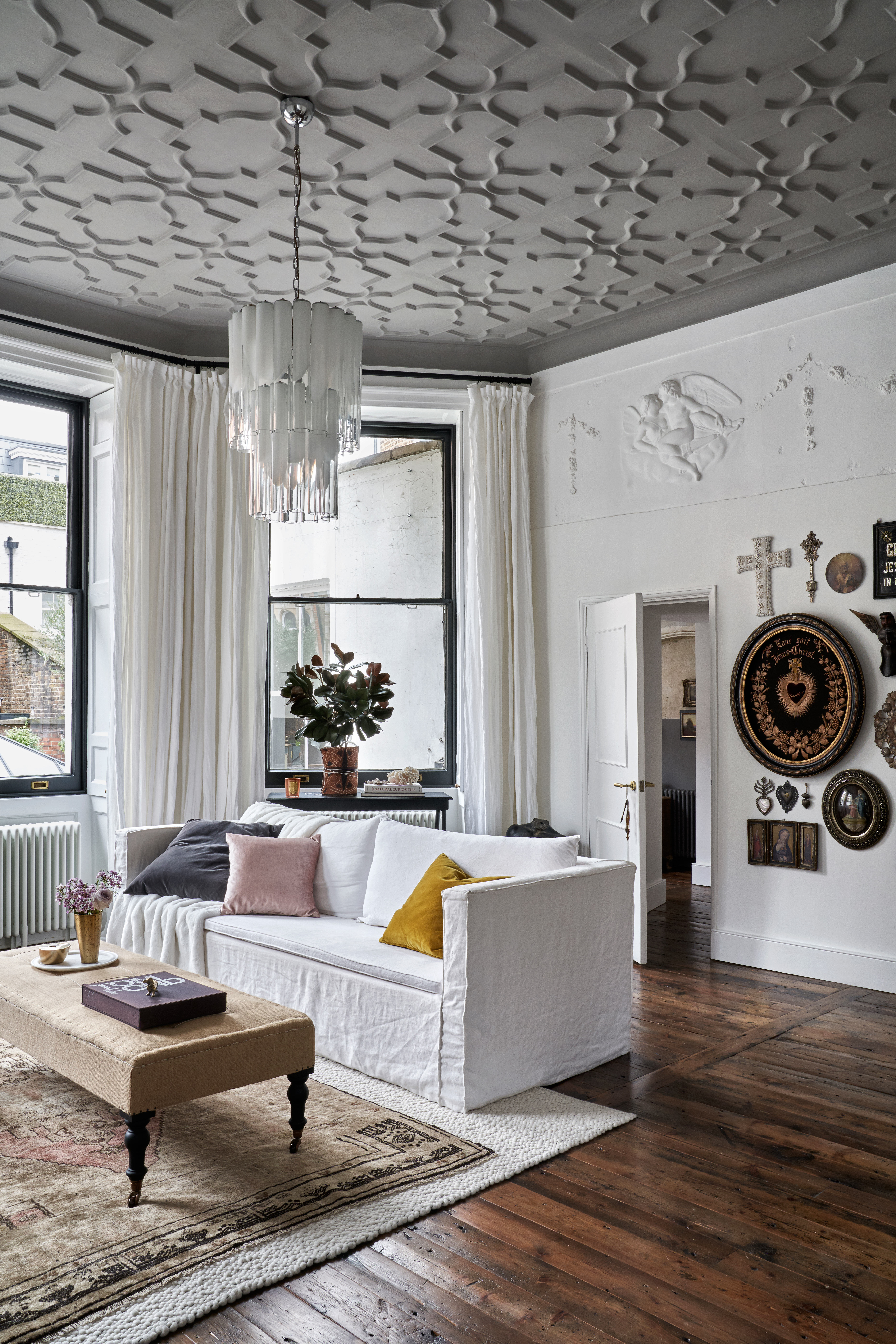
'I would always avoid anything with a really high saturation.' explains Tash. 'Anything too intense. And avoid the contrast being too great between the walls and the ceiling. So if you go for a painted ceiling, always do a complimentary color on the walls. So for example, if you wanted a pink ceiling, paint the walls a white with a pink undertone or blue ceiling with a blue undertone etc. This will soften that contrast.'
Ruth Mottershead of Little Greene suggests ditching the contrast altogether and embrace the interior design trend for color drenching. Stick the to same color on the walls, ceiling and even the woodwork.
'If you want to create the allusion of space, simply paint the walls and ceiling in the same shade to extend the walls upwards. This works particularly well in narrow hallways that may be lacking in natural light.' says Ruth.
'For a bolder feel, use the same color on the woodwork and ceiling or embrace color drenching which takes a single mid-tone color throughout the space, including woodwork, walls, and the ceiling, but if painting all elements in one shade feels a little overwhelming, select a group of tonally coordinating colors and utilize across the room.'
Should a ceiling be darker or lighter than the walls?
'I would always do the ceiling darker than the walls if you want to go for a painted ceiling.' says Tash Bradley. 'I think it gives the impact that you want, it's also a great way to inject some personality and go for a stronger color but it doesn't over dominate the room.'
What are the best colors for a ceiling?
'The best ceiling color is definitely dependent on the type of room that you’re painting.' says designer Marie Flanigan. 'For a living space or bedroom, I prefer to keep the ceiling color and wall color light and bright, which creates the illusion of space. For rooms like a study or powder bath, you can create a jewel box space where the wall color and ceiling color are often the same but in more saturated and deep tones.'
Andy Greenall Head of Design, Paint & Paper Library adds, 'Yellows work beautifully as a highlight color on ceilings, with wide expanses of wall in a neutral or grey and the ceiling, woodwork or door in a rich tone or a warm mustard. Or for a cohesive feel, consider painting the skirting, wall and cornicing in the same color, with a lighter color on the ceiling to create a feeling of height. Try our ‘Grenache’ floor to ceiling on walls, woodwork, and skirting which works beautifully with a lighter ceiling in ‘Lady Char’s Lilac’ to create drama as well as the illusion of height.'
Be The First To Know
The Livingetc newsletters are your inside source for what’s shaping interiors now - and what’s next. Discover trend forecasts, smart style ideas, and curated shopping inspiration that brings design to life. Subscribe today and stay ahead of the curve.

Formerly the Digital Editor of Livingetc, Hebe is currently the Head of Interiors at sister site Homes & Gardens; she has a background in lifestyle and interior journalism and a passion for renovating small spaces. You'll usually find her attempting DIY, whether it's spray painting her whole kitchen, don't try that at home, or ever-changing the wallpaper in her entryway. She loves being able to help others make decisions when decorating their own homes. A couple of years ago she moved from renting to owning her first teeny tiny Edwardian flat in London with her whippet Willow (who yes she chose to match her interiors...) and is already on the lookout for her next project.
-
 Turns Out the Coolest New Café is Actually In Your Kitchen — Here's How to Steal the Style of TikTok's Latest Trend
Goodbye, over-priced lattes. Hello, home-brewed coffee with friends. TikTok's 'Home Cafe' trend brings stylish cafe culture into the comfort of your own home
By Devin Toolen Published
-
 5 Bathroom Layouts That Look Dated in 2025 — Plus the Alternatives Designers Use Instead for a More Contemporary Space
For a bathroom that feels in line with the times, avoid these layouts and be more intentional with the placement and positioning of your features and fixtures
By Lilith Hudson Published