What Colors Make a Room Look Bigger? 5 That Designers Reach for to Make Walls 'Visually Expand'
Color can have a transformative effect on how we perceive spaces — here’s how the experts make small rooms look more expansive

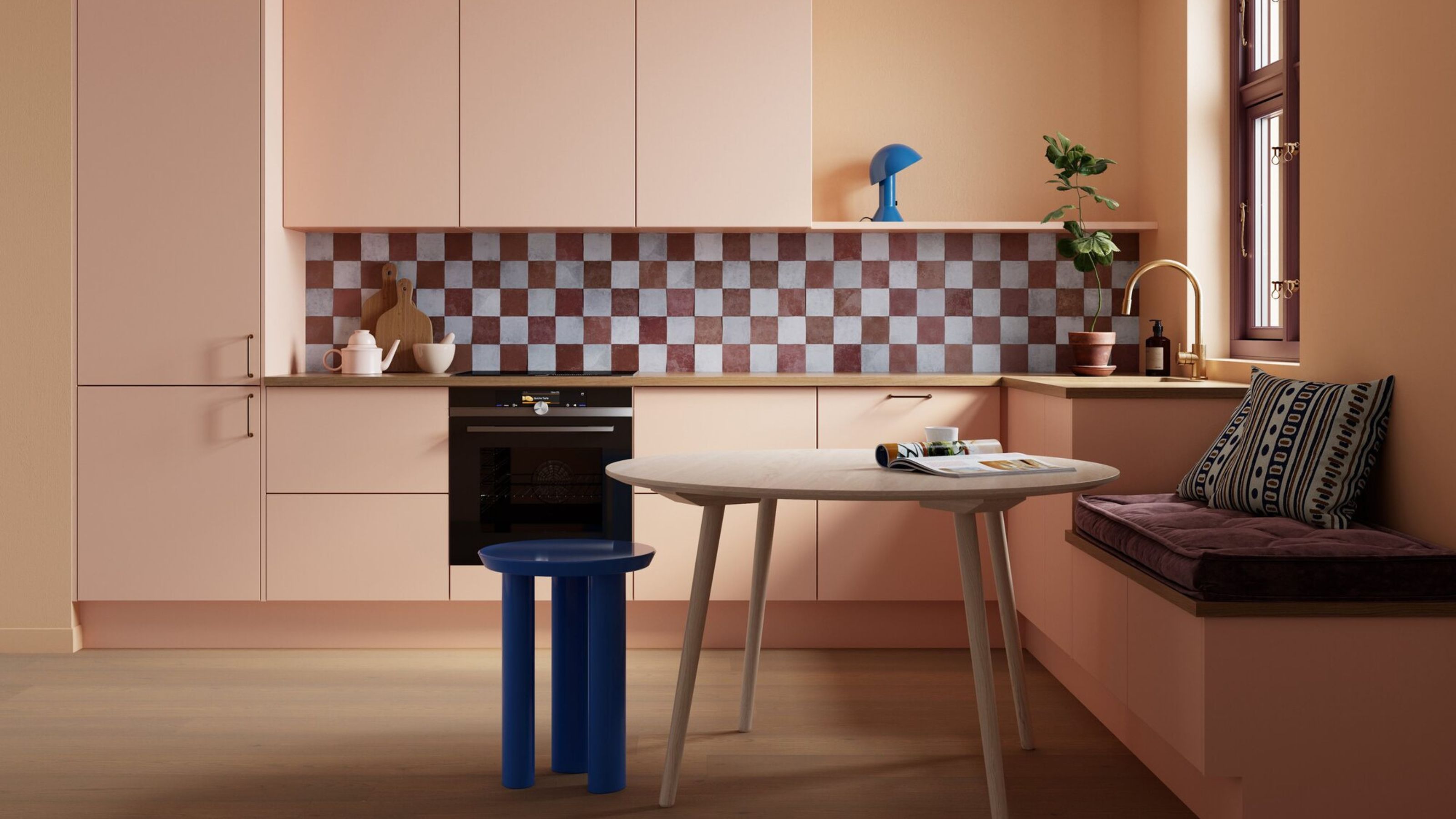
No matter where you live, it’s likely you’d enjoy having a little more space to play with. If extending isn’t an option, using color is a simple way to trick the eye into believing even the smallest room is more substantial. Interior designers have long used different shades to create the illusion of extra square footage.
What colors make a room look bigger? Because some work better than others. Well, when it comes to decorating with color for the purpose of making a room look bigger, designers often turn to pink. “From very pale shades through to powdery and chalky tones, pinks might not be as associated with enhancing space in the same way as white or beige, but the color offers real spatial clarity without the risk of appearing cold or flat,” explains interior designer Emma Deterding of Kelling Designs.
Of course, other colors are also effective in stretching the visual boundaries of a smaller space, and some even tap into the latest color trends for 2025, too. Read on to discover what colors make a room look and feel bigger.
Article continues below1. Uplifting Yellows
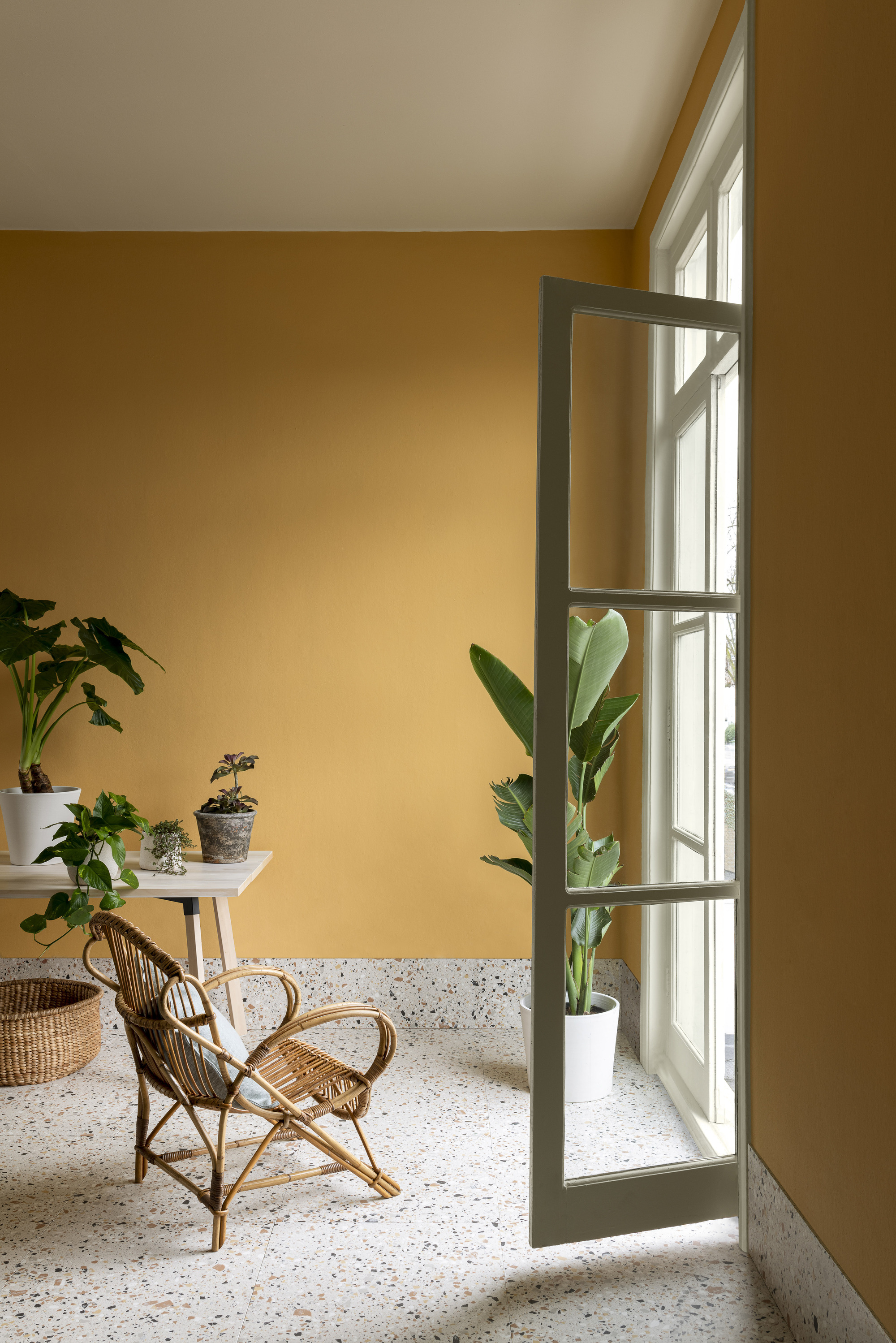
Yellow shades react wonderfully with natural light, making spaces appear longer and wider.
“Rich yellows can transform the atmosphere of a space, evoking positivity and warmth,” says Andy Greenall, head of design at Paint & Paper Library. “In more compact spaces, you can afford to use strong versions of the color as, unlike other shades, they won’t make rooms appear darker.”
Decorating with yellow is also an excellent way to reflect natural light. It bounces it around to make rooms feel open and airy and, therefore, bigger. “A pop of bright, dynamic yellow on walls, window frames, or furniture can enhance the dimensions of a space and make it appear larger,” adds Andy.
No matter the exact shade of yellow, the color pairs well with white, another color traditionally used to create a more expansive feeling in a space. “Yellow works well to reduce the visual impact of a room’s boundaries,” says Andy.
2. Muted Terracottas
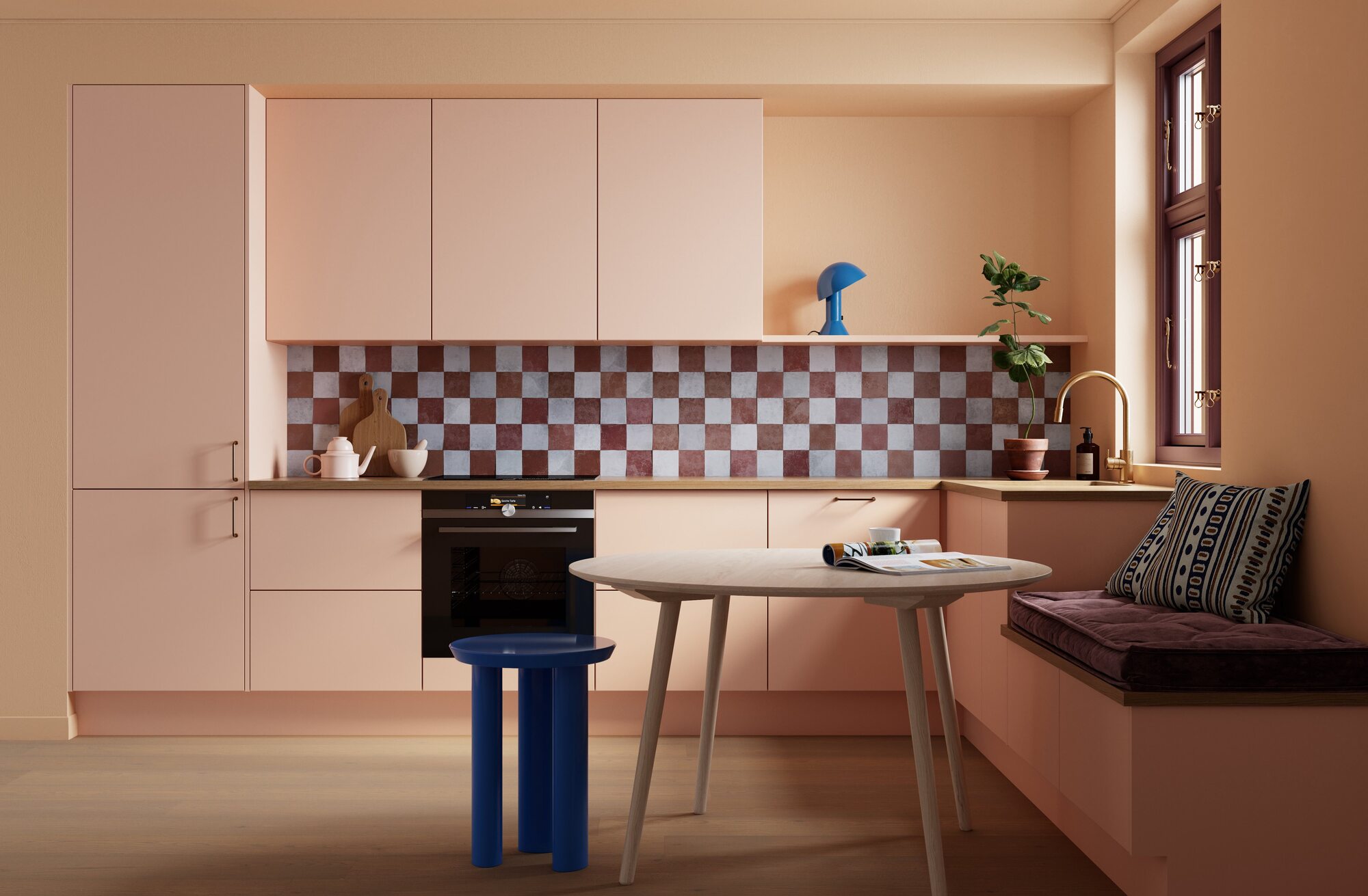
A pale version of this earthy shade is ideal for making compact spaces look and feel bigger.
If you’re keen to stick to a neutral, make it a more interesting choice by using one with a pink undertone. “A pale terracotta hue adds a grounded, comforting quality compared to beige, gray, or white, and offers much more character,” explains Dagny Thurmann-Moe, founder of KOI Colour and Design Studio.
The Livingetc newsletters are your inside source for what’s shaping interiors now - and what’s next. Discover trend forecasts, smart style ideas, and curated shopping inspiration that brings design to life. Subscribe today and stay ahead of the curve.
“Deeper versions of the color tend to absorb more light and make a small room feel even more compact, but a paler version reflects it gently without losing its sense of coziness,” she adds. “It’s a less heavy interpretation of traditional terracotta that feels very modern, ideal for creating a space that feels calm, cohesive, and much larger than it really is.”
This pinky shade works well all over and is an excellent candidate if you’re considering color drenching, which can help to blur edges and reduce visual contrast. “This helps to make a space feel more unified and visually expansive, with a lack of strong contrast encouraging the eye to move fluidly throughout a space rather than stopping on different surfaces,” says Dagny.
Based in Oslo, Dagny is an interior designer who has recently collaborated on a paint range with Scandi brand Pure & Original. She is known for her love of color and has even delivered a TEDx talk on the subject.
3. Vibrant Greens
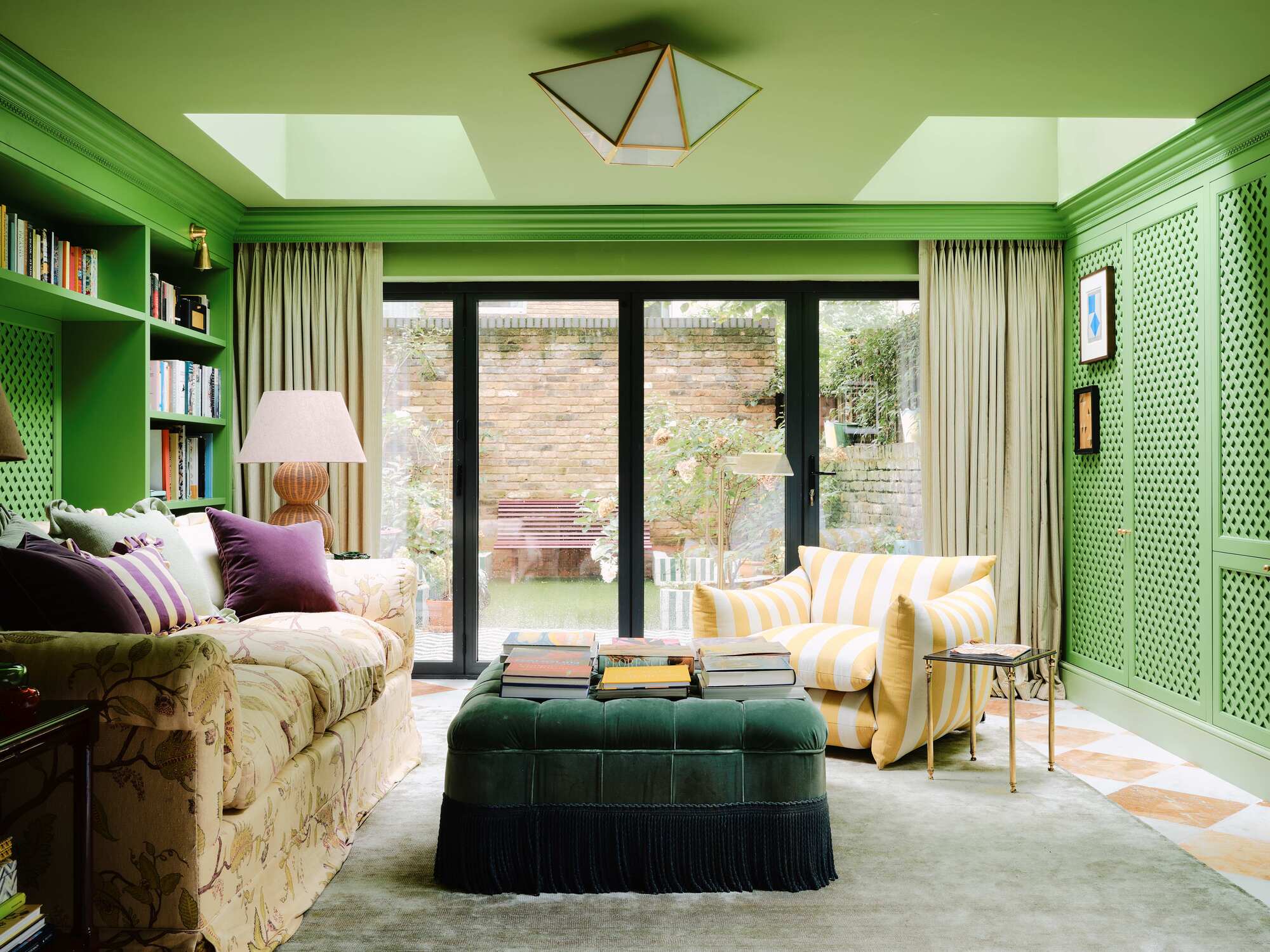
Perhaps surprisingly, a bold shade of green can open up a room, especially in rooms with a view to trees or foliage.
On the brighter end of the spectrum, decorating with green can be an effective color to visually expand the dimensions of a space. “It’s a powerful choice and is particularly effective in rooms with a view,” says Lena Dahnsjo, a color consultant at Edward Bulmer.
“Here, Studio Duggan have blurred the boundaries between living space and outdoor space by drawing the eye to the window," she explains. "It visually expands the room by bringing the colors of nature inside and creating an extension of the garden beyond.”
While the walls are painted in a bold green, the ceiling is in a lighter version of the color — a technique called 'color capping'. “As there’s not enough difference between the shades to create definite visual lines, which could make everything seem smaller, this helps to create an immersive experience in the space.”
4. Palest Pinks
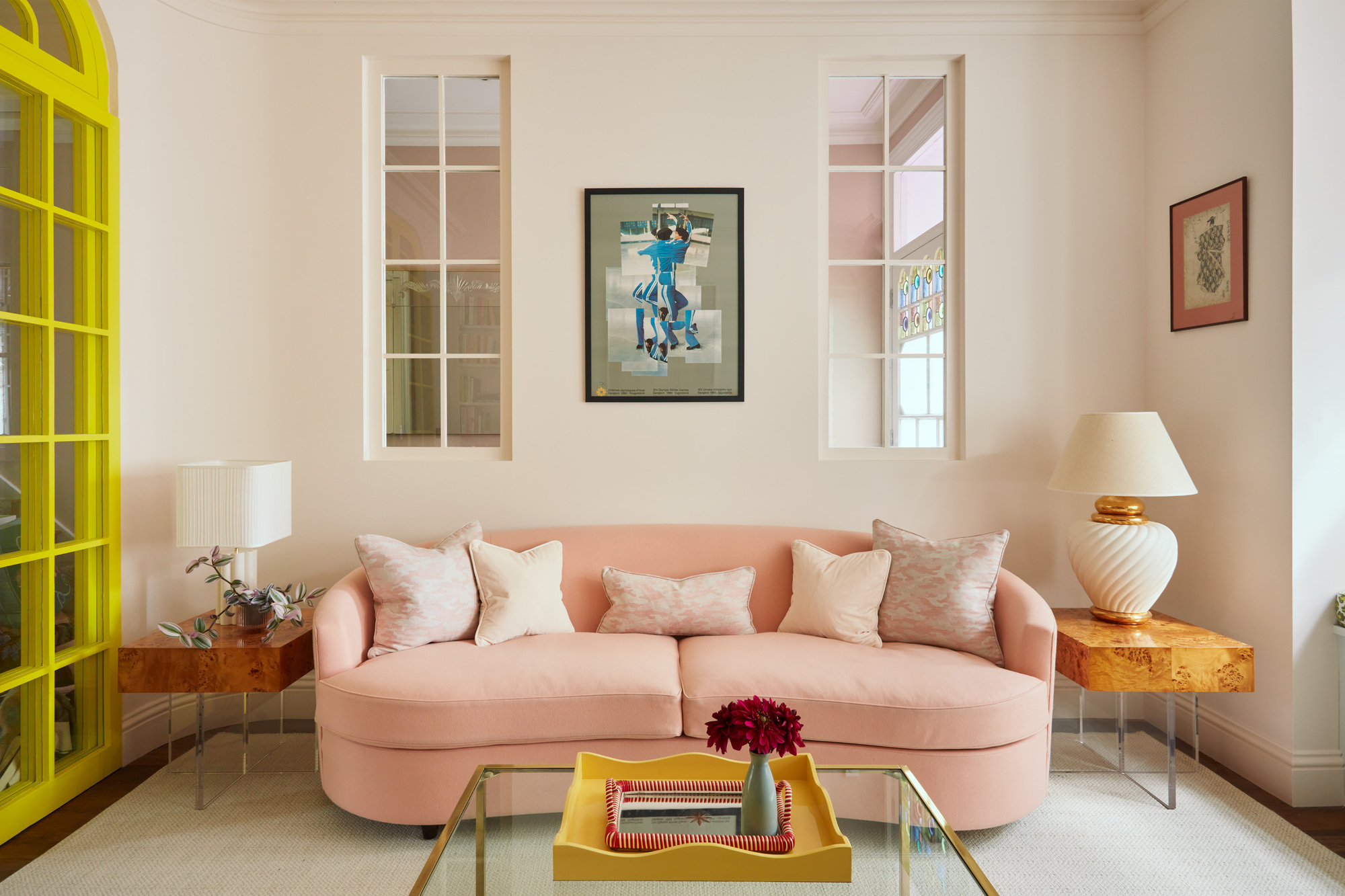
If you’re considering painting in white, a version featuring a pale pink pigment will add warmth while maximizing an illusion of space.
“Decorating with a really light color always helps to open up a space,” explain Ellen Cumber and Alice Bettington, interior designers and founders of Golden. “Even the faintest hint of pink gives much more personality, and this very pale hue just has so much more character than a white or cream tone does.”
In this London sitting room, the pair used Kensington Rose by Mylands, a soft white-pink containing very delicate red undertones. “To enhance the sense of spaciousness, we painted the ceiling the same color which allows the eye to roam without interruption.”
Of course, very pale walls can show scuffs and stains easily, so it’s worthwhile considering performance or heavy-duty paint finishes to avoid unsightly marks. “It can’t withstand being touched very much, but using plenty of texture in a scheme can help to draw the eye away from any tiny marks,” the designers add.
5. Deep Blues
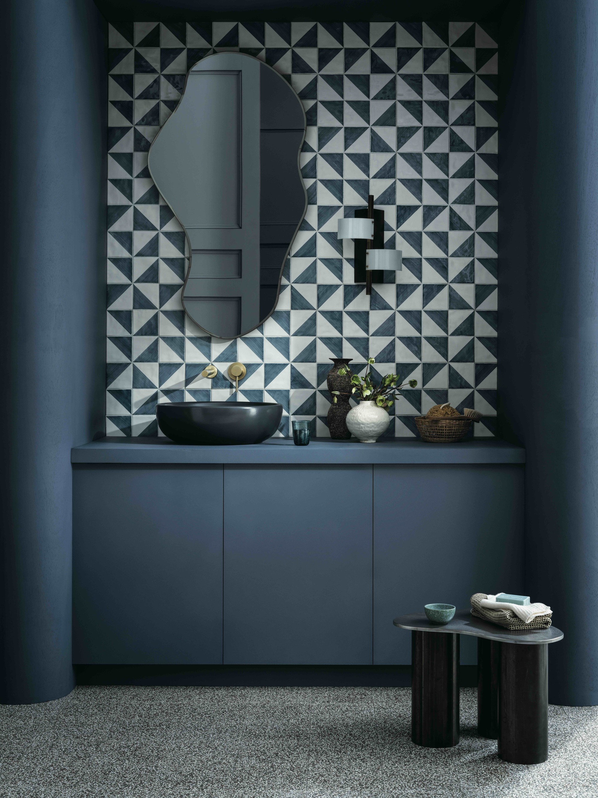
Even dark colors can be used to make spaces feel bigger, as long as they’re combined with light and texture.
“While it’s commonly thought that only light colors can be used to make a space feel larger, dark tones — especially rich, deep blues — can bring a sense of spaciousness when they’re used thoughtfully,” reveals Ali Childs, interior designer and founder of Studio Alexandra.
“Dark blue has a natural receding quality, drawing the eye inward to create a sense of depth,” she explains. “In this bathroom, the dark cabinetry and walls recede visually, giving the illusion of a more expansive space instead of a confined one.”
To use darker shades in a way that creates the illusion of extra space, don’t be afraid to give them room to breathe. Consider introducing elements of white, but in a measured way — the geometric tiles here, for example, are softened by plenty of organic curves. “It’s important to control the contrast,” Ali says.
Ali is known for creating colorful interiors full of character, and has worked on residential and commercial projects across Europe. She is known for her sustainable approach to design and is passionate about creating truly bespoke spaces with “soul and longevity.”
FAQs
What is most important when making a room look bigger: the color of your floors, walls, or furniture?
The color used on walls plays a huge visual role in a space, simply because they occupy the most surface area. They also set the boundaries of a space, acting as a ‘stop’ for the eye, so blurring them with a clever use of color helps to create a more expansive feel.
Then, of course, the color of other elements in your room can make a difference, such as your floors and furniture. Especially if you decide to highlight one of these pieces in stark contrast to the color scheme of the rest of your room, drawing the eye, and doubling its impact.
From a variety of pinks through to bolder greens and blues, color can have a surprising effect on the boundaries of your space. No matter what room you're decorating, the right shades can make your space feel all the bigger.
Need more inspiration for your compact space? By choosing the right pattern, you can use wallpaper to make your room look bigger, too.

James Cunningham is a freelance journalist based in London. He has written extensively on design and decorating for some of the UK’s leading publications, including House Beautiful, ELLE Decoration, and Country Living, and previously served as Homes and Gardens Editor at Good Housekeeping. When he’s not at his desk, James can be found globetrotting in search of good food, better wine, and the best architecture.


