I Was Convinced These Color Pairings Were Controversial — But Designers Have Persuaded Me Otherwise
Looking for daring color combos for your home? These unconventional, almost debatable palettes could be the ones to choose from

When it comes to color pairings, there are endless possibilities, albeit a few. Or at least I thought so until I spoke to designers. A few combos that are popularly known to be too stark or jarring aren't always a bad idea, as long as you're using them the right way, in the right places, and the right ratio.
So what is the secret formula to working with 'controversial' pairings? Brace yourselves as experts take us through these daring color trends that may be considered taboo but can be equally exciting and personality-filled.
1. Red and green
Do red and green go together? Probably only during Christmas! The two colors are famously associated with holiday decor, and also sit opposite each other on the color wheel, creating a sharp contrast.
'The intense warmth of red can overpower the coolness of green, creating a visually jarring effect if not balanced properly,' says Ashley Macuga of Collected Interiors. 'Instead, you could go in for a red and teal, as these two can each add vibrancy and visual contrast to a space. Red is a color of passion, whereas teal is a color associated with tranquility, which means that each can balance the other. It is important to play with saturation, adjusting the warm and cool undertones to ensure a palette that feels connected.'
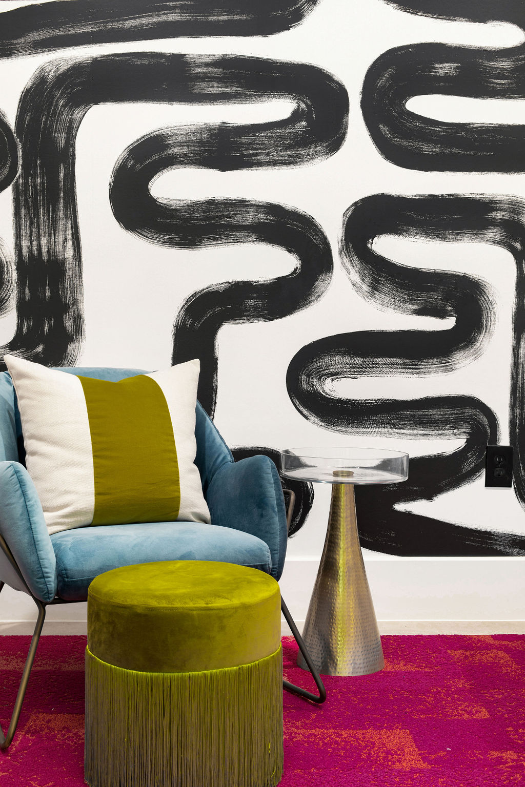
Alternately, Lindsie Davis of Blueberry Jones Design suggests a more pop-color technique ideal for smaller spaces. 'Consider chartreuse (yellow-green) and magenta (purplish-red) tones instead, to create an unexpected punch,' says Lindsie. 'To tone down their intensity, I like pairing them with calming blue hues. This creates a balanced contrast, allowing both colors to stand out without overpowering each other. Try this eclectic color combination in an entryway, living room corner or home office.'
2. Light pink and light blue

When you think of light pink and blue, you probably think of a kids' bedroom or an overly saccharine space that doesn't feel livable. But these tones can be great together if you consider pastel shades of each. And there are several 'grown-up' ways to decorate with pastels.
Pastels are muted by white and as such lack color saturation and vibrancy. This makes them perfect for combining with darker colors and neutrals very well. When you introduce a pairing of pastels, you could add a third deep tone to ground the scheme or a super light neutral such as white or beige for a more airy, open interior.
'In this bedroom, our clients wanted to feel like they were sleeping in the clouds,' says Michelle Gage, founder and creative director at Michelle Gage Interior Design. 'We had to use pastel tones to achieve this. We toned the saccharine hues down with a little fluffy white.'
3. Black and yellow

Think of black and yellow and images of an old fashioned taxi come to mind. This might not be the best imagery to work with in interiors! But as experts suggest, this electric combination can be softened and converted into a more sophisticated palette that is reminiscent of fun Hollywood Regency style.
A good way to combine the two colors is by using black as an accent tone, and using a more earthy yellow...think ochre. This is a color that goes with black and softens the visuals instead of making it seem too stark. 'Accents can help unite a room for a visually tidy and concise space,' says architect Sarah Barnard. 'Because it is visually attention-grabbing, using small amounts of black throughout the room will create harmony, while larger swaths of the other color can draw attention and create focus.'
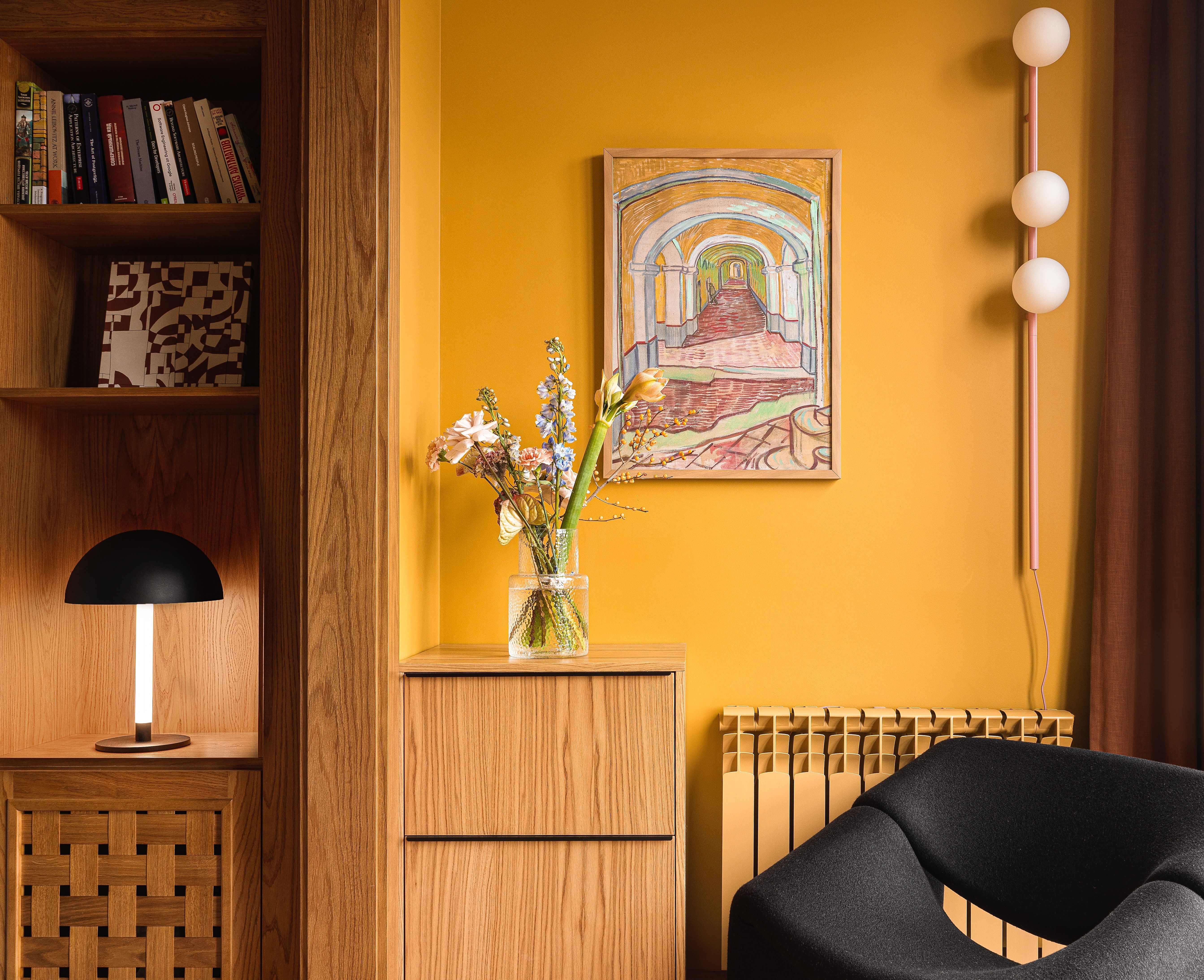
'We aimed to make this long and narrow room feel warm, so we chose a grounded orange-yellow (S392 by Tikkurila) which reminds one of the sunsets and added a black chair for contrast,' says Elina Mussakulova, founder of Sdelaemremont.
4. Pink and emerald green
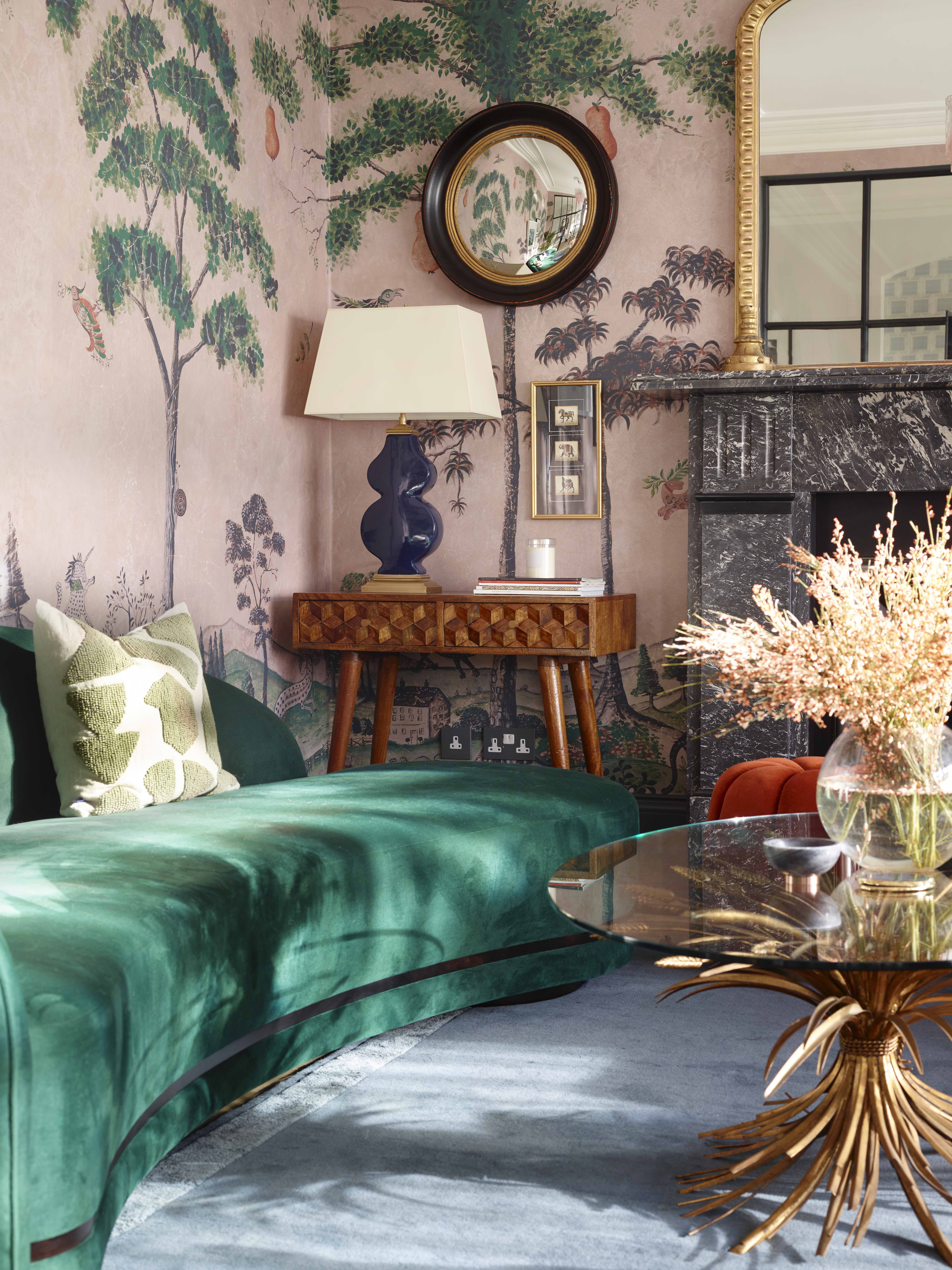
Pink and green sit opposite each other on the color wheel and can make for a sharp combination that might not be to everyone's taste. It's not common to see either boldly displayed in a room, and is generally a combo used in hotels, restaurants or high end bars. But when it's done right, the two can can be effective in creating a new mood in the space. For this, think of emerald green as a color that goes with blush pink for a more sophisticated look. Or you could just use these colors as simple touches in a more neutral room.
'Pair up dusty rose and emerald green for a wonderful combination that can last from winter to summer,' suggests Maria Vassiliou of Maria Zoe Designs. 'This unusual combination can be used in your living room, powder bathroom, or even your kitchen. The richness from the deep green compliments the softness from the pink hues.'
5. Red and blue
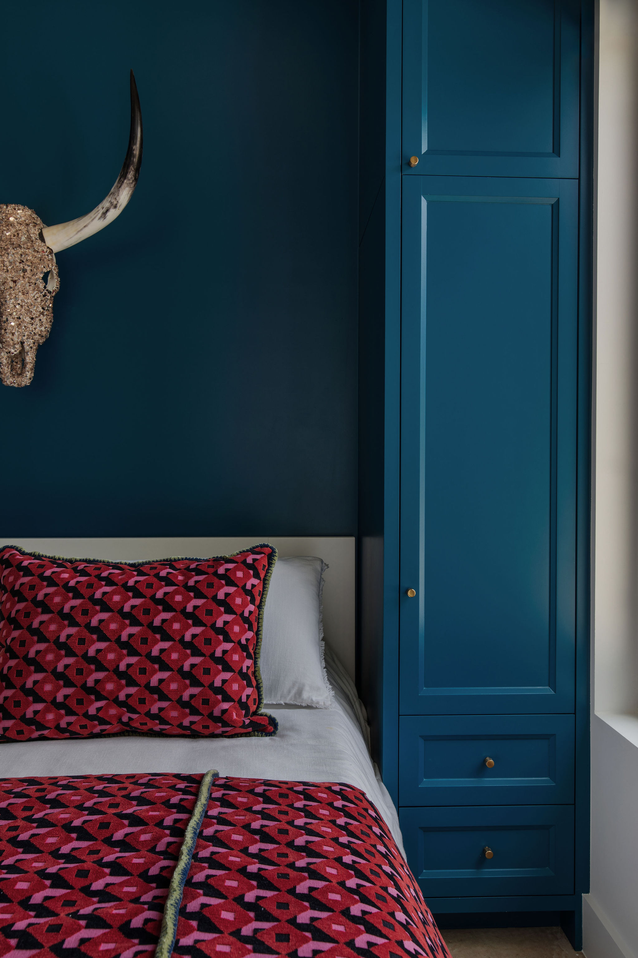
Sure, red and blue will remind you of the US flag and is not a common color scheme for homes. That being said, you can't say the combination doesn't entirely work. With slight adjustments in hue, tint, tone, or shade you can create a look that is dramatic and elegant. Plus, many colors go with red and blue, which means there's a possibility of bringing in a third shade to balance off the two strong colors.
Consider toning down the red by choosing a more earthy hue like terracotta. You could also go in for more modern renditions of blue. 'Soft and serene shades like French blue and powder blue are being used to create calming and tranquil environments,' says Victoria Holly, principal and founder of Victoria Holly Interiors. If you're using one tone liberally, use the second in transient elements like furnishings or decor pieces.
Another way to add these colors is inducing them in a largely neutral space. Think of a mostly white living room with a few dashes of bold orange-red and medium blue. The result will be a relaxed and comfortable vibe.
3 paint colors to create bold palettes with
Be The First To Know
The Livingetc newsletters are your inside source for what’s shaping interiors now - and what’s next. Discover trend forecasts, smart style ideas, and curated shopping inspiration that brings design to life. Subscribe today and stay ahead of the curve.

Aditi Sharma Maheshwari started her career at The Address (The Times of India), a tabloid on interiors and art. She wrote profiles of Indian artists, designers, and architects, and covered inspiring houses and commercial properties. After four years, she moved to ELLE DECOR as a senior features writer, where she contributed to the magazine and website, and also worked alongside the events team on India Design ID — the brand’s 10-day, annual design show. She wrote across topics: from designer interviews, and house tours, to new product launches, shopping pages, and reviews. After three years, she was hired as the senior editor at Houzz. The website content focused on practical advice on decorating the home and making design feel more approachable. She created fresh series on budget buys, design hacks, and DIYs, all backed with expert advice. Equipped with sizable knowledge of the industry and with a good network, she moved to Architectural Digest (Conde Nast) as the digital editor. The publication's focus was on high-end design, and her content highlighted A-listers, starchitects, and high-concept products, all customized for an audience that loves and invests in luxury. After a two-year stint, she moved to the UK and was hired at Livingetc as a design editor. She now freelances for a variety of interiors publications.
-
 Turns Out the Coolest New Café is Actually In Your Kitchen — Here's How to Steal the Style of TikTok's Latest Trend
Goodbye, over-priced lattes. Hello, home-brewed coffee with friends. TikTok's 'Home Cafe' trend brings stylish cafe culture into the comfort of your own home
By Devin Toolen Published
-
 5 Bathroom Layouts That Look Dated in 2025 — Plus the Alternatives Designers Use Instead for a More Contemporary Space
For a bathroom that feels in line with the times, avoid these layouts and be more intentional with the placement and positioning of your features and fixtures
By Lilith Hudson Published

