Cool color schemes – 8 interior palette ideas for a tranquil and serene space
Try these ideas for working with cool color schemes, with expert guidance on the the tones to pick and the best rooms in the house to decorate

Working with cool color schemes and the colder side of the color wheel in your interiors is a great way to revamp your home, creating a mood, illusions of space, and tying a room together with one tasteful palette. From ocean blues evocative of the sea to mossy, forest greens, a cool color palette can create feelings of serenity and calm with their strong ties to the natural world.
'Cool colors can create incredibly calming schemes – ideal for anyone that feel their most relaxed surrounded by the cool colors of nature,' says Charlotte Cosby, head of creative at Farrow & Ball. 'They are also great for contrasting against brighter shades to knock them back.'
'Choosing color palettes that follow the rhythms of the season and take inspiration from nature will always work,' says the interior designer Abigail Ahern, whose cool schemes are often moody, dark, yet enticing – using dark plum, grey-blue and deep green paint color ideas. 'Using calming and restorative paint colors and adding in some uplifting and energizing accents can promote creativity, balance, and a general sense of wellbeing.'
Here, we round up some of the best ways to create a cool color scheme for your home.
What are cool color schemes?
According to color theory, the color wheel is divided into warm colors and cool colors. On this side of the spectrum, you can find greens, blues, purples – evocative of nature, water and sky. On the contrasting side of the wheel you'll find the warm colors that theoretically complement these cool tones. Cool colors aren't overpowering either in a way that warm color schemes sometimes can be, so you can use them in a way that creates a feeling of space and openness.
Embracing a cool color scheme is about the way you work with these tones together, adding a complementary tone in a cool scheme to enhance the colors or by using cool shades against a neutral or white background. It's about using theory and the wheel to shape your interiors in a clever and cohesive way.
1. Blues and white
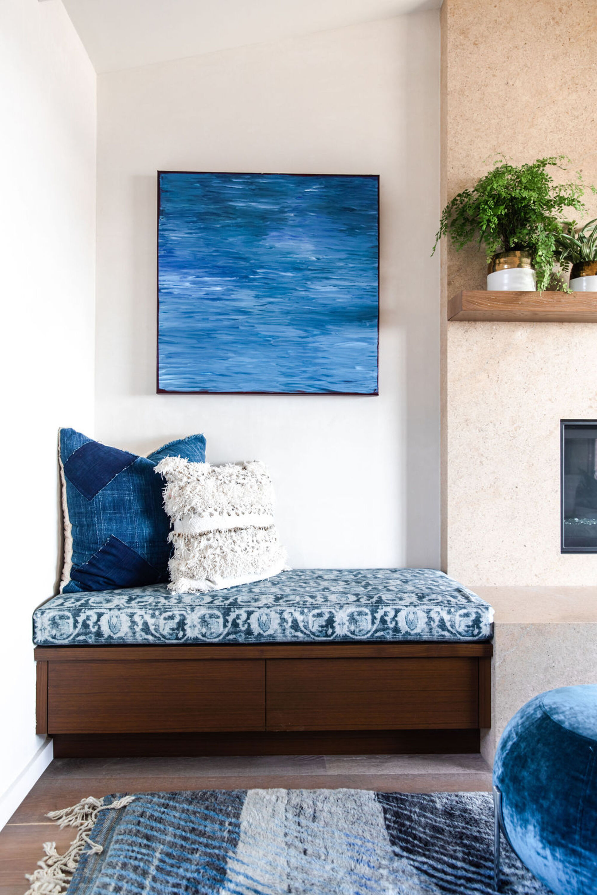
The go-to cool color on the wheel is blue, a bold primary color with strong connotations of water. When paired with white, the boldness of the blue is emphasized and the seaside connotations are emphasized. It's a popular combination of colors used frequently in coastal properties, like Hamptons style decor which is famed for its use of blue and white to bring the outdoors in and relate the location of the home with the scheme and interiors. This project has an ocean view in Stinson Beach, California, which was a key consideration from interior designer and founder of Skornicka Designs & Construction, Susan Skornicka.
'We designed a seaside color story,' says Susan. 'We integrated various hues of blue in the textiles and artwork, creating a harmonious connection with ocean.
'We chose light textured walls and soft sand-colored furnishings to connect with the natural surroundings and adorned the wall with an organic wave-like wood sculpture, creating a flow from the outside in.'
2. Green
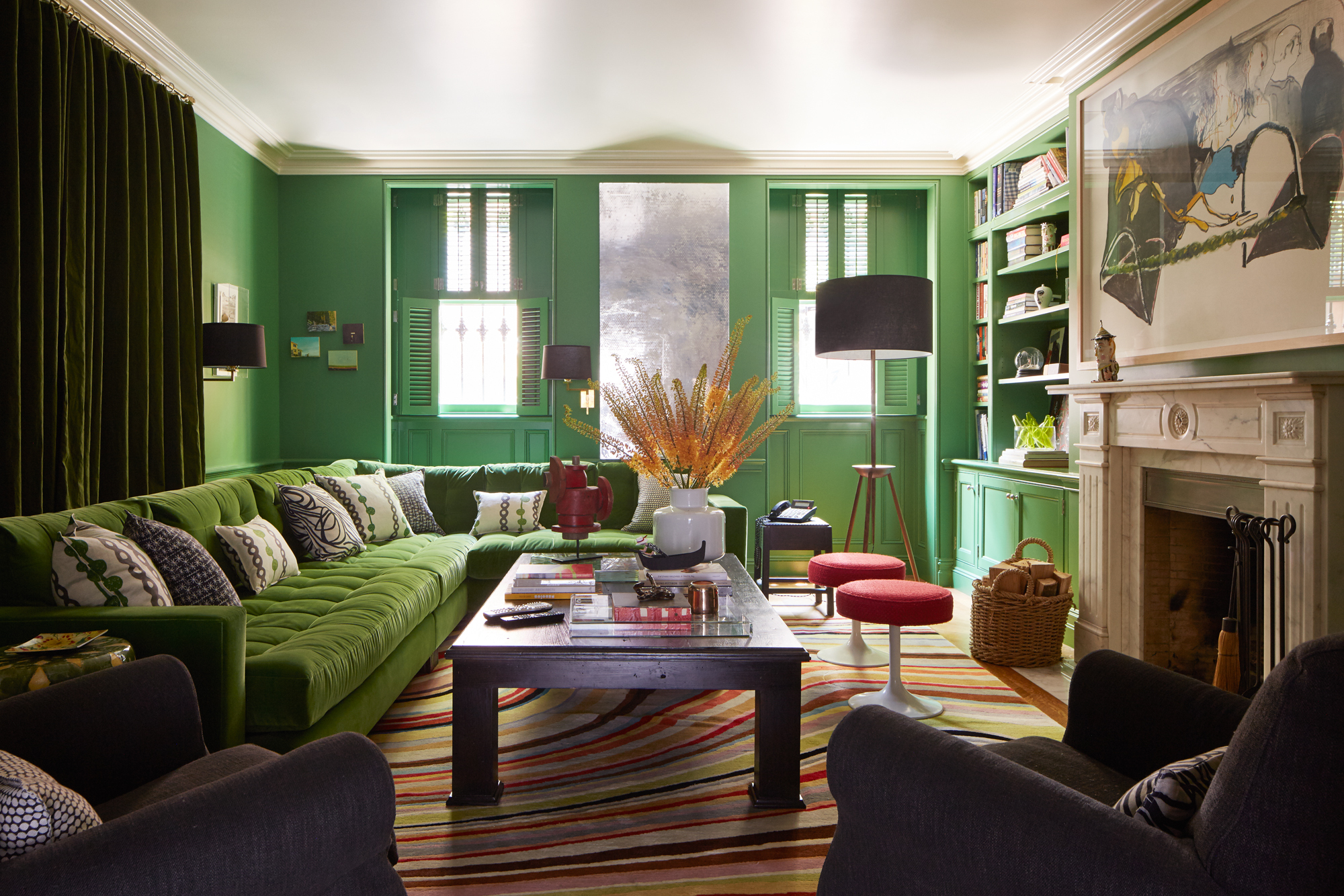
Green is another color on the cooler side of the color wheel. When warmed up with yellow, it can feel warmer, otherwise dark blue tones cool it down and bring depth. It can feel dark and sultry, yet vibrant and optimistic all at once.
'This house is a Brownstone in Brooklyn and filled with color,' explains interior designer Ellen Hamilton. 'In Brooklyn, we call the ground floor the garden floor. Green is for the garden - there is very little natural light here but it makes it cozy. It’s a happy green which creates life in a low natural light space and reminds of the grass.'
3. Purple
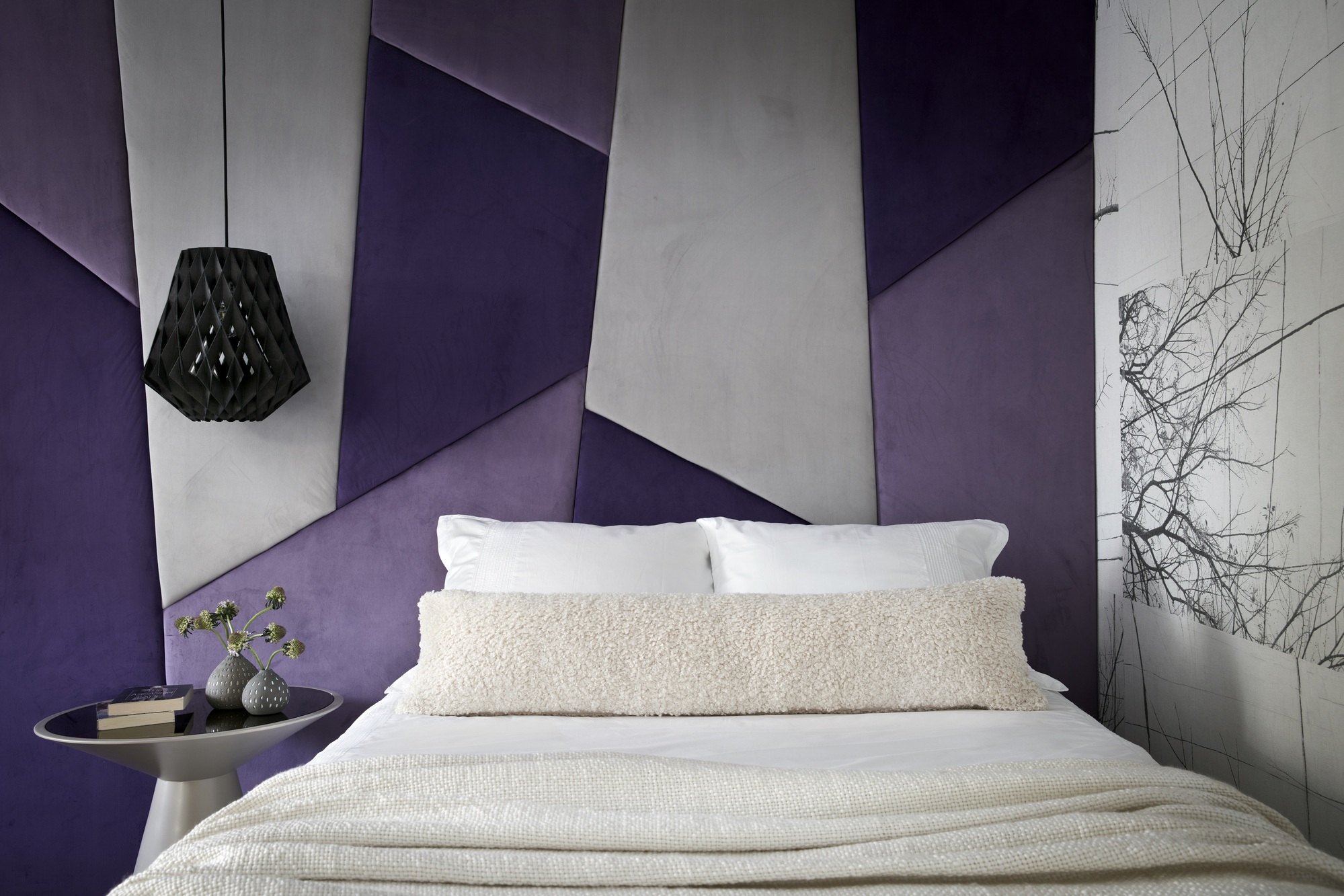
Purple is another cool color on the wheel, but has a red undertone, meaning that it can be used in a versatile way, either warmed up with the addition of more reds, or cooled down by adding blue.
In this scheme by designer, Nina Magon, using varying tones of the color brings those warmer and cooler contrasts, and the grey works for a great neutral base. The effect is that the bedroom becomes a retreat-like space, encouraging calmness and serenity. Purple living room ideas are also gaining popularity for this reason. 'The clients were looking for a modern home, filled with natural light,' explains Nina.
'With this bedroom for our client's daughter, we wanted to incorporate an accent wall that features a fun yet sophisticated color to create some elegant drama,' explains Nina. 'We took it one step further and applied two different shades of purple mixed with a light grey in an upholstered geometric wall feature that not only creates visual texture and interest for the wall behind her bed, but it creates a focal point for the room.'
'The different shades of cool purple play off each other to highlight the geometric shapes and create individual moments across the wall design,' she adds.
4. Brown-grey
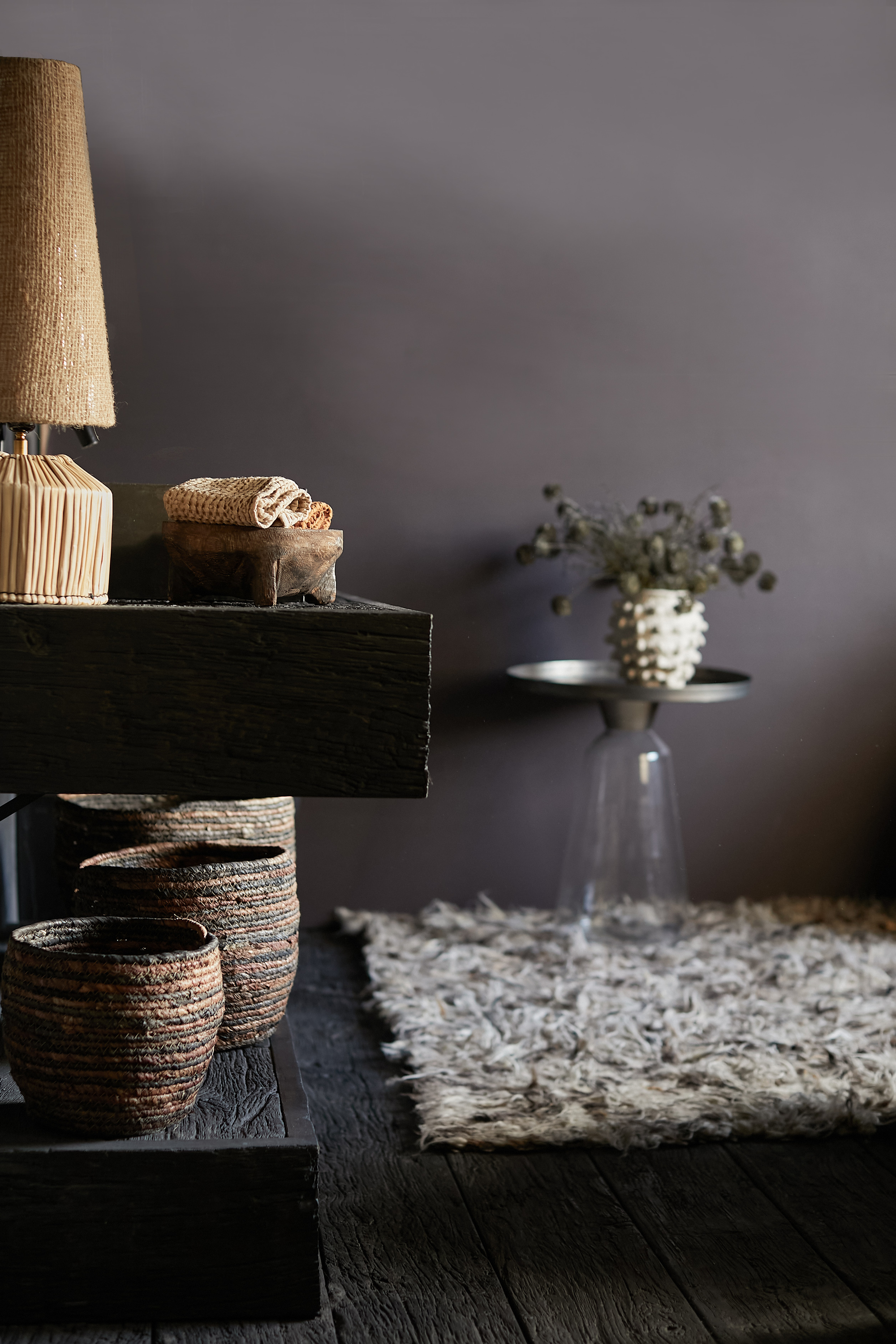
While brown can have a reddish undertone, making it a good addition for a warm color scheme, if it has grey undertones or hints of blue or purple, it can create a dark and earthy scheme. This paint color from Abigail Ahern, Noir, is cool and considered, with undertones that catch the light differently and mean your room changes throughout the day. Again, the brown tone has strong ties to nature.
'This paint color, Noir, is the color of the earth after a downpour. It's a deeply intense muddy hue with nuances and undertones of purplish plum. Beautifully moody, its warmth and softness make it a super soothing option for living rooms, dining rooms and bedrooms,' explains Abigail.
5. Black and white
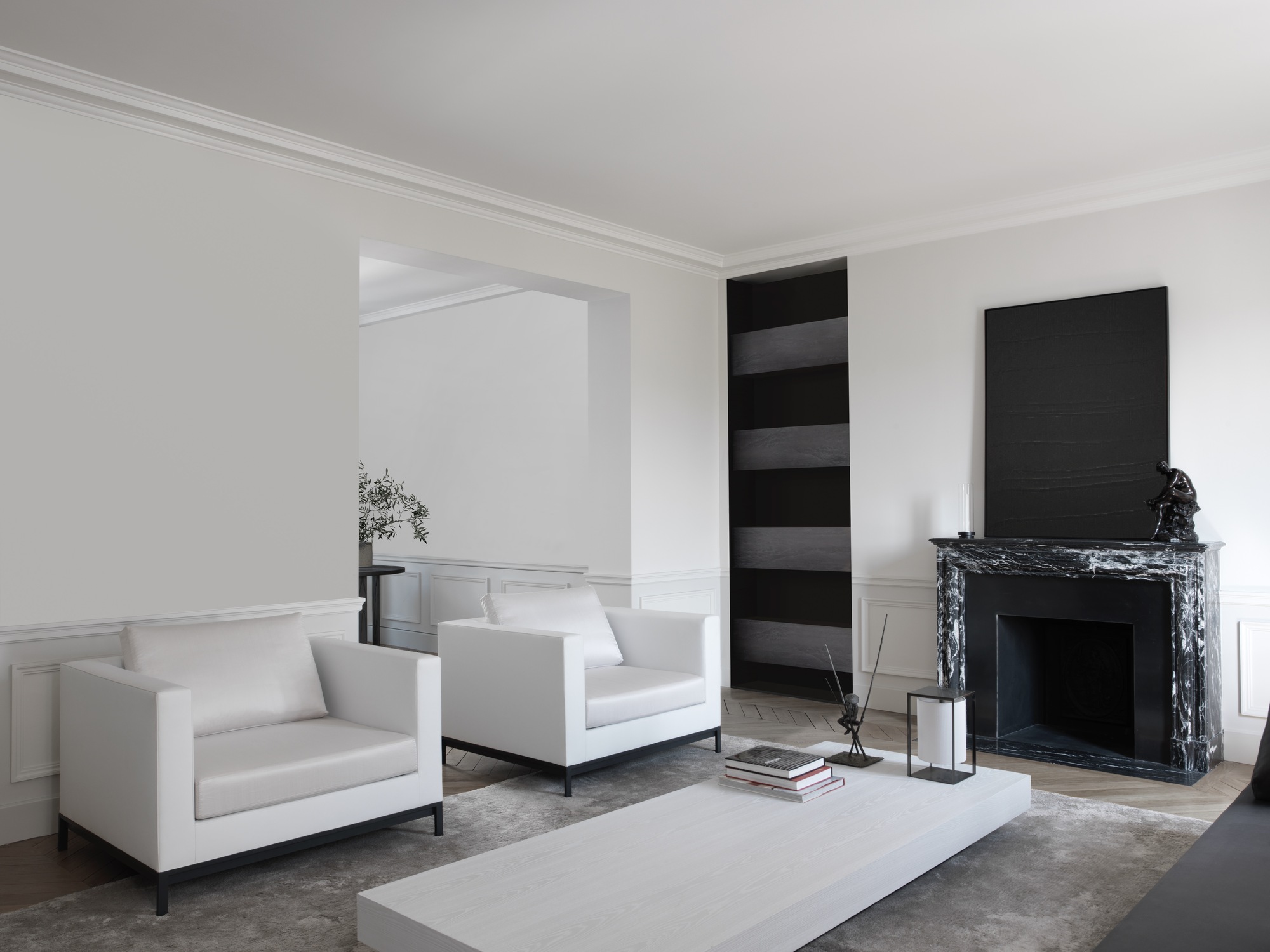
For a stark contrast, a monochrome palette workshere to create a cooling black and white living room idea. This design is by London-based French interior designer, Guillaume Alan and it is a minimalist, sleek and sophisticated interior.
This effect is about what the negative white space is saying as much as the jet black, with the ratios tipped in favour of the white space and the black fireplace, bookcase and wall art providing the contrast.
6. Grey
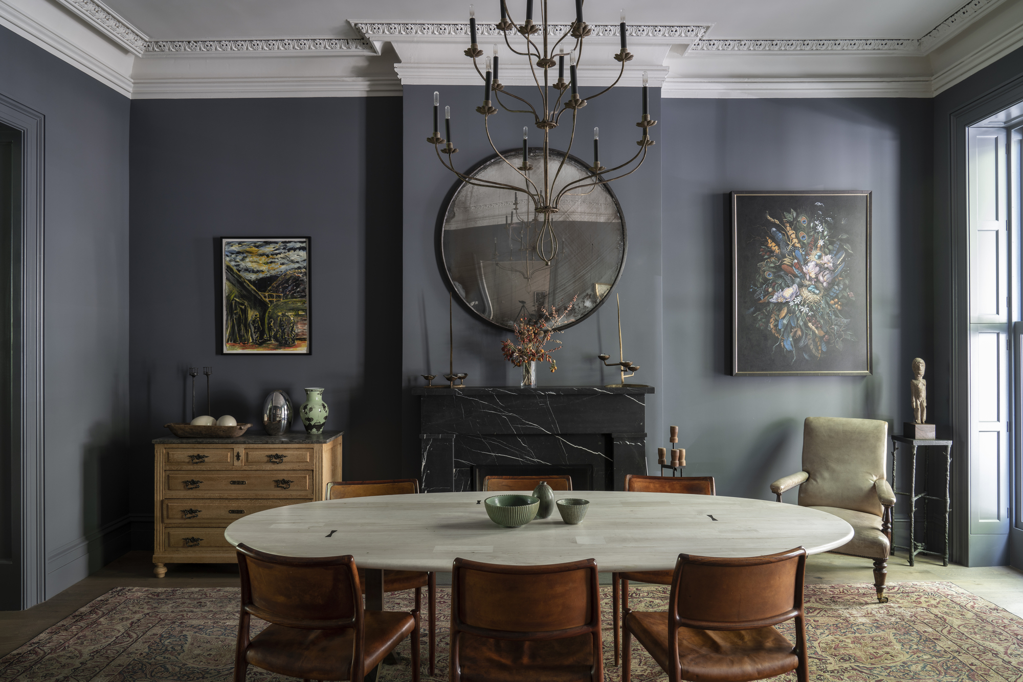
For a cozy, cool color scheme, there are many colors that go with grey and work well in many rooms. Grey can be quite a neutral base, as it readily absorbs many undertones, meaning it is flexible and easily manipulated. Add warmer tones and the grey feels completely different to a grey with diluted hues of grey, blue, green. In this example from Farrow & Ball, Down Pipe grey has been painted on the moudlings and door for a fully drenching and cocooning feeling.
The color is a dark lead grey, with blue undertones which deepen the complexity. Originally inspired by the color used to paint downpipes and guttering, it has been embraced for the inside of the home.
7. Indigo blue
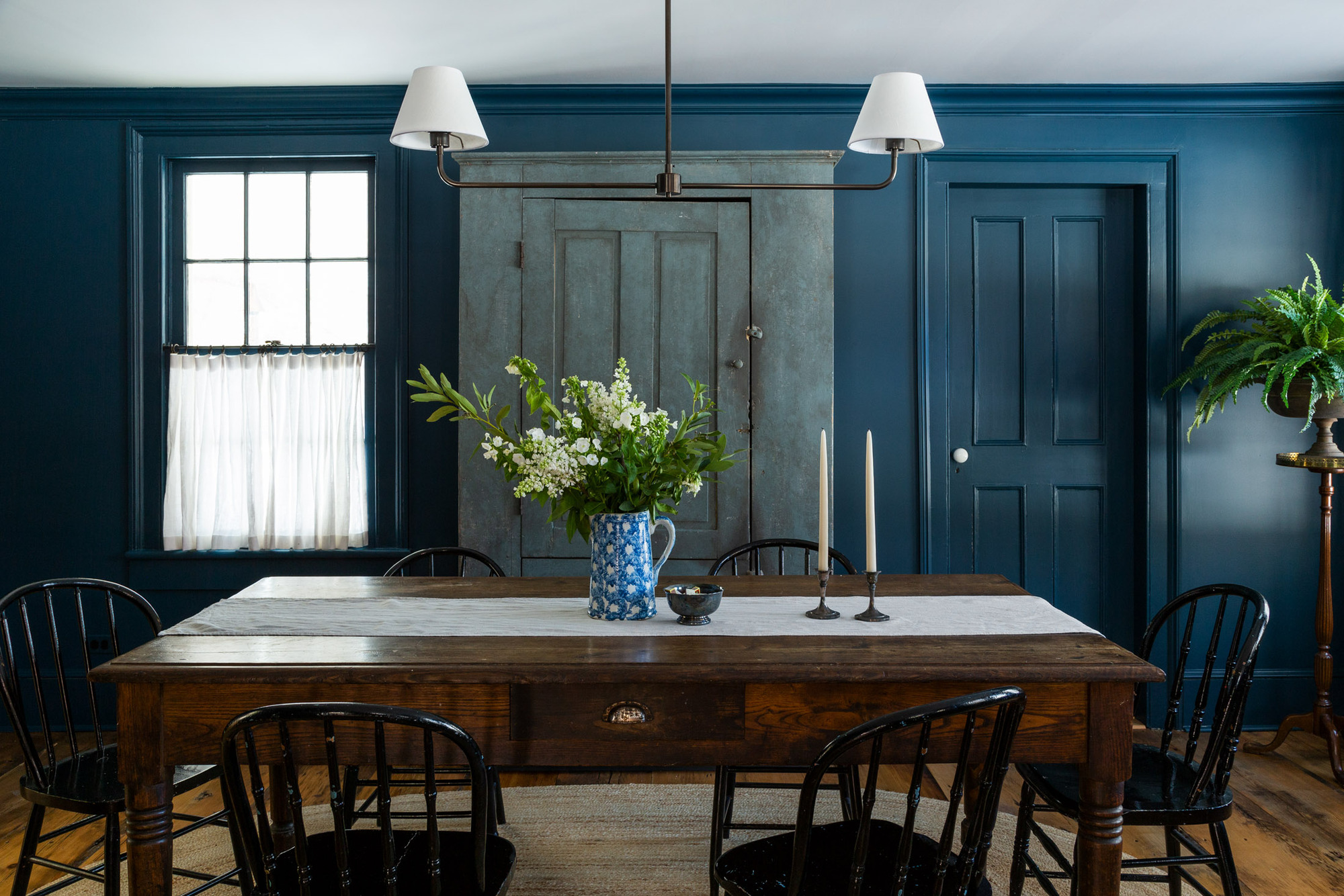
Go for a monochromatic scheme with a floor to ceiling indigo blue for a cool color combination. Located in the bucolic village of Pound Ridge, New York, this 1850s farmhouse is designed by White Arrow, received extensive restoration.
The farmhouse’s small galley kitchen had walls removed to bring in more natural light, and dark blue indigo was painted on the walls and custom Shaker cabinetry lend an English house feel. Authentic British design details can be found throughout the home, along with a mix of new and reclaimed antique fixtures.
8. Mint green
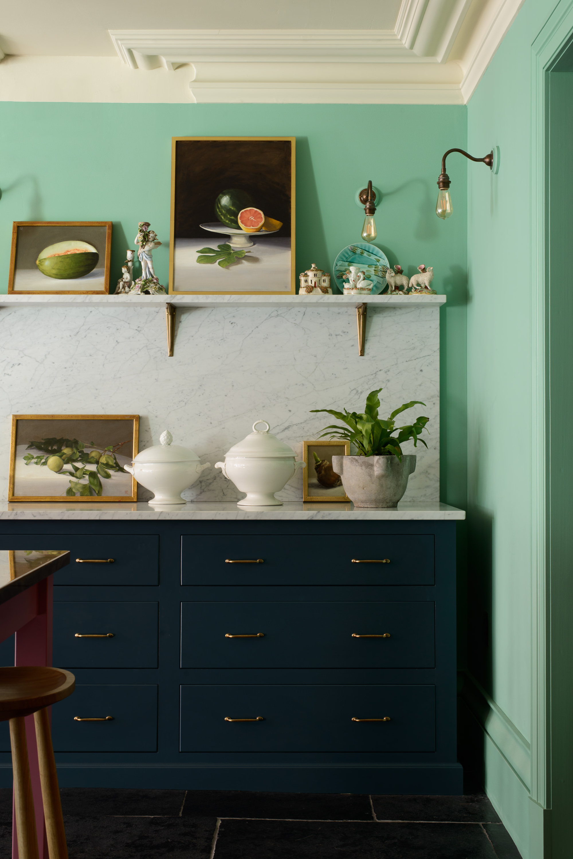
Cooling and light, yet playful and full of energy all at once, mint green is an iteration of pure green and can be a great cooling color to paint your room, while retaining a positive energy.
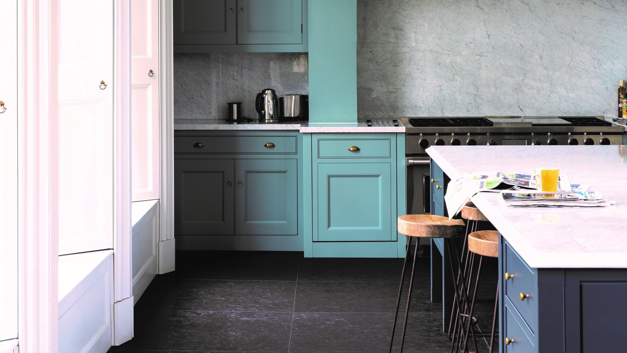
'Where a rich statement shade can be overwhelming in a large space, and a pale neutral can appear sterile, a muted or pastel shade such as mint can add warmth and colour without being overbearing,' says Helen Shaw, director at Benjamin Moore. In this deVOL kitchen, darker blue cabinets have been chosen as a color that goes with mint green, keep the color palette cool.
What rooms work best for a cool color scheme?
When considering a cool color scheme, think about the natural light and the mood of the room, encourages Ellen Hamilton.
'What is the natural lighting of the room. Or for the case of many Brownstone houses or townhouses, think about the absence of light,' says Ellen.
'You’ve got light in the front, light in the back and two solid walls on either side of the room when you’re in the townhouse. So working with light or a lack of is always something that’s on my mind. The second thing is what is the mood - what kind of mood or feeling am I trying to create here,' she adds.
'I like the idea of a cool bathroom because of blue and green specifically references water so I think that's great. I do really like dark rooms for television rooms or family rooms that people are in at night. I really do love a dark teal or a navy blue and a saturated blue can be very beautiful.
'I do think deep cool color schemes lend themselves to nighttime rooms and where there is a total absence of natural light.'
'Living rooms can be cool too, but create a different mood. A pale blue room is beautiful especially if you've got a view to the outside or you can see a bit of the sky.'
Think about which direction your room faces too, suggests Charlotte Cosby, head of creative at Farrow & Ball, as cooler shades may be colors to avoid in a north facing room.
'In east-facing rooms, embracing the cooler evening light with light blues and greens can have a beautifully soft and calming effect - such as Pale Powder or Teresa's Green. Both will retain some warmth into the evening with their subtle green undertone. Using soft, pale, or cooler tones on the walls of a south-facing room is also a great way to maximise the feeling of light and space. Blues, such as Pavilion Blue and Borrowed Light, creating an almost aquatic feel.'
Be The First To Know
The Livingetc newsletters are your inside source for what’s shaping interiors now - and what’s next. Discover trend forecasts, smart style ideas, and curated shopping inspiration that brings design to life. Subscribe today and stay ahead of the curve.

Former content editor at Livingetc.com, Oonagh is an expert at spotting the interior trends that are making waves in the design world. She has written a mix of everything from home tours to news, long-form features to design idea pieces, as well as having frequently been featured in the monthly print magazine. She is the go-to for design advice in the home. Previously, she worked on a London property title, producing long-read interiors features, style pages and conducting interviews with a range of famous faces from the UK interiors scene, from Kit Kemp to Robert Kime. In doing so, she has developed a keen interest in London's historical architecture and the city's distinct tastemakers paving the way in the world of interiors.
-
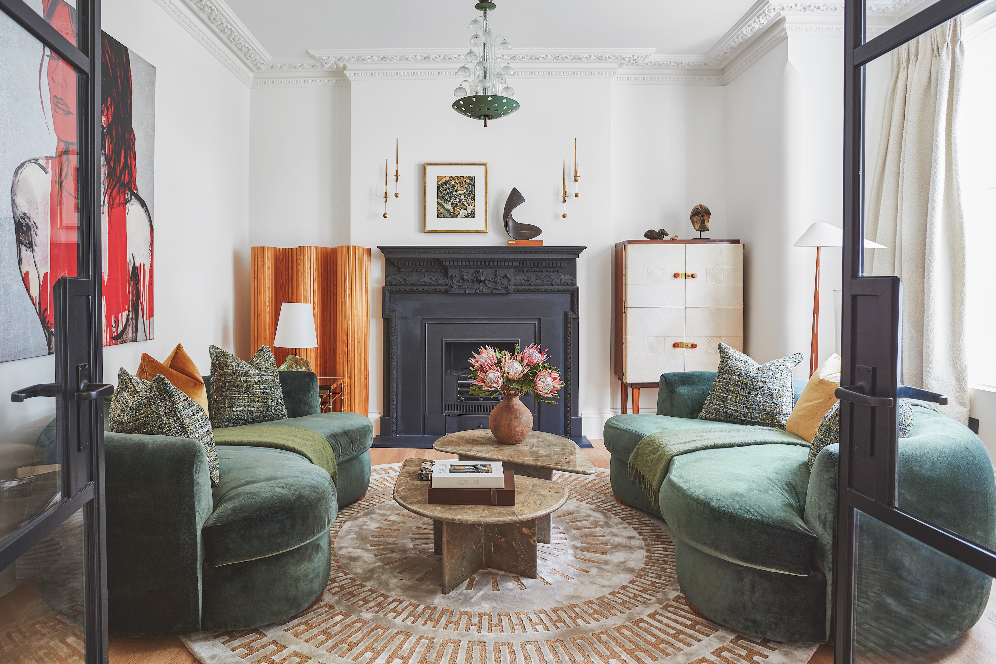 The 'New British' Style? This Victorian London Home Embraces Its Owners' Global Background
Warm timber details, confident color pops, and an uninterrupted connection to the garden are the hallmarks of this relaxed yet design-forward family home
By Emma J Page
-
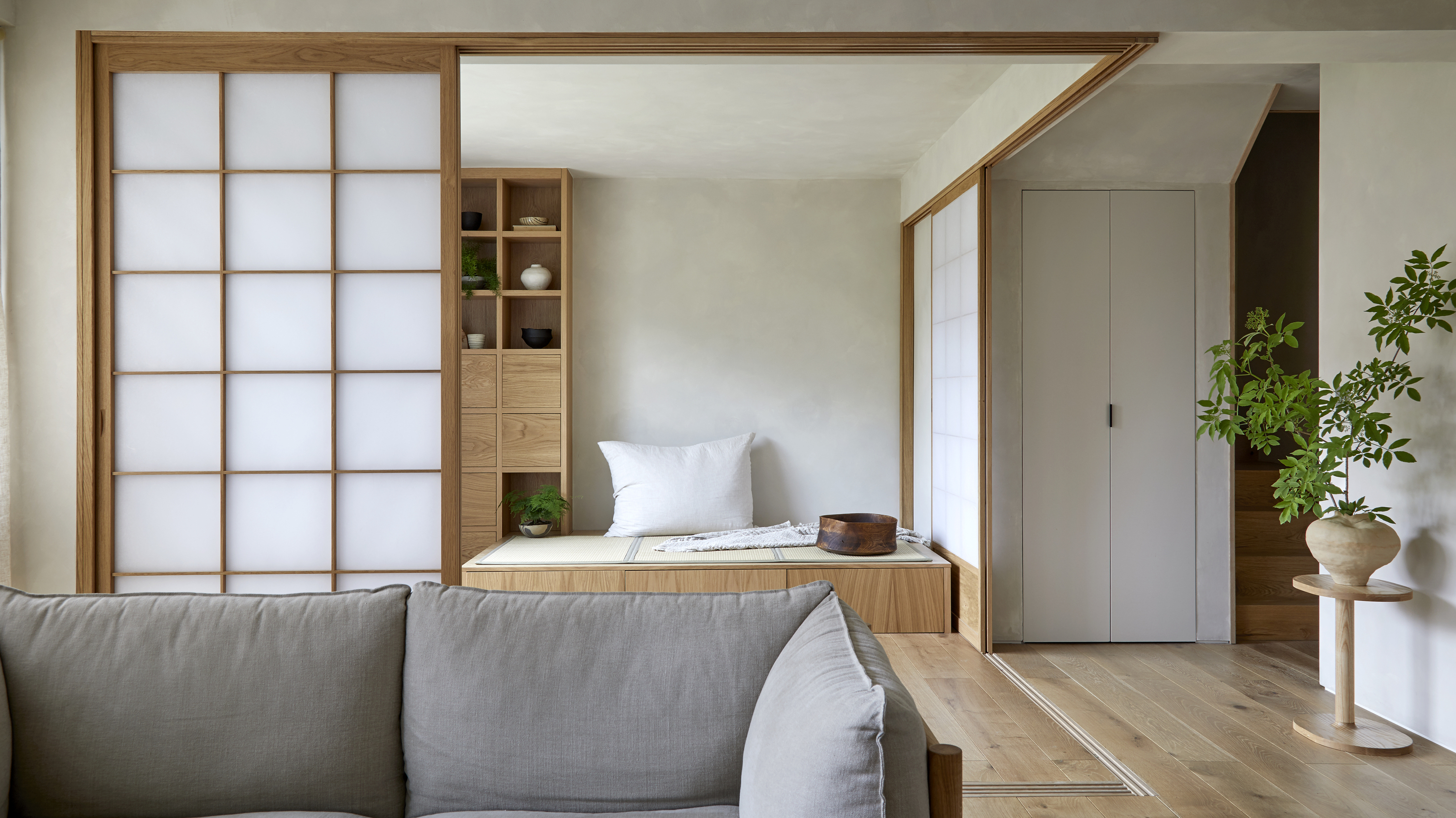 Muji Living Room Ideas — 5 Ways to Harness The Calming Qualities of This Japanese Design Style
Inspired by Japanese "zen" principles, Muji living rooms are all about cultivating a calming, tranquil space that nourishes the soul
By Lilith Hudson