

If you're a fan of astrology, daydreaming, and a little dose of the dramatic, (and honestly, even if you're not), you need to know about cosmic color palettes. Inspired by the wonders of outer space, these schemes add mystifying depth and mood to every space they inhabit, and, unlike more literal interpretations, can take on a much more elevated edginess when it comes to interiors.
So, what are they? "The cosmic color palette is one containing a predominance of deep, cool purple, indigo, and blue with balancing accents of luminous off-white, lilac, the lightest of periwinkle tones, and a pop of orange-tinged yellow," Houston-based color expert, Lauren Battistini, tells me. "The deepest anchoring neutral would be a charcoal verging on black."
These color palettes are full of deep, moody saturations, but don't let that be a reason to shy away from them. "There is a gentle, relaxing quality about the cosmic palette when used in home interiors," Lauren assures me. And I'd argue that a full immersion into this cool color trend is the best approach to understand its strength and potential. In other words, it's time to step out of your comfort zone and into the cosmos.
Below, I've shared three examples of designer-approved cosmic color palettes to inspire your inner celestial side.
1. A Purple-Forward Palette with Pops of Cream

Plum purples and indigo help a cosmic color palette feel more calming. By incorporating soft textures, this living room has a more relaxing aesthetic.
There is quite a bit of pigment (richness, or chroma) even in the deepest cosmic hues — that is the territory that comes with working with dark color schemes. To combat this, Lauren Battistini says, "I recommend tempering the chroma and opting instead for nuanced deep tones with less pop."
Enter rich, calming navy blues and soft but dark plum purples. Leaning into the purple side of the cosmos will give your space a relaxed and grounded feel. From there you can find the colors that go with purple best, to lighten the room.
"Rich furniture fabrics such as velvet and brocade with a metallic overcoat or sheen communicate the cosmic message alongside art pieces blending deep purples, blues, and black," adds Lauren. These textures help give a sense of depth and break up the dark values.
But where do we fit that pop of orange-yellow? "Incorporate it sparingly in unexpected places such as coffee tables, a commissioned piece of art, or as a stand-alone floor lamp in a corner," suggests Lauren. The finishing touch of a few off-white, glossy accents lifts the space, giving it a harmonious energy.

Lauren is a Houston-based color expert, chief color strategist, and founder of LFB Color Consulting. Lauren has certifications in color consulting and as a color expert and color analyst. Alongside her passion for color, her company provides color consulting for both residential and commercial projects.

Price: £1.50/peel-and-stick sample

Price: £5.50/sample

Price: £5.50/sample
2. A White Base With Futuristic Lilac Accents and Charcoal

Embrace a futuristic side of cosmic color palettes by opting for a clean white base to build your darker decor upon.
"No cosmic color palette is complete without a cosmic latte, a rich, light beige that is literally the average of colors observed from Earth of over 200,000 galaxies," explains Lauren. And her suggestion for this? Farrow and Ball's Au Lait.
Though Lauren explains that bright white, "is usually best used as an accent sparingly, in this palette cosmic latte provides a light visual reprieve from the otherwise deep-toned cosmic color palette."
If, like me, you have been obsessed with the latest Space Age interior revival, opting for a neutral background (as seen in the stairwell shown above, designed by Sydney-based Smac Studio) to build your cosmic palette upon is the perfect way to give this look a futuristic and modern edge. Artwork is then an easy way to add a pop of color, or I could even envisage a piece of delated decor to add that reflective chrome element. A 'cosmic latte' base is the perfect canvas.

Price: £5.50/sample

Price: £5.50/sample

Price: £2/peel-and-stick sample
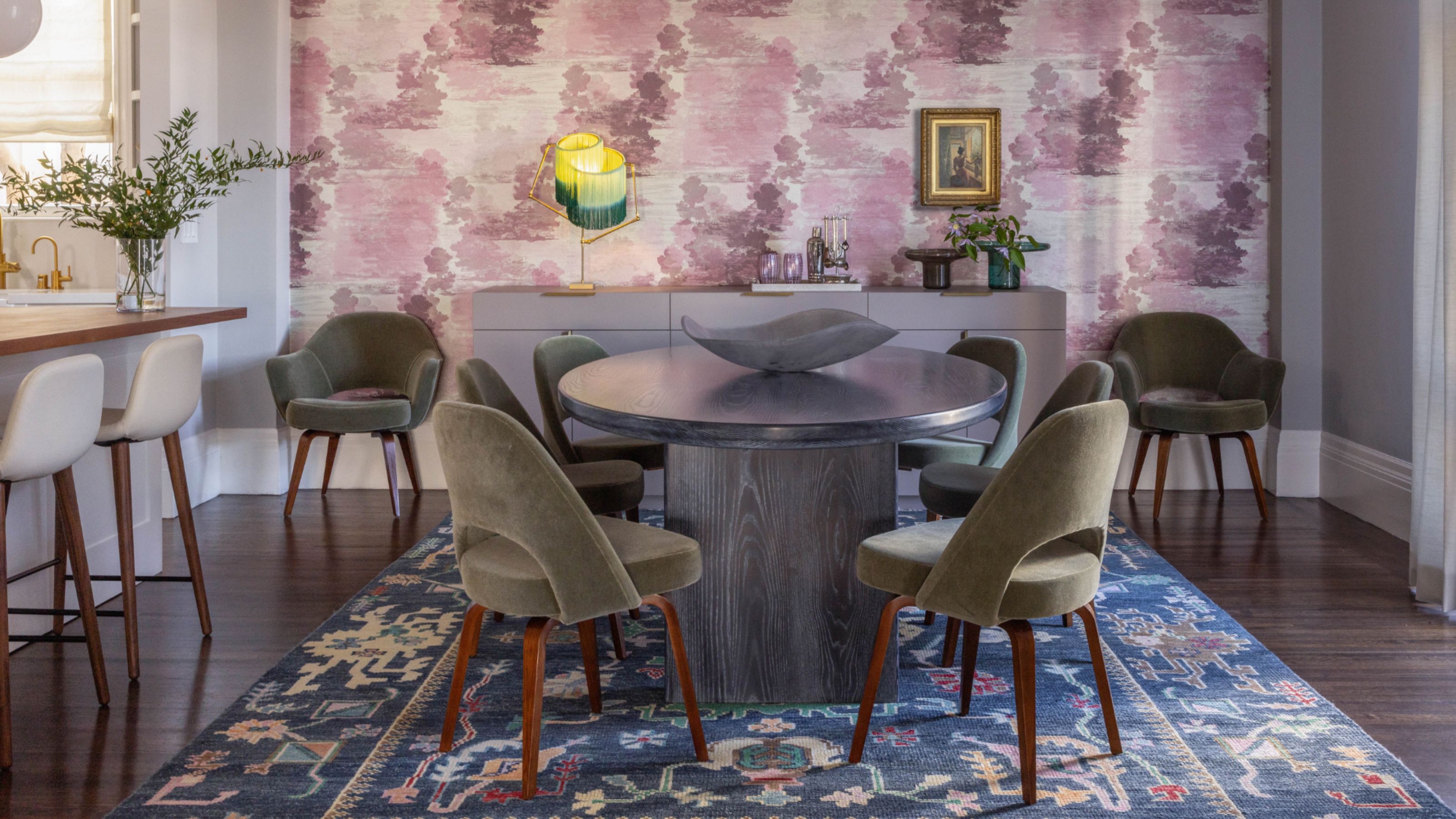
3. Deep Blues with Reds and Metallic Yellows Peaking In

Cosmic color palettes are all about bringing the mood, and this hallway shot feels straight from the cosmos. The gold reflection in the pendant lights adds that perfect glittering touch.
Inspired by the deep, mysterious shades of the universe, this palette variation is the richest in saturation. It combines dark and intense tones with highly contrasting luminous touches to evoke the vastness of space.
Think midnight blues and indigos, complemented by metallic silver or gold accents, along with bursts of yellow, pink, orange-red, or turquoise to reflect nebulae and stars. Though these colors are all rich in hue, together they create a sense of balance in interior design, which means they feel less overwhelming.
"Midnight blue and purple pair beautifully with touches of gold or bright yellow," adds interior designer and architect at GCG Architectes, Olivia Charpentier. "Deep black can be softened with silver tones and pearlescent hues."
To use this cosmic color palette most effectively, she further recommends "matte midnight blue, black, or deep purple painted walls as a base, then complemented by gold or silver metallic lighting fixtures and hardware." Velvet fabrics, mirrors, or reflective accessories can be the finishing touch that enhances the cosmic effect.

Price: £5.50/sample

Price: £5.50/sample

Price: £5.50/sample
Equally important as the colors themselves are the accents and materials used in home decor to reinforce the cosmic aesthetic. "These materials and finishes include holographic surfaces, ceramic pieces, or art accents with a pearlescent finish, and fabrics with a metallic overlay in silver or pewter," says Lauren.
Once you have launched your cosmic color palettes, it's time to dive into the details that will bring it to life. Will it be a moment of metallic decor? Or possibly a retro mushroom lamp to light up your space?

-
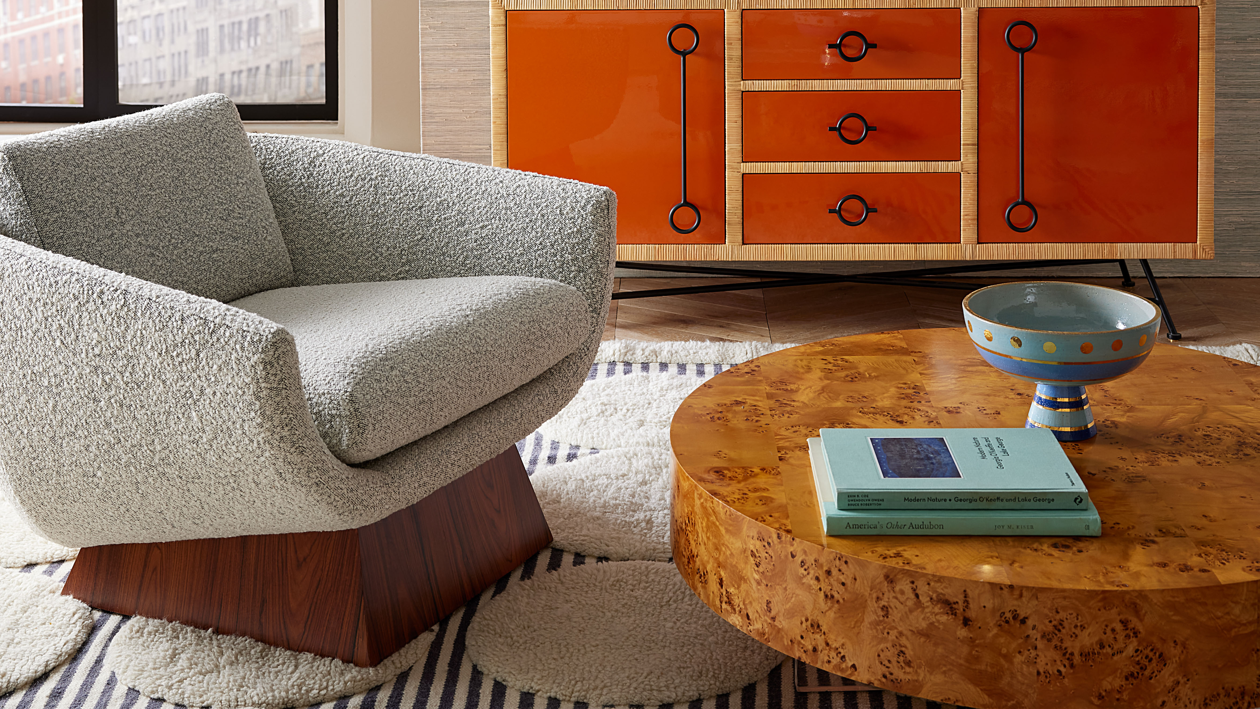 Burl Wood Decor Is 2025’s Most Coveted Comeback — Here’s How to Get the Storied Swirls for Less
Irregularity is the ultimate luxury, but you don’t need an antiques dealer to find it
-
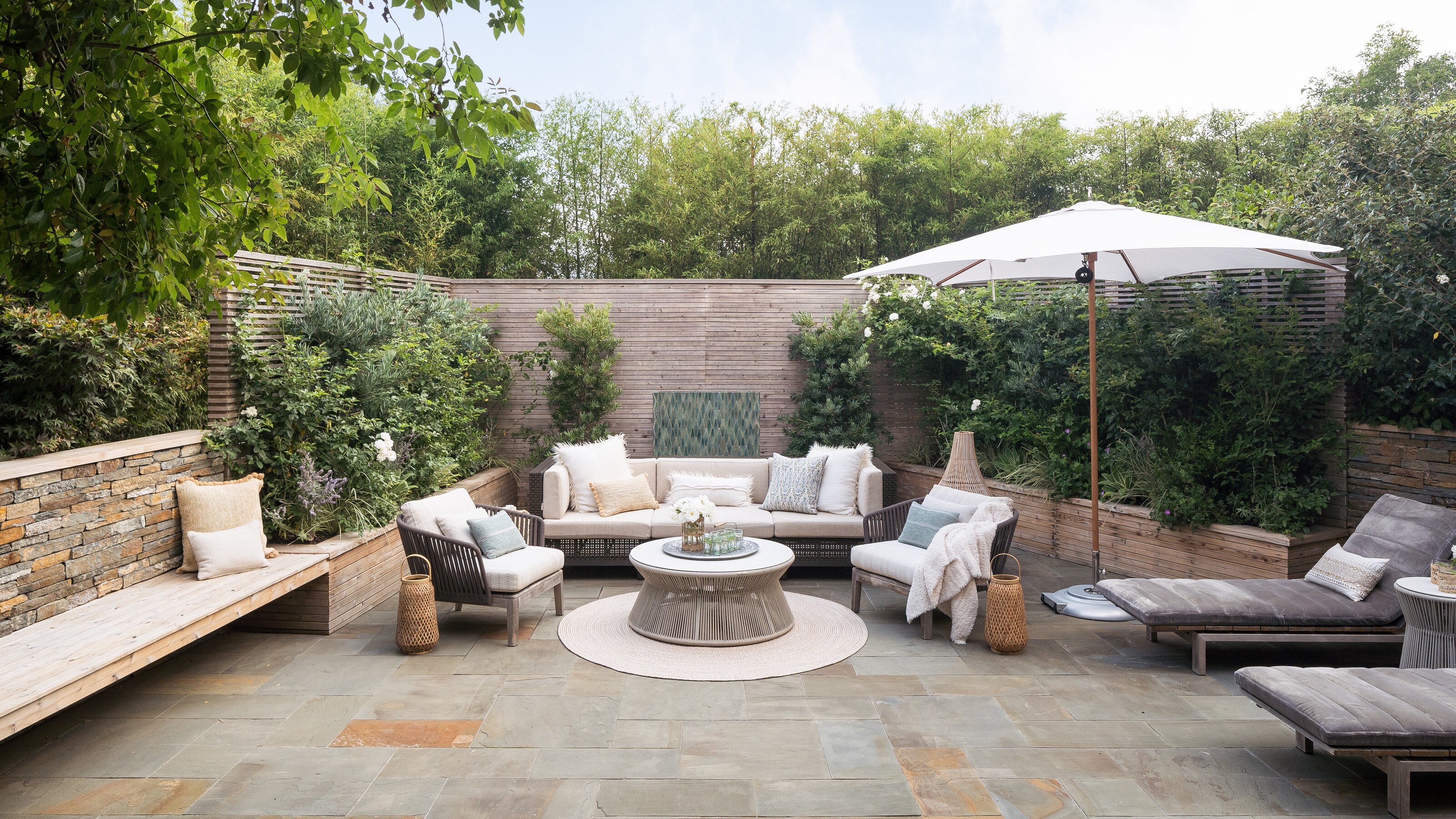 5 Garden Features That Instantly Add Value to Your Home — While Making Your Outdoor Space More Practical, too
Get to know all the expert tips and tricks for making your backyard a standout selling point for your home.


-
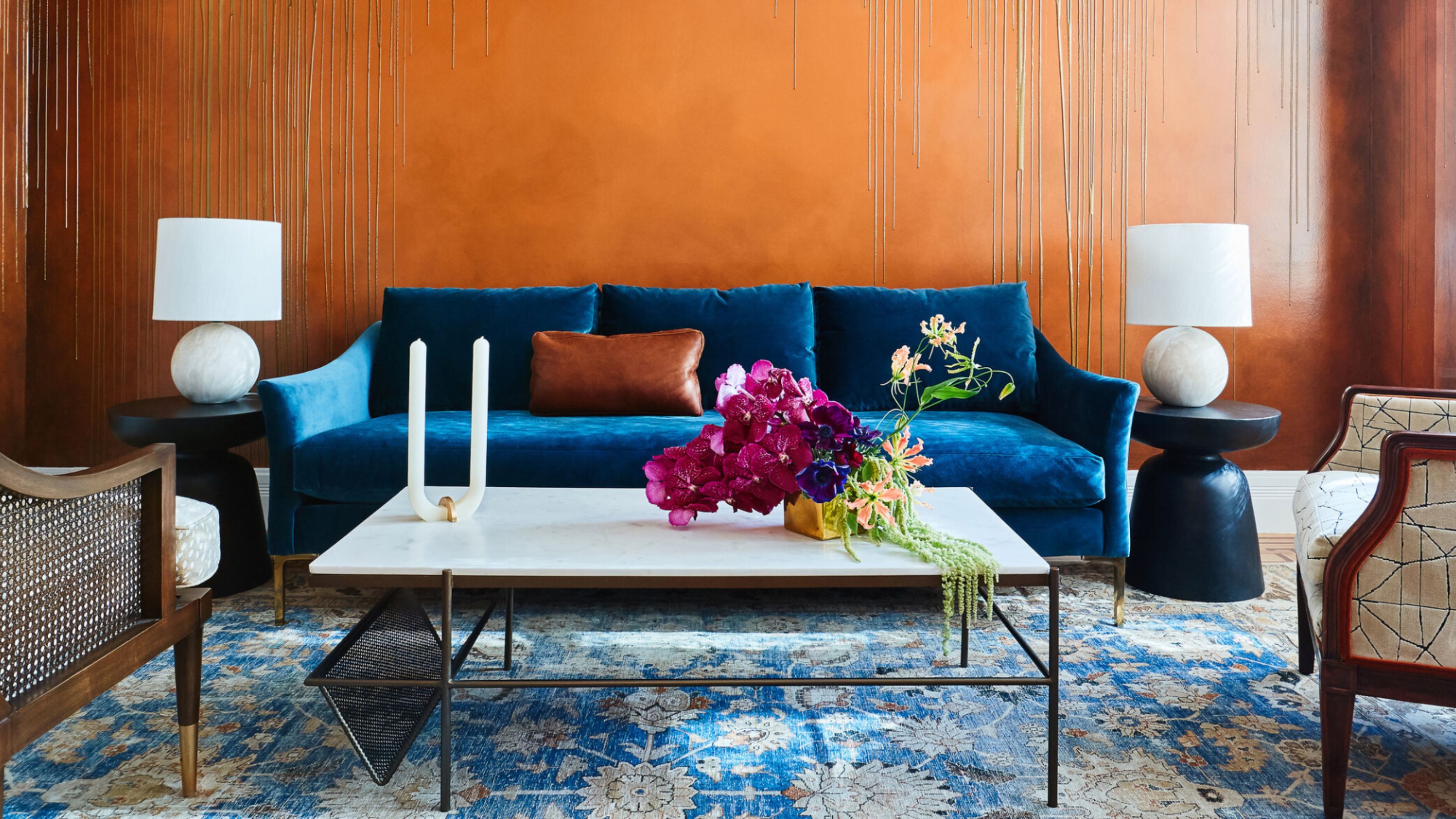 The Combination You Weren't Expecting to Love — 8 Blue And Orange Living Room Ideas That Feel Surprisingly Elevated
A blue and orange scheme for living rooms may sound jarring, but these spaces prove they're striking, vibrant, and certainly unforgettable
-
 Smeg Says Teal, and We’re Listening — The Kitchen Shade of the Year Is Here
Designers are already using the soft, sea-glass green everywhere from cabinetry to countertops
-
 Do Yellow and Purple Go Together? Designers Reveal How to Make This Unexpected Pairing Feel "Totally Intentional"
In an era where unexpected combinations have become cool, we've done a deep-dive to discover how to pair yellow and purple in a space
-
 5 Unexpected but Seriously Stylish Spring Color Palettes to Shake Up the Season — "It's Pastel, but Punchy"
Spring color palettes are notorious for their use of pretty pastels, but that doesn't mean they have to lack variation
-
 The 'Red Table Trick' Is the Easiest and Most Expensive-Looking Trend to Hit 2025 So Far
A red dining table makes a seriously stylish statement; the beloved pop of red trend just got an bold and expensive-looking upgrade
-
 Everyone's Going Crazy for This One New Shade From Farrow & Ball Online — So What's the Big Deal With 'Scallop'?
It's a classic beige, but with a hint of blush — and it's the shade we're expecting to see in every minimalist's home this year
-
 4 Bathroom Colors That Are Going Out of Style in 2025 — Don't Say We Didn't Warn You
If you're redecorating your bathroom this year, our design experts suggest you avoid these outdated colors
-
 70s Color Palettes That Work for 2025 — 4 Designer-Approved Color 'Recipes' That Feel Modern Enough for Homes Today
It's time to bring out your paisley print and disco shoes — the golden yellows, olive greens, and deep purples of 70s color palettes are making a comeback


