'It's the only thing that made sense' – this Brooklyn loft's clever TV display isn't just for looks, it's key to the home's layout
When dealing with a sprawling apartment with an open concept, designer Crystal Sinclair had to pay attention to the details to make this unusual layout work

The Livingetc newsletters are your inside source for what’s shaping interiors now - and what’s next. Discover trend forecasts, smart style ideas, and curated shopping inspiration that brings design to life. Subscribe today and stay ahead of the curve.
You are now subscribed
Your newsletter sign-up was successful
In New York's trendy Dumbo neighborhood, with its cobblestone streets and the Brooklyn Bridge looming between buildings, this apartment in a former warehouse is pretty much the mental picture I conjure in my loft living fantasy.
Once inside, it's no less dreamy. Interior designer Crystal Sinclair was tasked with decorating the apartment, which has retained the industrial coffered ceilings and pillars.
Yes, there's wow factor in the mezzanine book nook, accessed by a ladder, but just as enthralling is the wall of glass and steel used to separate the main living space from the bedroom.
Article continues belowIn theory, it's a beautiful way to live. Each space benefits from the full array of natural light on offer to the apartment, and by retaining the sightlines throughout the apartment, you lose none of the impressiveness that the proportions of this unit deliver.
'This space begged to be open with its high ceilings and windows,' Crystal tells us. 'To me, it only made sense. Keeping a space more open makes it feel grander, whereas a closed space feels homier.'
'But that's not to say that an open space can't feel cozy,' she adds. 'I wanted to keep the loft feel but add elements to make it feel warmer and more inviting.' And that was part of the challenge in re-designing this loft. How can a space this large and bright feel private and intimate when needed? And how, when you have such an open-concept home, can you hide the ugly, undesirable elements of a modern home?

Hugh Metcalf is Livingetc.com's deputy editor and an experienced homes and property journalist. He caught up with interior designer Crystal Sinclair to uncover the design secrets of making open concept living more beautiful.
Considering every angle
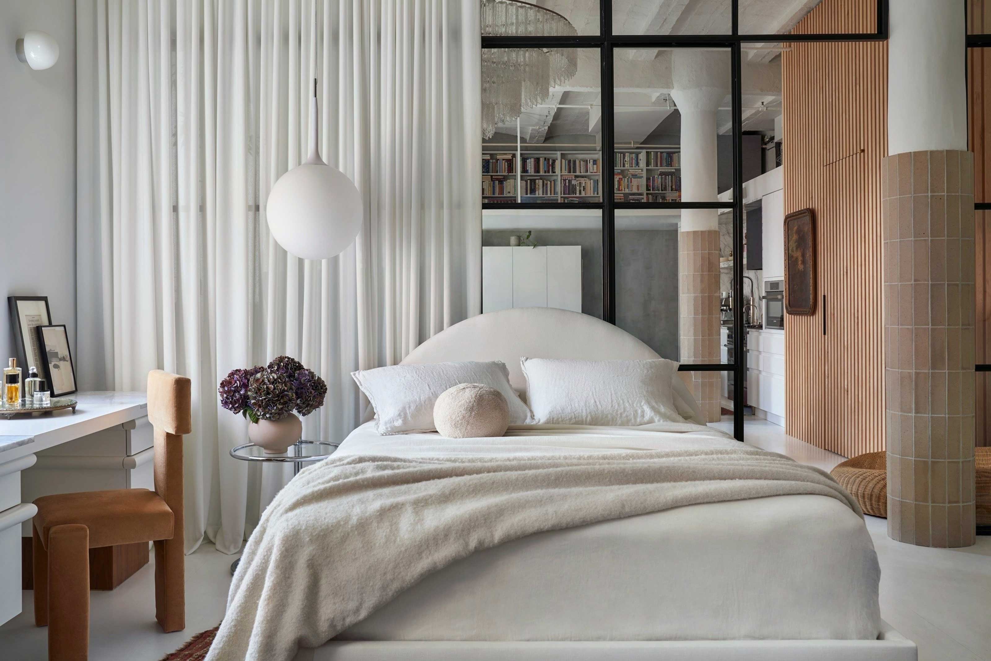
The use of a glass room divider instead of a solid partition wall is a defining design moment for this loft, but it's not without its drawbacks, too. Suddenly, the bedroom and living room are not only down a solid wall, another vista for each room was created for interior designer Crystal Sinclair to consider. Where a solid wall can hide a multitude of sins - the back of furniture, a mess of wires - this design hung on ensuring furniture looks good from every angle.
The Livingetc newsletters are your inside source for what’s shaping interiors now - and what’s next. Discover trend forecasts, smart style ideas, and curated shopping inspiration that brings design to life. Subscribe today and stay ahead of the curve.
Yet, rather than view this as a challenge to overcome, Crystal embraced the opportunities it presented, such as with the headboard in the apartment's bedroom. 'We selected the arched headboard for a statement - but not just in the bedroom, in the living room as well,' she explains. 'It really softens the hard but beautiful metal and glass wall.'
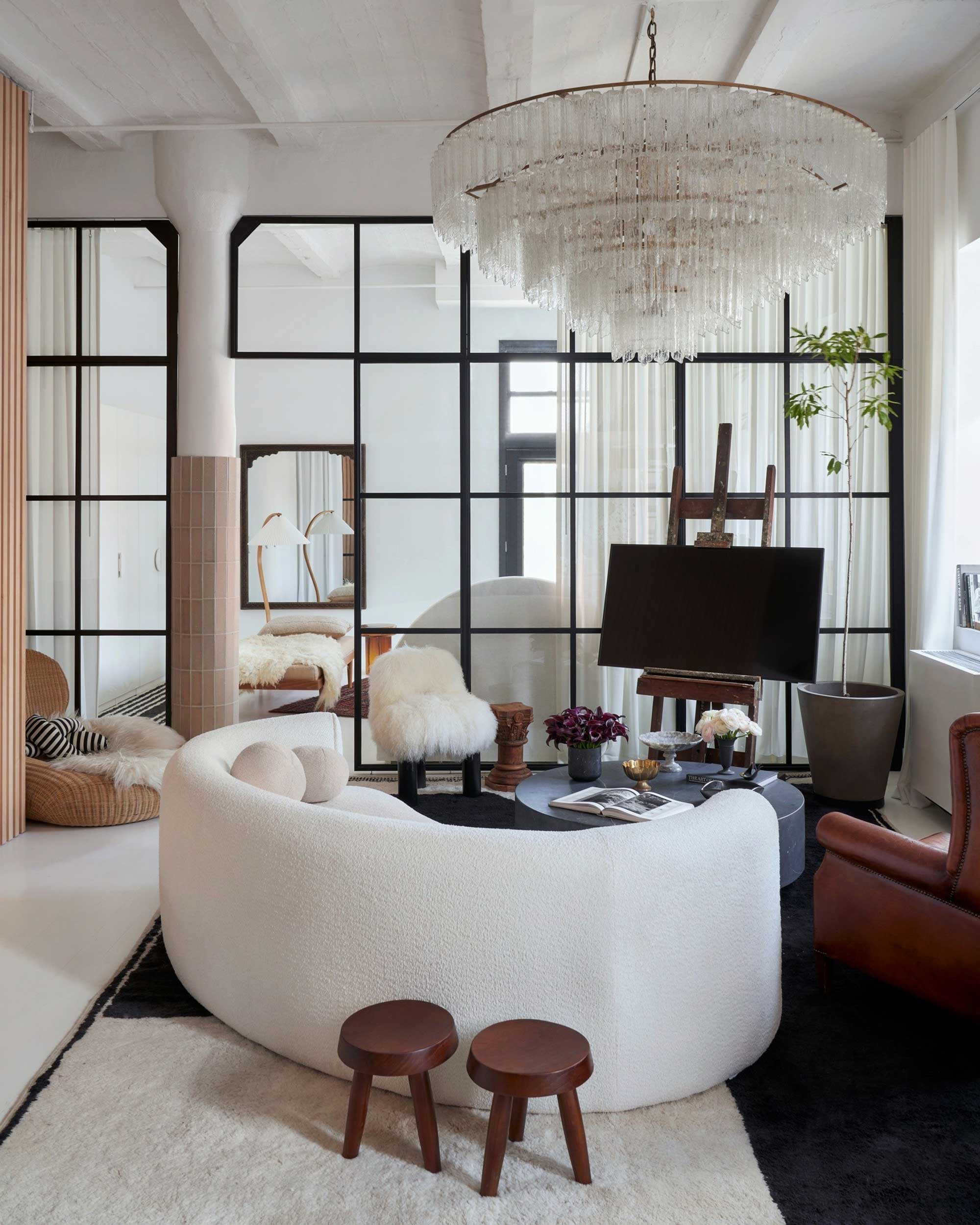
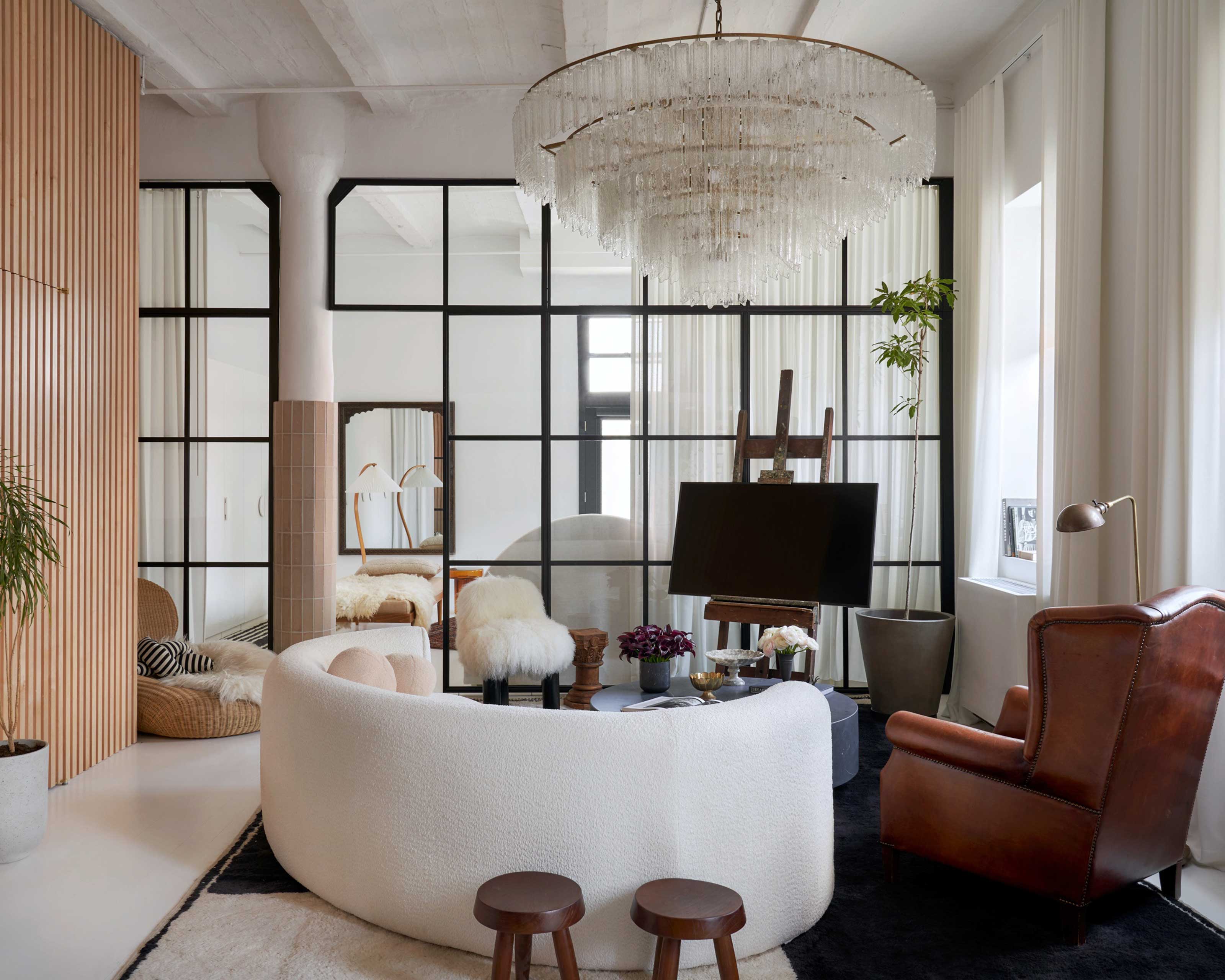
Every angle has been considered in the living room, too, from the curved boucle sofa from Crate & Barrel to the unique TV stand idea. 'The easel was more of a solution than a statement piece,' Crystal explains. 'There really isn't a place for a media unit unless you back it up to the partition wall, but then you'd see the backside with all the cords on the bedroom side of the space. To us, the easel was the only thing that made perfect sense.'
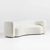
Leanne Ford Hugger sofa, Crate & Barrel
Is there any other brand better known for pioneering the boucle sofa? This design was created in collaboration with designer Leanne Ford, and has a cool, modern silhouette.
The new cozy
This area also demonstrates how the designer tackled the secondary challenge of the space, making the industrial architecture and lofty proportions feel cozy. A new, more luxurious design language has been introduced into the space as a contrast to the urban nature of the apartment. 'It's all about texture, texture, texture,' Crystal says. 'The drapes, for example, really warmed up the space while adding a wow factor.'
Clever spatial tricks play with your sense of space when using this cozy living room, too. 'The oversized chandelier acts like a ceiling which makes the living space cozier,' Crystal tells us.
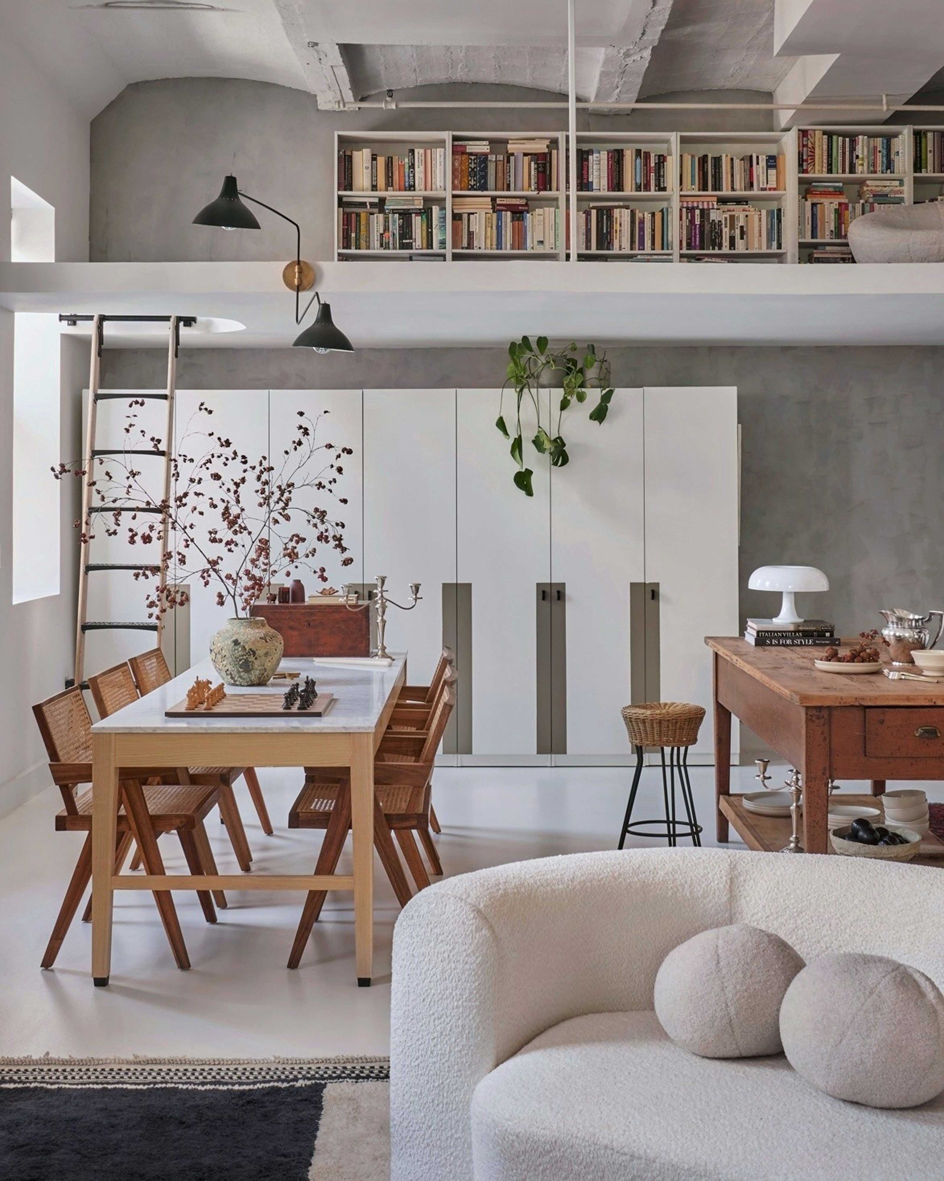
By making use of the vertical space, the loft doesn't feel too cavernous, while embracing warm textures and contrast when decorating with neutrals helps to provide some structure to the open concept kitchen-dining space. 'The neutrals in the public spaces contrast a bit more, whereas in the private space there's less contrast and more texture,' Crystal explains.
The kitchen island table was found on Chairish, and brings an interesting, worn texture to contrast against the luxurious marble used to clad the kitchen.
Boucle ball pillow, Lulu & Georgia
Designed by Sarah Samuel Sherman, finish off your boucle couch with these cushions for a contemporary look.
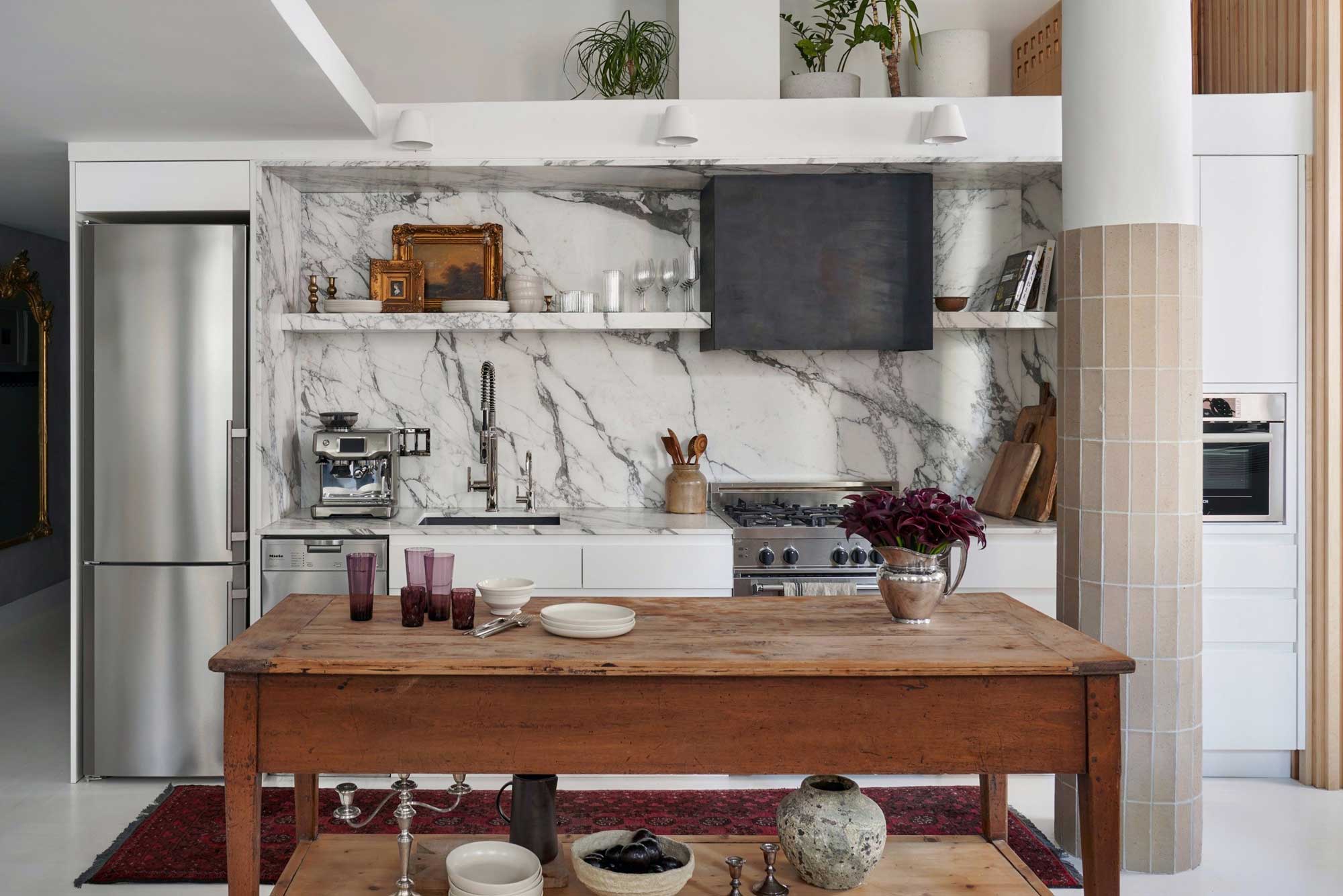
Each of the supporting columns in this loft apartment has been clad in terracotta tiles, making their presence a little more purposeful in the design, while introducing an extra texture. In the kitchen, this adds another dimension that allows for the cabinetry itself to be minimal - a simple, white slab door that defers to the more characterful elements of the space.
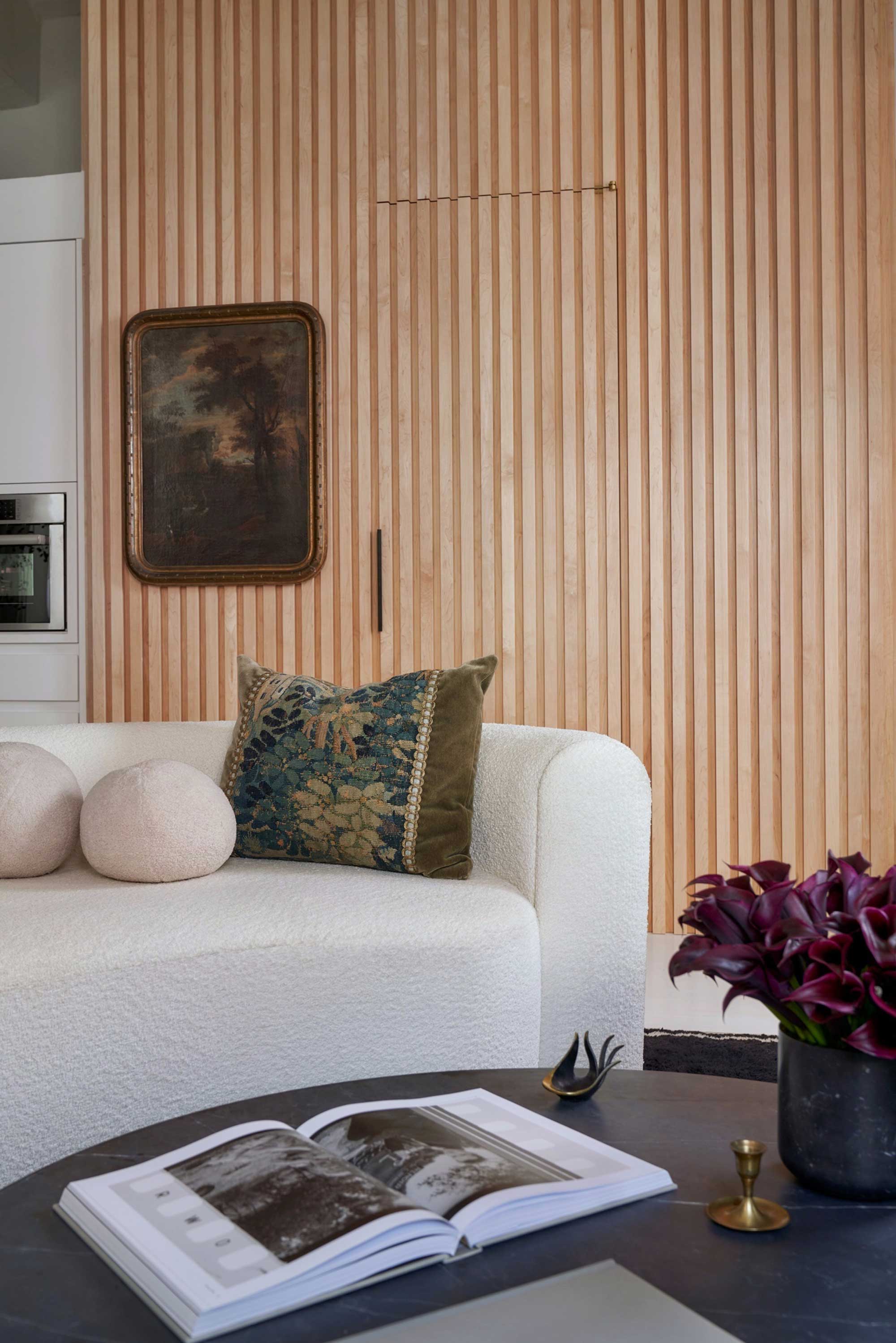
The scale of the open concept space means it's able to handle several accent walls, from the grey limewash to the marble kitchen and this section of modern slat wall which conceals a hidden door.

Hugh is Livingetc.com’s editor. With 8 years in the interiors industry under his belt, he has the nose for what people want to know about re-decorating their homes. He prides himself as an expert trend forecaster, visiting design fairs, showrooms and keeping an eye out for emerging designers to hone his eye. He joined Livingetc back in 2022 as a content editor, as a long-time reader of the print magazine, before becoming its online editor. Hugh has previously spent time as an editor for a kitchen and bathroom magazine, and has written for “hands-on” home brands such as Homebuilding & Renovating and Grand Designs magazine, so his knowledge of what it takes to create a home goes beyond the surface, too. Though not a trained interior designer, Hugh has cut his design teeth by managing several major interior design projects to date, each for private clients. He's also a keen DIYer — he's done everything from laying his own patio and building an integrated cooker hood from scratch, to undertaking plenty of creative IKEA hacks to help achieve the luxurious look he loves in design, when his budget doesn't always stretch that far.
