5 ways interior designers use "curved" tiles to design clever spaces – they work so well in small rooms
Curve-edged tiles aren't just a design gimmick, they can also help you design a small space better
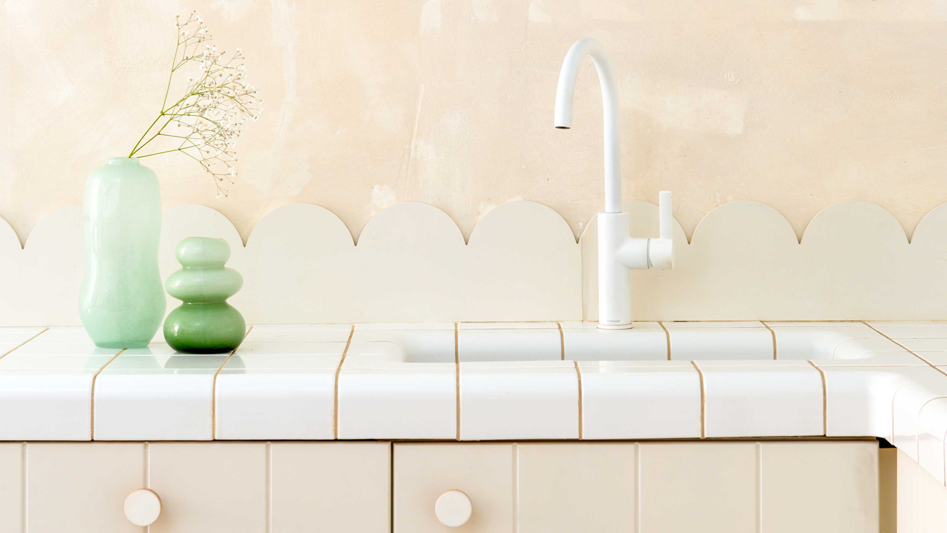

Have you ever seen an interior design scheme with "curved" tiles and wondered how it's done? These designs look as though the tiles are soft and fluid, melting over curved forms to allow for creative spaces that don't feel so rigid and hard-edged. However, the vast majority of any curved tiles you see actually belong to a very specific tile system called DTILE, designed and made in the Netherlands, which you'll actually need to design your space around to make work.
'It uses prefabricated parts,' explains architect Scott Weston. 'A standard tile, curved and bullnose pieces. You don’t have to cut the tiles to fit, as you base the design on the system. It's simpler for the tiler.'
It opens up your rooms, whether bathroom, kitchen or any other room in the house, to new design opportunities, and new ways to use tiles that feels fresh and modern. It's become an interior design trend in its own right.
Take a look at these 5 examples of creative ways in which DTILE has been used by interior designers that showcase just what you could do with this genius tile, and how it can work particularly well for a small space.
1. This small bathroom countertop
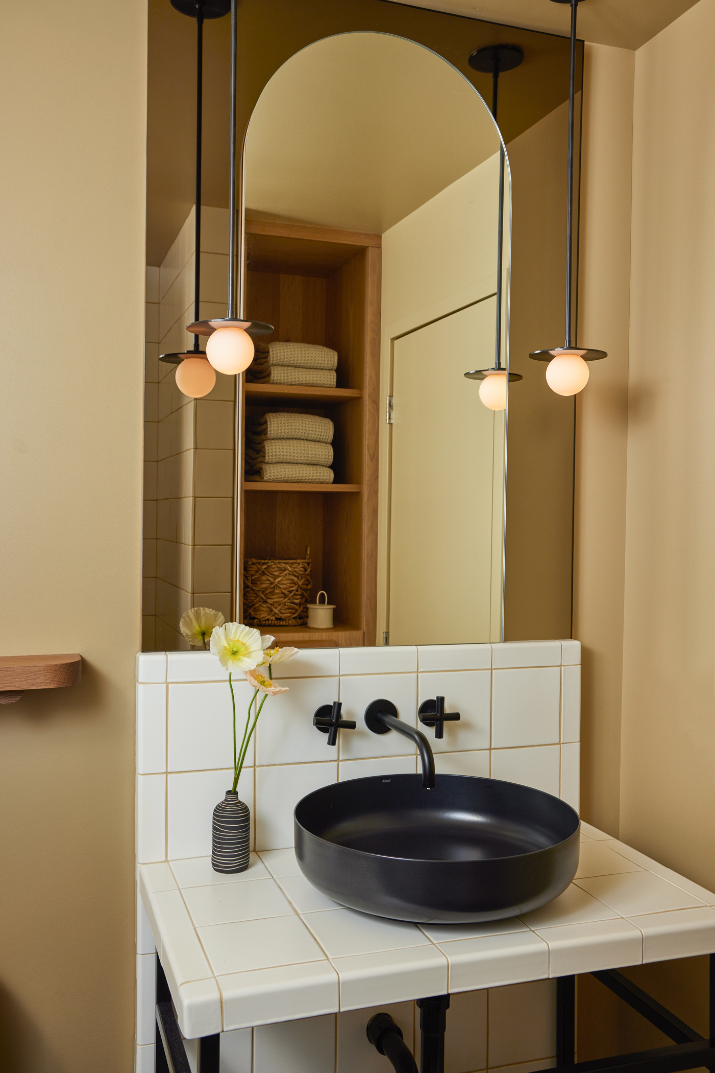
While some of these interior designer-designed schemes go all out on using these curved edge tiles from DTILE, they're also the sort of idea that works well when used as a small detail in a space.
In this small bathroom, for example, the tiles are just used to bring the finishing touch to the bathroom vanity - a tiny, but meaningful detail that helps to elevate the space. 'The custom tile vanity in the guest bathroom is design forward while nodding to the whispers of the architectural language of the home,' says interior designer Alissa Pulcrana of Portland-based design studio Bright Designlab. 'It also creates a textural visual interest which is a refreshing diversion from stone, and is also very durable.'
It feels like a softer edging for something like a countertop, too. Where our brains are hardwired to avoid hard, sharp angles, soft curves are welcoming and invite us to approach - perfect when space is short in supply, but you want to feel like you've got room to move.
2. This apartment's bold guest bathroom
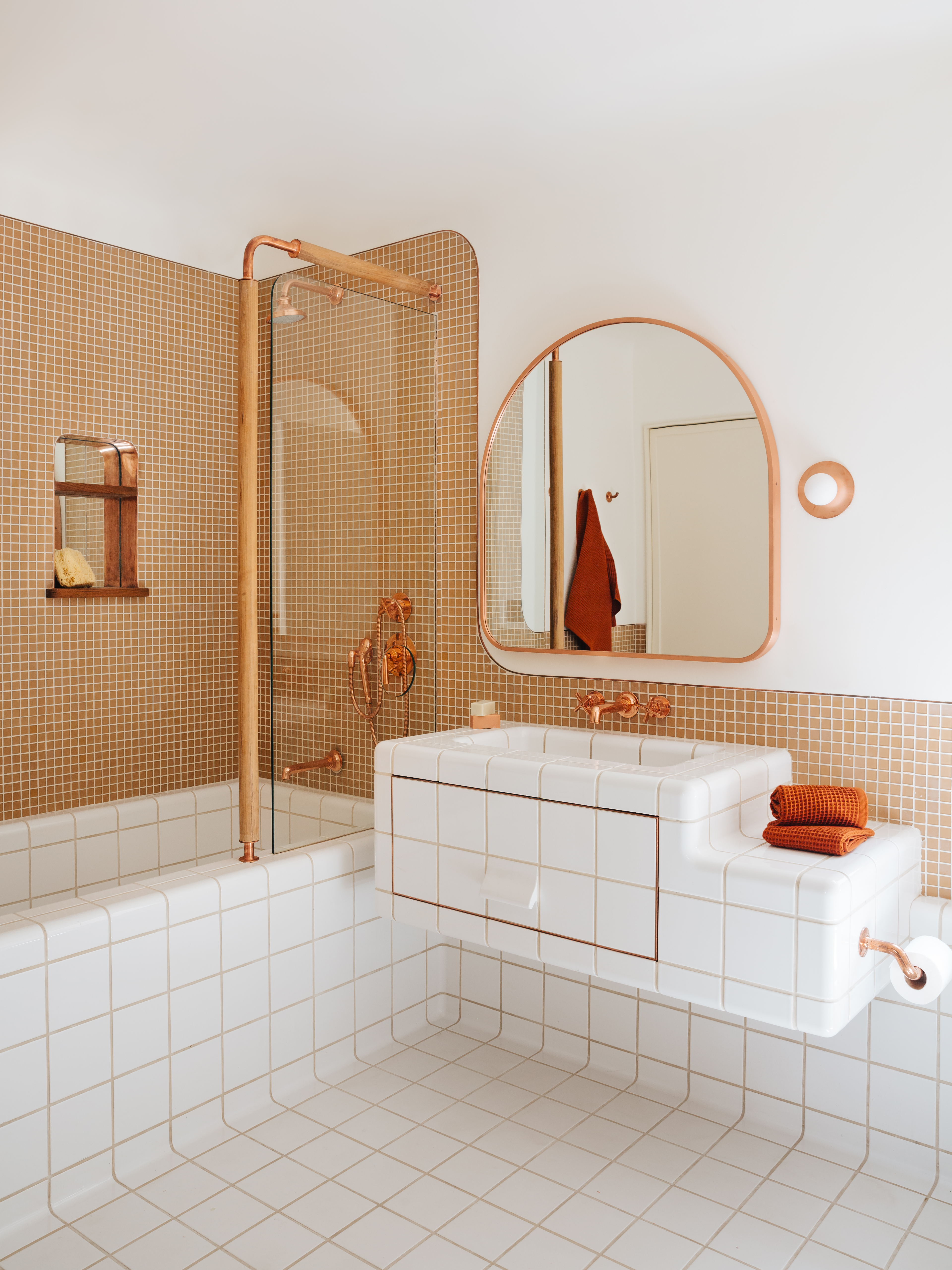
At the other end of the spectrum, interior designers Home Studios used the curved tile finished across the bathroom of this modern New York apartment. The D-Tile edgings are used across the vanity with integrated sink and built-in bathtub that's been fully tiled inside and out. It also extends to a small seating nook that incorporates towel storage for this guest space.
This bathroom also showcases how you can use the inward curving tiles along the perimeter of the room. It creates a softer connection between walls and floors, making the whole space feel like one tiled area, with no ugly or awkward cuts in the tiles to be found, while streamlining these disparate elements to make it feel a more cohesive space.
3. This small kitchen's countertop
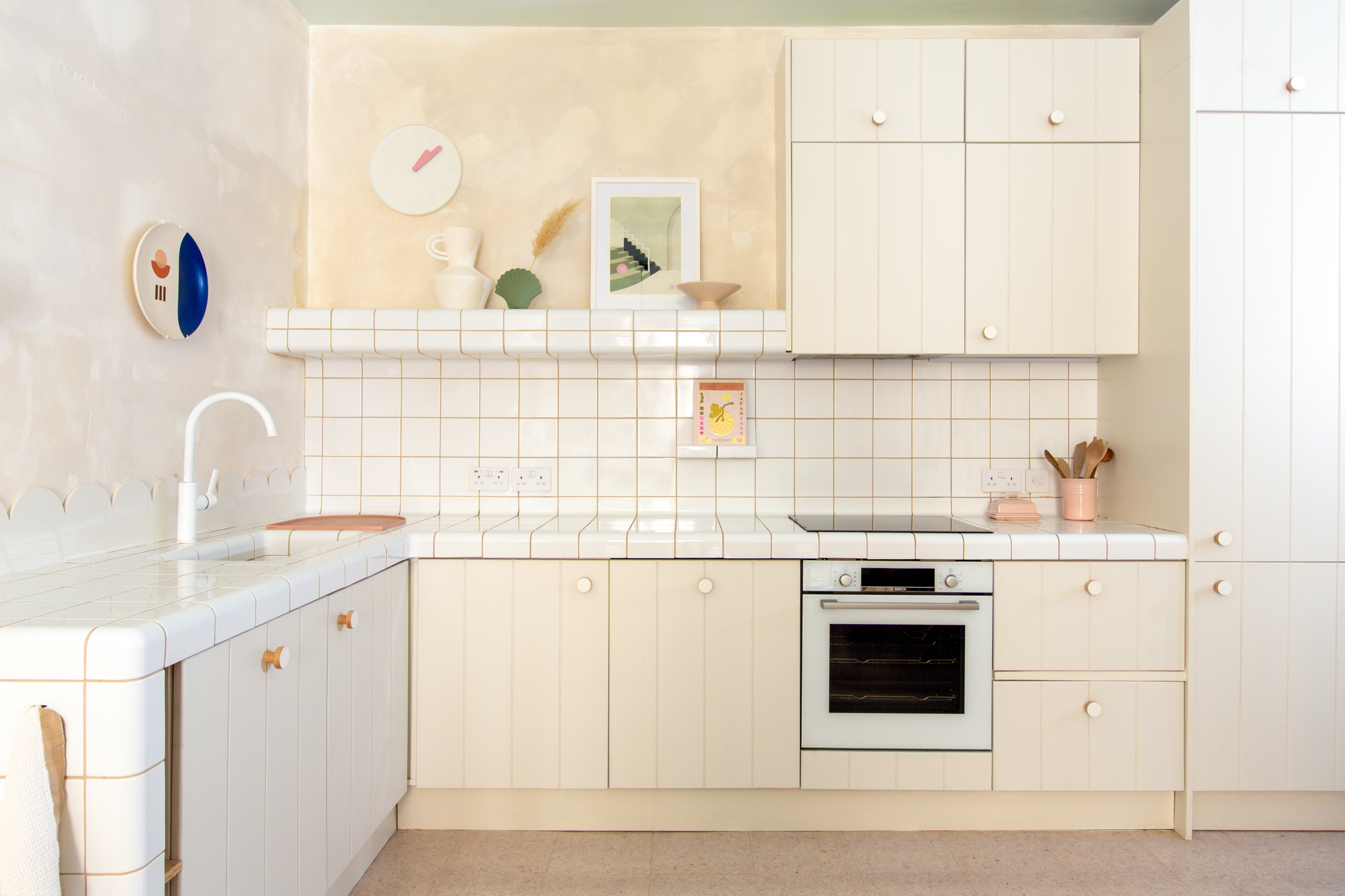
This clever ability to blend surfaces is the real secret to how curve-edge tiles really make a small space work better, and it's why Sophie van Winden, co-founder of Owl Design London, used them in this small kitchen.
'The kitchen is on the lower ground floor of an old chapel, so even though it has really high ceilings, it can get quite dark,' Sophie tells us. 'We wanted to open up the space with as little material and color change as possible. The DTILE was perfect for this as we could use them for the countertop, kitchen backsplash, shelf and sink and we then carried them along to become the dining table bench and media shelf continuing into the living room space.'
'The smooth curves and slightly reflective surface of them were perfect for bouncing the light and creating flow between the spaces,' the interior designer adds.
4. This living room's coffee table
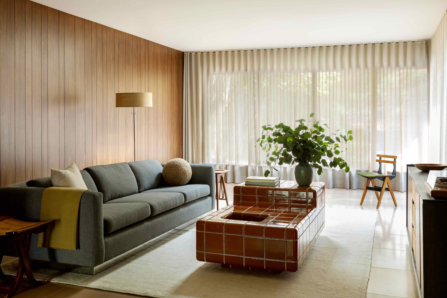
Curved tile edges aren't just limited to bathrooms and kitchens, either. We've seen some brilliant examples across the home, from fireplaces to dining tables, and even an outdoor kitchen. However, it's this coffee table designed by California-based interior designer Corinne Mathern that's our favorite alternative use of this tile system.
'I love the Superstudio tile tables of the 70s, but we wanted something softer for this living room and D-tile system was perfect for that,' Corinne said.
5. This modern kitchen island

In this modern kitchen, architect Scott Weston used DTILE to create an island to contrast against the other linear forms he'd chosen for the design in his own home, inspired by the tiled countertops that appeared in American movies he'd seen as a child.
'Creatively using a tile color or pattern provides unique design solutions to our clients’ homes, rather than sticking to the same old formulaic system of specifying marble or quartz,' he says.
Be The First To Know
The Livingetc newsletters are your inside source for what’s shaping interiors now - and what’s next. Discover trend forecasts, smart style ideas, and curated shopping inspiration that brings design to life. Subscribe today and stay ahead of the curve.

Hugh is Livingetc.com’s editor. With 8 years in the interiors industry under his belt, he has the nose for what people want to know about re-decorating their homes. He prides himself as an expert trend forecaster, visiting design fairs, showrooms and keeping an eye out for emerging designers to hone his eye. He joined Livingetc back in 2022 as a content editor, as a long-time reader of the print magazine, before becoming its online editor. Hugh has previously spent time as an editor for a kitchen and bathroom magazine, and has written for “hands-on” home brands such as Homebuilding & Renovating and Grand Designs magazine, so his knowledge of what it takes to create a home goes beyond the surface, too. Though not a trained interior designer, Hugh has cut his design teeth by managing several major interior design projects to date, each for private clients. He's also a keen DIYer — he's done everything from laying his own patio and building an integrated cooker hood from scratch, to undertaking plenty of creative IKEA hacks to help achieve the luxurious look he loves in design, when his budget doesn't always stretch that far.
-
 Biophilic Decluttering — What to Take Out of Your Home (and What to Put in) for a More Natural Home
Try your hand at biophilic decluttering to ground your interiors, connect to the environment, and cure chronic clutter in one go. Here's how.
By Amiya Baratan
-
 10 Arrestingly Beautiful Milan Restaurants Locals *Actually* Dine at — Selected for Their Interiors
Brought to you by our community of culture insiders, this edit of the best restaurants in Milan sees authentic Italian food and immersive design unite
By Gilda Bruno