
From tobacco tones to darkest chocolate, there's something about the color brown that can make a living space feel immediately more luxurious. Shades at the stronger end of the spectrum manage to feel both daring and timeless, while softer browns and mid-tones are warm, inviting and restful.
As a backdrop, brown is an easy win. It complements a huge range of other colors and integrates effortlessly into contemporary and traditional schemes. If you're aiming for quiet luxury, pair brown with natural materials and keep decorative flourishes to a minimum.
'Dark brown is beautifully complemented with textural elements such as wood and clay finishes, muted linens and tactile surfaces,' advises Ruth Mottershead, creative director at paint brand Little Greene, recommending the brand's Chocolate Colour as a 'dark and sumptuous' choice. Alternatively, brown tones also work really well with more decadent elements, such as lustrous brass, dark wood, velvet and marble.
Whether you're leaning towards gentle buff tones, rich mahogany shades or olive-toned browns, take inspiration from five design insiders below on how to use this color trend.
1. OPT FOR A WRAPAROUND DARK-CHOCOLATE SCHEME

We love how this striking Chocolate Colour paint shade by Little Greene both complements and modernizes the ornate period details of this cocooning living room. 'Deep, rich browns work wonderfully as an alternative where you might previously have considered black, charcoal or a dark blue, bringing a restful and warm atmosphere to a living space,' says Ruth from Little Greene.
'Avoid pairing this shade with bright whites, instead combine it with natural stone hues, warm whites or warm greys such as Rolling Fog Dark for a luxurious feel that envelops the space and adds warmth.'
2. CONSIDER OLIVE-BROWN FOR A SOFTER TAKE ON STRONG COLOR

If you'd like to go for a warm, dark shade but aren't completely sold on the idea of brown, consider khaki or an olive-brown tone. Moody, muddy hues such as these offer a similar earthiness, but can often seem a little more approachable. The green notes help to lift the strong color, while still retaining the luxurious feel, as this timeless corner of Heckfield Place proves.
The interior of this meticulously designed country house hotel features a considered color palette designed to connect guests with its idyllic rural surrounds. Take a tip from Heckfield's interior designer Ben Thompson, and accentuate the different tones in a chameleon wall color such as this by choosing accessories in either green or brown.
3. USE VERSATILE COFFEE SHADES TO BRIDGE OLD AND NEW

When Avenue Design Studio and Hedda Pier set to work transforming this Dutch townhouse in Haarlem, they devised a color scheme that would sit comfortably with the home's traditional architecture while providing a modern stamp.
‘It was important to us from the start to adapt some elements of the architecture, bringing them back in a way that felt contemporary,’ says the studio's Holly Marder, referencing details such as the richly painted wall paneling in the living room. 'The color we chose was Mouse's Back by Farrow & Ball,' Holly shares. 'It has a richness that translates so beautifully in residential living spaces.'
4. COMBINE TOBACCO HUES WITH RED AND OCHRE UPHOLSTERY

Built in 1929, Hotel Rochechouart is a charming and intimate Art Deco design gem located at the foot of Montmartre in Paris. It was recently renovated by Festen Architecture, who developed an autumnal 1920s color palette for the redesign, which is made up of muted greens, bronze, ochre, tobacco, mocha, terracotta and faded white.
'We wanted to give its original beauty back to the hotel by restoring its moldings and floors and at the same time adding a contemporary touch,' say the hotel's designers, who balanced history with luxury while steering well clear of pastiche with this expertly curated palette.
5. MIX BROWN WITH DARK WOOD FOR A TONAL SCHEME

'In this apartment we had a lot of height and natural light, so it was the perfect canvas for a darker tone on the walls to create elegance and warmth,' says Mariana Morales of Mexican architecture and interiors studio Direccion, who chose a deep grey-brown shade to envelop the space.
Mariana combined the rich-hued walls with warm timber floors and textural dark wood furniture, for a brown-on-brown monochromatic color scheme that's relaxed yet sophisticated. Textiles in lighter greige shades lift the look without compromising the cohesive palette, while a dark metal pendant lamp completes the tonal scheme.

Price: $70
Size: One gallon

Price: $130
Size: One gallon

Price: $49.98
Size: One gallon
-
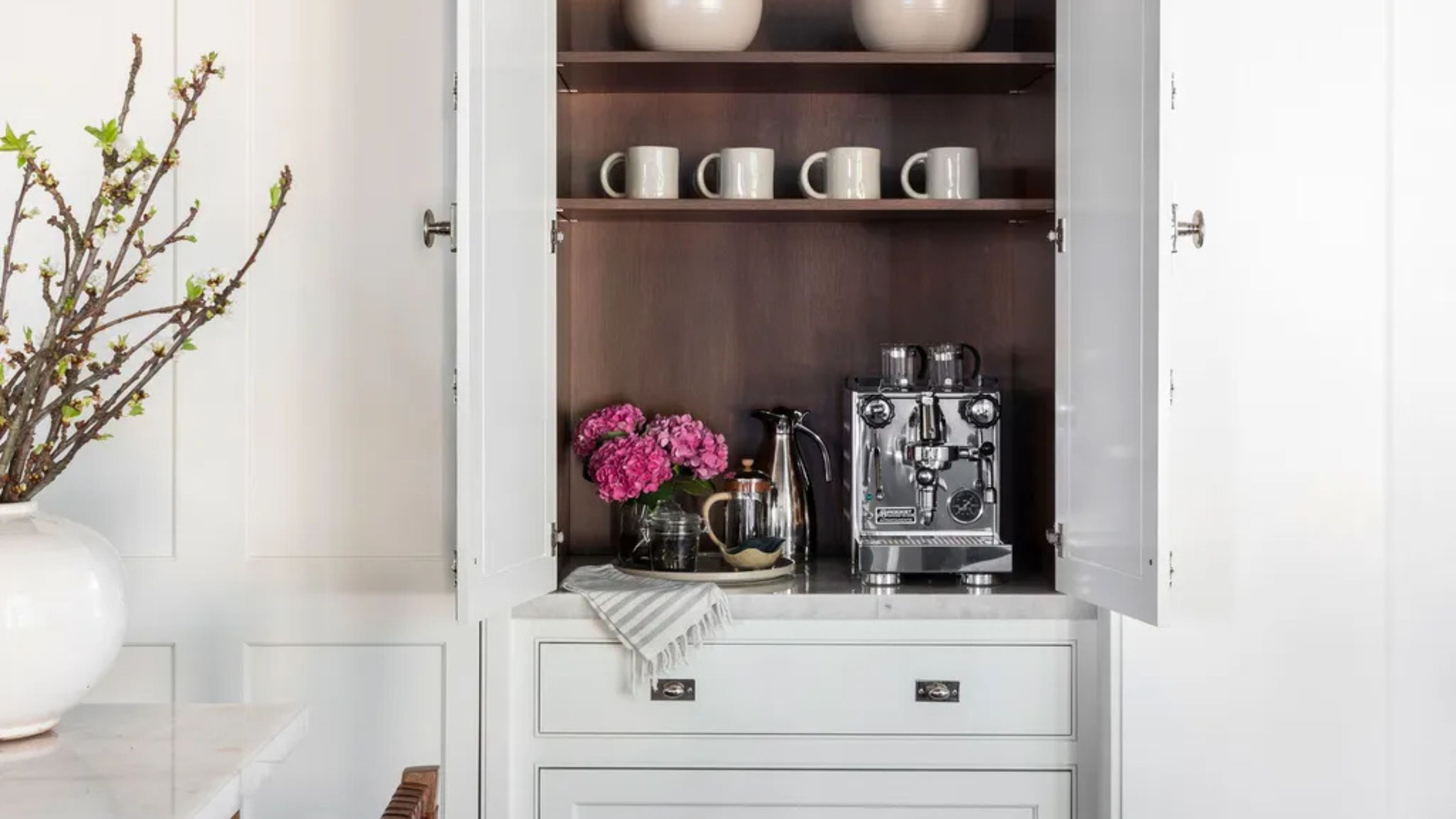 Turns Out the Coolest New Café is Actually In Your Kitchen — Here's How to Steal the Style of TikTok's Latest Trend
Goodbye, over-priced lattes. Hello, home-brewed coffee with friends. TikTok's 'Home Cafe' trend brings stylish cafe culture into the comfort of your own home
-
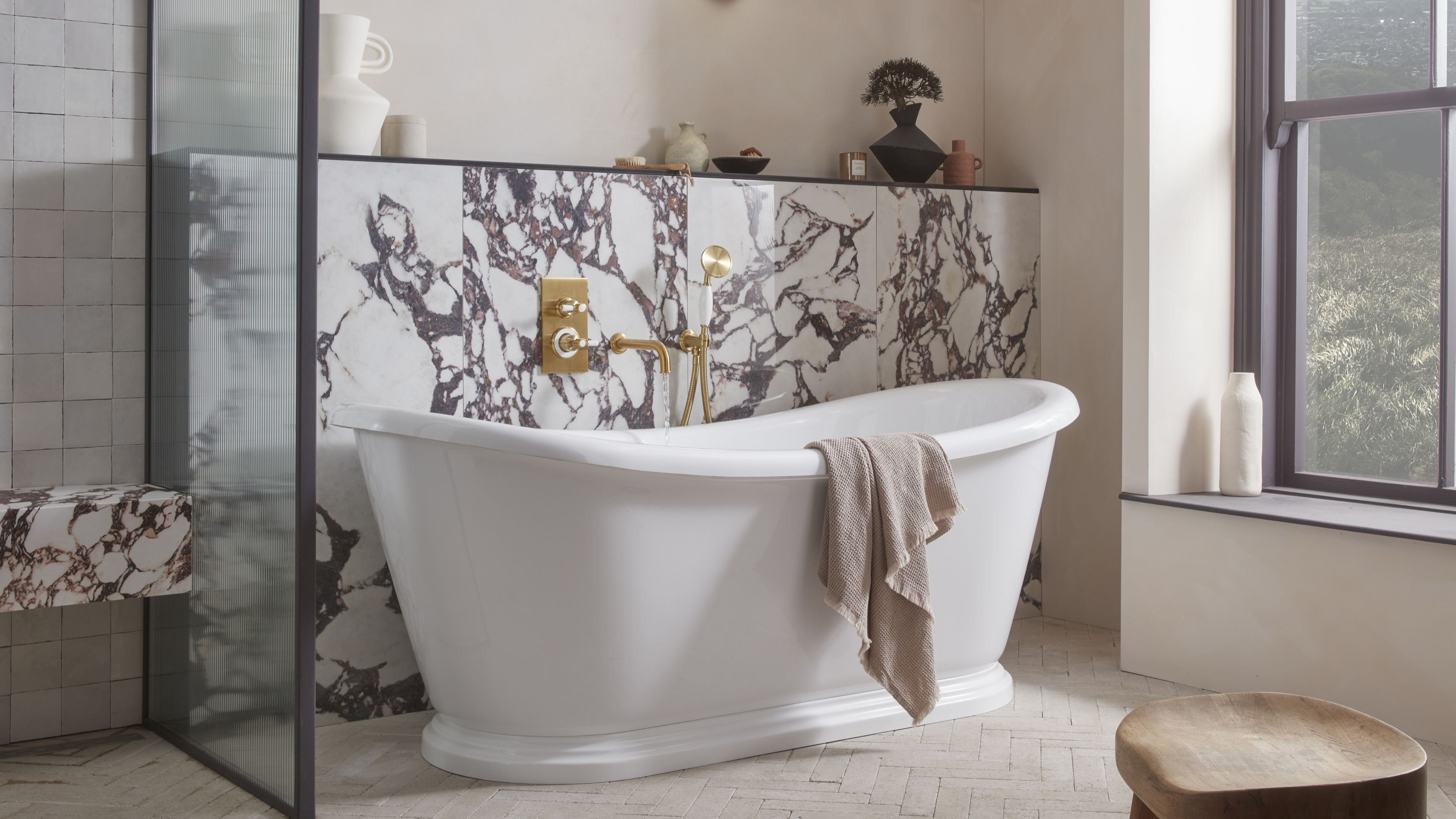 5 Bathroom Layouts That Look Dated in 2025 — Plus the Alternatives Designers Use Instead for a More Contemporary Space
For a bathroom that feels in line with the times, avoid these layouts and be more intentional with the placement and positioning of your features and fixtures


-
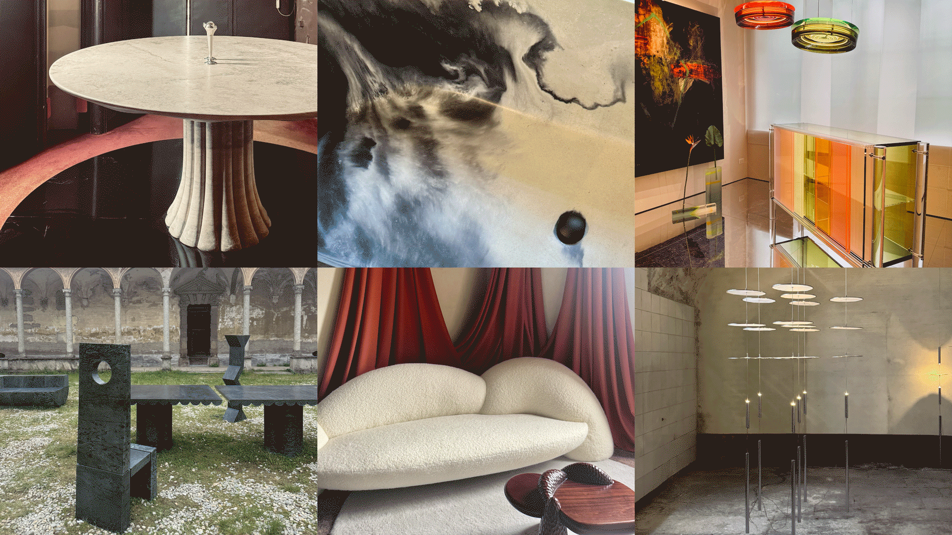 Straight from Salone: 5 Emerging Trends I Found in Milan That'll Shape Interiors for the Year Ahead
From reflective silver to fluidity, here's my perspective on the key themes and new moods coming through from Milan Design Week
-
 The 'Red Table Trick' Is the Easiest and Most Expensive-Looking Trend to Hit 2025 So Far
A red dining table makes a seriously stylish statement; the beloved pop of red trend just got an bold and expensive-looking upgrade
-
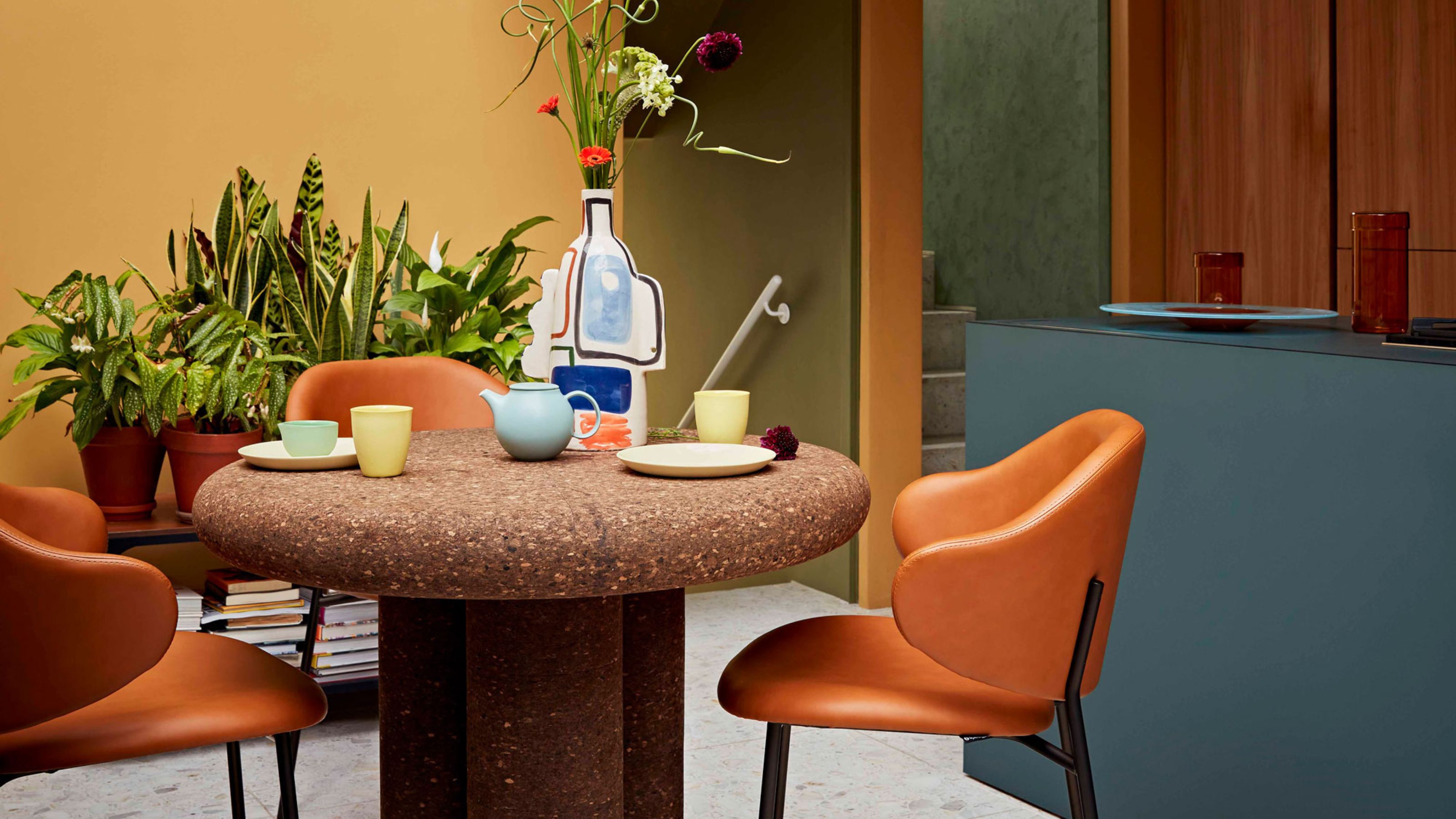 Cork Is the Cool, Sustainable, and Surprisingly Chic Material We Can't Stop Furnishing With Right Now
In honor of Earth Month, we’re toasting to cork... furniture, that is
-
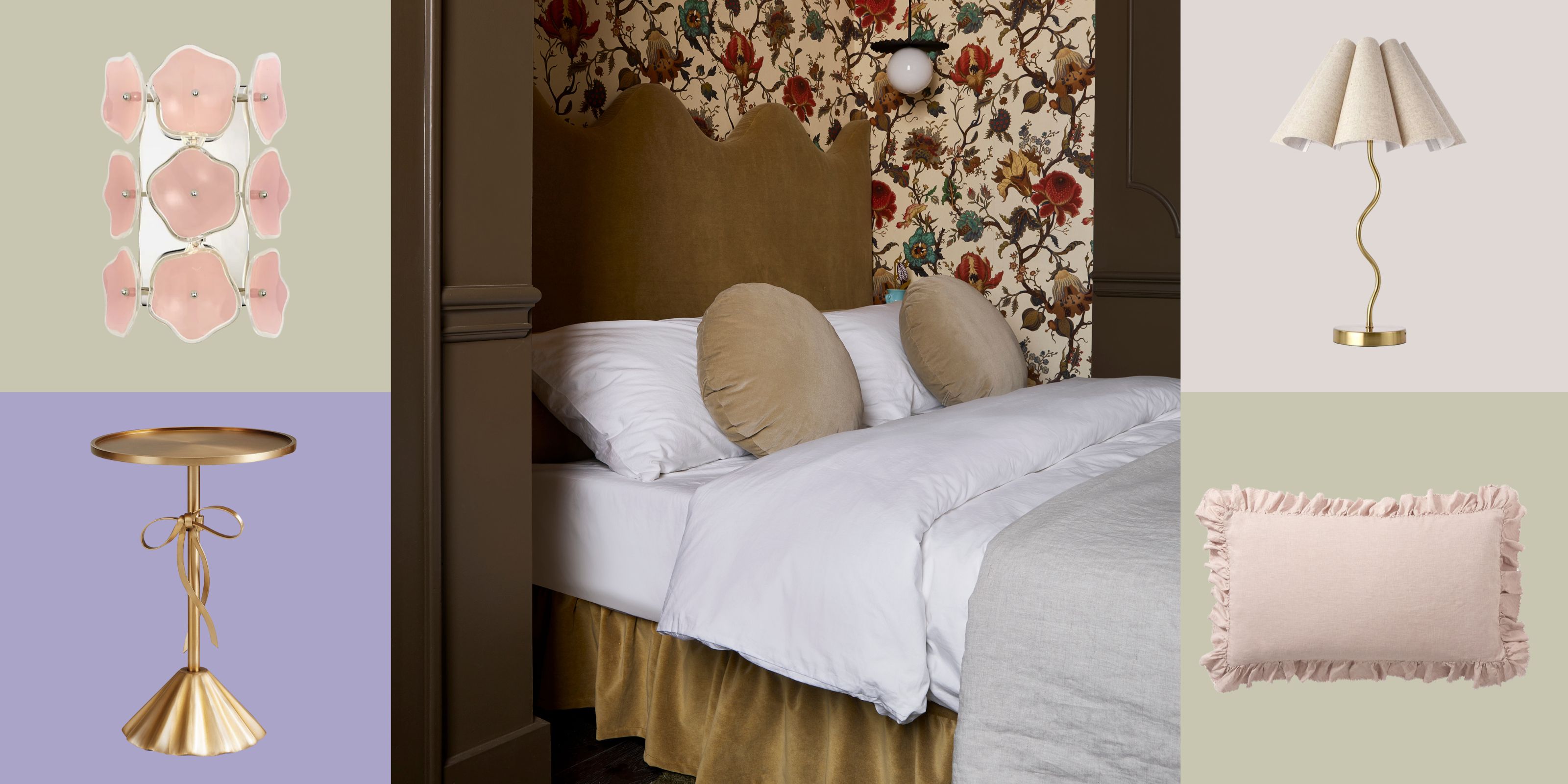 The Coquette Aesthetic Is Still Going Strong in Homes in 2025 — But Now It's Charming, Whimsical, and Has Modern Flair
A designer weighs in on how you can make the classic coquette trend feel modern while still retaining its whimsical elegance
-
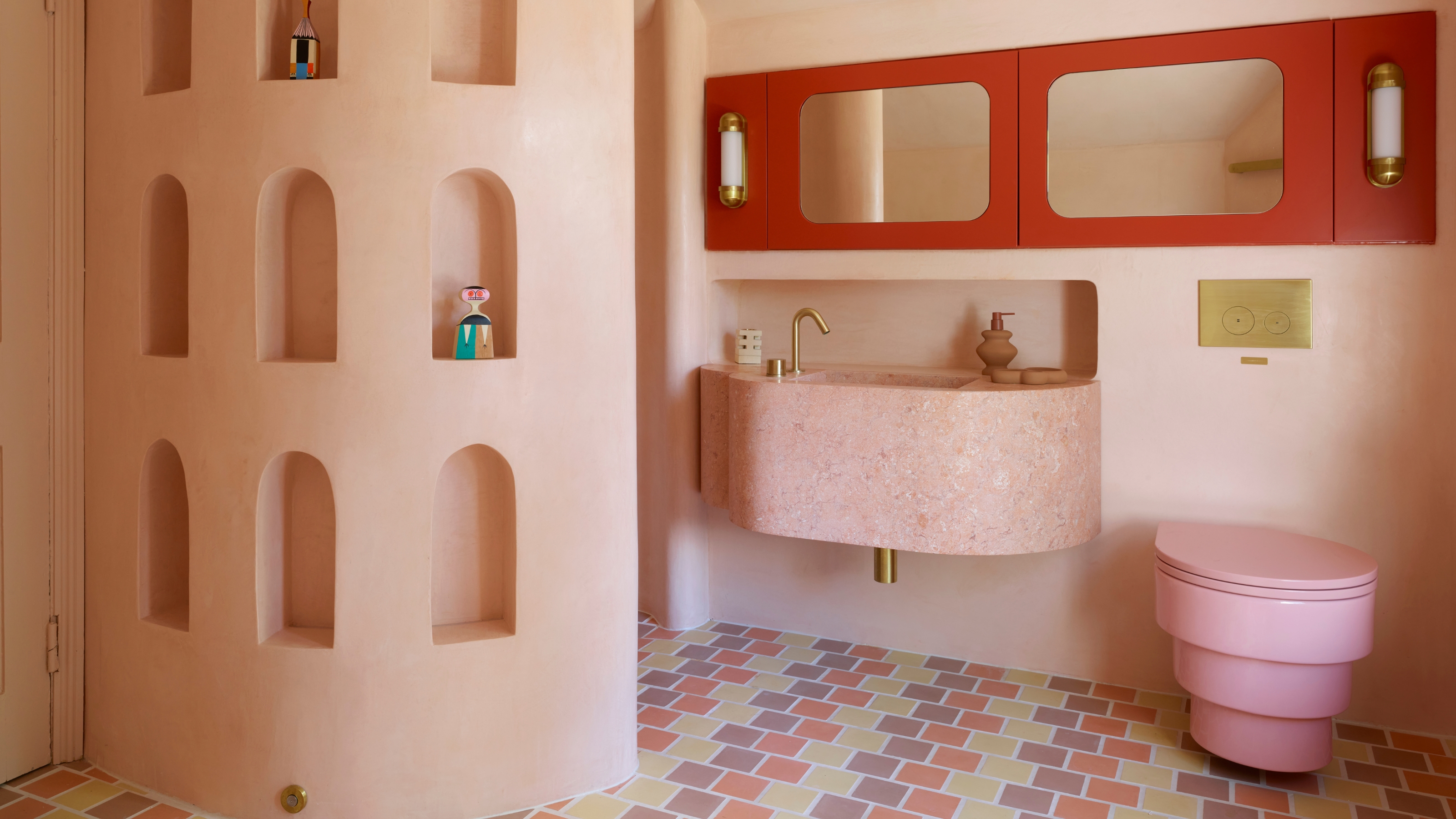 Spotted in the Coolest Bathrooms of the Moment — This Colorful-but-Divisive Trend Is the Idea You'll Either Love or Hate
See you later, sterile white. This playful plumbing trend is bringing color back to our bathrooms in an utterly unexpected way
-
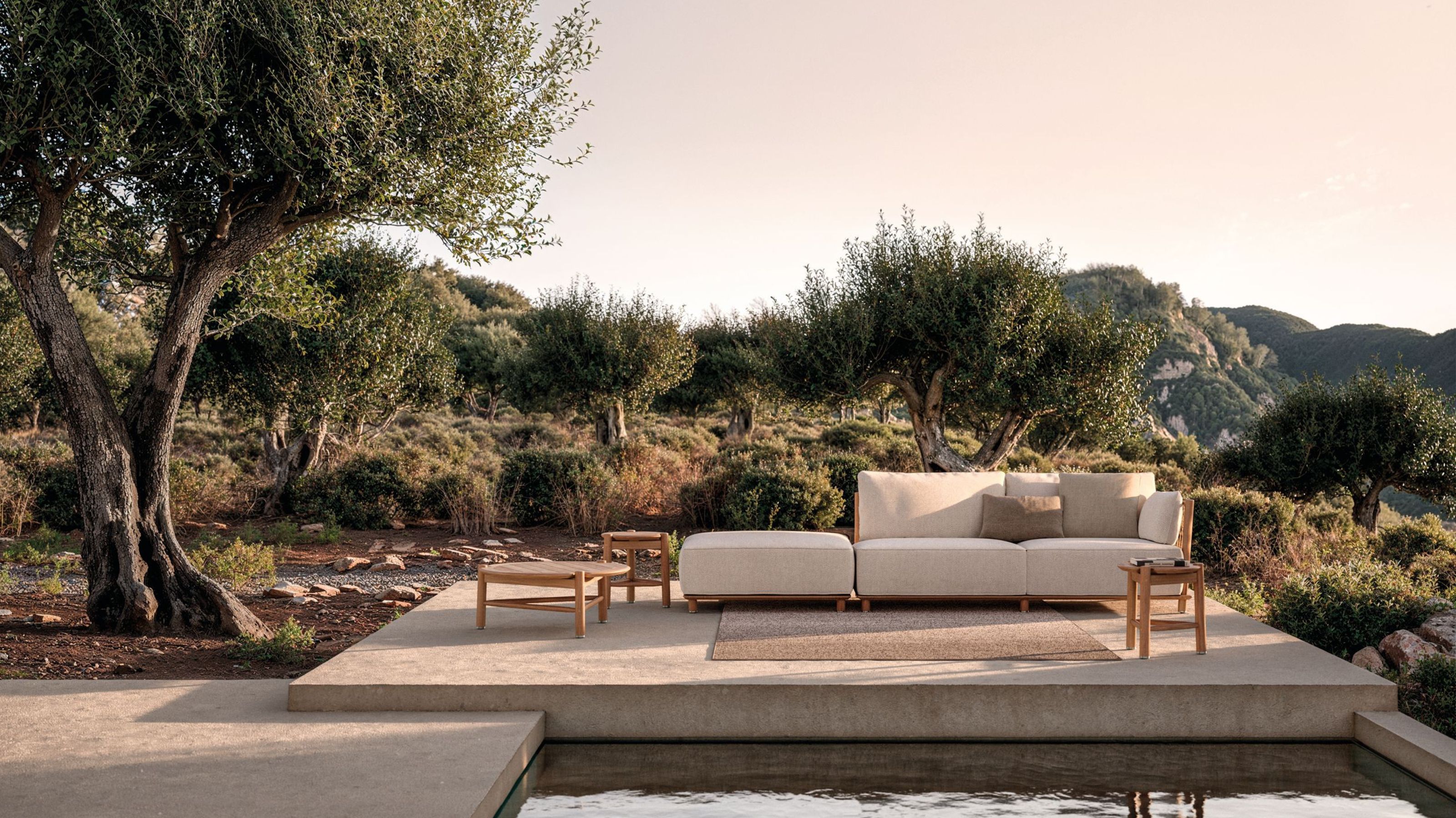 The Biggest Outdoor Furniture Trends for 2025 Embrace the Natural World, White Lotus, and a Touch of Whimsy
Sofas as plush as your living room’s, tables fit for a five-star resort, and materials straight from nature — here’s how outdoor living is evolving this year
-
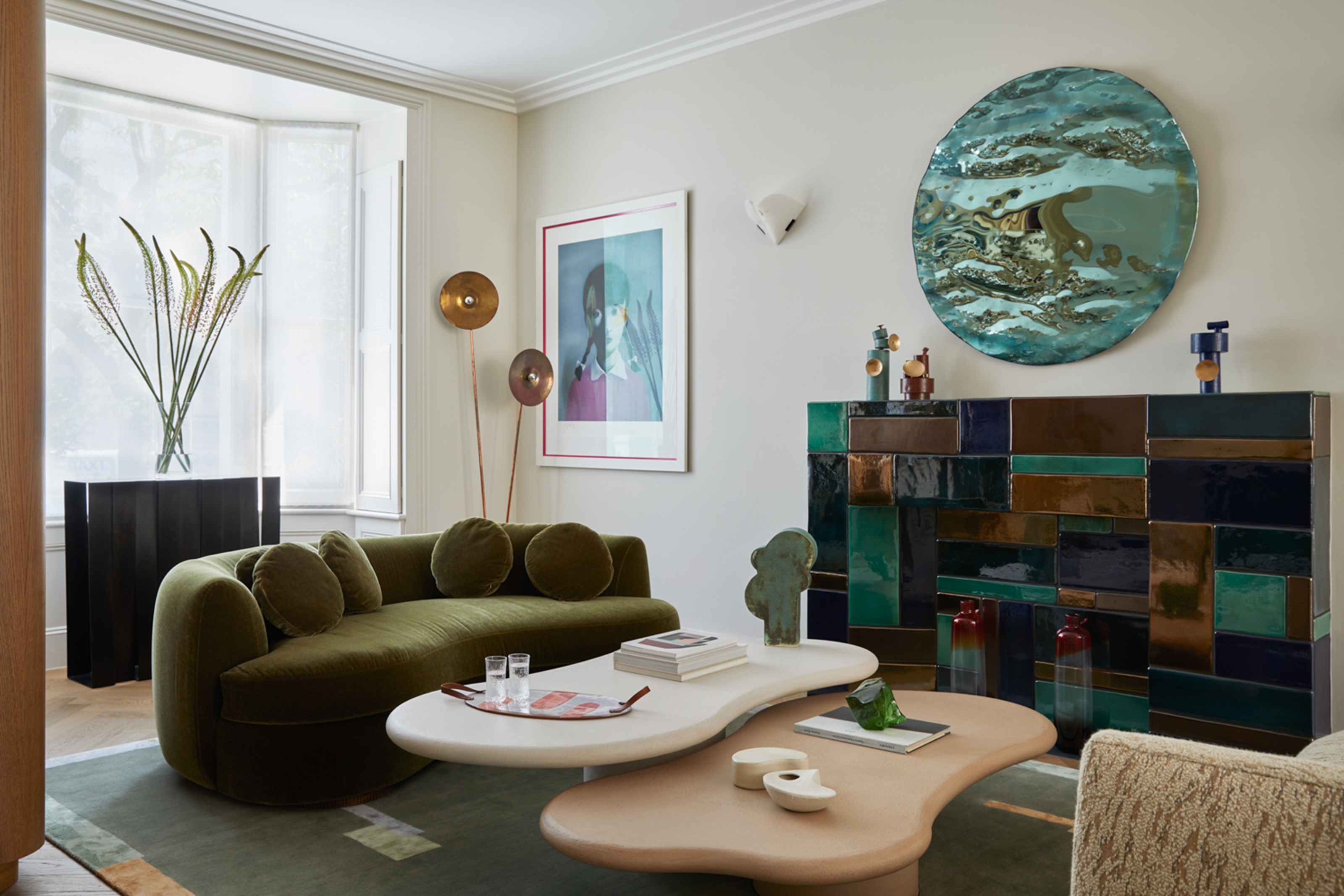 The "One Amazing Thing" Theory Could Just Be the Secret to Making Your Decorating Budget Go Further (While Making More Impact)
What if we told you designers had found a way to control a project's spend even while elevating the final result? This new trend does just that
-
 Carpets Used to Give Me the Ick, but This Bold New Style Makes Me Think They're the Next 70s Design Detail Due for a Revival
I've always had visions of ripping up wall-to-wall carpets, but now I'm thinking about actually installing them — what gives?


