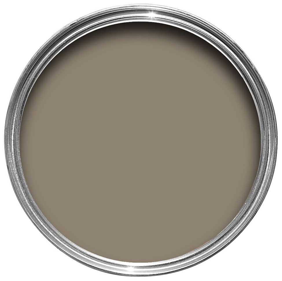
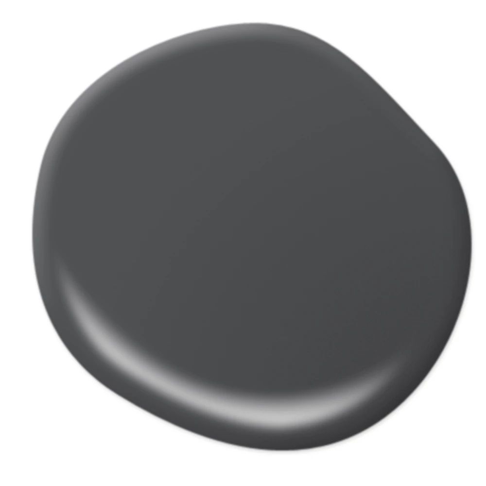
'This is how we're going to be decorating in 2024' - 8 dark color trends to paint your walls with for a luxurious look next year
Strike the perfect balance of drama and comfort with these room-defining shades
If you're wondering what dark color trends will be big in 2024, you're not alone. We've also noticed a slew of enviable interiors that harness the power of deep, dark palettes, and can't wait to see how this daring decorating trends evolves in the coming year.
While shades at the darker at the end of the spectrum can seem like a bold or dramatic choice, they're also surprisingly restorative, which in part explains the trend's traction. 'I think there's definitely a turn towards more decorative and moody spaces that feel nurturing and exciting at the same time,' says Bronwyn Riedel, co-founder of Bauwerk Colour. 'With decoration and color comes a place to imagine and dream,' she muses. 'At the moment, we're loving deep forest greens, dirty plums and earthy browns.'
As well as making a statement, dark colors can contribute to a serene and restful atmosphere, which is perfect for areas in the home where you want to relax and recharge.
Interest piqued? We've compiled some of our favorite dark hues below, which look set to be a big interior design trend for 2024 and beyond.
1. Forest green

Dark forest green has become a new go-to moody shade for dramatic spaces, such as the walls of this otherworldly bedroom, painted in Fir by Bauwerk to stunning effect. A forest-green limewash paint with a grey undertone, this dramatic shade makes a statement while retaining a soothing air.
'Fir connects you to nature and envelops you in a bold but calming color, like a still pool,' says Bauwerk's Bronwyn Riedel. 'For this reason, it's a perfect for bedrooms.' And, if you like the idea of going darker still, you could try the brand's Thistle Leaf shade.
2. Coffee tones
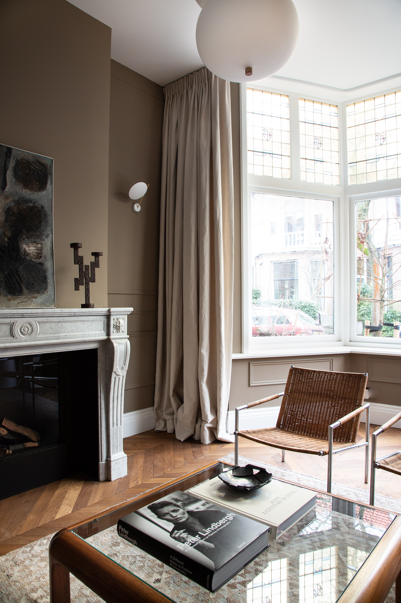
Evolving from the beige trend that we've seen a lot of in 2023, darker, coffee-tone browns are coming to the forefront.
'The color we used in this living room was Mouse's Back by Farrow & Ball. It's our favorite moody shade for historical architecture,' says Holly Marder of Dutch design studio Avenue, who designed this home in collaboration with Hedda Pier.
'We wanted to highlight the wall profiling and period marble fireplace of this Tudor home in Haarlem, while creating a layered effect tonally with the other elements in the space,' she continues, referencing the walnut herringbone floors, vintage kilim rug and mid-century artwork. 'We find this shade to be so grounding: it's the perfect dark neutral.'
3. Deep olive
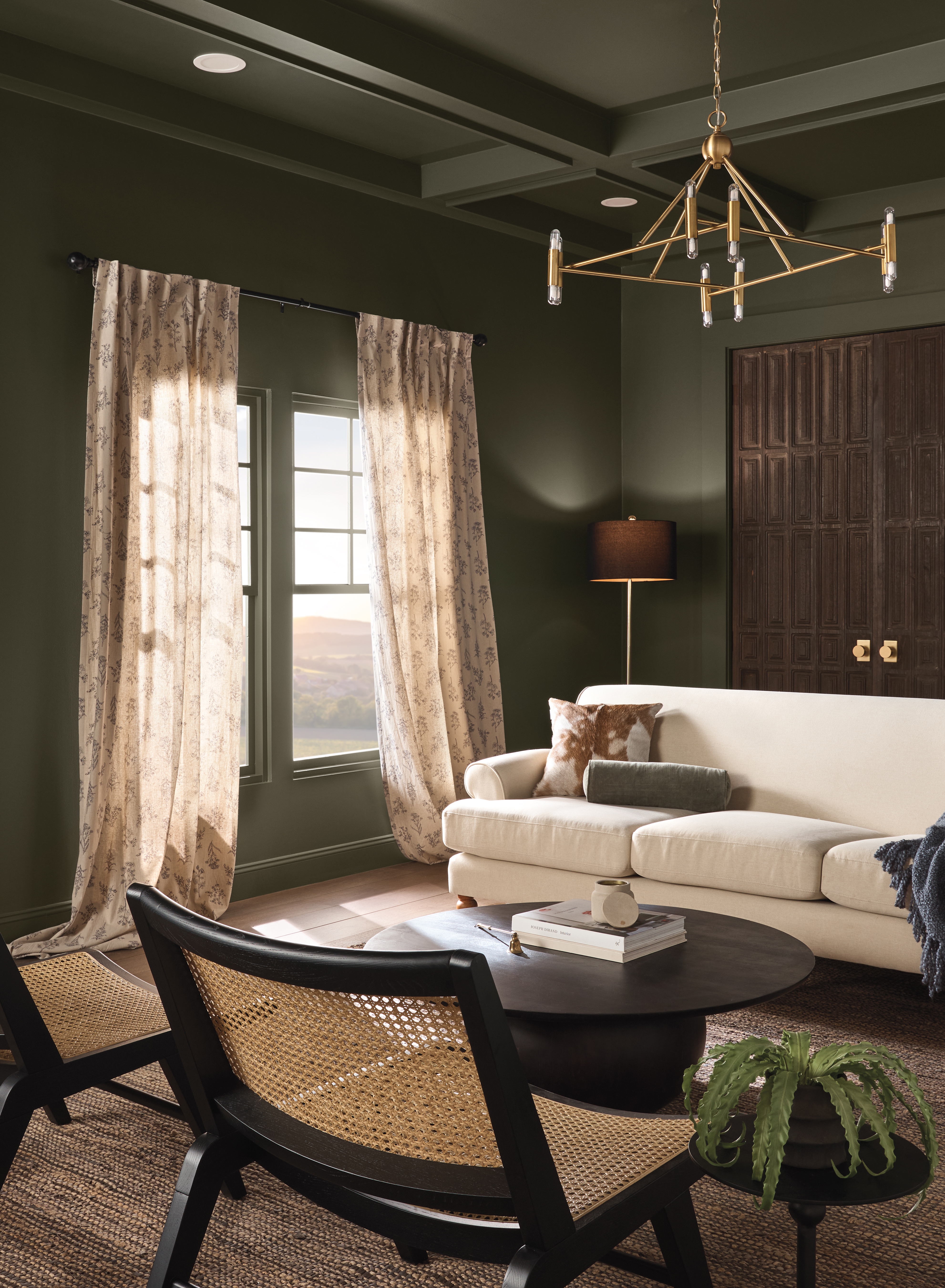
We love this comforting shade of dark grey-green, which Dutch Boy Paint has chosen as its color of the year for 2024. Color expert Ashley Banbury drew from global trends in fashion, culture and media to select the shade, which is called Ironside, for a modern dark color scheme.
The brand responded to the idea of home as a sanctuary and a place for self-care with this choice, noting that people are continually re-examining their daily habits, placing an emphasis on those that enrich their lives. 'Creating a space for wellness should be a driving factor in everyday life,' states Ashley.
4. Soft black
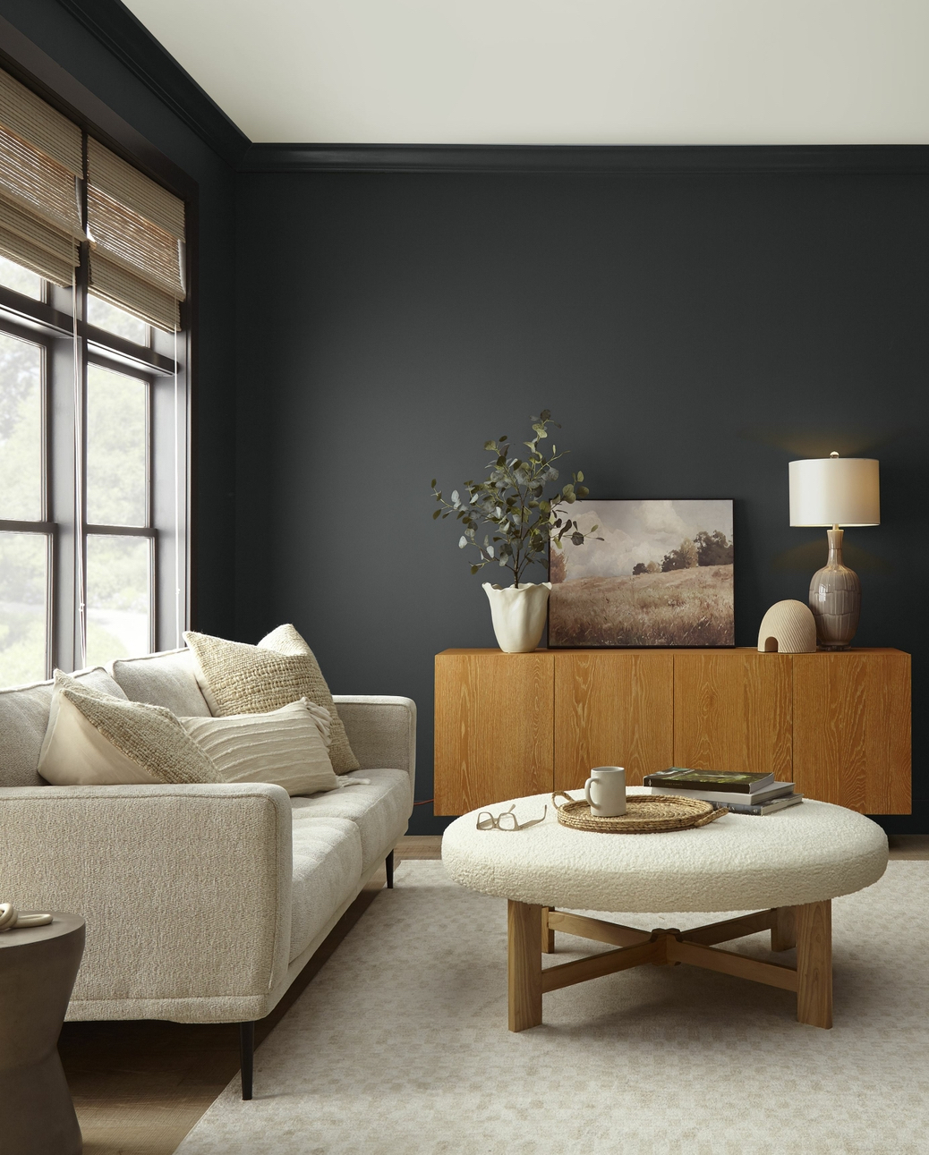
If you like the idea of black paint but, understandably, feel a little intimidated, try an off-black shade such as Behr's Color of the Year 2024 Cracked Pepper. 'As life returns to its more familiar rhythms, it’s time to allow our senses to come alive,' says Erika Woelfel, Behr's Vice President of Color
'From heightening the aromas of a dining room to feeling the softness of a living area, Cracked Pepper enhances the natural expression in any space.' Surprisingly versatile, a dark neutral shade such as this can work well in both modern and traditional spaces, pairing easily with a range of other colors, finishes, patterns, and textures.
5. Midnight blue
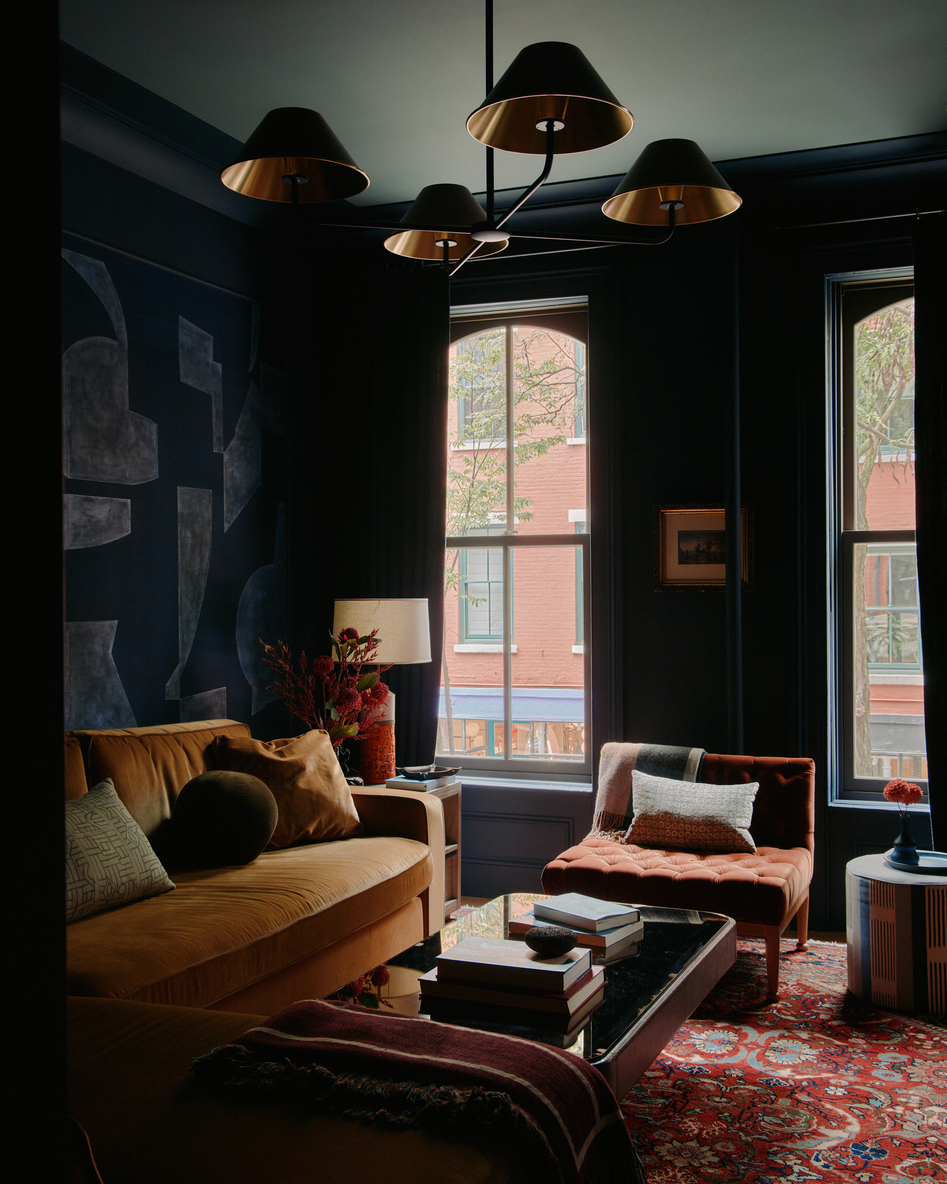
Dark blues were once the big color trend for dark spaces, but they've fallen out of favor for other moody hues in recent times. However, super dark, near-black blues are the way to take this color forward in 2024.
This inviting apartment in Manhattan's West Village is the work of Brooklyn-based studio General Assembly, who used a strong palette to imbue each room with its own unique atmosphere. A cocooning shade of dark blue defines the living area, matched to a panel of abstract De Gournay silk wallpaper for an inventive take on color drenching.
'The project is intentionally compartmentalized with multiple small rooms, each with their own distinct aesthetic traits by way of rich color and comforting materiality,' says General Assembly's co-founder Colin Stief. 'Though each room in the apartment offers immense personality, an undeniable sense of substance and depth ties each space to the other.'
6. Dark clay
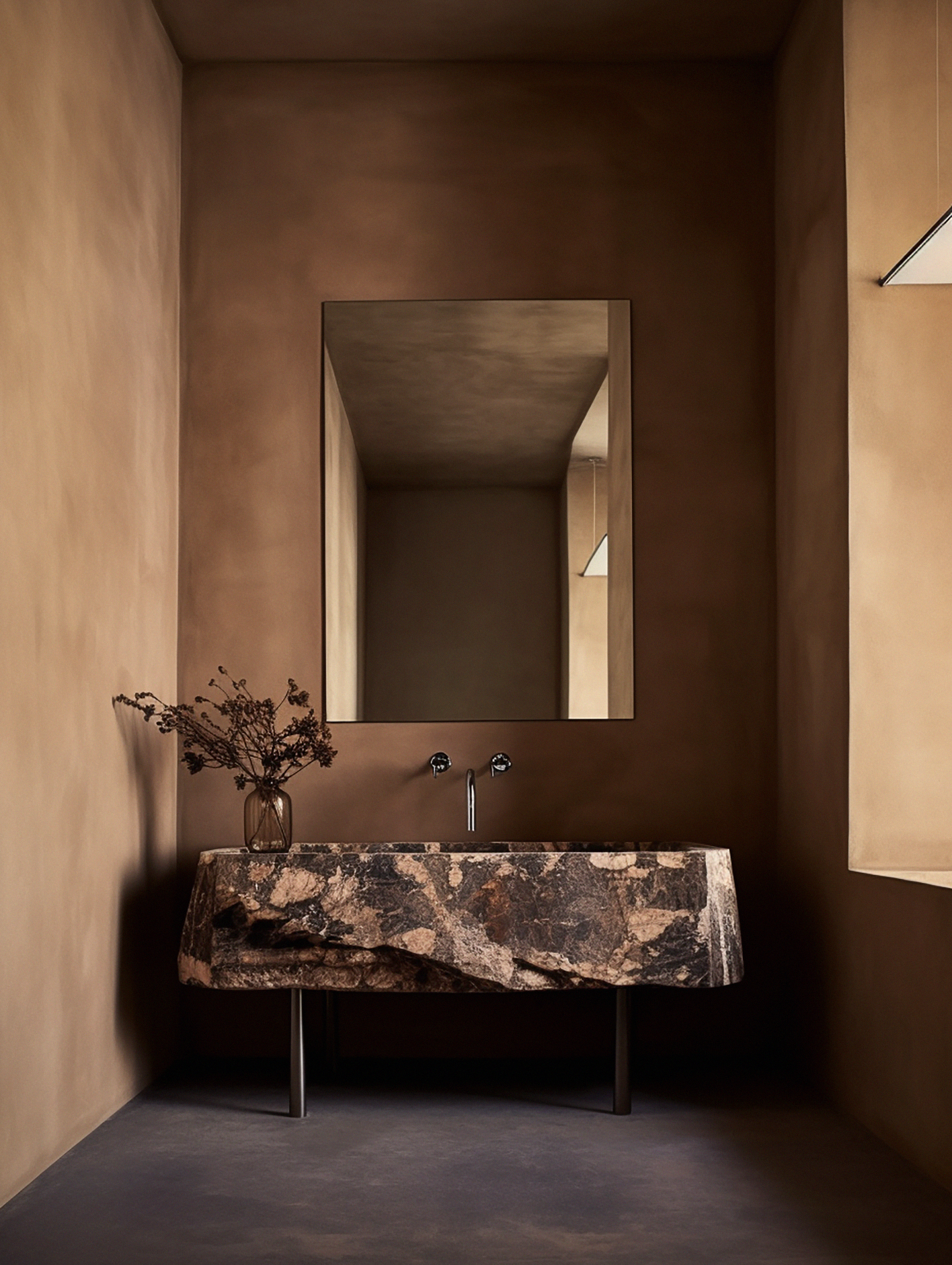
For those of us who prefer a neutral color scheme to bold color, darker versions of easy neutrals could be the way forward. This rich shade of brown – another beautiful Bauwerk shade called Bullrush – offers a new take on a neutral that's equally versatile but with added warmth.
'Bullrush is a natural brown with a very slight pink or reddish undertone from our range of limewash paints,' says Bauwerk's Bronywn Riedel. 'Paint this color on any way you like, it will reward you with a feeling of hygge, like a soft embrace.'
7. Decadent plum
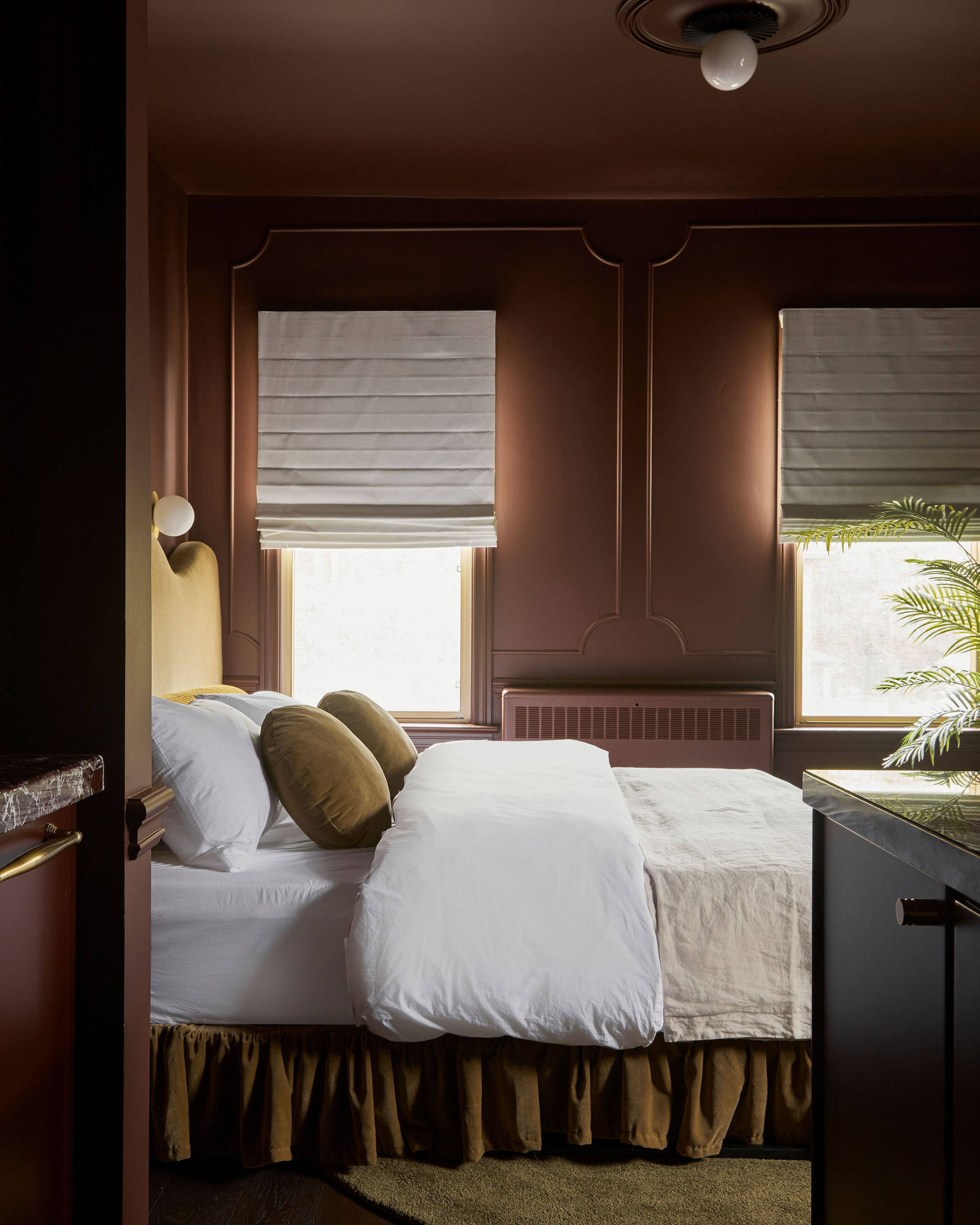
As an alternative to shades like dark red or blue, consider plum in your 2024 decorating plans.
The team behind Hotel Julie, which is situated in the Canadian town of Stratford, used a palette of dark shades to transform an 1800s inn into a decadently designed escape.
'With south and west-facing windows, this space is drenched in sun most of the day, so we painted the entire room in a rich wine color to capture that Hotel Julie moody feeling,' says Jillian Smith-Moher, co-founder of Twenty-Two Twelve, who implemented a theatre-inspired design brief throughout the property, featuring luxurious textures, bold motifs, and Victorian-era palettes.
8. Steel blue
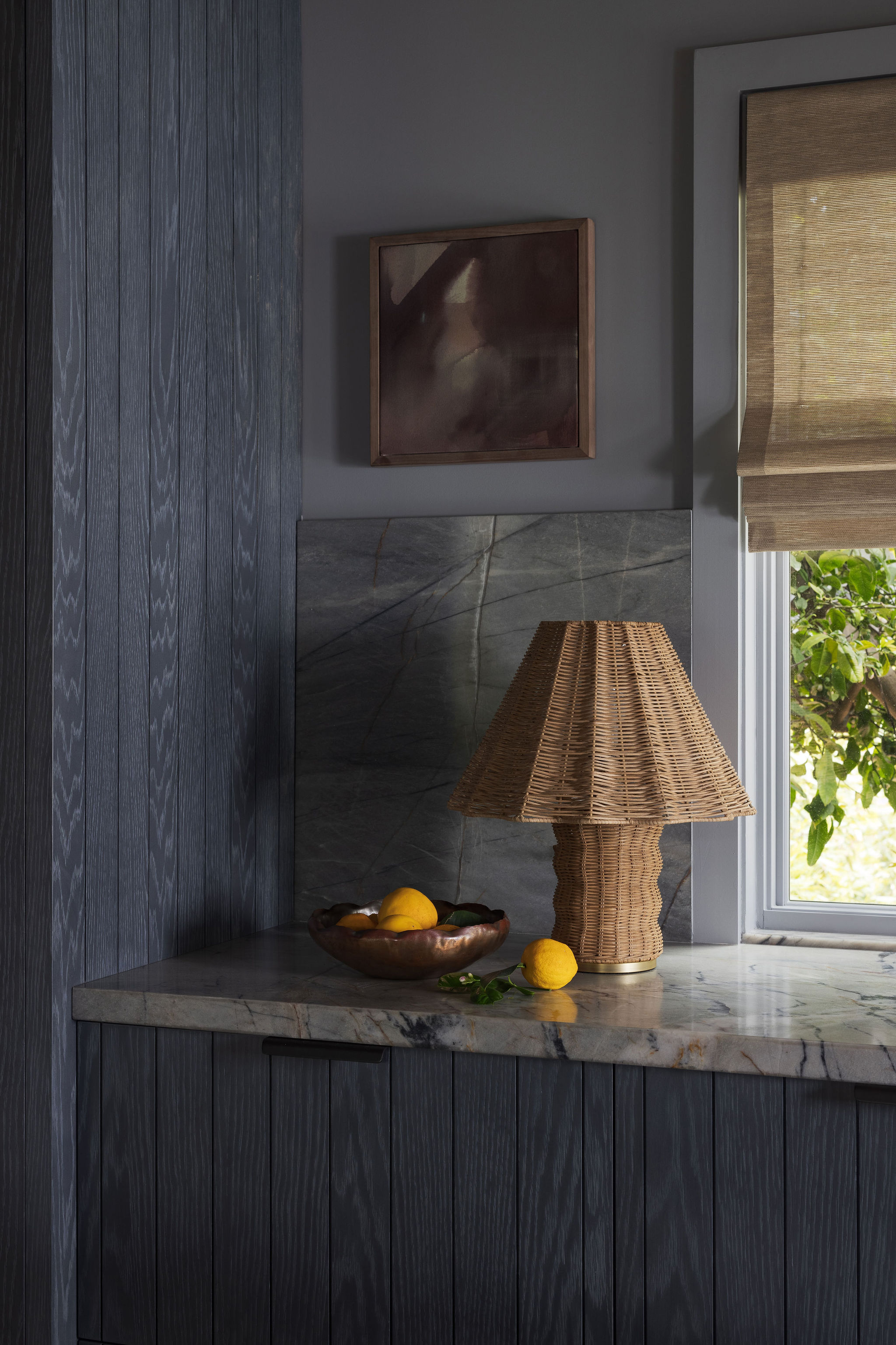
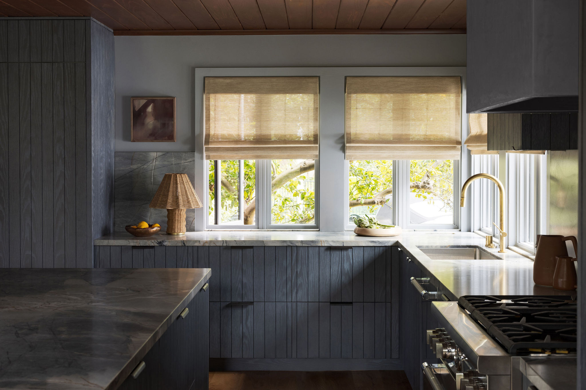
'We knew from the beginning of the project that we wanted a saturated color for cabinetry in this home,' says interior designer Katie Monkhouse, who installed a striking grey-blue kitchen in this mid-century-inspired Californian abode.
'Once we decided to run the redwood ceiling from the adjacent living room across to the eat-in-kitchen, we settled on a deep indigo stain that would highlight the wood grain in the cabinetry rather than a solid paint that would cover it. We took it one step further and painted the walls a dusty grey-blue color to really play up the light cerusing on the cabinets as well.'
What paint colors do you recommend for a dark scheme?
There are a host of dark paint colors being embraced by designers this year, such as Behr Paint, who selected Cracked Pepper (a rich, off-black shade) as its 2024 Color of the Year. 'We recognize the growing desire for using darker colors throughout spaces,' says Jodi Allen, Behr's Global Chief Marketing Officer. 'Adding a soft black like Cracked Pepper evokes a sense of confidence and individuality that we want all of our customers to feel after completing a project.'
Dutch Boy Paints' grey-green shade, Ironside, is a pivotal hue in the brand's newly launched Embrace palette, which aims to help homeowners create spaces where they can slow down and indulge in a little self-care. 'We’re taking a comforting approach; embracing restoration and nature, while bringing harmony into the home,' states Michelle Bangs, Senior Brand Manager at Dutch Boy Paints. 'The concept of home has evolved into a sanctuary for well-being.'
Be The First To Know
The Livingetc newsletters are your inside source for what’s shaping interiors now - and what’s next. Discover trend forecasts, smart style ideas, and curated shopping inspiration that brings design to life. Subscribe today and stay ahead of the curve.
Tessa Pearson is an interiors and architecture journalist, formerly Homes Director at ELLE Decoration and Editor of ELLE Decoration Country. When she's not covering design and decorative trends for Livingetc, Tessa contributes to publications such as The Observer and Table Magazine, and has recently written a book on forest architecture. Based in Sussex, Tessa has a keen interest in rural and coastal life, and spends as much time as possible by the sea.
-
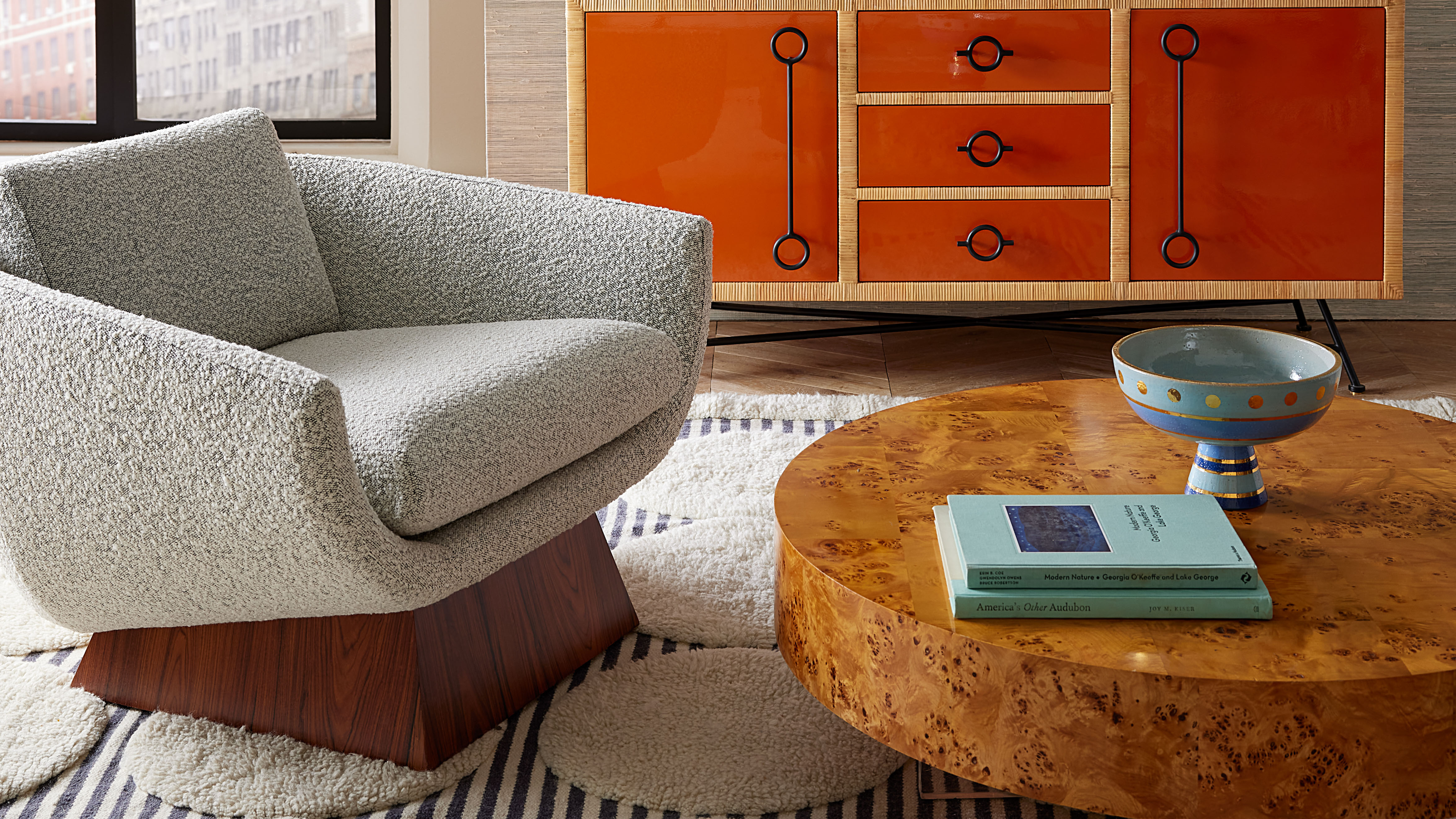 Burl Wood Decor Is 2025’s Most Coveted Comeback — Here’s How to Get the Storied Swirls for Less
Irregularity is the ultimate luxury, but you don’t need an antiques dealer to find it
By Julia Demer Published
-
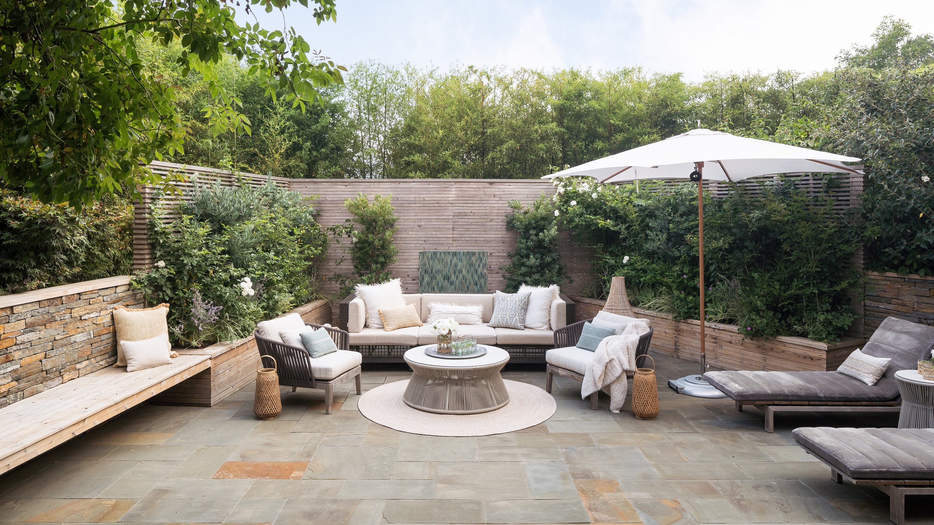 5 Garden Features That Instantly Add Value to Your Home — While Making Your Outdoor Space More Practical, too
Get to know all the expert tips and tricks for making your backyard a standout selling point for your home.
By Maya Glantz Published
