Shea McGee's Pantry Color Choice Might Seem Controversial — But Here's Why Designers Love it
You might question painting a small space like a pantry this color, but it's something designers love for to elevate your kitchen

The Livingetc newsletters are your inside source for what’s shaping interiors now - and what’s next. Discover trend forecasts, smart style ideas, and curated shopping inspiration that brings design to life. Subscribe today and stay ahead of the curve.
You are now subscribed
Your newsletter sign-up was successful
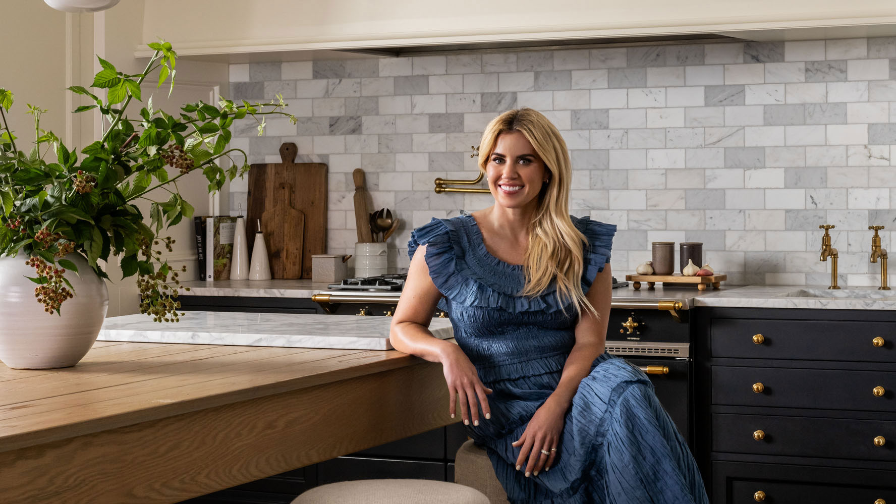
There's conflicting advice when it comes to small spaces — should you try to make them look as light and bright as possible, or embrace their often-naturally dark characteristics with a moodier scheme. The reality is there's no one answer for every space, but when you see remodels like interior designer Shea McGee's for her own home's pantry, it's hard to argue that the latter option has the wow-factor.
Sharing the renovation on her YouTube channel, Shea explained a little about her color choices. 'Gong dark in the pantry is something I've wanted to do for some time,' Shea says. 'It's a windowless space, and it's going to feel like a windowless space regardless of the color of the cabinet, so I decided to lean in.'
'Going dark and dramatic just felt like a really fun surprise in a small space,' she adds. If her own beautiful pantry isn't enough to convince you, we've found some other examples which show why taking your pantry to the dark side might be the most impactful thing you can do for your kitchen.
Article continues belowShould I paint a pantry dark colors?
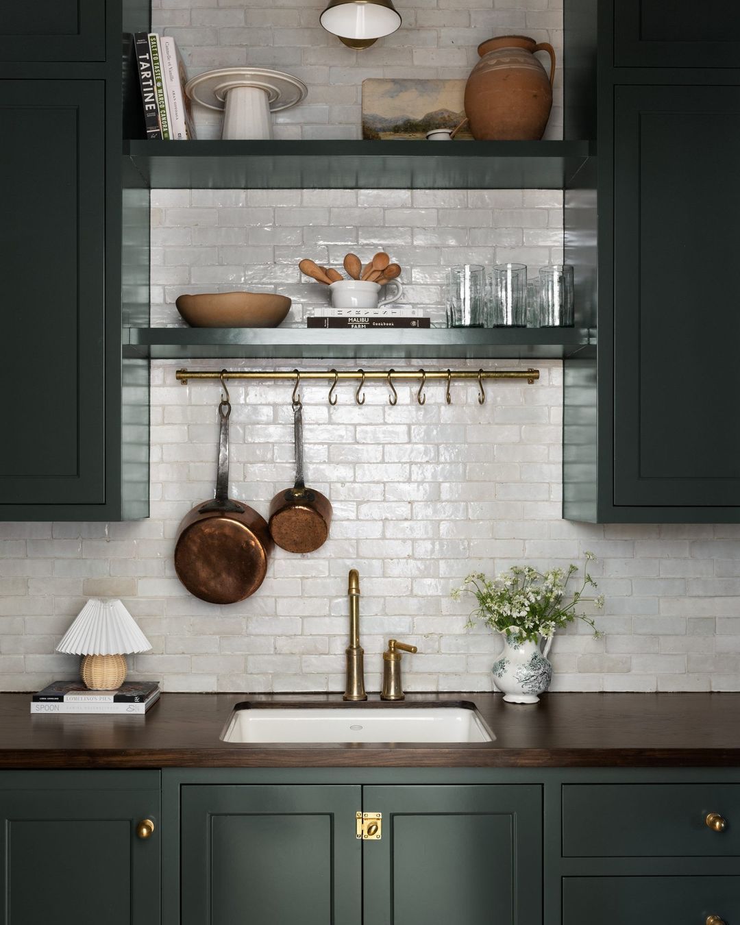
The short answer is, yes. While you might have concerns about going bold and dark, using these paint color ideas in a space that feels "contained" is a great way to make your home more expressive, without disrupting your existing color schemes. 'The pantry is a great opportunity to have a little more fun and implement bolder or darker colors that might not work in an open, light-filled kitchen space,' agrees Mindy O'Connor, principal of Melinda Kelson O'Connor Architecture & Interiors.
As well as pantry colors, it's an idea we also see interior designers use in powder rooms, laundry rooms and even inside closets — and it's a great way to change the pace of your home's design, adding the element of surprise behind closed doors.
A photo posted by studiomcgee on
How to design a dark pantry with wow factor
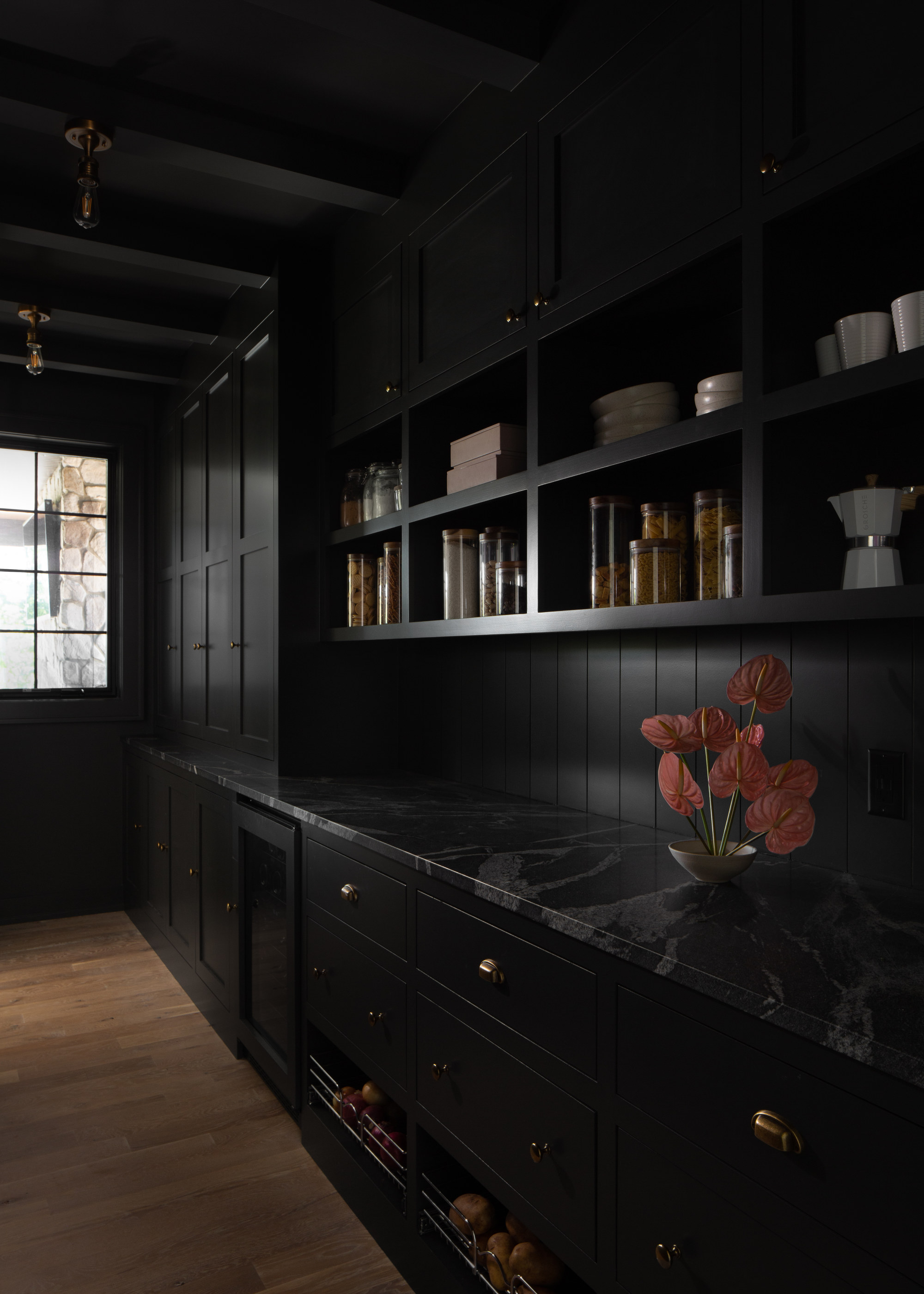
For Shea McGee, changing the pantry's cabinet color was enough to transform her space, keeping the countertop and backsplash the same. However, if you're starting from scratch, why not take a bolder approach and embrace color drenching in your dark shades.
This is the approach Liz Hoekzema, creative director of KLH Homes, took for this home's butler pantry. 'Our client had seen a dark pantry space that she loved, and we were thrilled to run with this concept,' Liz says. 'Visually, it almost acts as a continuation of the tile splash. Our first select for the space was the granite countertop that has soft yet dramatic vanilla veining throughout.'
The Livingetc newsletters are your inside source for what’s shaping interiors now - and what’s next. Discover trend forecasts, smart style ideas, and curated shopping inspiration that brings design to life. Subscribe today and stay ahead of the curve.
'We love how this particular granite mimics the movement of soapstone but gives an even hardier work surface,' Liz adds. 'We pushed the concept further by 'dipping' the ceiling in the same paint as the walls and cabinetry in Sherwin Williams' Iron Ore — reasoning that the natural light and view to the outdoors on the east end of the space would make up for the extra layer of moodiness.'
'I kind of love that this hard-working space is tucked in the shadows a bit, but is always at the ready for party preparations or kids running through from the mudroom door after school,' Liz adds. 'A dramatic backdrop for the family scenes unfolding every day!'
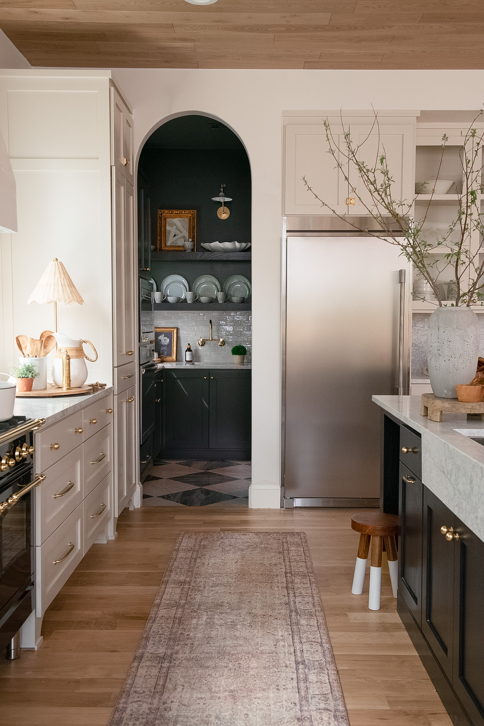
Your dark pantry doesn't have to be hidden away, either. 'It's a good idea to design it so you get a lovely peek of the space through a doorway in the kitchen,' Liz adds. The pantry design above by RoseRock18 is the perfect example, linking the kitchen color palette from the island through to the pantry.
While pantries may once have been an out-of-sight practical space, now they're spaces you may actually want to share and show off to guests. In that case, going dark with your pantry is the best way to make impact, according to a lot of designers.

Hugh is Livingetc.com’s editor. With 8 years in the interiors industry under his belt, he has the nose for what people want to know about re-decorating their homes. He prides himself as an expert trend forecaster, visiting design fairs, showrooms and keeping an eye out for emerging designers to hone his eye. He joined Livingetc back in 2022 as a content editor, as a long-time reader of the print magazine, before becoming its online editor. Hugh has previously spent time as an editor for a kitchen and bathroom magazine, and has written for “hands-on” home brands such as Homebuilding & Renovating and Grand Designs magazine, so his knowledge of what it takes to create a home goes beyond the surface, too. Though not a trained interior designer, Hugh has cut his design teeth by managing several major interior design projects to date, each for private clients. He's also a keen DIYer — he's done everything from laying his own patio and building an integrated cooker hood from scratch, to undertaking plenty of creative IKEA hacks to help achieve the luxurious look he loves in design, when his budget doesn't always stretch that far.
