Decorating with color – 10 fresh and surprising ways interior designers are playing with hues
Decorating with color can be quite an adventure, especially if you think out of the box. Take a look at some of our favorite modern examples
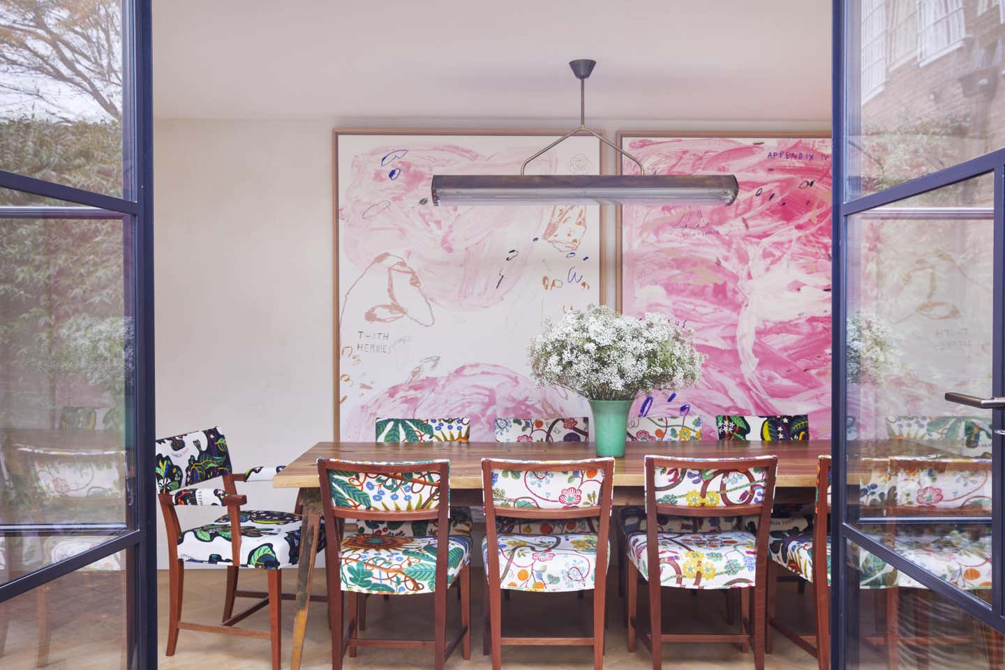

While we may love neutral decor as much as the next person, decorating with color is a surefire way to improve your mood and your outlook. Color used in bold, inspiring ways and in interesting combinations can create a room that makes us smile, feel relaxed, or even energize us.
If you are in the process of renovating and redesigning your home, or even just decorating a rental, we've pulled together some of our favorite ideas from contemporary interior designers so that you decorate with color with confidence, whether you're choosing a paint color or buying new furniture.

Aditi is an experienced homes writer and editor. She has written hundreds of articles for various international titles helping readers make the best home design choices, and spends her days interviewing interiors industry experts to bring the latest ideas to her readers. For this piece she spoke to the world's best designers to find out ways to decorate with color.
1. Use soft shades in bold ways
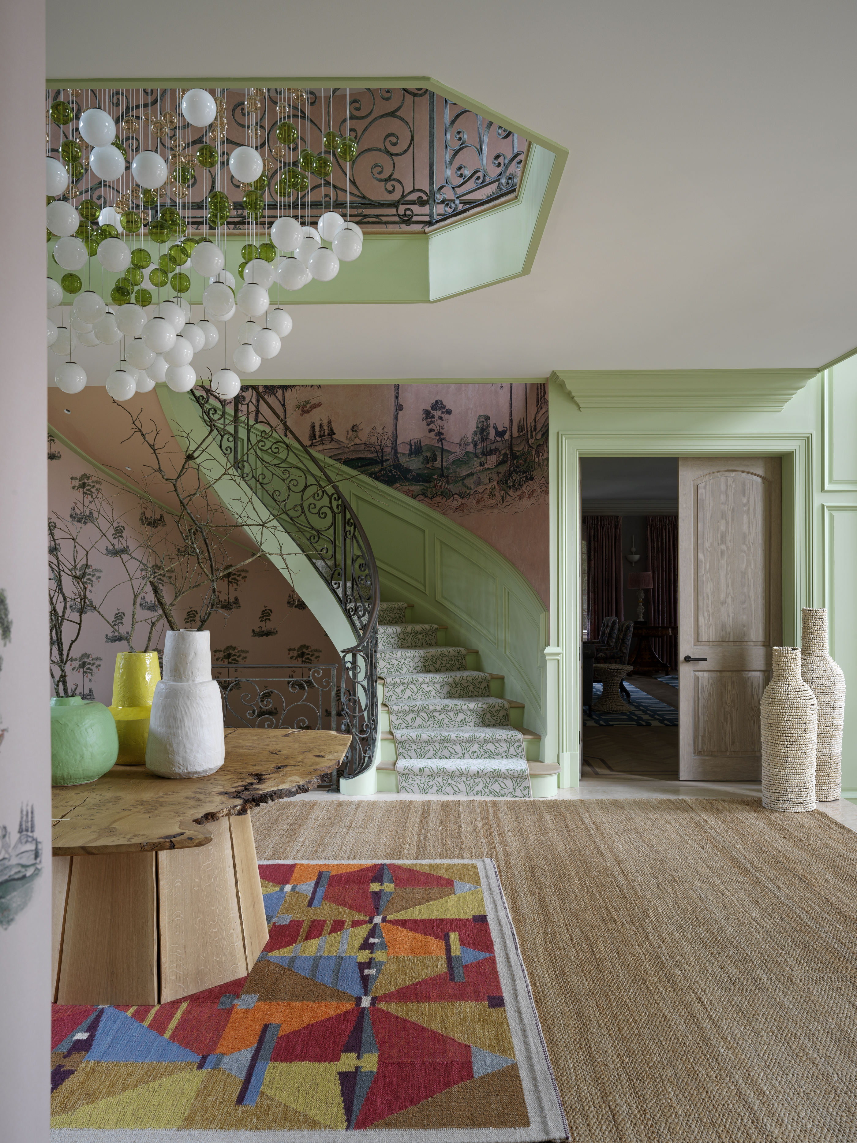
Bold, punchy schemes don't have to rely on highly saturated and shocking color palettes to be effective. Softer shades, handled in the right way, can bring a surprisingly fresh look to an interior scheme.
Consider applying softer shades to architectural elements you want to highlight to make these pastel hues feel punchier. In this project by interior designer Kit Kemp, all the trim and moldings in the hallway has been painted in one, cohesive soft tone, encouraging the eye to travel around the space, without creating too stark a contrast with the painted staircase.
2. Choose a bold color as a focal point
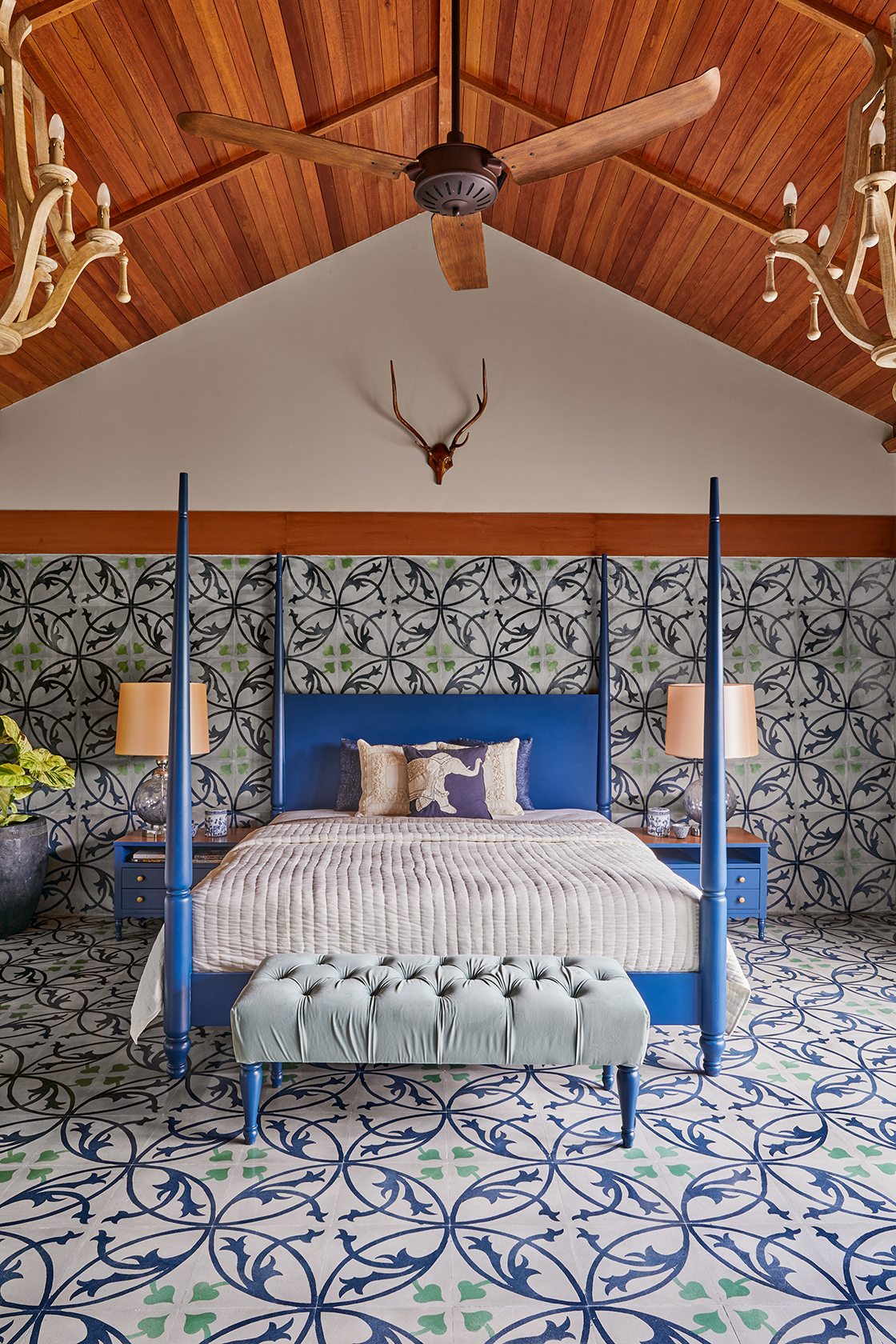
Want to add a big dollop of drama to a space? Go all out with a bold color, and spread it across the walls and flooring for a truly immersive visual. Interestingly, color doesn't only mean wall paints.
In this bedroom color scheme, design practice FADD Studio used a bright electric blue for the four poster bed, match with quirky tiles used across the room. 'We used hand-painted cement tiles from Bharat Floorings, across the floor and walls to inject color and movement,' says Farah Ahmed Mathias, co-founder of FADD Studio.
3. Embrace colorful minimalism
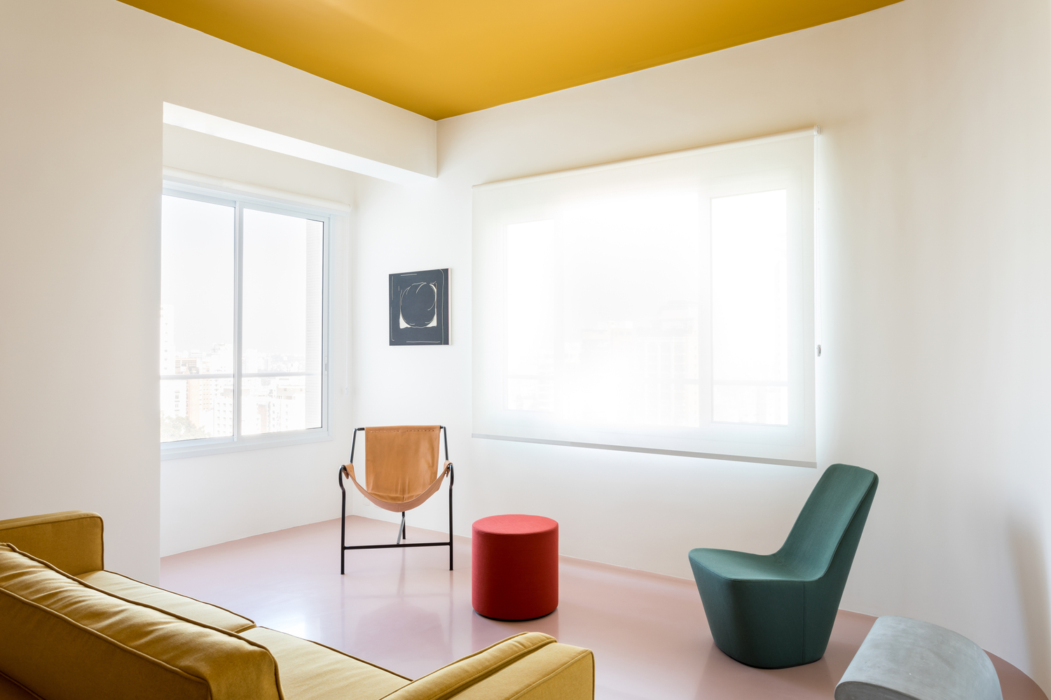
While thinking of living room color ideas, consider peppering the room with vivid tones, but do it in a more subtle, and pared-back way. One way to do so is to bring in a selection of bright-toned seaters, but paired with a muted background to keep the room's vibe enjoyable yet minimal.
Space out the furniture and choose visually light pieces. Ensure that the room receives plenty of sunlight so the colors inside don't seem too daunting.
An easy way to pair different tones is to partner up complementary colors (those that sit opposite each other on the color wheel). This will help create an energetic space. You could also choose colors on either side of the color wheel, or analogous colors. For example, blue and green or orange and yellow always work well together.
'The client, an artist, brought colored fabrics for the home, and we complemented them with colorful furniture pieces that could be used within the right context,' says architect Felipe Hess. 'On the ceiling, we added a washable paint with a custom-made yellow color. The sofa is a design made by our office and coincidently already was made in the ceiling color, matching perfectly with the interiors. The green chair and red stool are both from Vitra, the former designed by Jasper Morrison, and the latter by Verner Panton.'
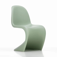
Looking for more designs from Vitra? Consider this Panton Chair in a stylish, S frame, to add a contemporary touch to your favorite seating areas.
4. Experiment with contrast using stripes
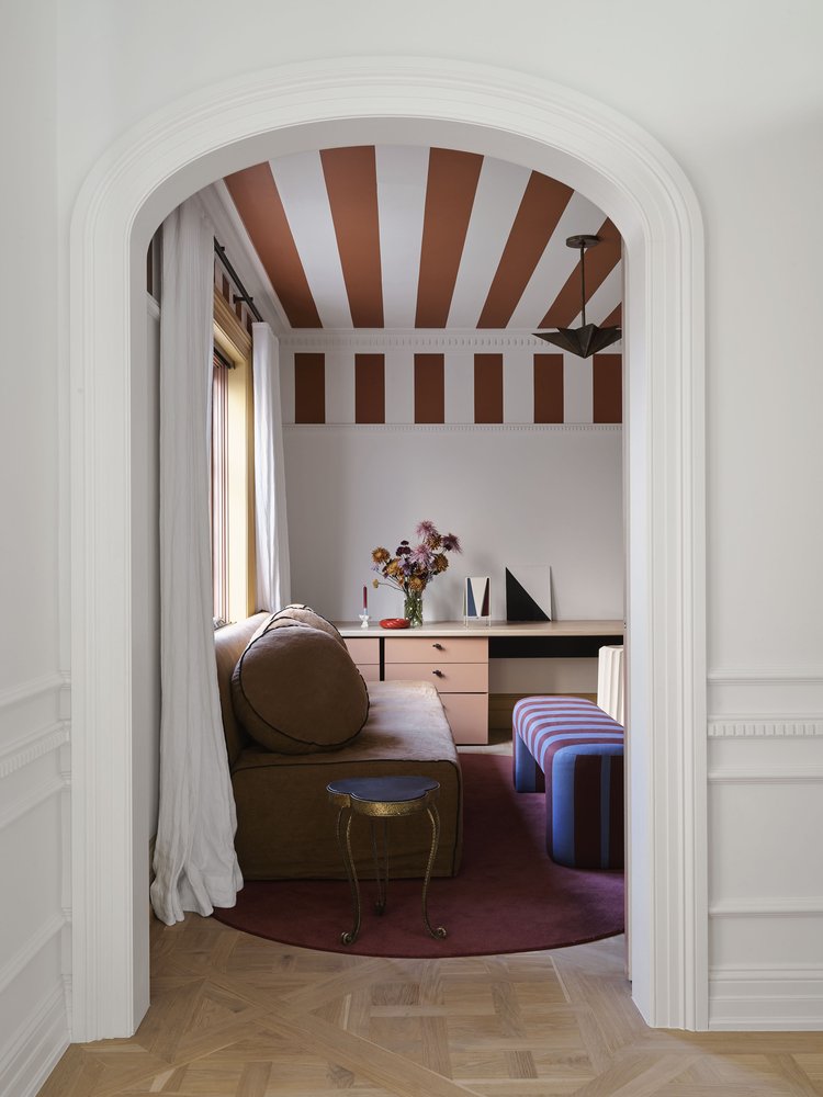
While color will add a boost of personality to your spaces, by choosing interesting paint techniques for walls, you can create the illusion of more space. Layer in a contrasting ceiling design with vertical stripes, so you can make a room feel taller, or horizontal stripes to visually boost the width.
'The color scheme for this particular space was informed by our very bold gesture of painting terracotta stripes on the upper portion of the walls and the ceiling,' say Dominique Brammah and Shannon Shlom, founders of We Are Duet. 'The traditional proportions of the space as well as its original stained glass windows commanded us to subvert the formal quality of the room by creating a joyful and delightful experience. After all, this is a space purely for the children of the home.'
'Then it was about creating a very natural layering of furnishings, joinery, and styling in warm complimentary tones, seen in the peachy pink drawer units all sitting on a deep burgundy plush carpet. The striped bench was added as a final touch, to bring a touch of the unexpected, lifting the scheme from being overly analogous.'
5. Try unexpected color combinations
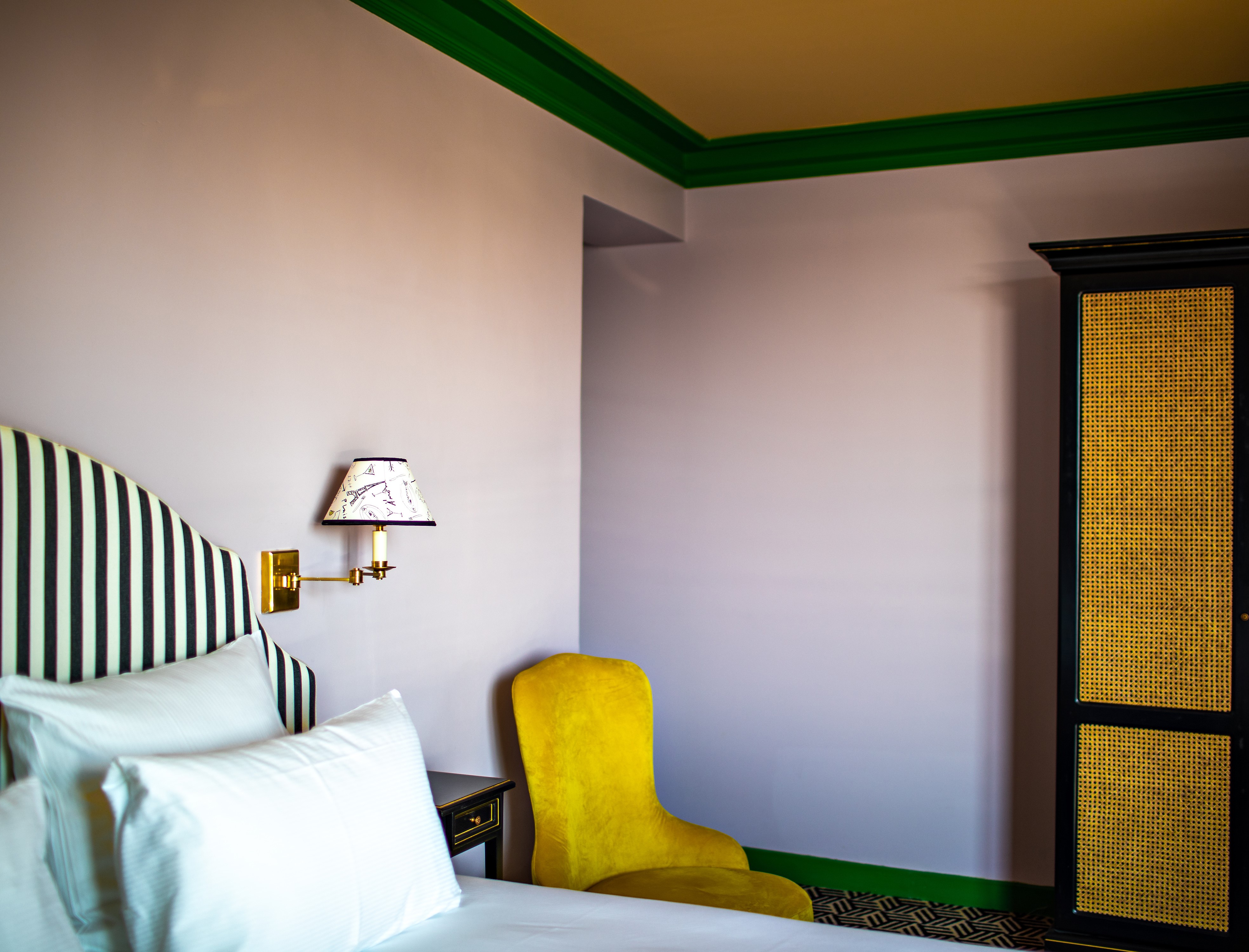
How often do you come across a color combination like this in modern interior design? Yellow and green are analogous colors, and they sit right next to each other on the color wheel. It should mean they sit harmoniously side by side but in their boldest, most primary shades, they're a bold, exciting contrast, especially alongside walls painted in soft lilac.
Consider experimenting with unexpected colors for painted ceilings, as this will encourage you to look up and take in the dimensions of the room more. If painting the two tones on entire surfaces feels too jarring, considering using one only for the borders or trims, allowing the ceiling to emerge as the focal point of the room. This way you can create an umbrella effect that gives the room a boost of energy.
'I wanted the room to have a mix of bright and playful colors,' says artist and designer, Luke Edward Hall. 'In this particular room, I painted the walls a soft lilac and the woodwork in bold kelly green. To stop the scheme feeling too sugary, I painted the ceiling warm butterscotch, and introduced a stark element such as the black and white striped headboard and ebonized bedside tables, which take their inspiration from French antiques.'
6. Bring depth to color with a textured paint
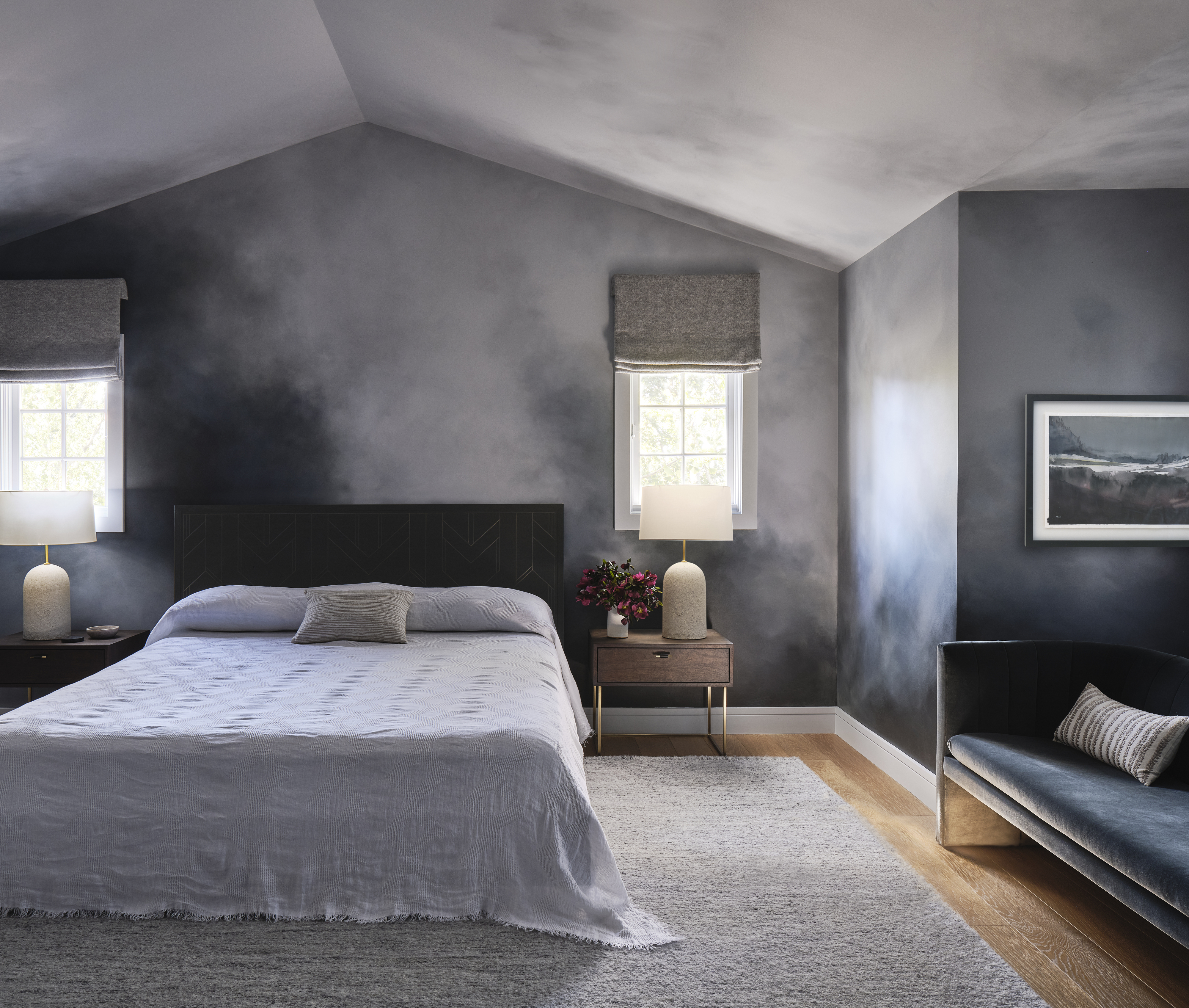
Texture paint effects are a big interior trend right now, and bring depth and dimension to color. Finishes like limewash or Roman clay are particular popular for bringing this sense of depth, but you could also try a paint effect like this moody modern bedroom using a tonal color palette.
'We partnered with our favorite decorative painter, Caroline Lizzaraga, on this room to create an ethereal, moody yet cozy primary retreat for the parents of four children,' explains Kristen Pena, founder of K Interiors. 'Starting with Benjamin Moore Silver Half Dollar as our base color, we brought in both lighter and darker shades into the space to create the feeling of being in the clouds.'
'We wanted the space to feel restful and sensual all at the same time and working around the room with movement like that of clouds moving,' Kristen adds. 'I think we were successful.'
7. Zones spaces with color
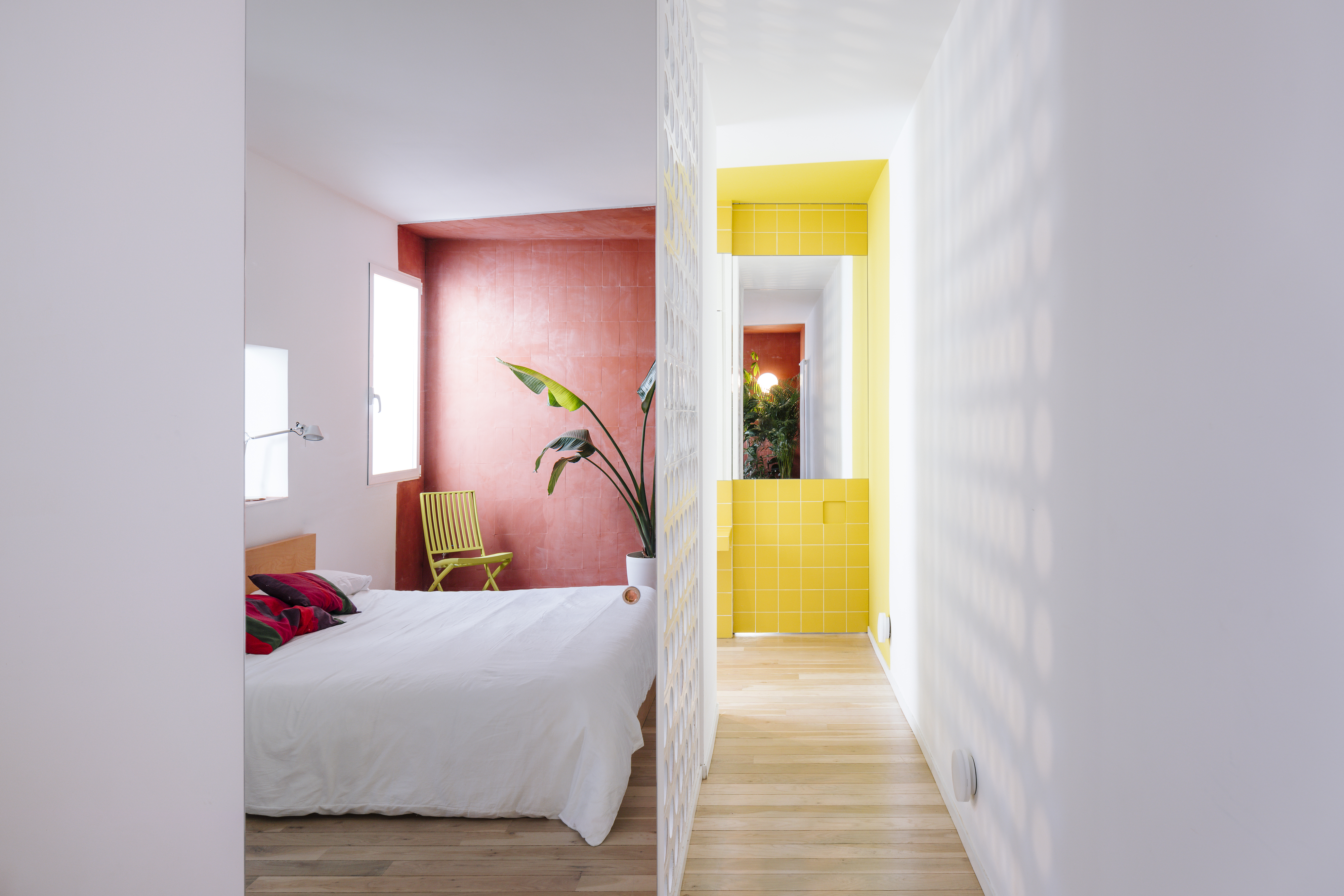
In large spaces or to create distinct functional areas, use the power of color to clearly define areas by zoning a room with color.
'We used terracotta tone in the house to define a zone; a material traditionally used in exteriors now used in interiors,' says Gonzalo Pardo, founder of Gon Architects of this modern design. 'In the case of yellow wall paint, it was used to show the room's continuity with the bathroom, and when the door is closed, it almost seems that the house ends.'
'That wall is intended to fill the overall room with light, optimism, and vitality,' Gonzali adds. 'The red marks the sleeping zone. In both cases, color is used as a spatial resource to build a volume that defines a specific domestic environment.'
8. Explore color beyond solid, painted walls
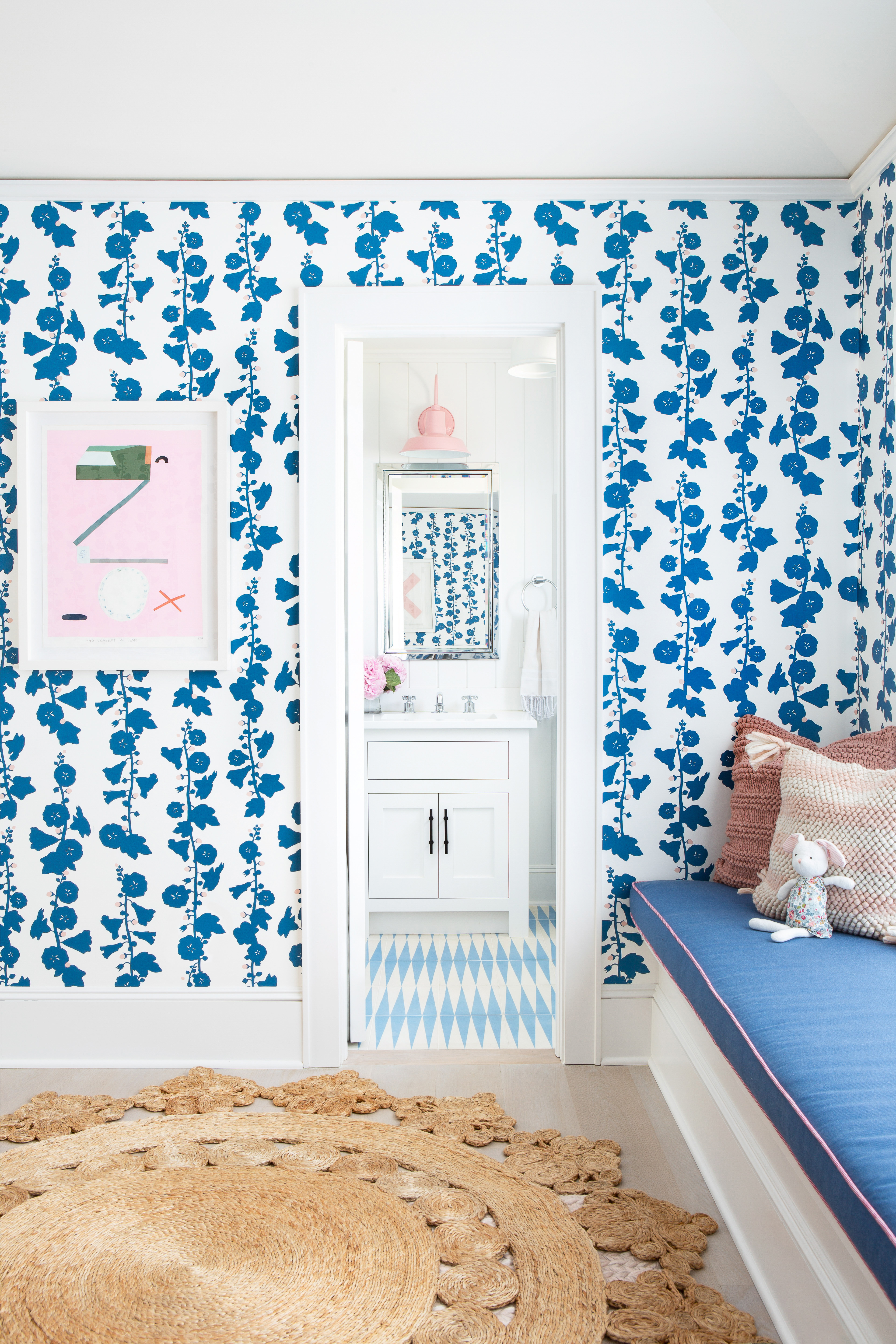
If you want to have an experiential sleeping space decorated entirely by color, consider bedroom wallpaper that covers all four walls along with the ceiling. Envelop yourself and the space in patterns or colors, creating a lovely conservatory effect. Deep tones can give the room depth, and make the space look evergreen. Plus, wallpaper is super easy to clean – you just need to wipe it with a dry cloth.
If you're going for large patterns on the wallpaper, you could tone it down with white wall trims and baseboards. You could even add an earth-tone rug to the room.
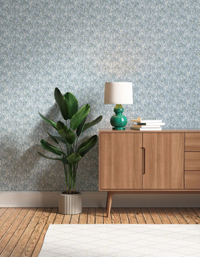
Recreated from an early 1900s French print, this relaxing yet refreshing floral wallpaper will add a charming touch to your bedroom, bathroom, or living room.
9. Embrace the weird and wonderful
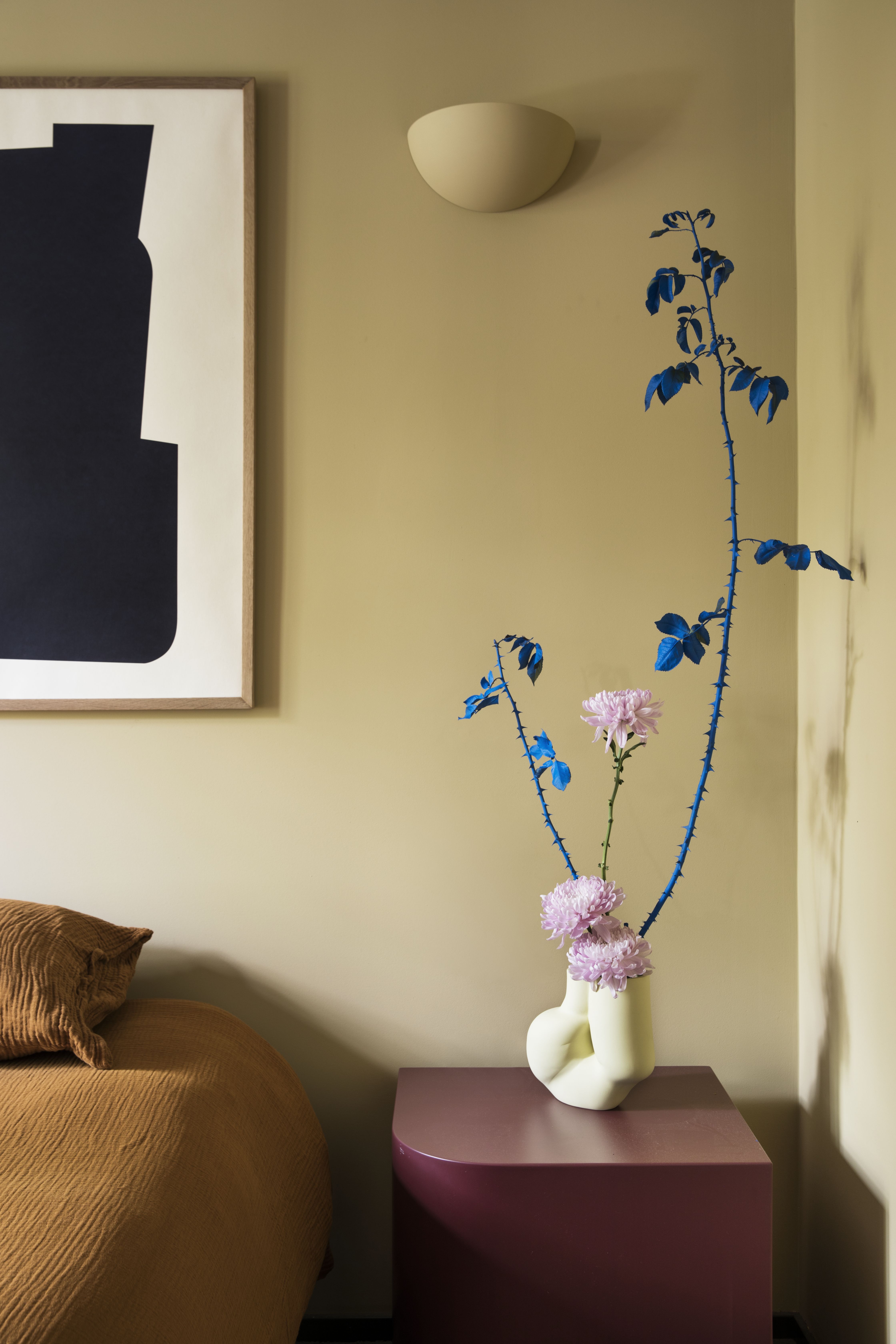
While interior design trends have followed for natural-inspired colors for a long time, there's a growing movement towards colors that feel unusual and 'artificial' in combination. Case in point, a trend for decorating with dried flowers in bold, unnatural colors. These tiny yet wonderful beauties enriched with natural tones can add a subtle but mesmerizing touch to an interior, and help create a charming vignette.
'This color combination is a little bit layered,' says Carlos Tomás, founder of Estudio Reciente. 'In this bedroom, as the principal color, we used a warm yellow with touches of burnt orange and burgundy on the bedding. All tones are on the warm side of the color palette. To add an accent to the palette, we used these vivid florals that stand out among the warm hues.'
10. Go for color layering for a bold interior
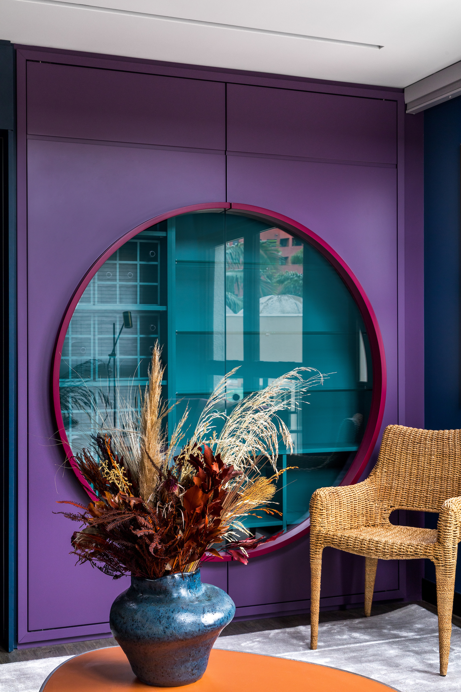
Colors, over colors, combined with more colors can create a lovely, layered scheme, that looks decorated but with a lot more depth.
Take this space for instance. The bold, purple wall has a wonderfully highlighted red frame, and right behind it, is a blue wall, that is framed by glass. In the foreground, the cane chair grounds the scheme, while the orange table adds a further pop of color, creating an on-trend yet eclectic style.
'For this space, we combined a mix of colors and shapes to assure the personality and boldness of the space,' says Talita Nogueira, founder of TN Arquitetura. 'The brand of the paint is Suvini, and we used the colors 'Mistério do Oceano' (ocean mystery), 'Uva' (grape), and 'Rosa Renascentista' (renaissance rose). The chair is the 'Cadeira Cage III' (cage chair III), from the store Artefacto.'
Be The First To Know
The Livingetc newsletters are your inside source for what’s shaping interiors now - and what’s next. Discover trend forecasts, smart style ideas, and curated shopping inspiration that brings design to life. Subscribe today and stay ahead of the curve.

Aditi Sharma Maheshwari started her career at The Address (The Times of India), a tabloid on interiors and art. She wrote profiles of Indian artists, designers, and architects, and covered inspiring houses and commercial properties. After four years, she moved to ELLE DECOR as a senior features writer, where she contributed to the magazine and website, and also worked alongside the events team on India Design ID — the brand’s 10-day, annual design show. She wrote across topics: from designer interviews, and house tours, to new product launches, shopping pages, and reviews. After three years, she was hired as the senior editor at Houzz. The website content focused on practical advice on decorating the home and making design feel more approachable. She created fresh series on budget buys, design hacks, and DIYs, all backed with expert advice. Equipped with sizable knowledge of the industry and with a good network, she moved to Architectural Digest (Conde Nast) as the digital editor. The publication's focus was on high-end design, and her content highlighted A-listers, starchitects, and high-concept products, all customized for an audience that loves and invests in luxury. After a two-year stint, she moved to the UK and was hired at Livingetc as a design editor. She now freelances for a variety of interiors publications.
-
 Burl Wood Decor Is 2025’s Most Coveted Comeback — Here’s How to Get the Storied Swirls for Less
Irregularity is the ultimate luxury, but you don’t need an antiques dealer to find it
By Julia Demer Published
-
 5 Garden Features That Instantly Add Value to Your Home — While Making Your Outdoor Space More Practical, too
Get to know all the expert tips and tricks for making your backyard a standout selling point for your home.
By Maya Glantz Published
