How to avoid the 'millennial grey' effect when decorating with this timeless shade
Grey rooms that feel flat and uninspiring give this color a bad name, but how do you decorate with grey in a modern way? Experts reveal their design secrets

You might have seen the term ‘millennial grey’ going viral online, but this time around, it's not a color trend that's particularly complimentary. It describes the mid-toned grey that young homeowners are decorating their homes with and is defined by Urban Dictionary as ‘the sad depressive hue of the color grey which many millennials coat their life in.’
Grey was a huge color trend for a while, but these "millennial grey" interiors have undoubtedly given this color a bad name. But, really, there are many modern and stylish ways of decorating with grey without it feeling flat and boring.
We consulted the help of interior designers to give us a few pointers on how to do so.
1. Choose the right shade
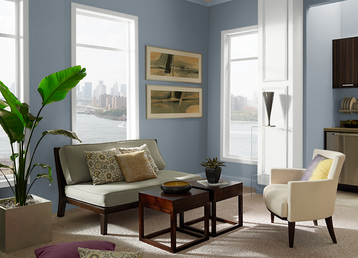
There are hundreds of shades of grey and the art of picking the right one for your space can be a little challenging. As a general rule, in north-facing spaces grey can appear very clinical so a warm-toned shade should work best. Conversely, with south-facing spaces it’s a lot easier to decorate with grey. Pick a shade with a cooler blue undertone if you want to balance out the warmth of the space.
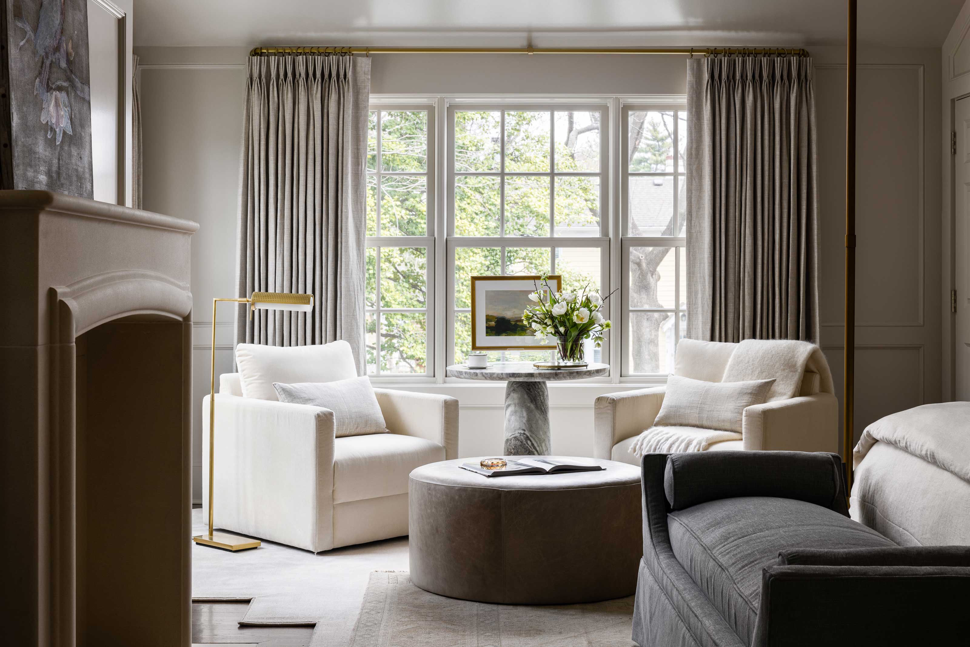
Elizabeth Bennett, Partner at Kobel + Co explains that ‘the greys of the last decade had a very cool undertone. We now steer our clients towards colors in the mushroom, taupe or even beige realm. The best grey paint colors are true chameleons and can look fresh during the day and enveloping at night.'
Choosing colors that work with the natural light of your space will ensure that they never feel flat or dull, which millennial grey has definitely been accused of. Interior designer Christine Vroom of Christine Vroom Interiors says ‘one rule of thumb to use while designing with grey is to select a shade with another color in its undertone so that it’s not flat. A few examples include a blue-grey, green-grey, or even a taupe-grey. It gives this typically dull color a bit more life within a space, and opens up the opportunity to pull a variety of other tones out.'
2. Saturate a space
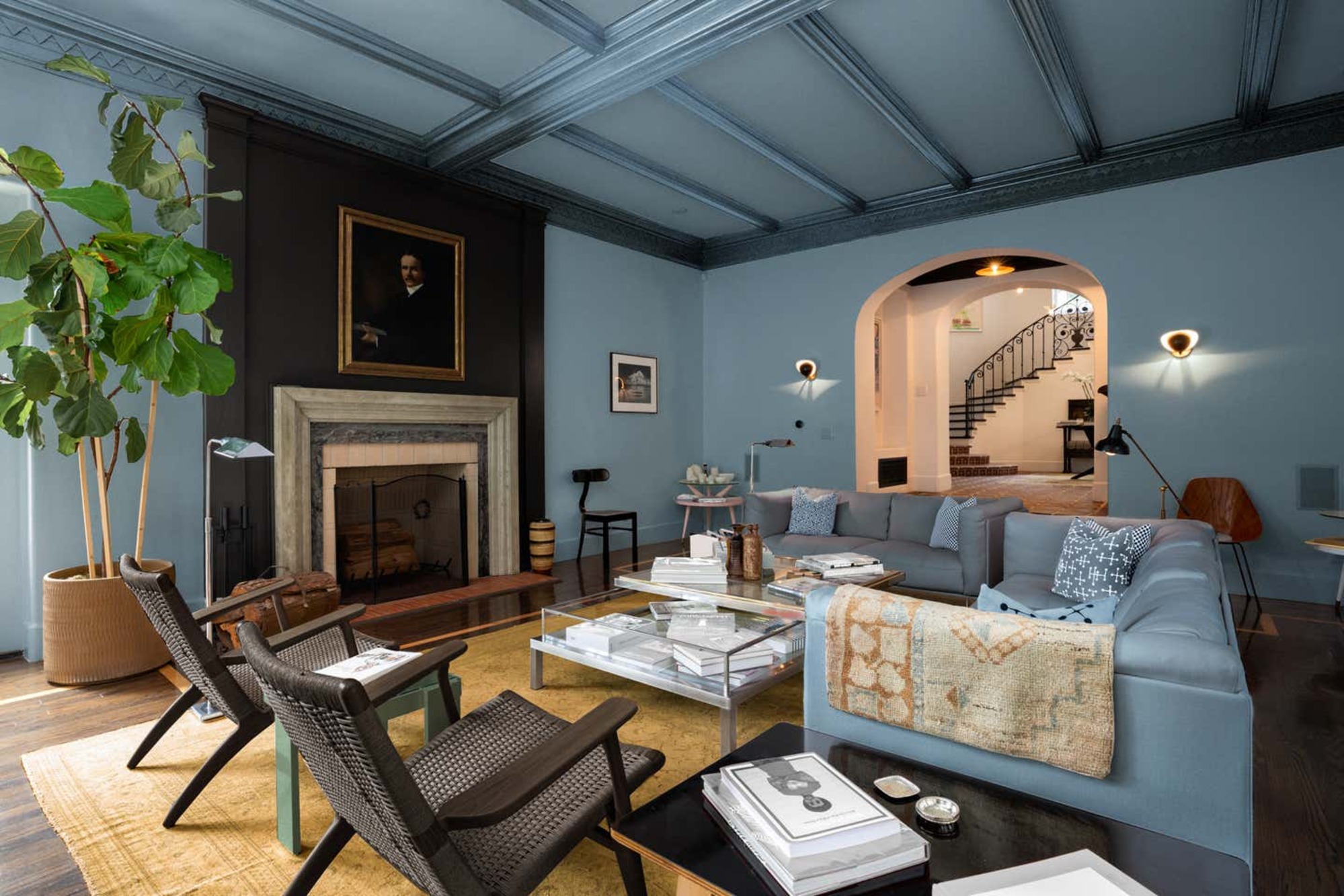
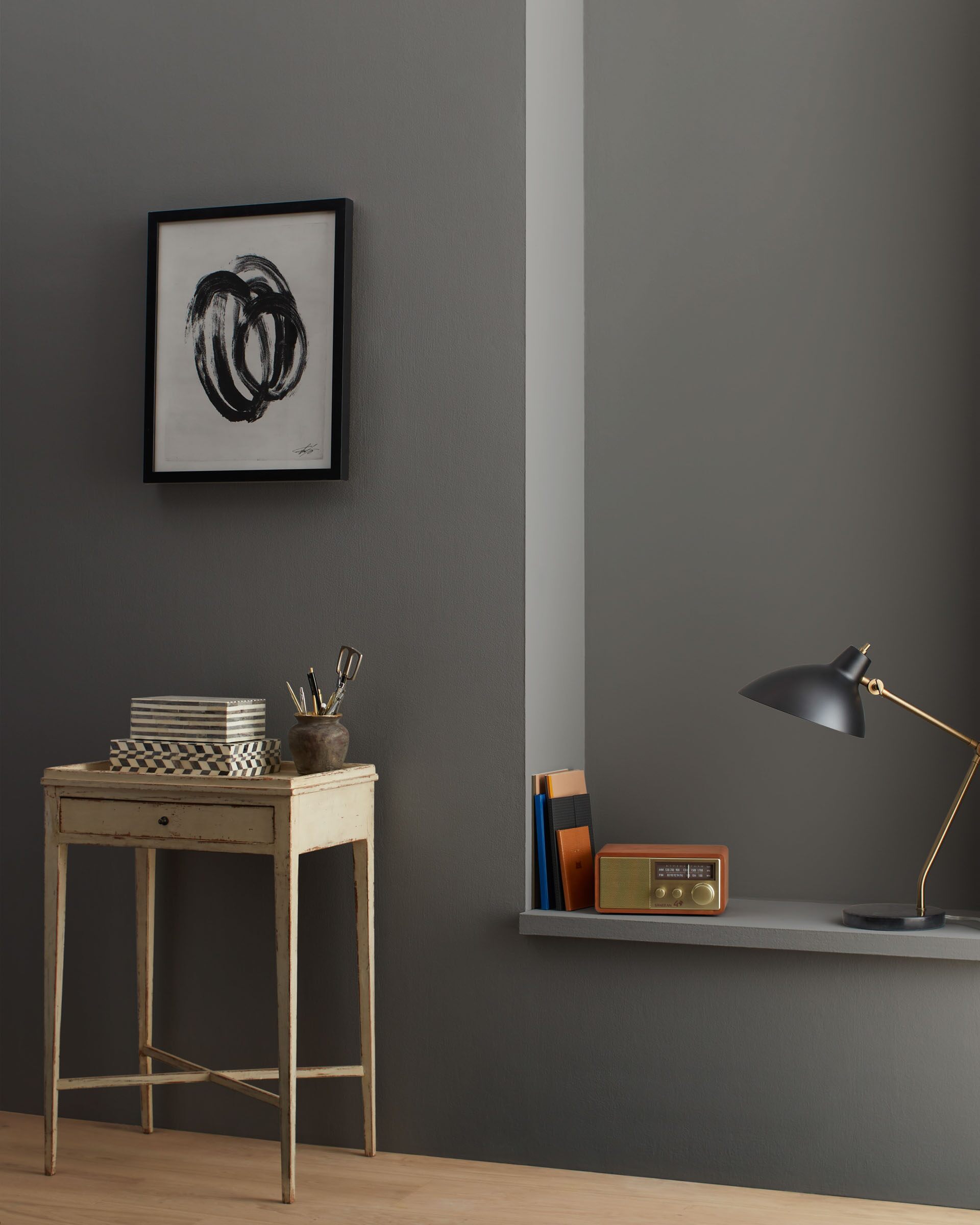
You can easily avoid the ‘millennial grey’ effect by going all in and color drenching with grey. Painting ceiling and walls the same color, along with your trim too, will saturate the room and make it feel contemporary and up to date. ’We often encourage clients to paint the ceiling, windows and door trim and millwork. This instantly creates a mood versus highlighting a greige paint color’, says Elizabeth.
If you decide to break up your grey paint scheme with a white ceiling and skirting, this creates a harsh contrast and can be quite jarring. Saturating the room with one shade, as Elizabeth suggests, feels far more modern and expressive.
3. Add more texture
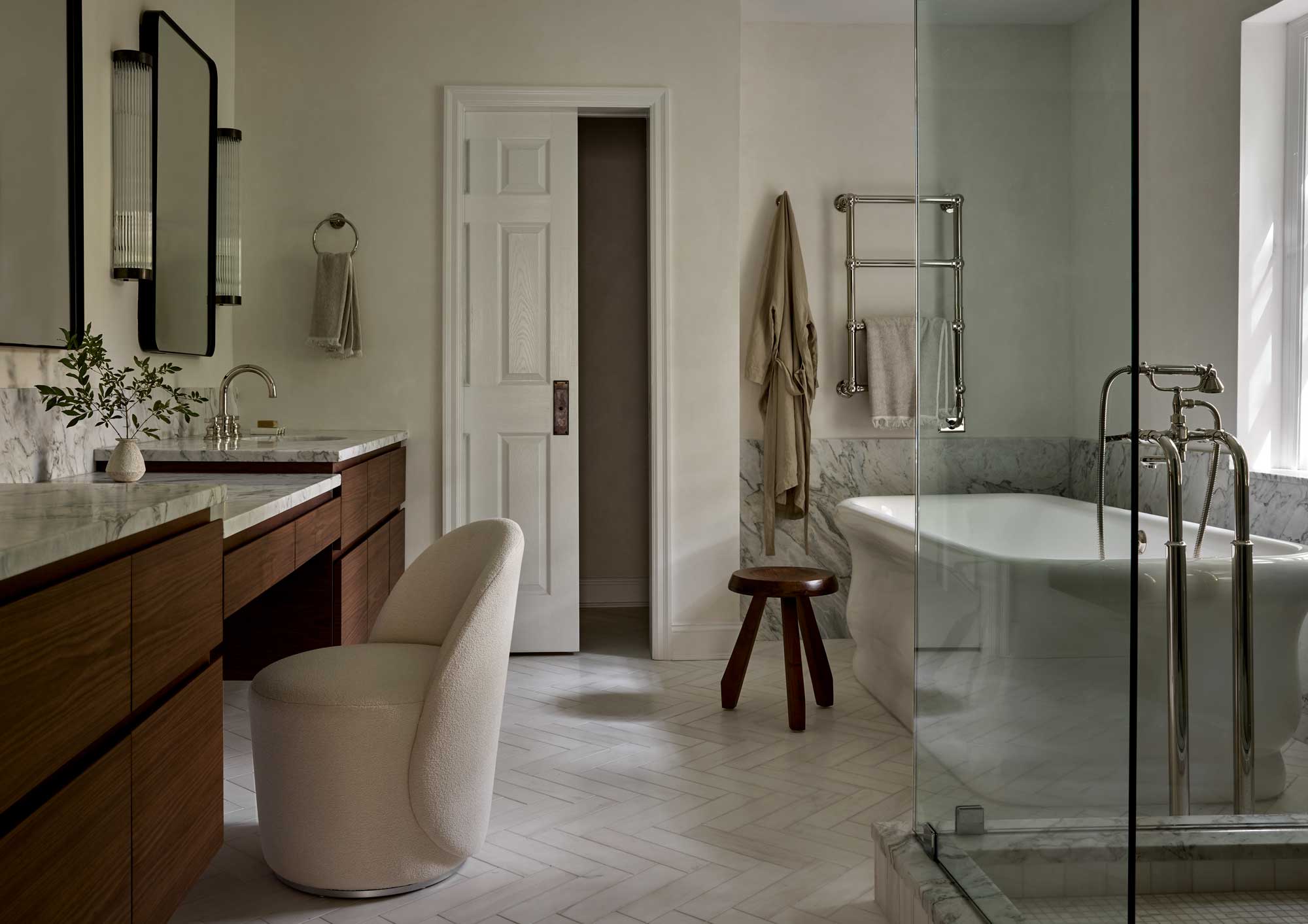
Grey often gets branded as a flat color, which can make a space feel uninviting. However, if done correctly it can make a home feel elegant and cozy. Introducing lots of texture into a grey room scheme is a tip worth knowing to avoid it feeling one-dimensional.
Texture can come from lots of different things. Soft furnishings are a key element of any design, which includes pillows, throws, rugs and window dressings. Lean towards natural fabrics that will instantly soften a grey look such as linen, silk, wool or jute.
Melissa Urdang Bodie, co-founder of Melissa + Miller Interiors offers a great example of one of their recent projects, a beautiful grey bathroom (pictured above). ‘For this bathroom we started with the color grey. We played with as many natural products/colors as possible to add to the bathroom’s classic and warm feel. Dolomite floor and shower tile, Calacatta Arabescato marble vanity tops, polished nickel hardware and a custom walnut wood vanity.' The result was a beautifully balanced grey bathroom with lots of texture and depth.
4. Pair with warm metallics

It's a common misconception that grey is strictly a cool tone, however it can feel warm and cozy in the right setting paired with complementary furniture, accessories and finishes. Silver or chrome might feel like grey’s natural pairing, however this runs the risk of a space feeling cold and clinical.
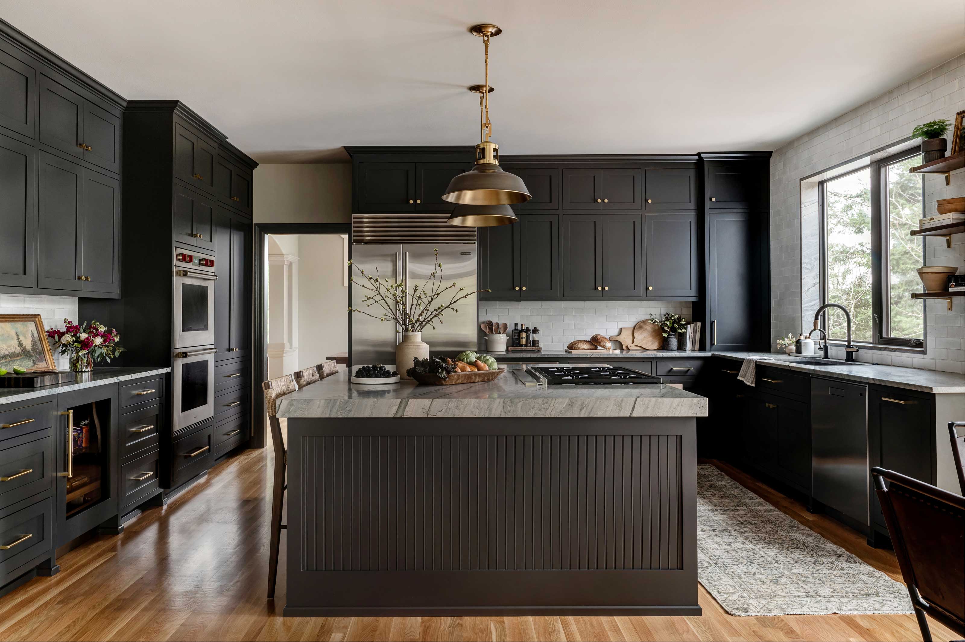
Instead, warm up a grey scheme with copper or brass elements. Grey kitchens are a great example of this. Contrast grey cabinets and walls with brass handles and lighting. This will immediately cozy up your space as well as making it feel cool and contemporary.
5. Mix up tones
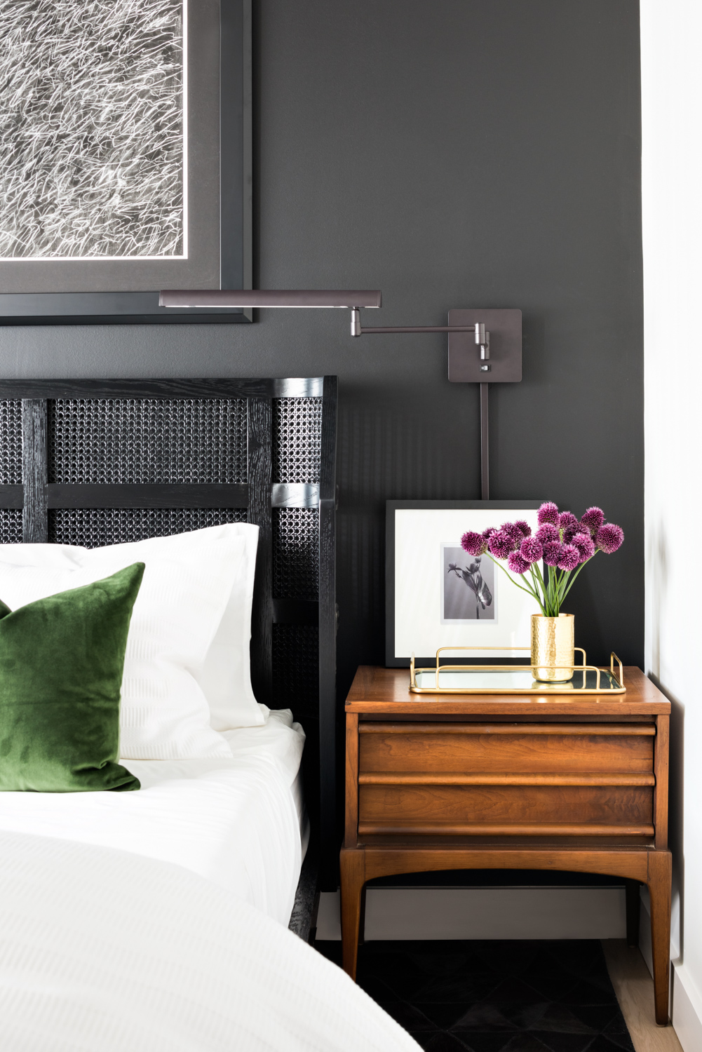
‘Millennial grey’ spaces are guilty of using one tone of grey to cover an entire space without playing with texture and tones. Melissa Urdang Bodie explains that ‘using the right mix of grey tones can be soothing and calming, somewhat like a cocoon’.
Determine whether you want to stick with cool or warm tones and then play with different shades within those tones. Consider furniture in different grey shades and contrast with tonal accessories and artwork.
Dan Mazzarini, principal and creative director of BHDM Design and Archive by Dan Mazzarini states ‘don't be afraid of the dark. A grey room is the perfect opportunity to use colors like tans and creams for a more sophisticated look. I've always loved Kendall Charcoal by Benjamin Moore. It’s dark and moody but brings a little sultry smokiness and the outcome is cozy, soft, and almost velvety in appearance’.
Be The First To Know
The Livingetc newsletters are your inside source for what’s shaping interiors now - and what’s next. Discover trend forecasts, smart style ideas, and curated shopping inspiration that brings design to life. Subscribe today and stay ahead of the curve.

Becca Cullum-Green is a freelance interiors content creator and stylist. She fell in love with interiors when she landed her first job as an editorial assistant at a leading UK homes magazine fresh out of university. You can find her renovating her 19th-century cottage in the Suffolk countryside, consciously trying not to paint every wall with Farrow and Ball’s ‘Pitch Black’. Her signature style is a mix of modern design with traditional characteristics. She has previously worked for House Beautiful, Grand Designs, Good Housekeeping, Red, Good Homes and more.
-
 Italian Kitchen Trends — 5 Emerging Ideas From the Chicest Italian Designers That I Predict Will Go Global in 2025
Fresh from Milan Design Week, these are the exciting finishes, styles, and innovative materials I can't wait to see in more kitchens this year
By Faiza Saqib Published
-
 Small Patio Ideas — 8 Clever Ways to Style Up Even the Tiniest of Outdoor Spaces
If you're dreaming of turning your small patio into a dream space the right combination of practical and creative ideas will help you max up its potential
By Sarah Wilson Published
