Do Yellow and Purple Go Together? Designers Reveal How to Make This Unexpected Pairing Feel "Totally Intentional"
In an era where unexpected combinations have become cool, we've done a deep-dive to discover how to pair yellow and purple in a space

Maximalist or not, the question 'do yellow and purple go together' when it comes to interiors is one that has likely crossed a few minds. Especially of late. Yellow, with its sunny, lighthearted disposition, and purple, its regal and slightly more demure air, might seem like polar opposites, but don't be fooled, there is chemistry there.
Sitting opposite on the color wheel, as with many complementary colors, there is an art to combining yellow and purple, but when mastered with care, you can unlock both of their personalities and a unified charisma for the space itself.
"Yellow is a cheerful color, bringing hope and vibrancy into an interior space," says Augustine Atobatele, interior designer and the creative director of Studio Augustine. "Purple on the other hand is a color not often found in nature, yet evokes feelings of regal, sensuality. Both colors are on opposite ends of the wheel, however as an interior designer, the success is in the hues."
So when it comes to decorating with yellow and purple, it's all about picking the right shades, proportions, and dosage. Below, we've shared a few spaces that prove yellow and purple go together, perfectly. Here's how to do it.
1. Spotlight a Purple Motif
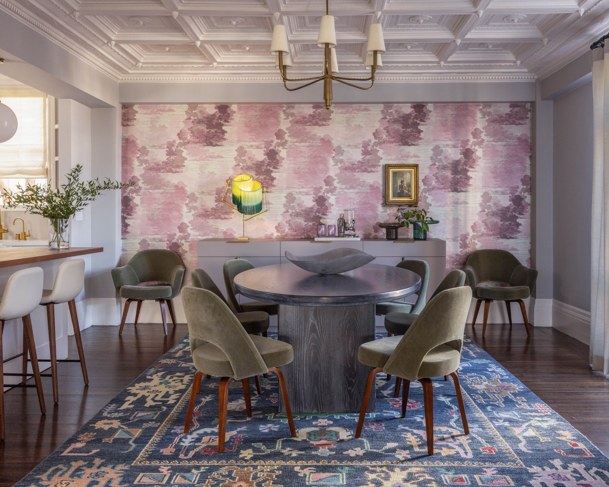
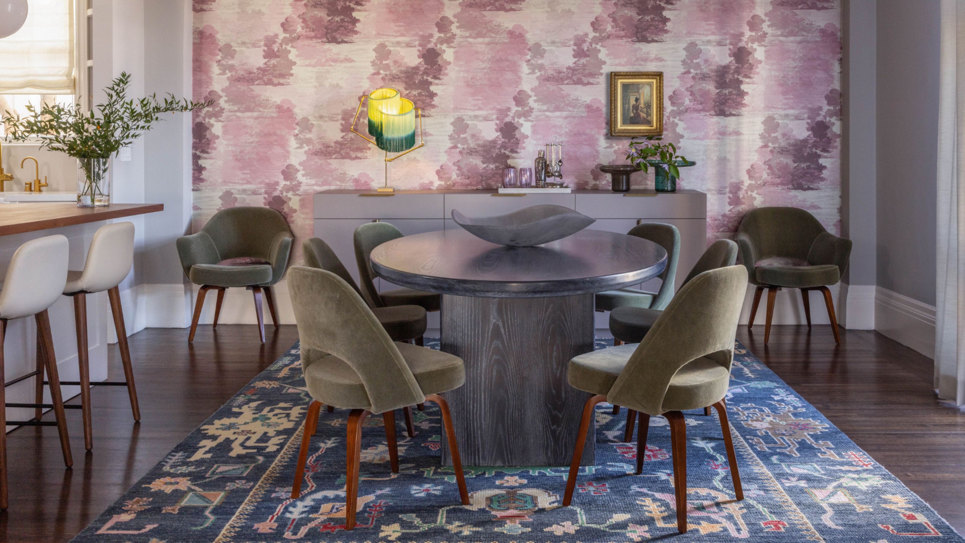
"A playful combination of color and pattern creates a unique and eye-catching dining room," says Kristin Riccio of this space.
Using just a small amount of yellow can make a room feel more collected and cohesive — especially with deeper shades of purple in the space. Here we see how the clever addition of accent dining room lighting with a citrus yellow-fringed lampshade elevates the tonal purple motif wallpaper, bringing this entire look together.
"Yellow and purple are complementary colors that create a visually pleasing contrast," explains designer Kristin Riccio, founder of Kristin Riccio Interior Design. "Yellow should be used thoughtfully and sparingly, though, to avoid overpowering the grounding tones of purple. The key is to carefully refine how and where to place yellow to juxtapose the purple, creating an eye-catching pop without overwhelming the overall aesthetic."
2. Pair Touches of Lilac And Jewel Tones
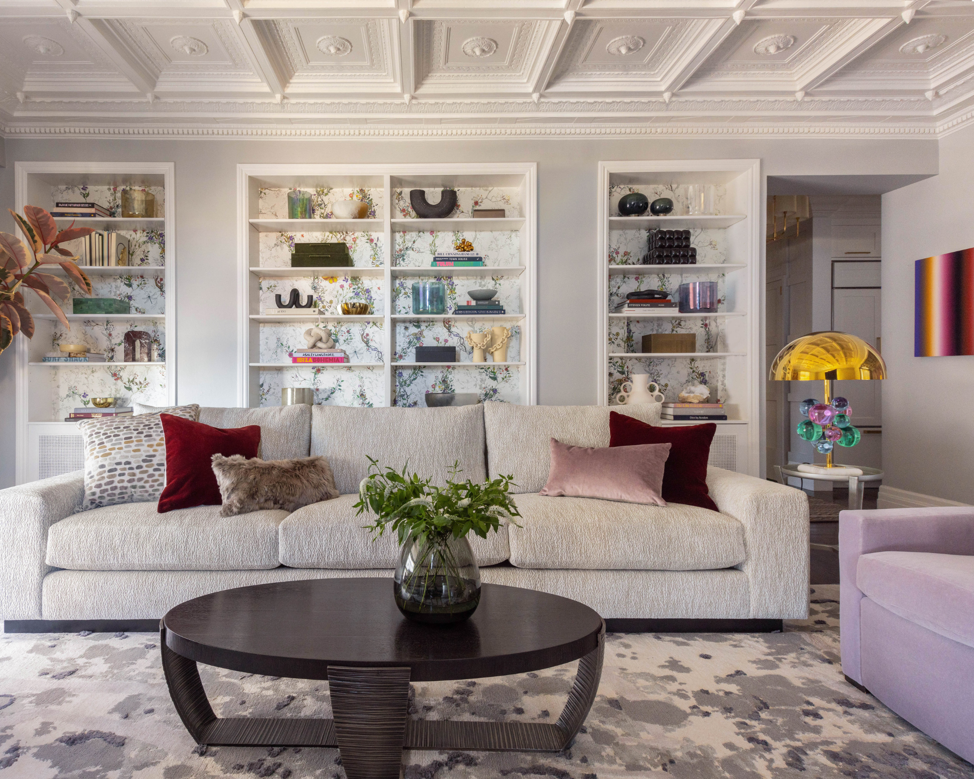
"Purple and yellow are incredibly versatile when paired together, so don’t be afraid to experiment and find the perfect balance for your space," says Kristin.
In this living space, gold and violet harmoniously collide. The small dosage in an otherwise neutral room makes this space a success — a key step when decorating with purple.
"Many people hesitate to incorporate color into their homes, but we believe that spaces with color are more engaging and allow a homeowner's personality to truly shine," says Kristin. "We paired lavender and gray-violet — two subtle, sophisticated shades of purple — with bold, jewel-tones for a playful touch. Yellow and gold accents, even in small doses, provide crisp contrasts that make the colors pop and feel even more vibrant."

Kristin Riccio is the principal designer and founder of multi-disciplinary interior design studio, Kristin Riccio Interior Design. The studio, which is based in San Francisco and Lake Tahoe, creates meaningful spaces that are deeply rooted in the homeowner's lifestyle and in response to the site and architecture, be that through playful design choices with vibrant wall art or by layering colors and tactile materials for visual interest and sophistication.
3. Go Bright, Bold, and Tactile
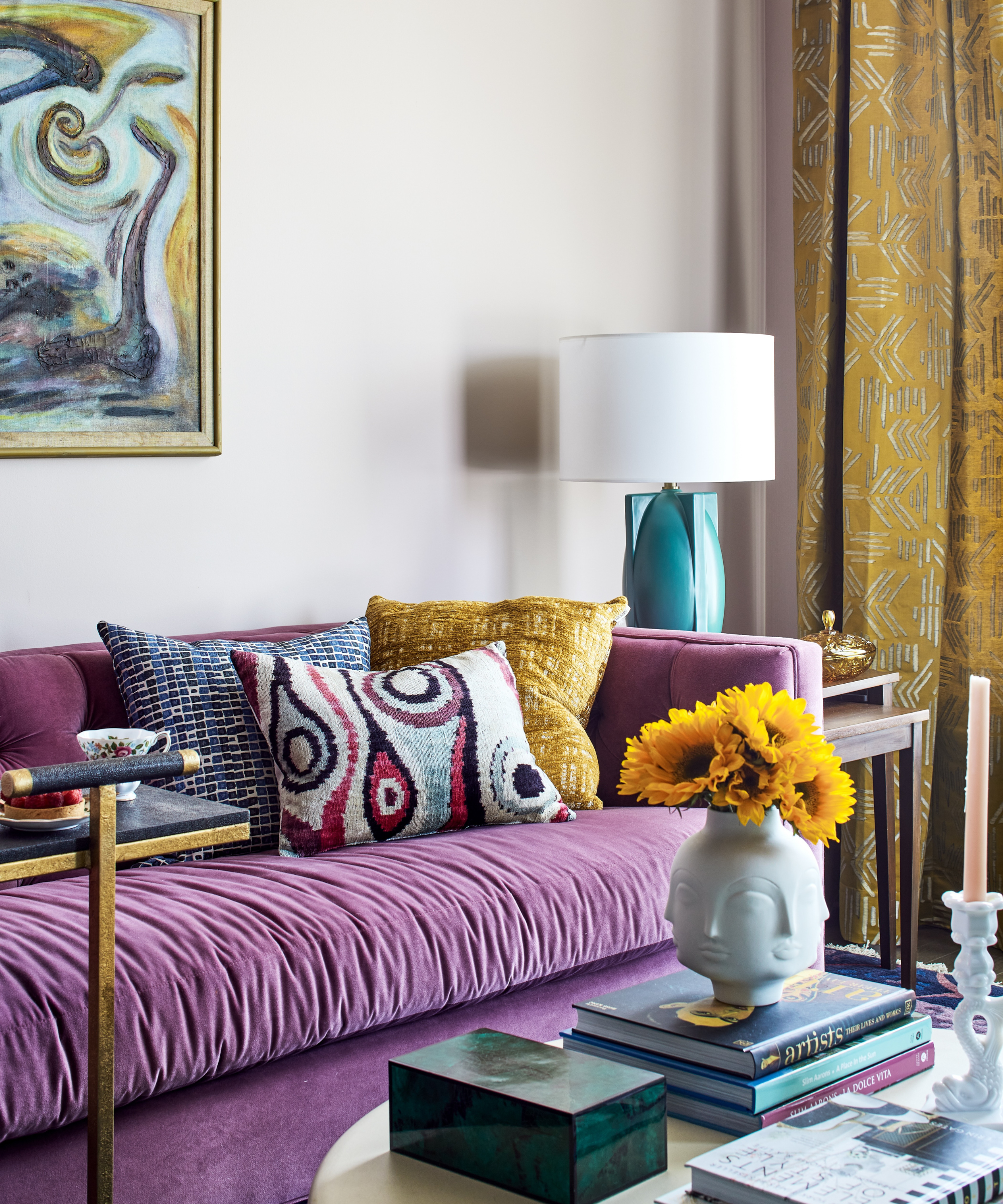
This purple and yellow living room by Lisa & Leroy employs bold and passionate color play.
Introducing tactile materials often enhances how colors interact with each other in a space, be that through fabric or temporary decorative objects such as fresh flowers.
"The purple sofa sets a rich, cozy tone, and then those golden yellow accents — like the textured pillows and those patterned drapes — just light the whole thing up," says Lisa Shaffer of Lisa & Leroy.
"Since yellow and purple are opposites on the color wheel, they naturally create this kind of bold, high-contrast look that feels both playful and dramatic," she continues. "What really makes it sing here is layering in so many great textures and patterns to bridge the colors in the room. Using contrasting colors doesn’t have to be scary — it can actually make a space feel alive and totally unique."
4. Match Mauve and Jeweled Ochre
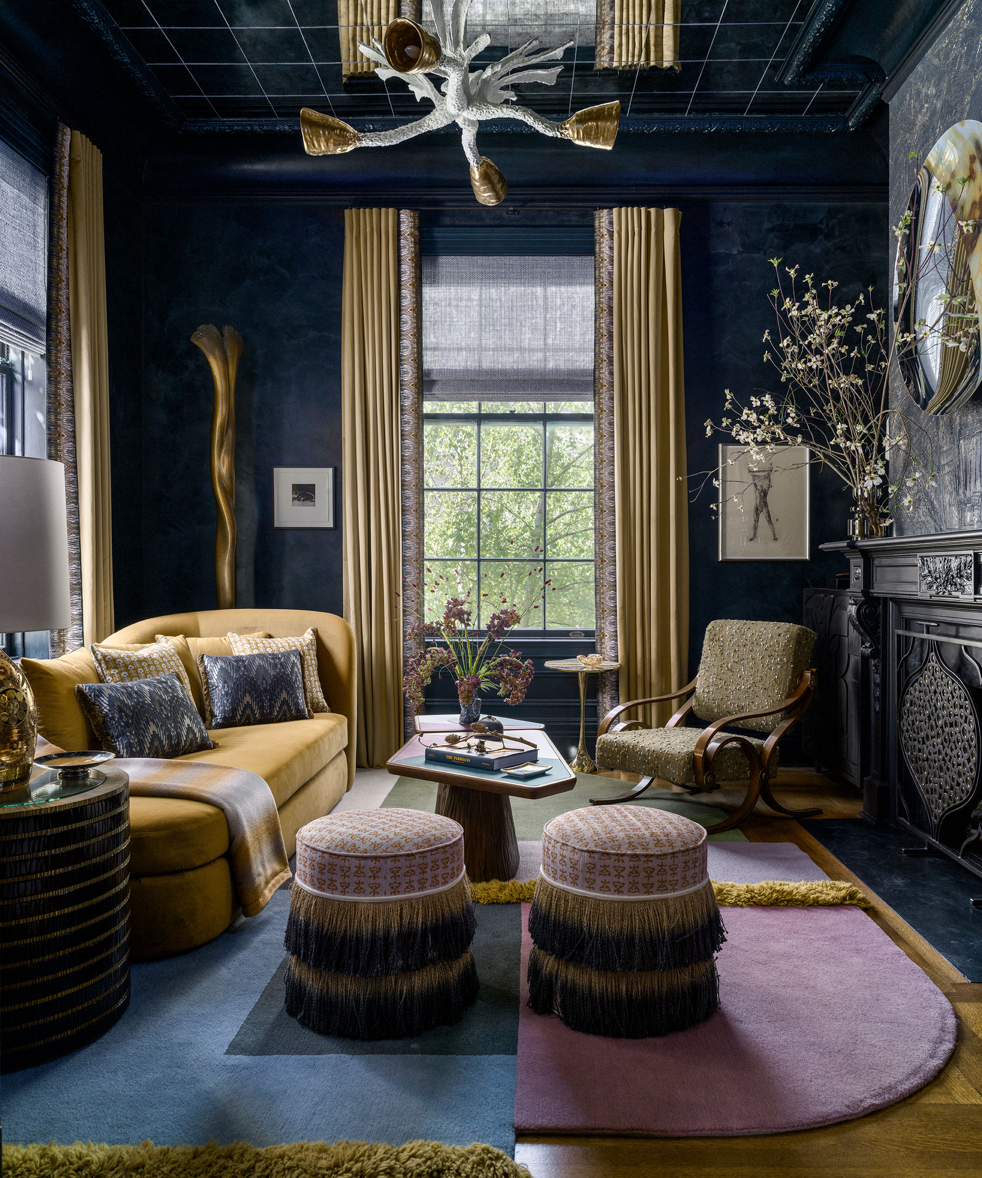
Ochre and gold tones act like the jewelry for this deep blue living room by Tineke Triggs Design.
Continuing with regal flair, this opulent living room poses a mauve and blue rug with gilded tassels alongside a warm ochre couch. It goes all out and works to marvellous effect, demonstrating that purple is indeed one of the colors that goes with mustard yellows.
"Purple and yellow — or even better, purple and ochre — make such a cool pairing if you’re up for playing with contrast," explains interior designer Tineke Triggs. "They’re opposites, so when you put them together, they naturally create this bold, high-energy vibe.
"Purple brings in that rich, moody depth, while ochre or yellow adds warmth and brightness that really lifts the whole palette," she continues. "It’s a combo that feels a little unexpected but totally intentional — like you’re not afraid to take a design risk, and it seriously pays off when it’s balanced just right."

Tineke Triggs is a San Francisco-based interior designer known for her soulful, artistic approach and imaginative blend of styles she calls “design mixology.” Her award-winning work, inspired by travel, nature, fashion, and architecture, has been featured in many interior design focused publications. A veteran of the San Francisco Decorator Showcase, Tineke’s debut book, Design Mixology, was released by Gibbs-Smith in Fall 2023.
5. Create Saturated Color Harmony
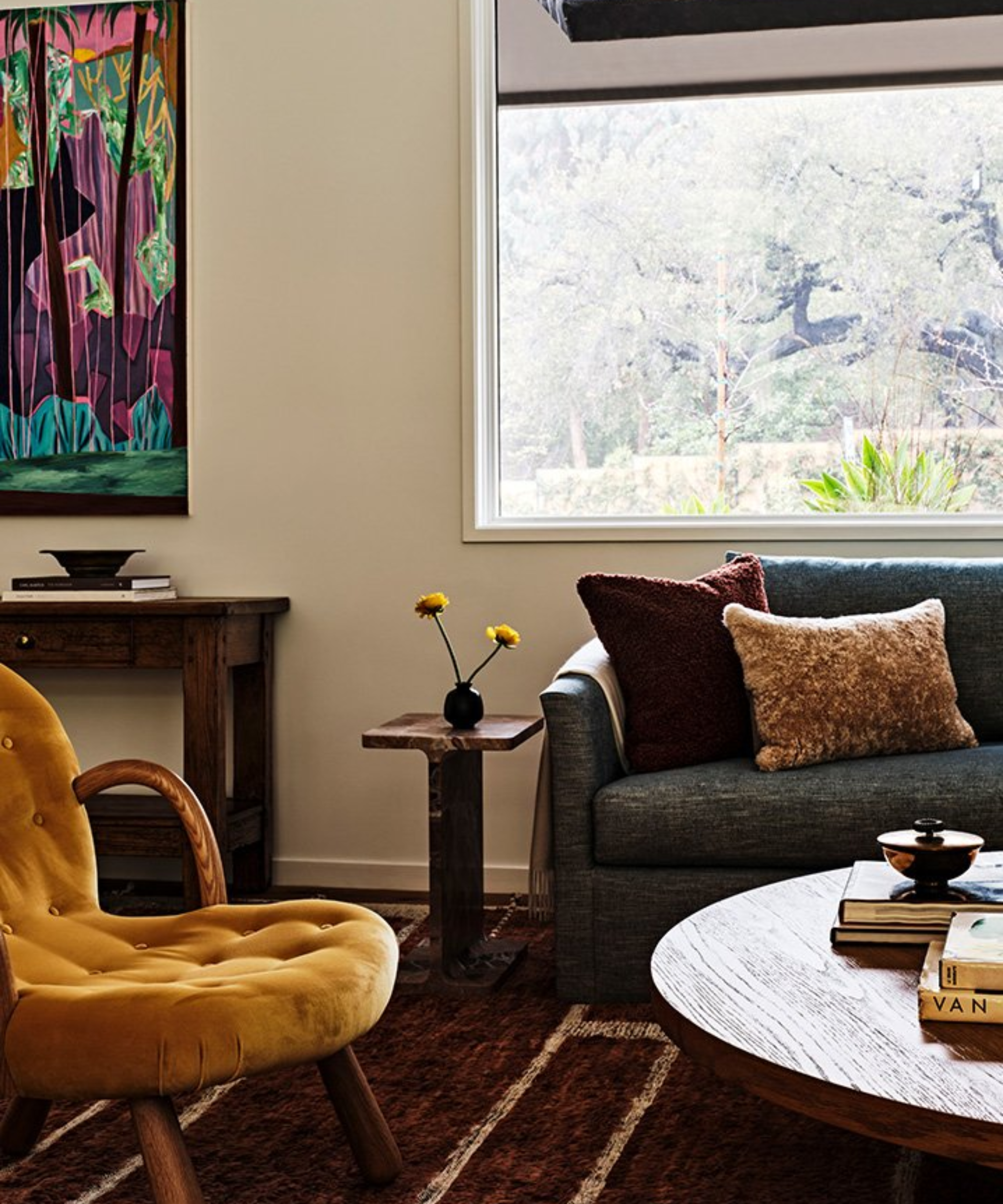
"We collaborated with the client to expand their art collection and selected pieces that were all very colorful, yet saturated," explains Lauren Waters, if this cozy living room.
Unity between yellow and purple can be achieved through thoughtful wall decor and other key design elements in a space, including the room's orientation.
"We had already chosen the amber velvet armchairs before selecting the art — so we were looking for a piece that had a lot of cool tones to balance it," explains interior designer Lauren Waters. For this cozy living room, Lauren chose varying shades of purple.
"From there, we selected wine-colored textured pillows for further contrast," she adds. "Another way to make contrasting, unexcepted colors match is to keep the colors in deeper jewel tones, with a lot of saturation rather than bright tones. Designing a room is similar to painting a canvas — it's important to balance the palette and play with light and dark tones."
6. Add a Secondary Color Duo
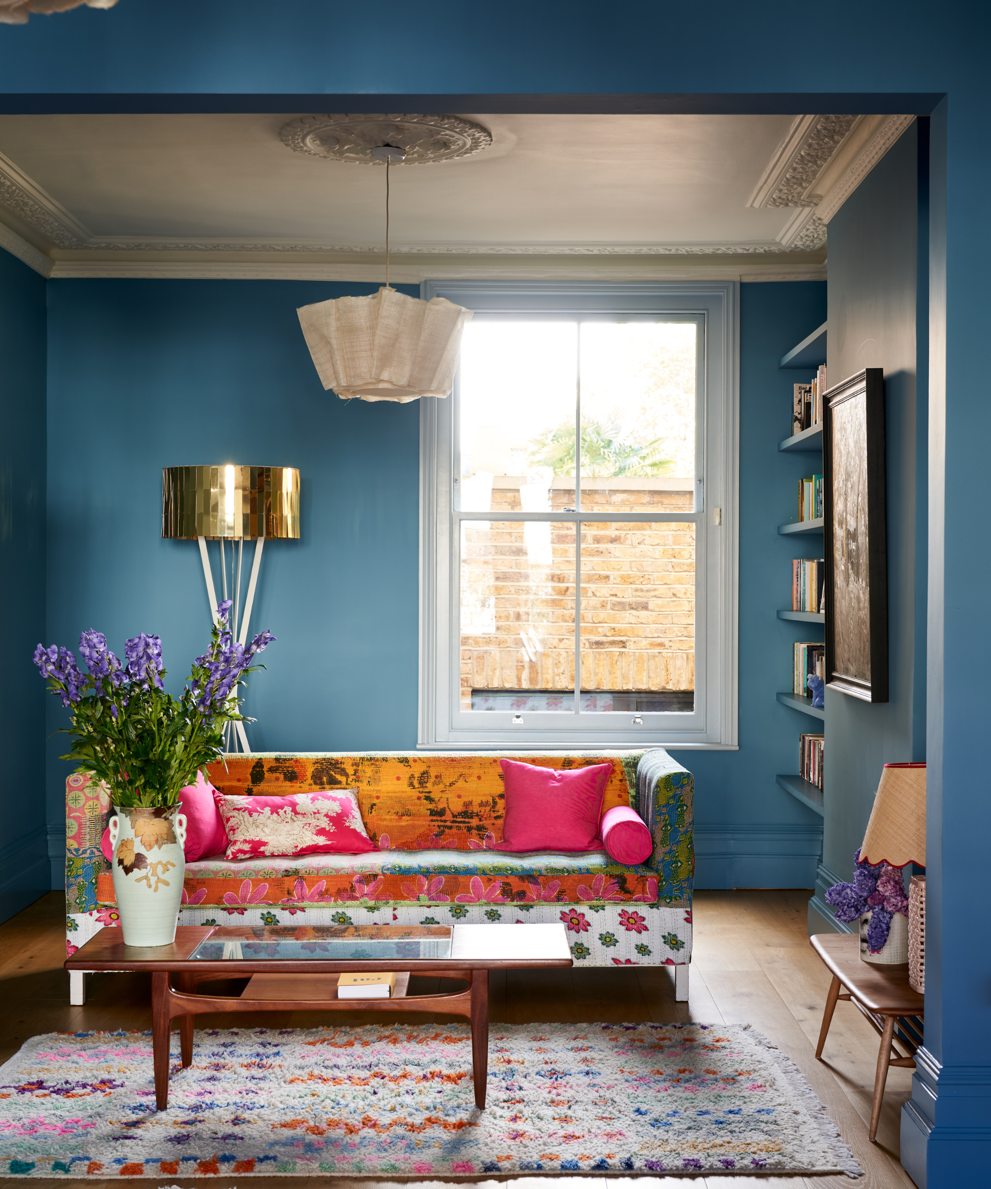
Blue walls cradle yellow silk on the couch, harmonized by purple flowers, and other pops of color.
As such potent colors in themselves, considering both yellow and purple as more secondary hues in a room can strike the perfect balance, bringing a space to life with gleeful atmosphere.
"Pending how it is used, the combination of colors can be vibrant with a wealth of depth," says Augustine Atobatele. "Yellow like rays of sunlight, evokes the spirit of joy and happiness whilst purple introduces references from the past into the present day context with the association with royalty. The atmosphere of the space, will create a dynamic tension between excitement, stimulation and a place of contemplation which is strongly used within Byzantine art, when yellow takes the dominate position."
7. Layer Indigo and Butter Yellow Accents
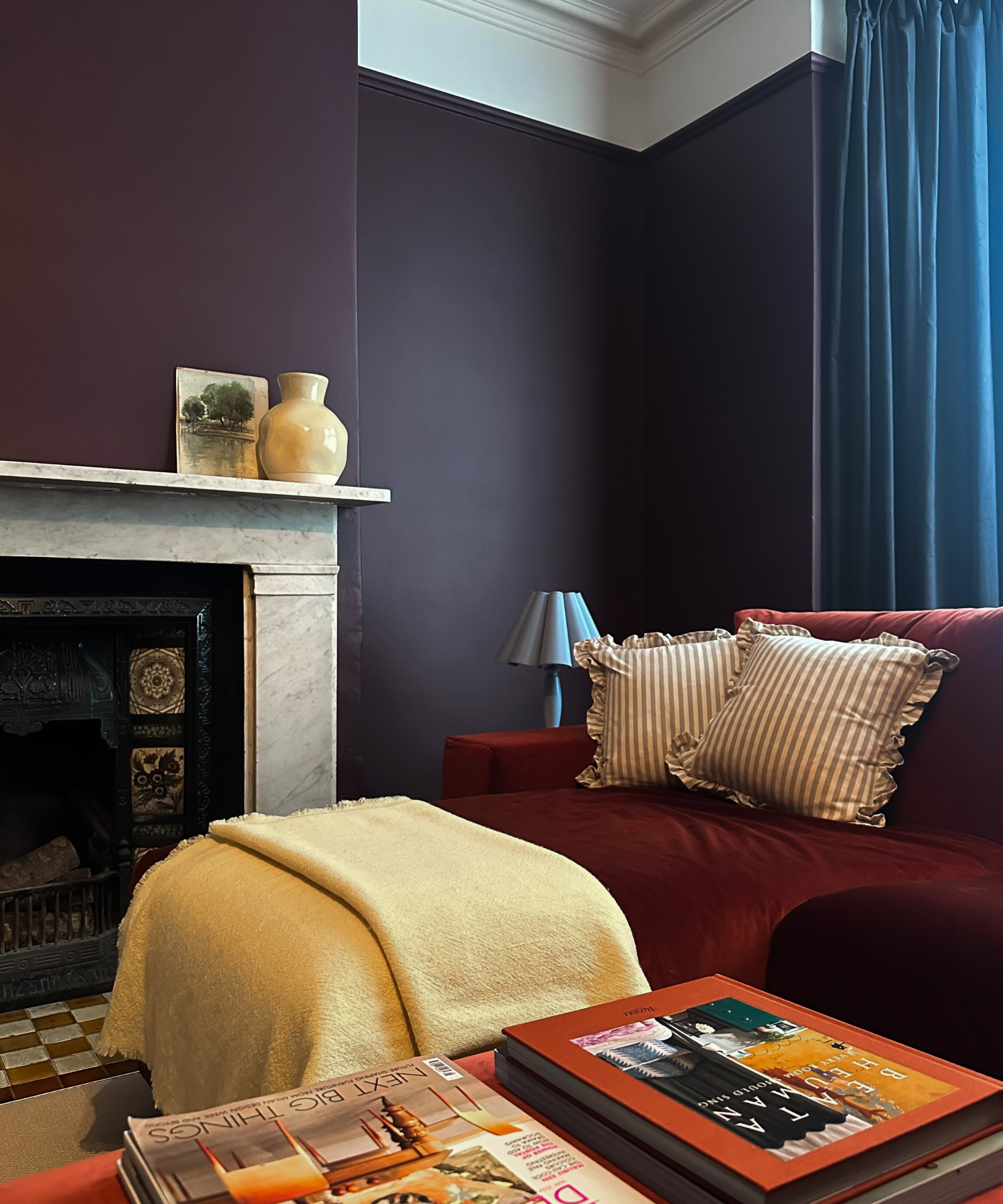
Lick's own brand director @citytoseasidehome combines Purple 03 DUMBO House Matt on the walls with butter yellow accents in her living room.
Choosing a wash of rich blue with purple undertones like the color indigo, can give an expensive looking finish. Combine with a delicious hue like butter yellow, and the results are sublime. And leaning into red undertones can give similar, dramatic and beautiful effect.
"The pairing of buttery yellow with deep burgundy like Lick's Purple 03 and accents of fresh blue, like powder Blue 08 or sky Blue 10, creates a bold yet balanced aesthetic," says Tash Bradley, Lick's director of interior design. "These colors ground a space while still feeling playful. Burgundy brings richness, buttery yellow adds warmth, and blue cuts through with a crisp, modern edge. When it comes to pairing butter yellow with materials, opt for chrome metallic finishes for a lovely contemporary feel, and dark woods like mahogany and walnut for a grown-up feel."
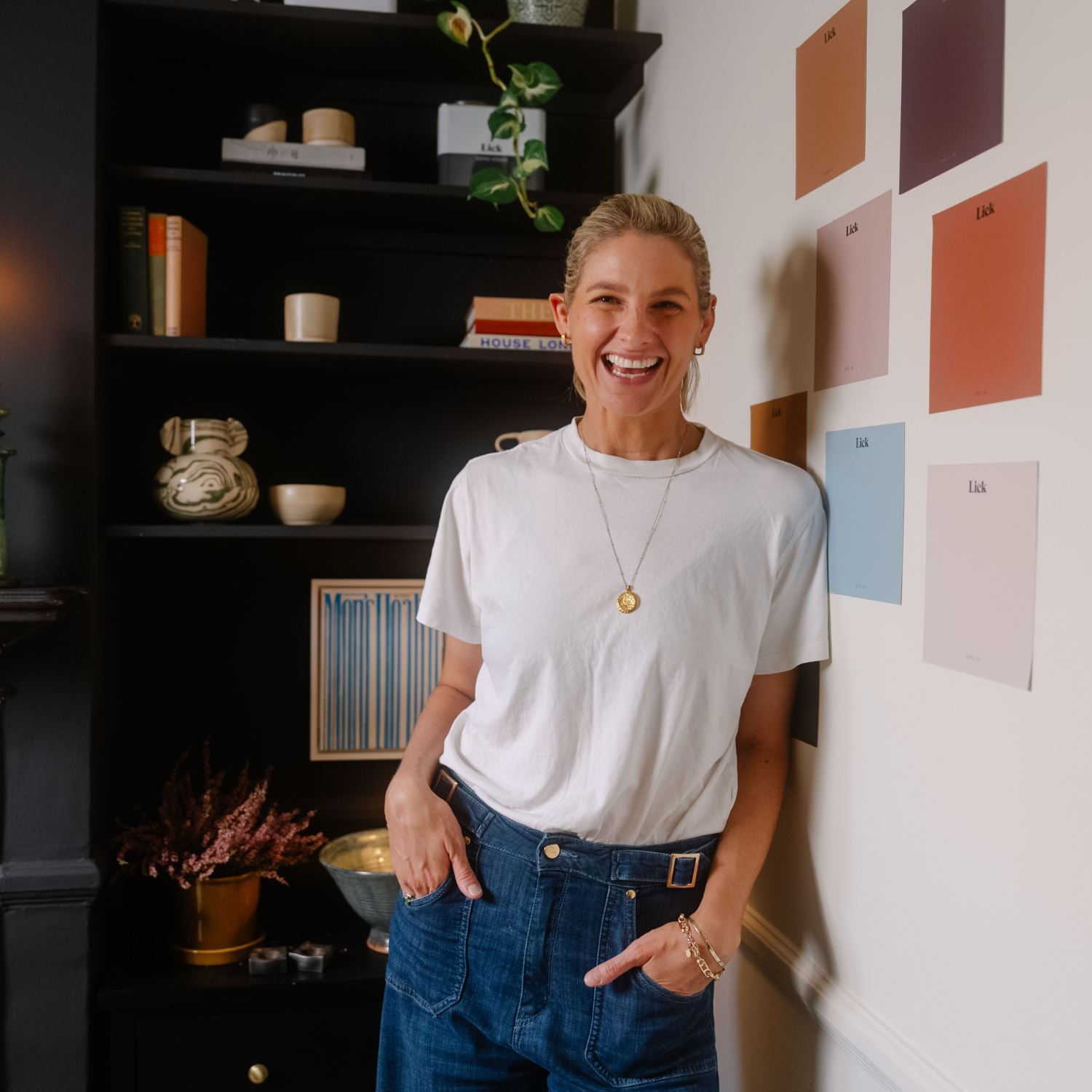
Tash is Lick’s director of interior design and is a respected color psychologist, color consultant, and interiors expert, specialising in residential and commercial properties’ color palette selection. As the creator and curator of Lick’s distinctive color collection, Tash brings her wealth of experience and knowledge of color psychology to all her projects.
For a modern living room paint color combination, or a hallway that wants unexpected interest, the answer to the question 'do yellow and purple go together' is a resounding yes.
“Purple and yellow are quite a bold choice for some people but actually they are natural partners and can look great together," adds Paula Taylor, color expert at Graham & Brown. "Yellow is a vibrant and energetic color and paired with the regal tones of purple can create a wonderful impression on an entrance hall."
But it's important to choose your location thoughtfully to harmonize this cool duo. "Try pairing a pale pastel yellow with a rich dark purple like Graham & Brown's Famous Paint for true perfectly partnered colorway, or the reverse with deep buttery yellows with pale lilacs to create a lively contemporary guest bedroom."
The Livingetc newsletters are your inside source for what’s shaping interiors now - and what’s next. Discover trend forecasts, smart style ideas, and curated shopping inspiration that brings design to life. Subscribe today and stay ahead of the curve.

Camille is a freelance interiors writer and the former deputy editor of Real Homes where she covered a broad range of topics, including DIY, small space design, and gardens. She studied English language and Italian at the University of Manchester and it was during her year abroad studying in Bologna that she started documenting her adventures and observations in a blog. Camille has a passion for art and beautiful spaces. When not writing or refreshing her home, you will find her gallery hopping, taking photos, painting, and traveling to seek out interiors inspiration.
