When we first wrote about an emerging decorating style called 'dopamine decor' back in 2022, it was hard to see beyond it as another 'viral' design trend. However, cut to 2025, and not only are the tenets of dopamine decor still as relevant to design today, but the name has stuck with it, too. Why? Because it's about using color in ways to bring you joy, and joy is never going to go out of style.
However, since that first report on this interior design trend three years ago, it's fair to say it has evolved — new colors have become popular, some that designers were gravitating towards back then have receded. But at its core, dopamine decor has stayed the same. "More people now have the language to talk about design in relation to their feelings," says the designer Ellen Cumber, founder of Golden Design. "Clients come to me and say they want their homes to feel happy, or calm, or joyful."
And so, with more of us understanding how our decor choices can affect our moods, it's no surprise dopamine decor has stuck around. But how do you get it right in 2025?
What Is Dopamine Decor?

This small bathroom design is a classic dopamine decor scheme. The color blocks, and palette of hues, is a prime example of how dopamine decor first burst onto the scene.
For the uninitiated, you might be wondering, well, what is dopamine decor? Well, we'd define it as a style of decorating that leans into a multicolored palette of bright shades, in graphic shapes. There's a simplicity in form that allows all that color without feeling too much. Strip out the color, and these spaces could even read minimalist.
However, that's dopamine decor in the classic sense, but for the designers who are taking this color trend into 2025, there's more of a sense of texture, depth, even soul being applied to these ideas.

This bathroom, on the other hand, offers a more nuanced take on the dopamine decor trend.
"Block colors aren't so interesting," says Natasha Lyon, founder of The Appreciation Project. "You need to be able to find a balance, to use softer hues like creamy whites or earthy mustards alongside the bolder shades if you want the whole look to work. Then you'll get a room of joy but not in an overwhelming way. It'll actually be quite soothing."
And this is the neatest summary of why dopamine decor is an art form, and how easily it can go wrong, with colors too strong.
For inspiration, take a look at the designers doing dopamine decor right for 2025. At the forefront are creative powerhouses like Natasha Lyon of The Appreciation Project, Ellen Cumber of Golden Design, Liv Wallers and Cath Beckett of Yellow London, Tola Ojuolape of her eponymous studio, Lonika Chande of her eponymous studio and Julien Sebban of Uchronia. They all have the ability to pair strong colors in ways that only enhance each other rather than clash, layering them in ways that create a fusion rather than an overwhelming shout.
How to Decorate With Dopamine Decor

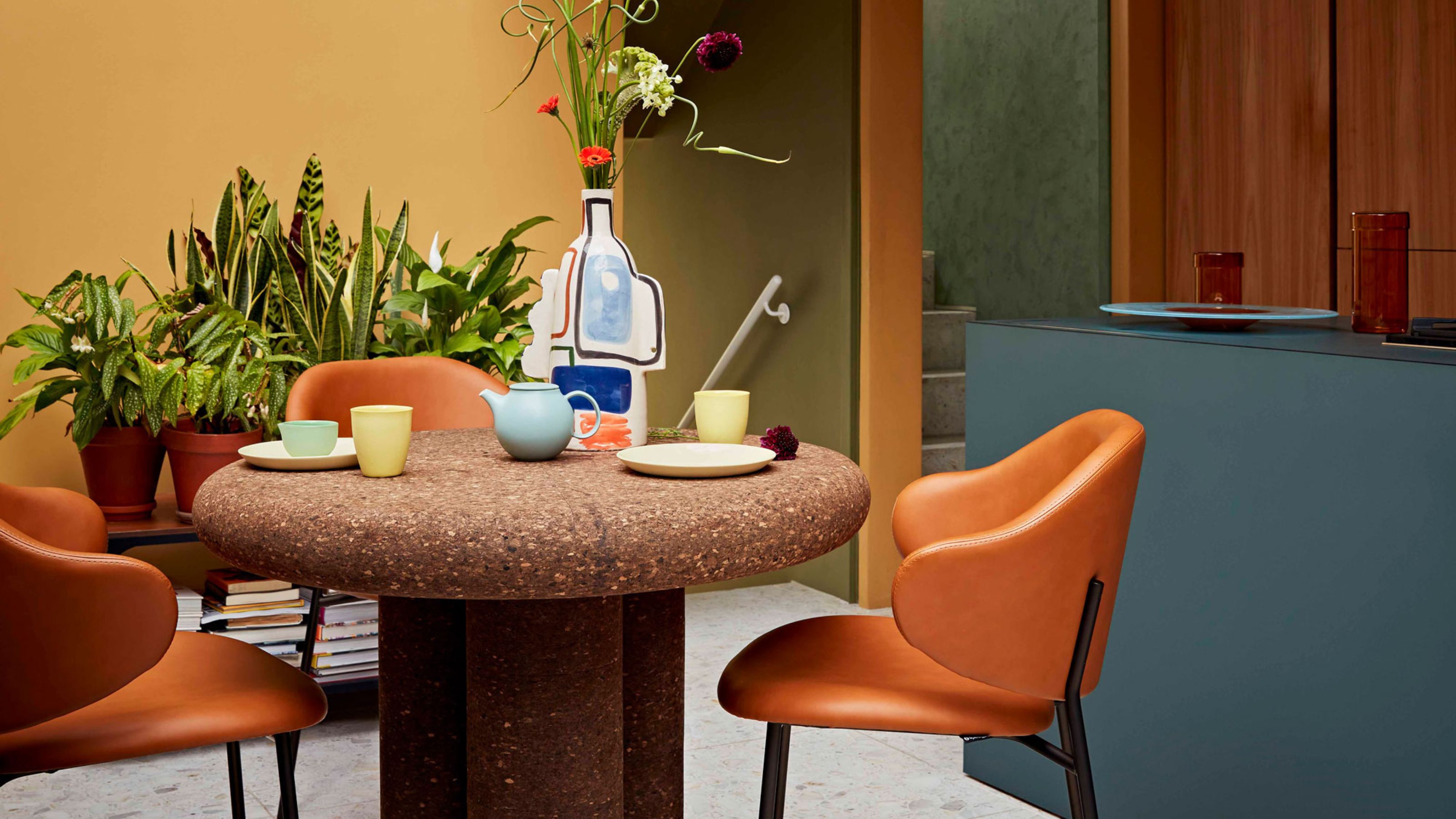
More sophisticated color palettes are replacing the gelato-inspired shades of the first wave of dopamine decor.
The dopamine decor approach is to use uplifting bold colors on the walls, to raise a smile on your face the moment you walk into the room. But it's not just color drenching the space in one hue anymore, or going as bright as you can. While the the color is often drenched, and goes up and over the walls and onto the ceiling, it no longer tends to include the woodwork or trim.
And in fact, the dopamine palette is now very rich. Think earth tones rather than neons. In this space by Roisin Lafferty, above, the red cabinetry has a russet tint. There is an understanding that if you're going to use a bold color — and use it big — it needs to be tempered by red, brown, or even black pigments so as to soften it around the edges.
For a great point of reference, the new dopamine palette takes its lead from the brand new Farrow and Ball color chart, which dropped this month. Of the 12 new colors, there are two terracottas, a buttery yellow and some rich greens and browns. "I feel that people want colors that are quite rich and that feel like they've been there forever," says Farrow and Ball's Color Curator Joa Studholme. "Nothing shiny or blingy or brash. Even the bigger colors seem to be slightly muted now, to have deep pigments but be slightly knocked back."
She thinks that terracotta is the ultimate dopamine color this year. "It just makes the shoulders drop. It's familiar and evocative and warm," she says. "And it goes with other earthy tones really well."

Even with bold contrasts in a dopamine decor color palette, this year's take is grounded by neutrals, too.
"I love to color drench and would probably use an earthy tone as a singular color for walls and ceilings," says the interior designer Tola Ojoulape. "If I had to pair it with something else, I would use it with a complementary color, slightly lighter and softer, on the woodwork and detailing. Then I would use contrasting fabrics on the furniture in the room, so as to create a beautiful space with depth and layers."
Lonika Chande's approach is to pare walls back a little, focusing on dopamine colors inside the space, believing that they're easier to live with this way. "It's a very happy-making way to design, to use such bold colors," Lonika says. "I’m just not a pastels girl, I love strong tones."
And Joa Studholme says that it's the finish that's important. "For the earthiest colors, that work so well in small spaces, use a matte finish rather than a gloss," she says. "The colors tend to be richer that way."
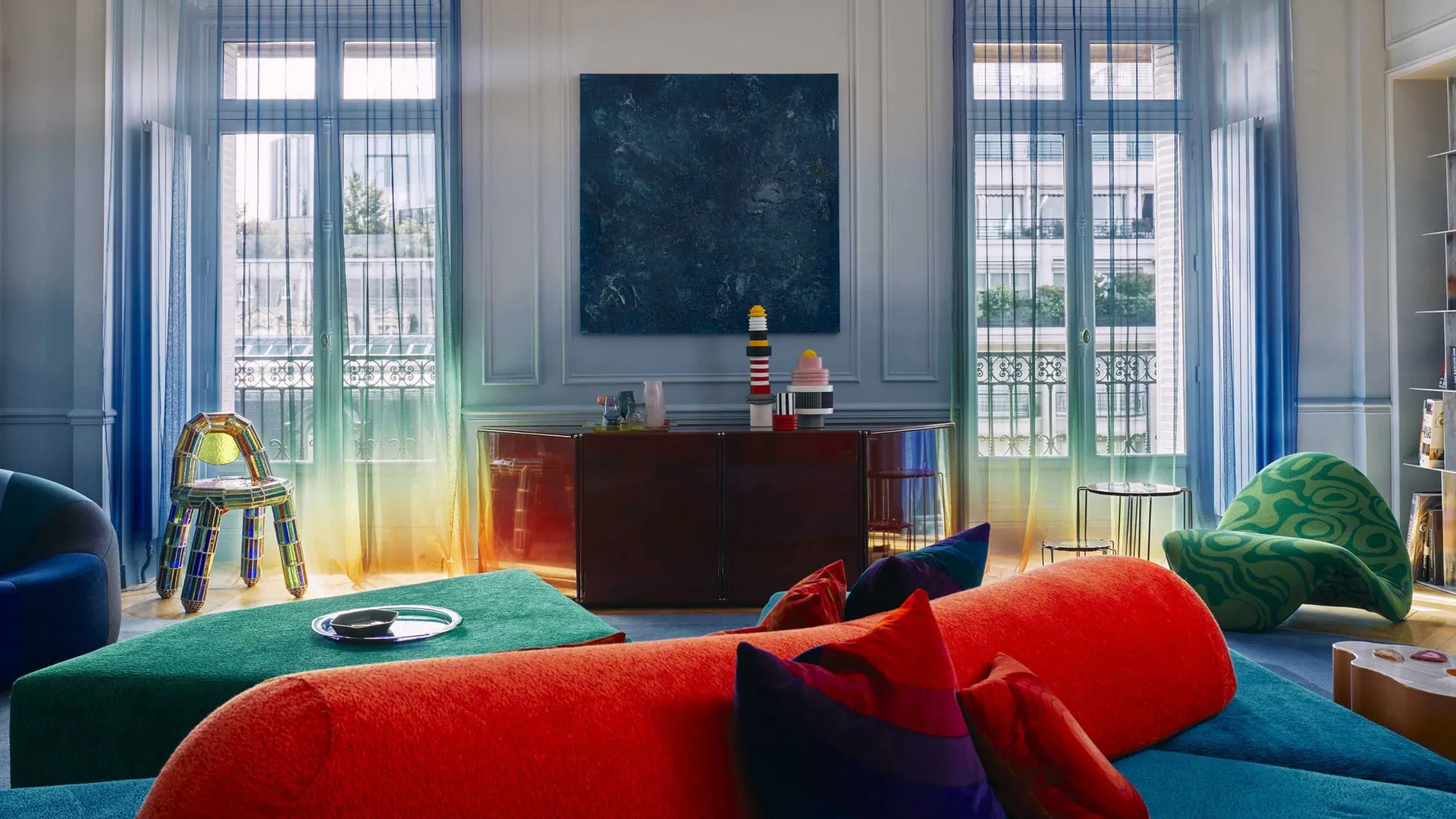
The Dopamine Decor Living Room

Using three of four equally bold colors will give the dopamine decor effect.
This dopamine decor living room is a far cry from the fluro green and blue rooms we saw back in 2022. Instead, Lonika Chande has used an uplifting yet soft earthy pink on the walls, focusing on bold reds, blues and greens in on the details and furnishings.
"Our backdrops always tend to be softer, earthier. Jewel shades sit so well as colors that go with terracotta or light whites, clay finishes that have a bit of depth to them," Lonika says. "Those bright hues are so much fresher when there is a neutral for them to sing out against."

Price: £33.60
This shade of blue is total dopamine decor.

Price: £5.95 per sample
This warm coral pink is a great way to bring joyful color to your walls.

Price: £71.50
This green lamp brings texture to a space in a way perfect for the new dopamine decor.
The Dopamine Decor Bedroom

The old style of dopamine decor would be relatively plain, but we're now seeing pattern used more
One tenet of Dopamine Decor that has stayed true since the beginning is that it's meant to jolt you a little, to enliven your home. 'What you shouldn’t do is always conflate happiness with calm,' says the interior designer Liv Waller of Yellow London, who created this bedroom, above. "Pattern is the instant mood-booster, and we love to use it in a bedroom. The last thing you see at night and the first thing you see each day."
She suggests that for a dopamine decor bedroom you do need some sense or order, though, or you'd never go to sleep. "Symmetry can make you so happy - it is so pleasing on the eye - and changes how you view the space you’re in. If there is reason to how a room is decorated, if it makes you feel like there is order rather than chaos then you’ll naturally feel more in control, and happier about life, too."
The Dopamine Decor Kitchen

Teal and red are more sophisticated than some dopamine colors, but still feel bold and happy.
This colorful kitchen is a new take on dopamine decor, using more mature but equally bold colors that can't fail to raise your serotonin levels. Under the skillful hand of the designer Roisin Lafferty the tones are more welcoming than they are in-your-face. "This is a project that is all about depth, richness, opulence, and detail," says Roisin. "It’s a sensory space that wraps itself around you as soon as you step foot inside. When it came to specifying materials, it was all about balance, contrast and play."
Because the kitchen is a functional space that people tend to congregate in it, it's safer to temper the dopamine touches with the veining and whorls of natural materials like marble and wood. The result is sophisticated instead of shouty.
It's such an interesting idea that a trend that has such a clear cut aesthetic can evolve over time, but still remain under the same guise. All in all, it's about using positive colors that will make your home feel happier, and that's a trend that's going to be enduring.
-
 This Specific Fabric Print Is Literally Everywhere Right Now — Here's Why
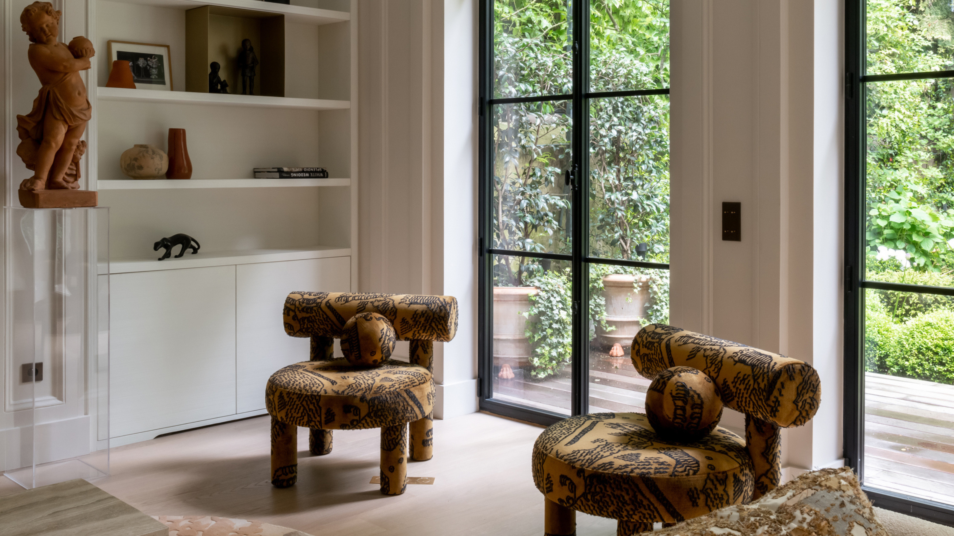
It's whimsical, artistic, and full of character. We've called it already: Dedar's 'Tiger Mountain' is the fabric that will define 2025
-
 These Are the Dos and Don'ts of Bamboo Plant Placement — Follow This to Avoid Bad Feng Shui
By following the experts' guidance on where to place this houseplant you can usher luck, wealth, and prosperity into your home


-
I Spy With My Design Eye: This Specific Fabric Print Is Literally Everywhere Right Now — We've IDed It for You
It's whimsical, artistic, and full of character. We've called it already: Dedar's 'Tiger Mountain' is the fabric that will define 2025
-
 Having Mismatched Dining Chairs Is the New Telltale Sign of Serious Style — Here's How to Make It Look Intentional
Once considered a sign of a lack of care, a dining room table with different chairs now screams ultimate curation... if you can do it right, that is
-
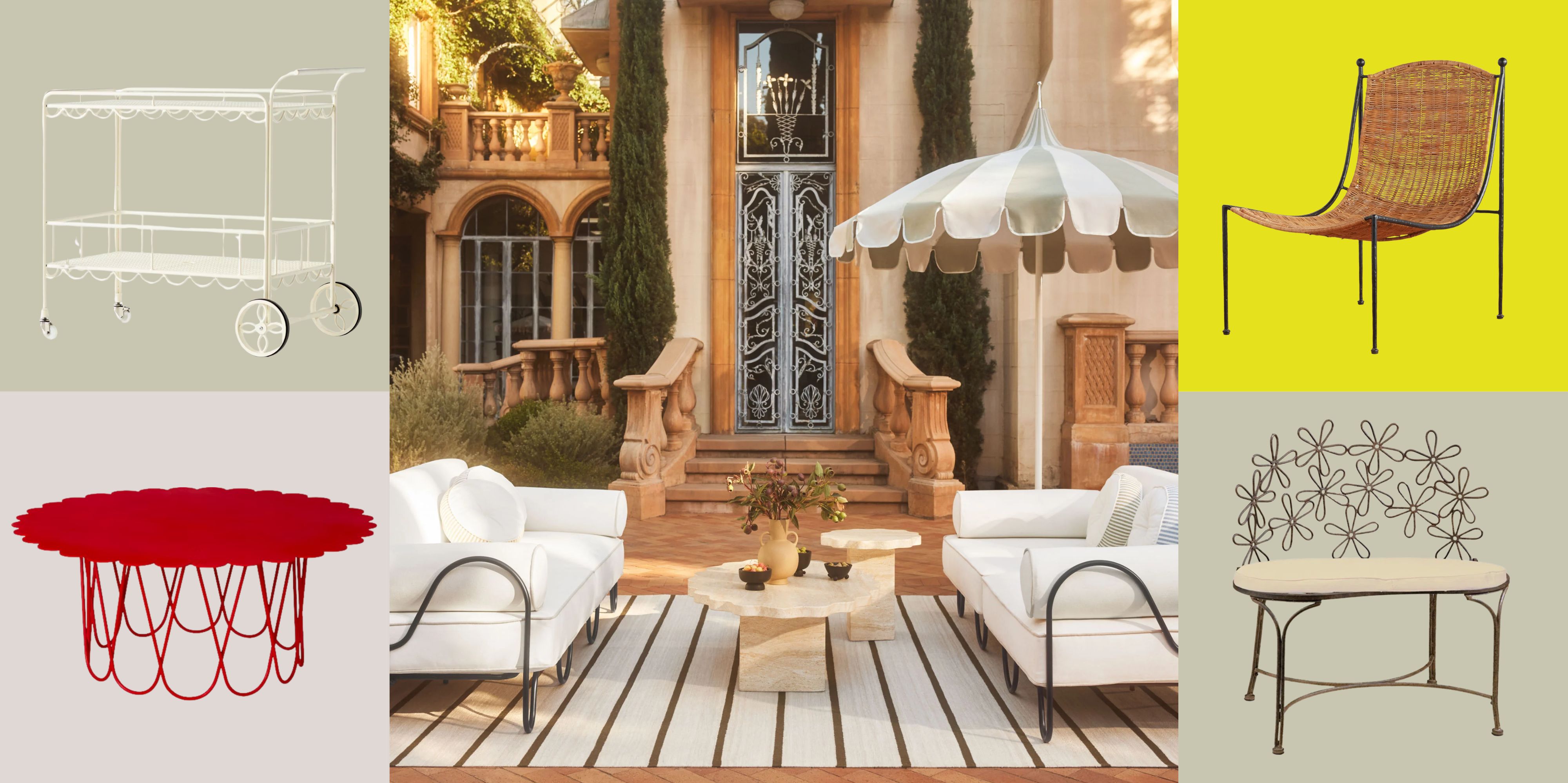 There’s a New Shape in the Garden — Why Whimsical Curves Might Be the Outdoor Furniture Silhouette of the Summer
Powder-coated petals, wavy lines, and a hint of surrealism — this microtrend is blooming, and we’re paying attention
-
 I Asked Interior Designers to Share the Worst Decorating Trends They've Seen on Social Media
Just because something is trending, doesn't mean it's tasteful — from dupe-culture to OTT lighting, here's what designers hate seeing in homes
-
 I'm Calling It — Chrome Decor Is the Most Influential Design Trend of 2025 for Rooms That Feel Effortlessly Cool
Have you been eyeing a chrome candle holder or side table to complete your room's look? This is your sign to embrace the shiny, chic material
-
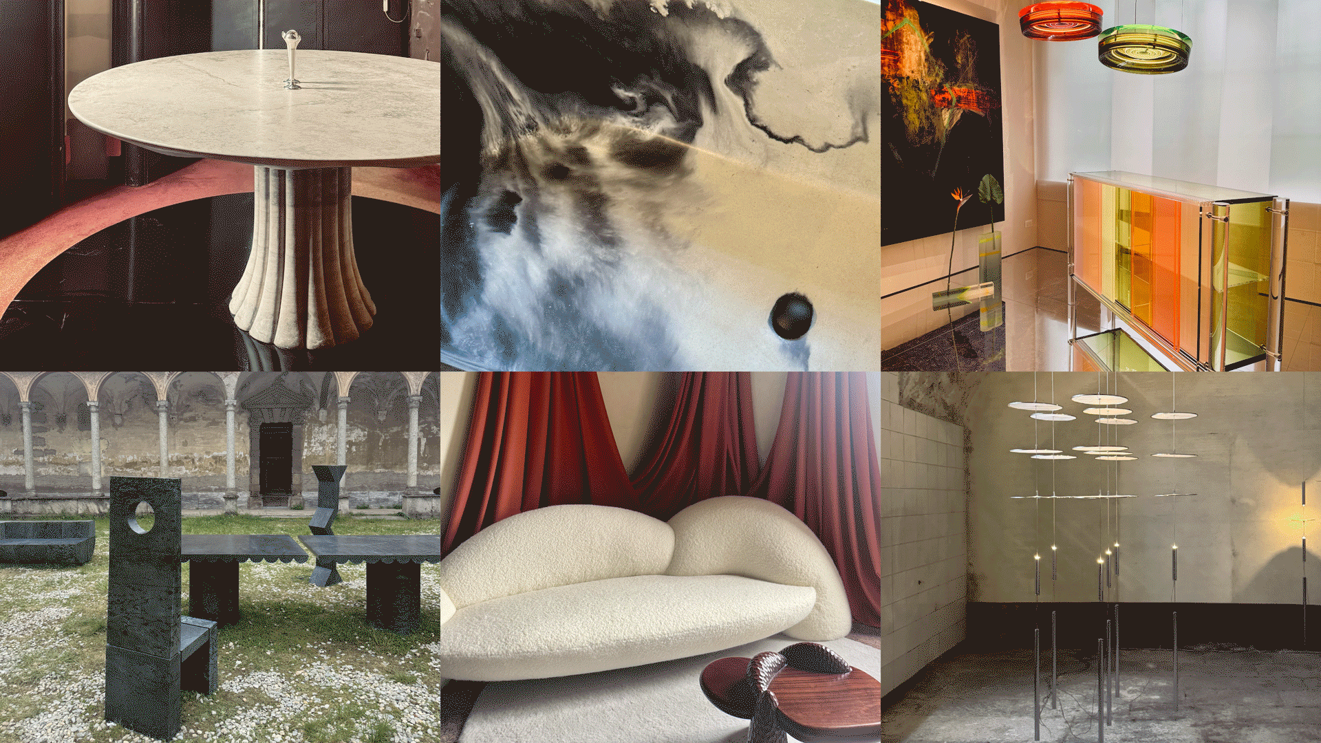 Straight from Salone: 5 Emerging Trends I Found in Milan That'll Shape Interiors for the Year Ahead
From reflective silver to fluidity, here's my perspective on the key themes and new moods coming through from Milan Design Week
-
 The 'Red Table Trick' Is the Easiest and Most Expensive-Looking Trend to Hit 2025 So Far
A red dining table makes a seriously stylish statement; the beloved pop of red trend just got an bold and expensive-looking upgrade
-
 Cork Is the Cool, Sustainable, and Surprisingly Chic Material We Can't Stop Furnishing With Right Now
In honor of Earth Month, we’re toasting to cork... furniture, that is


