Entryway Makeovers — 5 Before and Afters of Dated Spaces That Now Make the Best First Impression
Looking for entryway makeovers? These 5 projects showcase just what can be done

Entryway makeovers can completely change the way your home looks and feels. With the right ideas, fresh paints, and decor pieces, you can make the entrance (and your home) distinctly your own, reflecting personal style and taste.
Yet, these passageways are oft-overlooked in home renovations. A perennially put-off task, neglected in favor of tackling the kitchen, or living room.
These homes show the aesthetic power of beautiful entryway ideas put to work. How immediately arresting a well-designed entry-room can be, offering you a plethora of inspiration to bring into your own home.
1. The Maryland entrance lifted by wallpaper
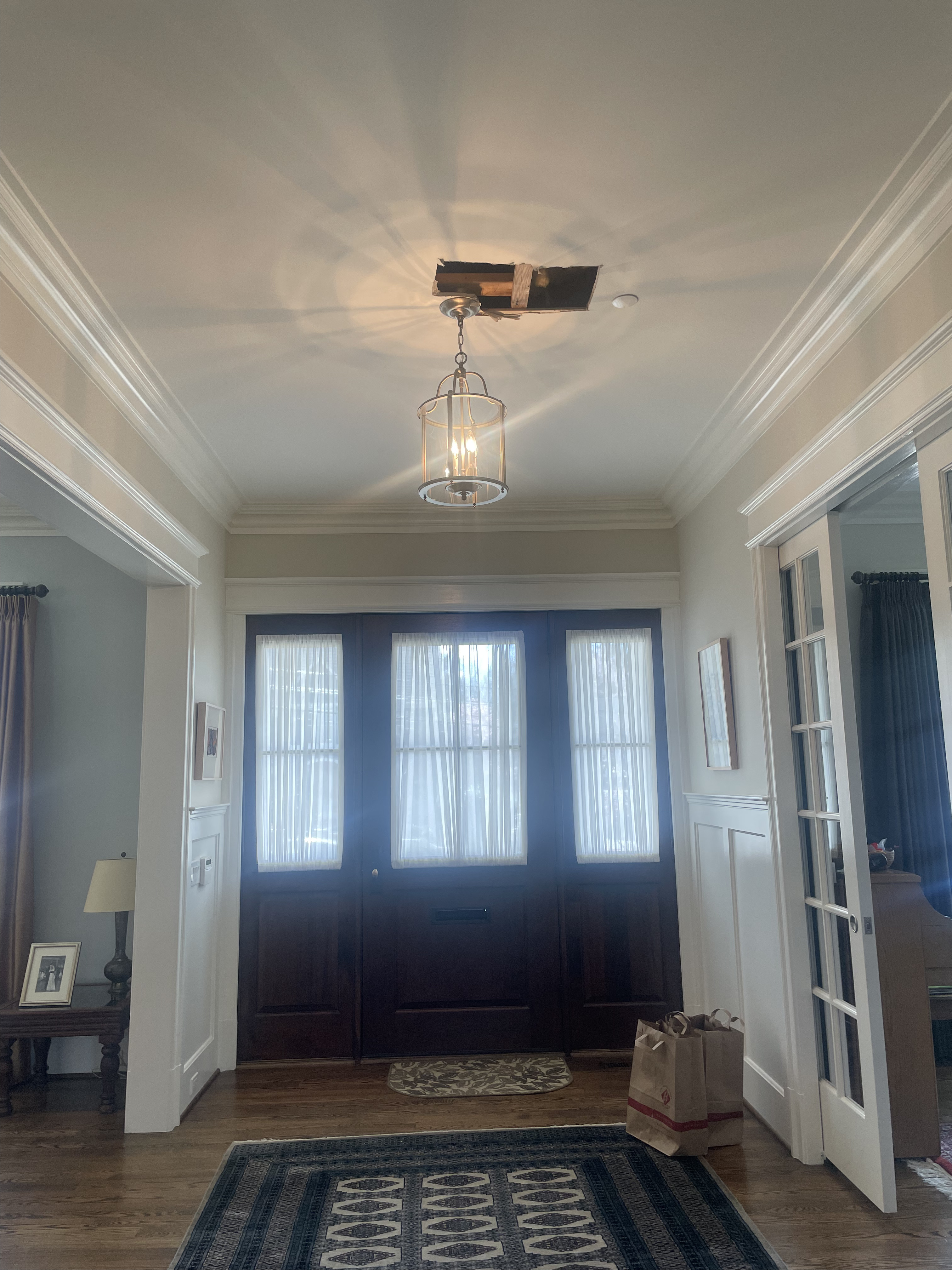
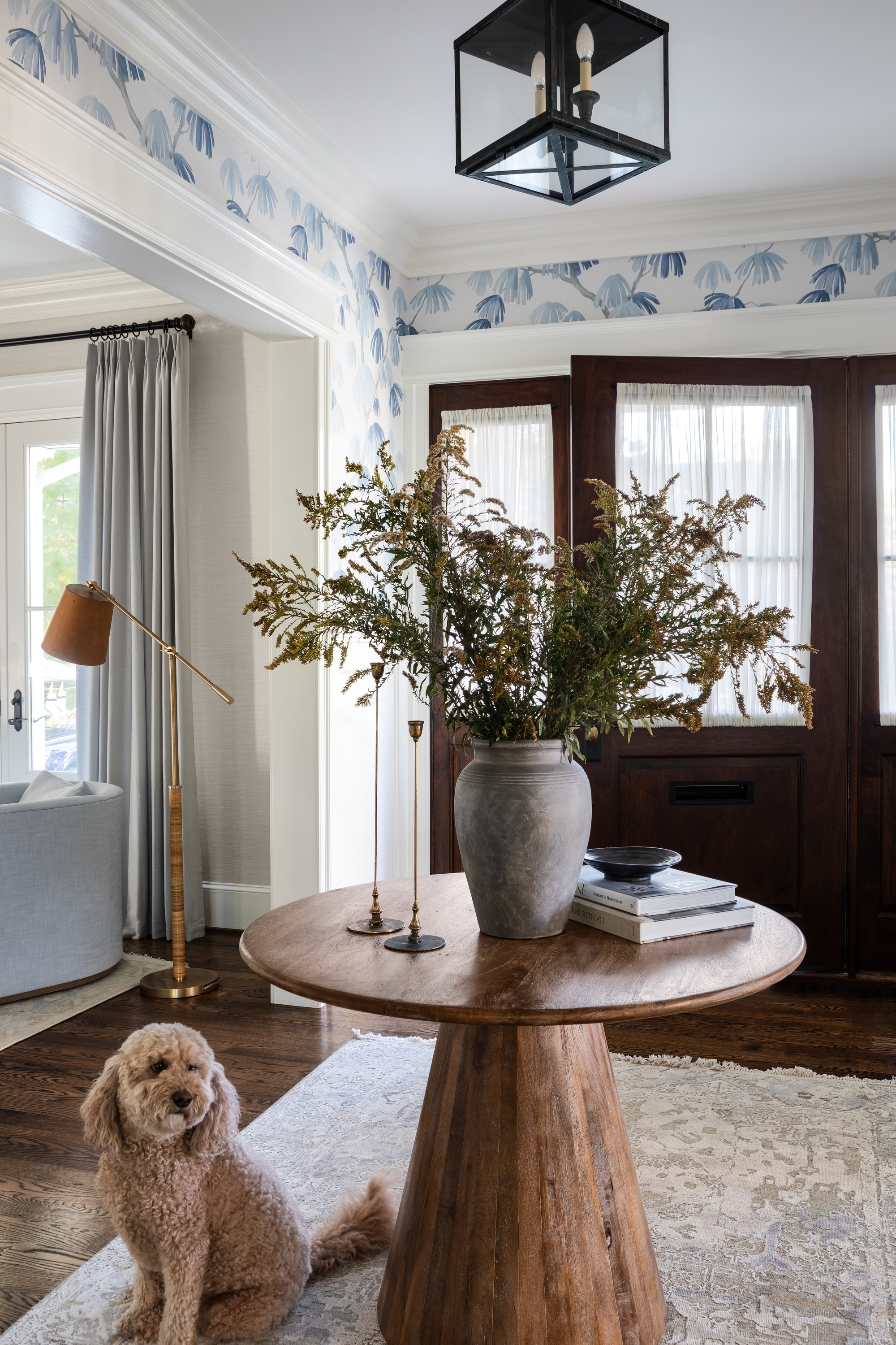
Despite the luxury of a large, open entryway, prior to renovation, this hallway made no use of the space. Decorated only with a simple lantern light and patterned rug, there was plenty of room for improvements.
Now, thanks to Kristen Harrison of Bungalow 10 Interiors, the room is light, airy, and welcoming, setting the mood for the rest of the home.
The weeping pine wallpaper from Schumacher is eye-catching without being obnoxious, and ties in beautifully with the dramatic houseplant in the centre of the table. The stunning, neutral-toned rug beneath the table comes from Jaipur, and was passed down to the homeowner by his parents, adding a personal touch to this room.
See the rest of this serene home here.
2. This Spanish-inspired renovation
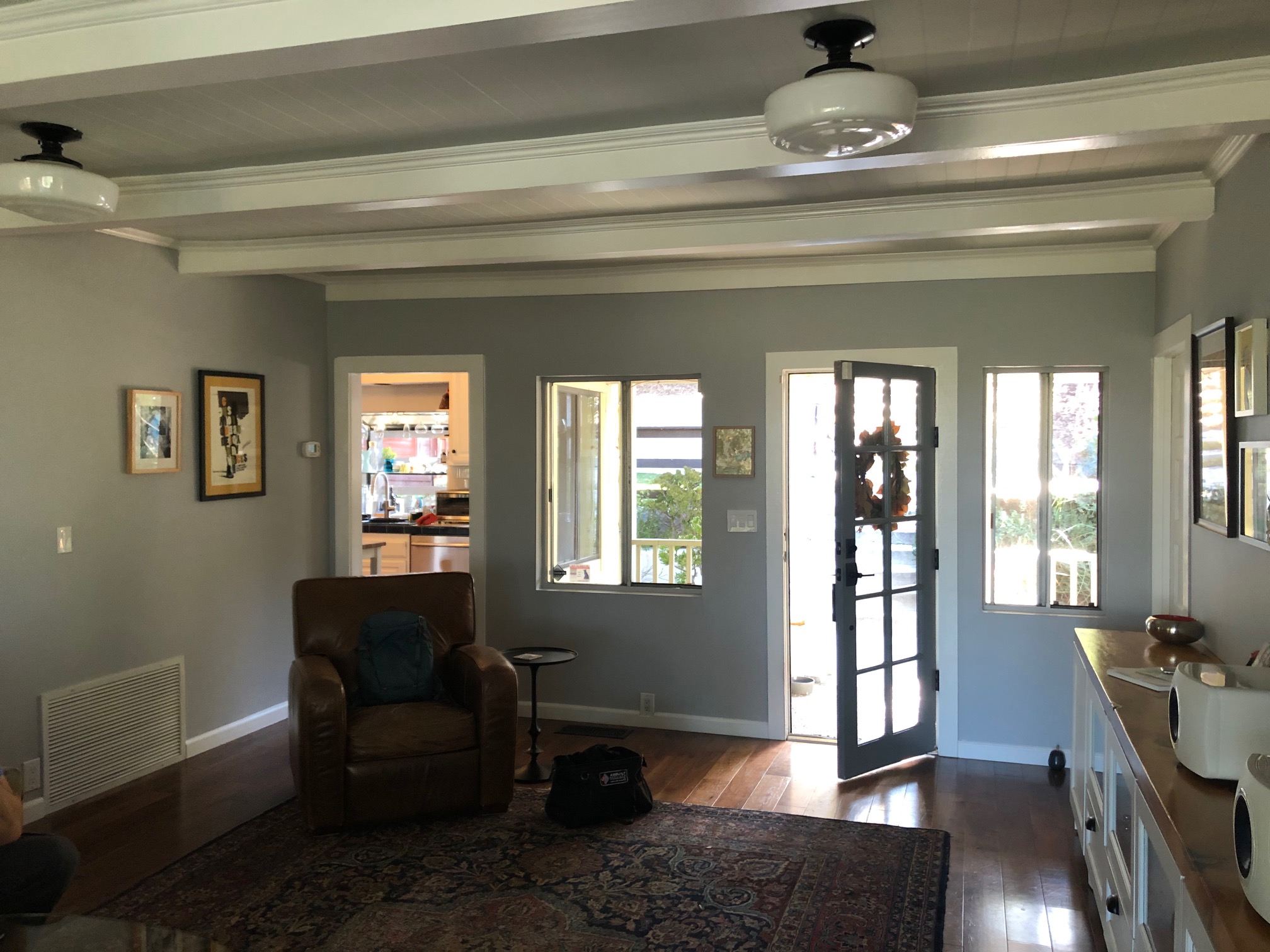
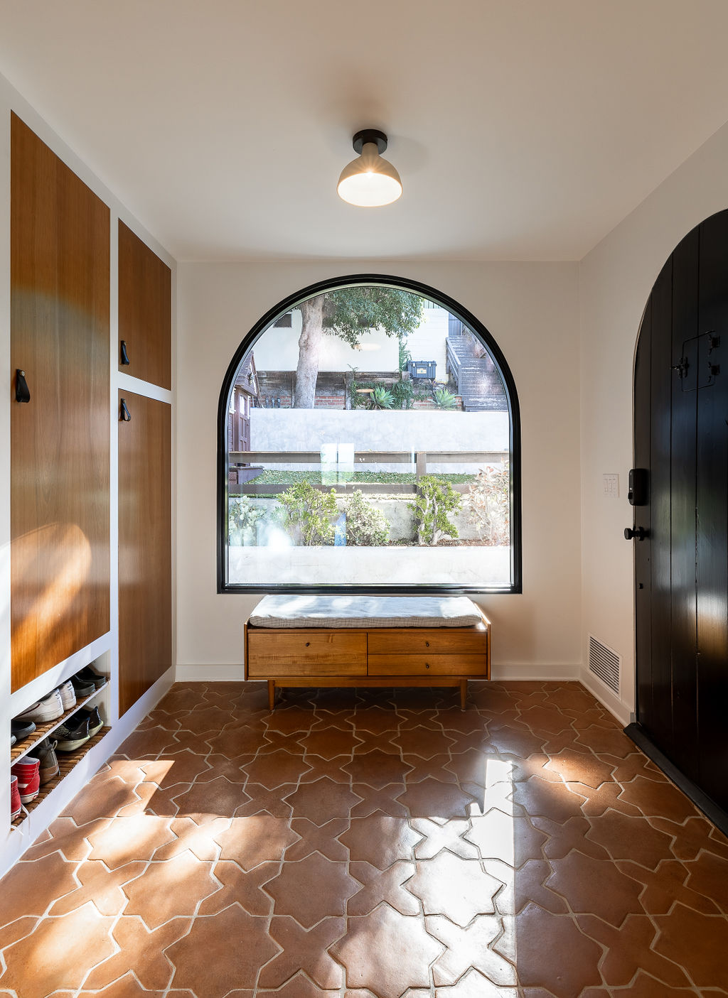
Practically unrecognizable, Barrett Cooke of Arterberry Cooke has transformed this space from dreary and forgettable, to one of the homes design highlights.
The terracotta tiles used for the entryway flooring and large, arched window lend the room a Mediterranean feel, inspired by the Spanish-style homes surrounding the house in Eagle Rock, Los Angeles.
While natural light had initially been one of the major issues in this house, the addition of the arched window offers the perfect solution.
The warmth of the terracotta, and the wooden cabinetry make this space infinitely more welcoming, transforming the experience of entering this home.
See the rest of bohemian home here.
3. The hallway that went from seventies to chic
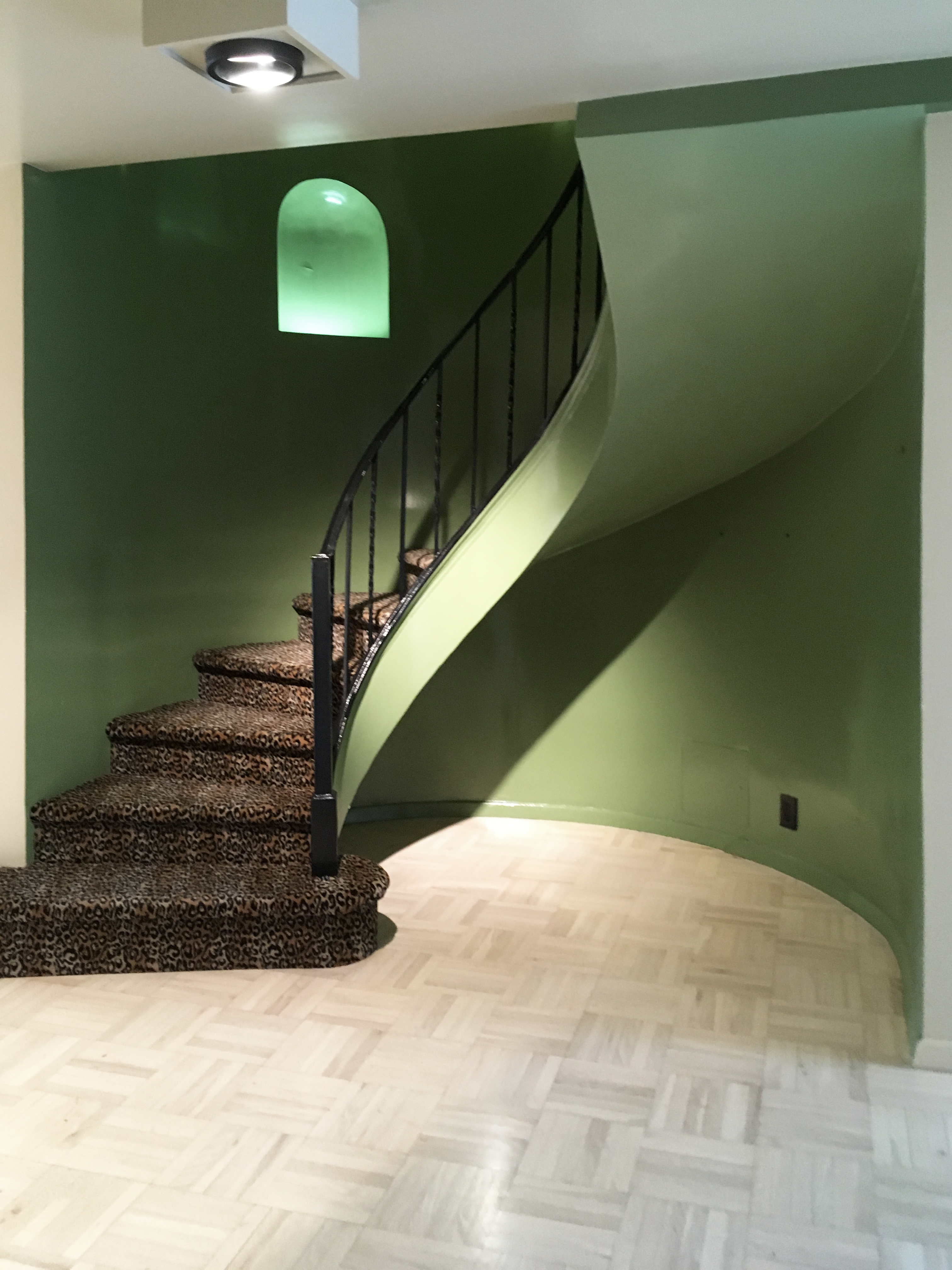
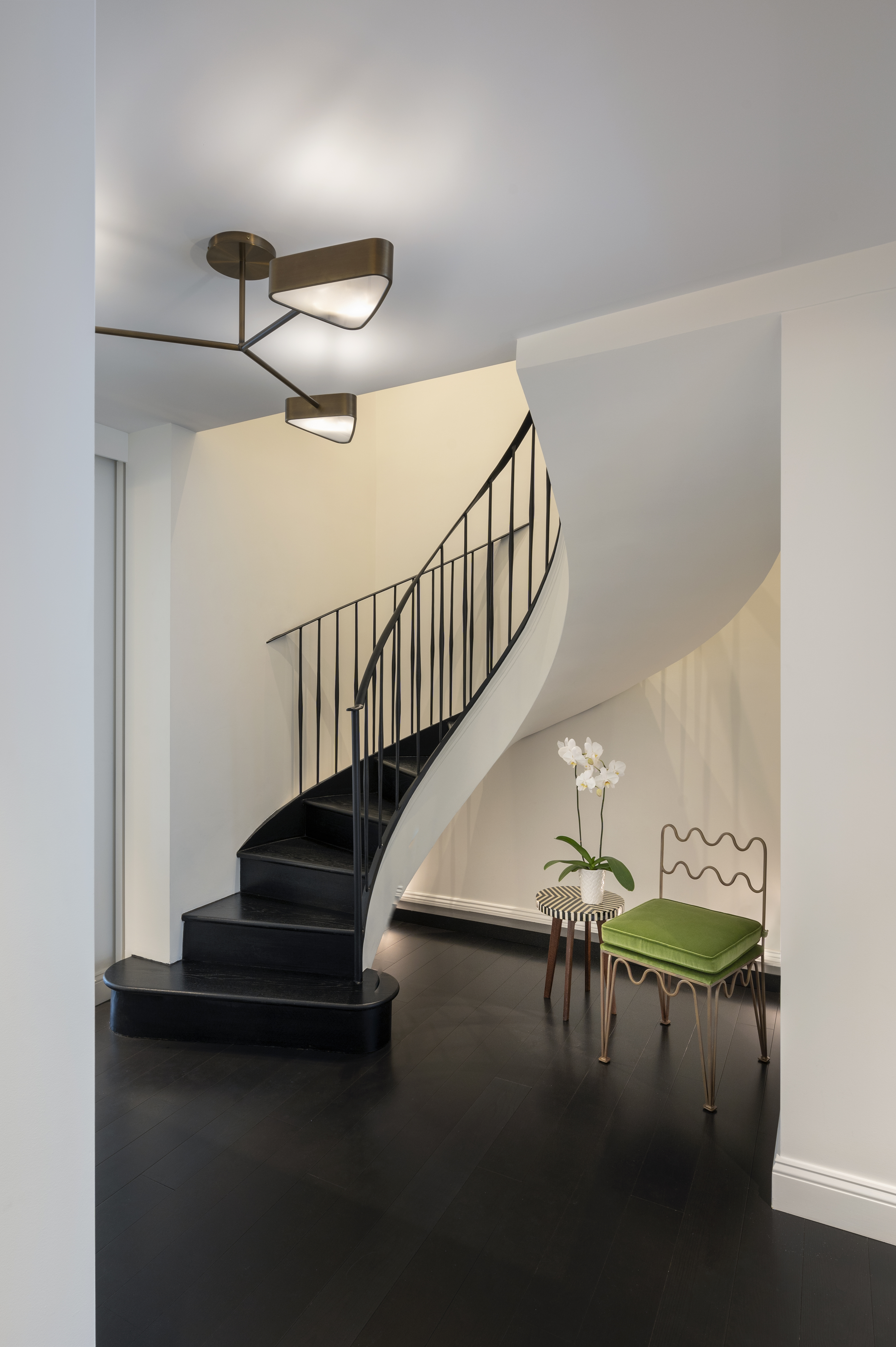
This Park Avenue duplex boasted a statement-making curved staircase entrance. However, painted a putrid green and covered in leopard print carpet, it wasn't exactly making the right statement.
PJCArchitecture modernized this entrance, while maintaining the original, unique structure. Swapping the dark green for a crisp, bright white paint lightened up the space, making it more open and welcoming. While the dark wooden floors and steel railing create a distinct contrast, highlighting the structural intrigue of the floating staircase.
To further the focus on this architectural feature, the designers added lighting behind the staircase. 'Artificial floor-mounted up-lights and ceiling downlights wash the entire double-height space to brighten the entry and welcome you into the apartment,' says the firm's Principal, Philip J. Consalvo.
See the rest of this Park Avenue duplex here.
4. This stunning Victorian revamp
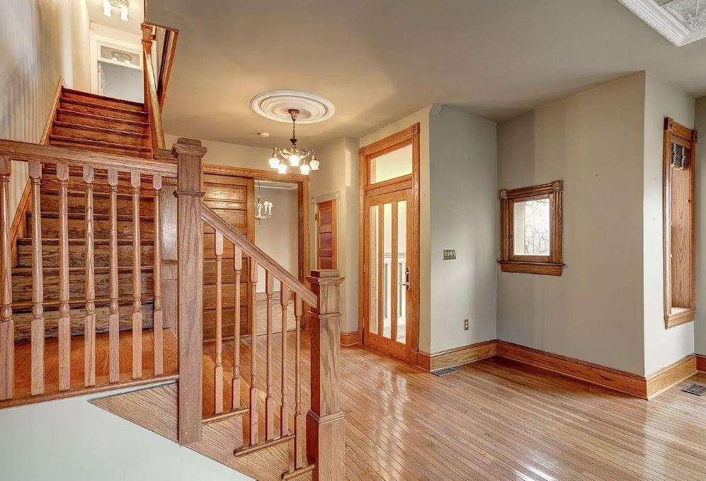

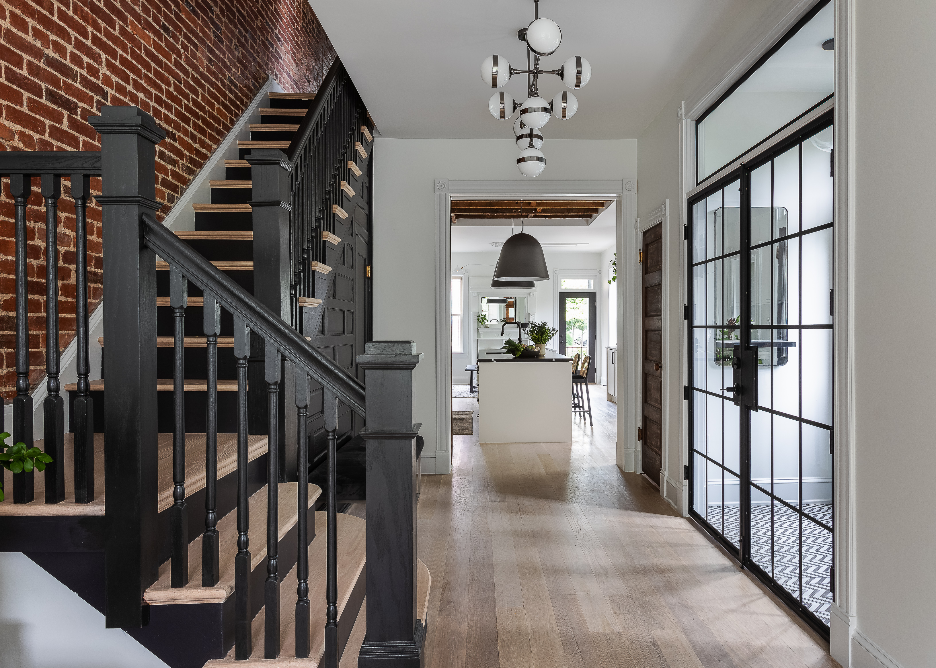
This gorgeous refurbishment managed to respect the homes original Victorian features, while giving them a contemporary spin that completely transforms and modernizes the space.
This historic Washington D.C home was designed in 1904, and from the looks of it had hardly been touched since. When the designers at Third Street Architects began this project, they were keen to maintain as many of the original features as possible, while combining them with modern, sleek designs.
They managed to do this beautifully within this entrance. Switching the warm wood for a matt black finish creates a striking visual contrast with the white walls and light wooden floor, bringing this room into the modern-day. The exposed brick wall is a nod to the Victorian industrial revolution, and gives the entry a more relaxed look.
5. xxx
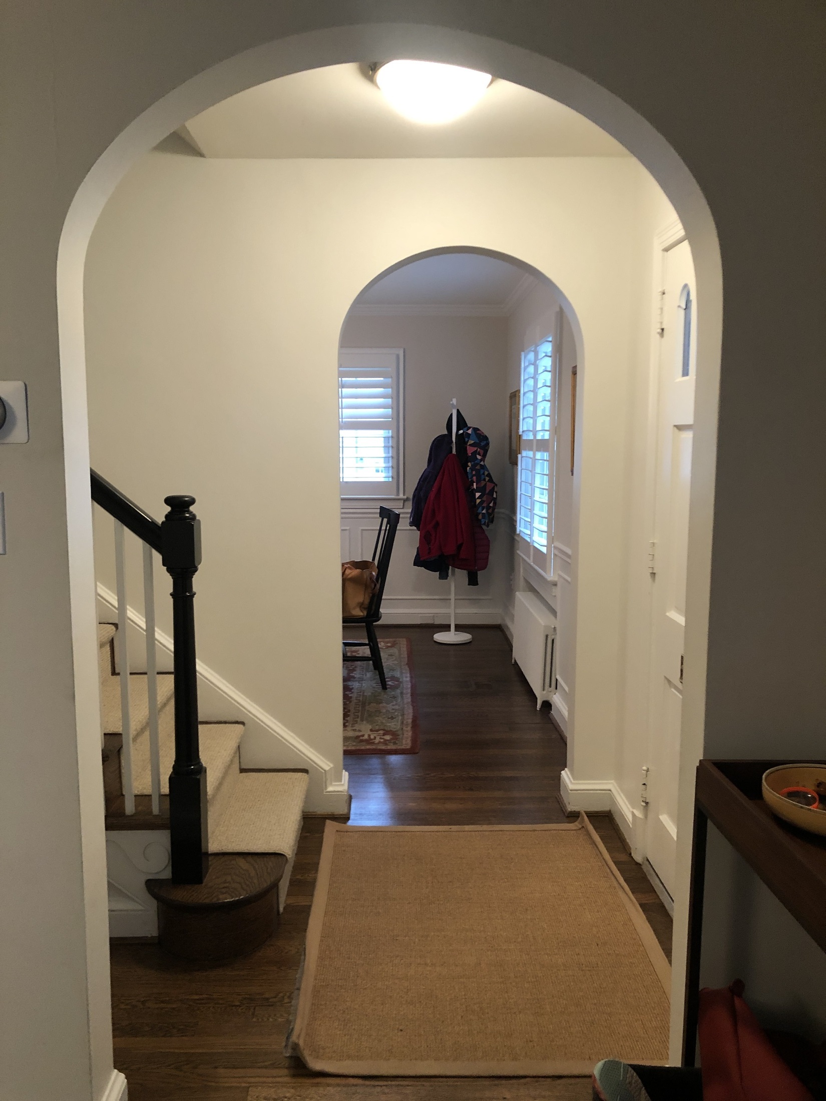
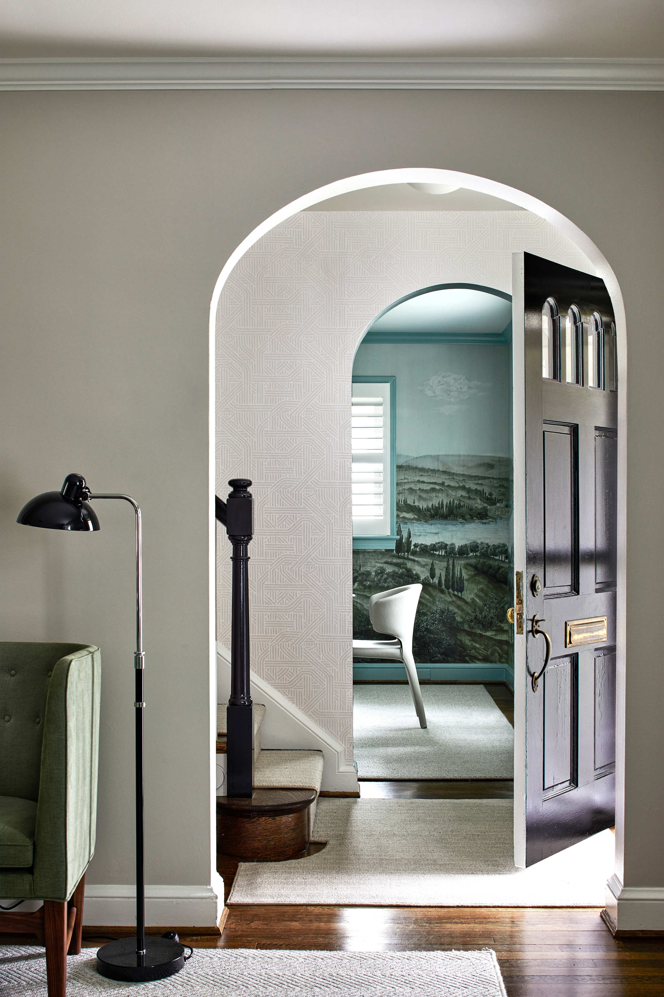
The entryway of this Maryland home was small, but important to the layout of the entire ground floor. ' ‘The center hallway meant that circulation happens constantly through all of the living spaces, so one of the main challenges was keeping the furniture plan open and flexible with appropriately scaled pieces,’ Kate Ballou of Hendrick Interiors explains.
Simple changes - introducing a wallpaper that stops the space feeling too plain, yet doesn't clutter the walls, for one - have helped to elevate this tiny entrance. A clumsily placed rug in the before, has been replaced by a bespoke one, cut to hug the curves of the bottom step of the stairs. It's a small detail that goes a long way.
Be The First To Know
The Livingetc newsletters are your inside source for what’s shaping interiors now - and what’s next. Discover trend forecasts, smart style ideas, and curated shopping inspiration that brings design to life. Subscribe today and stay ahead of the curve.

Maya Glantz is a Design Writer at Livingetc, covering all things bathrooms and kitchens. Her background in Art History informed her love of the aesthetic world, and she believes in the importance of finding beauty in the everyday. She recently graduated from City University with a Masters Degree in Magazine Journalism, during which she gained experience writing for various publications, including the Evening Standard. A lover of mid-century style, she can be found endlessly adding to her dream home Pinterest board.
-
 Sateen vs Percale Sheets — What's the Difference, and Which Are Better?
Who would have thought a simple weave pattern could make all the difference to your sleep
By Devin Toolen
-
 I Asked Interior Designers to Share the Worst Design Trends They've Seen on Social Media — And What They Want to See Instead
Just because something is trending, doesn't mean it's tasteful — from dupe-culture to OTT lighting, here's what designers hate seeing in homes
By Devin Toolen
