9 Style Lessons From European Kitchens for Sophisticated Spaces That Are Great to Cook in
For a 'warm, homely yet standout kitchen,' take inspiration from these designer spaces across Europe

Kitchens are the hub of our homes. It's where we cook up a storm, stir a conversation, or shake up a cocktail, and every kitchen needs to be carefully thought out.
Interior design trends come and go, but if you're remodeling your decisions are going to be more finite. Sometimes, all it takes is going to a friend's house for dinner, or reading us, to spark a new interior design scheme for a modern kitchen. So instead of going into overdrive when designing, even if you're just refreshing kitchen countertops, why not see what there is to learn from our not-so-geographically-close neighbors?
We caught up with some brilliant interior designers in France, Belgium, Italy, and Sweden, for their latest thoughts on kitchen design. These are how they are bringing all the good mood vibes and atmosphere to their culinary spaces.
1. Keep walls and floors light to balance accent pieces

TUILERIES, shot by Stephan Juillard for Humbert & Poyet
Be it a kitchen island that you will not forget in a hurry, or an architectural pendant, the key to getting it right in the kitchen is in the composition of colors, shapes, and materials.
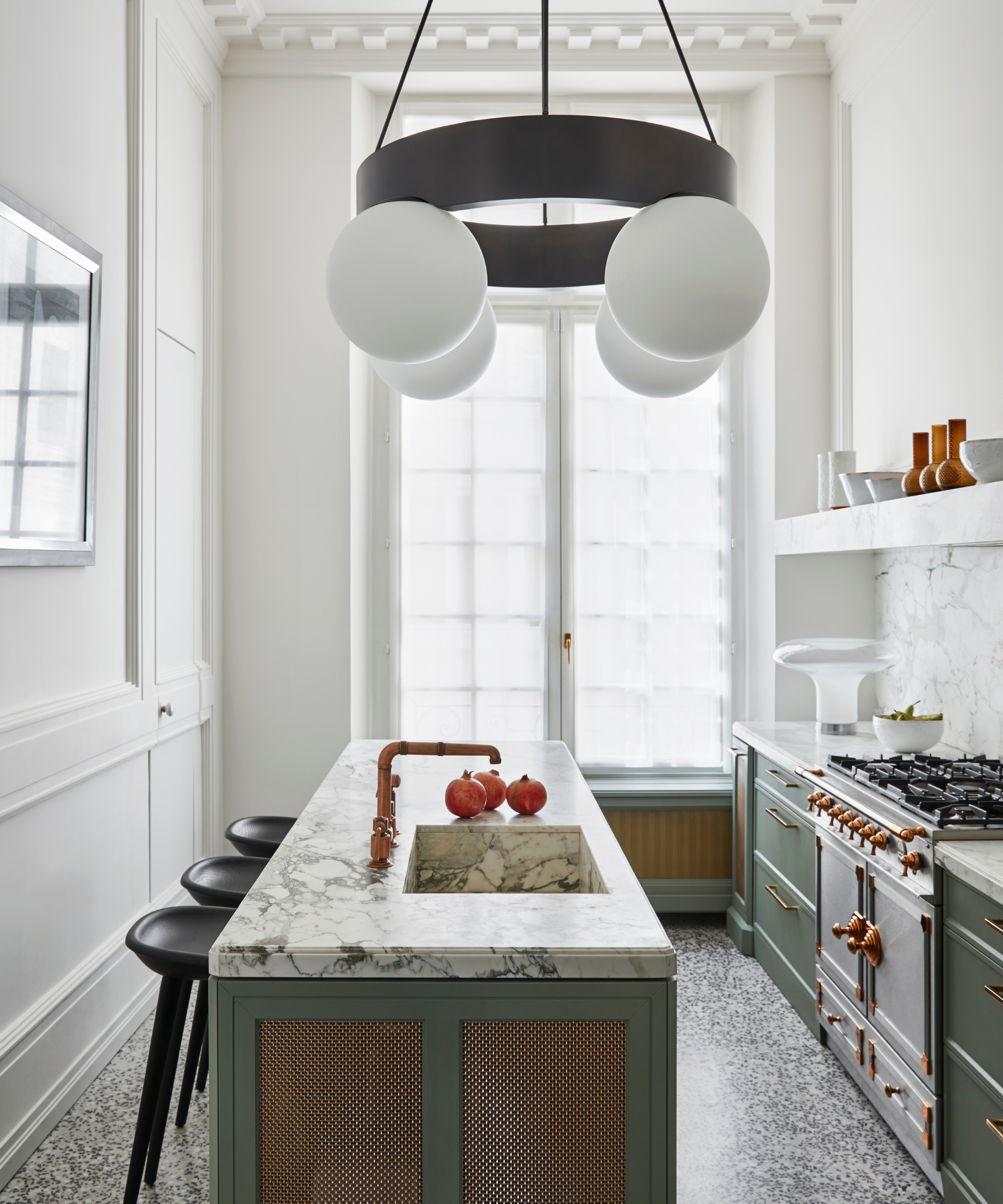
'Balancing accent pieces and deeper elements with lighter walls and flooring is a signature way to create a warm, homely yet standout kitchen,' say Christophe Poyet and Emil Humbert, the founders of Paris-based studio, Humbert & Poyet. There is so much to love about this slab kitchen island in green marble, complete with well-chosen kitchen counter stools, (these are in fact BassamFellows Tractor stools), and custom lighting by the design duo. There is no denying that it is a standout feature, but light parquet floors and off-white walls with fluted detail ground the space as a whole, bringing depth and balance.
2. A mixture of lighting is mandatory for atmosphere
Francis Amiand for Humbert & Poyet
There are no unconsidered lighting schemes in these kitchens. Instead, some redefined layered kitchen lighting, including table lights, are the way forward. 'Additionally, standing lamps and sconces provide a mix of lighting options, always allowing for flexibility to create different moods and atmospheres in a kitchen,' continue designer duo Christophe Poyet and Emil Humbert. Filled with natural light, the only way to make this space even more spectacular is, of course, with a truly remarkable pendant, and frosted table lamp.
3. Playful color schemes and accent pieces serve as focal points
©Belen Imaz & Pedro Bermejo for Victoria Maria - Valentine
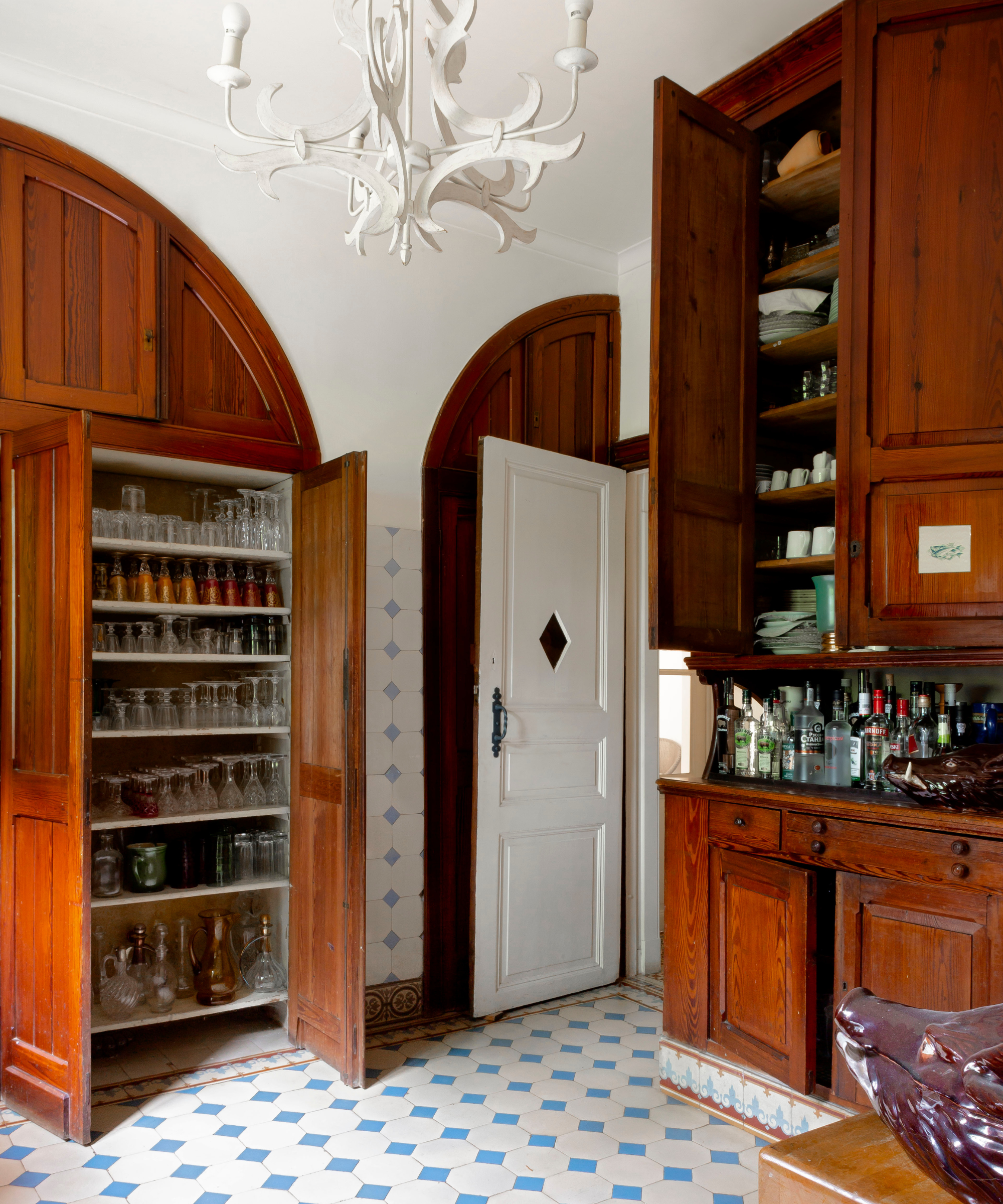
Belgium-based interior designer Victoria-Maria reimagined this kitchen space as part of the Valentine project – set in a castle might we add. This is undisputedly not an average cooking space, it is elegant and traditional-looking but also very contemporary. Subtle statement pieces pull your attention, such as that blue floor kitchen tile and whimsical pendant. 'An accent in a kitchen may often be a designer’s focus, and for me, this will either be via a color palette that brings warmth and timelessness to the space or even a focal art piece that centralizes the room, such as a pendant light,' says Victoria.
4. You can go beyond tile for more warmth and personality
©Belen Imaz & Pedro Bermejo for Victoria Maria - Valentine
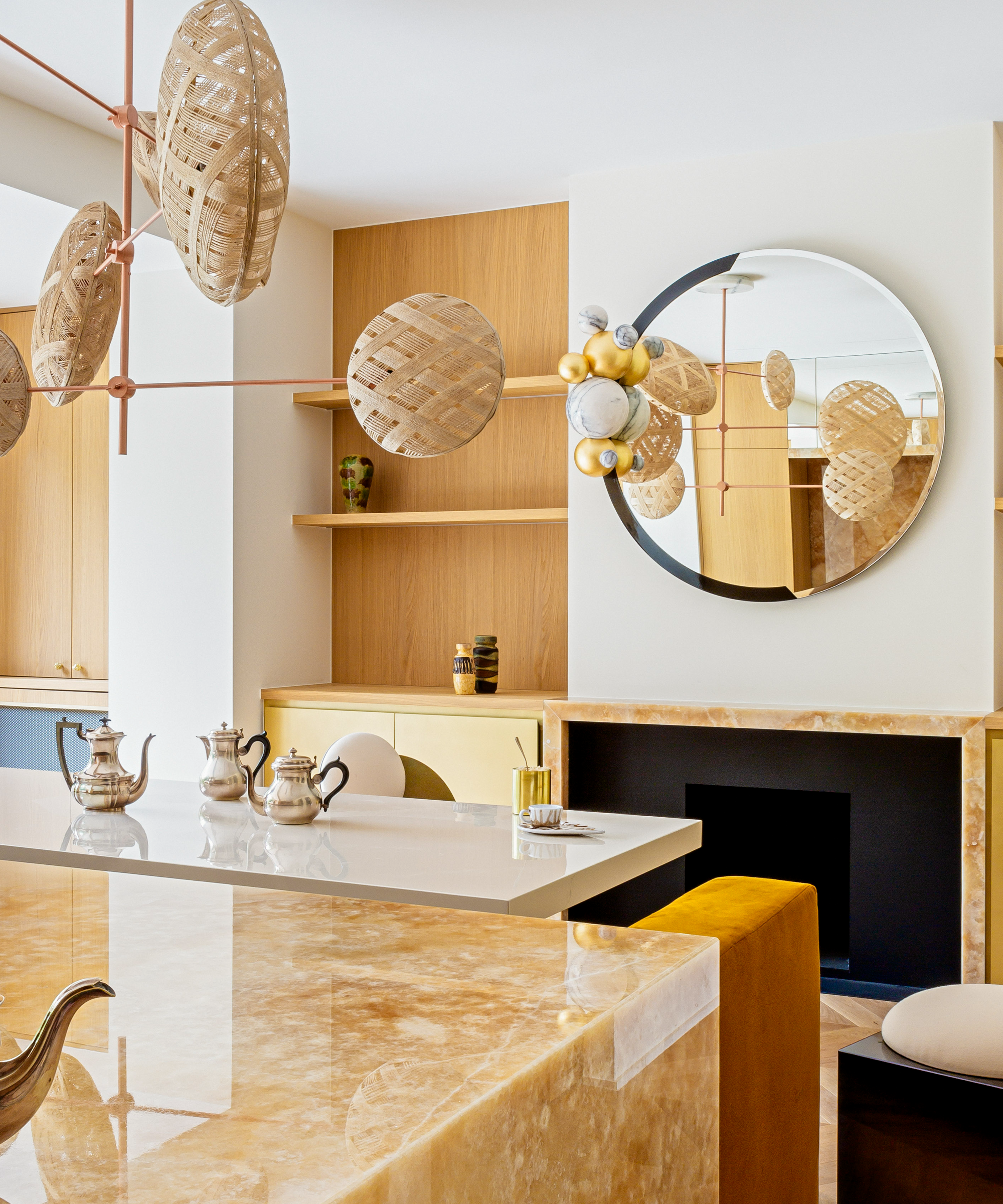
We love tile as much as the next decor magazine, but we know there are other intriguing kitchen countertop materials to give time to. Often, we'll see marble, or granite combined with tile, somewhere. Not in all European kitchens it turns out: 'I opted for marble and onyx instead of traditional tile as we felt these materials infused the space with elegance, sophistication, and luxury,' continues Victoria-Maria. 'Marble and onyx offer timeless beauty, durability, and versatility, allowing us to create visually stunning surfaces for flooring, countertops, and accents.'
Furthermore, balancing a honed finish with a texture that aligns with the warm color palette, softens the space. 'I love to combine them with wood and natural textile elements, to strike a perfect balance between natural warmth and refined elegance in the design.'
5. Not just an island will anchor a kitchen
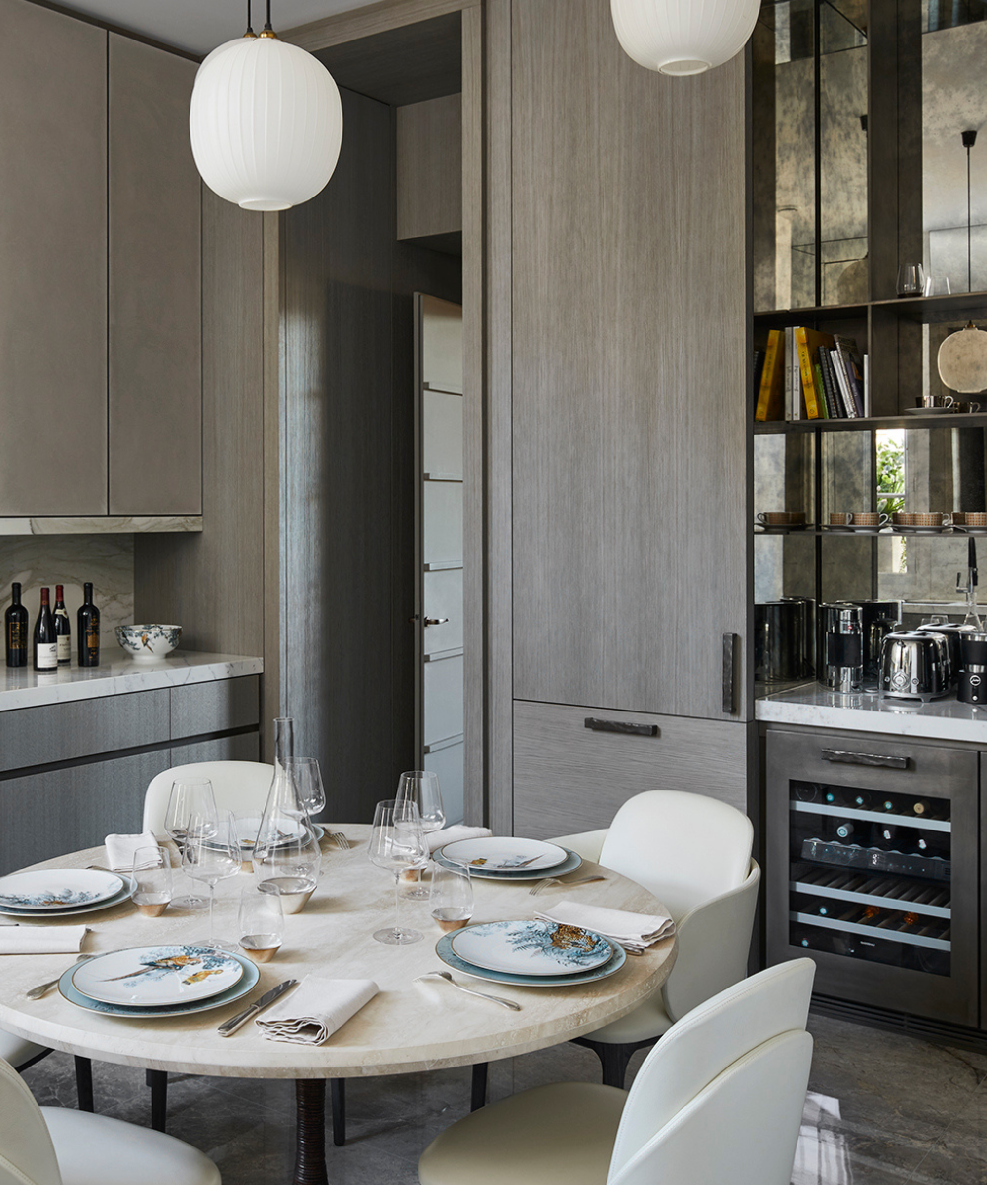
The mirrored surfaces and sculptural pendant lighting were just some of the features I found particularly eye-catching in this kitchen by Paris-based interior designer, Stéphanie Coutas. It looks modern and lived in, serving a more ornate rough luxury kitchen look that is effortlessly cool.
I also loved the traditional low-set dining table anchoring the space. Eat in kitchens are very European, after all. It's not pretending to be a kitchen island, but serves more than the obvious purpose as Stephanie shares with me: 'The round travertine marble table centralizes the room, therefore selecting a pendant light that aligns with the shape, as well as the tones, of the table was essential in complementing this design aesthetic and decision.'
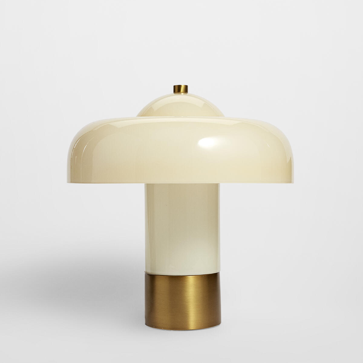
Price: $450
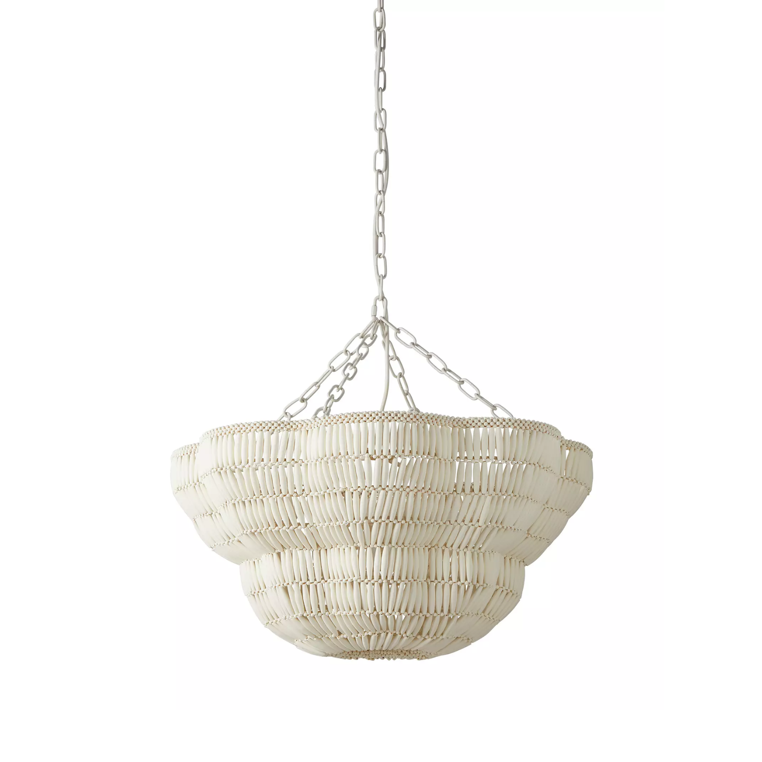
Price: $2,298
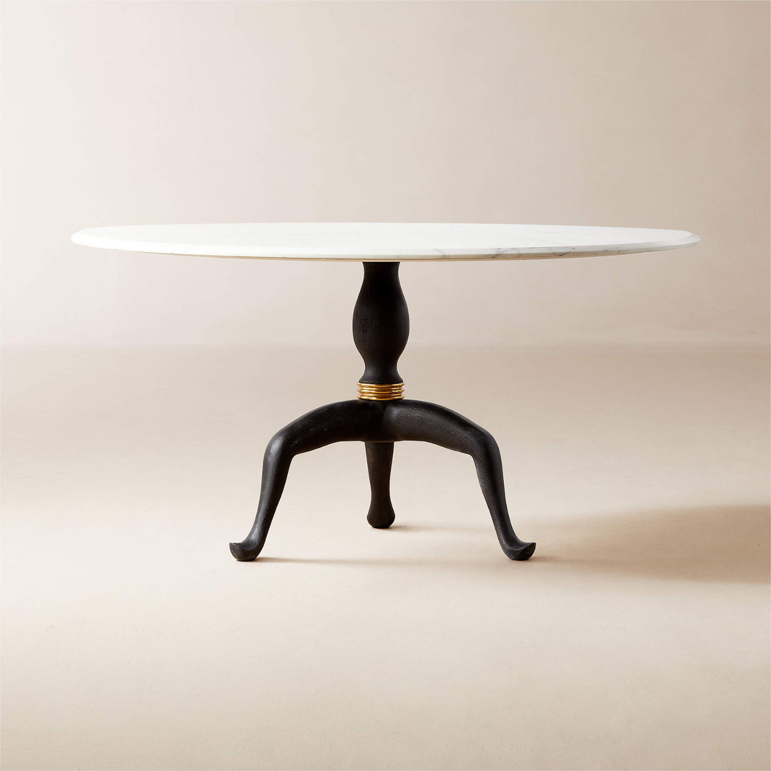
Price: $1,999
6. Artwork serves as a 'concluding flourish'
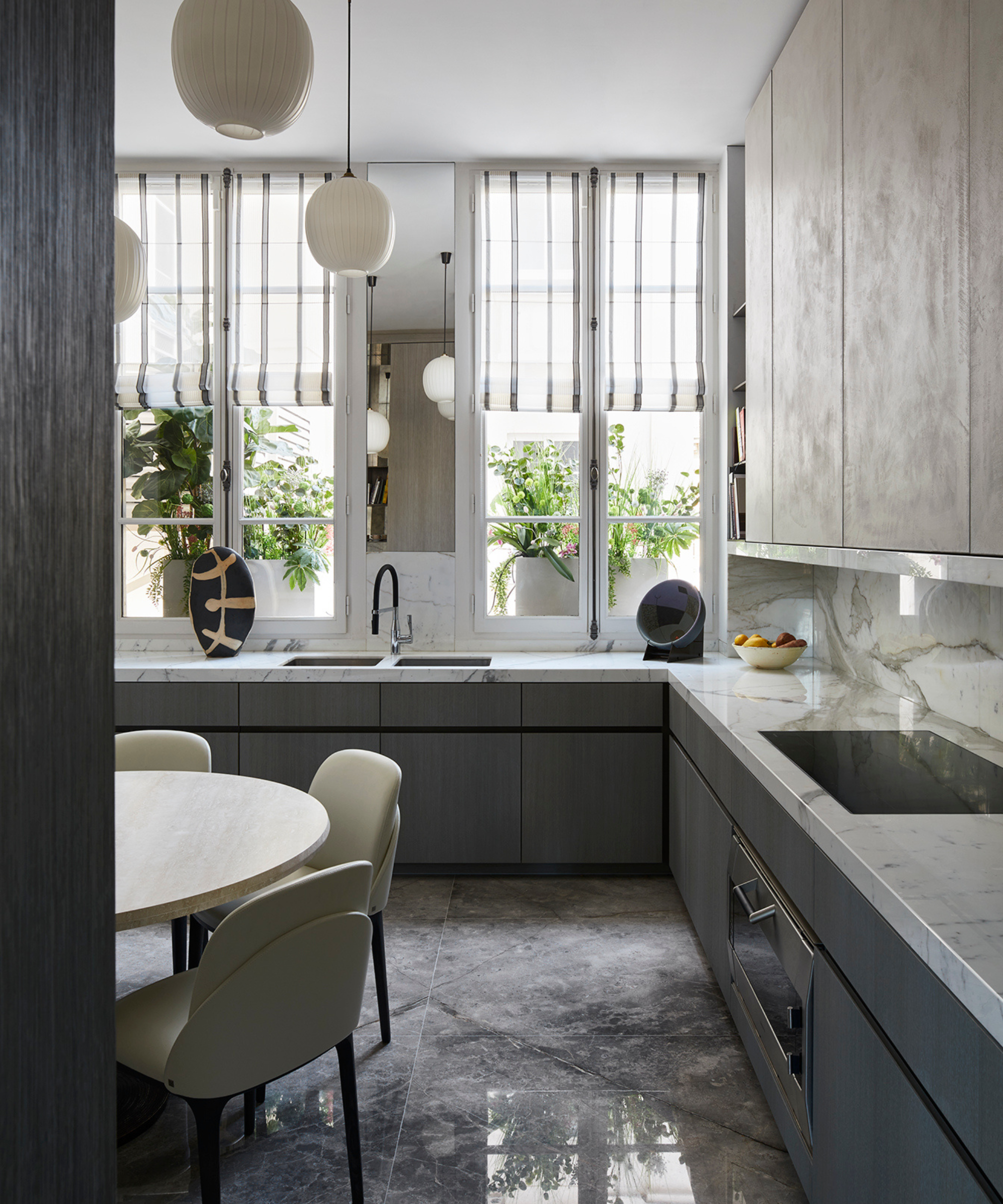
Viewed from a different angle, when asked whether European kitchens always feature artwork, Stephanie shared that it is definitely on the rise in modern kitchen design: 'We always strive to identify the standout focal point in any given space, and kitchens are among the rooms where we aim to achieve this.'
Your kitchen wall decor might not be your typical "oeuvre d'art", like a framed print, but it could be something more unexpected and unique like a sculpture: 'Artwork has undoubtedly emerged as a favored method to create a refined, concluding flourish to a kitchen, and the concept of "artwork" can be interpreted uniquely by each individual.'
7. Countertop materials and cabinetry colors can comfortably contrast
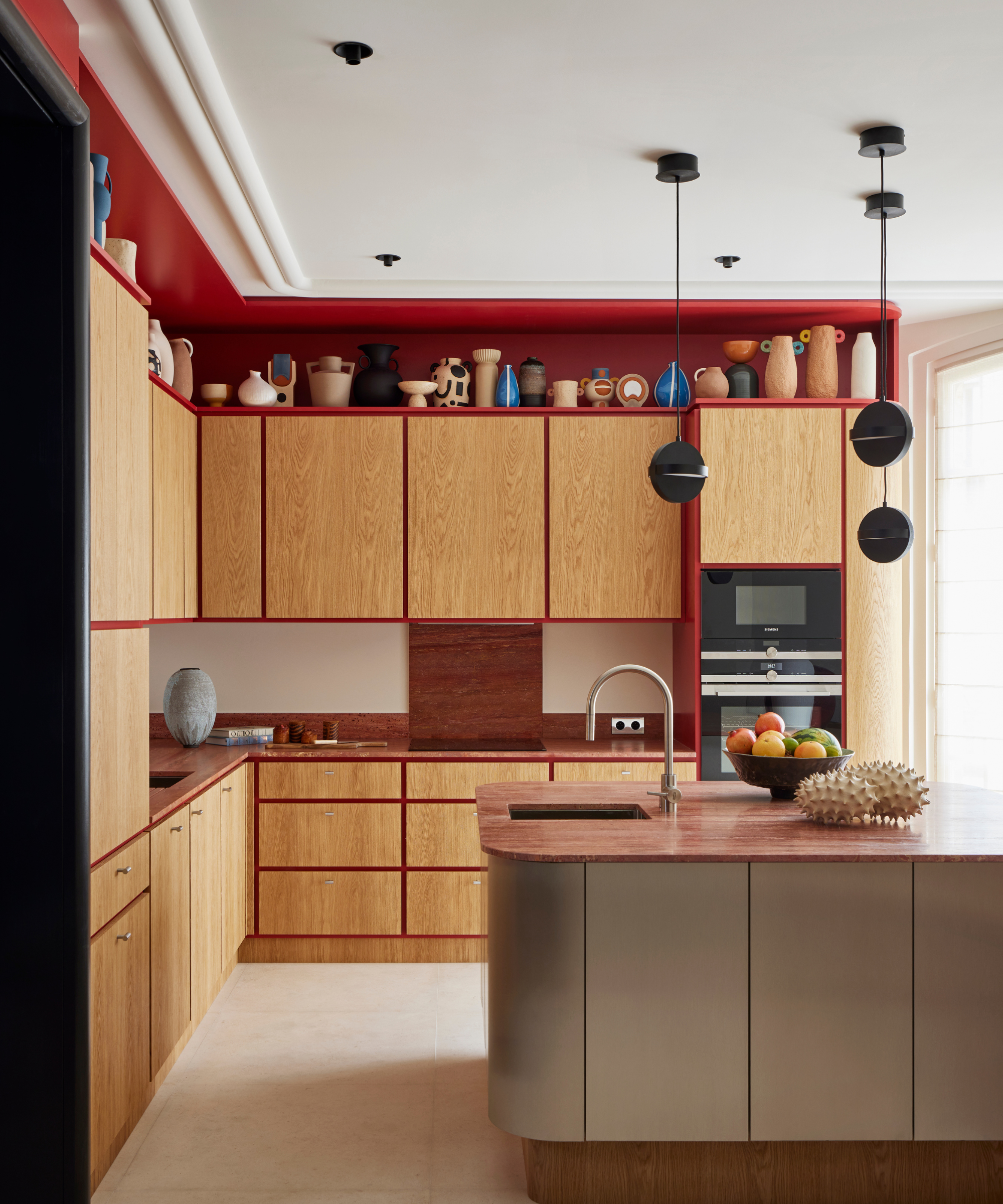
Francis Amiand for Paris-based Fabrice Juan - Magellan design
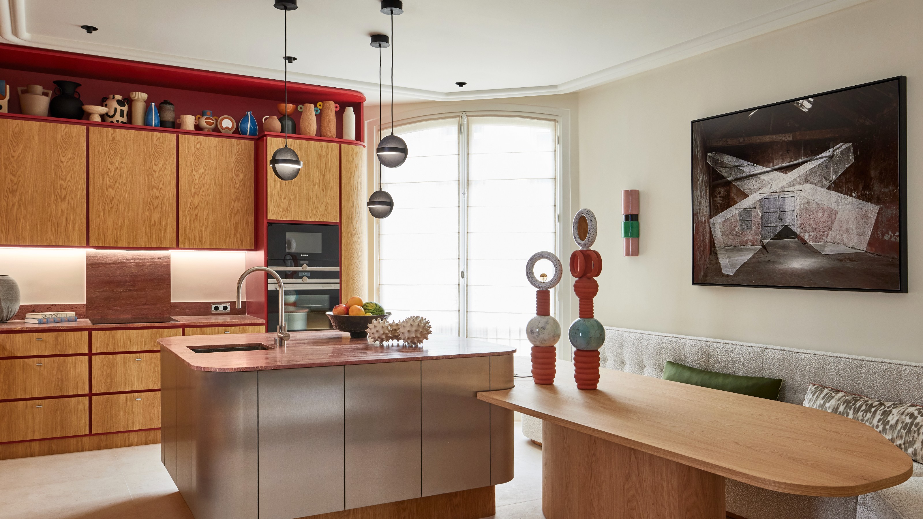
This is the kind of kitchen that neighbors would never leave. Warm, and stylish with clever detail, it has endless appeal – not just to the culinary-minded. Designed by Paris-based Fabrice Juan, the custom design combination of oak and red lacquer, with a brushed stainless steel kitchen island that takes centerstage with a red travertine top. There is texture upon texture here, for layered intrigue, and to serve as a talking point too. I asked Fabrice what a go-to cabinet and worktop material was in kitchens at the moment: 'The work of contrasts has always fascinated me, both in the combination of materials and in associations of colors and shapes,' says Fabrice.
'Combining the warmth of wooden cabinets with the timeless elegance of marble worktops creates a stunning contrast in any kitchen,' and proves to be a timeless kitchen cabinet and countertop combination. 'The grain of the wood complements the luxurious veining of the marble, bringing a sense of natural beauty and sophistication to the space. Together, these elements elevate the kitchen, imbuing it with both functionality and aesthetic appeal.'
8. Work across both axes for design synergy and architectural impact
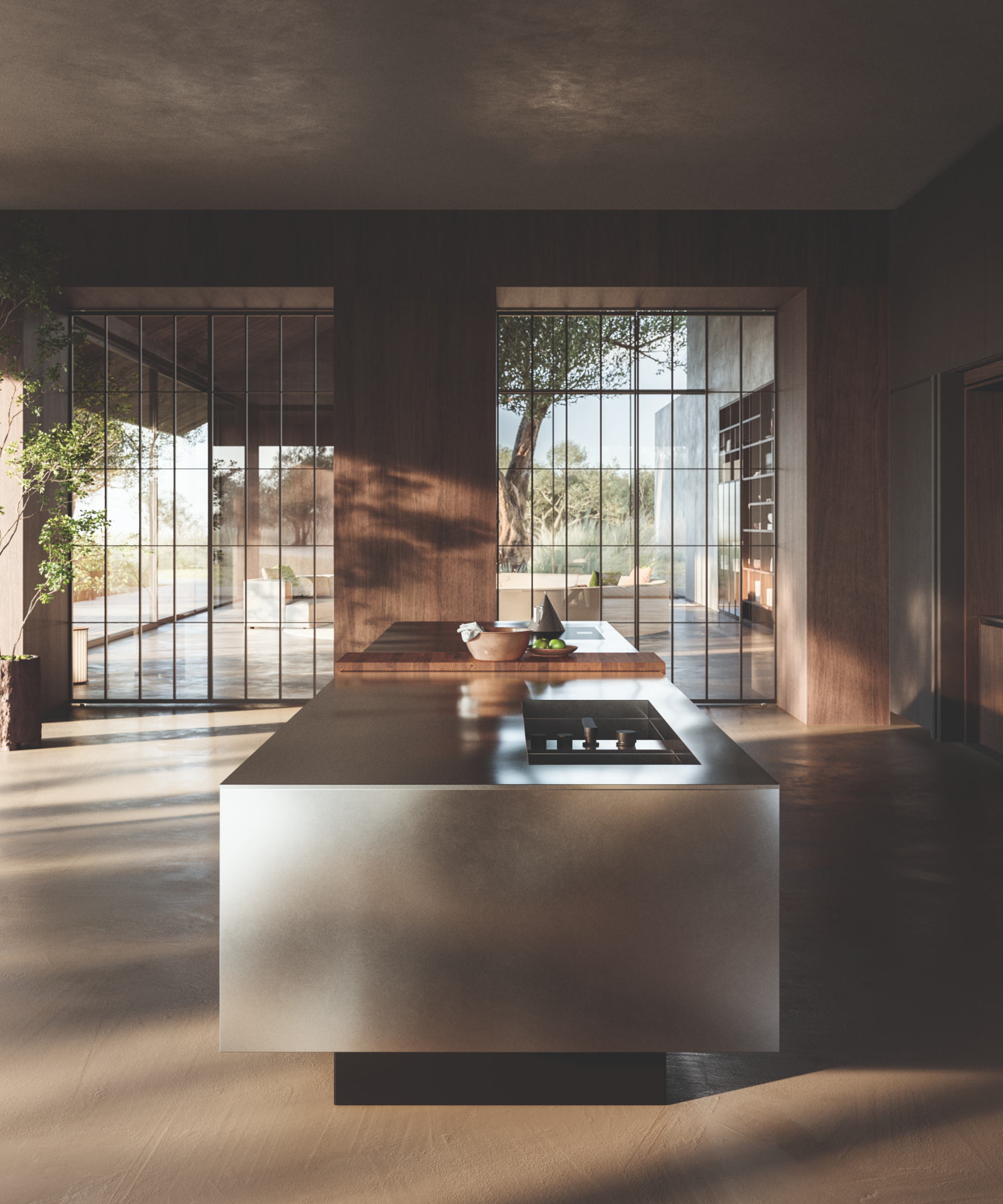
A design by Italian architect Piero Lissoni – the Novanta kitchen system – to celebrate 90 years of Boffi, a made-in-Italy furniture brand.
Next, we head to Italy, with a design by renowned Italian architect Piero Lissoni – the Novanta kitchen system – which was to celebrate 90 years of Boffi, a made-in-Italy furniture brand. It is a sleek space, brimming with tactile materials and clean-cut design to impress: 'Novanta is a very architectural kitchen designed with a different scale, almost as if it were a suspended building,' says Piero of this space. 'It is made up of horizontal elements, the islands on which one works, and perpendicular containment elements, just like a city that develops both horizontally and vertically. In this way, we’ve left the world of the design product to enter into the world of the architectural product.'
9. Upper kitchen cabinetry is not always essential
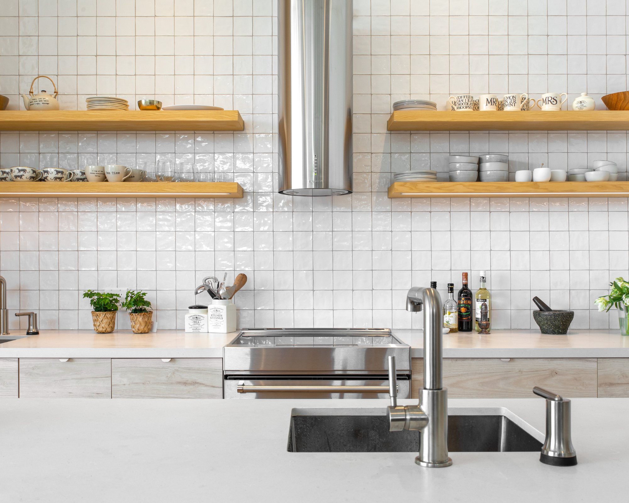
We are hesitant to remove the upper kitchen cabinets, but Swedish interior designer Christina Richardson says we're missing a trick. You might be trying to maximize kitchen storage already, but looking beyond cabinets in favor of open shelving can do more for a kitchen than you might think. 'Open storage lets the light flow uninterrupted and is also functional,' says Christina.
When approaching the interior design for any space in your home, considering the environment and location is more important than you might think. In Scandinavian kitchen design, for example, it is key to factor in the fact that there are long dark winters. 'Since the Nordic countries lack natural light during parts of the year, I always am very conscious of optimizing every bit of natural light that comes through the windows,
'I really don’t want to obstruct the light and therefore, I use upper cabinetry very sparsely.'
What are the fundamentals of Nordic kitchen design?
Scandinavian design is all about combining utility with an inviting and gently lived-in finish. 'Keep in mind, functionality and minimalism are two opposites in my opinion and Scandinavian design is all about function, we don’t put just decorative, unuseful, things on our shelves, we put items we use every day on them, that’s the difference between functionality and minimalism,' continues Christina.
'When it comes to color, or maybe the lack thereof, I always want the kitchen to feel warm and light,' think a neutral backsplash and gaining color through texture. 'I love working with light wood cabinetry and horizontal lines,
'The lines are important. You want a clean look with as few lines running through your design as possible. Using hidden drawers is a great way to reduce the number of lines in your kitchen.' This will keep the design simple but lofty, inviting, and sublimely functional.
Be The First To Know
The Livingetc newsletters are your inside source for what’s shaping interiors now - and what’s next. Discover trend forecasts, smart style ideas, and curated shopping inspiration that brings design to life. Subscribe today and stay ahead of the curve.

Camille is a freelance interiors writer and the former deputy editor of Real Homes where she covered a broad range of topics, including DIY, small space design, and gardens. She studied English language and Italian at the University of Manchester and it was during her year abroad studying in Bologna that she started documenting her adventures and observations in a blog. Camille has a passion for art and beautiful spaces. When not writing or refreshing her home, you will find her gallery hopping, taking photos, painting, and traveling to seek out interiors inspiration.
-
 Biophilic Decluttering — What to Take Out of Your Home (and What to Put in) for a More Natural Home
Try your hand at biophilic decluttering to ground your interiors, connect to the environment, and cure chronic clutter in one go. Here's how.
By Amiya Baratan
-
 10 Arrestingly Beautiful Milan Restaurants Locals *Actually* Dine at — Selected for Their Interiors
Brought to you by our community of culture insiders, this edit of the best restaurants in Milan sees authentic Italian food and immersive design unite
By Gilda Bruno