5 Ways You're Decorating for Fall That Are "Overdone" — And What to Switch Them Up for
Decorating for the season doesn't have to mean design clichés — interior designers say to avoid these ideas

The Livingetc newsletters are your inside source for what’s shaping interiors now - and what’s next. Discover trend forecasts, smart style ideas, and curated shopping inspiration that brings design to life. Subscribe today and stay ahead of the curve.
You are now subscribed
Your newsletter sign-up was successful
There are some themes that are inescapable in the fall season — pumpkin spice candles are just the tip of the iceberg. However, there are ways to decorate for fall that don't feel so... expected.
Giving your home a seasonal update to cozy up your space doesn't need to rely on the literal. We consulted interior designers for their insight into which of these autumnal decorating trends are overdone or just clichéd.
So, here are some of the fall decor ideas that experts recommend skipping, and the ones that they feel better capture the cozy season aesthetic.
Article continues below1. Oversatuared Warm Tones
Do instead: Subtler tones of classic fall colors
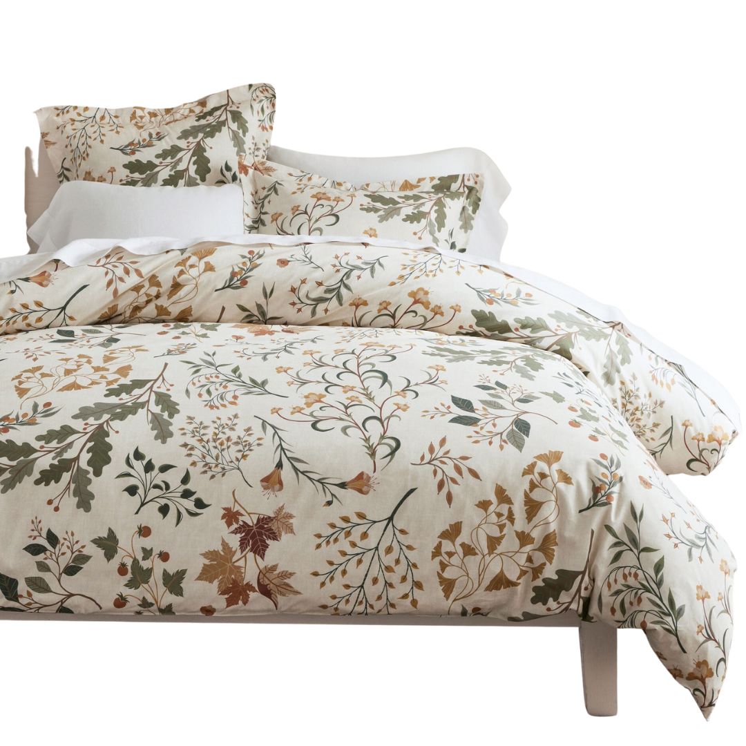
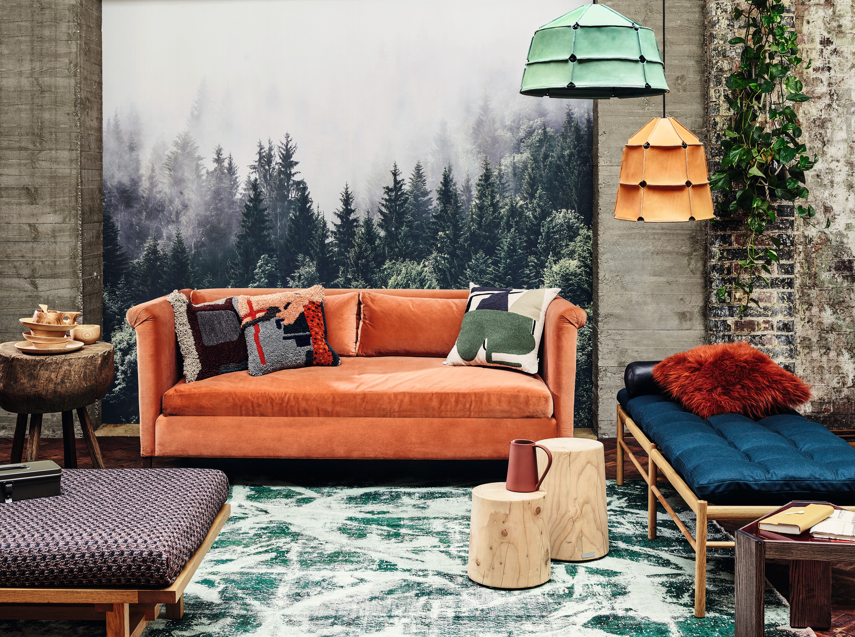
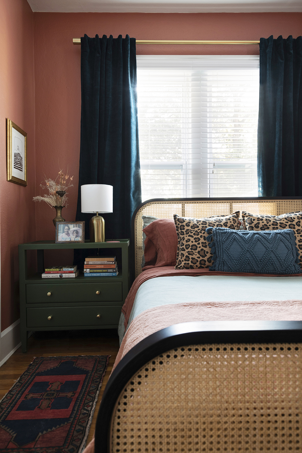
When it comes to fall palettes, the ones that come immediately to mind are bold and saturated yellows, greens, and oranges. While these tones are still relevant, interior designer Nishtha Vashist believes it's time to choose the more unexpected fall colors. She says: "While traditional fall colors like deep burgundy, burnt orange, and mustard yellow have had their moment, they can feel a bit overdone and predictable in today’s design landscape. Instead, consider refreshing your fall palette with more modern hues. Swap out bright orange for a richer, more sophisticated terracotta. This earthy tone still brings warmth but with a contemporary edge, making it perfect for adding depth without overwhelming the space."
"Mustard yellow can sometimes feel too bold or harsh," she adds. "Instead, opt for ochre or dusty gold. These tones offer a softer, more elegant glow that still captures the essence of fall but in a subtler, more refined way. And finally, olive green has long been a fall staple, but it can feel a bit flat. Update your green palette with sage or moss green. These shades are softer and more versatile, offering a natural, calming vibe." Your other fall shades are colors that go with sage green effortlessly, too.
2. Literal Fall Motifs
Do instead: Less expected patterns
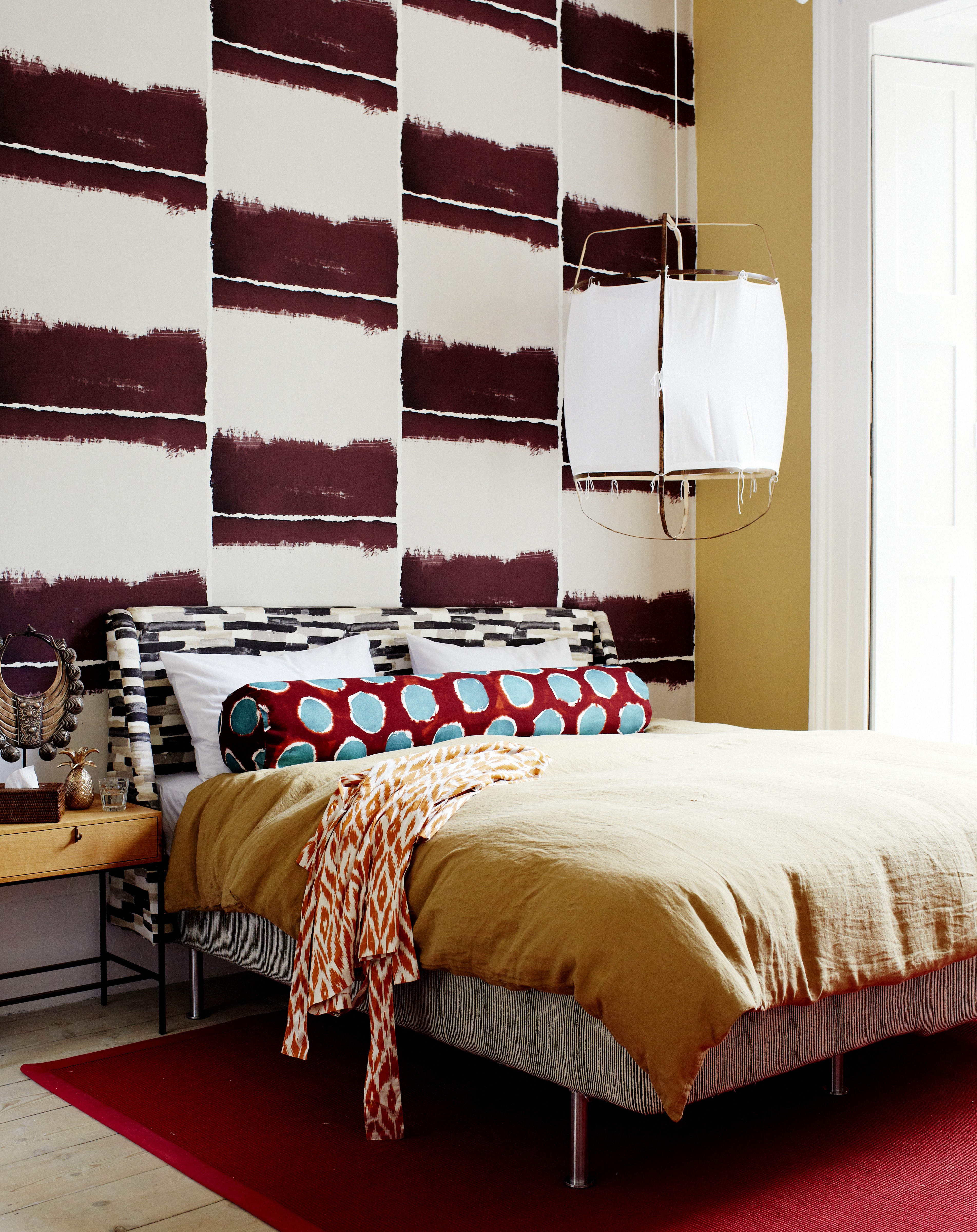
Fall colors aside, certain seasonal prints and patterns are timeless, but whether designing a fall bedroom or living room, avoiding some more obvious and outdated motifs is a good idea.
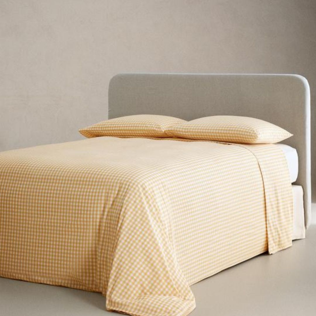
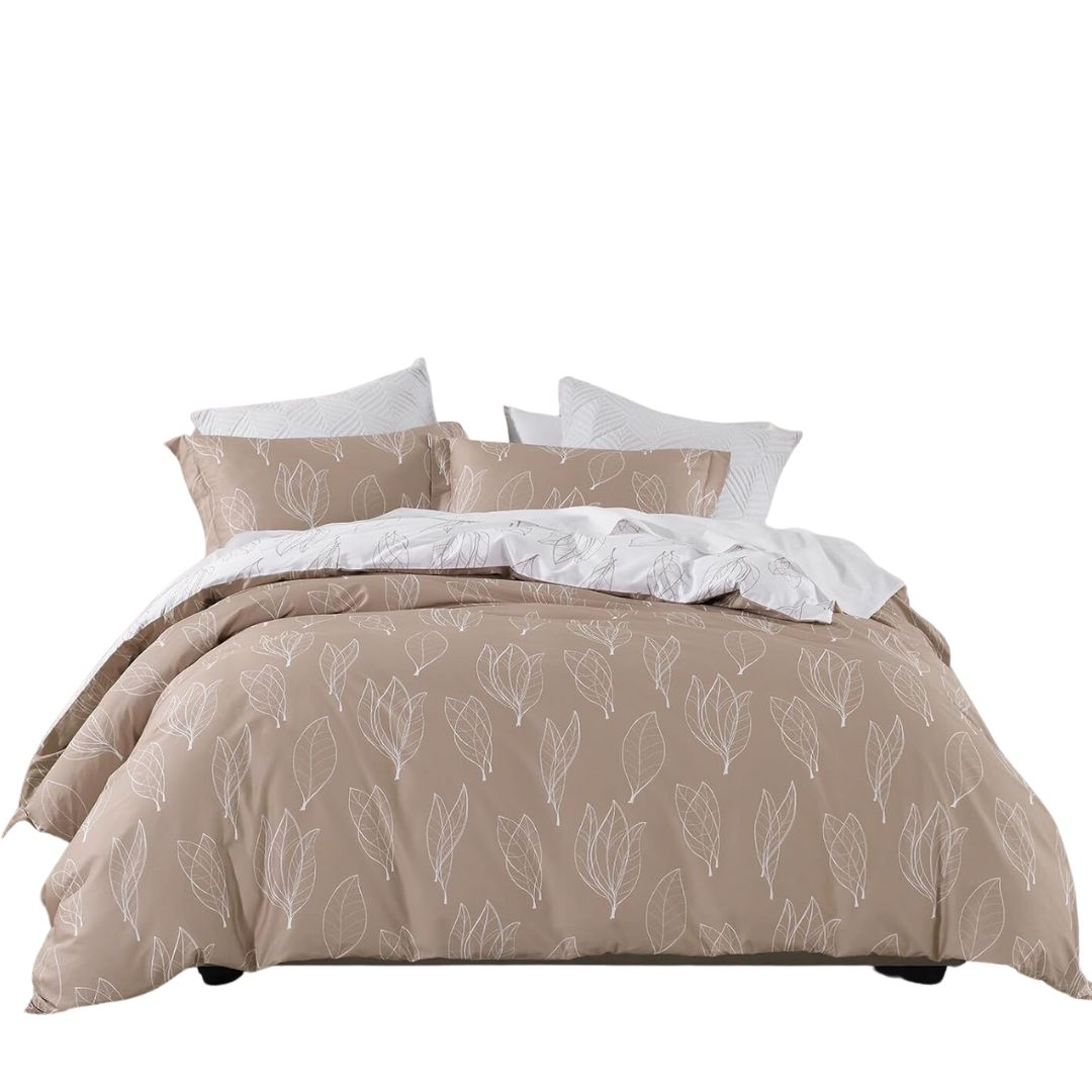
"Outdated fall prints often include overly literal motifs, and while these can evoke a traditional sense of autumn, they tend to feel more seasonal and less timeless," advises Sarah Brady, founder and principal designer at Salt Design Company. "Instead, I recommend opting for textured fabrics such as linen or velvets, and prints that incorporate the colors of fall in a more abstract or sophisticated manner. Consider deep, rich hues like burgundy, greens, and browns in patterns such as botanical prints or subtle plaids. William Morris' intricate, nature-inspired patterns are a perfect example of how fall colors can be integrated into timeless, elegant designs."
The Livingetc newsletters are your inside source for what’s shaping interiors now - and what’s next. Discover trend forecasts, smart style ideas, and curated shopping inspiration that brings design to life. Subscribe today and stay ahead of the curve.
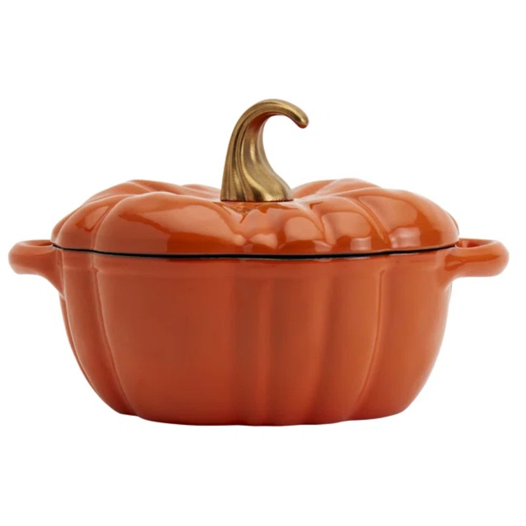
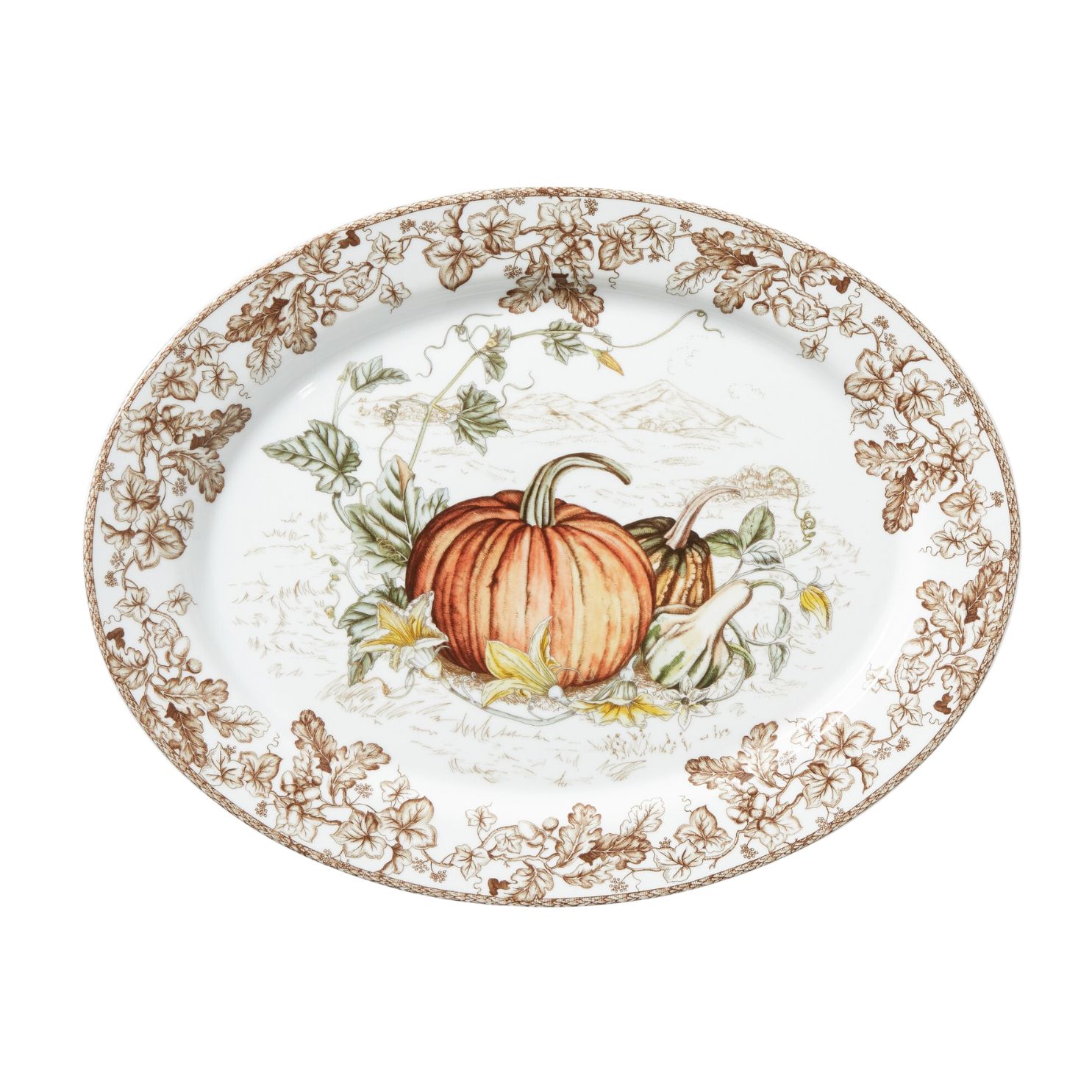
3. Too many pumpkins

Do instead: Smaller accessories with fall motifs give a subtler nod to the season.
This is also the season of the scares — Halloween is perhaps the biggest marker of fall. And while it's still fun to go all in for Hallween decor, gets tacky when they linger on for a whole season.
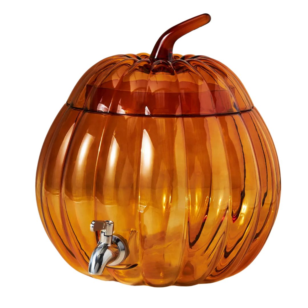
"I always encourage everyone to do what brings them joy," says Jenna LeBlanc of Jenna Sue Design, "but personally, I avoid having too many things that scream fall like scarecrows, pumpkins, and word art on doors. Less is more, and I prefer to keep it simple and understated by swapping out just a few key pieces."
Think small, pumpkin-shaped decor pieces or cutlery, like the one pictured above by Anthropologie; add a wreath on the door, or curate a fall-inspired mantel decor with vases and tall candles.
4. Cliched Flower Bunches
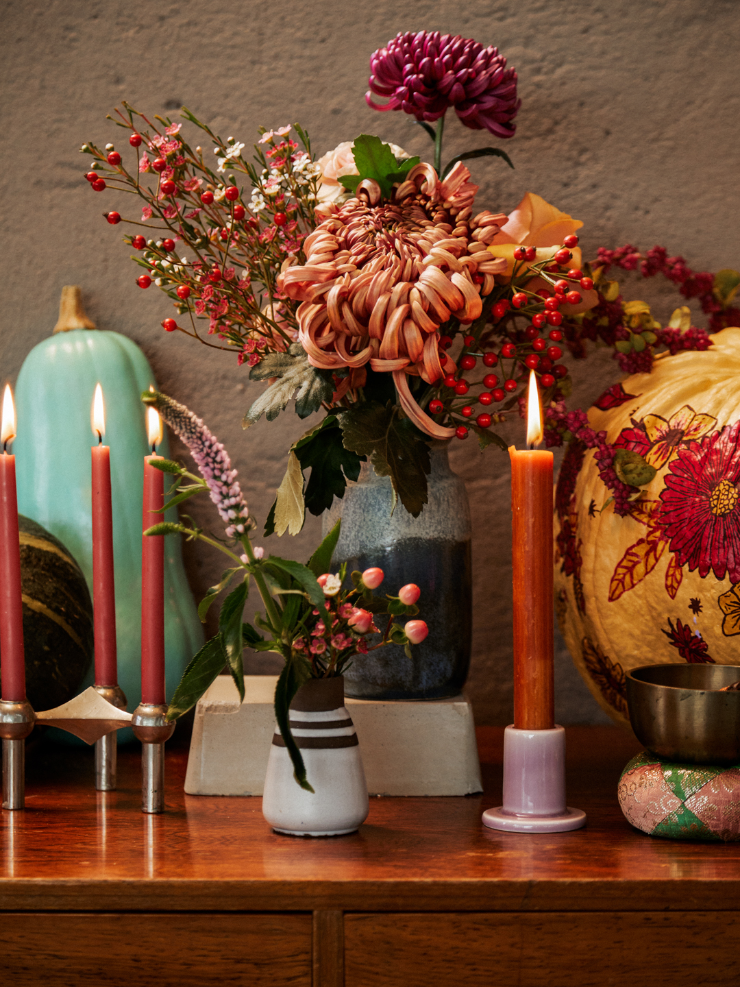
Do instead: Mixed bouquets in softer shades
It's a good idea to jump on the flower trends for fall but there are a few flowers and arrangements that seem too traditional.
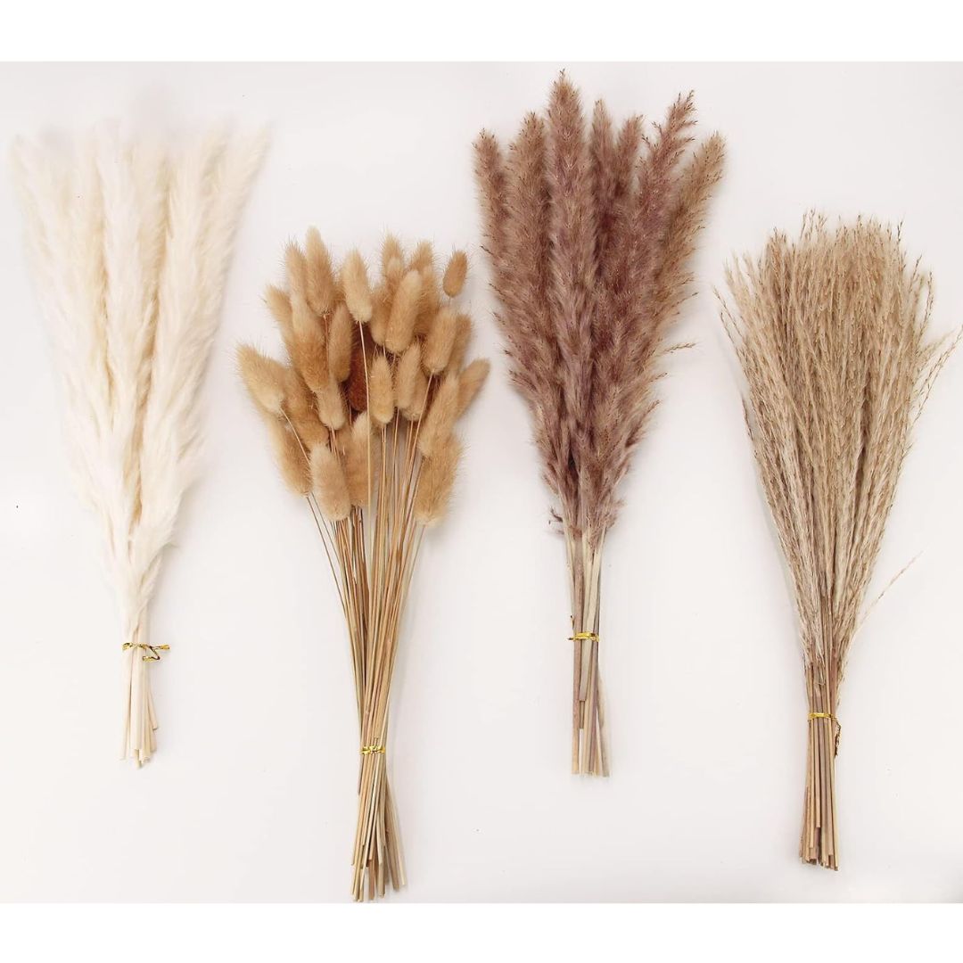
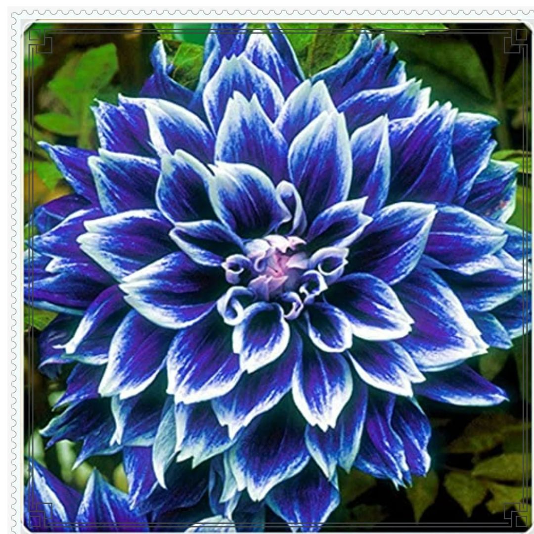
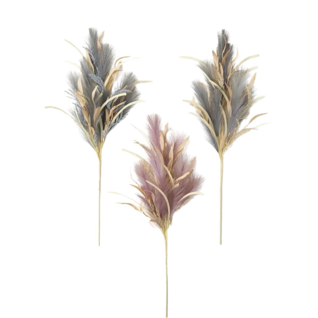
"Traditional fall arrangements often feature sunflowers, orange mums, and oversized pumpkins," shares Sarah. "While these elements are classic, they can feel a bit too predictable. To update fall floral arrangements, consider using a mix of dried and fresh flowers. Incorporate grasses, branches with autumnal leaves, and unexpected blooms like dahlias or proteas in rich, moody colors. The contrast of textures and the use of less traditional autumn florals create a more modern and curated look. You can also add elements like pheasant feathers or dried pods for an extra layer of interest and texture."
5. Bowls of Potpourri
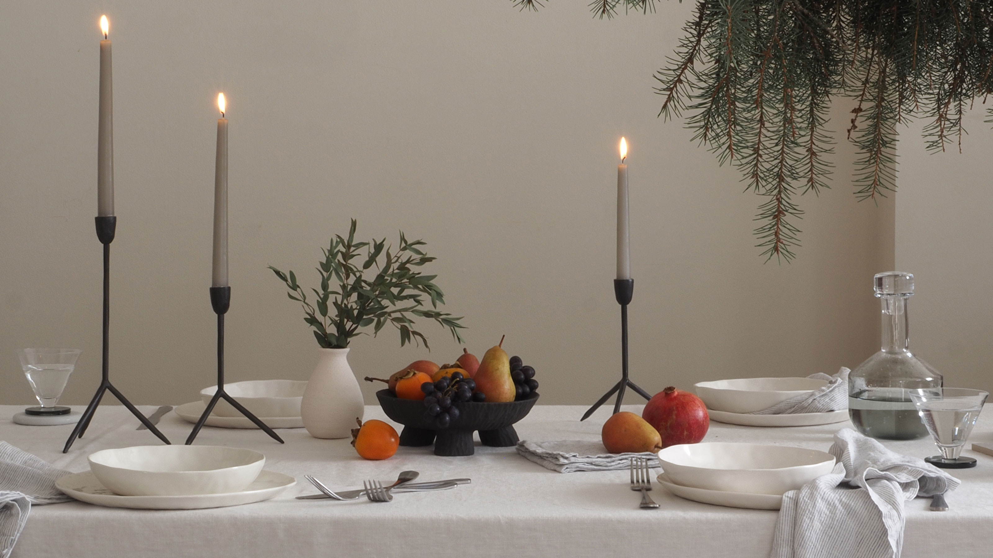
There was a time when a potpourri bowl was a living room staple - a centerpiece of the fall living room decor - but its days are long over. There are, after all, more stylish things you can display in a bowl.
"A bowl, preferably wood or some other organic material, on the counter with seasonal fruit (like gourds, squash, etc), paired with dried autumn flowers looks great," suggests Andrew Suvalsky, founder of Andrew Suvalsky Designs.
What are some fall decor trends to avoid this year?
Don't go over-the-top adding fall-inspired elements. Over-designing (adding too many pillows and throws, and large floral decorations) for the seasons isn't practical or timeless and can cost a lot too. Simple swap out easily changeable items. Also, solid and large pumpkins that are bright orange placed by the porch are out. The trend is for slicker, minimalist decor with a small, dainty vase with mini pinecones or a front door wreath. And finally, overly saturated home palettes are out. So instead of bright orange or yellow, go for more earthy tones of maroon, burgundy, and sage green.

Aditi Sharma Maheshwari started her career at The Address (The Times of India), a tabloid on interiors and art. She wrote profiles of Indian artists, designers, and architects, and covered inspiring houses and commercial properties. After four years, she moved to ELLE DECOR as a senior features writer, where she contributed to the magazine and website, and also worked alongside the events team on India Design ID — the brand’s 10-day, annual design show. She wrote across topics: from designer interviews, and house tours, to new product launches, shopping pages, and reviews. After three years, she was hired as the senior editor at Houzz. The website content focused on practical advice on decorating the home and making design feel more approachable. She created fresh series on budget buys, design hacks, and DIYs, all backed with expert advice. Equipped with sizable knowledge of the industry and with a good network, she moved to Architectural Digest (Conde Nast) as the digital editor. The publication's focus was on high-end design, and her content highlighted A-listers, starchitects, and high-concept products, all customized for an audience that loves and invests in luxury. After a two-year stint, she moved to the UK and was hired at Livingetc as a design editor. She now freelances for a variety of interiors publications.


