

While many are turning to deep and dramatic colors this year, there's no need to stress if that isn't quite your style. Yes, for the more minimalist amongst us, take note, there's a much more neutral shade that's been slowly rising in the ranks lately. Meet Farrow & Ball's Scallop.
While Farrow & Ball's new paint collection for 2025 was full of hits, none were so quickly favorite-d as Scallop — in fact, the Livingetc team spotted this paint color trending all over the internet, with searches spiking since the launch.
While it has the soft blush of freshly bloomed petals and the subtle pink of the fluffiest clouds, Farrow & Ball's Scallop still somehow feels refined, and not at all saccharine. And although the beige-adjacent shade may look similar to other neutral paint colors you already know and love, its nuanced undertones give it a stylish edge.
Just like the name suggests, Farrow & Ball's Scallop takes its inspiration from the natural world. It's versatility stems from the pearlescent place in which it lives — somewhere between a true beige, a soft gray, and a bright coral, making it easy to pair and a neutral color palette pleaser. Is it going to be one of the most popular Farrow & Ball neutral paint colors? I think we might be looking at a new classic.
So, wondering how to bring Farrow & Ball's Scallop into your home? Scroll on.

Price: From £5.50 per sample
There's the perfect amount of soft blush pink hidden in the undertones of this beige. Paired with deep hues, it provides a crisp contrast, and when next to similar light paints, feels full of warmth.

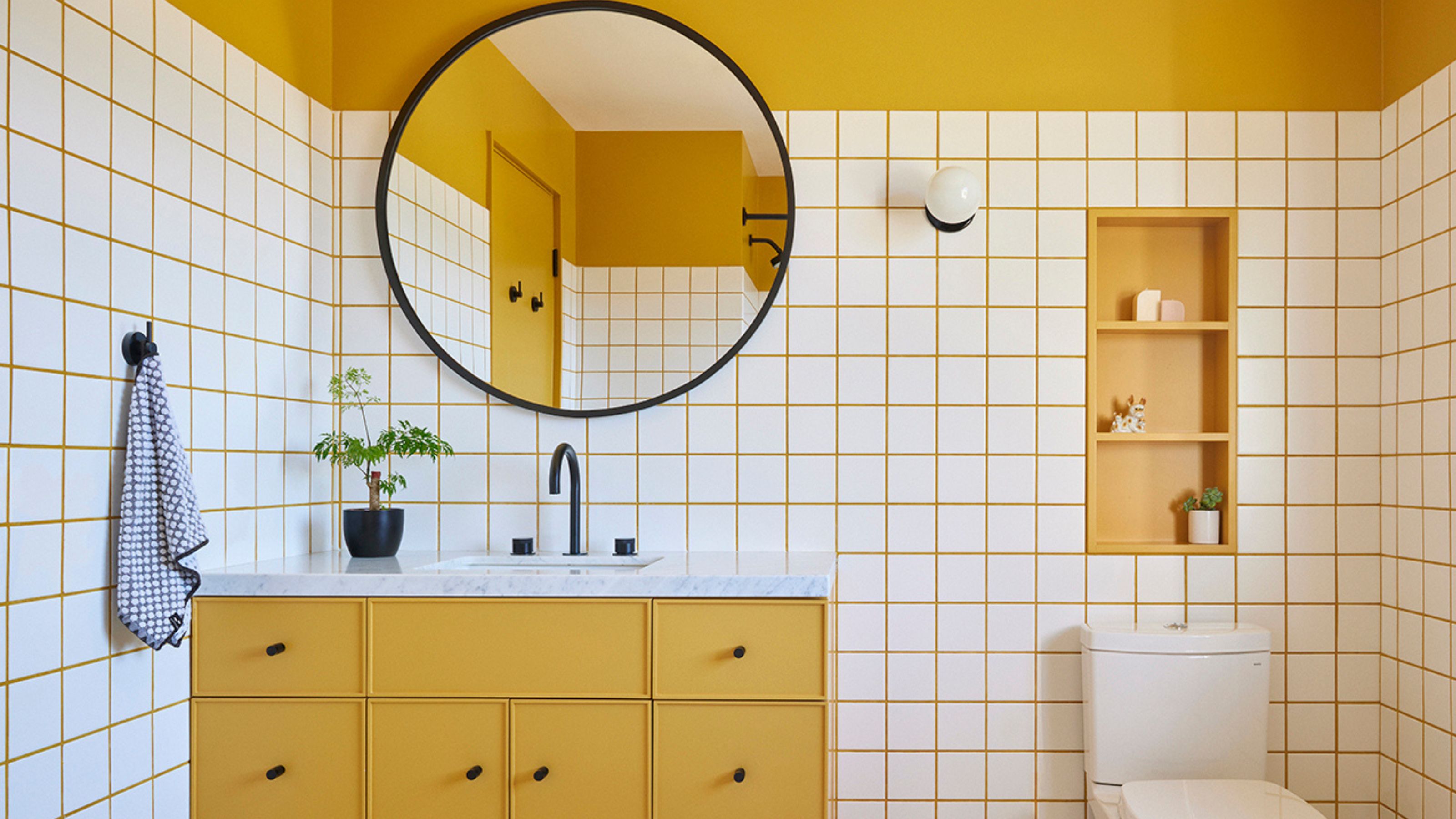
Farrow & Ball's Scallop has pink undertones that mingle beautifully with this warm yellow wall.
So what makes Scallop the latest contender for the most popular Farrow & Ball paint color? Patrick O'Donnell, brand ambassador and color expert, says, "Scallop has universal appeal and can be used widely across the home from bedrooms to bathrooms, hallways to sitting rooms."
It works for trims, ceilings, and walls. "The slightly ‘dirty’ quality to it (think of it as a less clean version of Pink Ground) stops it from ever feeling too pretty or neat," he adds.
It also has a gentle warmth especially when hit with plenty of light, but neutralizes to a nuanced off-white in full daylight. This means it will breathe light into both north-facing rooms, as well as rooms that thrive with sunlight.
Come evening when the lamps are on, Patrick says, "Scallop has a wonderfully ethereal quality. The pink notes are very discreet which means it will respond as a great foil to most decorating tastes and styles."

Patrick O'Donnell is a paint color expert and brand ambassador for Farrow & Ball. He can speak about colors in a way no one else can, and knows the brand's extensive collection, inside and out. While he offers consultations for paint pairing in your own projects, consider this your own cheat sheet to Scallop.
As for coming up with color combinations, Patrick says, "Scallop will pair effortlessly with muddy browns such as Broccoli Brown through to drab khakis like Dibber, or to bolder poached quince colors like our new Marmelo. It will play to almost anything."
To get even more technical, you can break it down further by thinking about the aesthetic of the room. If you want a light, airy look, pair Scallop with soft whites like Pointing or School House White.
For a bolder contrast, deep greens or muted blues work really well. Earthy tones like terracotta or warm browns will also complement it nicely. See what I mean by it being the perfect neutral?

The light shining from the skylight highlights Scallop's ability to act as a bright contrast in this color-blocked kitchen.
So it's clear that Farrow & Ball's Scallop is a win for the minimalists and neutral-lovers. It works with everything, feels timeless and pared-back, but still imbues a space with a certain something; an edge that ensures it doesn't feel flat.
But above all else, it's further evidence that neutrals are replacing white right now — something I'm certainly not mad about.

-
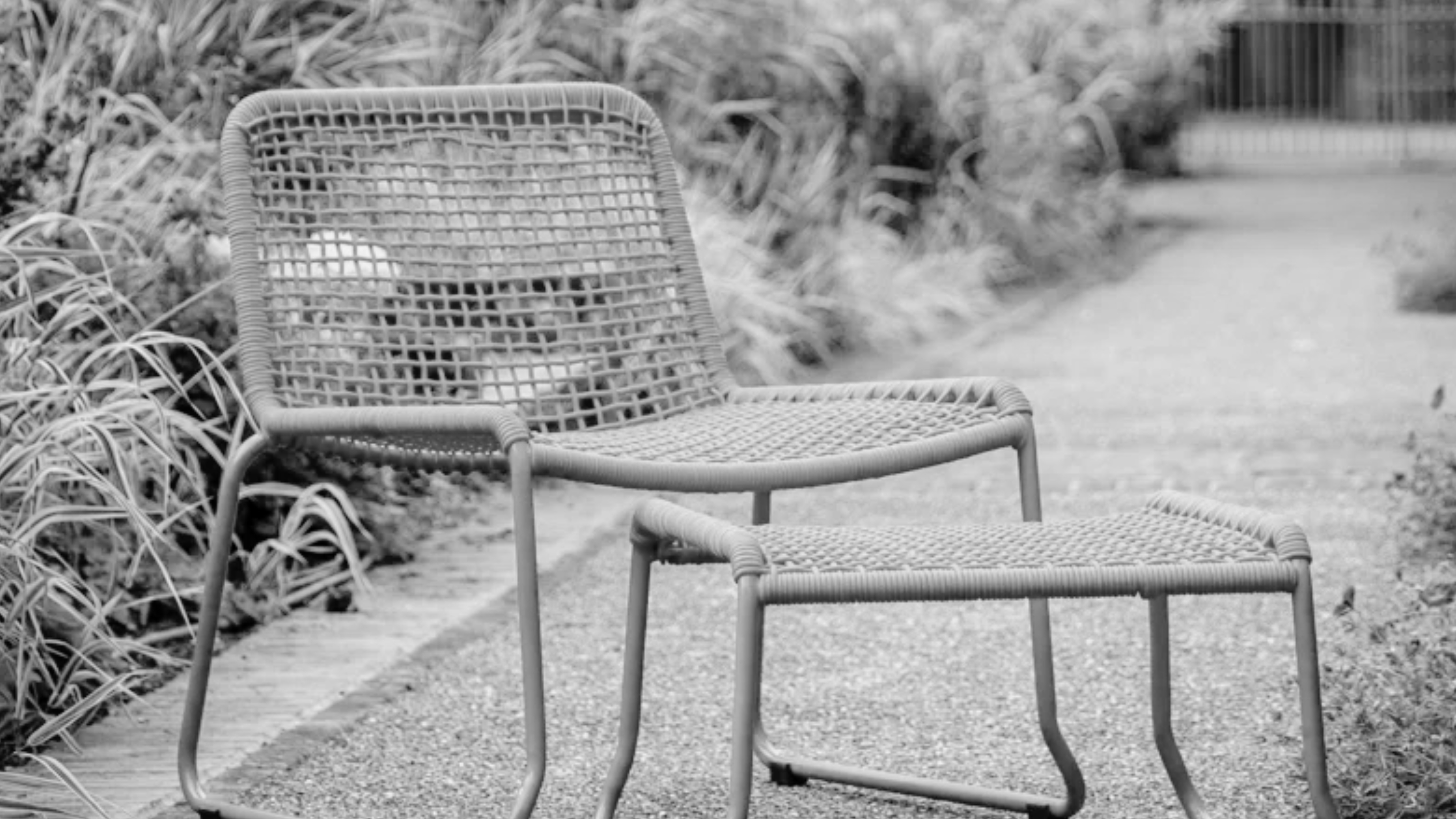 This Outdoor Lounger Is the Color of the Season for Garden Furniture — And It's on Sale This Weekend
This year, it's all about the contrast, and this bright, sunny hue is the perfect foil to your green outdoor spaces
-
 Kelly Wearstler Designed an Animal Hospital Where "Anxiety Just Melts Away", and I'm Taking Notes for My Own Home
The renowned designer's foray into healthcare demonstrates have even the most functional of spaces can still be design-forward


-
 What Does the Color Yellow Mean in Interior Design? A Color and Design Psychology Expert Explains
Whether you love or hate it, yellow always seems to elicit a strong reaction from people — here, we explain why
-
 10 Yellow Bathroom Ideas That Vitalize Your Mornings and Look Unexpectedly Sophisticated While Doing So
Yellow is a color that by its very nature is energetic and full of life, and these designers have proved it's ideal for a bathroom
-
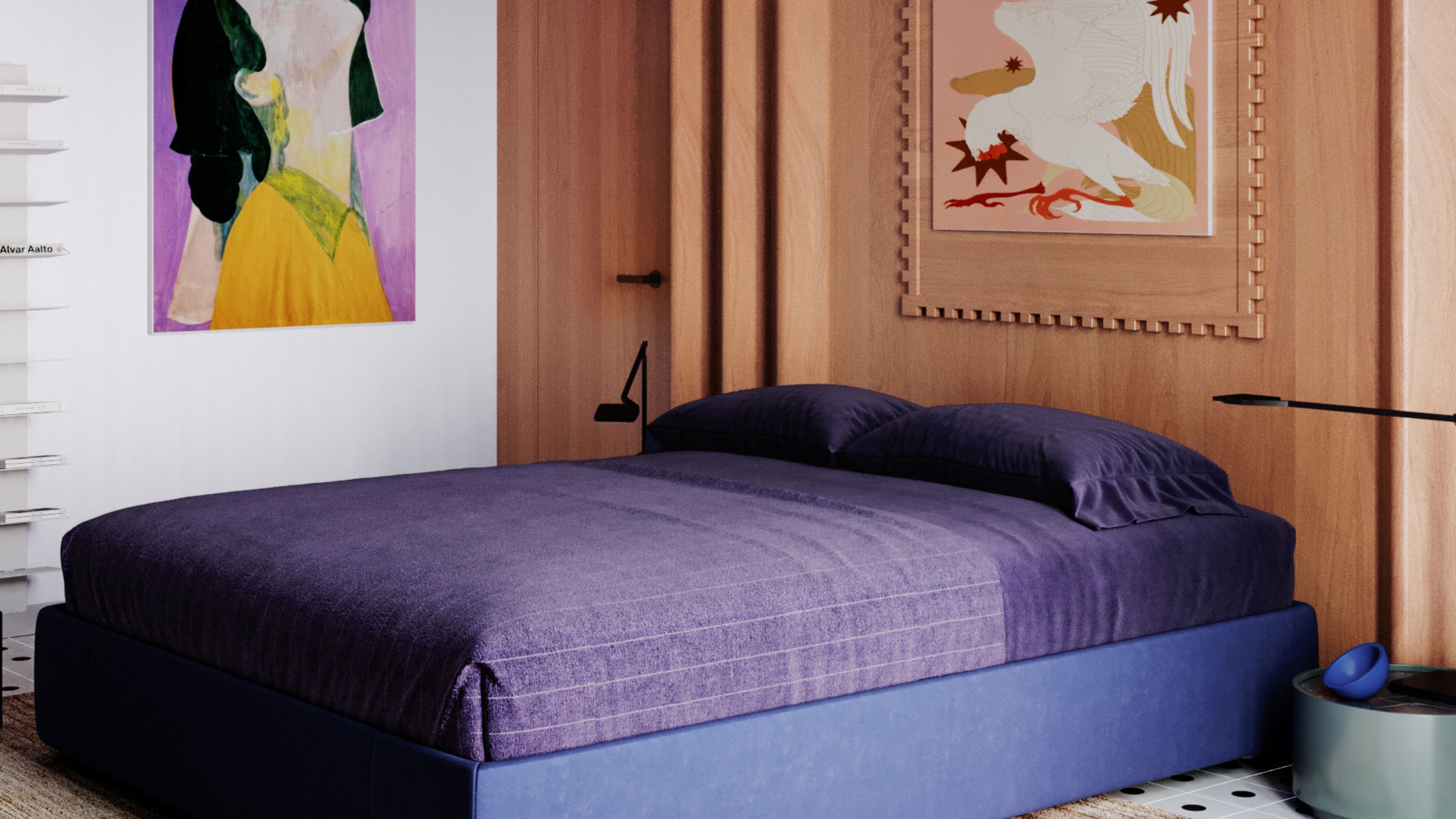 It's a Color Symbolic of Dreams, so These Purple Bedroom Ideas Almost Guarantee a Good Night's Sleep, Right?
Not always an obvious choice for the bedroom, these designs prove that purple has restful and calming qualities, making it perfect for the bedroom
-
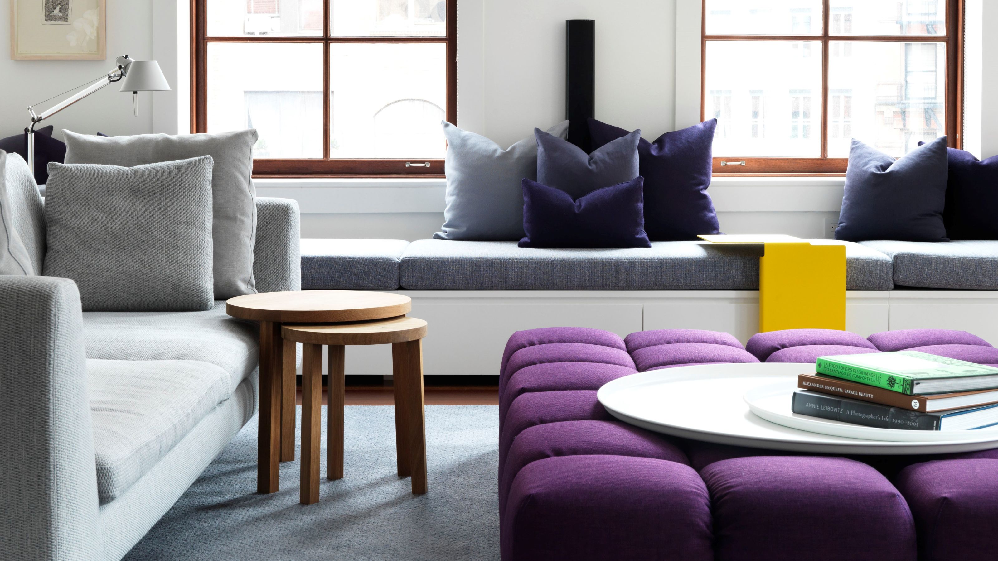 Amethyst, Heather, Pansy, Plum — Turns Out Decorating With Purple Opens You Up to a World of Possibilities
Purple certainly isn't a color for the faint hearted, it's a shade that can smell your fear. Here's how to conquer it through your interiors
-
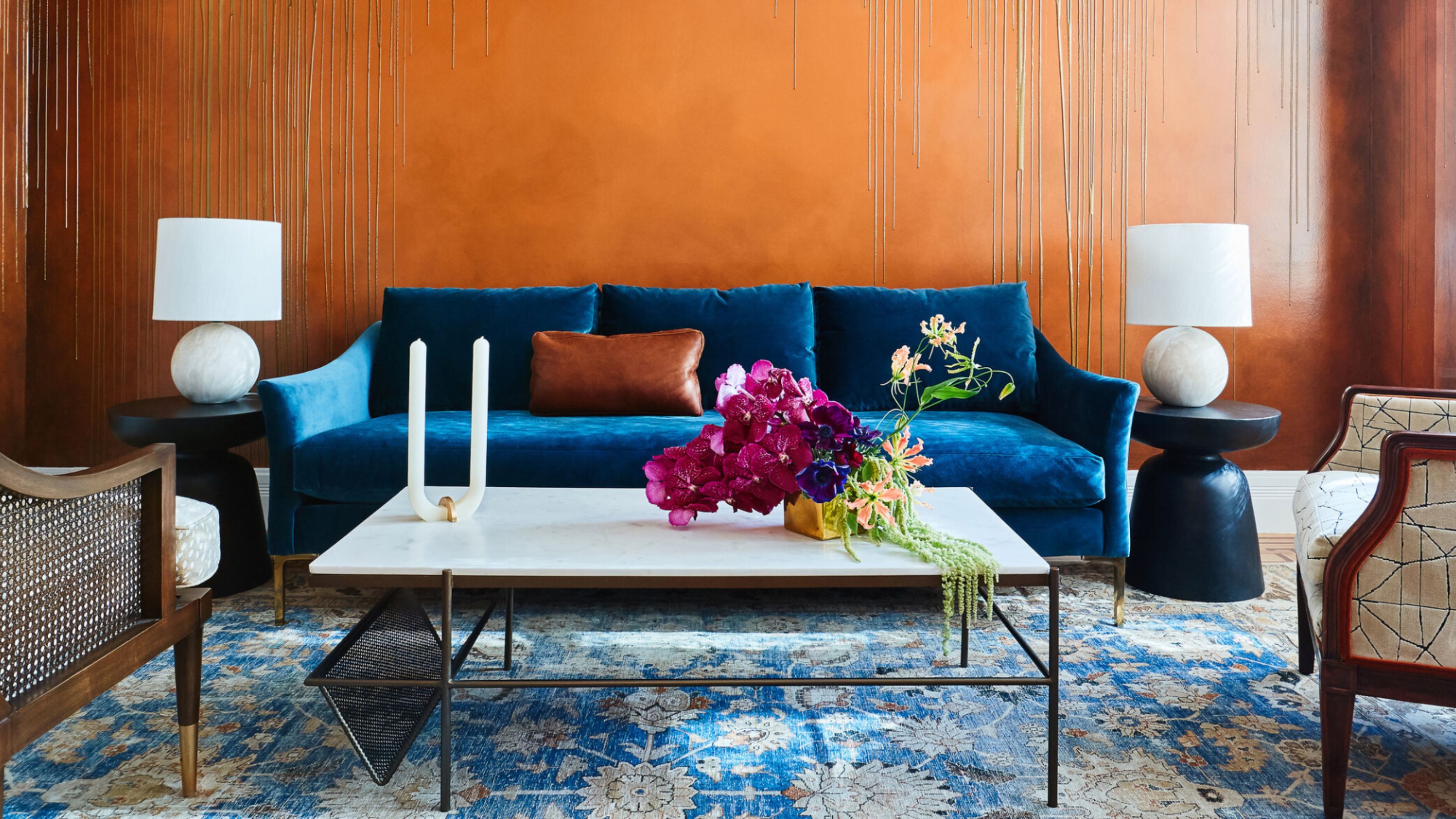 The Combination You Weren't Expecting to Love — 8 Blue And Orange Living Room Ideas That Feel Surprisingly Elevated
A blue and orange scheme for living rooms may sound jarring, but these spaces prove they're striking, vibrant, and certainly unforgettable
-
 Smeg Says Teal, and We’re Listening — The Kitchen Shade of the Year Is Here
Designers are already using the soft, sea-glass green everywhere from cabinetry to countertops
-
 Do Yellow and Purple Go Together? Designers Reveal How to Make This Unexpected Pairing Feel "Totally Intentional"
In an era where unexpected combinations have become cool, we've done a deep-dive to discover how to pair yellow and purple in a space
-
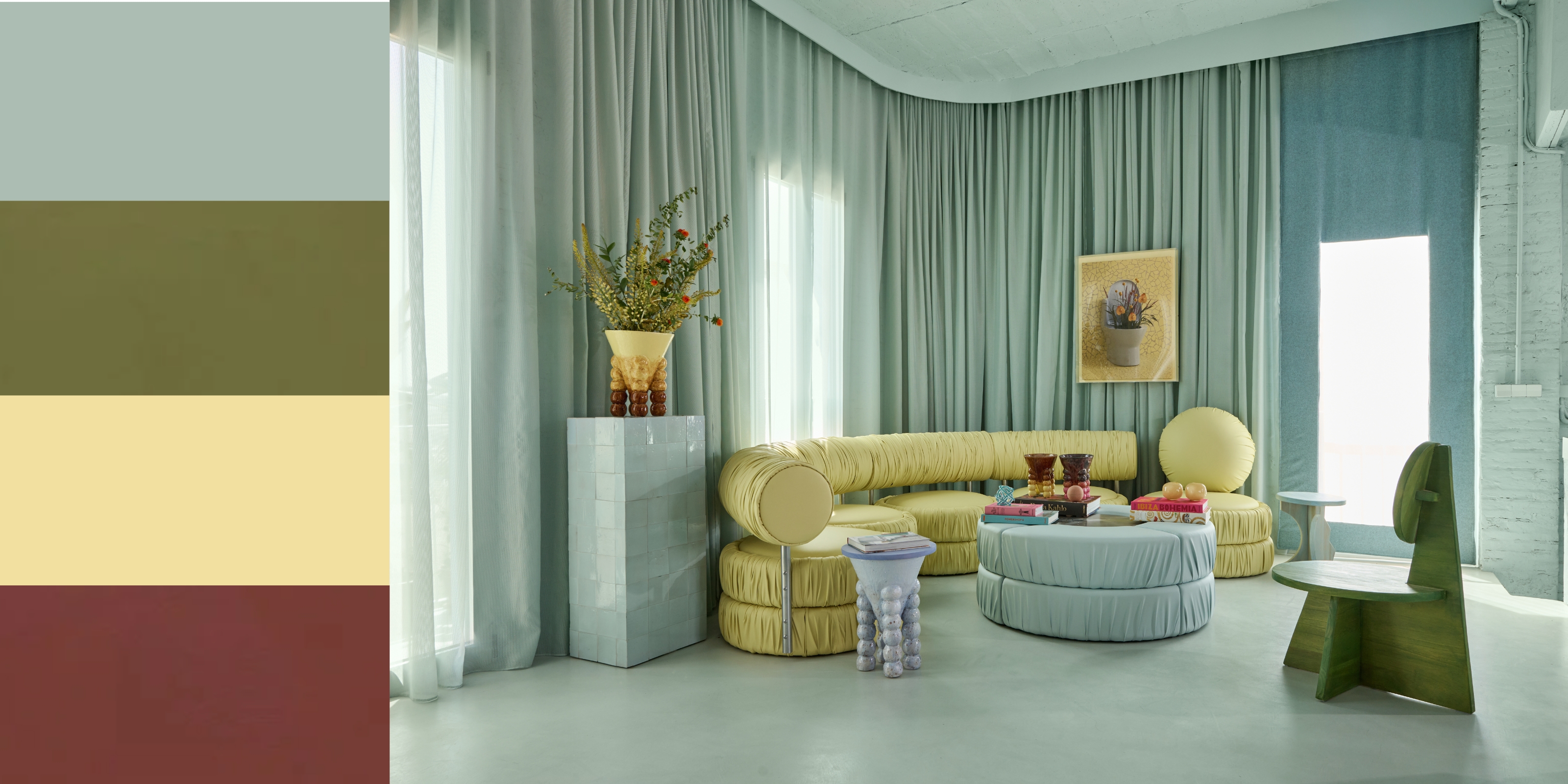 5 Unexpected but Seriously Stylish Spring Color Palettes to Shake Up the Season — "It's Pastel, but Punchy"
Spring color palettes are notorious for their use of pretty pastels, but that doesn't mean they have to lack variation


