These were my 10 favorite kitchens of 2022 – and the lessons they taught me about kitchen design
If you're planning a kitchen project for next year, tour these design-forward, inspiring kitchens that we loved in 2022
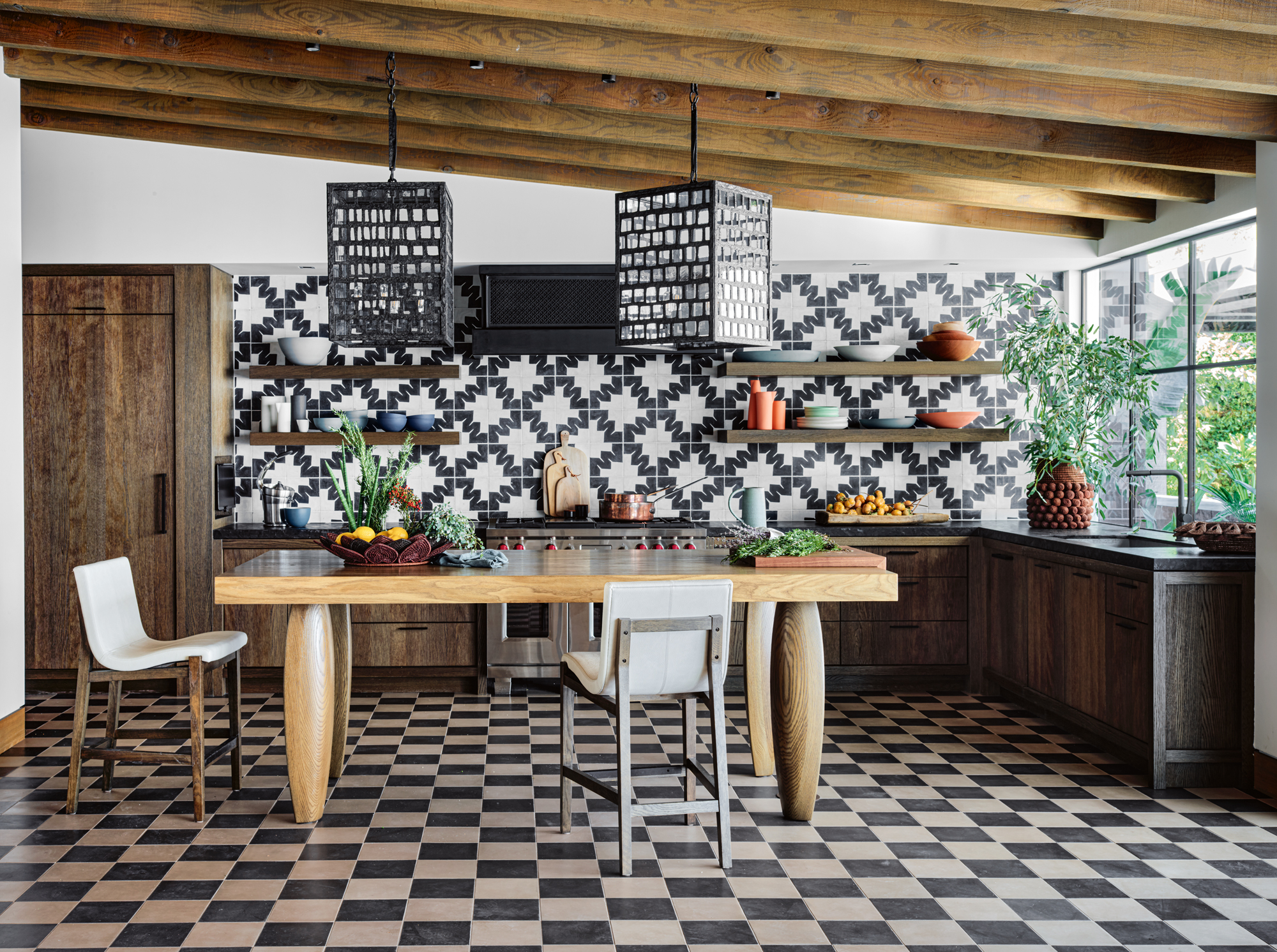

In my line of work, you see a lot of beautiful homes every year, but it's fair to say that some make more of an impression than others. And while a beautiful bedroom or living room will always catch my eye, it's the kitchen were I find myself most impressed by what today's designers are doing.
Modern kitchens have become the new showpiece of the home. Where once they were the space to play it safe for longevity and re-sale value, now homeowners and interior designers are embracing bold materials, colors and design choices that make kitchens stand out.
If you're starting to think about a kitchen project for 2023, and are looking at the latest kitchen trends as a starting point, I've picked 10 of my favorite kitchen designs we've featured in the last 12 months that I think set the tone for style in this most important of spaces right now.
1. This materials masterclass
There are certain kitchens that are 'scroll-stoppers'. That is, when you're scrolling mindlessly on Instagram, they'll stop you in your tracks. It's not, necessarily, something you're likely going to prioritize for your own kitchen, but there's something in this idea that I'd argue does translate into the real world.
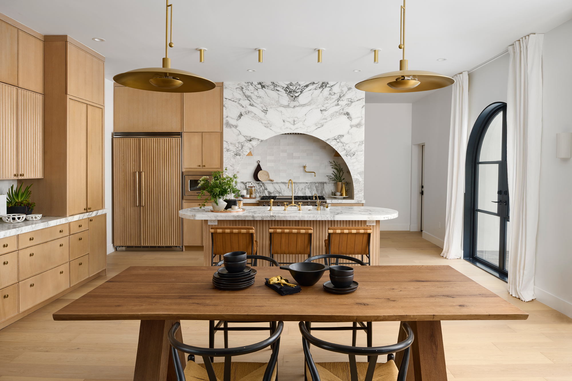
Take this kitchen by Cdot Design Studio, for example, that we featured for its amazing marble arched cooker hood this year. If you want to think of the kitchen as the heart of the home, your kitchen island is the centerpoint of everything. With the most exciting details of this kitchen framing the island, it draws your eye to this space subconsciously. It's a scroll-stopper in real life.
It's a kitchen full of interior design trends that defined 2022, too. From the fluted finish of the island to the arches and expanses of Carrara marble, you'd be hard-pressed to find another kitchen that best sums up some of the most popular ideas we've seen this year. Whether they should all be as big players in 2023, or whether they should be left in 2022, is up to you.
2. This ode to pattern

If there was ever a room I'd be nervous about choosing a decorating style that's a little more controversial, it would be the kitchen. Ideas like pairing multiple tones of wood, combining multiple patterns and prints, or choosing bold clashing colors require a skillful, tactful touch – and it's something that can easily go awry.
In this Californian home designed by Lucas Interior that we toured in Livingetc this year, a fearless approach to pattern clashing tiles can be seen throughout the space, including onto the pool deck, but it was the kitchen that made a lasting impression. 2022 was undoubtedly the year of the checkerboard flooring, too, but its combination with another monochromatic pattern tile on the walls really gives this kitchen a unique character, set off by rich, beautiful wood tones.
3. This forward-thinking apartment kitchen
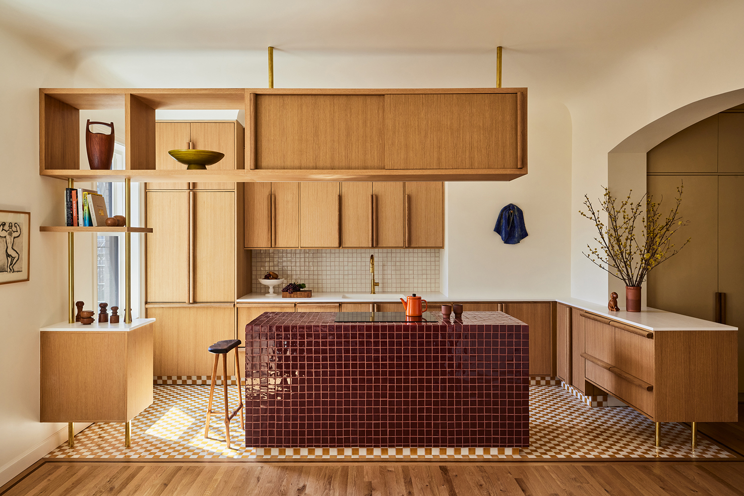
A late contender for my kitchen of the year, yet the kitchen of this New York apartment created by GRT Architects is undoubtedly one of my favorites. The semi-partitioned layout that creates both a sense of an open plan kitchen while also making it feel contained within a certain area of the floorplan is so well done.
However, what undoubtedly most sticks in my mind is the beautiful kitchen island, completely tiled, including the countertop. It creates this monolithic look that really highlights this material and brings a block of this brilliant burgundy into the space, while keeping the aesthetic clean and refined. The biggest lesson for me? Okay, a tiled countertop might not necessarily be the most practical choice when it comes to maintenance, but for the right design intervention, you really can make a decision on whether you're happy to strike a balance between practicality and good looks. For a kitchen island this handsome, I will happily spend a little bit longer wiping it down each day.
4. This brilliant use of color
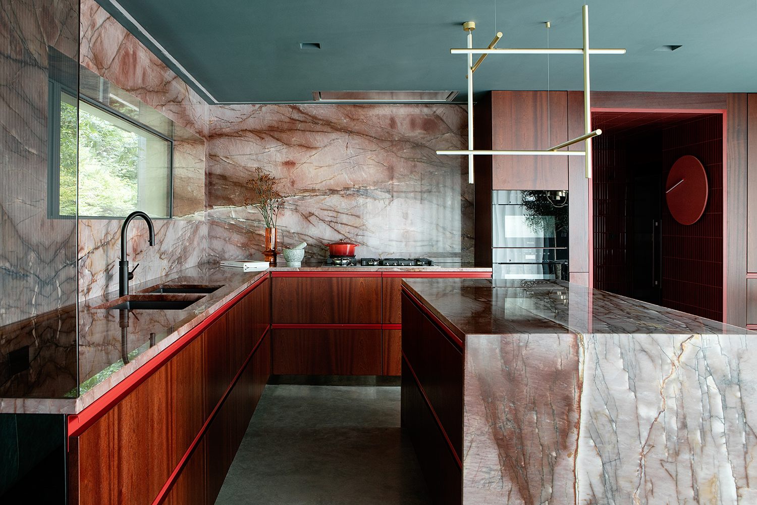
This colorful home in Dublin, Ireland, was one of my favorite homes of this year. It's a space that's full of evocative jewel tones and luxe materials – something that could easily stray into a design that's too-dramatic and too-opulent. However, the designers at Kingston Lafferty handled this material and color palette in a way that the resulting home still feels almost minimalist.
The kitchen is just such an example of how designers in 2022 have used color in new, fresh and invigorating ways. A teal-painted ceiling with red cabinetry detailing and pink marble shouldn't, I think it's fair to say, work on paper, but what an incredible modern kitchen they've ended up creating here.
5. This cool, curvaceous kitchen
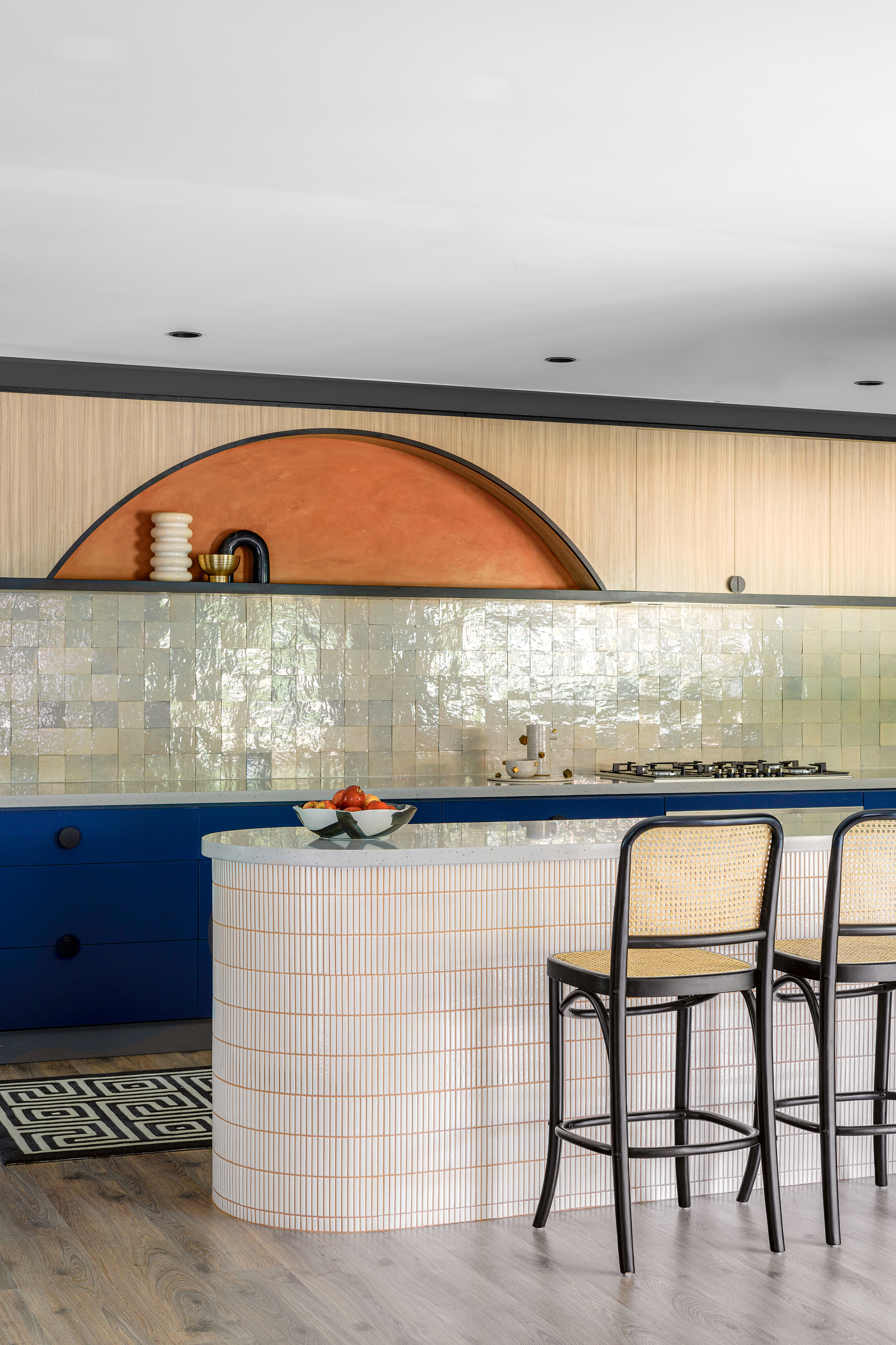
Curves have been another hallmark in design in 2022, and no kitchen perhaps did it better than the design of this Sydney bungalow by interior designer Nicholas Kaiko. From the decorative cabinet reveal to the curved kitchen peninsula, clad in orange-grouted mosaic tiles, this kitchen is another exploration of color, texture and shape.
It's, again, a color palette that's a hard sell on paper, but the combination of these tones - from the almost artificial feel of the electric blue cabinetry to the soft and natural variation of the backsplash tiles - just goes to show what's possible with color when you put a palette in the right hands.
6. This dramatic, yet understated space
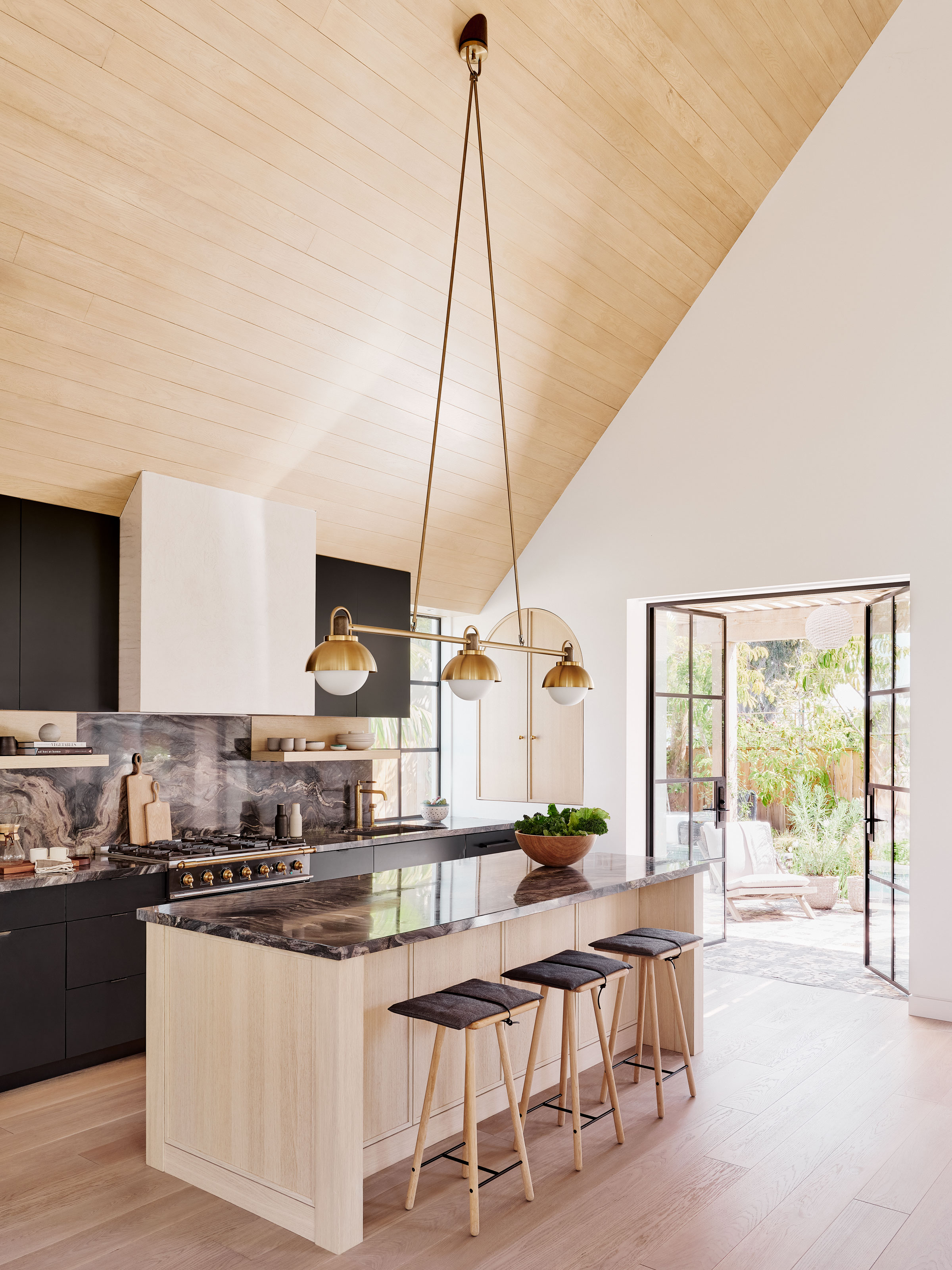
If good design is all about balance, this kitchen by Los Angeles-based architect Laney LA is a masterclass in it. It's a space that has an inherent sense of drama to it, with its lofty, pitched ceiling, but for me, it's the perfect example of how to give the eye something to excite it, and then space for it to rest.
The dramatic kitchen lighting is a touch of theater, while cloudy marble countertops bring a subtle glamour to the kitchen, yet elsewhere, the design is sleek and streamlined, with materials providing background character that allows these other elements to take the spotlight, while still pulling their weight.
For me, it's the perfect example of appliance trends we've seen this year, too. Sleeker appliances have generally been out of favor for stylish freestanding ranges.
7. This kitchen's bespoke detailing
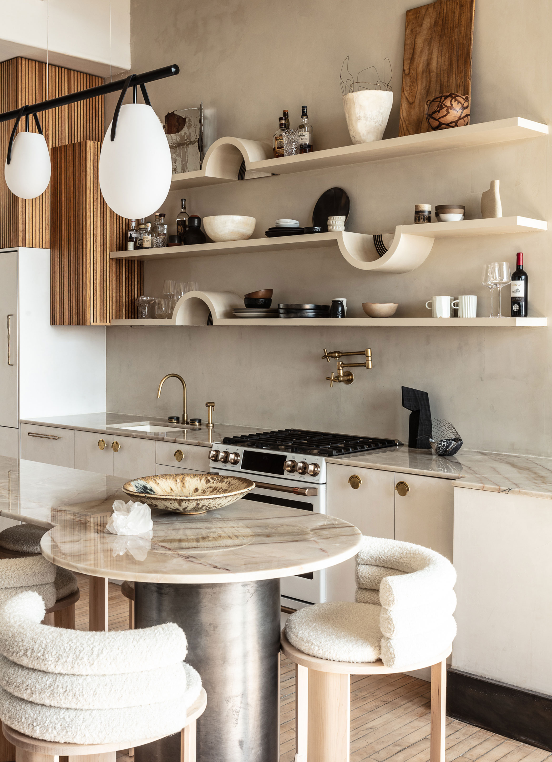
Bespoke detailing that features in many of the kitchens that have inspired me this year. It's a sign of an unwillingness to compromise for something that's almost, but not quite right in a kitchen design, while in other spaces, it can be the detail that a whole kitchen design hinges on.
This kitchen is actually in the New York showroom of design studio Aker Interiors, but the space provided fertile ground for the designers to experiment with ideas. This floating kitchen shelving, made bespoke with a ceramicist, each incorporate an arch, within which a wall sconce sits, for a particular novel detail that sets the tone for the space.
8. This luxe small kitchen
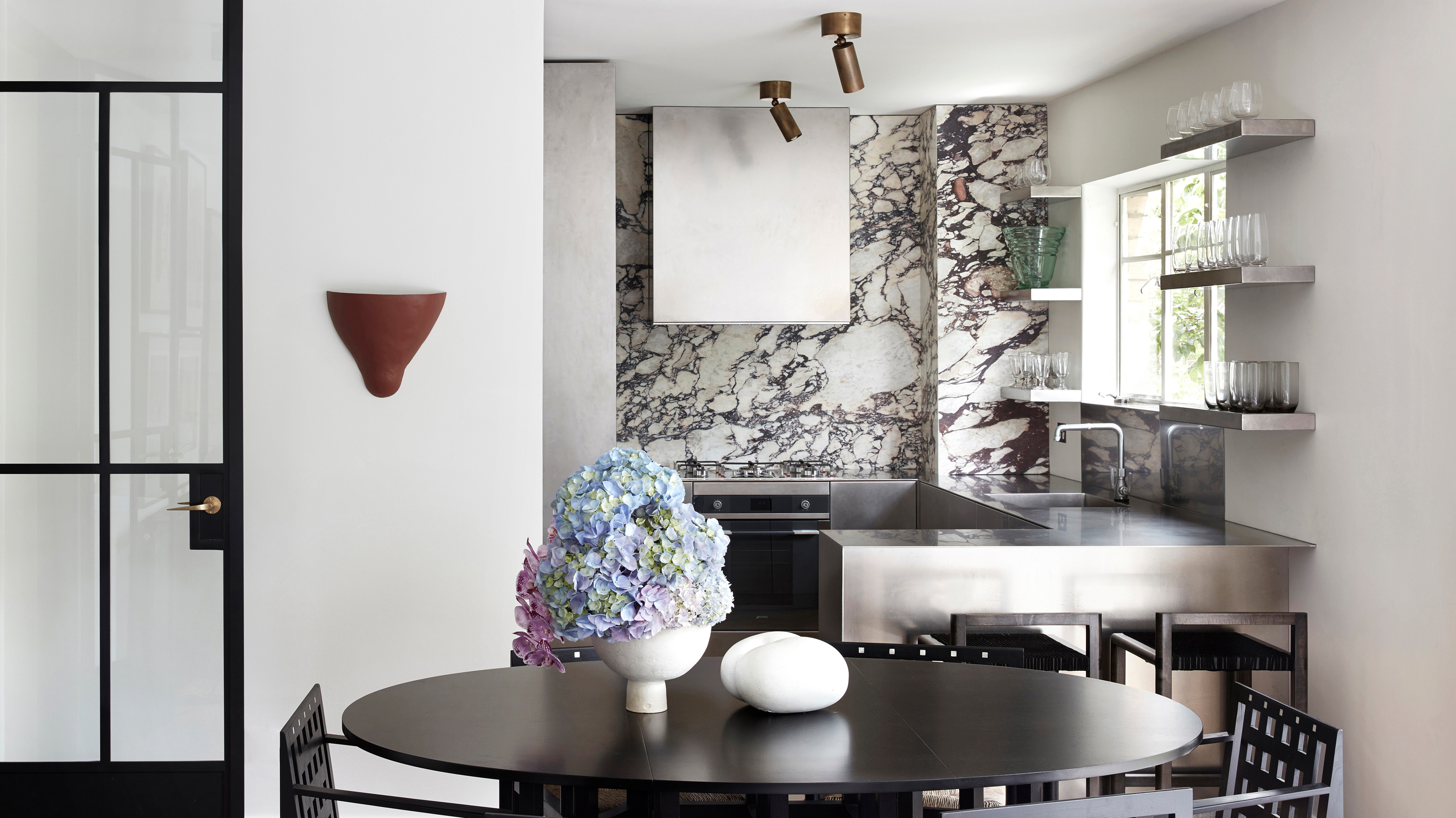
Small yet bold, this compact kitchen designed by Tamsin Johnson was one of my favorite spaces of the year for a fearless approach to materials. Where you might be tempted to keep a small kitchen simple and pared back, Tamsin chose an intricately-veined Viola marble (which, dare we say, may well be the material trend of the year) as a luxury contrast to the industrial, utilitarian vibe of the stainless steel kitchen cabinetry that wraps around the remainder of the space.
9. This cozy eat-in kitchen
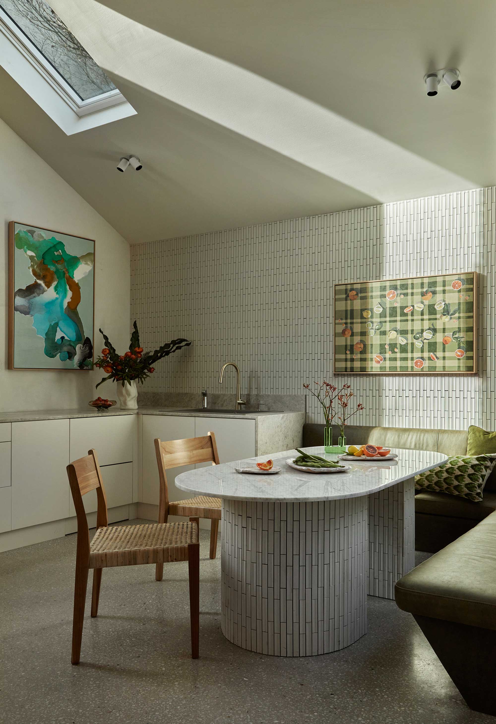
This kitchen featured on the cover of Livingetc's August issue as a highlight of a beautiful, brilliant home in Australia. Yet, while the kitchen cabinetry itself is rather restrained, it speaks to a move towards creating comfort and coziness for an eat-in kitchen.
Supersized, comfy banquette seating wraps around the bespoke dining table in the scheme by Melbourne-based Angelucci Architects, designed with the same tiles as the kitchen's walls, turning the space into the heart of the home's entertaining spaces.
10. This traditional with a twist space
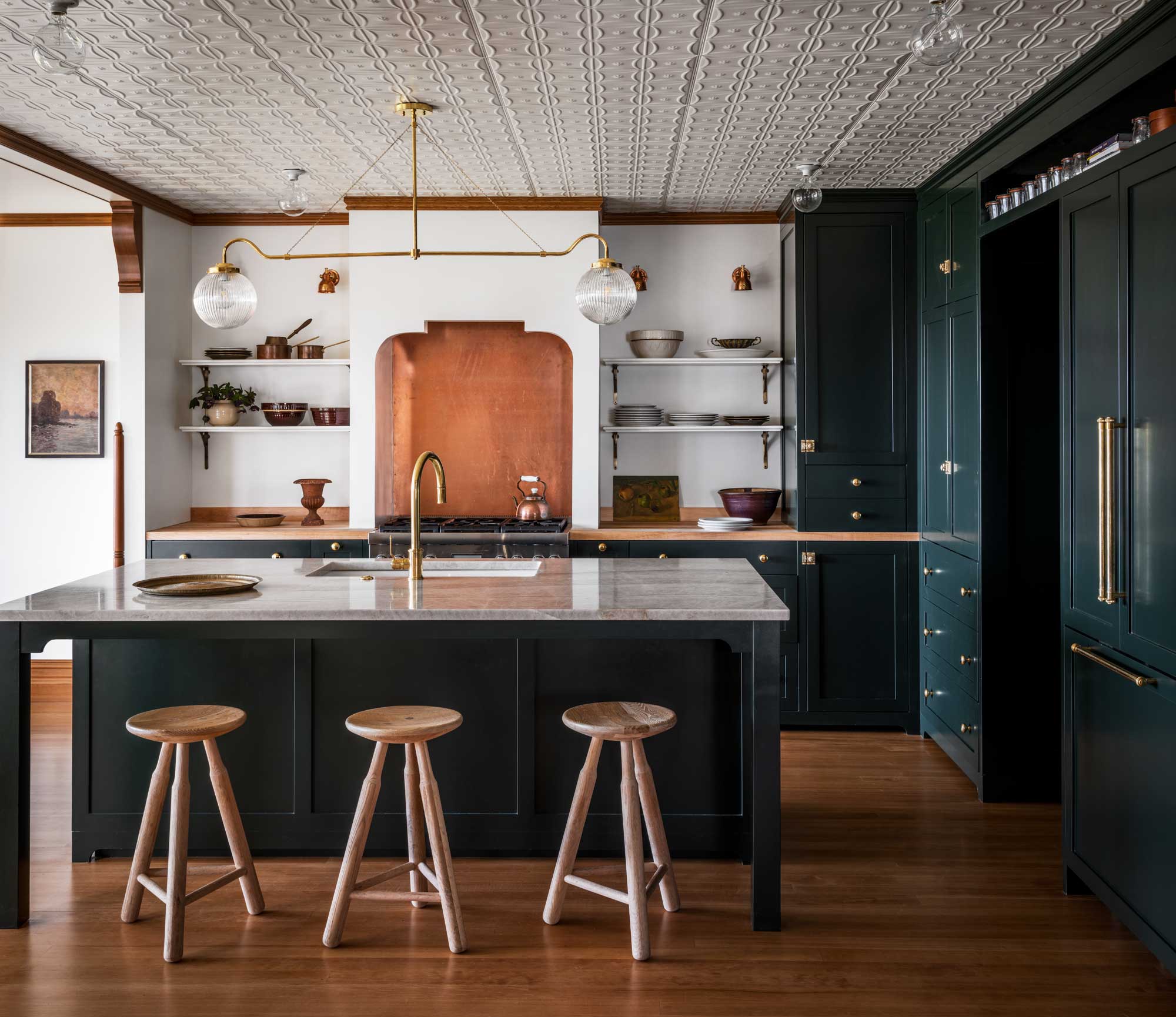
While you may not find too many traditional kitchens gracing Livingetc.com, 2022 is the year we've embraced a new lexicon when it comes to spaces that straddle both classic and modern design. Say hello to the transitional-style kitchen.
This kitchen, designed by interior designer Lisa Staton, is one of my favorite examples of transitional style of the year. The traditional details are undoubtedly charming - a traditional Shaker style cabinetry in a timeless shade, touches of antiqued brass and copper, and period detailing, like a newly installed tin tile roof, painted in a white gloss really give this kitchen character.
However, the edge of a crisp white wall, minimal styling and even just the slightly more modern design language of the stools used at the kitchen island seating bring a cool, contemporary energy to the space. It distills that timelessness that never borders on outdated.
Be The First To Know
The Livingetc newsletters are your inside source for what’s shaping interiors now - and what’s next. Discover trend forecasts, smart style ideas, and curated shopping inspiration that brings design to life. Subscribe today and stay ahead of the curve.

Hugh is Livingetc.com’s editor. With 8 years in the interiors industry under his belt, he has the nose for what people want to know about re-decorating their homes. He prides himself as an expert trend forecaster, visiting design fairs, showrooms and keeping an eye out for emerging designers to hone his eye. He joined Livingetc back in 2022 as a content editor, as a long-time reader of the print magazine, before becoming its online editor. Hugh has previously spent time as an editor for a kitchen and bathroom magazine, and has written for “hands-on” home brands such as Homebuilding & Renovating and Grand Designs magazine, so his knowledge of what it takes to create a home goes beyond the surface, too. Though not a trained interior designer, Hugh has cut his design teeth by managing several major interior design projects to date, each for private clients. He's also a keen DIYer — he's done everything from laying his own patio and building an integrated cooker hood from scratch, to undertaking plenty of creative IKEA hacks to help achieve the luxurious look he loves in design, when his budget doesn't always stretch that far.
-
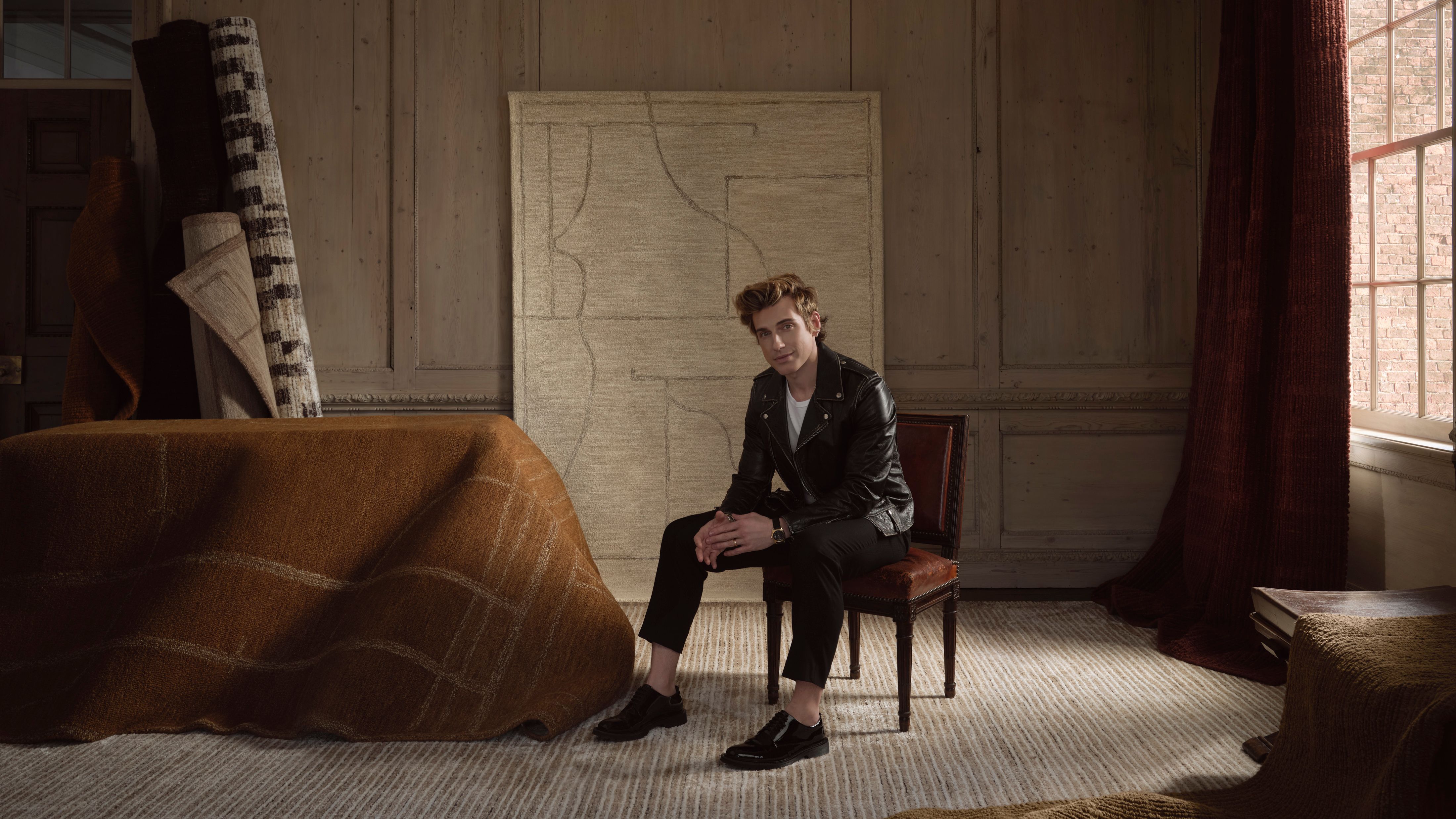 Jeremiah Brent Captures the Grit and Glamour of NYC in His New Loloi Collaboration
The TV-famous interior designer looked out of his own window — and hit the pavement — for a collection that turns city spirit into tactile design
By Julia Demer
-
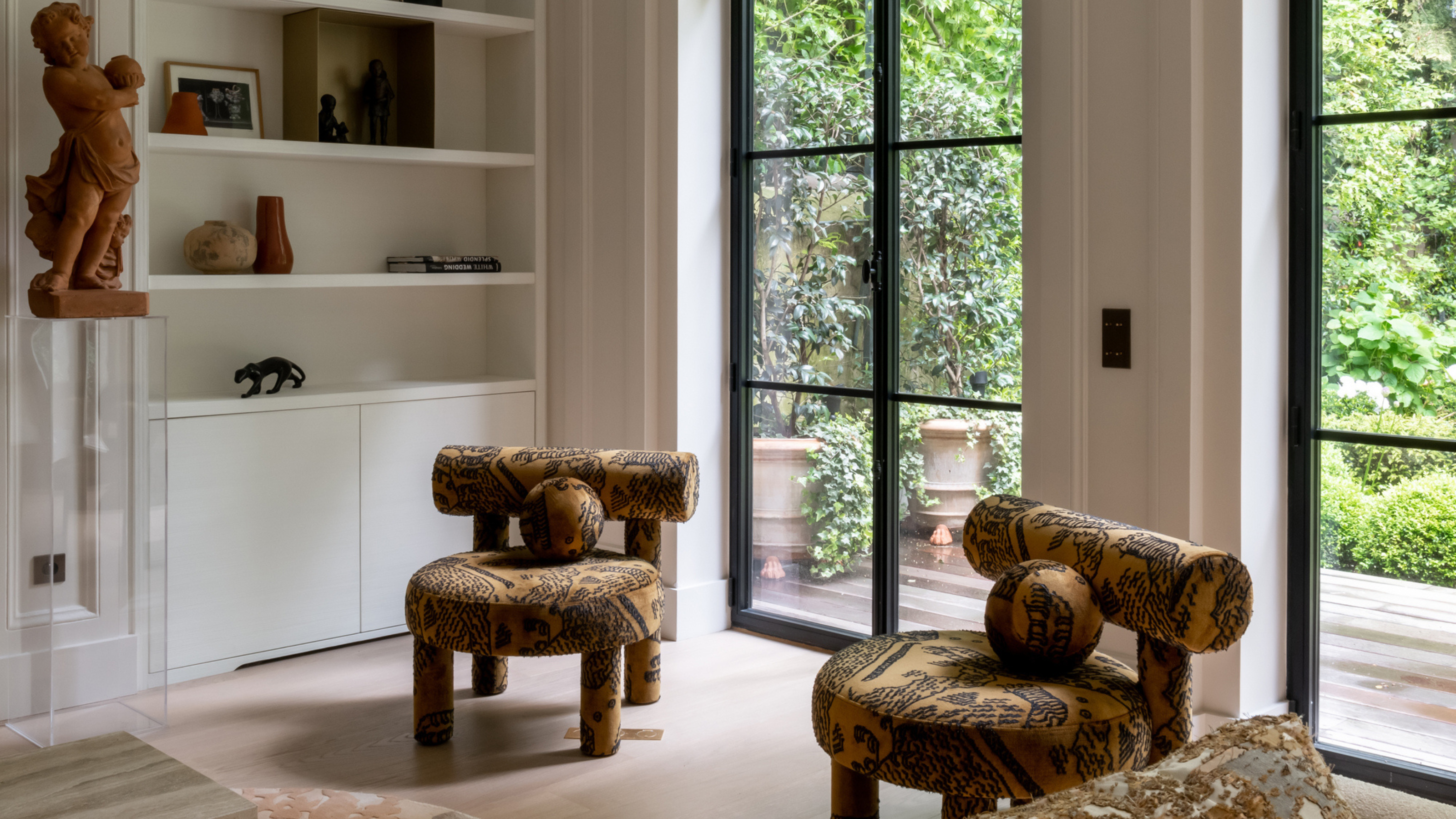 This Specific Fabric Print Is Literally Everywhere Right Now — Here's Why
It's whimsical, artistic, and full of character. We've called it already: Dedar's 'Tiger Mountain' is the fabric that will define 2025
By Devin Toolen