5 Storage Ideas That Make So Much Sense for a Galley Kitchen — They'll Make the Most of Narrow Spaces
Explore these great-looking galley storage ideas that really maximize what you can do with limited footprint kitchens

The Livingetc newsletters are your inside source for what’s shaping interiors now - and what’s next. Discover trend forecasts, smart style ideas, and curated shopping inspiration that brings design to life. Subscribe today and stay ahead of the curve.
You are now subscribed
Your newsletter sign-up was successful
It can be hard to eke out good galley kitchen storage when a space is so constrained. This type of kitchen usually suffers from feeling awkward to use, especially wen you're dealing with opening cabinet doors and deep drawers. But with the right ideas, a galley kitchen can be made functional and effortlessly stylish.
To give you some inspiration, we asked experts for ways to maximize space and include plenty of kitchen storage in this small area. Take a look at these winning examples, and get designing.
1. Add floating shelves in the galley kitchen
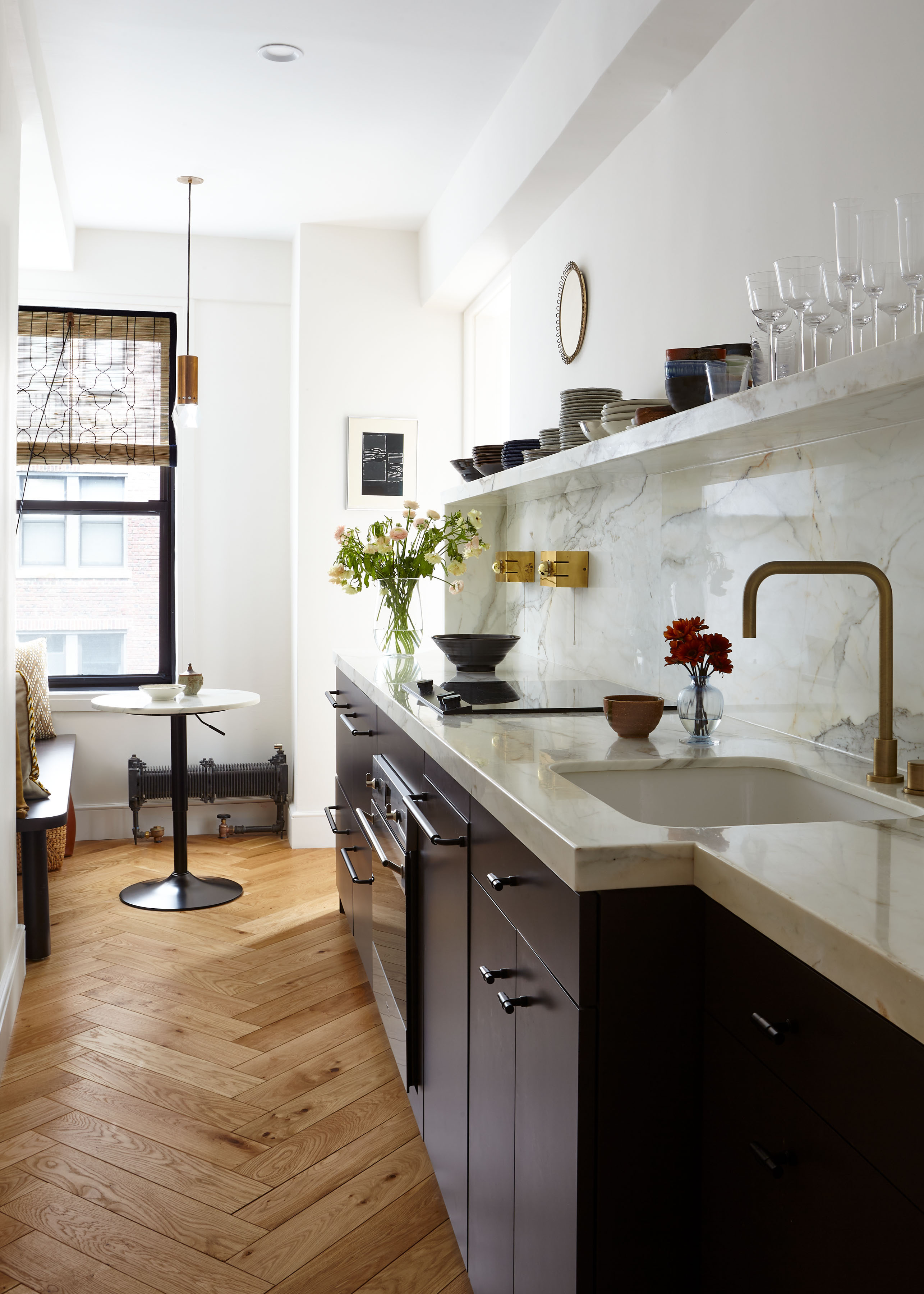
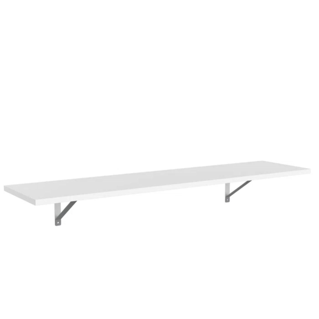
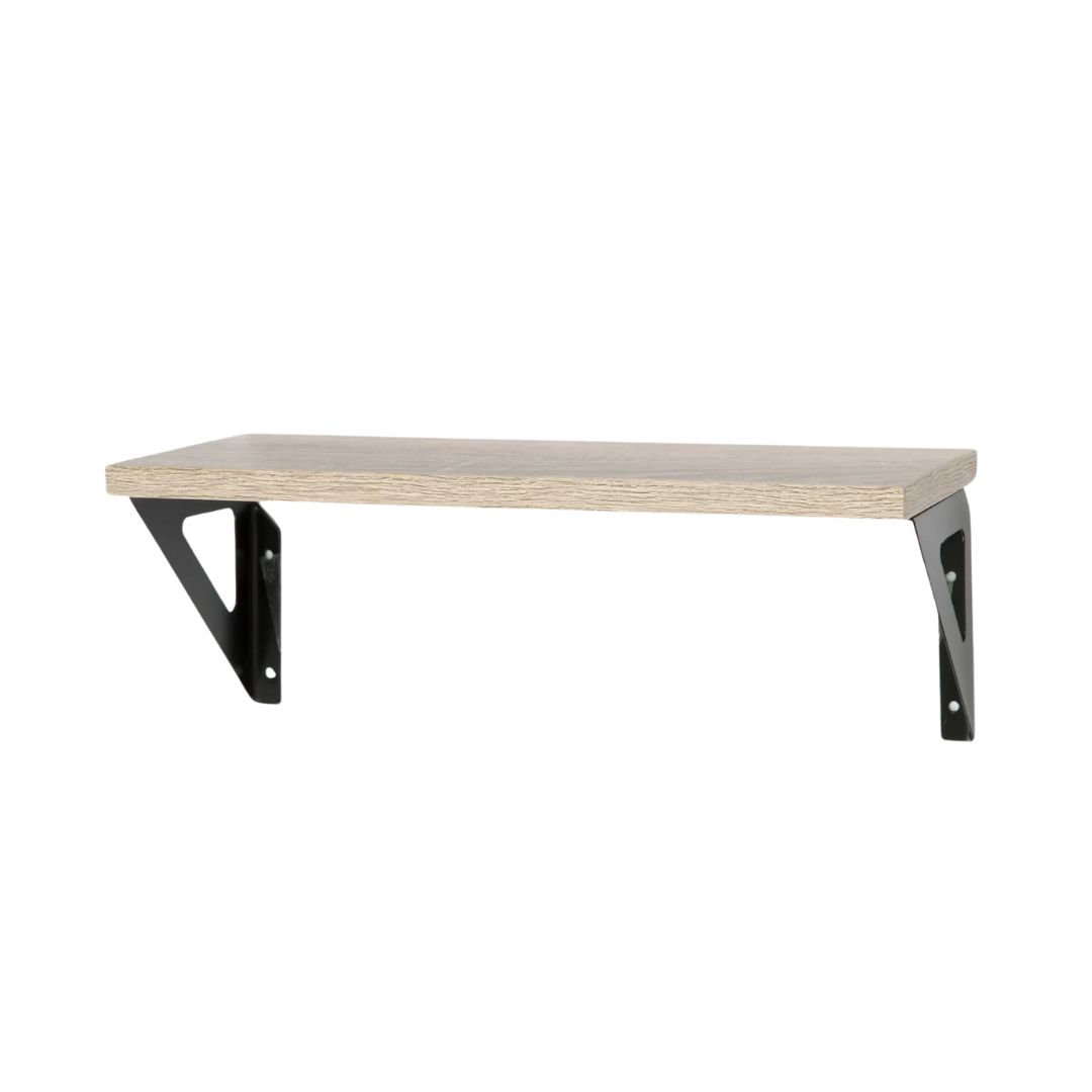
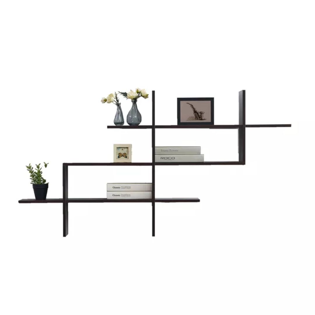
An opened-up galley kitchen will make the room feel larger, allowing you to enjoy more natural light. Instead of adding extra kitchen cabinets and storage units, consider floating shelves that stop the room from feeling too bulky, yet offer the perfect small kitchen storage space. Here you can place your choice china, glassware and more, so that the kitchen looks well-decorated as well.
Article continues below'This narrow kitchen also has a hidden full-height pantry, which adds storage for all food and larger items like pots and pans,' says Sarah Sargeant, co-founder of Cochineal Design. 'The four drawers at the end are actually refrigerator and freezer drawers. The narrow bit to the right of the sink houses drawers for utensils and cooking odds and ends. The flooring is Zio & Sons zellige unglazed with a glazed “sea salt” bouchon. We wanted the room to feel indoor-outdoor so we intentionally chose a material reminiscent of a fine outdoor patio.'
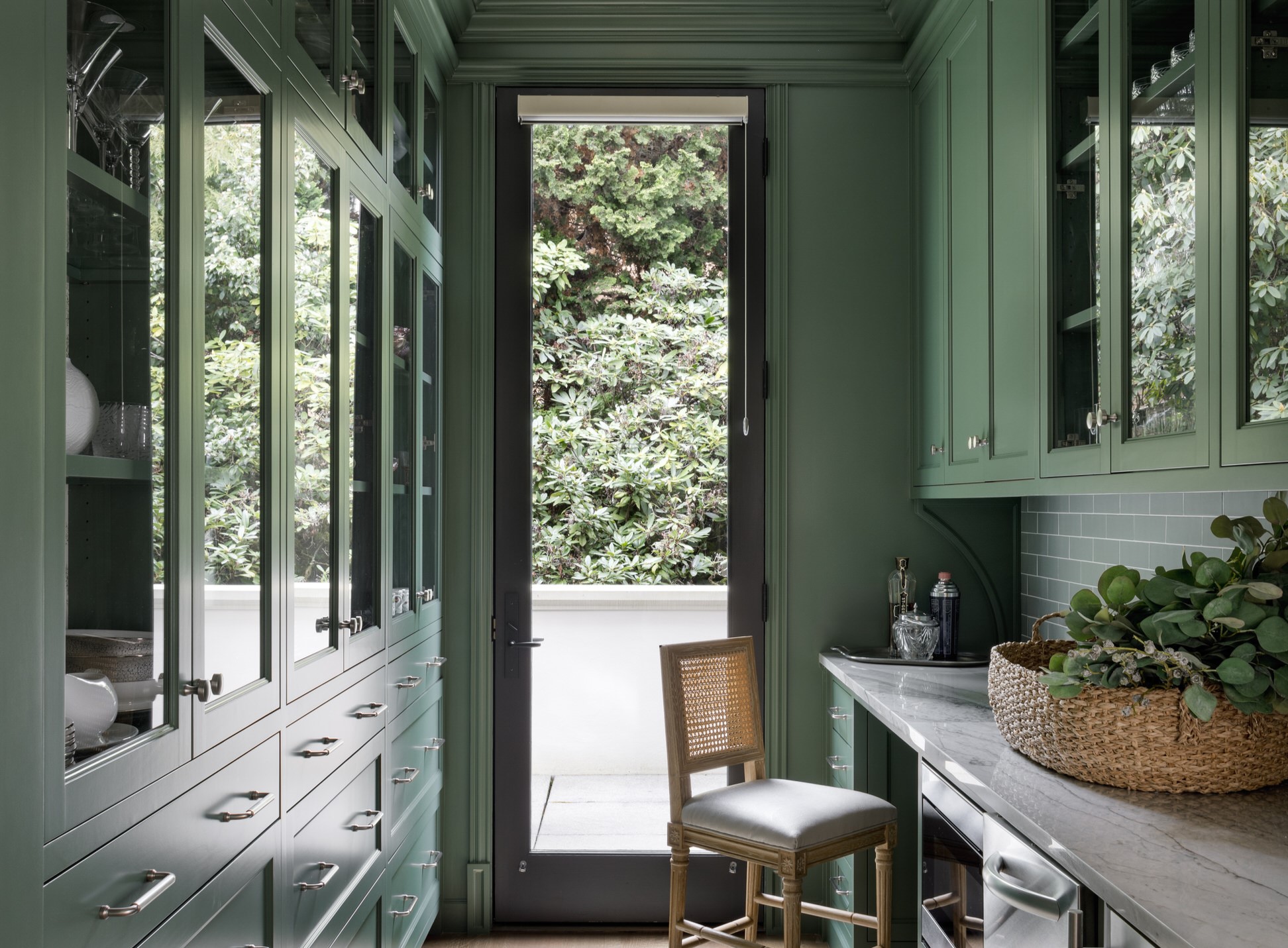
2. Consider floor to ceiling storage
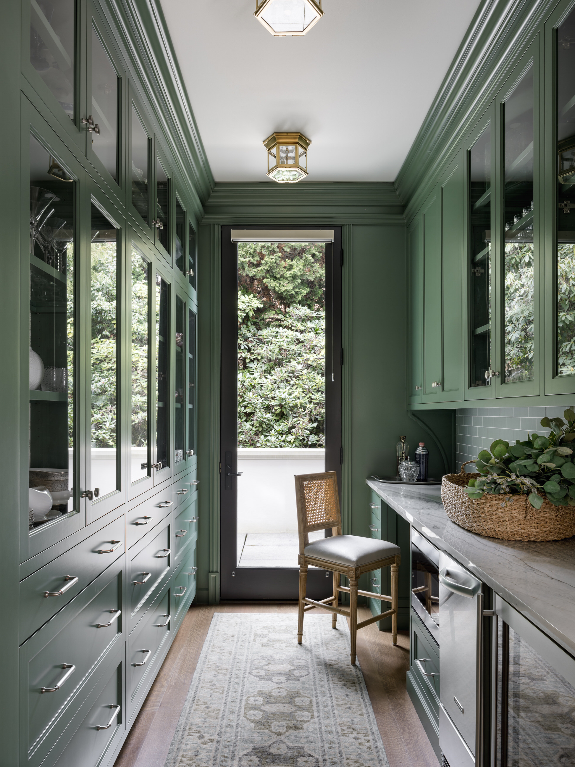
When the floor space is less, look to the walls for solutions. Consider building kitchen shelves and cabinets from the floor to the ceiling, taking in all of the vertical space available.
'This long narrow space had different uses that needed to be considered during programming,' says LeeAnn Baker of LeeAnn Baker Interiors. 'The client, originally from the south, has a large collection of China and glassware that needed to be stored in the floor-to-ceiling space that offers plenty of storage. She also wanted an area that could be utilized as a bar or an overflow space for caterers working at one of her many events. When not entertaining, our client requested a desk space where she could complete day to day tasks.'
As for the kitchen color, LeeAnn chose a soothing green that creates a lovely indoor-outdoor feel. 'We elected to paint all of the cabinetry and trim the same color as the island,' she says. 'It sets a more subdued feeling as you enter. We chose Benjamin Moore’s Holiday Wreath, as it gives an overall feeling of serenity.'
The Livingetc newsletters are your inside source for what’s shaping interiors now - and what’s next. Discover trend forecasts, smart style ideas, and curated shopping inspiration that brings design to life. Subscribe today and stay ahead of the curve.
3. Match storage to the walls

Typically, a galley kitchen layout has two parallel lines of base and wall cabinets, with a really tight work triangle. If you go in for high contrast cabinets to your walls, chances are that your space will feel more closed in. Plus, the kitchen appliances on the kitchen countertops will crowd an already tight space. In cases like these, consider cabinets in muted tones with flush handles (or even sliding doors) to create a feeling of openness.
This project by Crosby Studios is a great example. Here, the white cabinets visually merge into the walls and create a feeling of more space than there is. They also make the narrow room not feel too closed in.
'Color sets the tone of a space and provides personality to a kitchen,' says Juliette Thomas, founder of Juliettes Interiors. 'Apart from white, light pastel shades too instantly make the room look modern and feel breezy and relaxed. Remember to pick complementing pastel colors, such as a soft pink and a mint green.'
4. Prioritize drawers
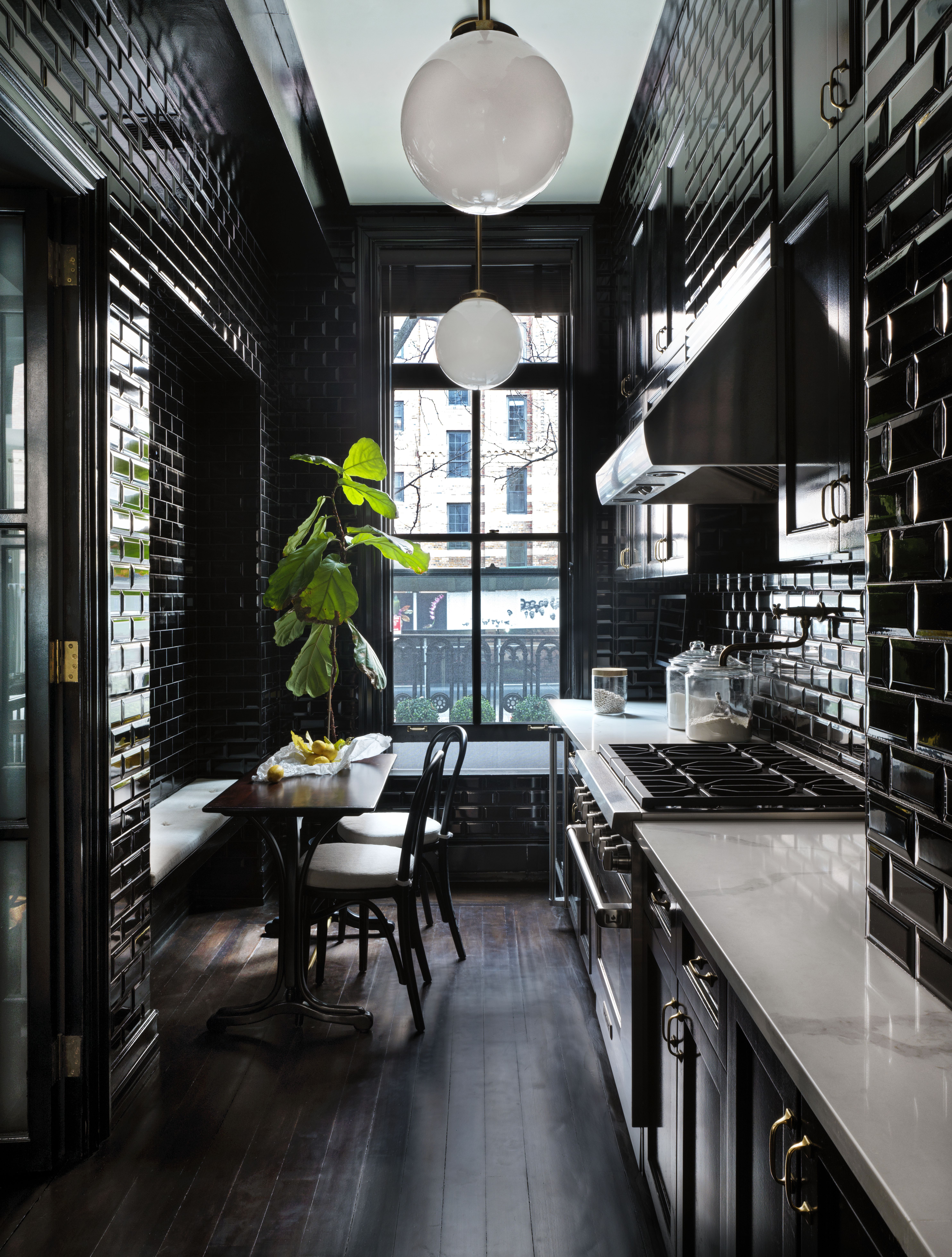
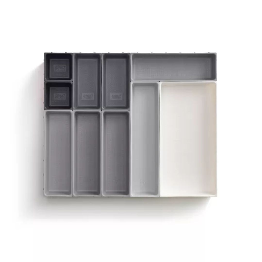
When it comes to the best type of storage for a small kitchen, drawers win out over cabinets. Cabinet doors can be unwieldy in a small space, especially on base cabinets where they can obstruct your ability to move around the space when open. With drawers, you can simply reach down to reach what you need, without worrying about which way the door opens on a cabinet.
In this project by Nannette Brown, a glossy black finish to the cabinets and tiles help give this tiny space a greater sense of depth. 'A black kitchen is a great choice, especially in open kitchens,' says Laura Williams of ATX Interior Design. 'It's bold, it's beautiful, and can be timeless if done right. Plus, black never goes out of fad — and is lately a tone that's being preferred by designers for its longevity.'
5. Change the depth of storage
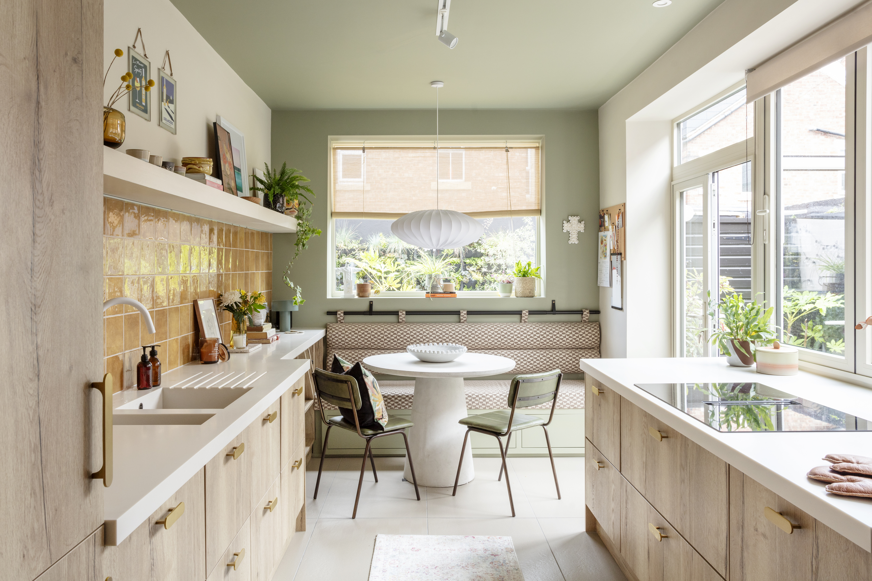
Fitting everything you need into an eat-in galley kitchen can be tough — especially as seating areas demand a decent amount of floor space to feel comfortable. However, this modern galley kitchen makes sure neither dining space or storage is compromised by choosing narrower storage around the banquette seating. Instead of choosing not to have storage beside this area, the countertop is narrowed to better accommodate the seating.
'We replaced the range with eye-level ovens and placed a huge hob by the window that had seating on the other side, with loads of space on either side so that our client could prep, chat and do the active cooking in the most sociable spot in the house, not hunched over a range, looking at a wall,' says Cathy Dean, founder & CEO of Studio Dean. 'We also managed to integrate a breakfast cupboard, and created a bespoke laundry space in tall cupboards around the door.'

Aditi Sharma Maheshwari started her career at The Address (The Times of India), a tabloid on interiors and art. She wrote profiles of Indian artists, designers, and architects, and covered inspiring houses and commercial properties. After four years, she moved to ELLE DECOR as a senior features writer, where she contributed to the magazine and website, and also worked alongside the events team on India Design ID — the brand’s 10-day, annual design show. She wrote across topics: from designer interviews, and house tours, to new product launches, shopping pages, and reviews. After three years, she was hired as the senior editor at Houzz. The website content focused on practical advice on decorating the home and making design feel more approachable. She created fresh series on budget buys, design hacks, and DIYs, all backed with expert advice. Equipped with sizable knowledge of the industry and with a good network, she moved to Architectural Digest (Conde Nast) as the digital editor. The publication's focus was on high-end design, and her content highlighted A-listers, starchitects, and high-concept products, all customized for an audience that loves and invests in luxury. After a two-year stint, she moved to the UK and was hired at Livingetc as a design editor. She now freelances for a variety of interiors publications.
