A New Interior Color, “Hyper Green” is Here — And if It's Good Enough for Gucci, You've Got Our Attention
If there’s one color that has always drenched the corridor of time, it’s green. New iterations of this tone take cognizance every few years and now there’s a fresh one on the horizon

Gucci said it and now it’s gospel. Their Spring 2024 runway highlighted a rather unique, fresh, and might I say, sharp green encased in casual grandeur, making two facts quite clear: green will always be omnipresent in design, and a fresh shade of pop green is about to transverse fashion and land firmly in our interiors. The lemony stand-out green color trend spells a bold yet refined vision for interior design; it has a bit of eccentricity yet still feels sophisticated. And we’re calling it “hyper green”.
So, what’s the fuss, and why is this tone special? For one, it’s associated with creativity and a confident aesthetic. It’s modern, crisp, and instantly eye-catching — you can’t not have an opinion on it! While it does have an upbeat look (especially when used as an accent hue), a fully drenched small room in “hyper green” could do the trick lending a room a more sophisticated look.
Interestingly, this color has several ways with it. You can consider adding more colors that go with green to create statement combinations that won’t be forgotten easily. Or you can work out ways to make it feel warmer. Much like other tones such as olive green, and sage green (or dare I say even "Brat" green) that took over our homes in the past few years, the moment right now is on Hyper Green. Here's how experts recommend using it.
Firstly, what is "Hyper Green"?
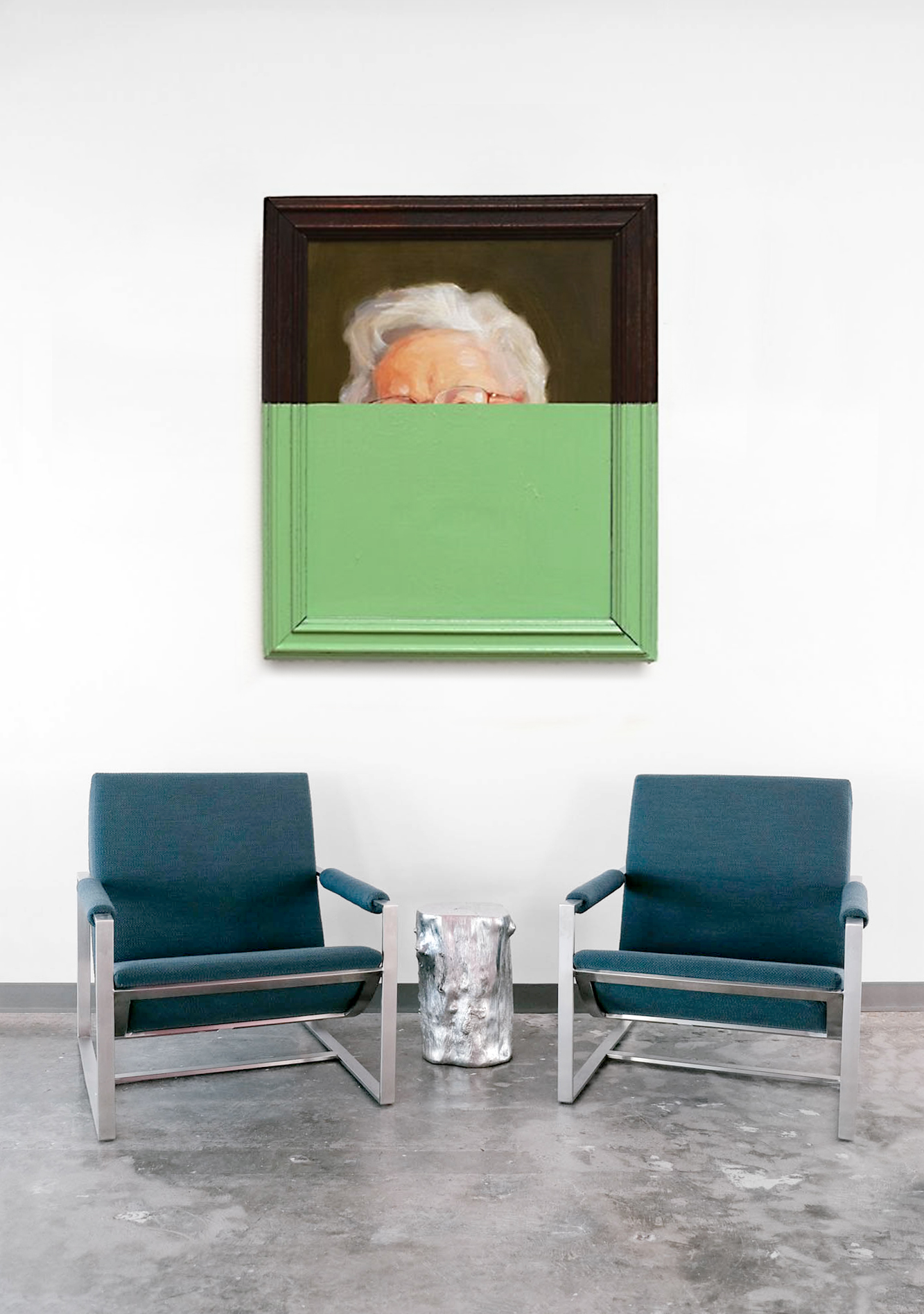
Striking, distinct, and head-turning, the slightly citrusy Hyper Green is the color of the moment. Sure, it is nature-inspired but it has a lot more punch to it; like a modern, slicker, and more “woke” version of the leafy green. Its timing is perfect too.
As many homeowners are open to being more experimental with their spaces and are initiating fresher color stories in their homes, this off-beat, cool shade of green couldn’t have come at a better time. Green room ideas are always a safe bet, but this green also comes with a powerful identity.

“Bold greens evoke the lushness of nature and modernity,” explains Burcu Garnier, founder of Color Atelier. “This vibrant hue creates a striking contrast against neutral backgrounds, making spaces feel fresher and more alive. Bold greens are also invigorating and can enhance mood, making them appealing for spaces designed for relaxation and rejuvenation.”
“As per color theory, these types of greens have had a strong show in decorating, creating dramatic yet characterful rooms,” adds Patrick O'Donnell, brand ambassador at Farrow & Ball. “Because of the nature (and nurture) of the green family, these bright tones have good psychological associations such as calming and relaxation. They have a strong affinity when paired with many other colors, never appearing too challenging or constrained to disrupt the bigger picture of bringing all the room elements together cohesively.”
How do you use "Hyper Green" in interiors?
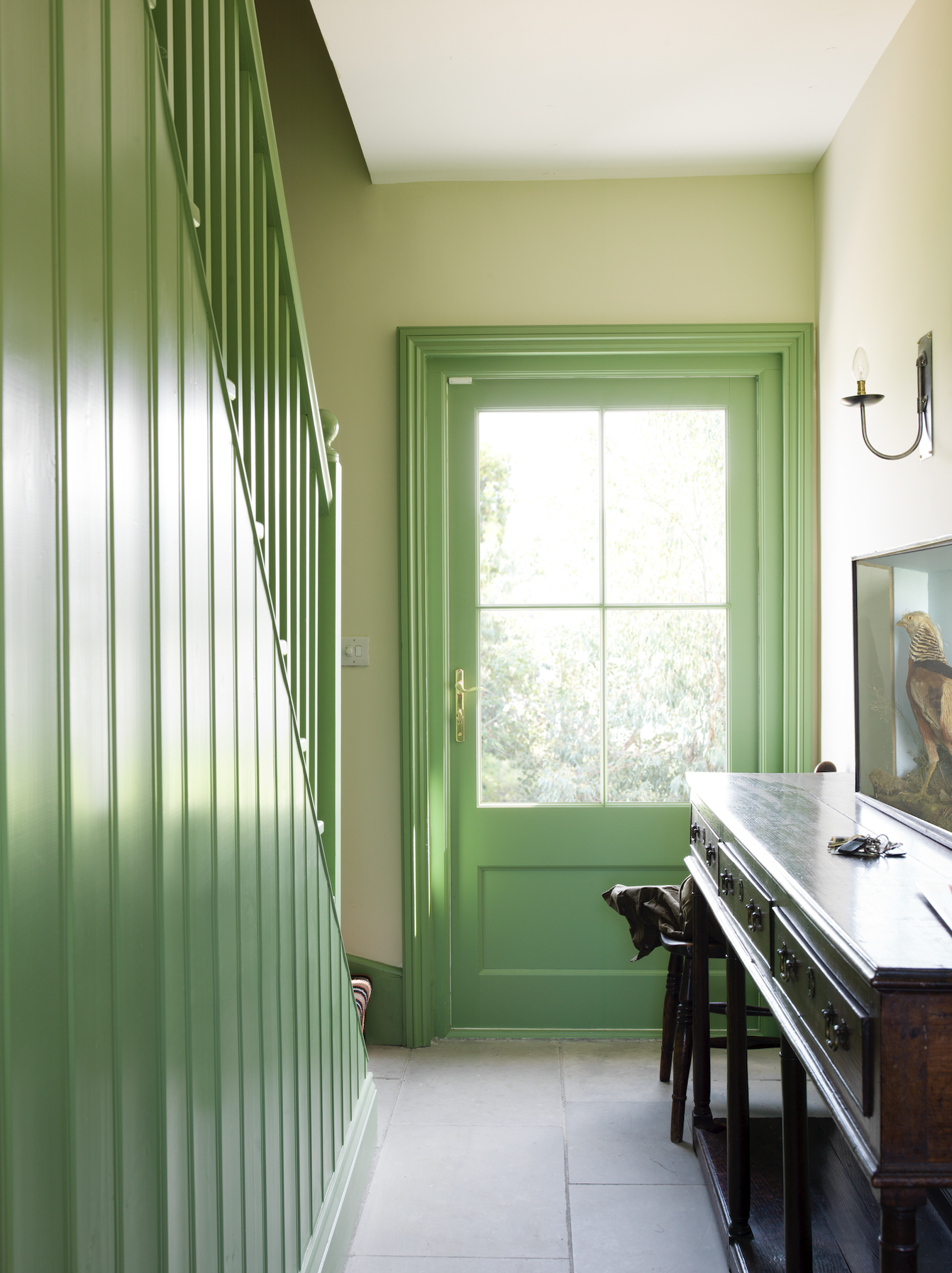
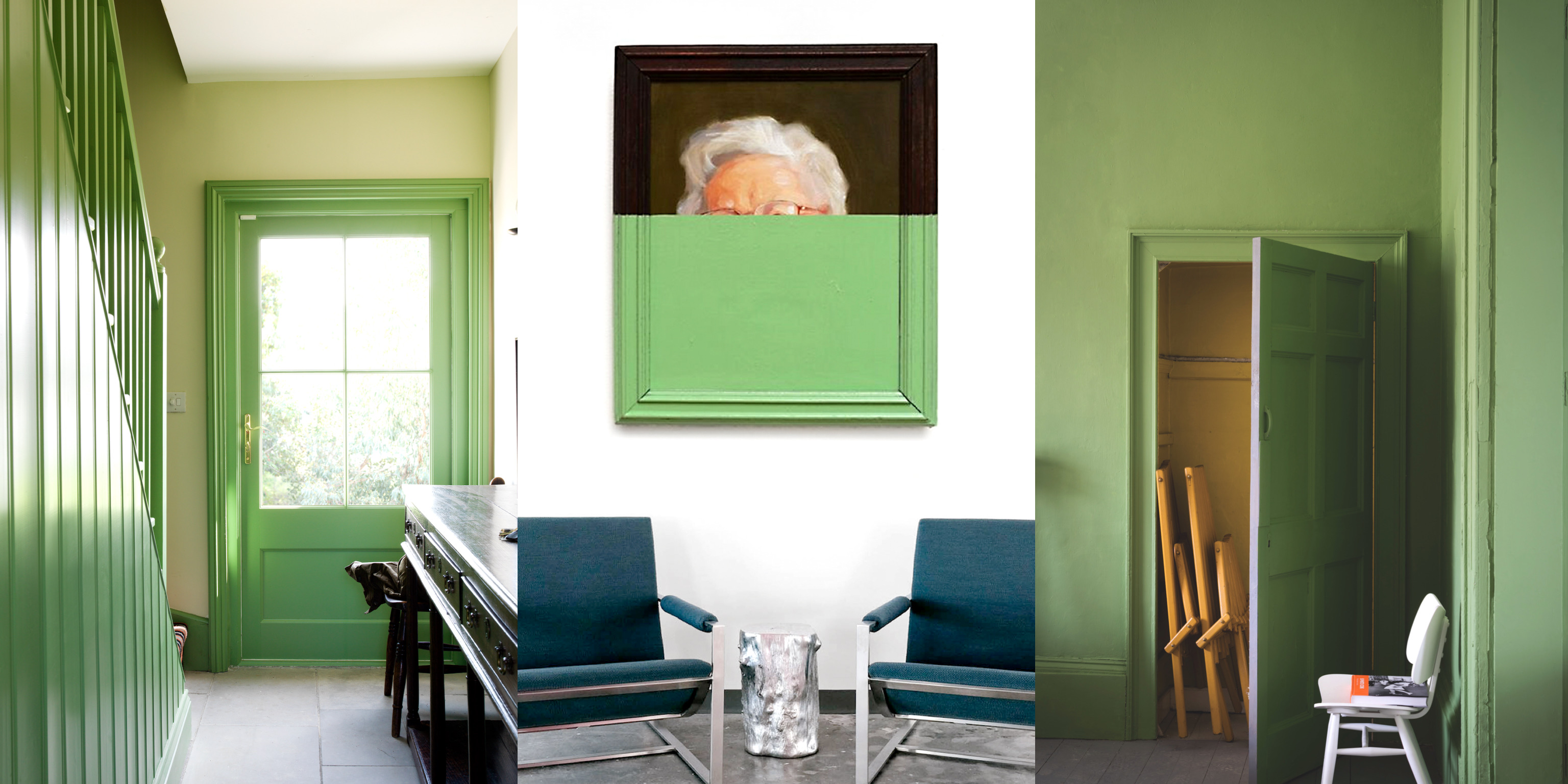
There are several possibilities with this hue. Experts aren’t averse to using this green paint color across walls and ceilings but they do suggest adding a white trim to balance out the brightness of the tone. For a jewel box effect, and for that extra drama, go for a semi-gloss or gloss paint finish. Also, this shade would work great in a woody room for that added warmth and sophistication.
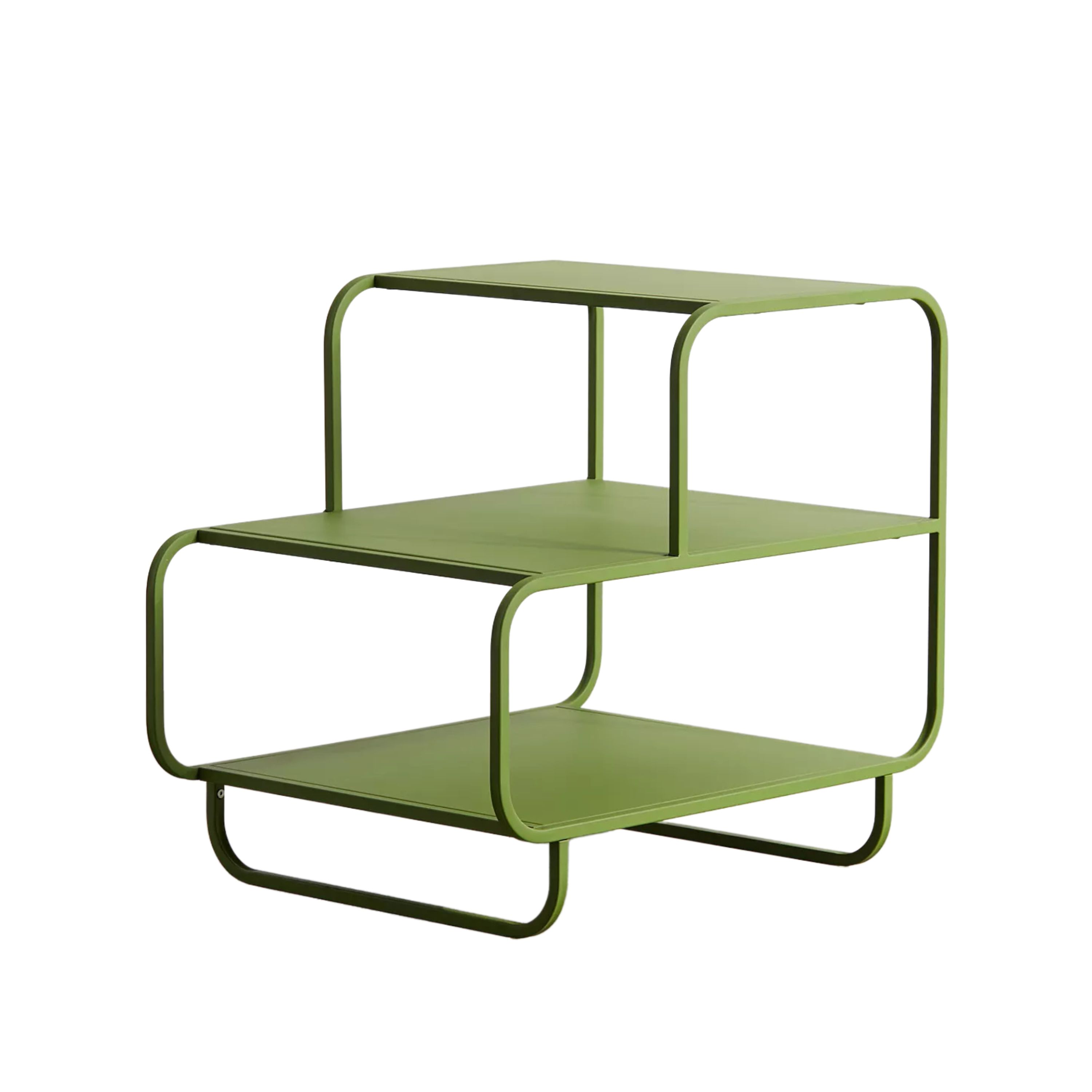
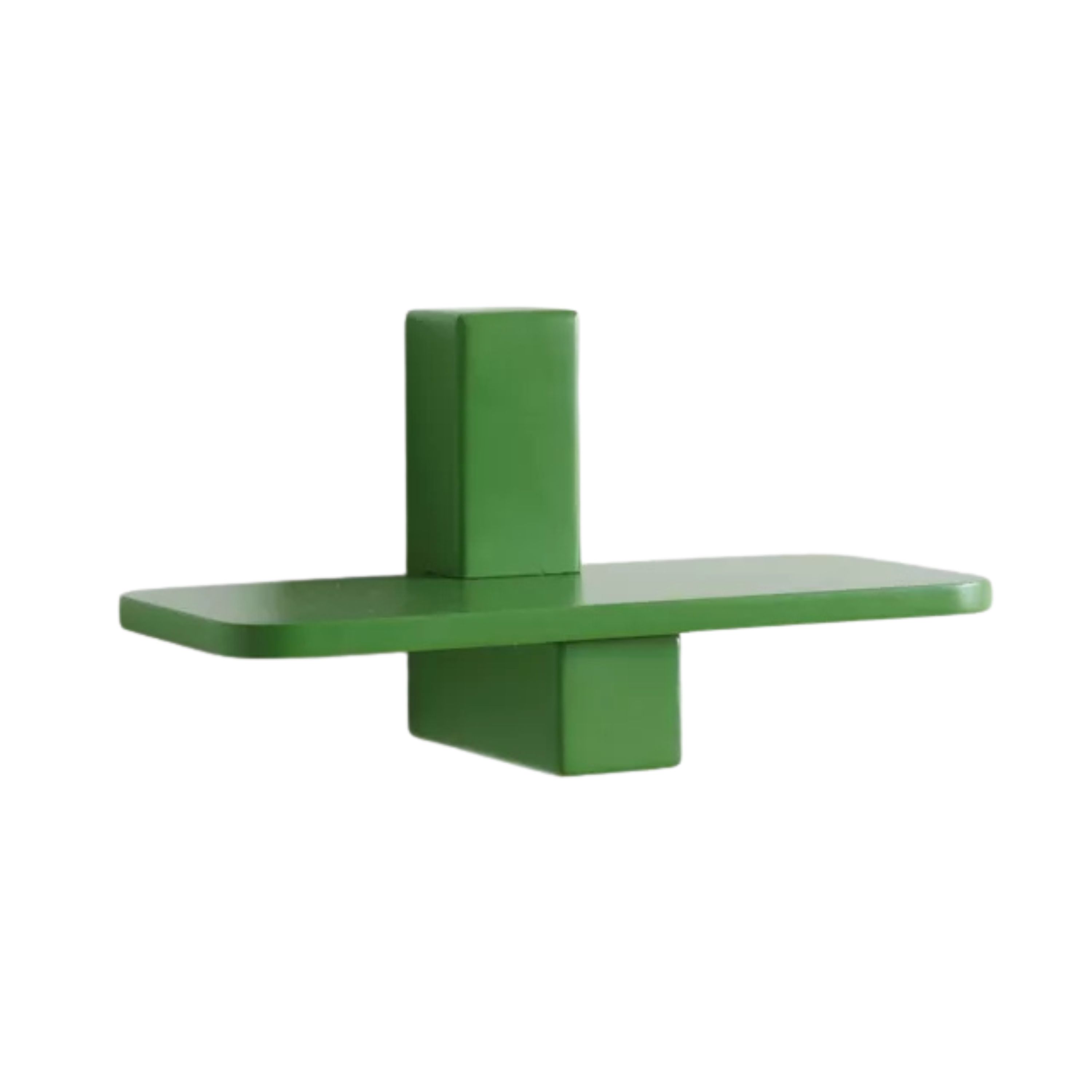
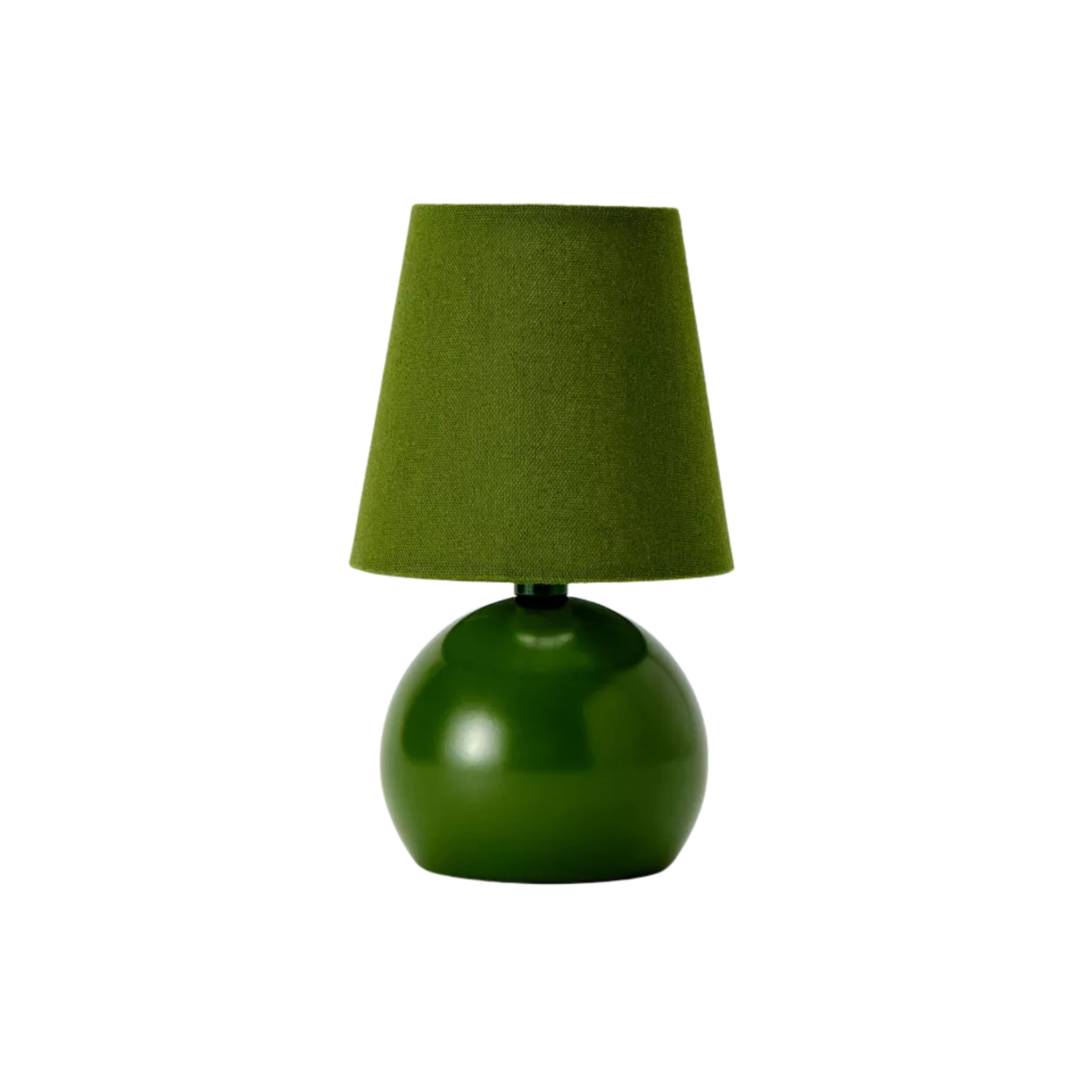
That apart, you can use hyper green as an accent tone to add to any bedroom or green living room ideas; perhaps on an artwork, a throw, a row of pillows, lamps, or even on a resin coffee table designed in this tone.
Hyper Green will translate wonderfully on prints too — think pillow covers or wallpapers. You could also use this tone as a color connector in your home. Adding a bit of Hyper Green to each room creates continuity and flow throughout the home, making it feel considered.
Shop "Hyper Green" Accents
Other greens that have dominated interiors trends

For a decade, many versions of greens have enthralled us. Green, after all, has an enduring appeal in interior design “and it stems from its inherent connection to nature, psychological associations with tranquillity and balance, and remarkable versatility that seamlessly integrates with diverse aesthetic styles and color palettes," explains Cara Woodhouse, of Cara Woodhouse Interiors.
“Olive green became popular during the 1960s and 1970s, often associated with military aesthetics and counterculture,” shares Burcu. “Its earthy tone made it appealing for fashion and home decor, reflecting a desire for natural and muted palettes.” For many years, olive green bedrooms and kitchens were the norm, as the tone added a serenity and warmth to spaces.
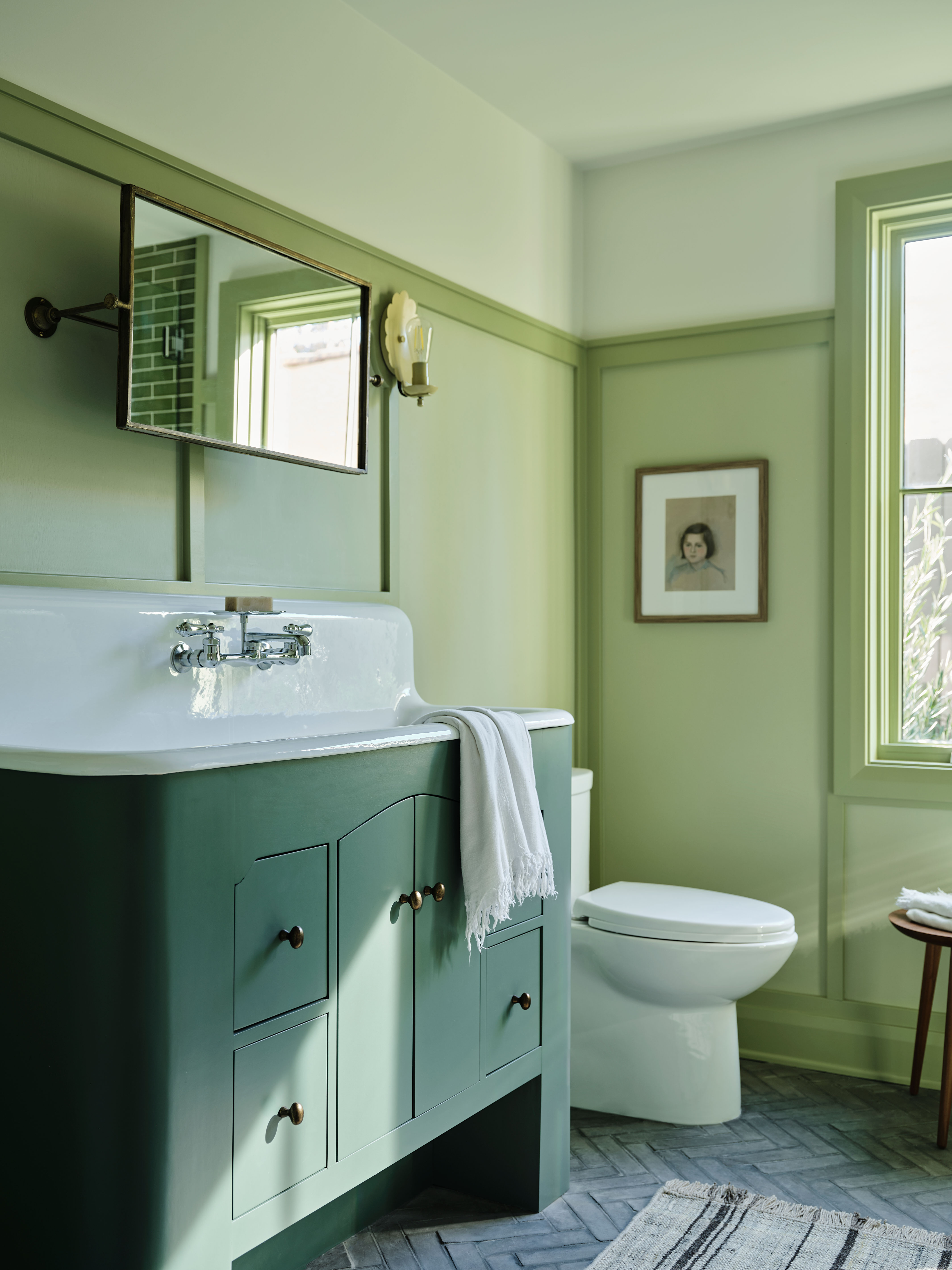
Then came mint green. “In the early 2000s Mint Green’s light, pastel shade became popular, associated with retro and vintage styles,” shares Paula Taylor, head stylist & trend specialist at Graham & Brown. “Its cheerful vibe and freshness made it popular in kitchens and bathrooms, appealing to those looking for a light-hearted touch.
“Sage green saw a resurgence in the 2010s, driven by trends toward wellness and mindfulness,” adds Burcu. “This soft, muted green is often associated with tranquillity and nature, making it a favorite in interior design, especially in spaces aiming for a calm, serene atmosphere.” Around the same time the rich and luxurious, Emerald Green gathered much love too. “Its association with opulence and elegance made it a favorite for statement pieces and sophisticated interiors, often reflecting a desire for boldness and individuality particularly with feature walls,” says Paula.
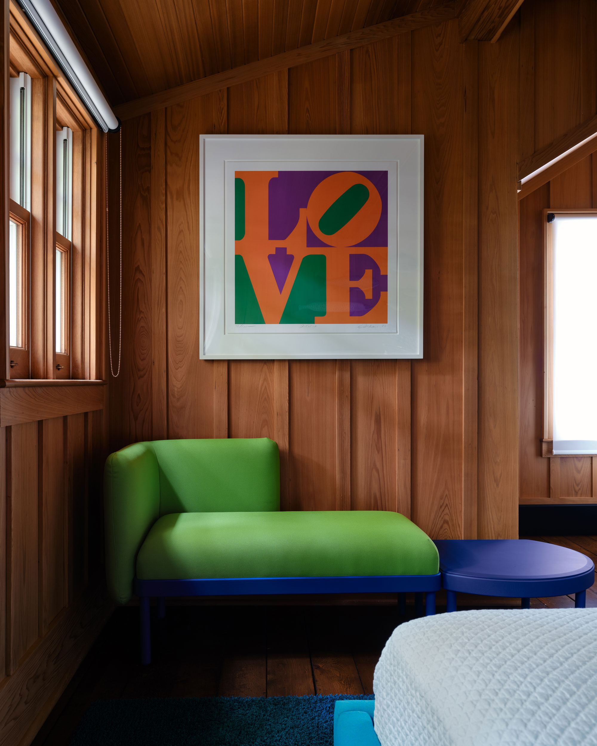
And more recently, “the electric color of Brat Green like Graham & Brown’s Matcha Tea, created by a tech company made a splash in the digital space; although it is a challenging color to use in interiors and is possibly not for everyone. This is a color that has been created to disrupt the senses so may be best to use as an accent. It has a slightly retro 70’s feel about it which brings joy and lifts the spirits.”
And now, it’s the turn for Hyper Green — a smart, bold, and distinct green that’s parading the runway and fashion world, and is trickling into interiors with confidence. So, do you think this green is for you?
Be The First To Know
The Livingetc newsletters are your inside source for what’s shaping interiors now - and what’s next. Discover trend forecasts, smart style ideas, and curated shopping inspiration that brings design to life. Subscribe today and stay ahead of the curve.

Aditi Sharma Maheshwari started her career at The Address (The Times of India), a tabloid on interiors and art. She wrote profiles of Indian artists, designers, and architects, and covered inspiring houses and commercial properties. After four years, she moved to ELLE DECOR as a senior features writer, where she contributed to the magazine and website, and also worked alongside the events team on India Design ID — the brand’s 10-day, annual design show. She wrote across topics: from designer interviews, and house tours, to new product launches, shopping pages, and reviews. After three years, she was hired as the senior editor at Houzz. The website content focused on practical advice on decorating the home and making design feel more approachable. She created fresh series on budget buys, design hacks, and DIYs, all backed with expert advice. Equipped with sizable knowledge of the industry and with a good network, she moved to Architectural Digest (Conde Nast) as the digital editor. The publication's focus was on high-end design, and her content highlighted A-listers, starchitects, and high-concept products, all customized for an audience that loves and invests in luxury. After a two-year stint, she moved to the UK and was hired at Livingetc as a design editor. She now freelances for a variety of interiors publications.
-
 Burl Wood Decor Is 2025’s Most Coveted Comeback — Here’s How to Get the Storied Swirls for Less
Irregularity is the ultimate luxury, but you don’t need an antiques dealer to find it
By Julia Demer Published
-
 5 Garden Features That Instantly Add Value to Your Home — While Making Your Outdoor Space More Practical, too
Get to know all the expert tips and tricks for making your backyard a standout selling point for your home.
By Maya Glantz Published
-
 The Combination You Weren't Expecting to Love — 8 Blue And Orange Living Room Ideas That Feel Surprisingly Elevated
A blue and orange scheme for living rooms may sound jarring, but these spaces prove they're striking, vibrant, and certainly unforgettable
By Camille Dubuis-Welch Published
-
 Smeg Says Teal, and We’re Listening — The Kitchen Shade of the Year Is Here
Designers are already using the soft, sea-glass green everywhere from cabinetry to countertops
By Julia Demer Published
-
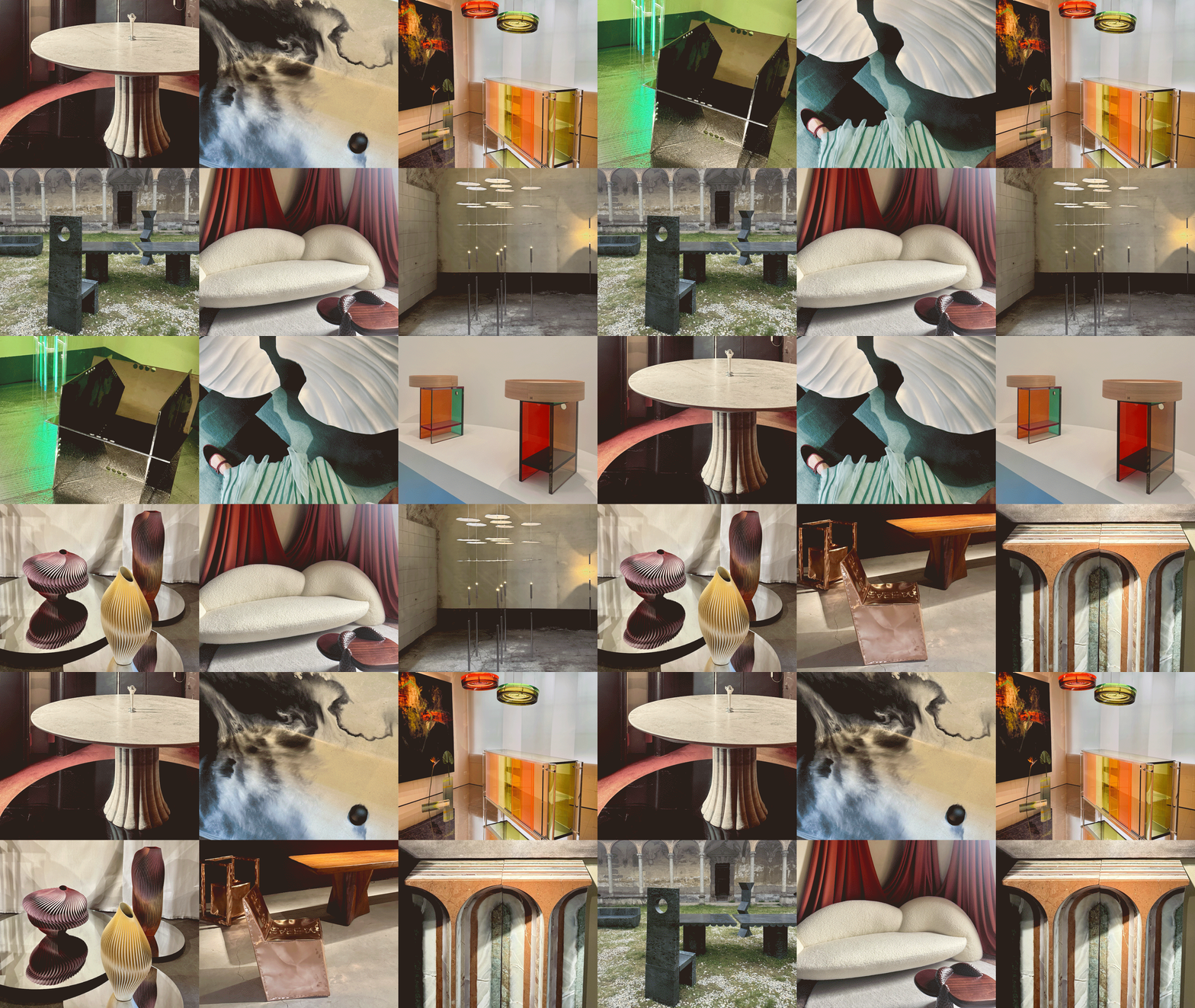 Straight from Salone: 5 Emerging Trends I Found in Milan That'll Shape Interiors for the Year Ahead
From reflective silver to fluidity, here's my perspective on the key themes and new moods coming through from Milan Design Week
By Sarah Spiteri Published
-
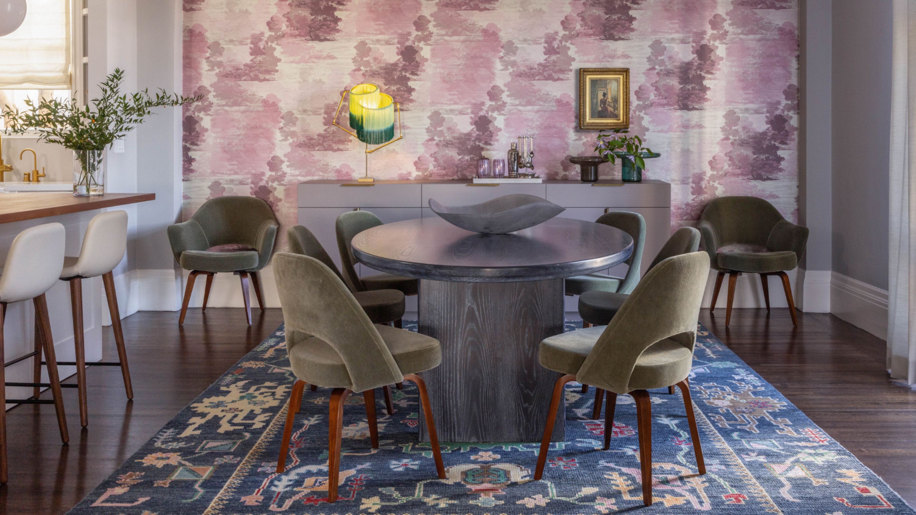 Do Yellow and Purple Go Together? Designers Reveal How to Make This Unexpected Pairing Feel "Totally Intentional"
In an era where unexpected combinations have become cool, we've done a deep-dive to discover how to pair yellow and purple in a space
By Camille Dubuis-Welch Published
-
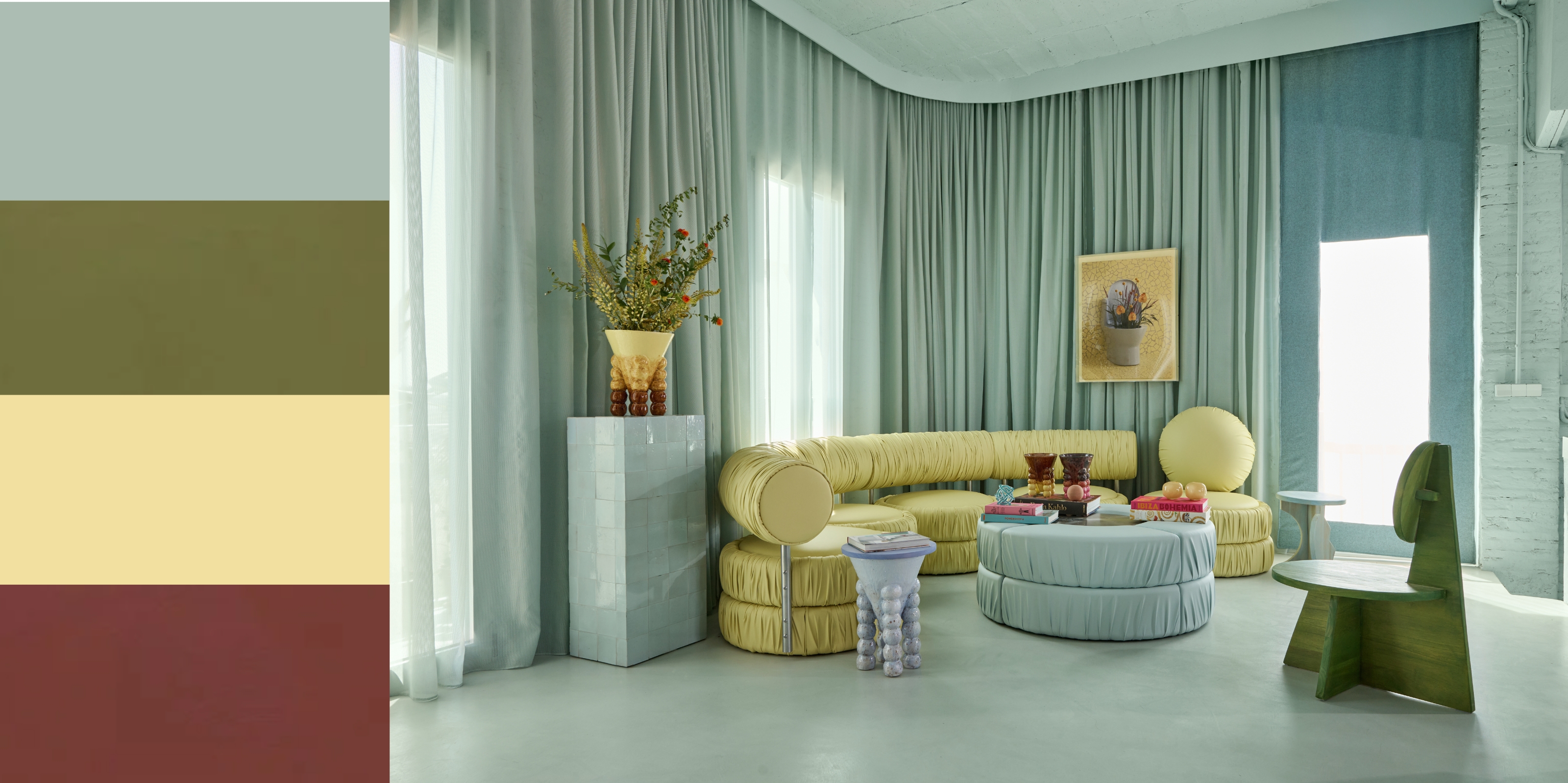 5 Unexpected but Seriously Stylish Spring Color Palettes to Shake Up the Season — "It's Pastel, but Punchy"
Spring color palettes are notorious for their use of pretty pastels, but that doesn't mean they have to lack variation
By Olivia Wolfe Published
-
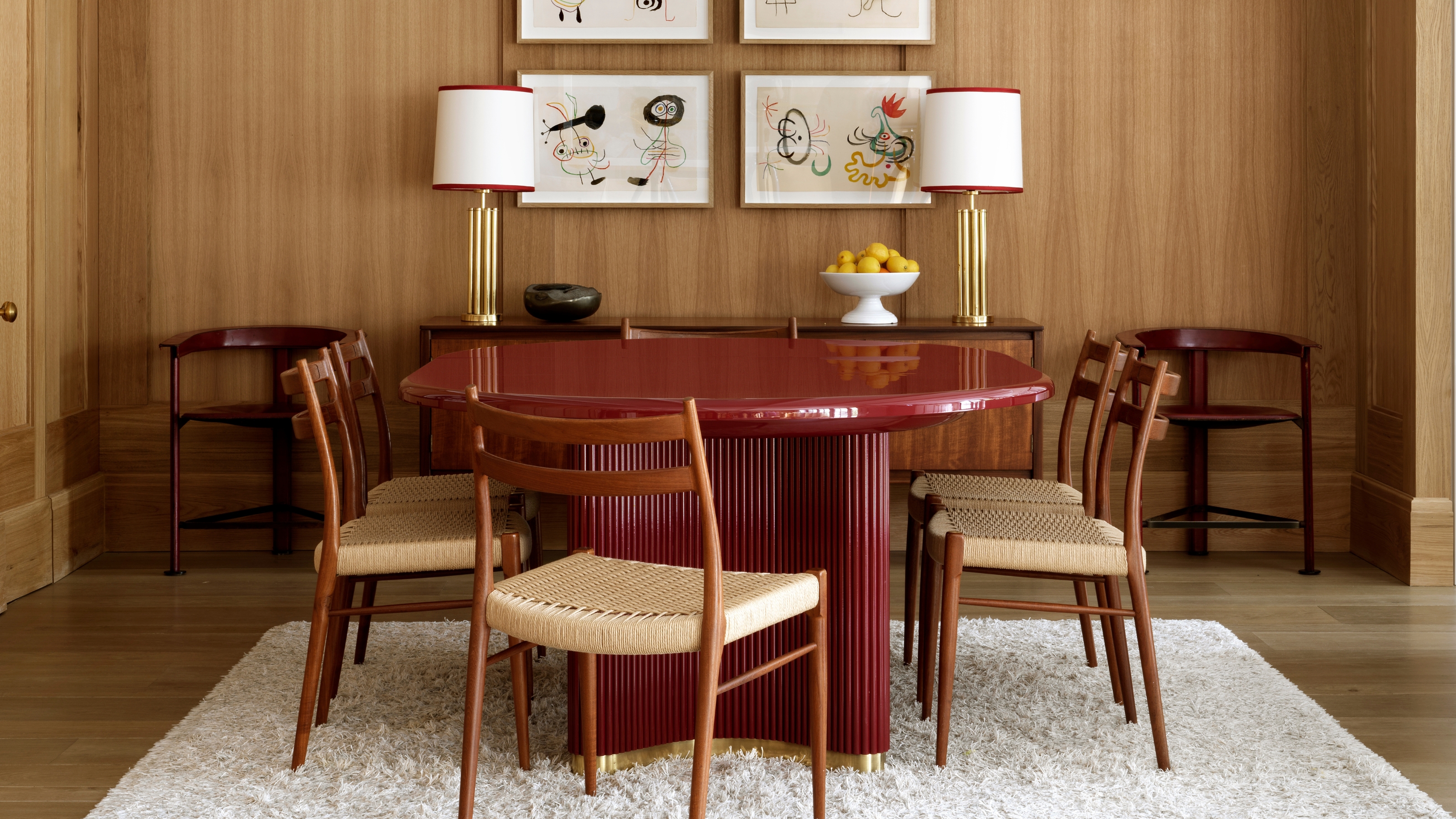 The 'Red Table Trick' Is the Easiest and Most Expensive-Looking Trend to Hit 2025 So Far
A red dining table makes a seriously stylish statement; the beloved pop of red trend just got an bold and expensive-looking upgrade
By Olivia Wolfe Published
-
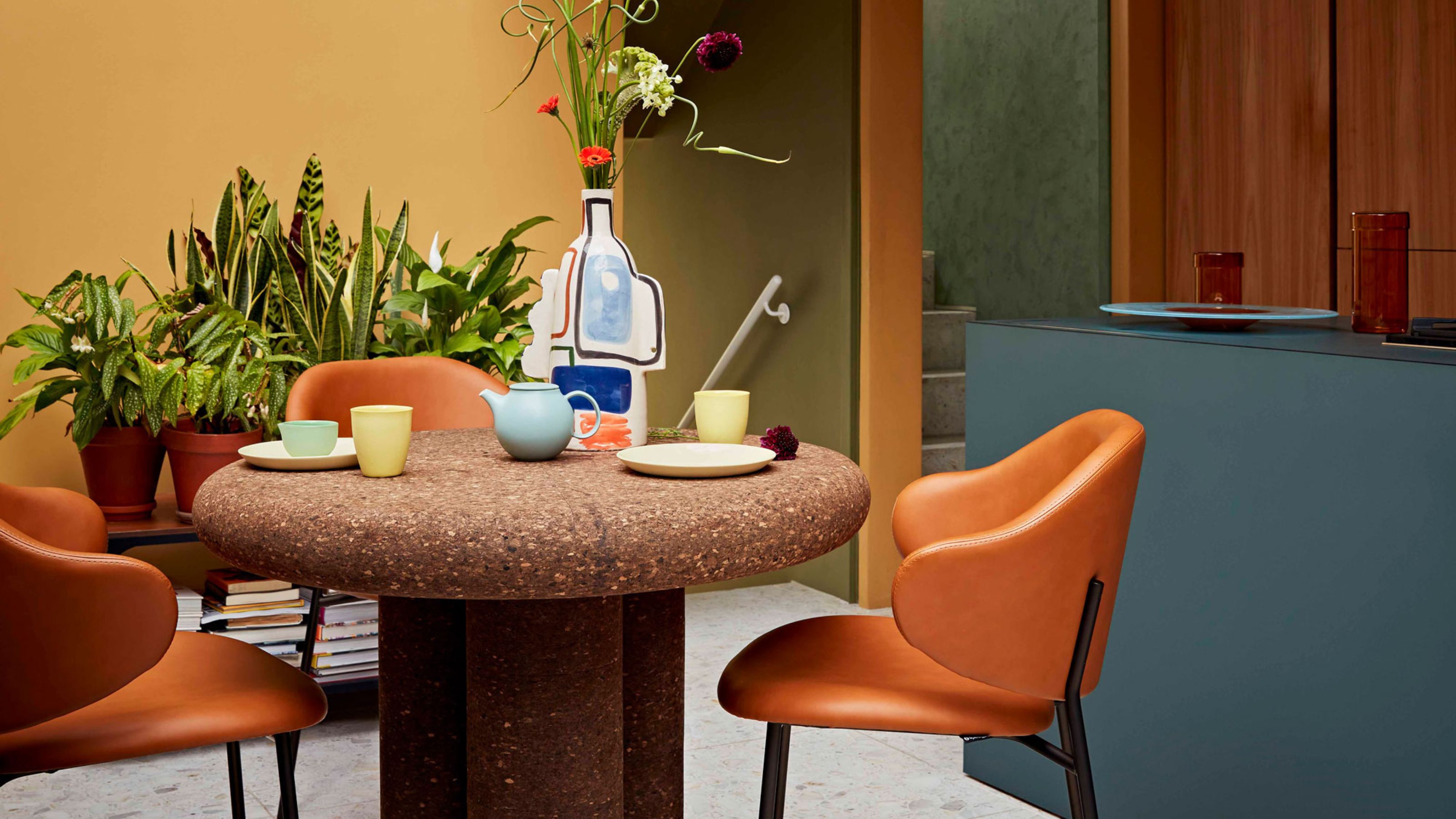 Cork Is the Cool, Sustainable, and Surprisingly Chic Material We Can't Stop Furnishing With Right Now
In honor of Earth Month, we’re toasting to cork... furniture, that is
By Julia Demer Published
-
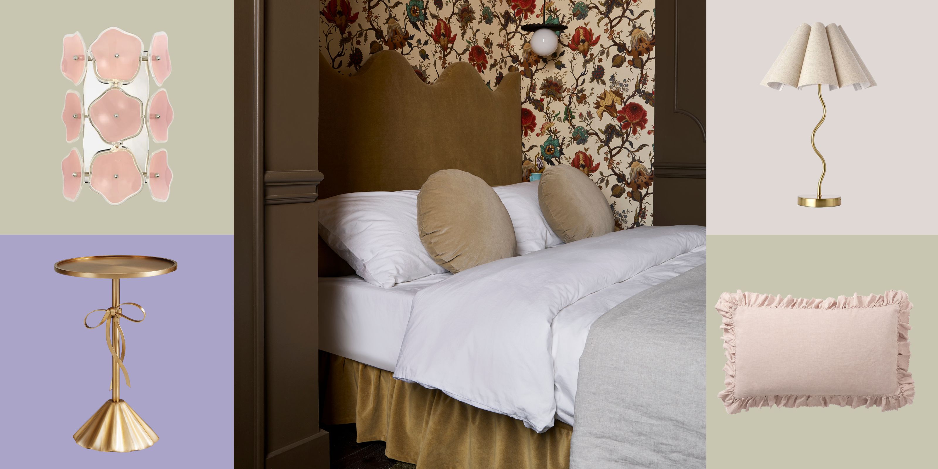 The Coquette Aesthetic Is Still Going Strong in Homes in 2025 — But Now It's Charming, Whimsical, and Has Modern Flair
A designer weighs in on how you can make the classic coquette trend feel modern while still retaining its whimsical elegance
By Devin Toolen Published


