Hallway paint ideas – 15 ways to give this narrow room big personality
Try these hallway paint ideas to transform this oft-ignored space and set the tone for your home

Aditi Sharma
With our hallway paint ideas, you'll learn to love this small, narrow, and ignored space, a little more. This important room that connects living spaces to sleeping spaces, the exteriors to interiors, or the homes to the terraces isn't always given as much importance design-wise as it deserves. This transitional space can be an experience to walk through with the right paint and decor ideas.
'First impressions are everything, which is why your entryway is your opportunity to go all out,' says Annie Sloan, color and paint expert at Annie Sloan. 'Build a space that delights you every single time you return home and impresses those lucky enough to get a glimpse at its hallowed halls. Given that the space is small, this is your opportunity to go bold and be holistic,' she says.
Thanks to our experts, we have plenty of hallway ideas to inspire you. Browse through our selection of fun ways to liven up this space.
15 hallway ideas to lift this secluded space
Colorful rugs, picture galleries, and artworks aside, you can use the magic of paints to brighten up this space. A paint job, after all, isn't necessarily just coloring the walls a single color and calling it a day.
From color drenching, color blocking, painting skirting to boarding, and even murals, there are several great techniques to lift a narrow hallway.
1. Experiment with a two-tone effect
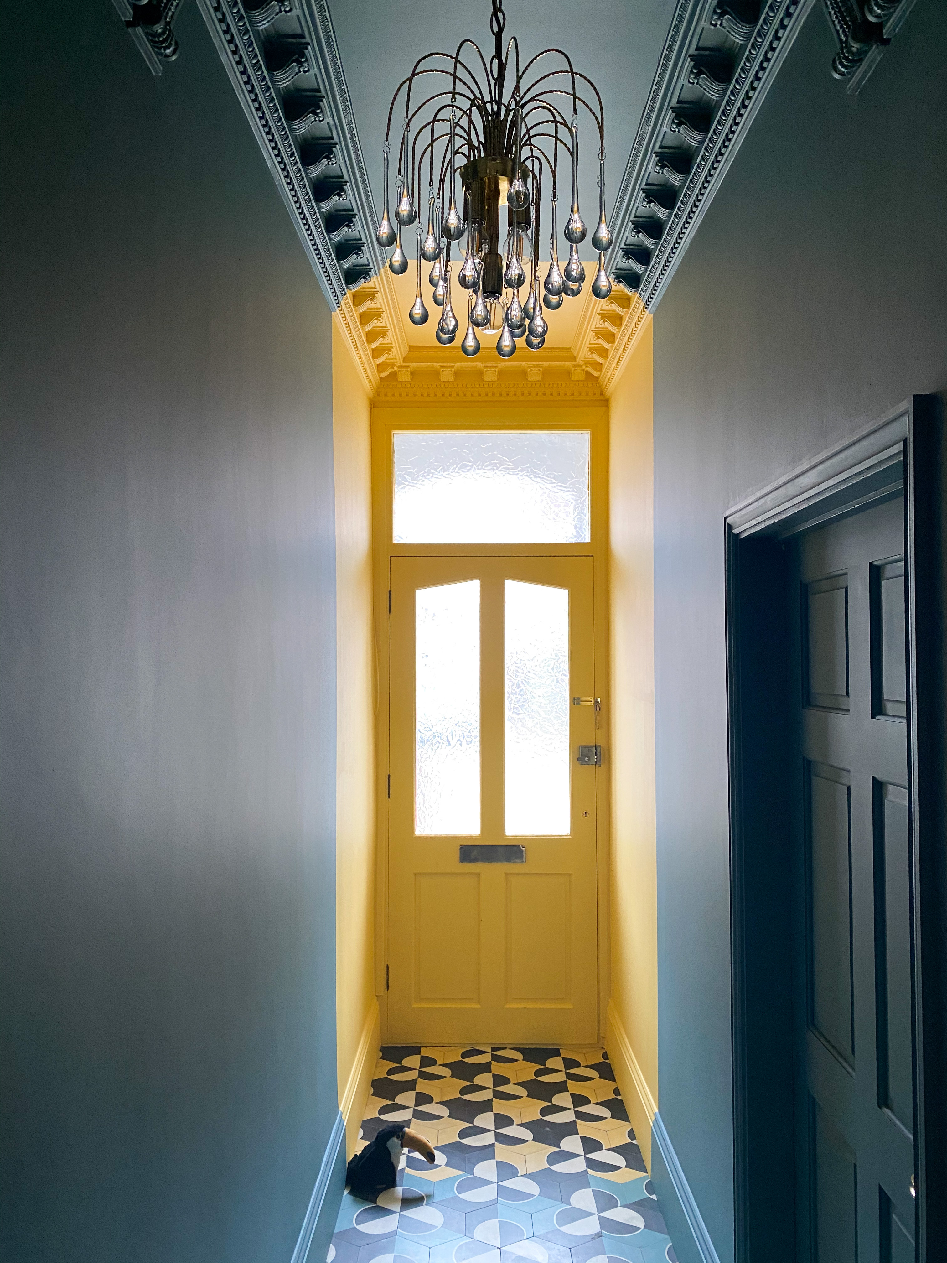
Bold colors are a great way of expressing yourself, and there's no better place to do that than in the passageway. This space presents you with a wonderful opportunity to be as experimental as possible. That's because it doesn't share space with any other room, and is stand alone with its own personality and purpose.
By using color blocking, as in this image, you can create a wonderful moment as passers-by walk through the space and admire the dalliance of colors. Yes, while here the blocking is only a hint, the effect is quite significant. The door and walls are painted with Golden Square No.131, and Burlington Arcade No.216 on the walls, all available on Mylands.
While hallway wallpapers can do the same job of injecting color, there's nothing richer than paints that are textural and more luscious to look at.
2. Paint a mural for a bold look
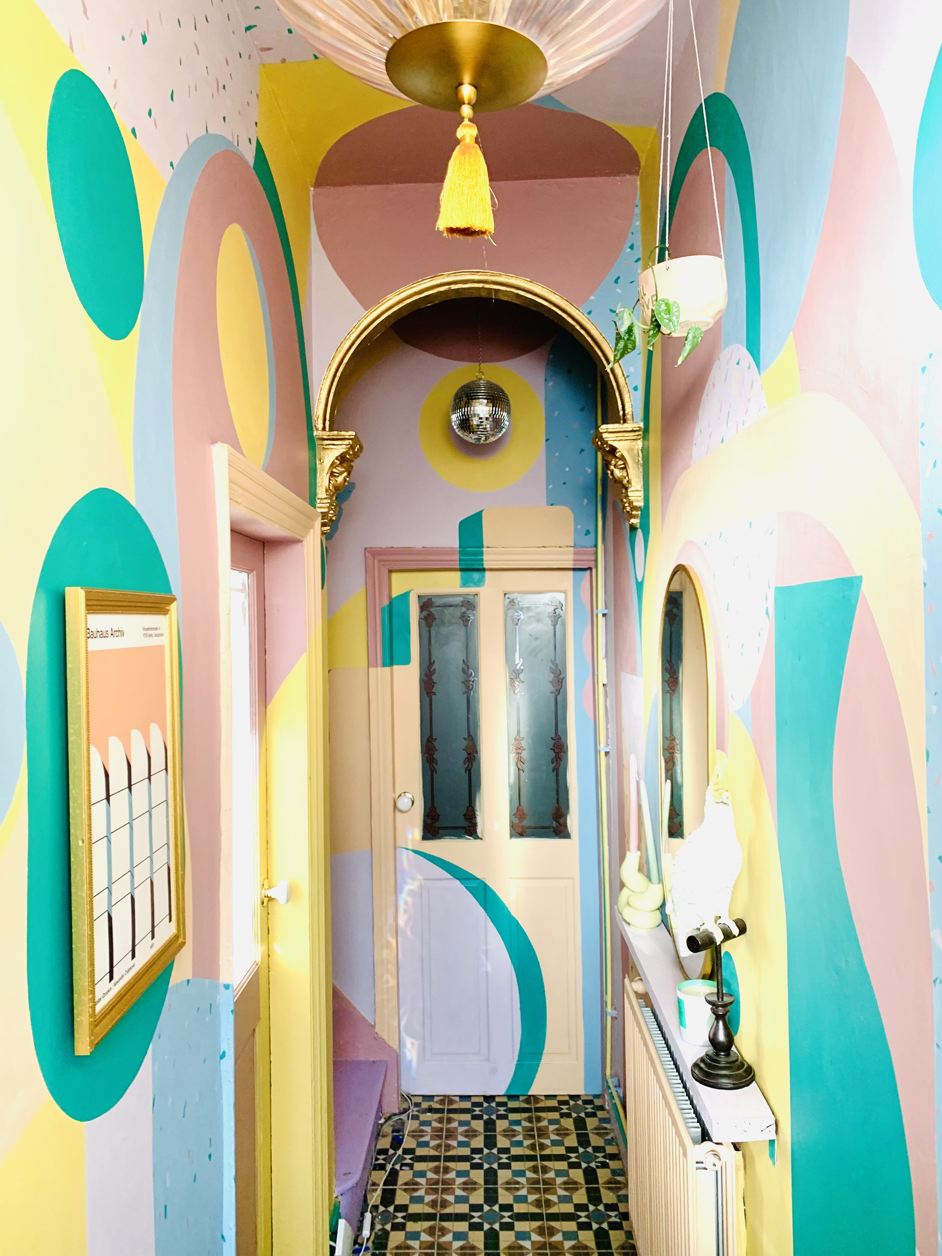
When it comes to design, a mural is a wonderful, decorative way to personalize a space. Hand-painted, customized ones offer something unique and one-of-a-kind.
The other advantage of using dark, bright, or bold colors and creating a color paradise is that the experiment masks the look of the passageway, especially if it isn't architecturally beautiful. In most homes, these areas are humble, narrow spaces that are usually not included in the overall design scheme of the home.
But think of passageways as another opportunity to give your home a big personality. Go all out, like in this space by HouseHomo. If you aren't a pro painter, engage the services of a professional and ask them to paint you a landscape that will not be forgotten by anyone.
3. Color drench the hallway
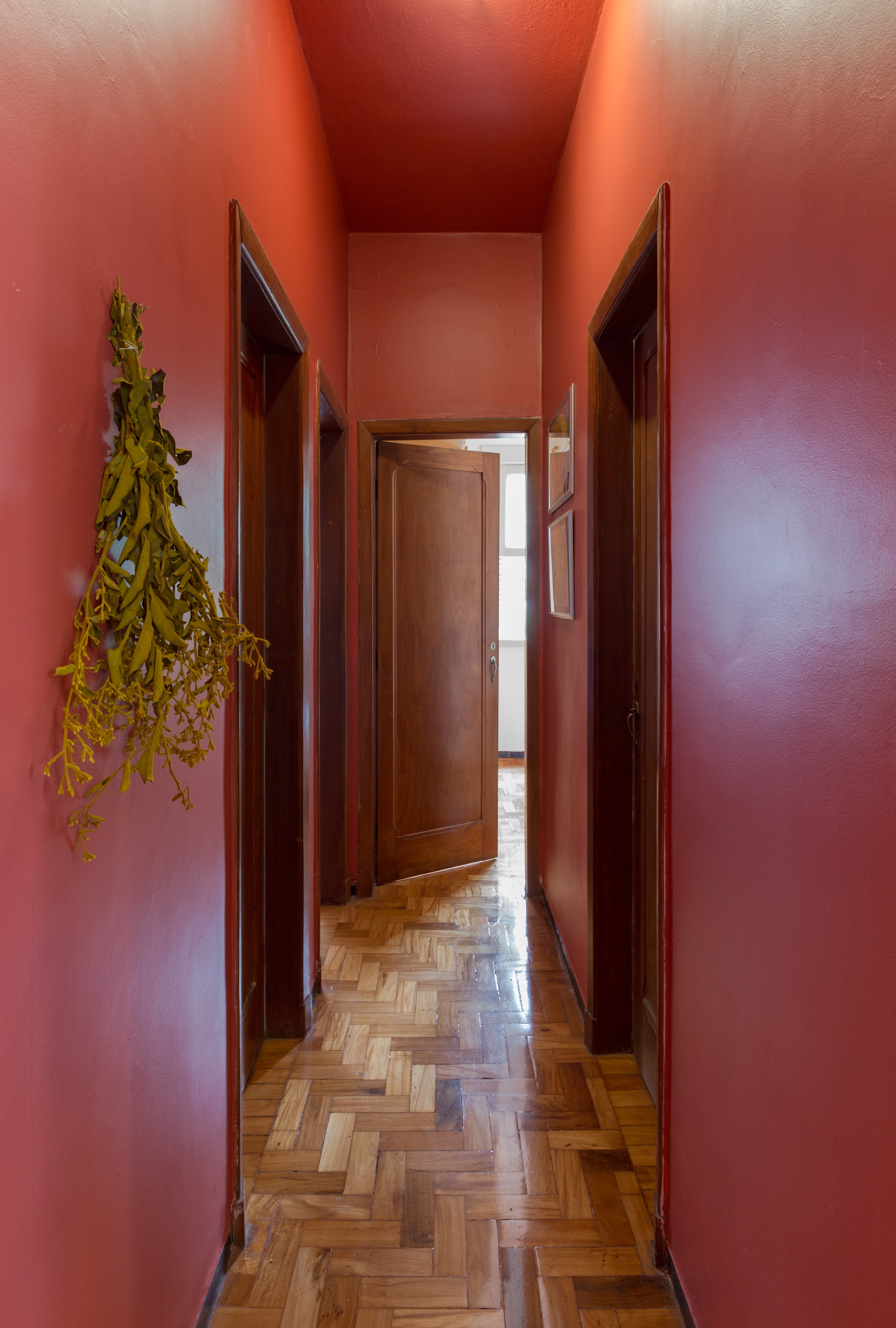
Color makes the eyes travel and it's a magical thread that tugs on your feelings, opinions, and thoughts. Color can even encourage you into action. If you need to emphasize a particular element, space, or zone, there is no better way to do that than with color.
By color drenching, you can make a fearless statement. Deeper tones can create a feeling of depth as if the space is endless. These can even create a fascinating, tunnel effect as if passing through a whimsical land.
Be sure to add appropriate hallway lighting. Could you even consider semi-gloss or full gloss paint so that it bounces the light around in the room, brightening up the space?
'I’d paint everything,' says Annie. 'This will build excitement for the rest of your home and is so much more easily done in a hallway space than in, say, a kitchen.'
4. Consider a painted staircase
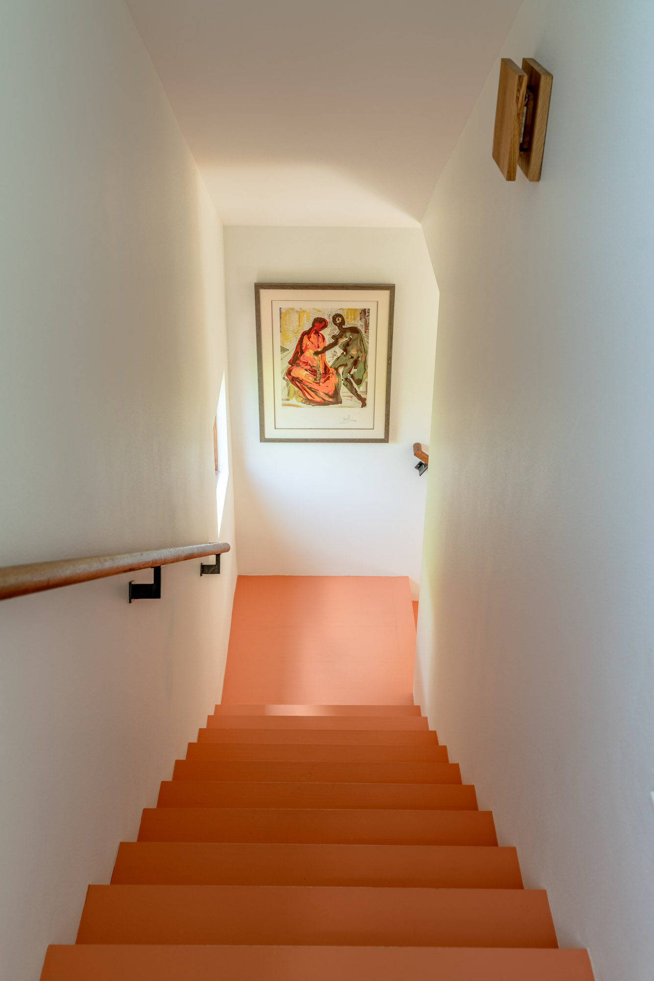
While painting walls and ceilings is common, consider your stairs too as the ideal canvas for creativity. If you have wooden stairs, it's easy to give them a fun lick of paint, that will not only change their look but even transform the small hallway it is situated in.
If you aren't keen to paint the entire staircase one tone, consider painting for just the stair runners that can add a decorative touch. These create the illusion of a runner or a carpet but are a lot more casual. For a lovely monochrome look, paint the risers white and the treads black.
5. Add a light tone to the arches
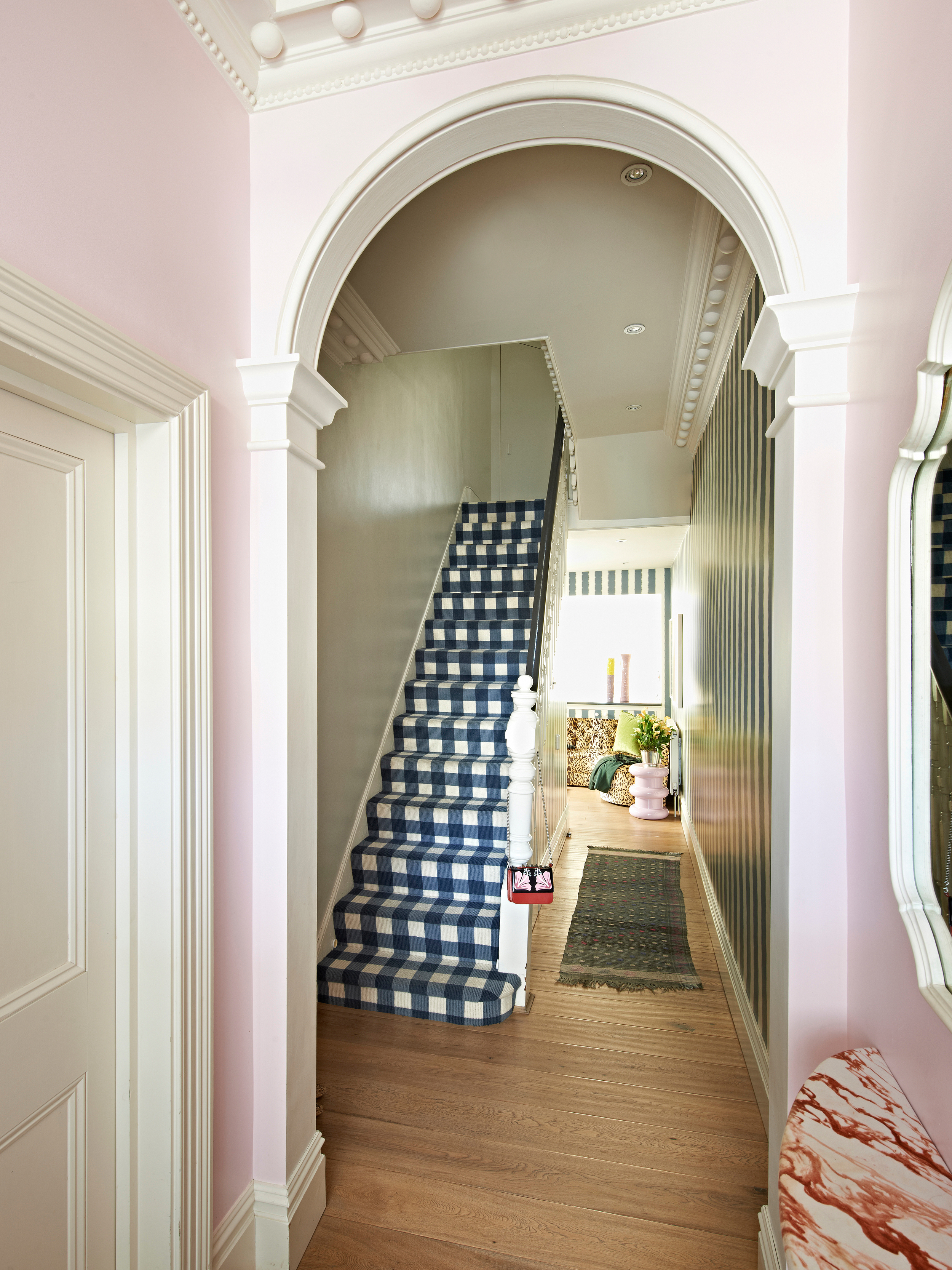
Very few homes have great architectural bones but if you are lucky enough to have them, highlight them with paint. If your apartment entryway has a lovely archway leading into a hall, create a dramatic entry point with color. This will also set the tone of what people may find inside the home, and establish your design style and tastes.
Lighter paint colors can add a dainty touch to the narrow area and make an impact without being overbearing.
'With narrow hallways, it is all about perspective,' says John Ashton at Albany. 'Lighter colours will reflect light around the space to make it feel bigger and brighter and can be livened up with prints and artwork to add personality and break up the expanse of the wall.'
6. Don’t overlook the ceiling and trim
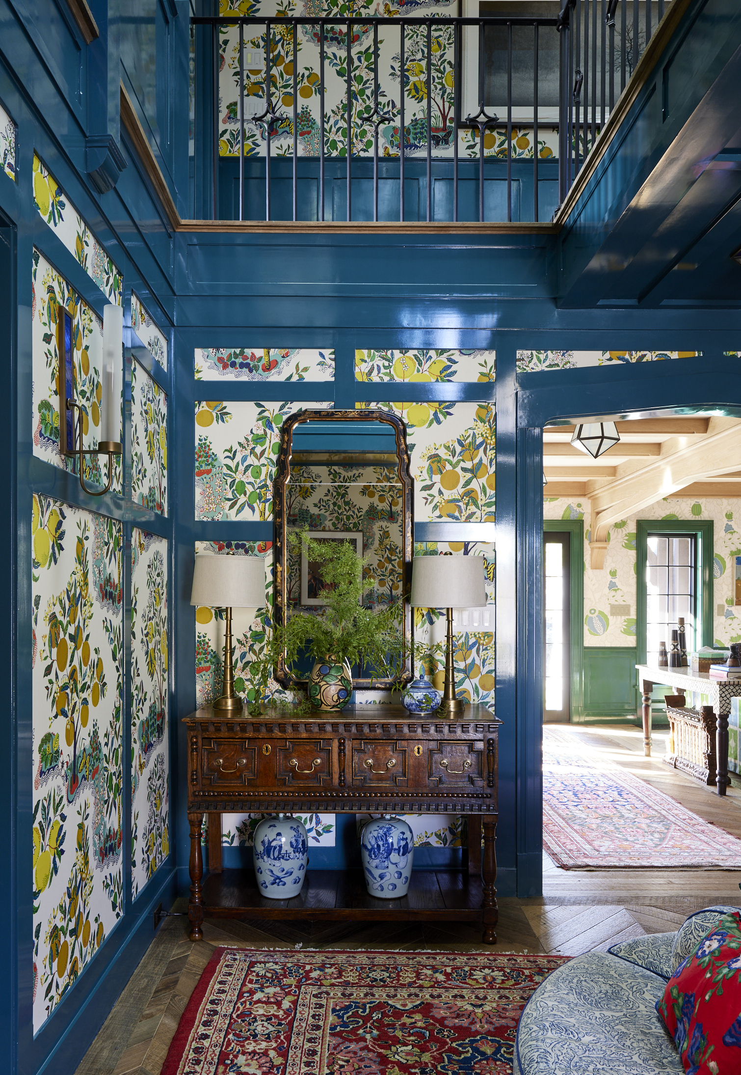
Design by Kati Curtis
There are so many interesting ways to incorporate paint outside of the walls, an we recommend experimenting with eco paint to make some sustainable choices here. Whether it’s a pop of color on the ceiling in a lacquer finish or painted molding that coordinates with the adjacent wallpaper.
‘For paneling and trim, I like Benjamin Moore Swiss Coffee in a semi-gloss finish,’ says Andrea Schumacher. ‘The walls would look nice in the same color, but in a flat finish.’
According to designer Betsy Wentz, contrast is a great way to create excitement. ‘If a client wanted a hall with gallery-style artworks and a white backdrop, I might suggest lacquering the ceiling in a bright shade like citron,’ she explains.
7. Choose a color that reflects your personality
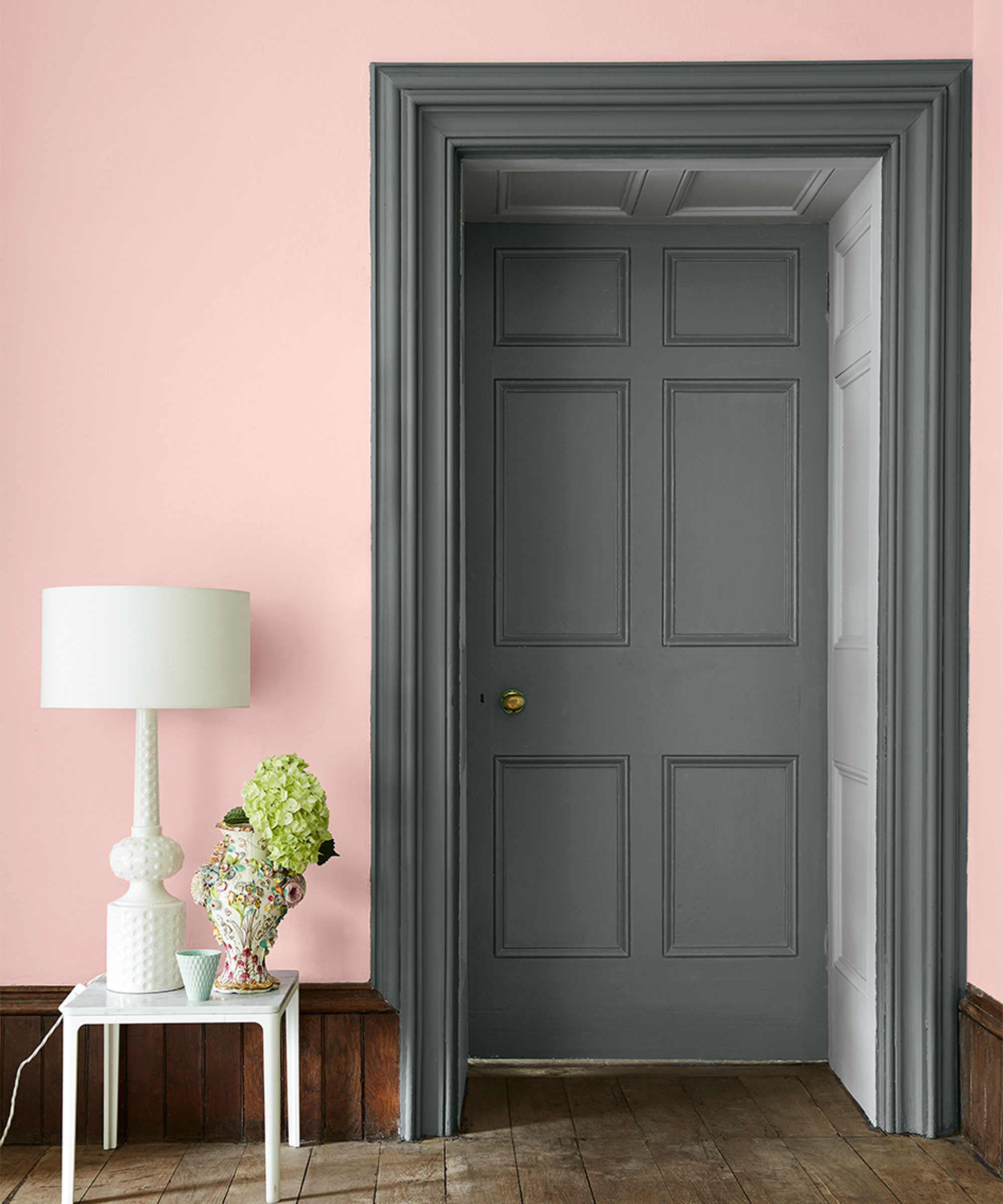
‘There are so many gorgeous paint colors to choose from, but whatever the shade, it should make sense in your home. Colors are very personal, so what’s right for one person may not be right for you,’ says interior designer Andrea Schumacher.
'My advice would be to look through your house and find something that speaks to you, like a vase, a favorite fabric, or a piece of artwork, and pull a color out of that,' she adds.
Interestingly, you can also choose a color based on the mood you want to create, and the way you want the color to make the dwellers look. When we spoke to experts on color psychology, they revealed that pink can make your skin look brighter whereas green can sometimes make a person look sallow.
Similarly, red can create emotions of prestige while teal can evoke optimism. Based on your personality, choose colors that can create a specific vibe in the home.
8. Use color to draw the eyes to the end of the room
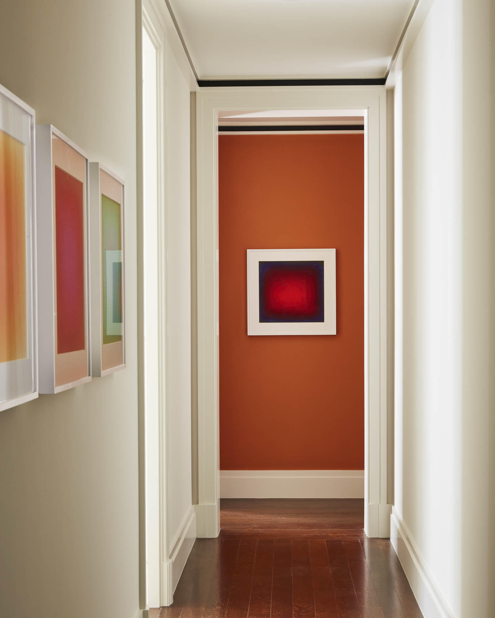
Design by Kevin Isbell
Designer Kevin Isbell loves experimenting with fun colors and hallway paint ideas, but he’s also thoughtful about using paint for specific purposes. For a recent project with a long, narrow hallway, the designer painted the wall at the end of the hall in Benjamin Moore’s Buttered Yam, a bold orange. Interestingly, there are several colors that go with orange and a wonderful pairing can be created with these shades.
'It draws the eye to the end of the hall immediately and helps mitigate the length,' says Kevin. 'You want to keep the eye moving forward in a space like this, so it’s important to create a strong focal point at the end.'
'If you are working with a long narrow space, like a hallway, you can use a darker colour at the end to draw the eye through the space and make the area feel more spacious,' says Helen Shaw, UK Director at Benjamin Moore. 'As well as using colour to create the impression of a larger space, your hallway connects to each room so the colour chosen should feel harmonious with the rest of the house.'
9. Try calming green for a restful scheme
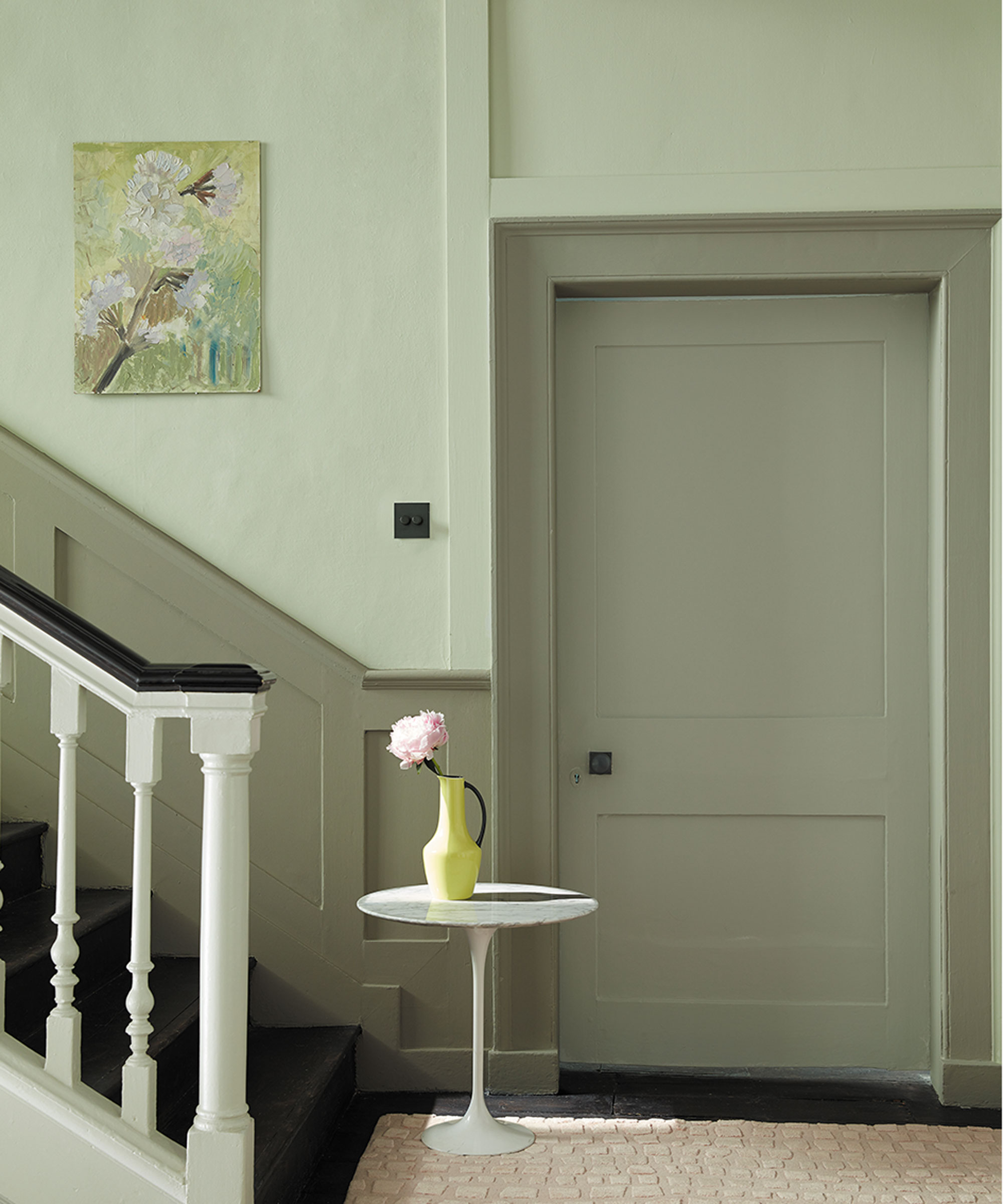
Create a harmonious look by choosing the best green paints that compete equally and don’t outshine each other. If using more than one shade and space is tight, keep the lighter color toward the ceiling to create a feeling of spaciousness.
Kevin Isbell recommends choosing shades from the same family of colors. ‘Basically, the colors should be distant cousins,’ says Kevin. 'The wall color should be kept close to the trim color but unique enough that there’s a distinction between the two shades. If you have a bigger room to work with, then a pop of bright color overhead will certainly make a difference to the hallway.'
10. Blur the boundaries with darker paint colors
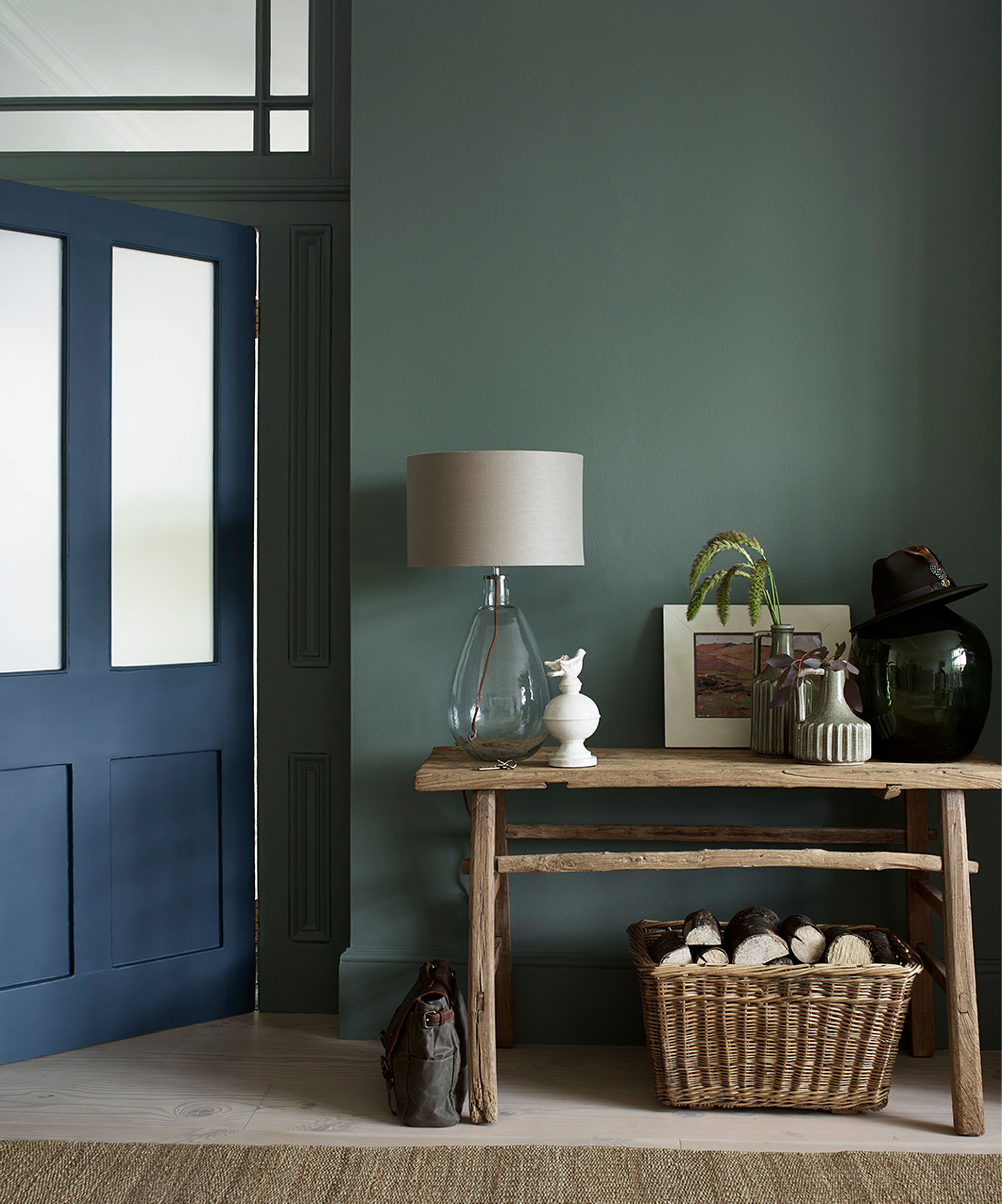
While it might be tempting to paint a small hallway with the best white paints to make it feel bigger, darker colors can have the same effect too. Painting a hallway in the same dusky tones throughout can soften the edges of the space and help blur the boundaries.
Melissa Warner Rothblum of the firm Massucco Warner suggests painting the walls, molding, and ceiling the same shade. ‘When the eye doesn’t sense any choppiness, it makes a space appear larger.’
11. Lend depth to a scheme with darker tones
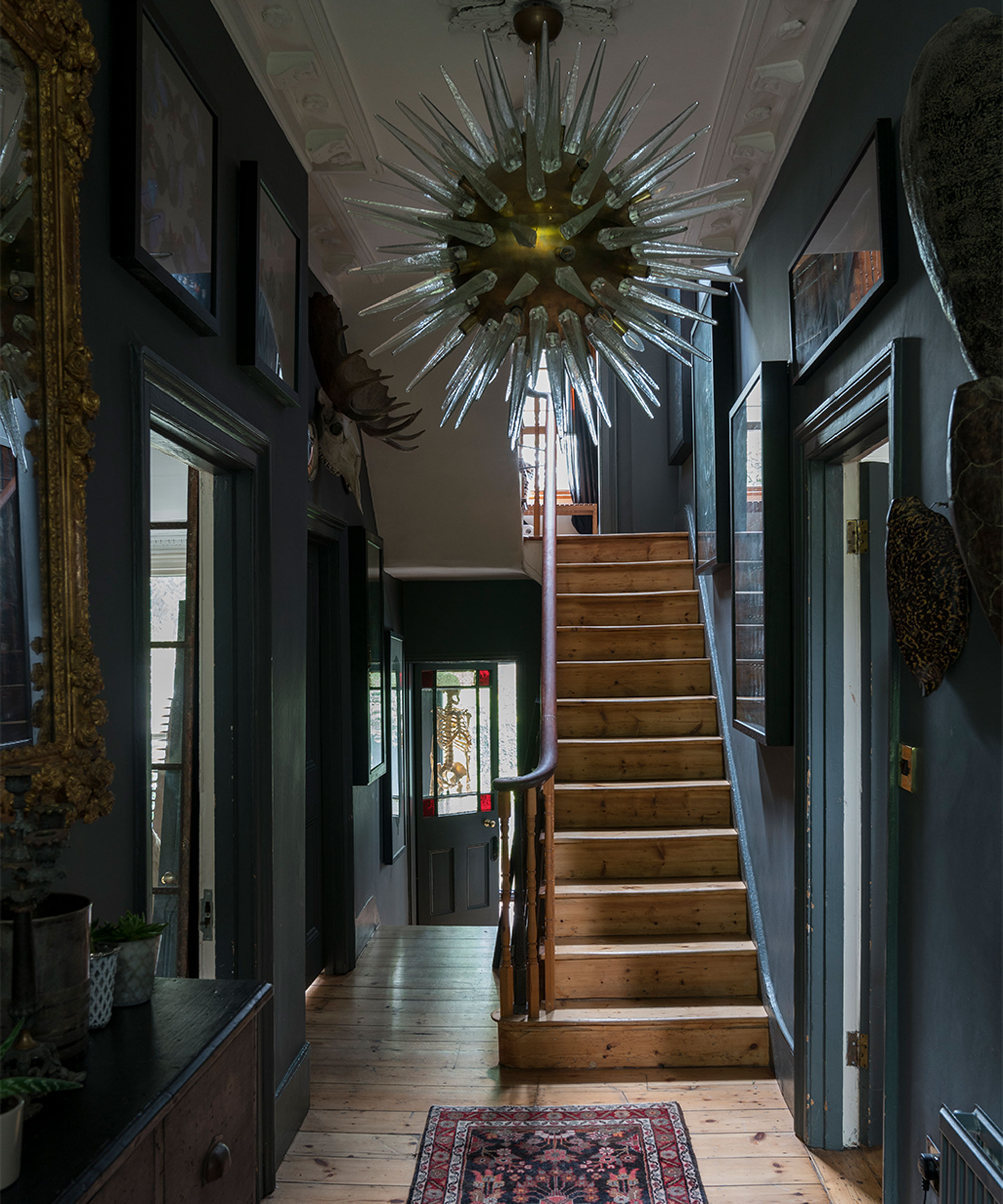
Many designers agree that it’s okay to either go light and bright or dark and moody. ‘It’s counterintuitive, but dark colors lend depth and make a space feel more expansive,’ explains interior designer Kati Curtis.
Painting ceilings, walls, trims and doors all the same shade will give the space an even color palette so you can choose which elements you want to stand out, such as a hallway mirror, artwork or a statement light pendant.
12. Lighten up with soothing paint colors
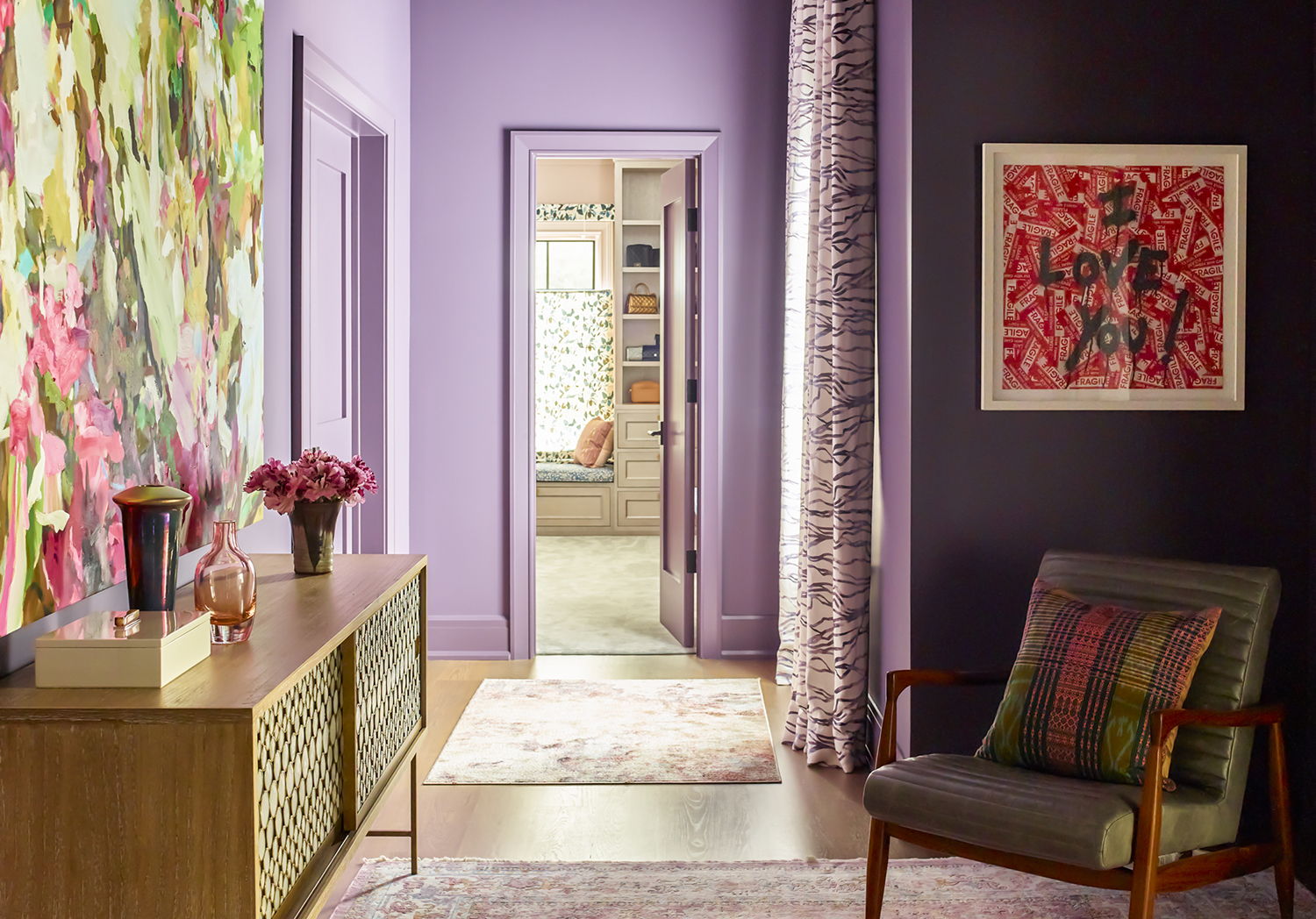
If you want to shift away from safe neutrals in your hallway, Marika Meyer warns against colors that are muddy, since they absorb light. 'Instead, choose a color with clarity, whether it be light blue, cool lilac, or even pale orange,' says Meyer.
Shades of lilac and lavender have a gentle, soothing effect and can help to calm down a busy space such as a hallway. The color is light, and as many other colors that go with purple, it creates interest without overpowering the space and looks chic teamed with greys and neutrals.
13. Create a calm backdrop for artwork
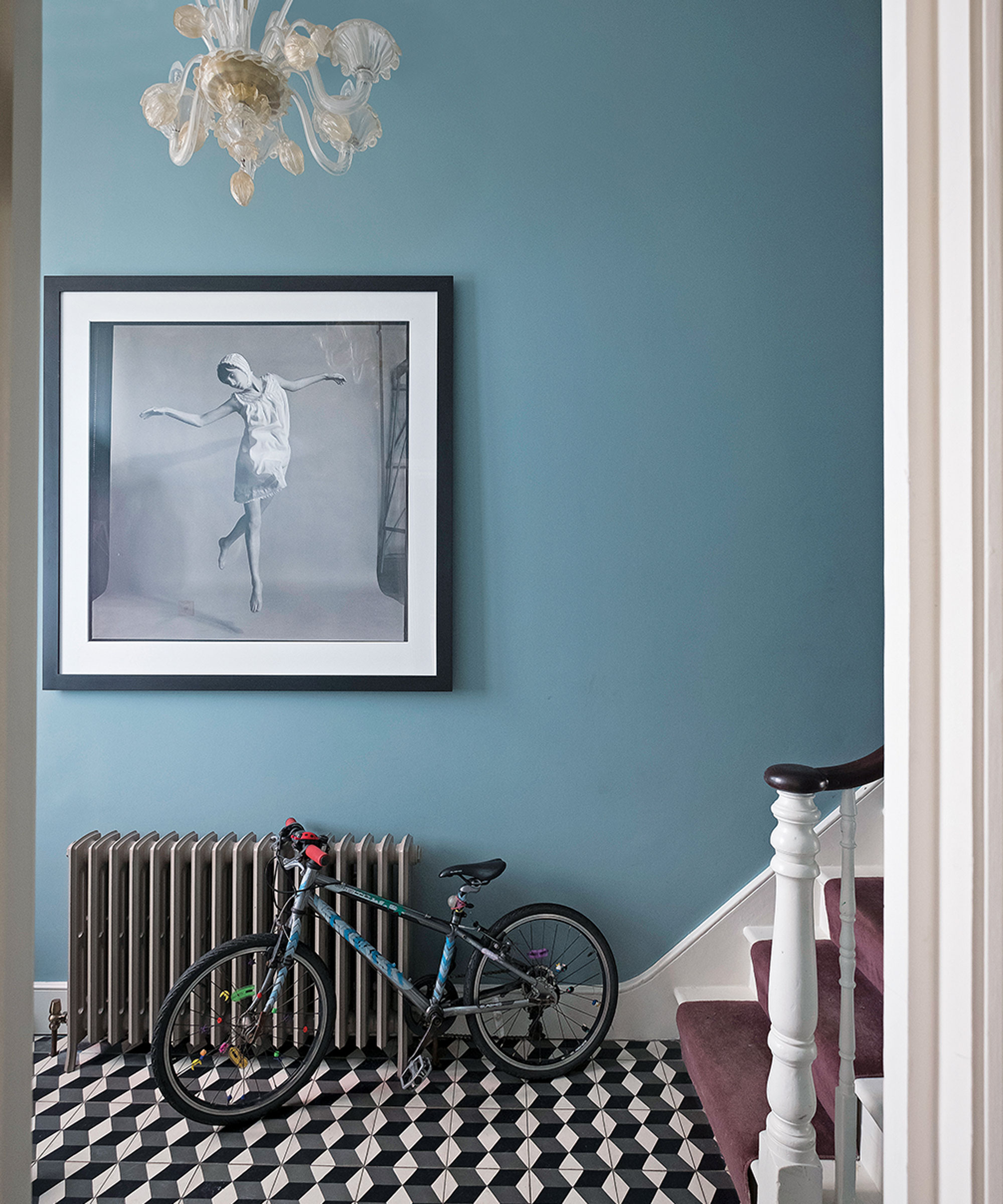
Hanging artwork in a hallway is an easy way of transforming a humdrum space and adding a gallery wall effect but choosing the right background color is of importance. Flat paint is the best choice to show off colorful art work, there’s no sheen so the light reflection will come from the art and not the wall.
For a paint color with personality, interior designer Christina Nielsen likes to pair artwork with Farrow & Ball’s Stone Blue, which she describes as 'a light denim tone. I also like Farrow & Ball’s India Yellow in a hallway.'
14. Use paint to create a focal point
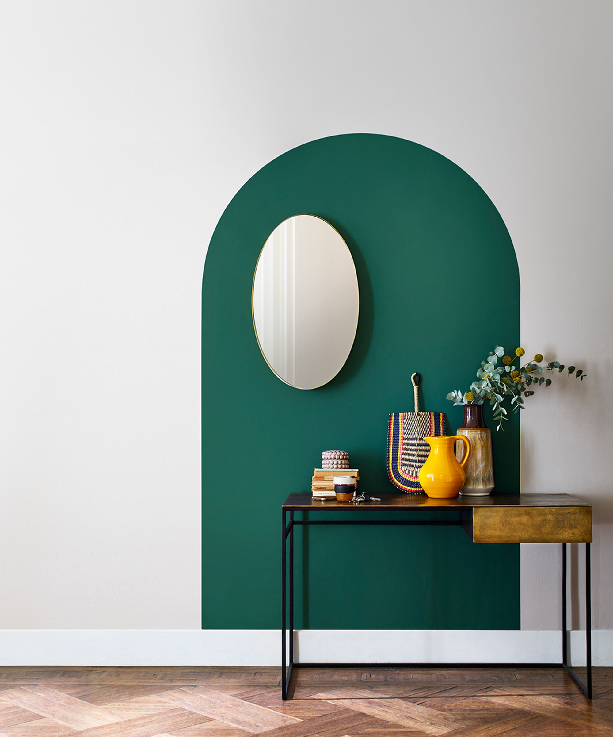
For a hallway that is devoid of any architectural features, try faking it instead. Painting an arch in a standout shade will create a decorative feature in its own right and makes a stylish backdrop for a hallway console table. Position the console off-centre, rather than straight-on, for a more eye-catching effect and style it up with ceramics and art.
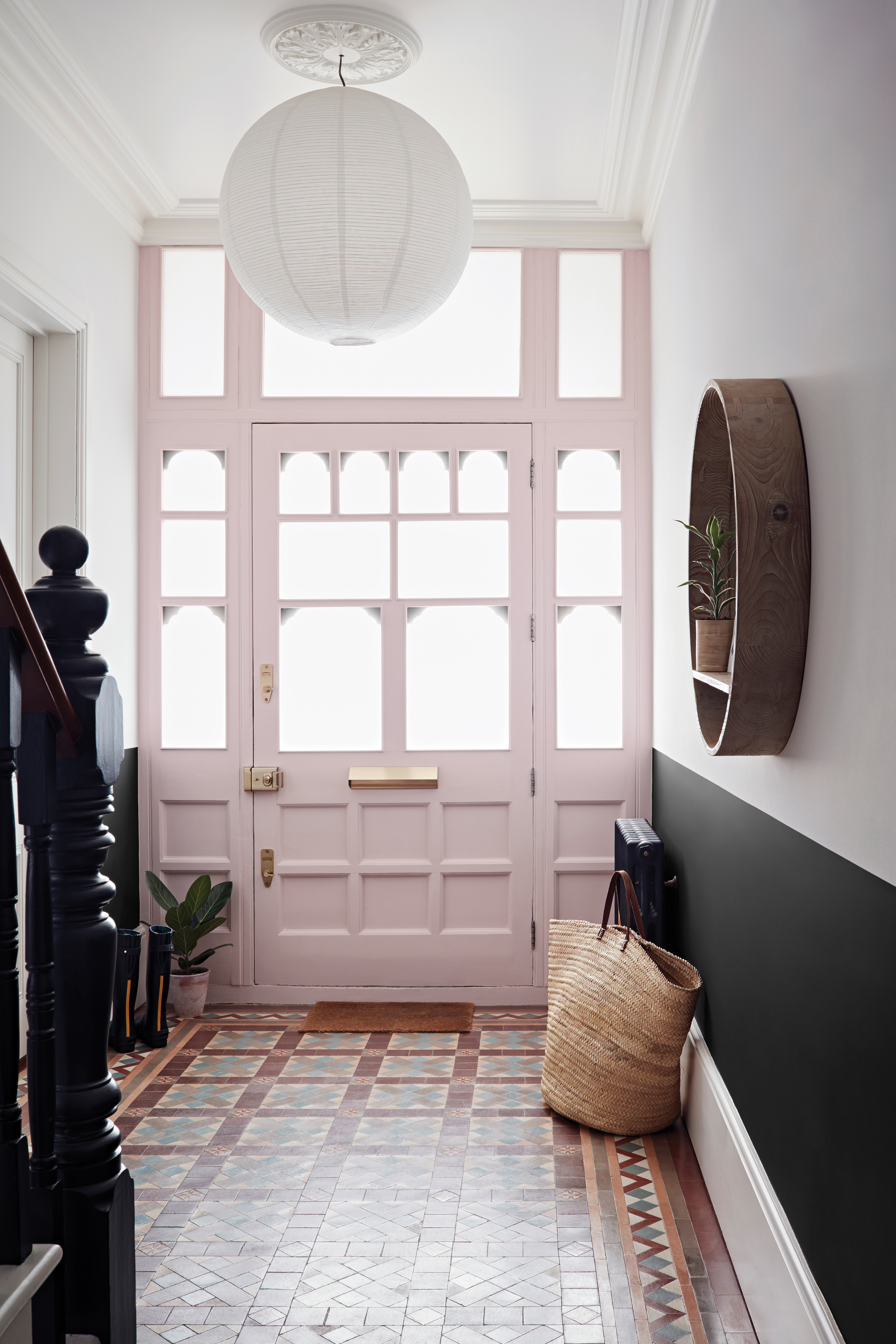
15. Calm a busy hallway with blush pink
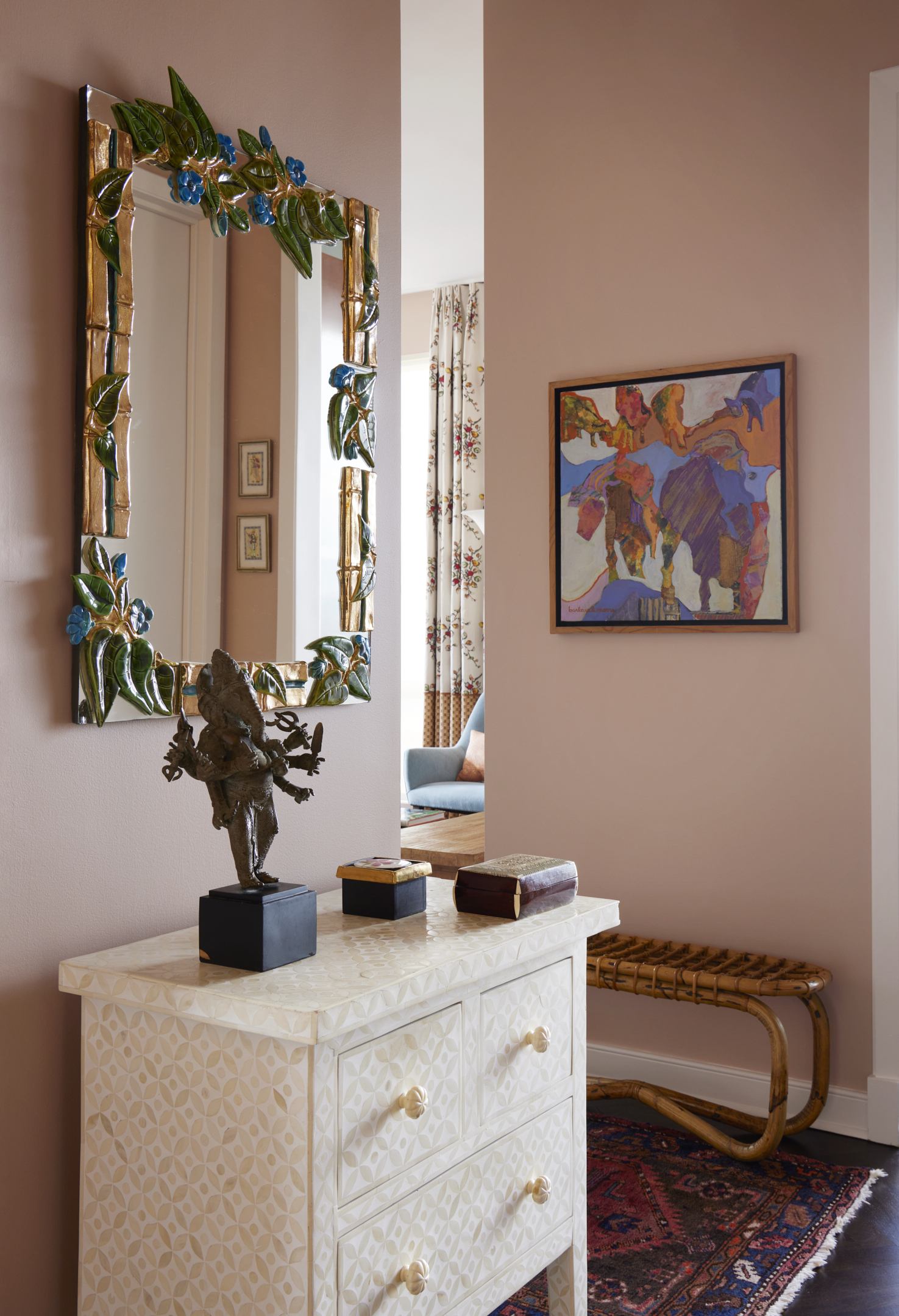
Take account of the other rooms that lead off the hallway when you’re deciding on a colour scheme. If you have views into lots or other rooms, try to keep hallway walls tonal so that the colour doesn’t jar.
Warm, blush, the best pink paints give just a touch of oomph and makes a chic alternative to neutrals. When it comes to furniture, soft pink complements most tones of wood and makes a great foil for gilt mirrors, picture frames, vibrant tapestries and artwork.
What color is best for a small hallway?
For Kevin Isbell light colors aren't the only option. 'I’ll often just embrace the small space and turn the negative into a positive by going dark. Benjamin Moore’s Nantucket Fog is a nice, saturated blue that would work well.'
On the opposite end of the spectrum, a light shade – especially one in a high-gloss finish that allows light to bounce around the space – can create a sense of openness. 'I often use a high-gloss paint in white or grey,' says Gerson.
What color makes a hallway look wider?
Wentz suggests going light. 'A favorite white of mine is Benjamin Moore’s Simply White,' she says. 'It’s a bright white with a touch of green in it.' Another Benjamin Moore white, Super White, is a stark white 'that makes the ceiling feel taller and the hallway wider,' says Michell Gerson.
Isbell likes a pale blue such as Benjamin Moore’s Constellation on the walls because 'it has a subtle hint of grey, but it’s still light and crisp. I would paint the trim in either Benjamin Moore’s White Dove or Dove Wing, another white with a little brown in it.'
Be The First To Know
The Livingetc newsletters are your inside source for what’s shaping interiors now - and what’s next. Discover trend forecasts, smart style ideas, and curated shopping inspiration that brings design to life. Subscribe today and stay ahead of the curve.

Alyssa Bird is a New York−based freelance writer and editor with experience covering architecture, interior design, travel, hospitality, and real estate. She has held editorial positions at Architectural Digest, Elle Decor, Hamptons Cottages & Gardens, and New York Cottages &Gardens. When she’s not writing about dreamy spaces, you can find her tweaking the decor in her own Brooklyn home, honing her green thumb, testing out a new recipe, or scouring for antiques.
- Aditi SharmaFormer Design Editor
-
 Lone Fox's Drew Michael Scott Drops a Vintage Capsule with Joon Loloi (And Some Seriously Good Tips For Thrifting Antiques)
Sourced straight from one of the world's biggest antique shows, Drew shares how to stay sane, cut through the noise, and score what you actually want
By Julia Demer Published
-
 9 Easter Table Decor Ideas to Plan Now for Perfect Tablescapes This Season
From centerpieces and color schemes to tablecloths and seasonal themes, let these designer-approved ideas inspire your table styling this Easter
By Lilith Hudson Published
-
 10 rules to achieve balance in interior design - the secret style sauce which brings schemes together
For calm interiors with visual stability, balance is the go-to design principle for perfect harmony in good measure
By Keith Flanagan Published
-
 I'm trying a 30-day minimalism challenge this January, a step-by-step guide to life of soothing simplicity
Try our 30-day minimalism challenge to declutter your mind and home this January
By Oonagh Turner Published
-
 These 10 foolproof rules will help you host Christmas in a small space
If you're faced with hosting a Christmas in a small home, fear-not, we've got the expert advice to see you through the season
By Oonagh Turner Published
-
 The 10 best minimalist interior designer accounts to follow to inspire a less cluttered home
These are some of our favorite interior designers accounts to follow for seriously beautiful, minimalist spaces
By Oonagh Turner Last updated
-
 8 of the best table centerpiece ideas that will take minutes to achieve, yet make any occasion feel extra special
These table centerpiece ideas will help to elevate your hosting game and wow your guests
By Oonagh Turner Last updated
-
 This often-forgotten element of design is what will make your Christmas feel most magical, say these experts
Festive scentscaping is the next frontier for the home at Christmas. We speak to fragrance experts to find out how to do it
By Oonagh Turner Last updated
-
 9 genius tricks for decorating with books that can change the vibe of your home in less than an hour
If done in the right way, decorating with books can bring unique, fresh and interesting perspective to your space
By Aditi Sharma Maheshwari Published
-
 25 modern bedroom ideas for a sleep space that's contemporary yet cozy
A modern bedroom doesn't mean a cold, soulless space. These ideas take contemporary style and make it comfortable
By Aditi Sharma Maheshwari Last updated