10 Genius Hidden Storage Ideas That'll Help Conceal Clutter and Keep Your Home's Eyesores Out of Sight
Keep your home clear from clutter with clever ways to disguise these hidden storage ideas into every room

The best hidden storage ideas are the ones that guests don't even know are there when they first come to visit. There's nothing quite like being able to surprise someone with a hidden feature in your home, but more than the novelty, hidden storage is a brilliant way to make your home feel less cluttered.
Bulky, on-show storage can overwhelm spaces, especially if you're including them in a small room, but with invisible storage ideas, you can include as much as possible, and still end up with a minimalist outcome.
The sky's the limit with how you can incorporate storage subtly into your home, but we've collated 10 of our favorite examples to get your creative design juices flowing.
1. This kitchen's hidden compost bin
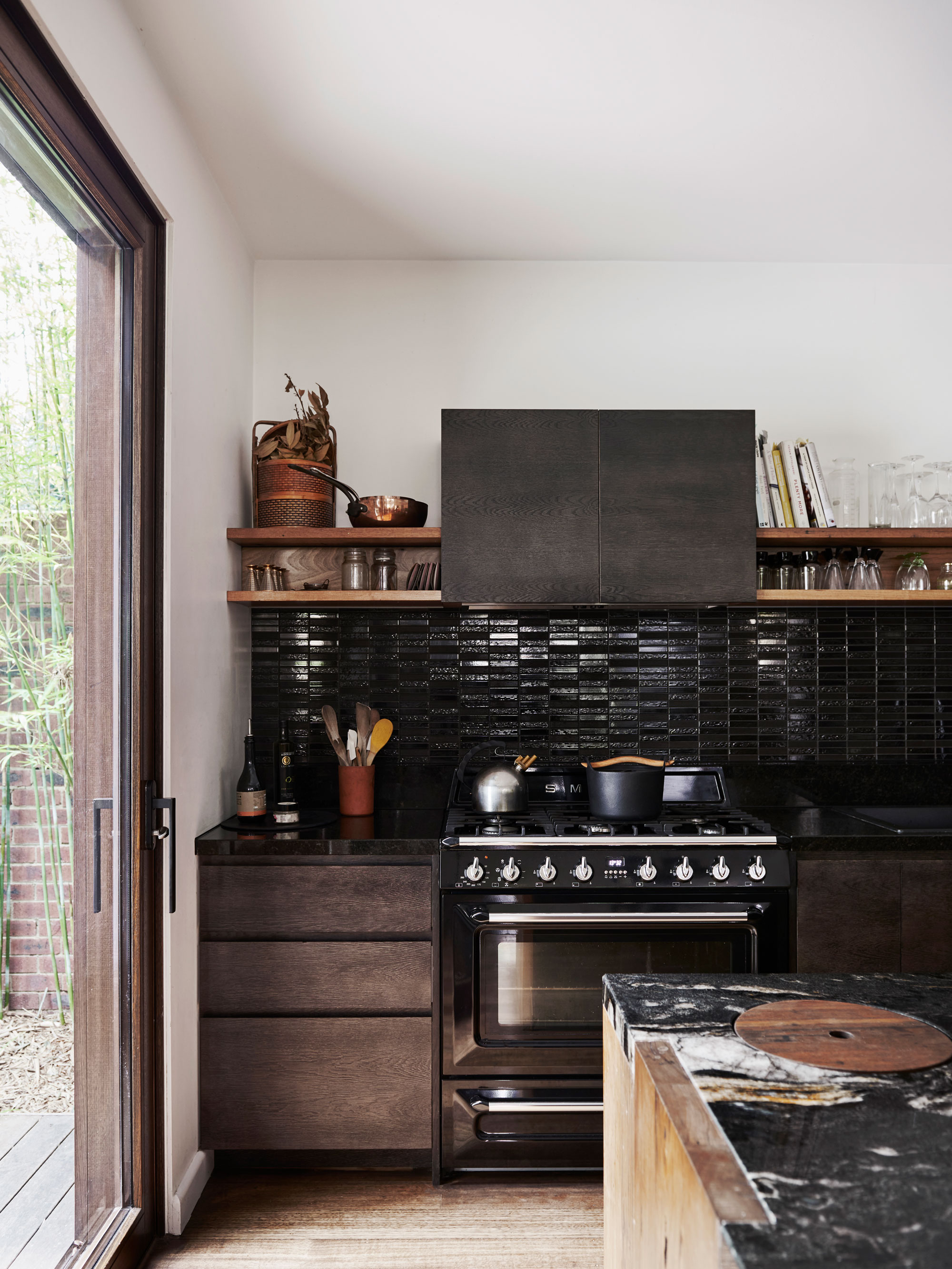
Trash cans are one of a kitchen's biggest eyesores if you don't find a way to hide them away; however, that may mean losing kitchen storage space in cabinets, or putting bins in less-than-functional spaces.
This idea created by interior designer Kim Kneipp for her own kitchen sees a compost bin hidden in the surface of the island, sunken under a simple wooden lid that matches in with the aesthetic of the space.
'The compost bin is both a functional and aesthetic highlight of the kitchen,' Kim explains. 'The combination of the recycled timber lid inset into the crystal-rich cosmic black granite was a nod to the disparate styles of my partner and I - my love for the rustic combined with his love for luxury.'
'We used an off-the-shelf Hafele stainless steel compost bin with lid, integrated into the joinery design. The plastic bucket inside the stainless steel bin lifts out with a handle (similar to this compost bin from Amazon), so as soon as the bin is full we take it outside and empty it into our compost bin to create organic fertilizer for our lush garden.'
'Having the lid open during cooking means that all of our produce scraps can immediately be scraped away, keeping the bench top clean and clear,' Kim adds. 'The stainless steel lid seals off any odors and the flat timber lid masks the practical with the beautiful.'
2. This camouflaged storage door
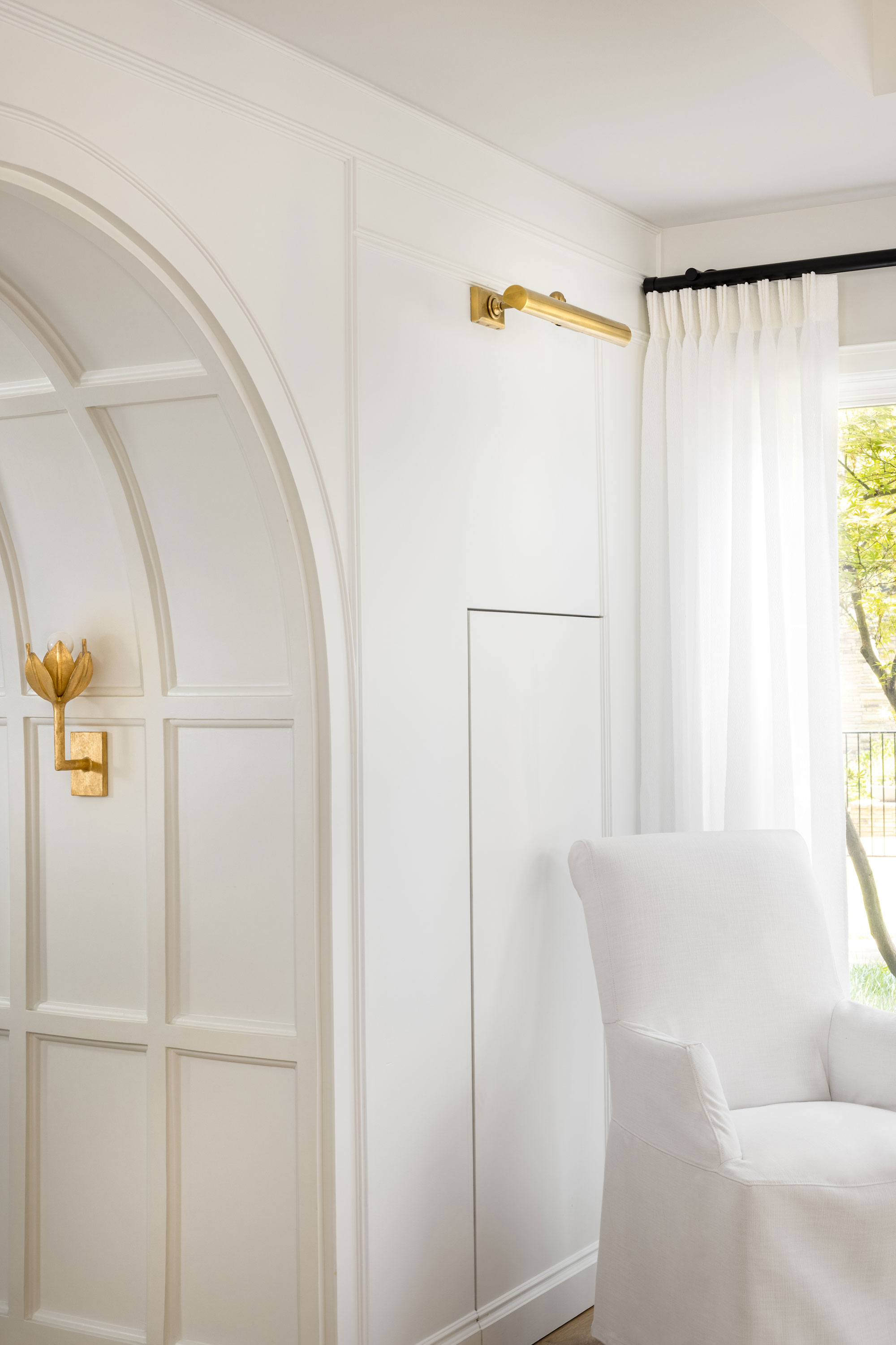
No home can be without enough storage, but sometimes there might be areas of your home that feel difficult to make proper use of, without sacrificing style for functionality.
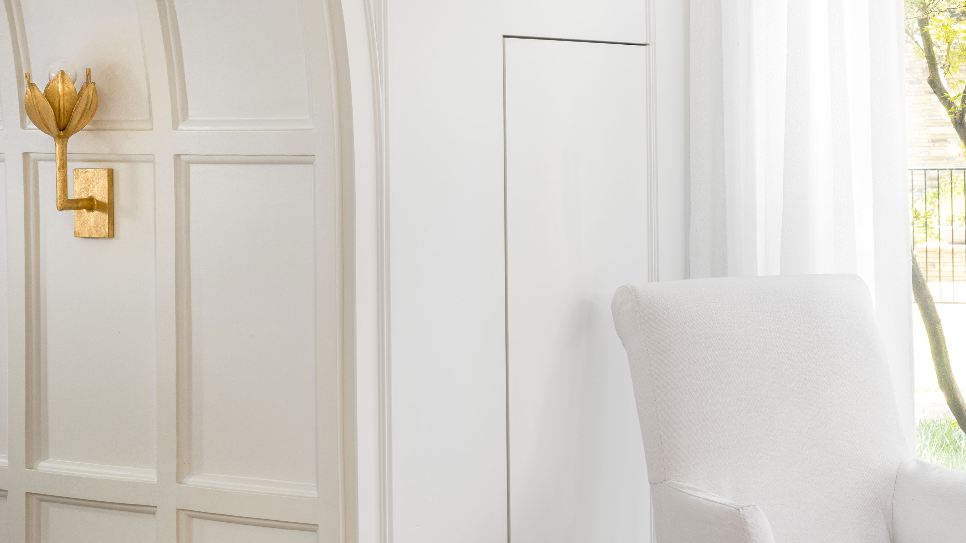
Designer Eddie Maestri had one such awkward corner in the design of this beautiful Tudor-style home, but came up with a clever way to make the most of it. 'It was important to maximize storage in clever ways, but we wanted to keep the space simple,' he tells us. 'Where possible, we hid storage to blend in with the wall paneling.'
In this space, storage is created for items that don't need to be accessed regularly, so a chair can be placed in front of the hidden door without the layout feeling clunky. 'The kitchen also has this detail, we wanted the walls to feel like traditional paneling, hiding the freezer and refrigerator, and making the architectural elements and key decorative features of the space shine,' Eddie says.
3. This disguised bathroom cabinet
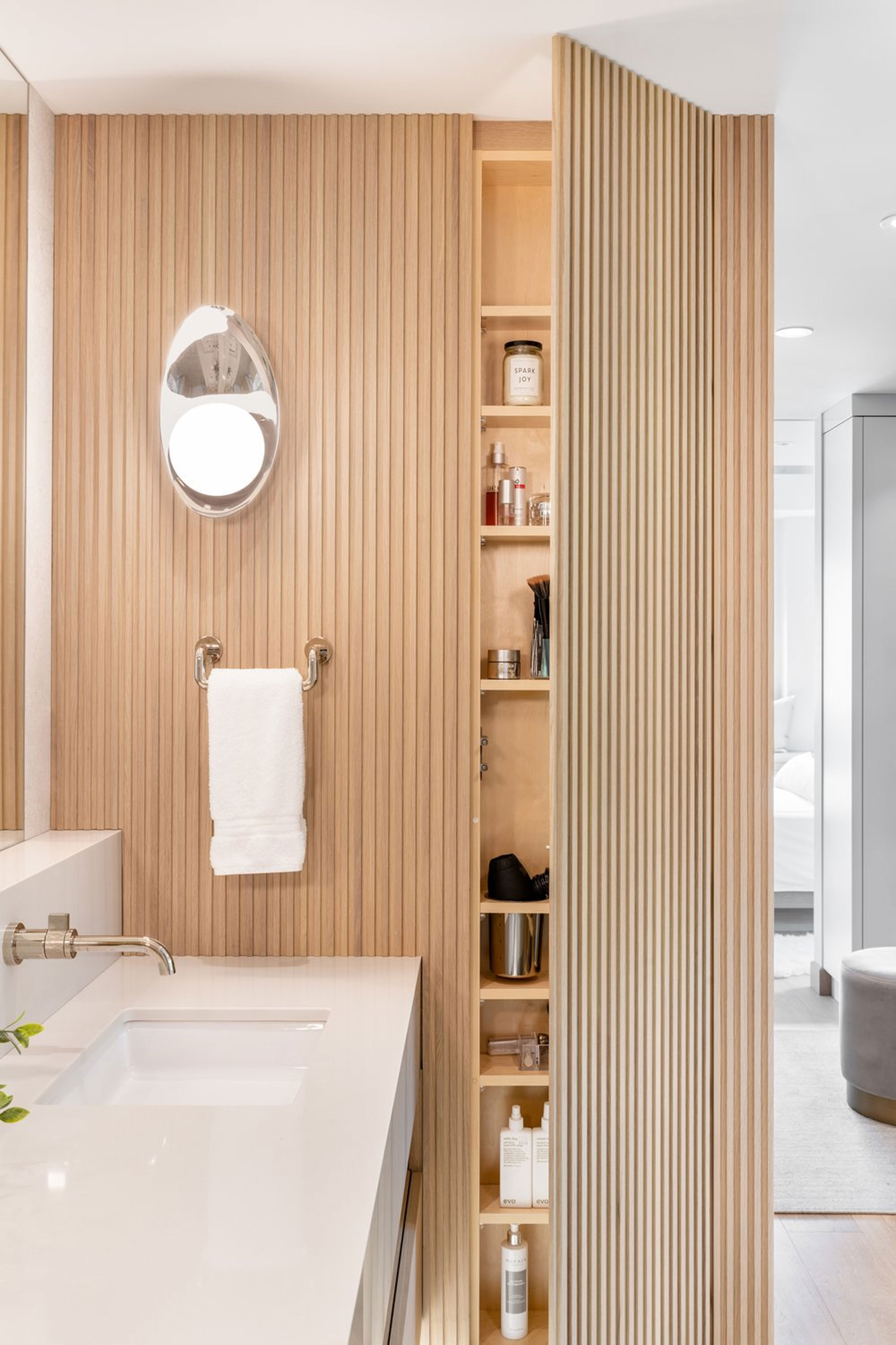
When it comes to bathroom storage, the best ideas are the ones that keep your countertop clutter hidden from view. 'Storage is an integral component to our bathroom designs,' Jenny Martin, founder of Jenny Martin Designs, says. 'Making a space look as seamless as possible, we love hidden storage, concealing your everyday items behind unassuming millwork. This keeps a space looking clean and curated.'
In this bathroom design, Jenny incorporated the hidden storage into a slat wall — a clever way to downplay the edge of the door and make the whole space feel seamless.
4. This hidden cocktail bar
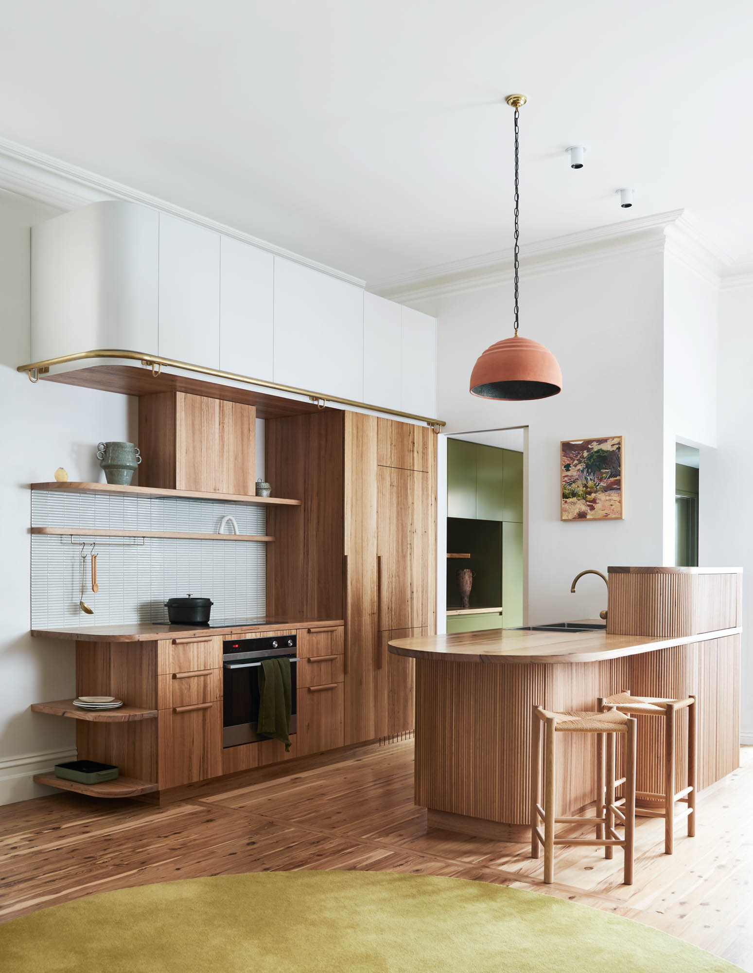
This kitchen, another creation by Kim Kneipp, also uses a fluted texture to cleverly hide some storage within it; however, this time it's for a small home bar that turns the space into an entertaining hotspot when needed.
'We had just finished designing the interiors for a caravan where every inch of space needs to be accounted for, and this methodology has since followed through into all of our joinery design,' Kim explains. 'The cocktail bar evolved from our initial desire to create a buffer zone between the basin and dining area — somewhere to tuck away the dirty dishes, out of sight whilst still enjoying a dinner party.'
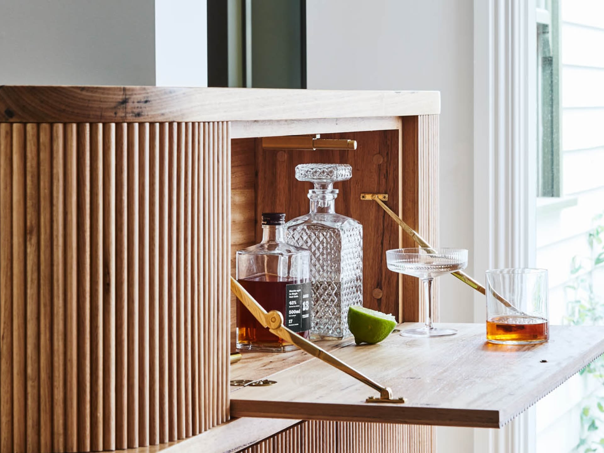
'Although not big drinkers, our clients love to host dinner parties and had collected a lovely assortment of liquors and spirits,' Kim adds. 'Rather than have these on display, we thought it would add a Deco-era prohibition style charm to have a secret liquor cabinet tucked away, giving a secondary function to the sink upstand.'
'In a relatively small living/dining space it also means making cocktails doesn’t impact the flow of whoever is in the kitchen,' Kim says.
5. This ingenious artwork storage idea
In this home's renovation, interior designers Kobel & Co decided against filling in a huge recess in a wall that was originally designed to house a bulky wall-mounted TV from the 1990s. Instead, they turned it into a secret storage space for the family room.
'Rather than keep the space visible and highlight the 90s architecture, we chose instead to capitalize on the majority of the space, closing up only a small portion at the bottom with drywall, and covering what remained with an oversized piece of art, specially framed to receive concealed hinges,' Mallory Robins, co-founder of Kobel & Co, explains. 'A touch latch mechanism now allows the family easy access to their games and records. The art, a photograph by Natalie Obradovich, sits flush against the wall when closed so that the casual observer is none the wiser.'
6. This secret bathroom storage
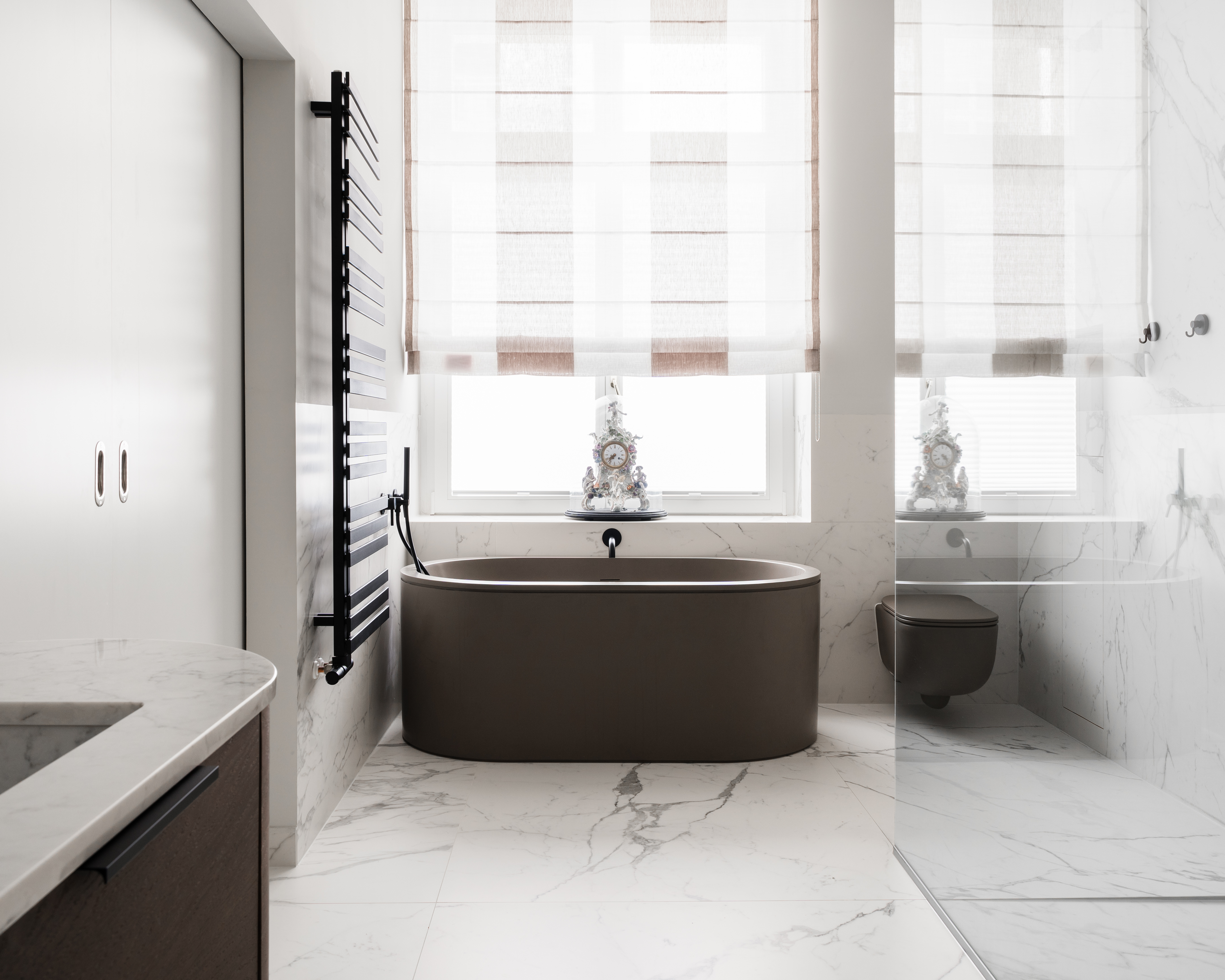
In this minimalist bathroom, designer Agnieszka Kuczyńska of Takk Studio found a clever way to solve one of our home's biggest storage dilemmas — where to store toilet paper so it's always to hand. Instead of including bulky, distracting storage in this space, Agnieszka instead created a hidden recess built into the large format marble-effect bathroom tiles.
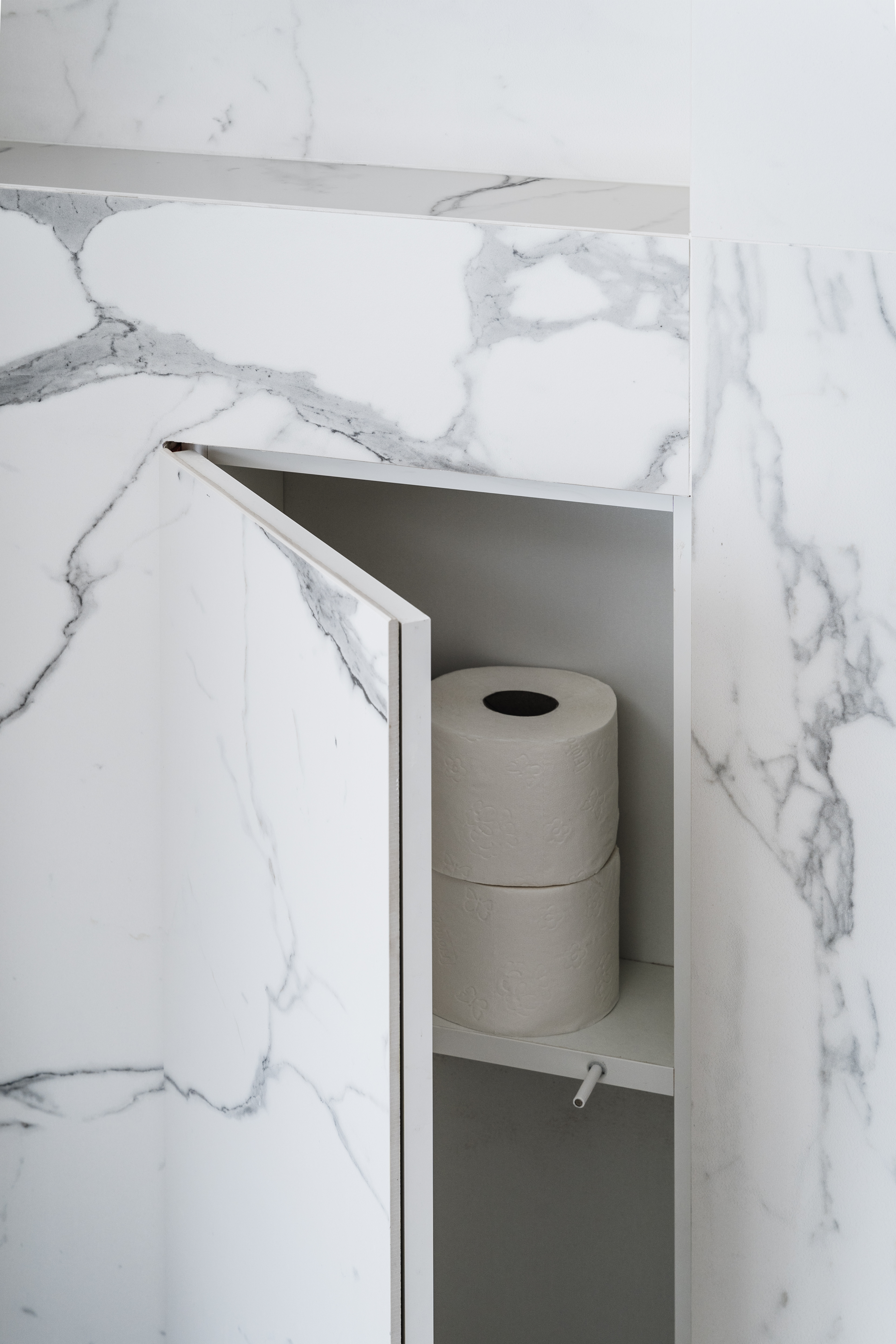
'By cutting the tiles for the hinged door, we managed to keep the veining pattern in place, so when the cabinet is closed it almost completely disappears,' Agnieszka says. 'A simple push mechanism means it doesn't even need a handle for you to open it,' she adds.
7. This unexpected island storage

Sometimes, hidden storage is in design elements where you don't expect it. This kitchen, designed by interior designer Nancy Surby of NAKO Design, is the perfect example.
Its rounded, fluted island might just feel like the latest kitchen trend, it belies clever curved doors that open up for surprising extra storage in the base.
'The design for this element responded to our clients’ needs of using their existing island as their primary space for informal meals while balancing out the lack of upper storage along the perimeter’s walls,' Nancy explains. 'Given we were working within a tight footprint it felt natural to introduce a ‘pill shape’ form and get creative with adding storage to the fluted pillars, leaving a small section for counter stools.'
8. This transforming bathroom vanity
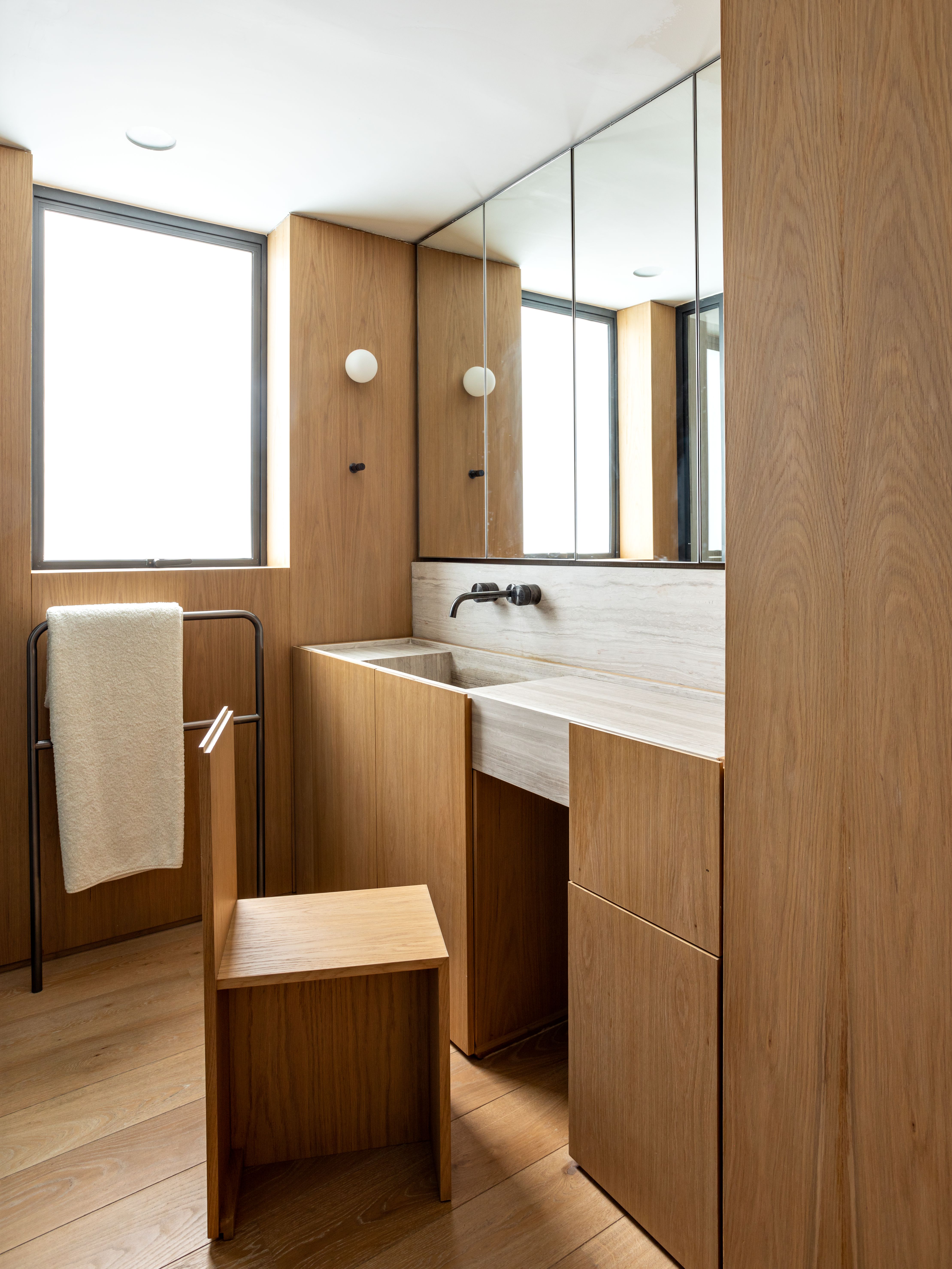
This bathroom vanity is such a clever idea, helping to make this space multi-functional, but keeping it minimalist when not in use. A seemingly-solid paneled wall includes not only hidden storage, but a hidden vanity chair that can be pulled out when required. 'We had to take advantage of every corner and free space available in the bathroom, and create custom joinery for the space,' says architect Felipe Hess. 'In doing that, we were able to have both, spaces for storage and free space for the bathroom to be used.'
'We couldn't have furniture disrupting the daily flow of the room, so we specially designed a chair and incorporated it into the design of the lower cabinet, creating the bench within the modulation of the doors,' he tells us.
9. This laundry room's hidden cat tray
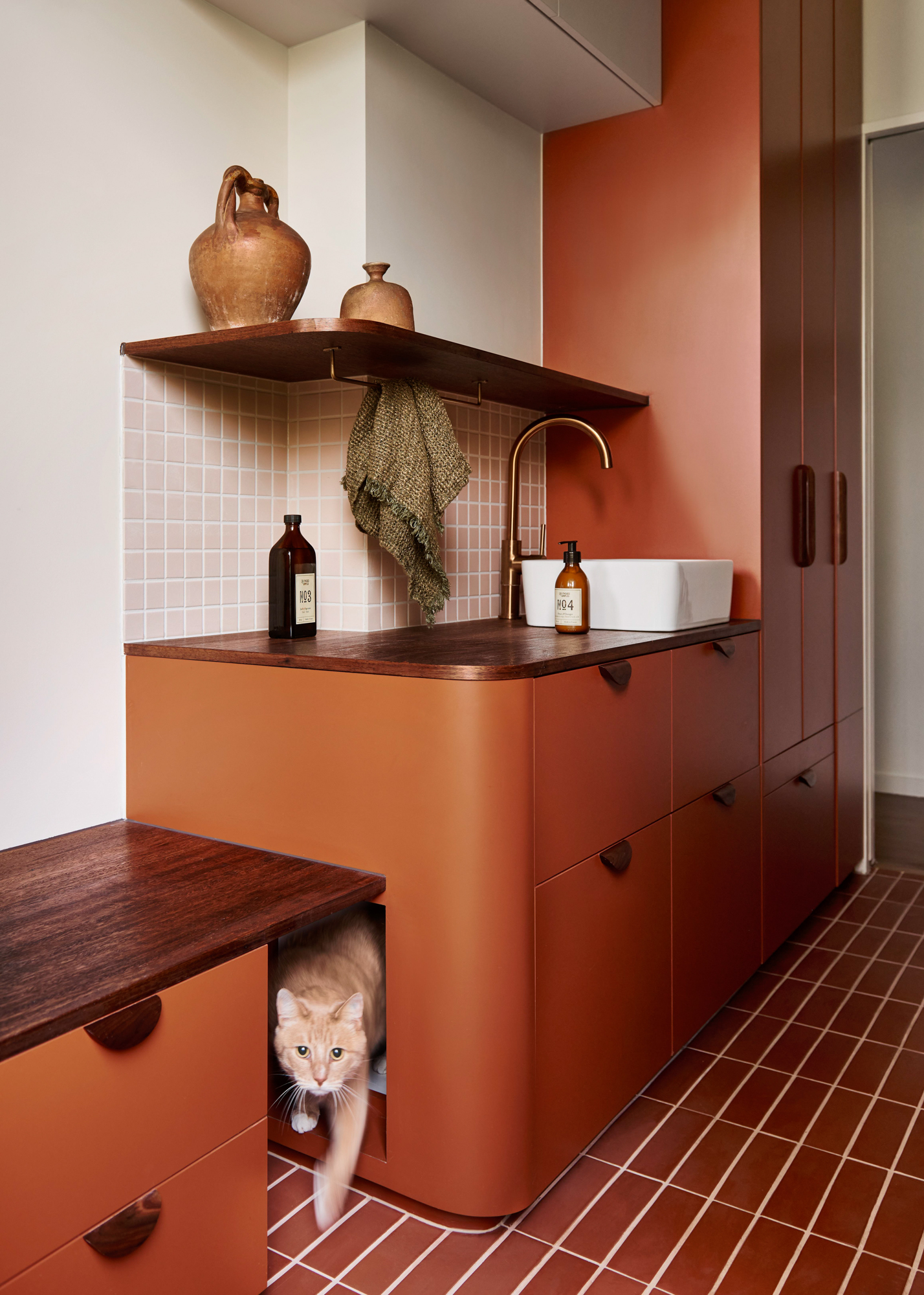

If you own pets, you'll know they tend to bring certain accoutrements that you could consider eyesores in your home. Whether it's pet beds, toys, scratching posts or, worst of all, a litter tray, the right bit of hidden storage can solve your pet-owning woes.
This was a problem that Kim Kneipp set out to solve for her clients. 'Beloved owners of two cats, our clients were accustomed to keeping the cat litter out on display in the laundry and hadn’t actually asked for any special joinery allocations for their cats,' she explains. 'As our interior design evolved and the multi-faceted needs of the laundry room became apparent, we proposed the hidden cat litter zone to reduce the smell and mess and to maintain a clean, open, aesthetically pleasing walkthrough.'
10. This home office's secret cupboard
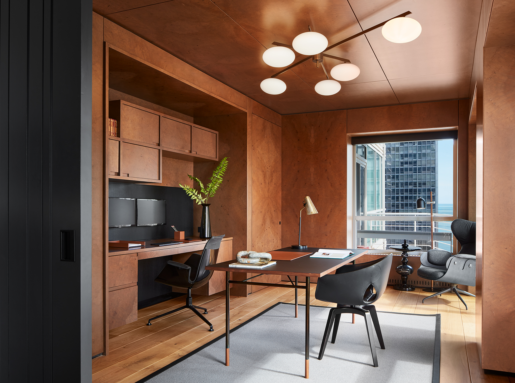
In this sleek, modern home office designed by architects Searl Lamaster Howe, a beautiful wood paneling has been used to unify the materials and create plenty of storage around the desk.
However, look closely and you'll also spot another hidden piece of storage, tucked into the far corner of the room. 'The room conceals a walk-in closet, outfitted to the gils in office supplies, adjacent to the desk and behind a hidden door clad in the same burled walnut that wraps the rest of the space,' explains Greg Howe, co-founder of the architectural firm.
For a feature that could have had a standard closet door, it's something that makes the room feel far more bespoke, while quietening the visual clutter of the design. It's what each of these examples of hidden storage do so well, and it just happens to also be a bit of a thrill to show off to guests, too.
More ways to add extra storage to your spaces
Be The First To Know
The Livingetc newsletters are your inside source for what’s shaping interiors now - and what’s next. Discover trend forecasts, smart style ideas, and curated shopping inspiration that brings design to life. Subscribe today and stay ahead of the curve.

Luke Arthur Wells is a freelance design writer, award-winning interiors blogger and stylist, known for neutral, textural spaces with a luxury twist. He's worked with some of the UK's top design brands, counting the likes of Tom Dixon Studio as regular collaborators and his work has been featured in print and online in publications ranging from Domino Magazine to The Sunday Times. He's a hands-on type of interiors expert too, contributing practical renovation advice and DIY tutorials to a number of magazines, as well as to his own readers and followers via his blog and social media. He might currently be renovating a small Victorian house in England, but he dreams of light, spacious, neutral homes on the West Coast.
-
 This Outdoor Lounger Is the Color of the Season for Garden Furniture — And It's on Sale This Weekend
This year, it's all about the contrast, and this bright, sunny hue is the perfect foil to your green outdoor spaces
By Hugh Metcalf
-
 Kelly Wearstler Designed an Animal Hospital Where "Anxiety Just Melts Away", and I'm Taking Notes for My Own Home
The renowned designer's foray into healthcare demonstrates have even the most functional of spaces can still be design-forward
By Devin Toolen
