How to use paint in a home office – 11 work from home spaces that have been transformed with color
Explore these home office paint ideas and inject new energy into your WFH life
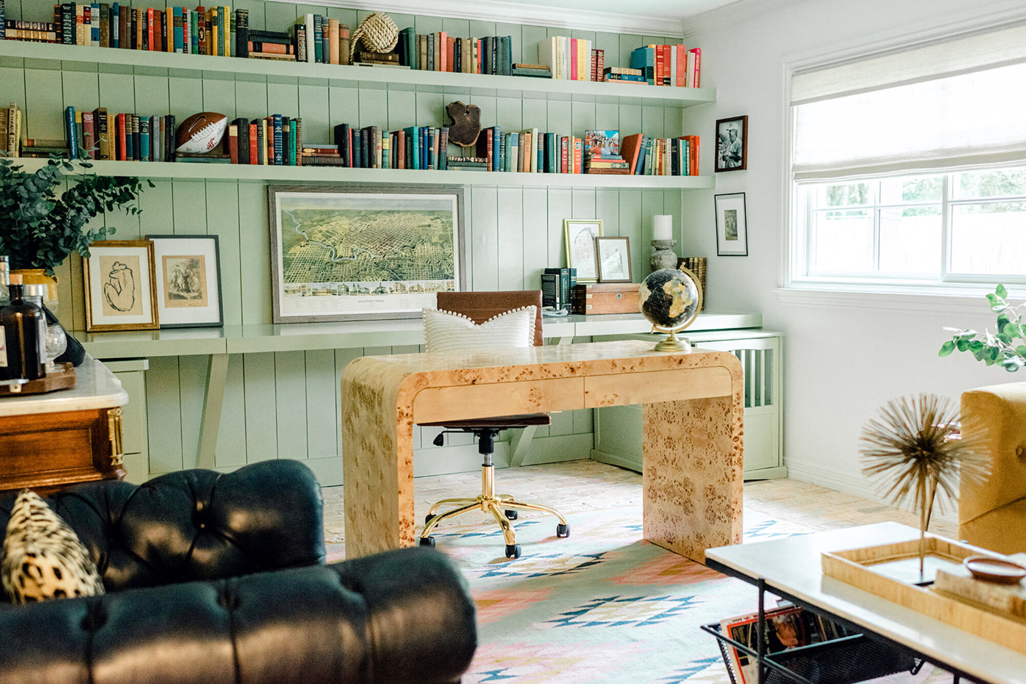

Your choice of home office paint ideas will affect mood, productivity, comfort, and energy levels in the space. And design-wise, colors can alter perception, open up a room, link spaces, and even create a sense of being cocooned.
Other than that, if you have client meetings at home, or juggle several Zoom calls a day, a workspace that is not only functional but beautiful will truly help your work from home space go the extra mile.
When it comes to home office ideas, choosing the right paint should be the starting point of your scheme. We spoke to experts, from interior designers to color experts, to understand not only the best shades to use but also creative ways to play with paint.
11 home office paint ideas that will motivate and stimulate creativity
'For many, home offices have become an essential part of the modern home,' says Ruth Mottershead, creative director at Little Greene. 'They should inspire and delight, or help to create a sense of order and calm.'
'Whether you are decorating a designated room for your office or simply zoning a corner of your living space, paint can help to separate your home working area,' Ruth adds.
Take inspiration from these clever paint ideas for your home office to get you started.
1. Color drench the room in a deep hue
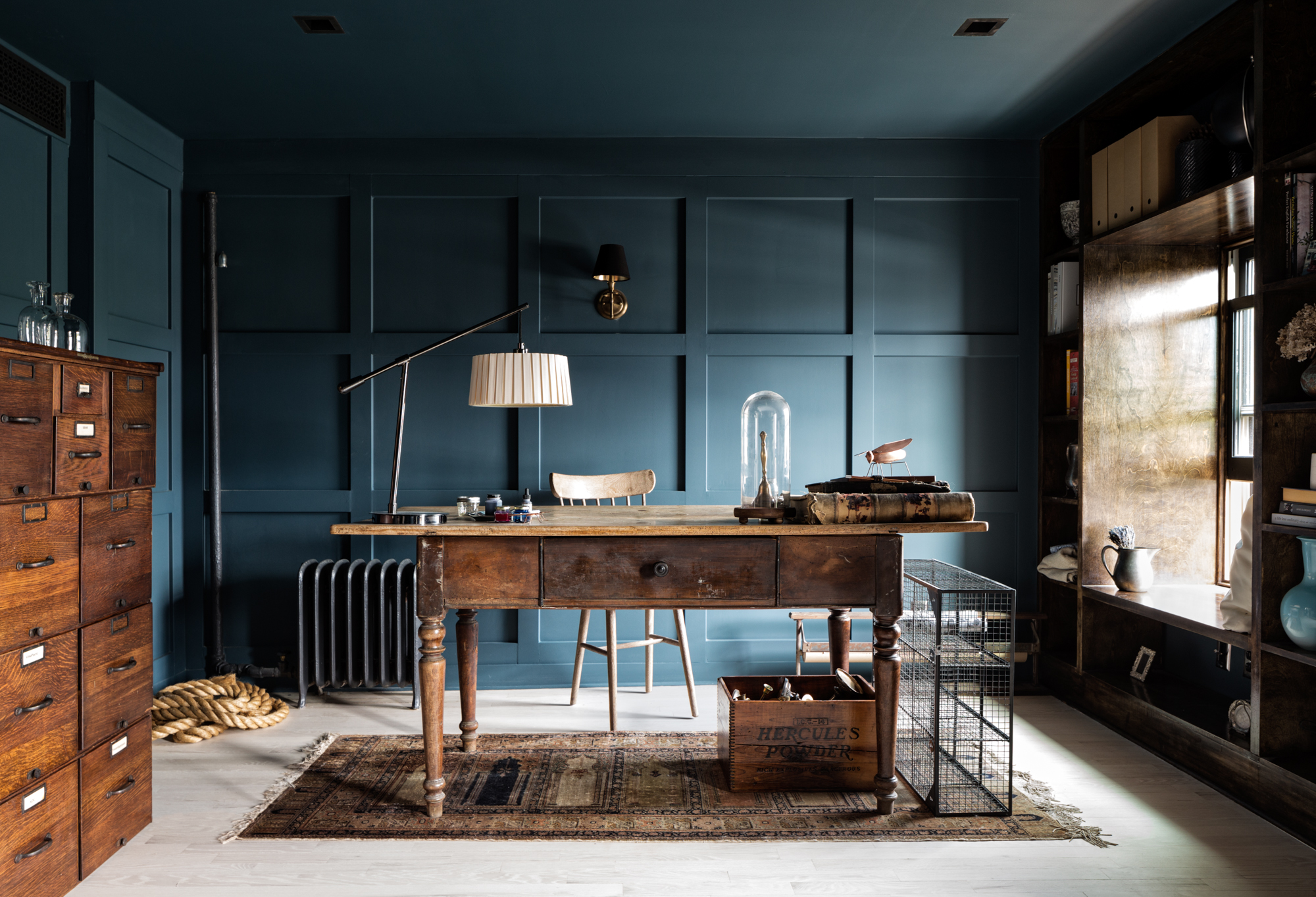
Why not use paint to highlight architectural elements (like moldings, paneling, etc), to truly make a statement. Color drenching is an interesting way to not only enliven walls and ceiling but also add depth to the room.
Using the same color as your walls, windows and ceiling can make the room recede, making all the other elements like the lights, furniture, or curtains take a more central role.Deeper tones of blue, grey, or brown work great, as these, do not overwhelm the room but give it character and style.
'For the paint, we chose Benjamin Moore's Newburg Green,' says Melissa Lee, founder and principal at Bespoke Only, designer of this grown-up home space. 'We like the depth in this rich teal blue; the pigments highlight the definition of the moldings and shift poetically as the light changes at different times of the day. The result is a moody refuge that promotes calm.'
2. Create an enveloping feel with paint
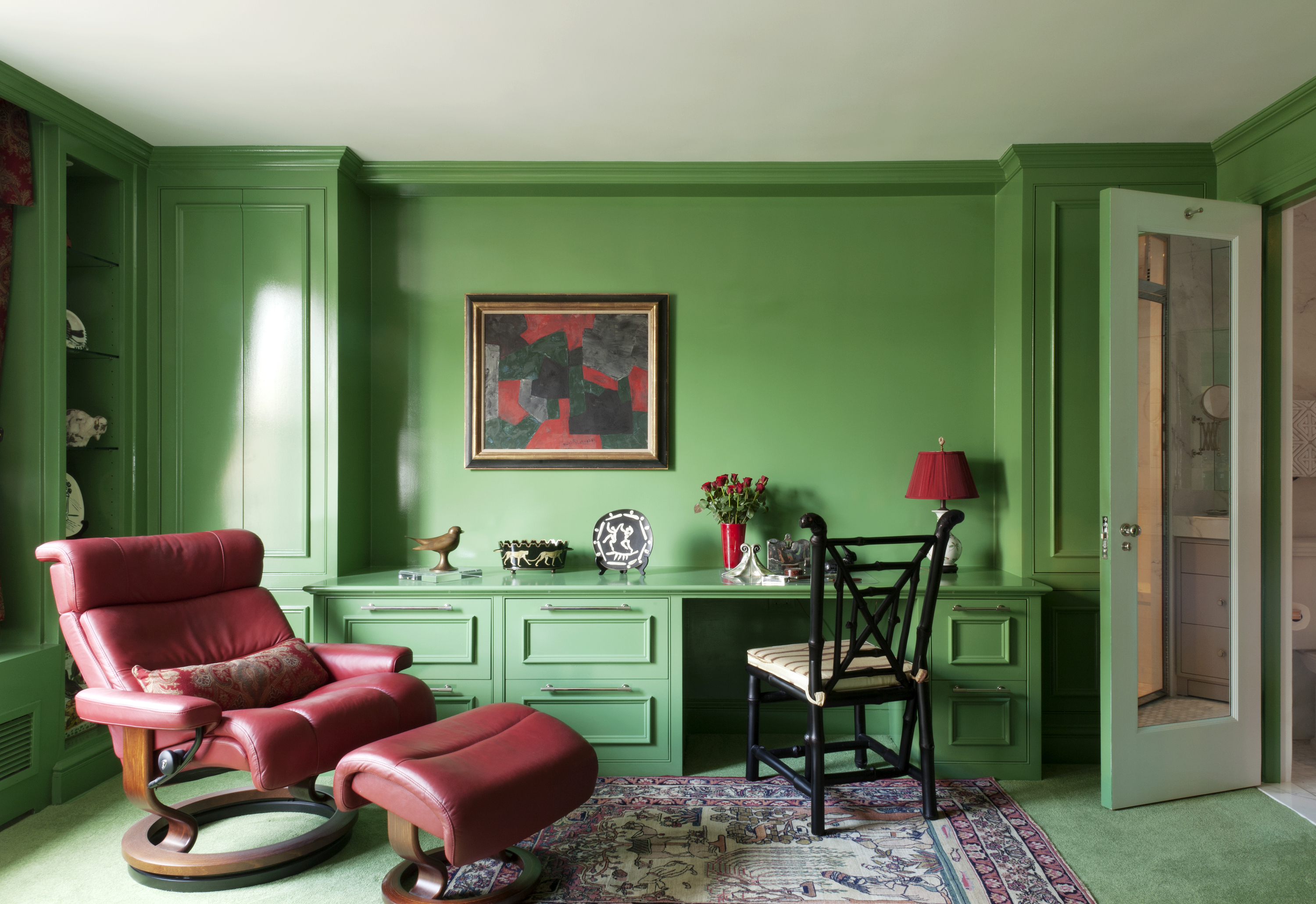
Another way of color drenching is painting all walls and furniture in one color, leaving the ceiling white. This technique will allow you to experiment with punchier, bolder hues, leaving some breathing space.
In this space, where this desk, along with even the floor carpeting is doused in green, the deep red armchair acts as a clashing color.
'The client wanted this room to be "an envelope of green" with as much saturation as possible,' says Rachael Stollar, partner at New York-based architecture and design firm Studio SFW who created this design. 'The paint is a high gloss on all surfaces which creates depth and punches up the lux vibe of super-saturated color. Once we landed on that just-right shade, we had the carpet custom dyed to match.'
3. Use contrast paint colors to make a statement
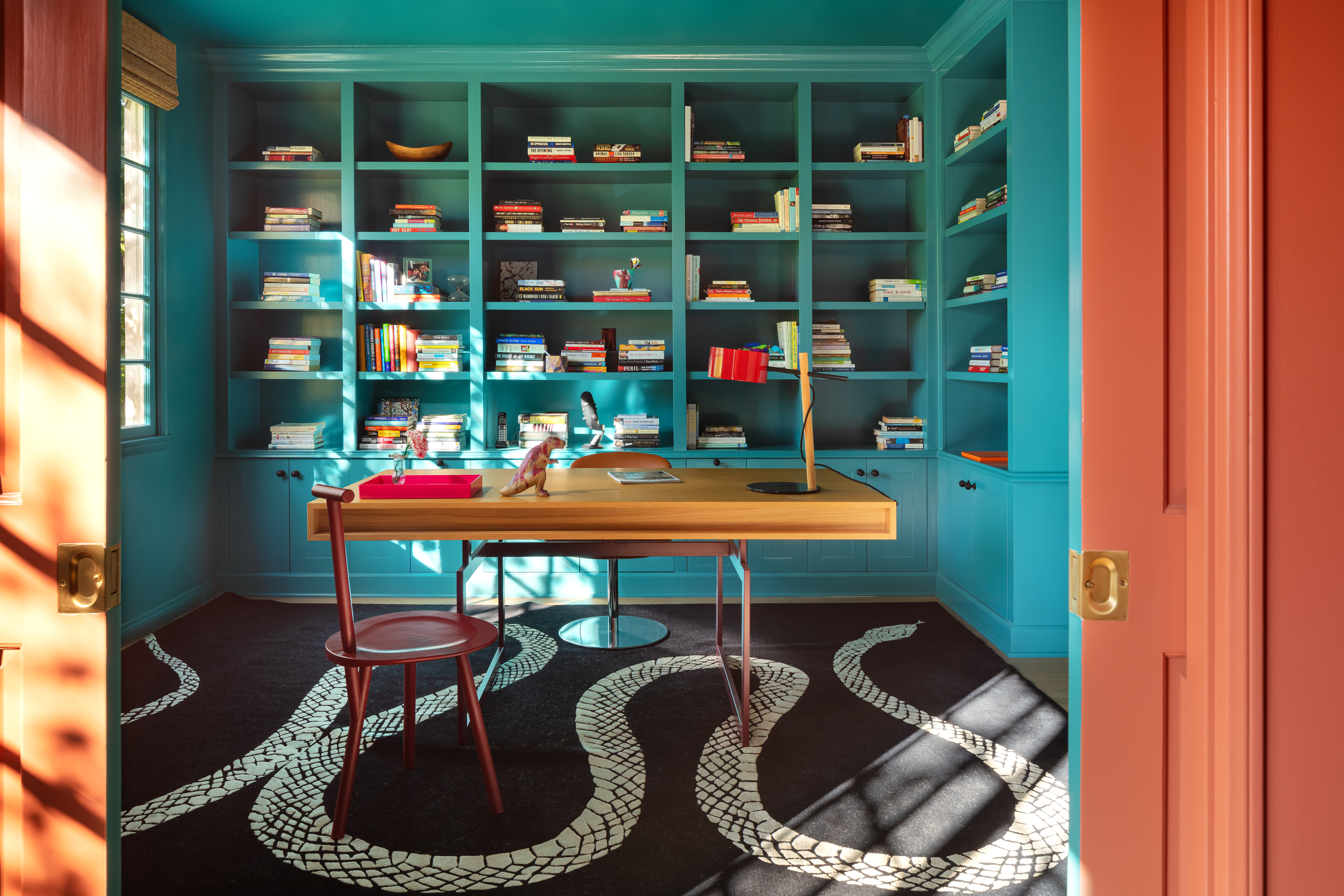
Creating a contrast between rooms is an exciting way to use paint. 'When creating this office space, we wanted to design an easy transition between the desk and seating area, exuding tranquillity amongst the chaos of a creative workspace,' says Azar Fattahi, principal at LALA Reimagined. 'We wanted to build an office suite where the client could host meetings virtually with a colorful backdrop or in-person meetings in a much more intimate setting of the offset seating area.'
'Starting with the colors of the doors, we used Red Earth by Farrow & Ball to evoke a sense of tranquillity and warmth in the seating area and Vardo by Farrow & Ball in the desk area to brighten the room and create contrast between the two,' says Azar. 'This home office is designed in the Hollywood Hills and absolutely has a feel of a holiday. We believe in the art of living, and living well is having the feeling of a holiday no matter where the location is.'
4. Try color blocking

Color blocking on walls is a key way to add depth, interest, and personality to a space. It also allows you to be creative in the way you contrast colors.
Using opposing blocks of colors next to each other can refresh your home office or even home library (if that's where you work), bringing energy and positivity. Color blocking doesn't have to be done in a way where two large walls display opposing hues. You could try interesting paint patterns to bring the colors together on one wall, and make a feature of it.
Color blocking doesn't need to be limited to two hues. You could choose up to three or four colors, although it is advisable to have one neutral color in the mix, so the wall or the room doesn't seem too busy and chaotic.
'Paint horizontal stripes across a wall in wide bands with the darker color on the lower thirds of the wall and the lighter color above,' says Little Greene's Ruth Mottershead. ‘Dock Blue and Celestial White are a smart combination. For a softer look, use colors from the Portland Stone family.'
5. Paint the home office alcove to give it a distinct look

If your home does not have a separate office, steal a few square feet from somewhere – perhaps an awkward alcove hidden under the stairs, in a bedroom, guest room, kitchen, basement, or hallway. You could even go in for closet offices that save space and still offer good functionality.
'When incorporating your home office into an existing room or corner, use paint to zone the area,' says Ruth. 'This will create visual boundaries between home and work and help you to switch off when your work is completed. In alcoves, accentuate the shadows with a dramatic, dark paint color like Knightsbridge and walls in the almost white, Down.'
6. Go for a hand-painted mural
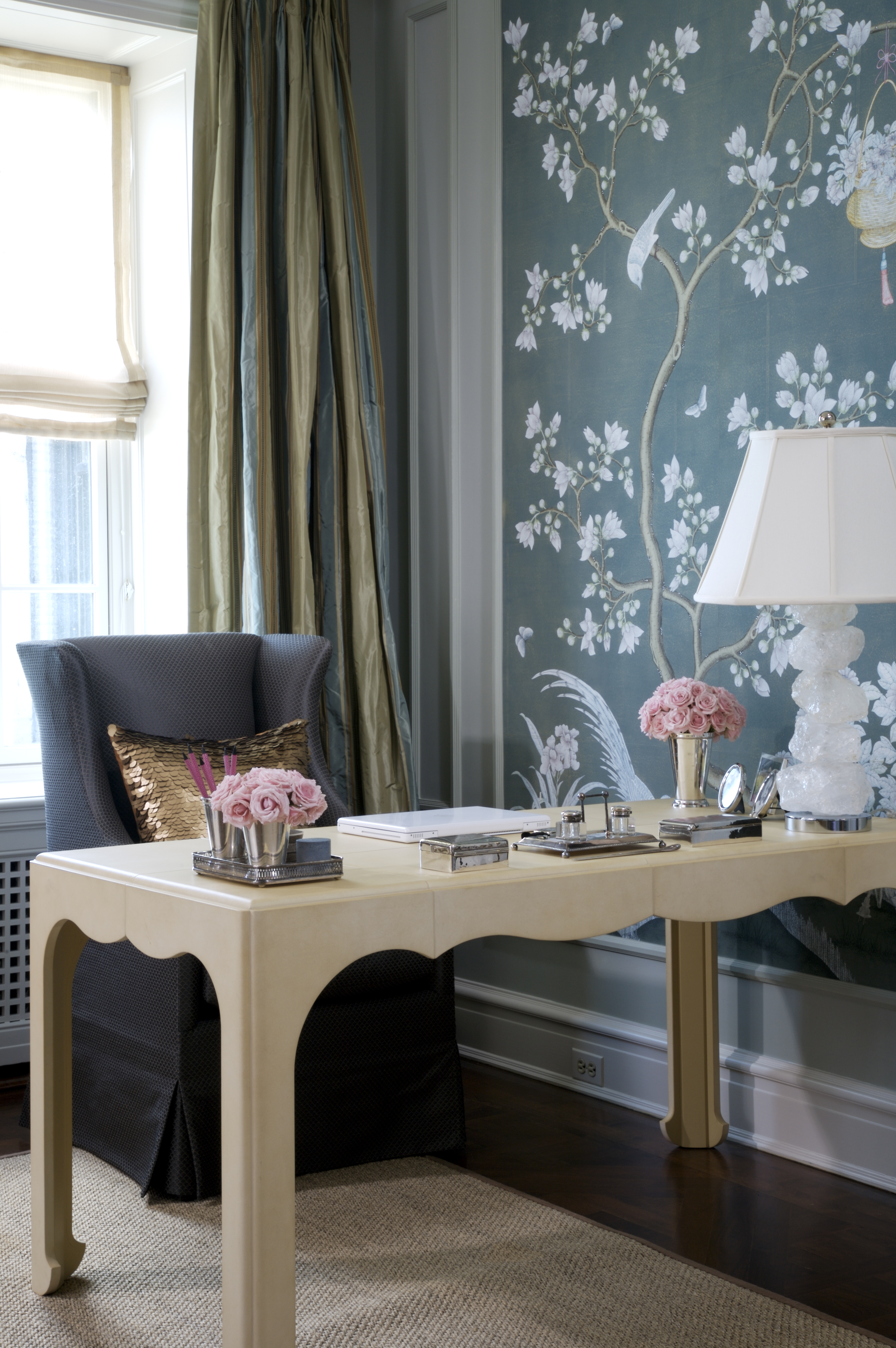
Want to personalize your home office? There's no better way than with wall murals. Since these can be customized, they enable you to have something unique and one-of-a-kind.
These also give a wonderful sense of depth to a room and add magic and interest that nothing else can. Choose soothing hues and create a landscape that will help you to work from home.
7. Choose a paint with warm undertones to ground the room
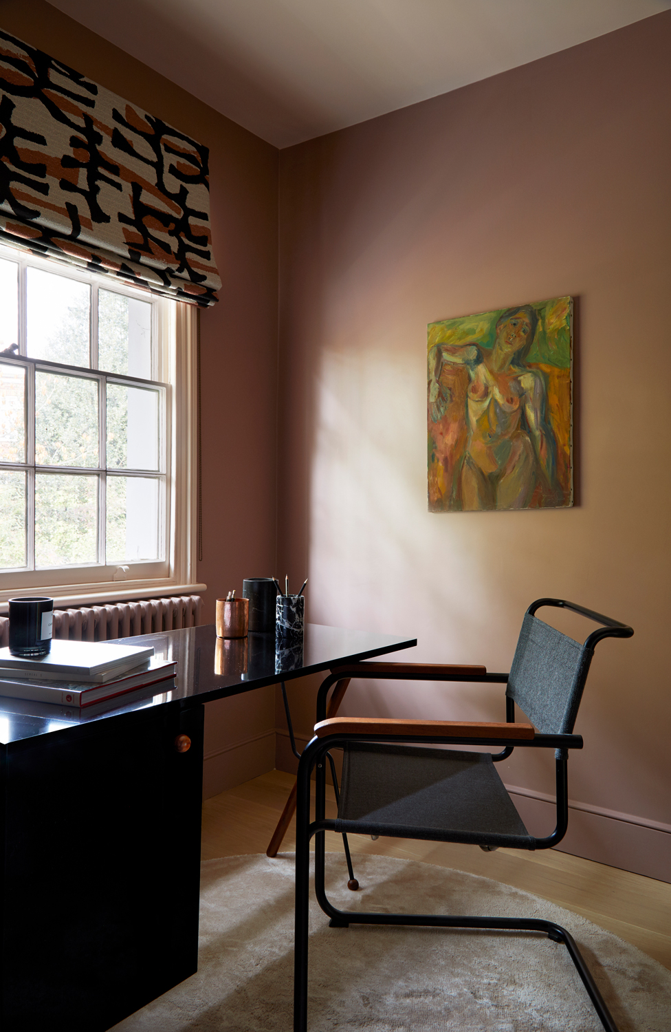
Warmer colors are a big paint trend at the moment, and work particularly well for a calm, grounded home office.
'With this home workspace we set out to create something that felt feminine but strong,' says Andrew Jonathan Griffiths, founder of design studio A New Day. 'The walls are in a muted rose-tone, while on the ceiling is a very soft pink that has a big dose of grey in it.'
'The softness and warmth of the palette are paired with the beautiful mid-century form of the desk, with its rich walnut tone and crisp black lines which are then echoed in the window dressing,' Andrew adds. 'The marriage of strong lines, bold forms, and soft powdery pink tones look to strike a balance of feminine strength.'
8. Highlight an architectural feature with paint
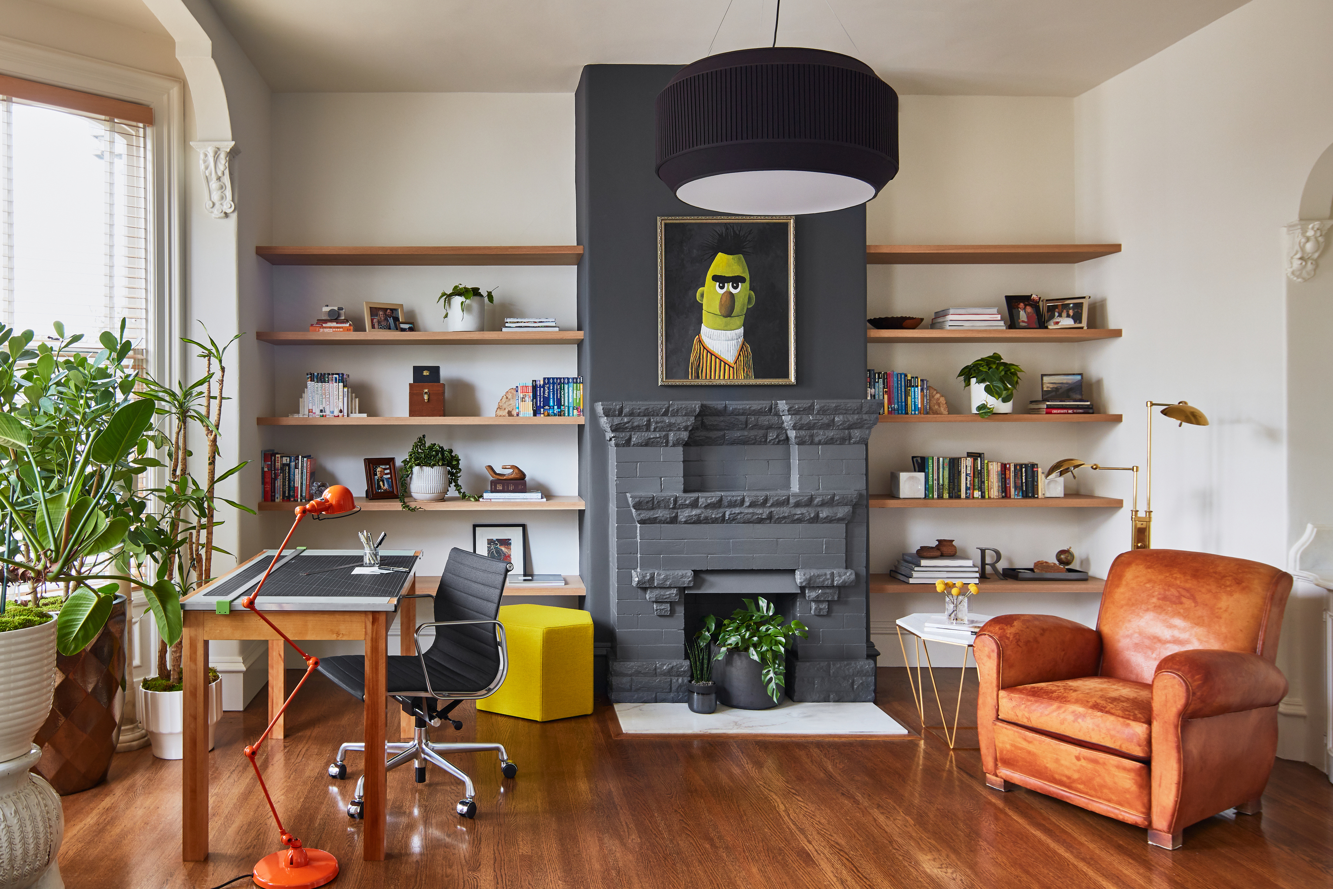
For a modern take on an accent wall, you could use paint to highlight an architectural feature. This could even be used to demarcate a large floor plan.
'The ceiling height in this room begged for a bold fireplace but the brick detailing was narrow and ran less than halfway up the wall,' says Emilie Munroe, founder of Studio Munroe. 'To create a more balanced and bold architectural statement, we painted the entire fireplace build-out, floor-to-ceiling, in charcoal black.'
'The dark color grounds the room and draws the eye upwards, enhancing the ceiling height, another key architectural element in the room,' Emilie adds. 'If room walls are dark in tone, an equal effect can be achieved by using white paint on the fireplace wall. The key is high contrast between the fireplace and the adjacent walls to create definition and the feeling of a deliberate statement.'
9. Zone the open plan office with paint
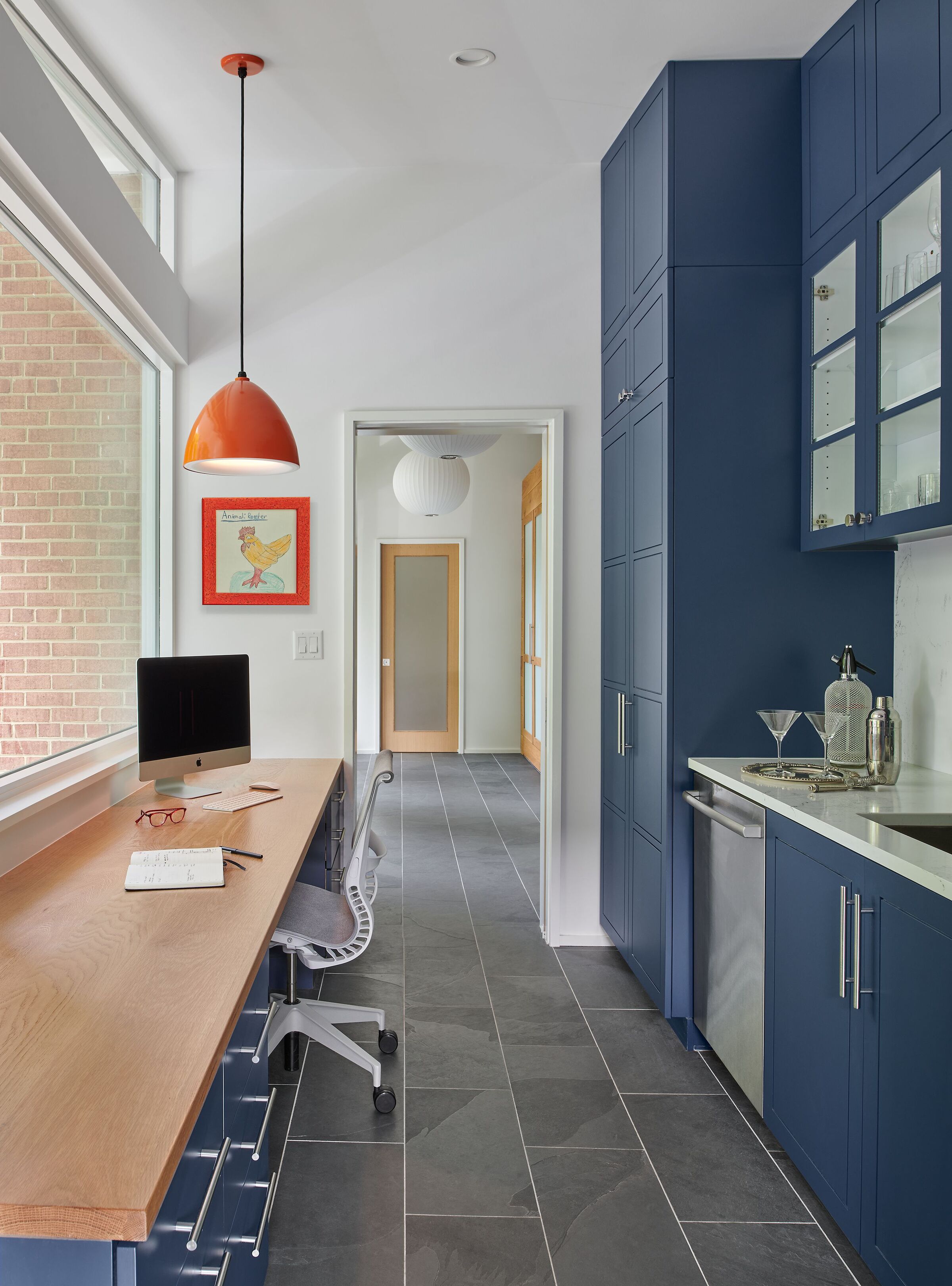
If your home office is within an open plan, a clever dividing tool is paint. In this image, the blue-painted kitchen holds its own identity, although it shares the same space and even floor as the home office.
'The owners, as part of the renovation, asked us to include dedicated office spaces,' says Charles Warren, founder of TEASS \ WARREN ARCHITECTS. 'This became particularly important because of the pandemic. We designed a large desk and office configuration at the front of the house as part of the mudroom/pantry. It allowed the owner to be part of the main living level of the house, but a bit removed from the more active areas like the living room and open-plan kitchen. It also lets the homeowner see if any visitors or delivery people were approaching.'
'The space is north facing which brings in tons of natural light without the glare,' says Charles. 'We included pocket doors so the space can be closed off if she needs some quiet, needs to take a zoom call, or if she just wants to hide a messy desk.'
10. Highlight sharp architectural lines with bright paint
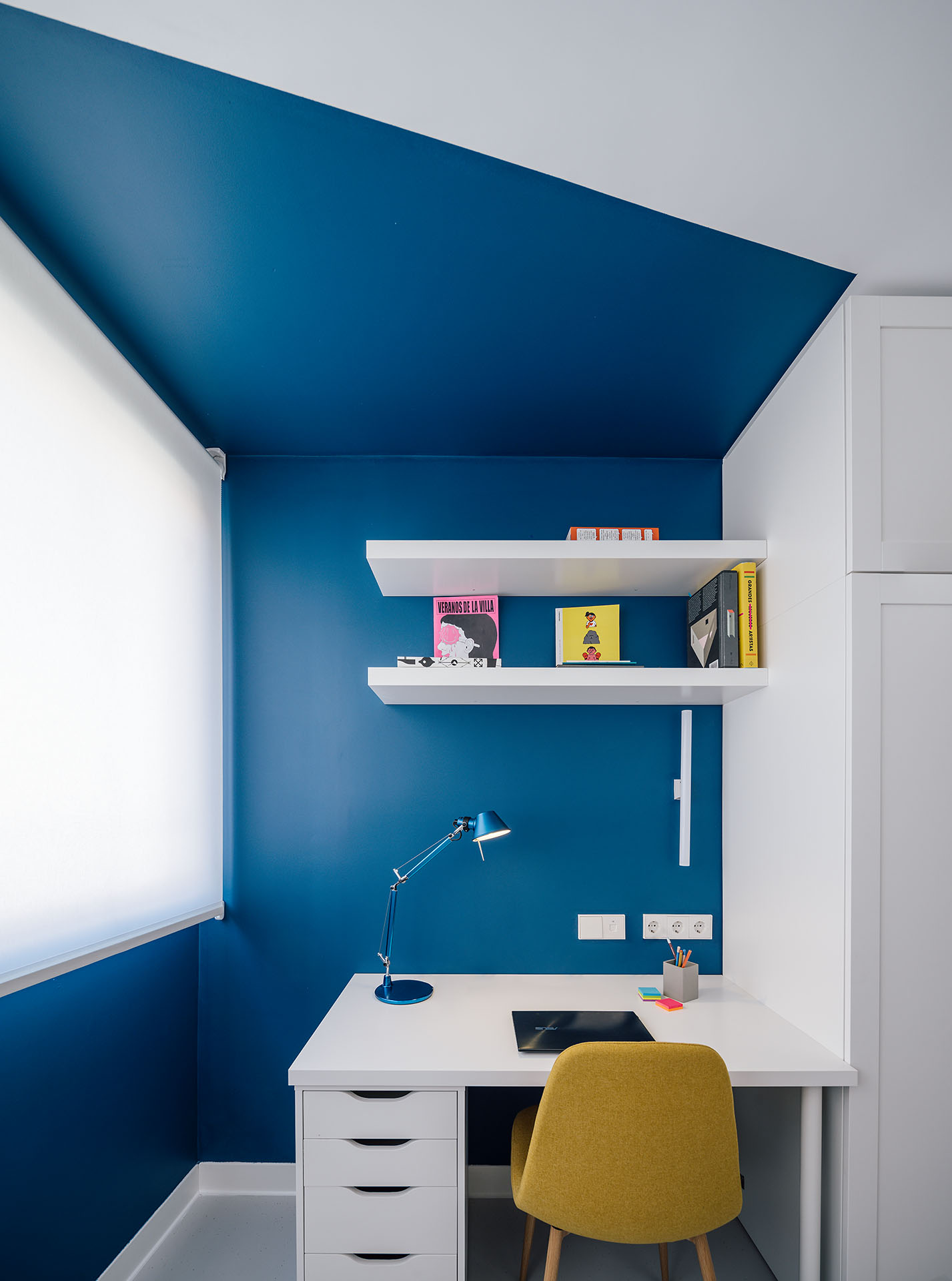
Sometimes a room, especially a small, spare bedroom or an attic may have awkward dimensions, with strong, sharp lines that lead towards dead corners. Usually, people shy away from displaying these spaces and try to hide the odd layout. However, by turning the tables around, and drenching these sharp lines with a bold hue, you can give the room a different, unique, and memorable look.
'By painting the wall with irregular polygons we wanted to delimit the work area within the bedroom,' says Celia Urbano of gon-architects.
Which color is best for home office walls?
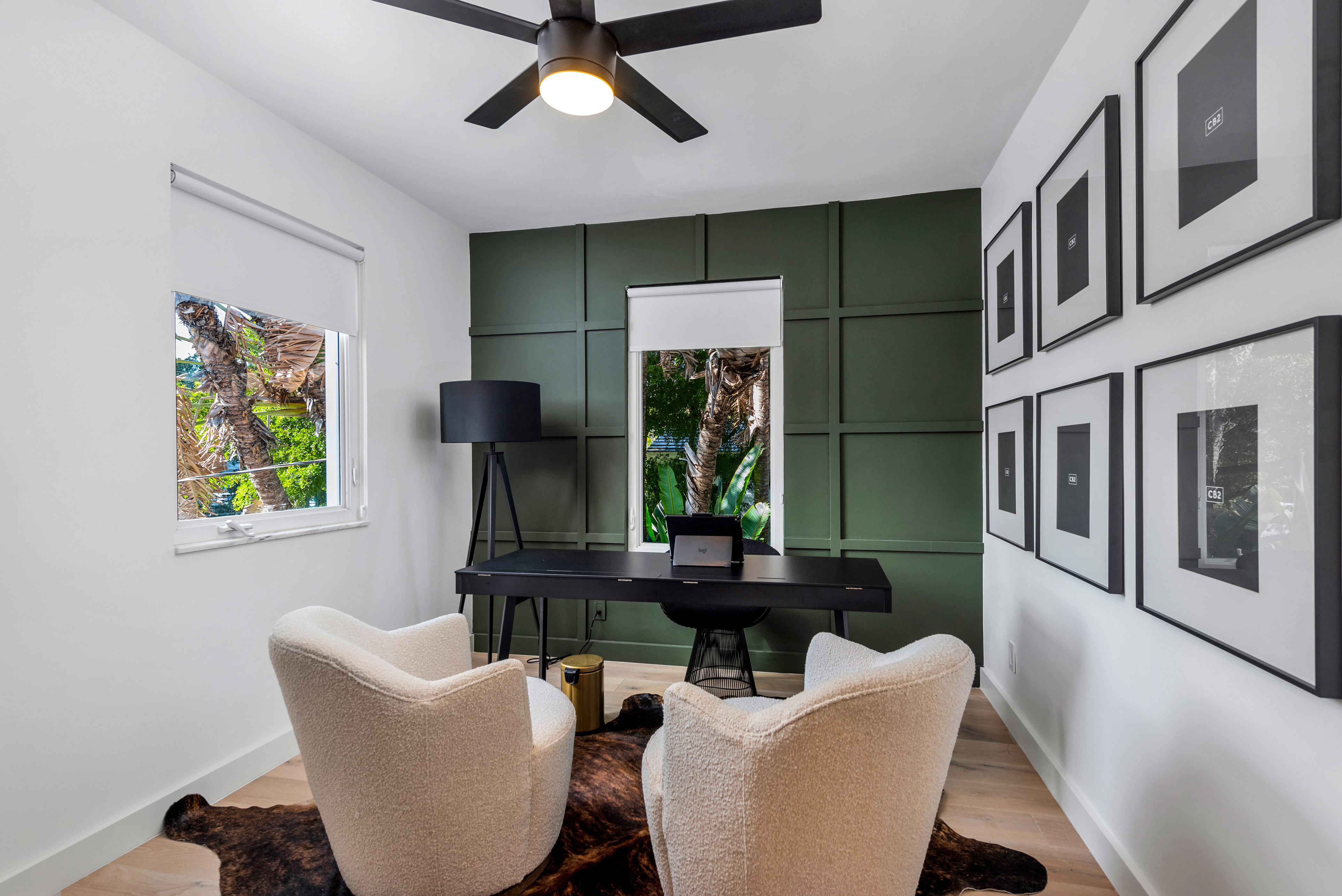
If you're wondering how to pick the right paint color ideas, especially those in the home office, we suggest you look for colors that help you concentrate instead of distract.
'Offices need to encourage work. Colors that aid concentration and inspire thought are blues and purples,' says interior designer Natalie Tredgett. 'Blues are long associated with level headed coolness. Psychologically it encourages logic and clarity of thought. The more pastel the color the more soothing it is. Purples have been linked to creating connections to the higher realm, for contemplation and mediation. A blue-purple could be a place for finding inspiration.'
Be The First To Know
The Livingetc newsletters are your inside source for what’s shaping interiors now - and what’s next. Discover trend forecasts, smart style ideas, and curated shopping inspiration that brings design to life. Subscribe today and stay ahead of the curve.

Aditi Sharma Maheshwari started her career at The Address (The Times of India), a tabloid on interiors and art. She wrote profiles of Indian artists, designers, and architects, and covered inspiring houses and commercial properties. After four years, she moved to ELLE DECOR as a senior features writer, where she contributed to the magazine and website, and also worked alongside the events team on India Design ID — the brand’s 10-day, annual design show. She wrote across topics: from designer interviews, and house tours, to new product launches, shopping pages, and reviews. After three years, she was hired as the senior editor at Houzz. The website content focused on practical advice on decorating the home and making design feel more approachable. She created fresh series on budget buys, design hacks, and DIYs, all backed with expert advice. Equipped with sizable knowledge of the industry and with a good network, she moved to Architectural Digest (Conde Nast) as the digital editor. The publication's focus was on high-end design, and her content highlighted A-listers, starchitects, and high-concept products, all customized for an audience that loves and invests in luxury. After a two-year stint, she moved to the UK and was hired at Livingetc as a design editor. She now freelances for a variety of interiors publications.
-
 10 Hidden Kitchen Socket Ideas That Disguise Eyesores and Make Backsplashes Look More Minimalist
Discover innovative ways to hide those ugly outlets and claim a sleek, clutter-free space
By Linda Clayton
-
 Clad in Cork, This 70s Retrofit is a Model for Low-Impact Living
In South Tottenham, interior designer Nina Woodcroft transformed her leaky, inefficient house into a low-energy, tactile family home
By Lauren Jones