This small apartment has a genius "rolling" desk that makes its home office so much more versatile
This clever office solution creates a flexible space that you can change and move as you please
Working from home is the once novelty factor in our lives that we’re all used to by now, but what a lot of us still haven’t quite figured out yet is how to create that perfect home office space. For those lucky enough to have a spare room that can be solely dedicated to this, the issue might not be as pressing, but most still have to make do with dining tables, office/bedrooms, or taking over guest rooms.
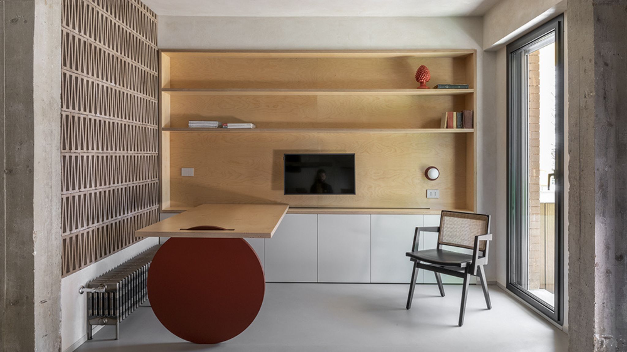
In this renovation project, I noticed a wonderfully clever small home office idea that allows a desk to be moved in and out of position when needed and depending on where you would like to be sat in the room.
It can be seen in a renovated apartment for a young couple of lawyers, with large windows that let the light pour in and that capture the greenery outside, on the Roman coast. Casa Rude, as the architects named it, was born from the owners' needs to make the best use of the outdoors, and the office space created delivered to the brief impeccably.
‘We are originally from Sicily and felt the need to reconnect with nature. Since we moved to Rome we have always lived in small, cramped apartments with artificial materials. We wanted a bright, open house that privileged the uniqueness - sometimes even imperfections - of the materials,’ the owners explain. Let’s get a closer look at this modern home.
The innovative moving desk with a view
For the owners of this Roman apartment, it was important to devote more space to relaxation and feel connected to the outdoor views. STUDIOTAMAT, the architecture and design practice in charge of renovating the home managed to create a minimalist and calming space with one very important desk idea.
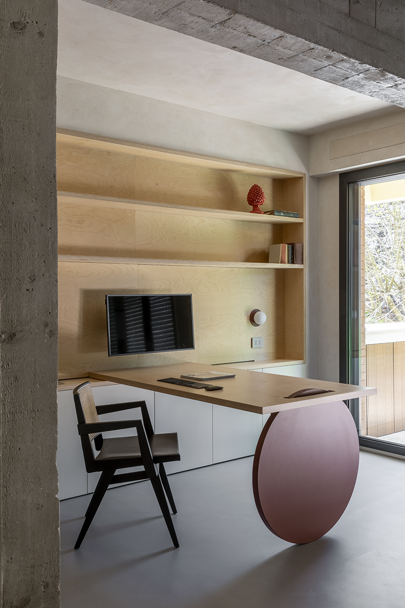
A studio desk moves in the space thanks to a wooden wheel that runs on a track hidden inside the bookcase. ‘That's why we thought of the table that slides in different positions through a rail on the bookcase, you can get closer to the outside and by keeping the windows open you may feel in the middle of the terrace greenery,’ says Tommaso Amato, co-founder of STUDIOTAMAT.
The bookcase is minimalist in its form, and that is reflected in the shape of the desk, which only features a simple worktop. This, however, makes the wooden red wheel become such a great feature that is still minimalist in design but brings an element of surprise and color to the room.
‘The whole house has a minimalist twist. The idea was not to define the space but to leave it flexible and let the owners decide where they wanted to position the table, in order to have different configurations of the space. For example, it can divide the space in two in order to have the seats in front of the desk, or it can be moved towards the terrace to have a bigger studio, or it can be moved to the opposite side for extra seating space,’ adds Tommaso.
I love how this could work wonderfully as a living room home office idea where you can move the desk to make room for a sofa, you can push it back or forward to add chairs and create a dining space, or just simply use it tucked closer to the wall as a work area, its main function.
The brutalist design restores fluidity to the space
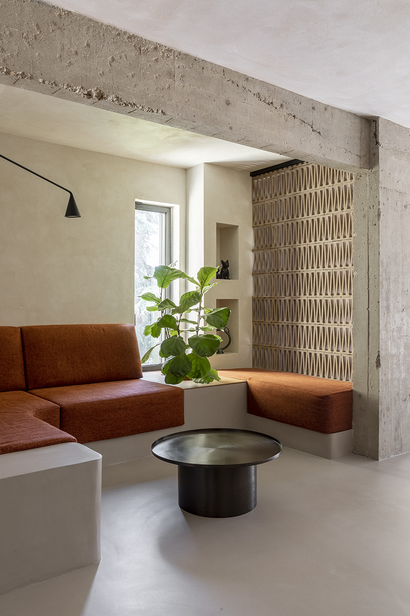
You might not have put the two together, ‘brutalist interior’ and ‘fluidity’, but this apartment shows you that they couldn’t be a better fit.
The mindful use of materials, such as the reinforced concrete left exposed and unshaved of the pillars and beams, and the balanced distribution inside the space creates a cohesive appearance and allows for light and air to flow, to a surprisingly peaceful and calm effect.
‘What guided us in the design was the desire to enhance the distinctive features of the unique terraced building, dating back to the 1980s, which houses the apartment. We wanted to restore fluidity to the spaces, encourage the opening and the rediscovery of pre-existing materials and details, on which to set a new vision,’ explains Tommaso.
The design of this apartment is an oasis of serenity created by the clever use of minimalist design, materials in a rough and smooth mix, and the adaptability of space all at one with the light and nature outside.
Recreate the look of this brutalist apartment with these buys
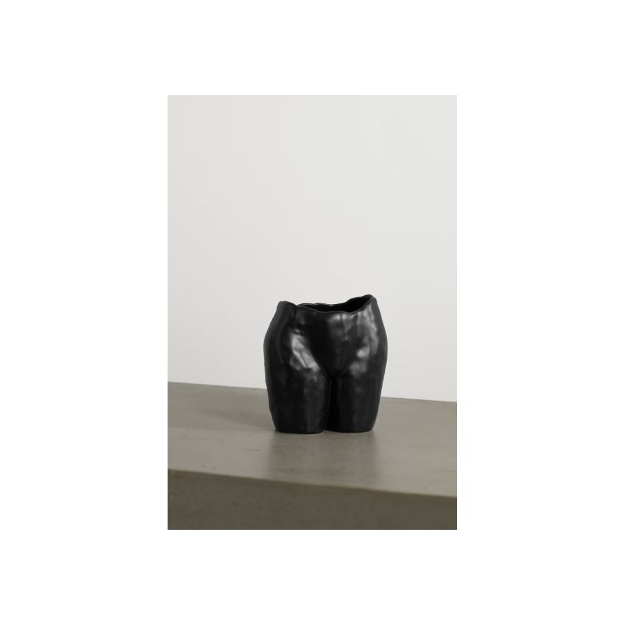
Price: $85
This black ceramic vase will bring playfulness into a minimalist home. Its irregular surface will blend in a brutalist design that combines the rough and smooth.
Be The First To Know
The Livingetc newsletters are your inside source for what’s shaping interiors now - and what’s next. Discover trend forecasts, smart style ideas, and curated shopping inspiration that brings design to life. Subscribe today and stay ahead of the curve.
Raluca formerly worked at Livingetc.com and is now a contributor with a passion for all things interior and living beautifully. Coming from a background writing and styling shoots for fashion magazines such as Marie Claire Raluca’s love for design started at a very young age when her family’s favourite weekend activity was moving the furniture around the house ‘for fun’. Always happiest in creative environments in her spare time she loves designing mindful spaces and doing colour consultations. She finds the best inspiration in art, nature, and the way we live, and thinks that a home should serve our mental and emotional wellbeing as well as our lifestyle.
-
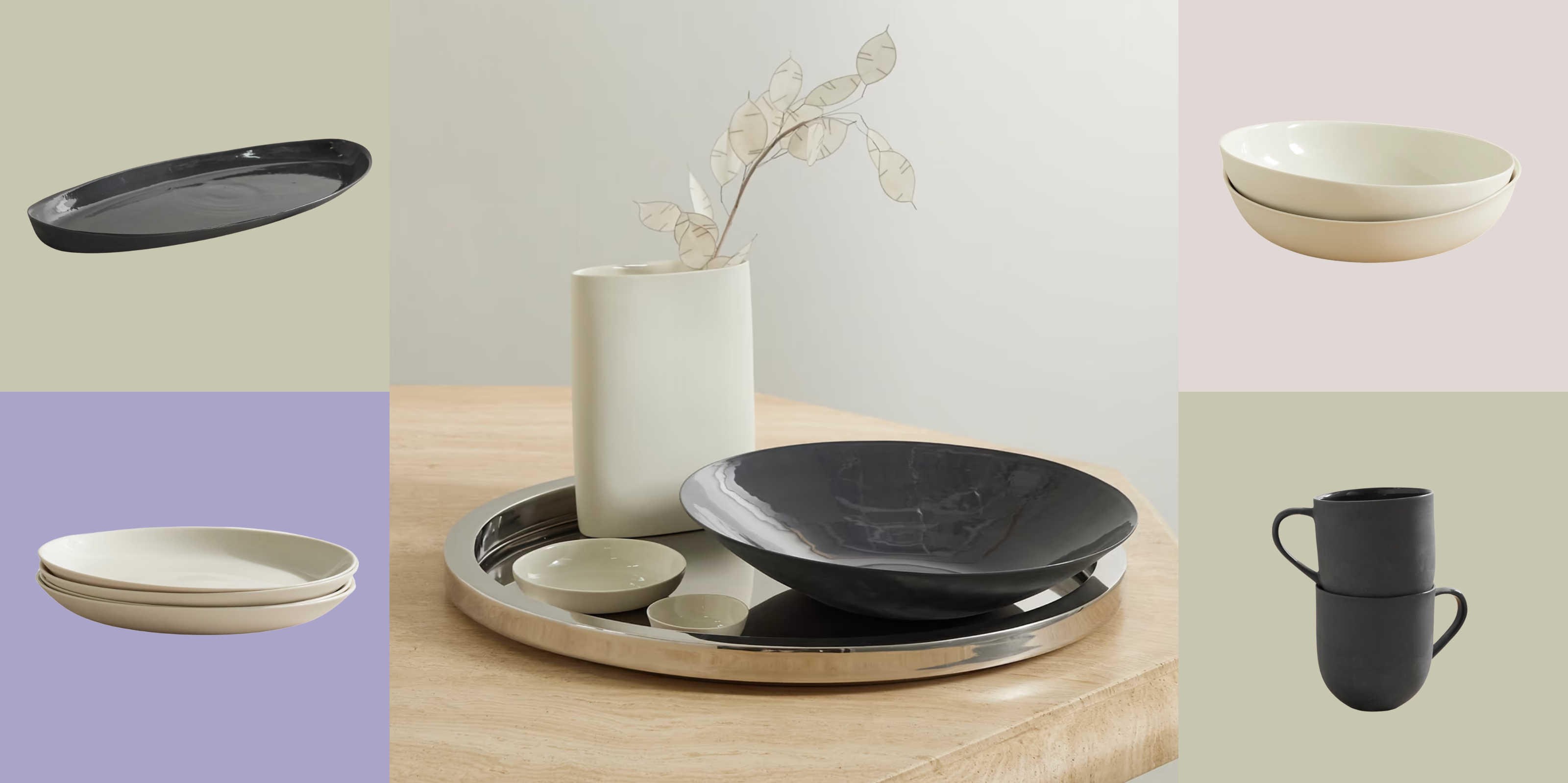 Turns Out, Sustainable Design Can Be Chic, and Net-a-Porter's 'Net Sustain' Curation Is Proof — Here's What I'm Shopping
From the Net Sustain collection, Mud Australia's homeware is not only design-oriented, but eco-focused, too
By Devin Toolen
-
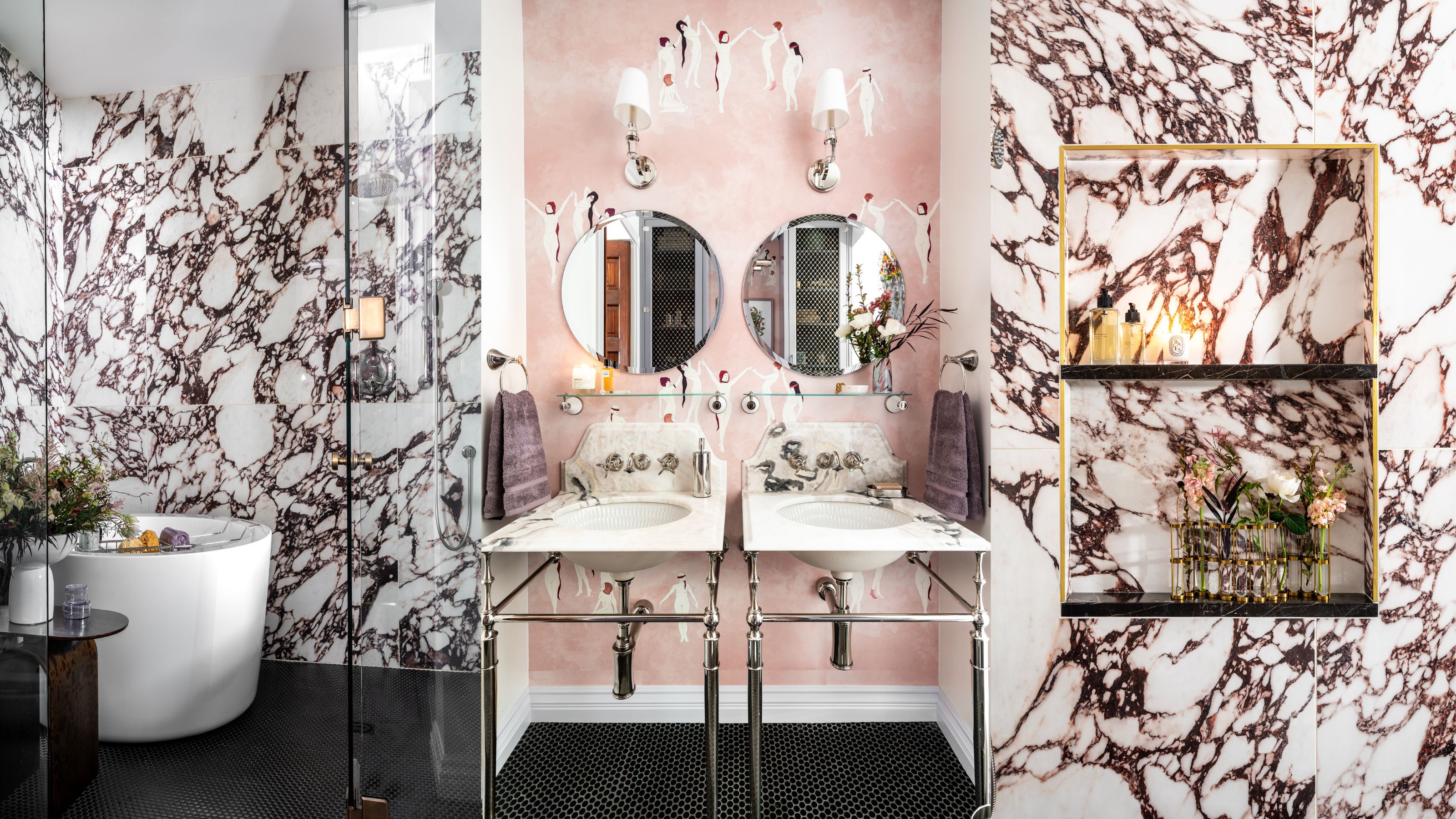 Before and After — How This Jewel-Box Bathroom Made the Most of Its Proportions With Maximalist Design and a 'Soaking Tub'
This design offers a masterclass on creating a luxurious bathroom that is equally playful and elegant.
By Maya Glantz
